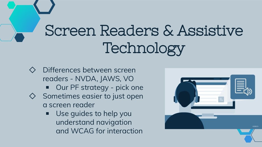
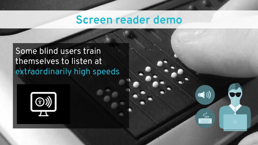
Our PF strategy - pick one ◇ Sometimes easier to just open a screen reader ■ Use guides to help you understand navigation and WCAG for interaction Screen Readers & Assistive Technology
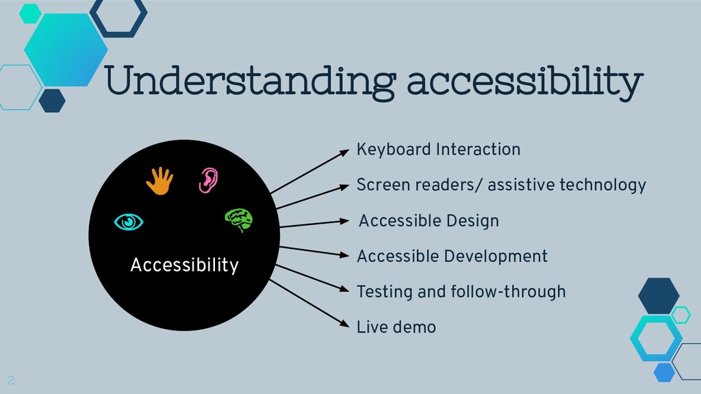
Ear infection Had eyes dilated Sore throat Broken bones Dark environment Non-fluent speaker Hands full Loud environment Auditory Sight Speech Motor Designing for all users
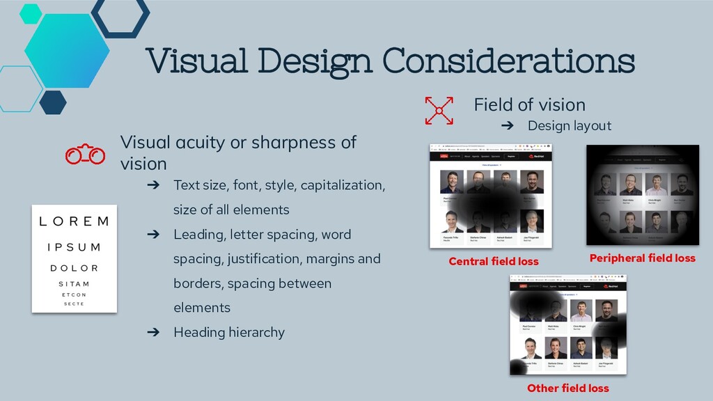
Text size, font, style, capitalization, size of all elements ➔ Leading, letter spacing, word spacing, justification, margins and borders, spacing between elements ➔ Heading hierarchy Field of vision ➔ Design layout Central field loss Peripheral field loss Other field loss
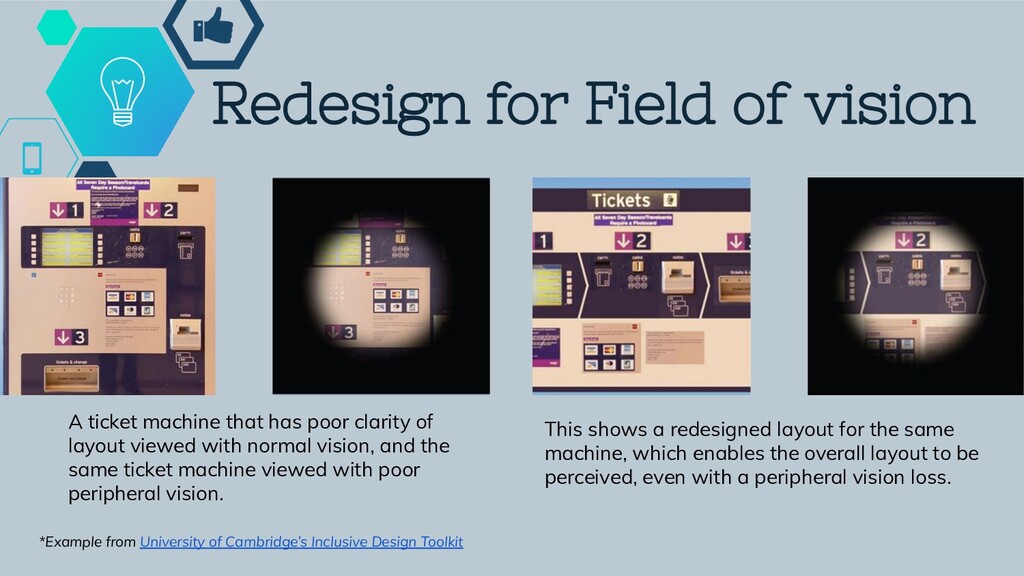
poor clarity of layout viewed with normal vision, and the same ticket machine viewed with poor peripheral vision. This shows a redesigned layout for the same machine, which enables the overall layout to be perceived, even with a peripheral vision loss. *Example from University of Cambridge’s Inclusive Design Toolkit
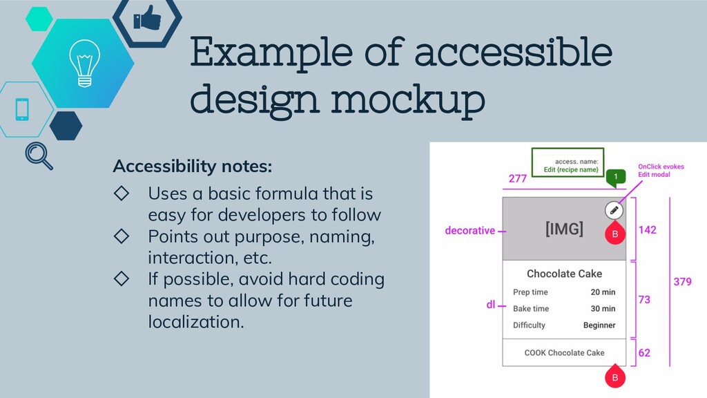
for developers to follow ◇ Points out purpose, naming, interaction, etc. ◇ If possible, avoid hard coding names to allow for future localization. Example of accessible design mockup
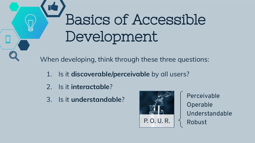
discoverable/perceivable by all users? 2. Is it interactable? 3. Is it understandable? P. O. U. R. Perceivable Operable Understandable Robust Basics of Accessible Development
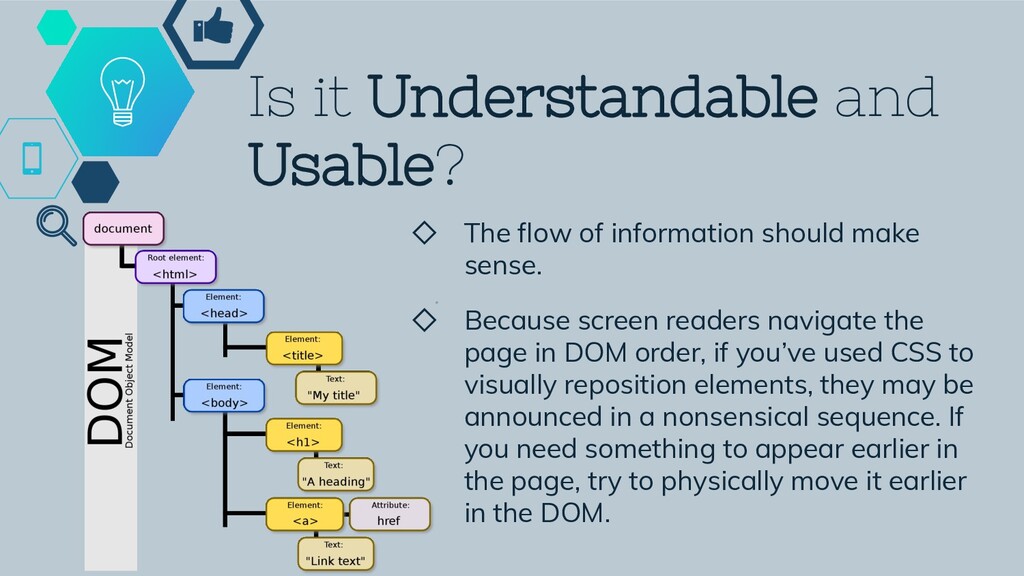
should make sense. ◇ ◇ Because screen readers navigate the page in DOM order, if you’ve used CSS to visually reposition elements, they may be announced in a nonsensical sequence. If you need something to appear earlier in the page, try to physically move it earlier in the DOM.
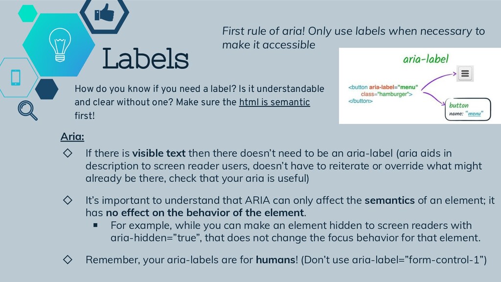
doesn’t need to be an aria-label (aria aids in description to screen reader users, doesn’t have to reiterate or override what might already be there, check that your aria is useful) ◇ It’s important to understand that ARIA can only affect the semantics of an element; it has no effect on the behavior of the element. ■ For example, while you can make an element hidden to screen readers with aria-hidden=”true”, that does not change the focus behavior for that element. ◇ Remember, your aria-labels are for humans! (Don’t use aria-label=”form-control-1”) How do you know if you need a label? Is it understandable and clear without one? Make sure the html is semantic first! First rule of aria! Only use labels when necessary to make it accessible
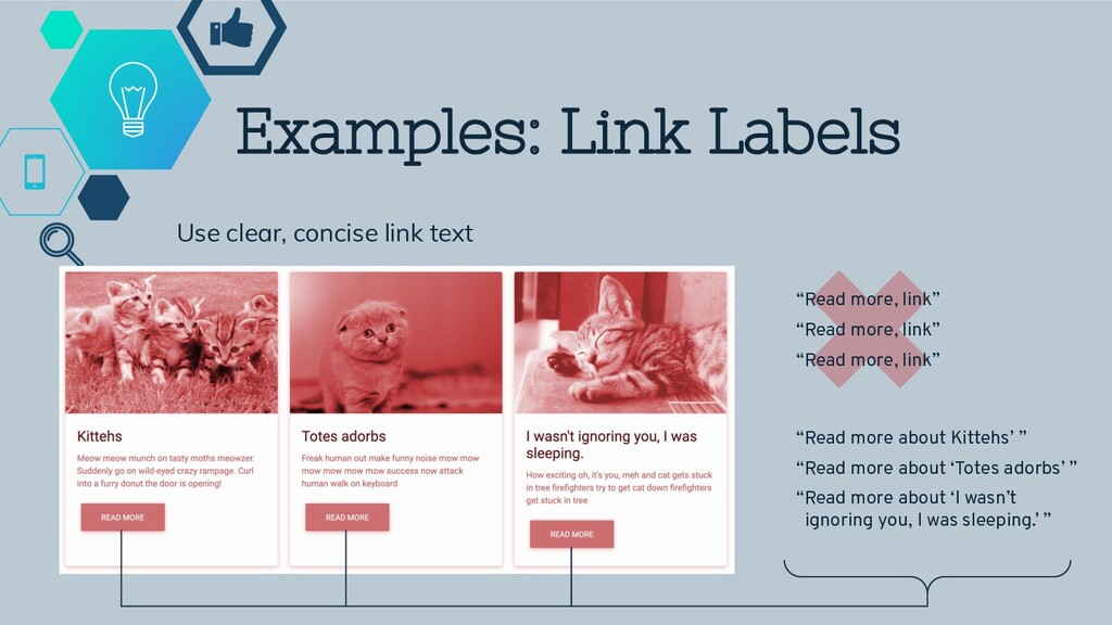
“Read more about ‘Totes adorbs’ ” “Read more about ‘I wasn’t ignoring you, I was sleeping.’ ” “Read more, link” “Read more, link” “Read more, link” Examples: Link Labels
go from there? ◇ Accessibility guide and other a11y resources ◇ Is there an established practice? (WCAG is the standard) ◇ Nothing firm? Article documenting someone has done it before ◇ Try and test ◇ If not a firm standard/practice, test across use cases and platforms: ■ Keyboard ■ One or more screen readers (VO, NVDA, JAWS, etc.) ◇ Stuck? Ask for help! - ■ web-a11y slack channel and other communities Resources
Caron, Jess Law, and Michael Spaxman for presentation inspiration Brian Dellascio for presentation design guidance The PatternFly team for all of their a11y efforts