Upgrade to Pro — share decks privately, control downloads, hide ads and more …

Show me the Numbers: Designing Your Own Data Visualizations

Aaron
September 09, 2017

Show me the Numbers: Designing Your Own Data Visualizations

Data visualization basics at the PEPFAR Applied Learning Summit

https://achafetz.github.io/pals_dataviz/

Aaron

September 09, 2017
Tweet

More Decks by Aaron

Other Decks in Design

Transcript

  1. How do we design an effective tool? Data Viz Principles

    Program Context Software Skills Structured Dataset Guiding Question
  2. Global Single IM Broad Focus Narrow Focus PEPFAR Executives TWG

    Leads SI Advisers Partners Country Teams Agency Leadership Defining an audience Scott Jackson, PWC
  3. Explore Analyze Communicate Influence A good visualization allows you to…

    Chafetz, Essam, Hughes, Johnson (2016). “Fundamentals of Data Analysis & Visualization Training”
  4. We are interested in tracking the progress of the number

    of people on treatment by age group against the COP target set in PEPFARlandia. • Where do we go to access and extract the data? • What information do we need to pull the data?
  5. 775 777 745 75 779 785 786 Total Numerator Aggregated

    Age/Sex Results Age/Sex Aggregated/Result Age/Sex/Result ServiceDeliveryPoint ServiceDeliveryPoint/Result PEPFARlandia Completeness Check FY 2016 Q2 HTS_TST thousands of people
  6. Validate the completeness of TX_CURR for DSD for the current

    FY in PEPFARlandia. • Where do we go to access and extract/view the data? • What information do we need to pull the data? • What disaggregates do we need to look at?
  7. We are interested in tracking the progress PEPFARlandia is making.

    • Using the handouts containing PEPFARlandia indicator data, explore the data by making some visualizations. • What story are you trying to tell with the visualization?
  8. Visual Analysis to Find Stories Andy Kirk, Visualization Workflow o

    Categorical comparison and proportions o Ranking: big, medium, small o Measurements/values: absolutes o Range and distribution o Context: Targets, forecasts, averages o Hierarchical relationships COMPARISONS o Up and down vs flat? o Linear vs exponential o Steady vs fluctuating o Seasonal vs random o Rate of change vs steepness TRENDS o Outliers o Intersections o Correlations o Connections o Clusters o Associations o Gaps RELATIONSHIPS
  9. We are interested in tracking the progress PEPFARlandia is making.

    • How were you going about analyzing the data your visualizations? • How could you improve upon your visualization?
  10. Consistent color scheme Consistent font family, vary size and emphasis

    t T Adjust size Simplify Logical Order Integrate text and legend MWI TNZ Start with a sketch Key Principles Clear purpose
  11. We are interested in tracking the progress PEPFARlandia is making.

    • How could you improve upon your visualization? • Add in some features mentioned on the last slide around key principles, starting with a clear title
  12. • Prepared for the ICPI/CIT training, “Data Use Training” (DC),

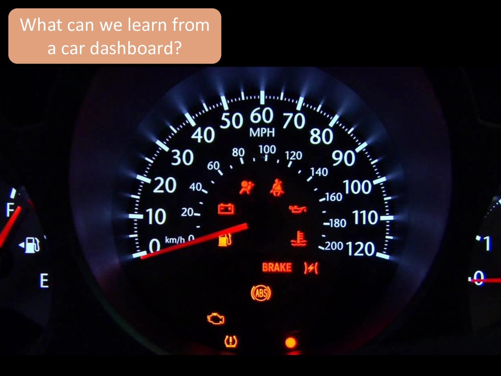
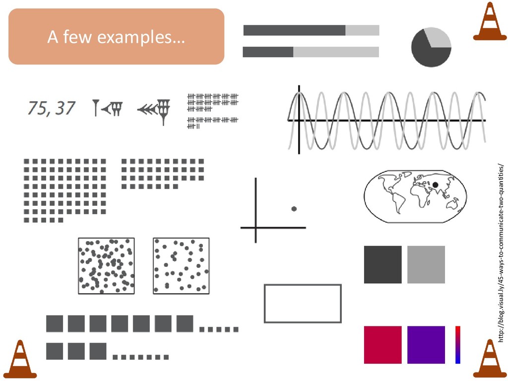
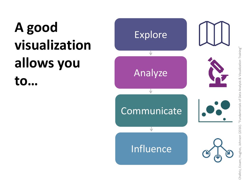
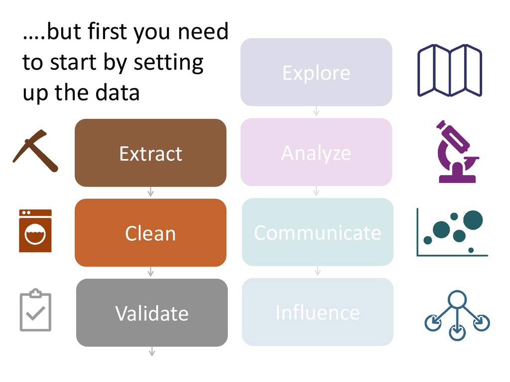
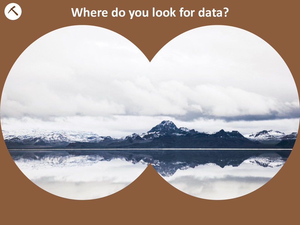
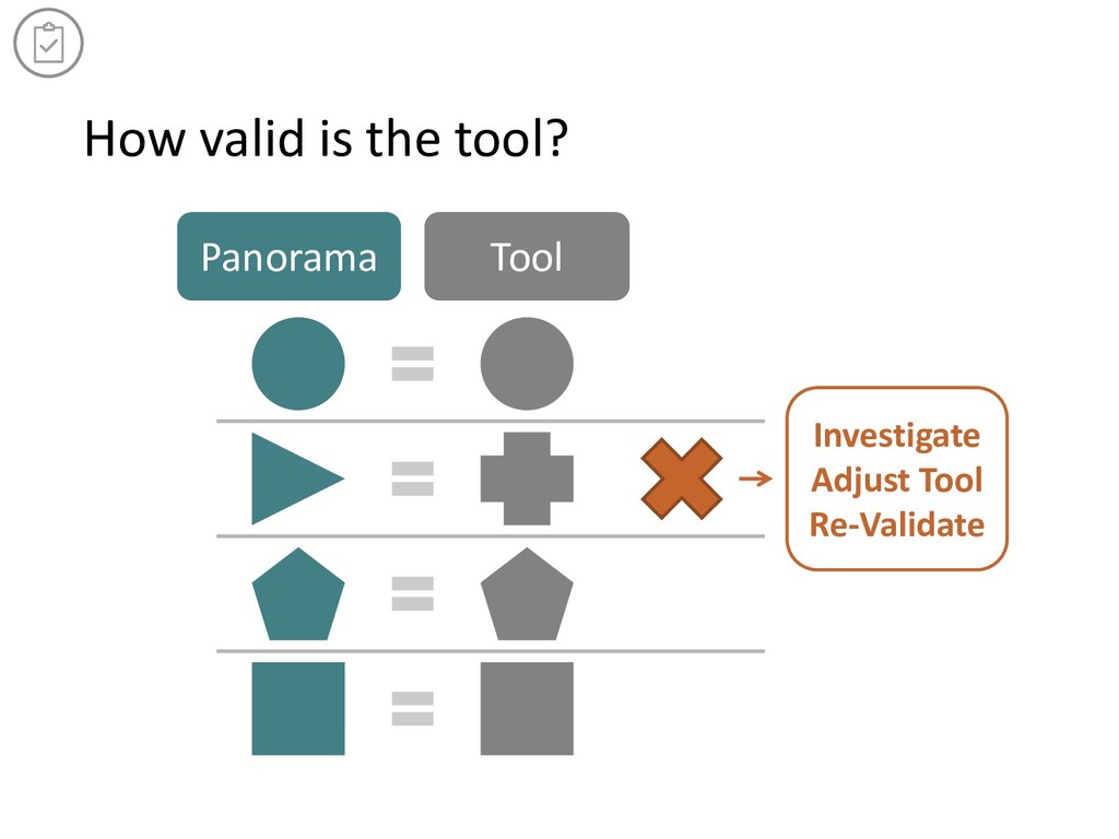
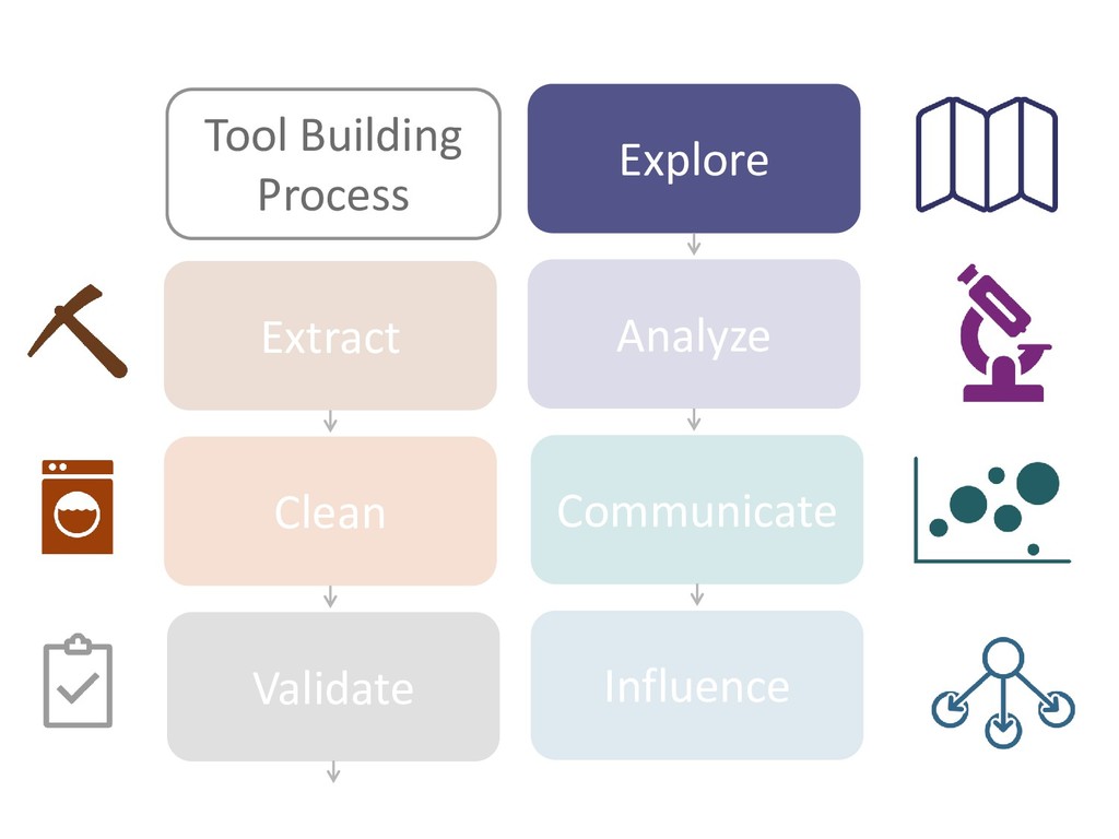
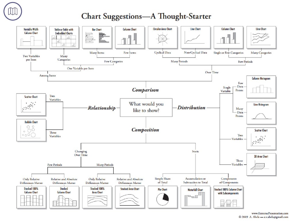
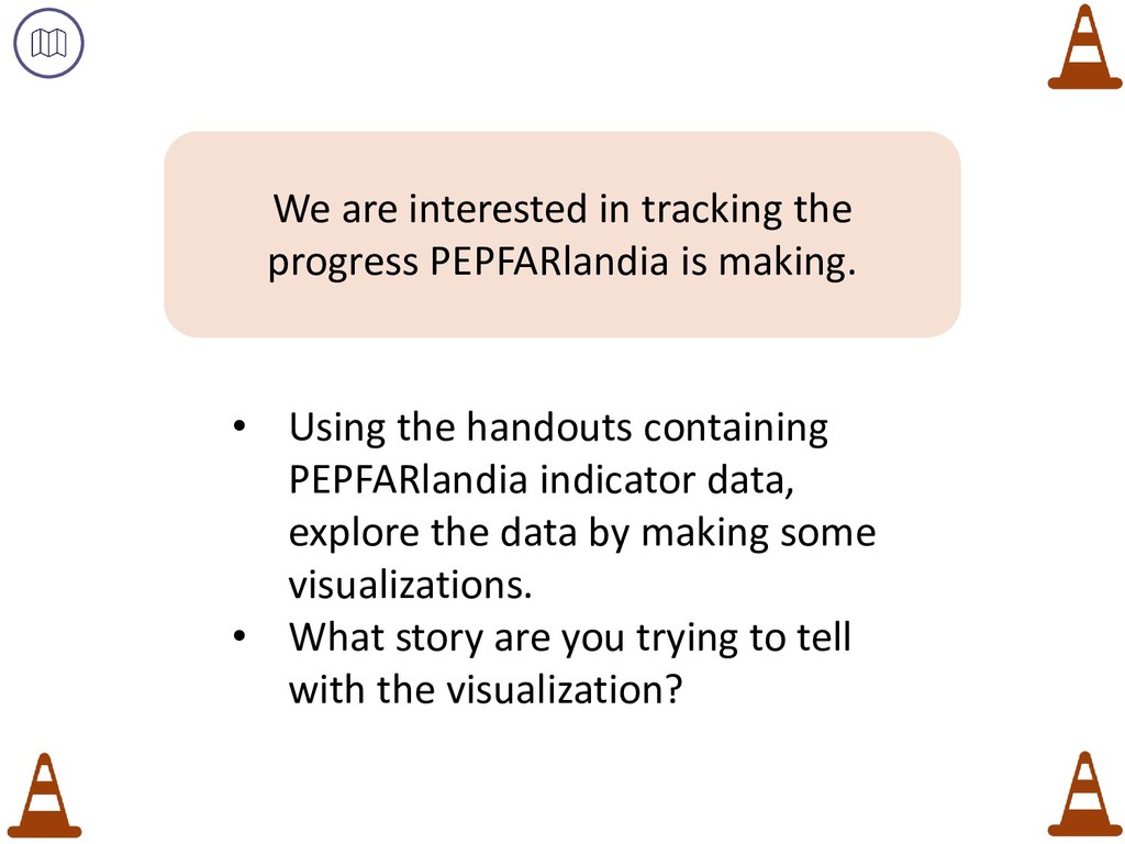
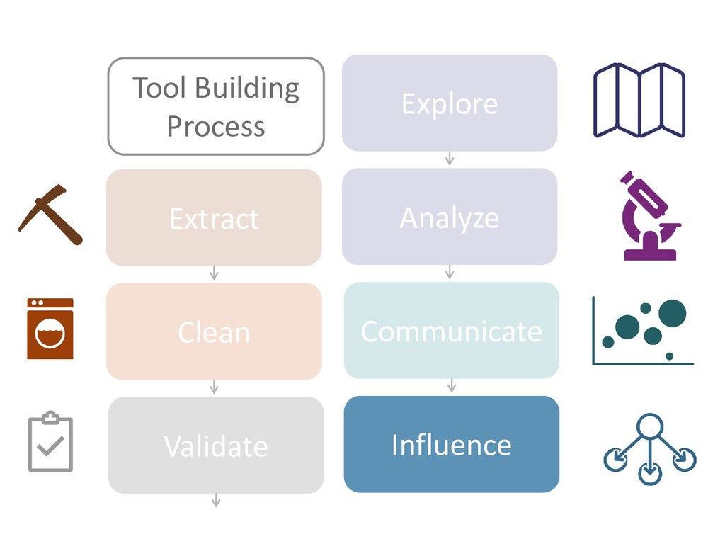
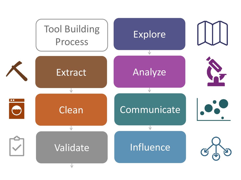
    October 2016 (adapted from June 2016 version) • Presentation material adopted from J. Schwabish (2014). “A Visualization Mapping: Form and Function” (http://policyviz.com/a-visualization-mapping-form-and-function/), S.Ortiz (2012). “45 Ways to Communicate Two Quantities, (http://blog.visual.ly/45-ways-to-communicate- two-quantities), A. Kirk (2013). Visualization WorkflowFinding Stories and Telling Stories (http://www.slideshare.net/visualisingdata/andy-kirks-facebook-talk) and Chafetz, Essam, Hughes, Johnson (2016). “Fundamentials of Data Analysis & Visualization Training” (http://geocenter.github.io/StataTraining ) • Image Sources • Youtube [Dashboard], Sears Auto Center • Unsplash, [Lake and Mountains], Justin Luebke • Extreme Presentation, “Chart Suggestions” • Icons downloaded from the Noun Project and designed by various artists: The Noun Project, [map], Ivan Colic; “Microscope”, lastspark, “Graph”, gira Park; “Influencer”, Adam Beasley; “Pickaxe”, Creative Stall, “Detergent”, Megan Mitchell, “Washing Machine”, National Parks Service, “Clipboard”, matthew hall, Phil Goodwin; [country shape], Anna Gajowiec, “Traffic Cone”, Vicons Design, “Structure”, Alexandr Cherkinshy, “simplify”, Chameleon Design, “Analytics, Syafiqa Fickle; “Pencil”, David; “Target, Franck Junker, “Mouse”, John Testa, “Wrench”, Bluetip Desig, “Power Drill” Maksim Karalevich Notes and Attribution