submit your final questions on Canvas. Please indicate your group name and the names of all group members. One submission per group. Deadline: Mar.11 at midnight. Photo: Startup Weekend Hackathon. Nov.2014 ASSIGNMENT 2
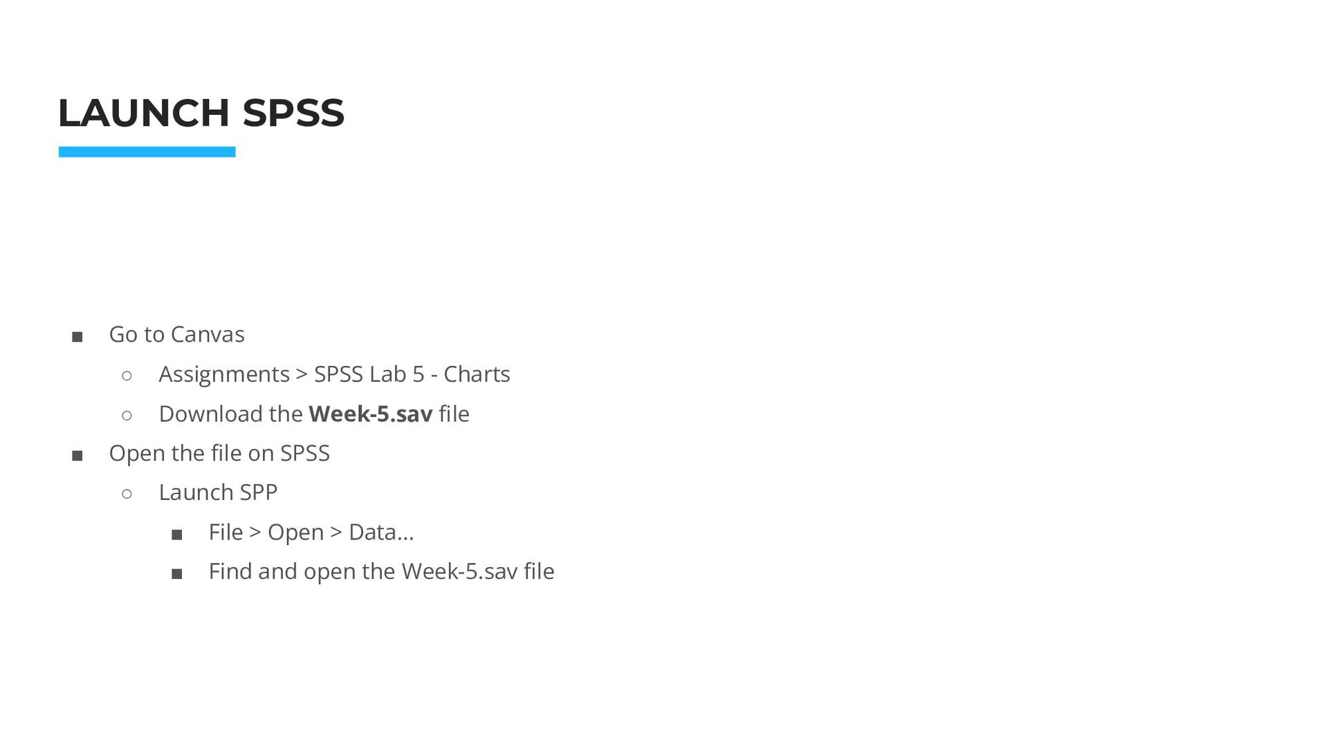
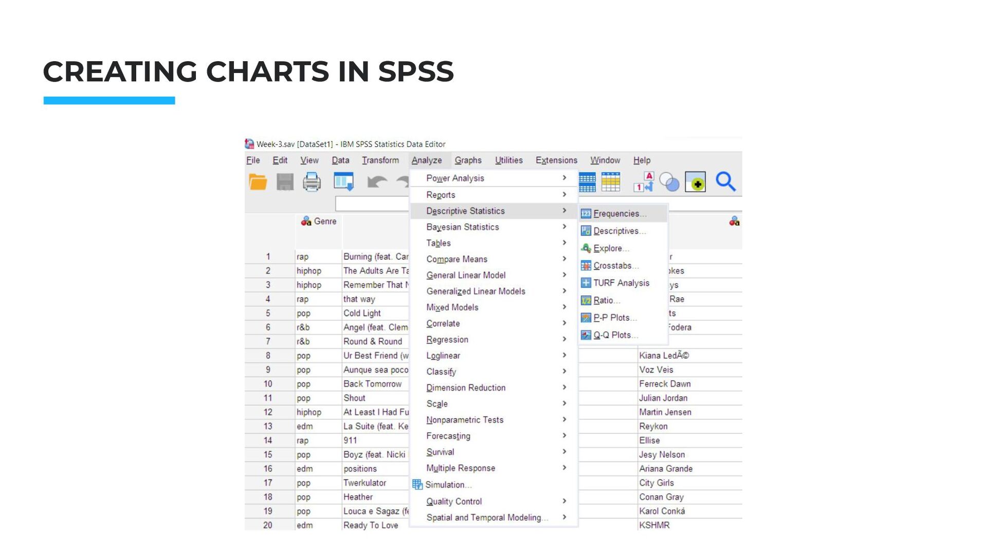
Canvas ◦ Assignments > SPSS Lab 5 - Charts ◦ Download the Week-5.sav file ▪ Open the file on SPSS ◦ Launch SPP ▪ File > Open > Data… ▪ Find and open the Week-5.sav file
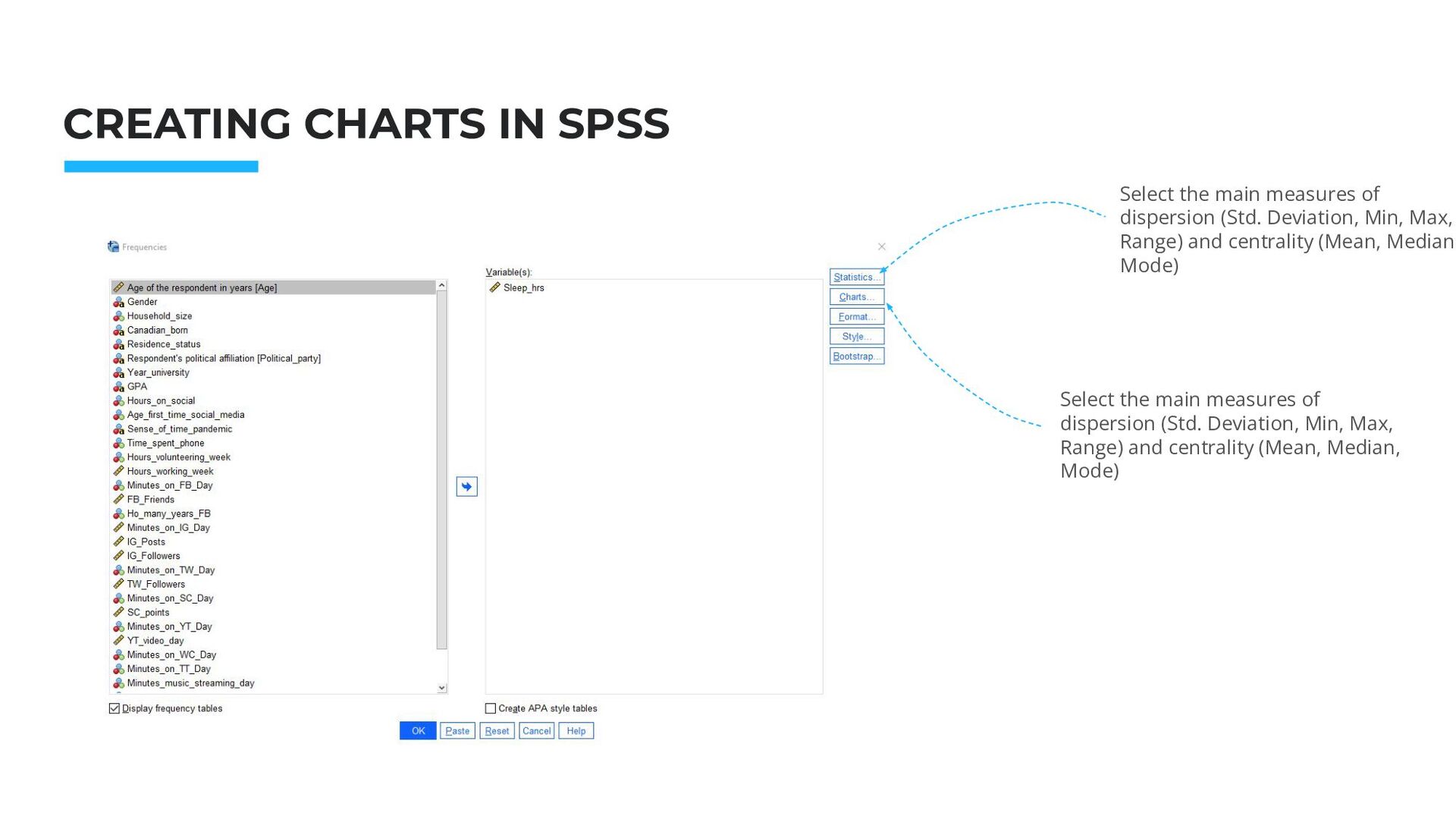
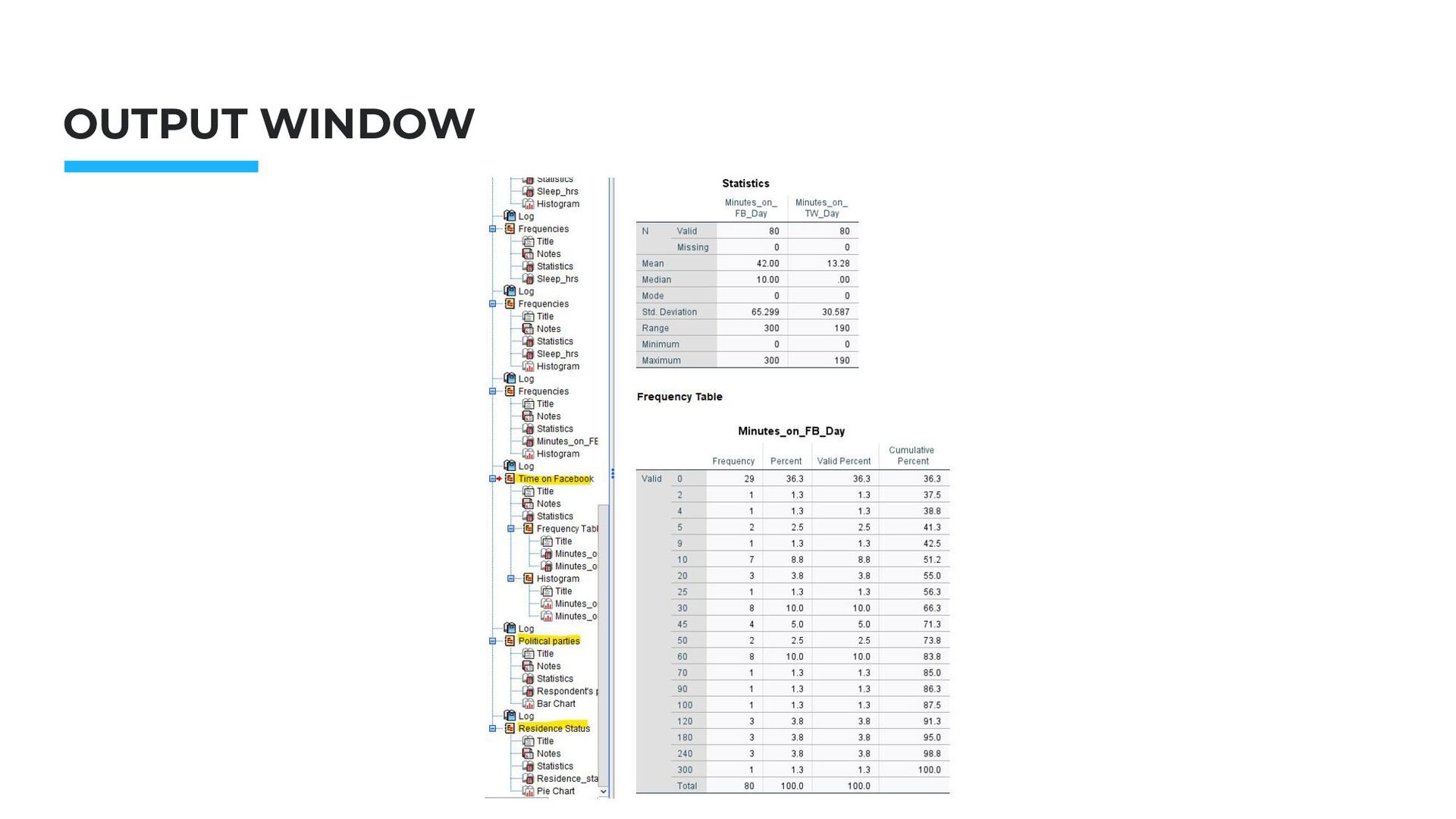
the main measures of dispersion (Std. Deviation, Min, Max, Range) and centrality (Mean, Median, Mode) Select the main measures of dispersion (Std. Deviation, Min, Max, Range) and centrality (Mean, Median, Mode)
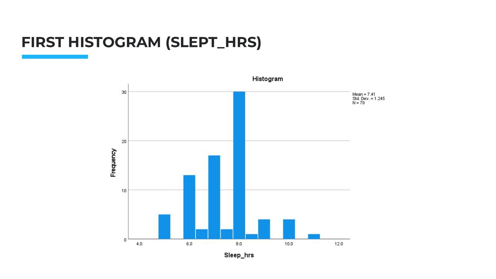
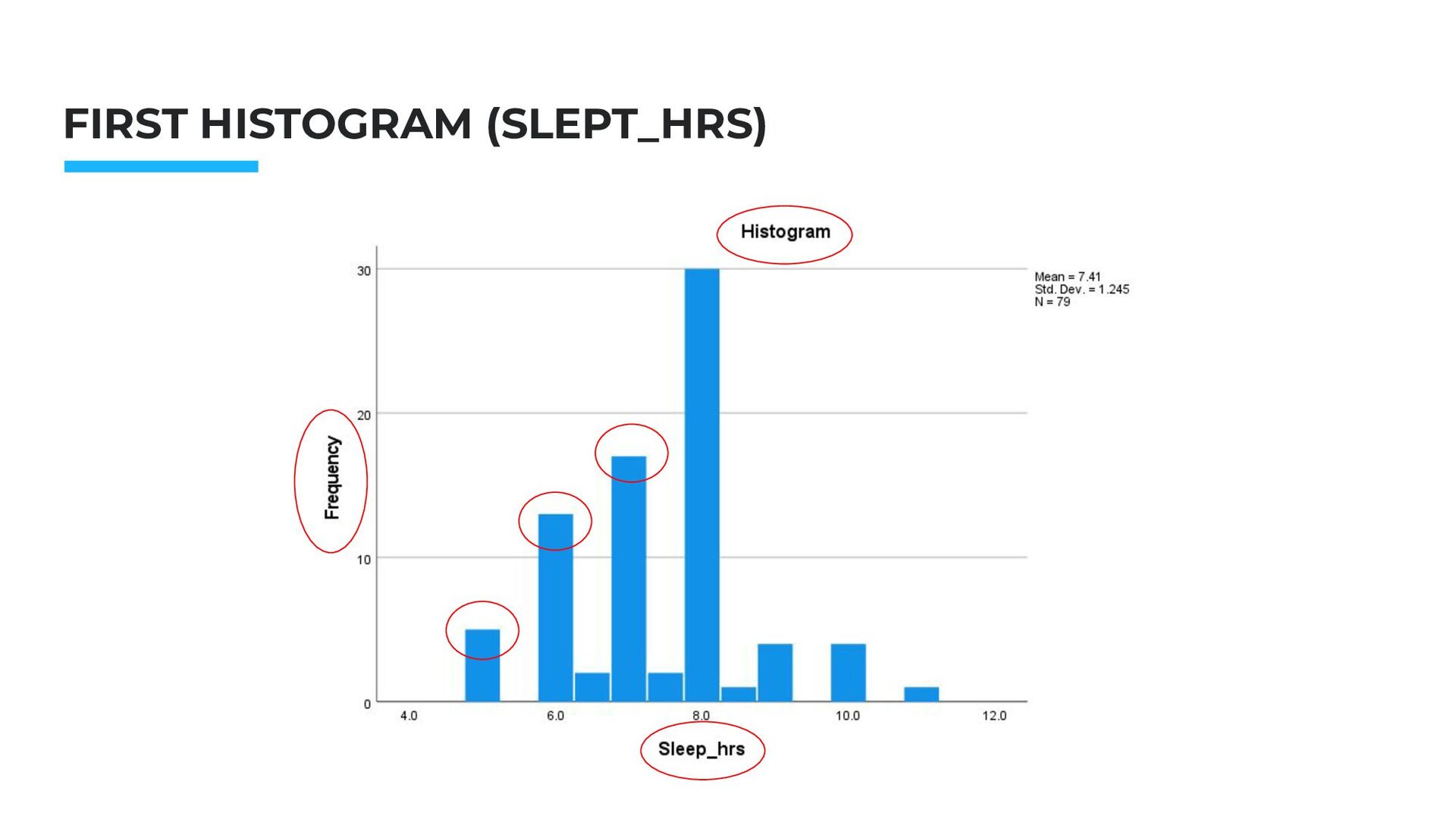
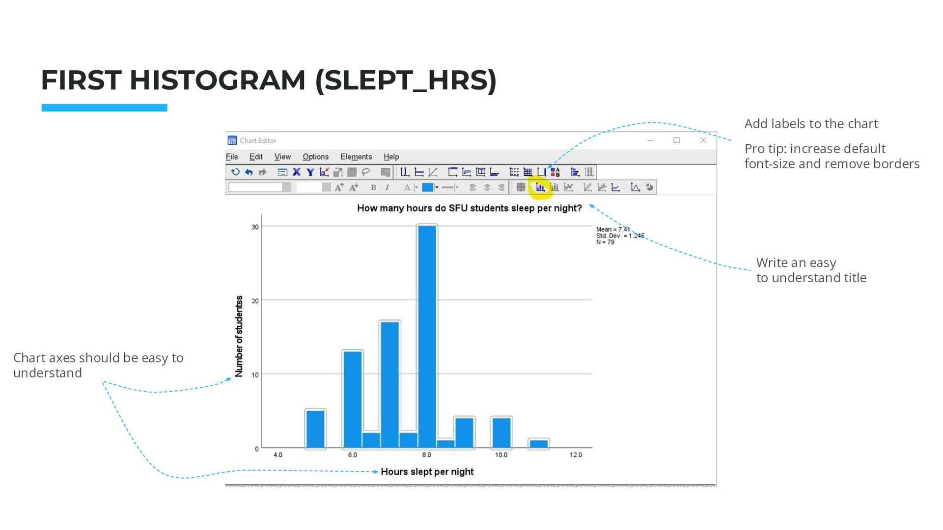
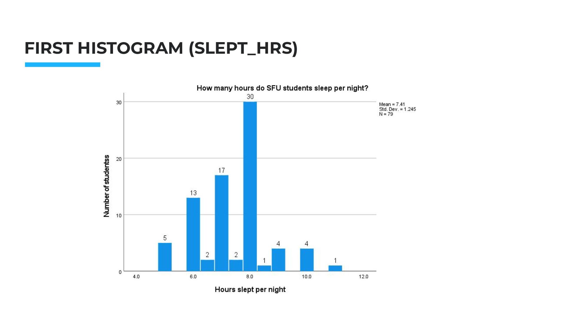
Nov.2014 FIRST HISTOGRAM (SLEPT_HRS) Add labels to the chart Pro tip: increase default font-size and remove borders Chart axes should be easy to understand
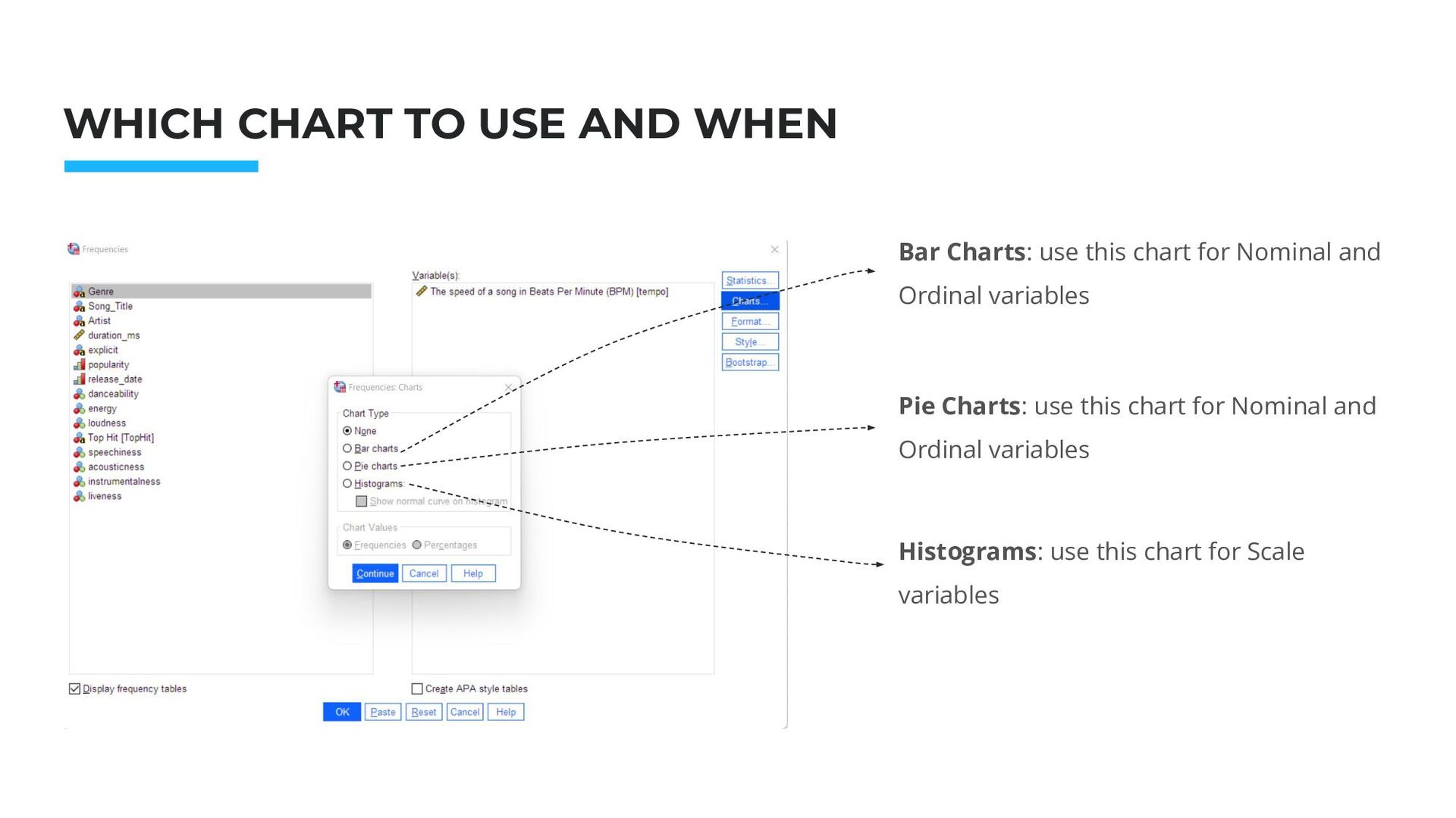
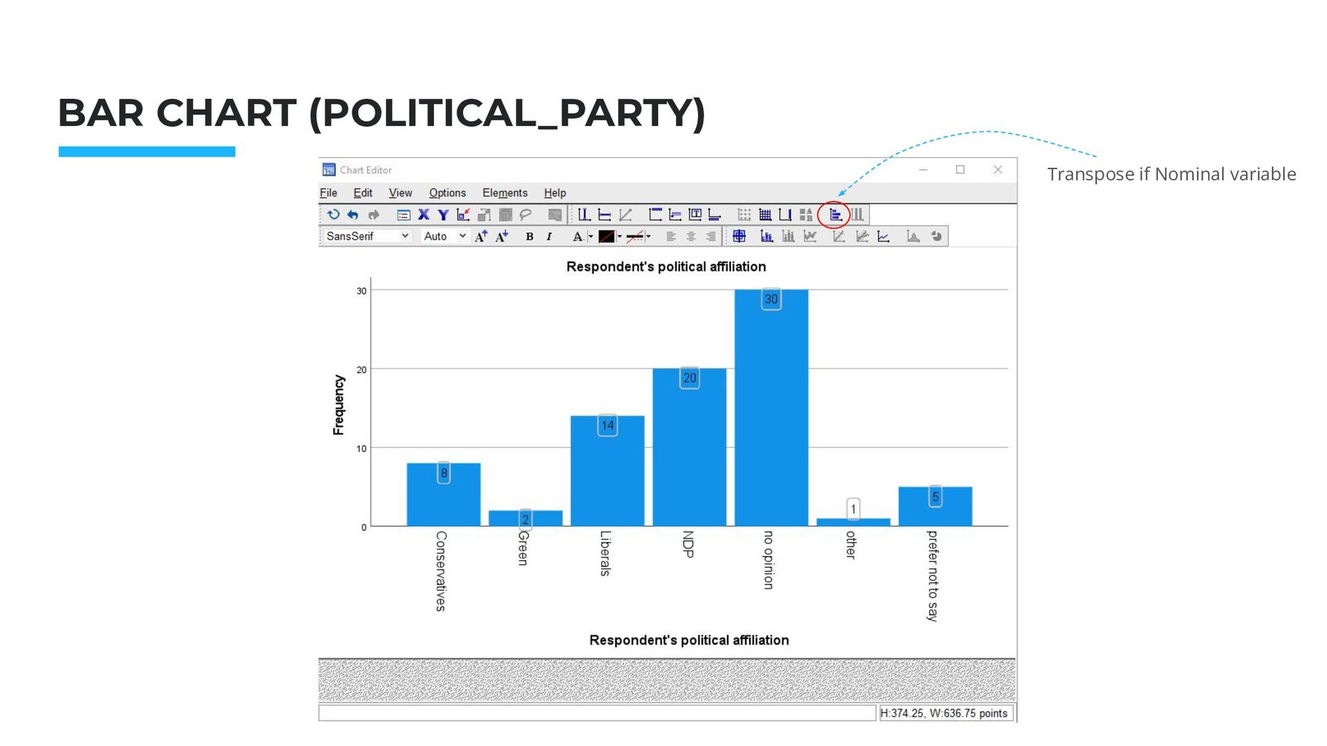
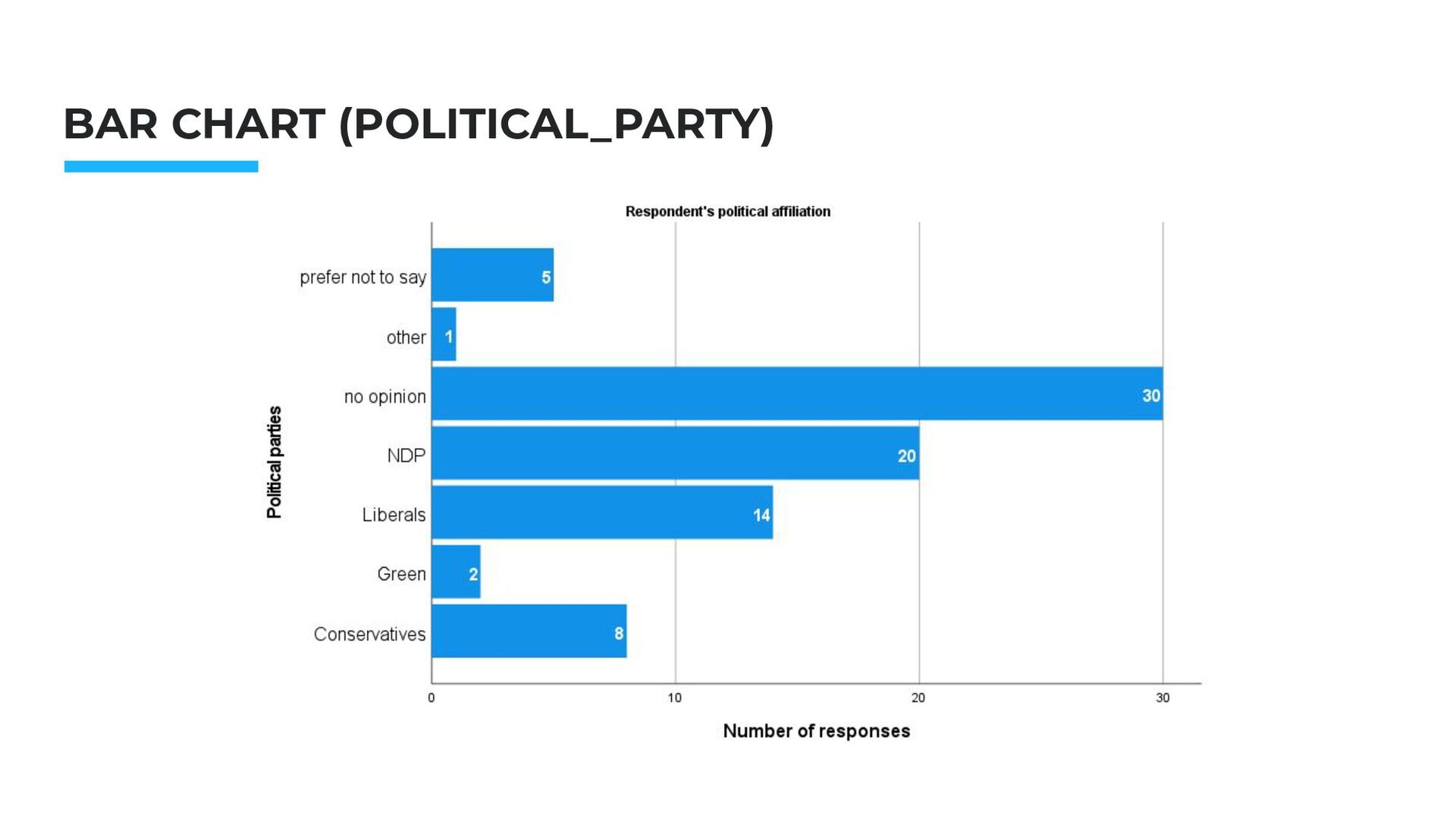
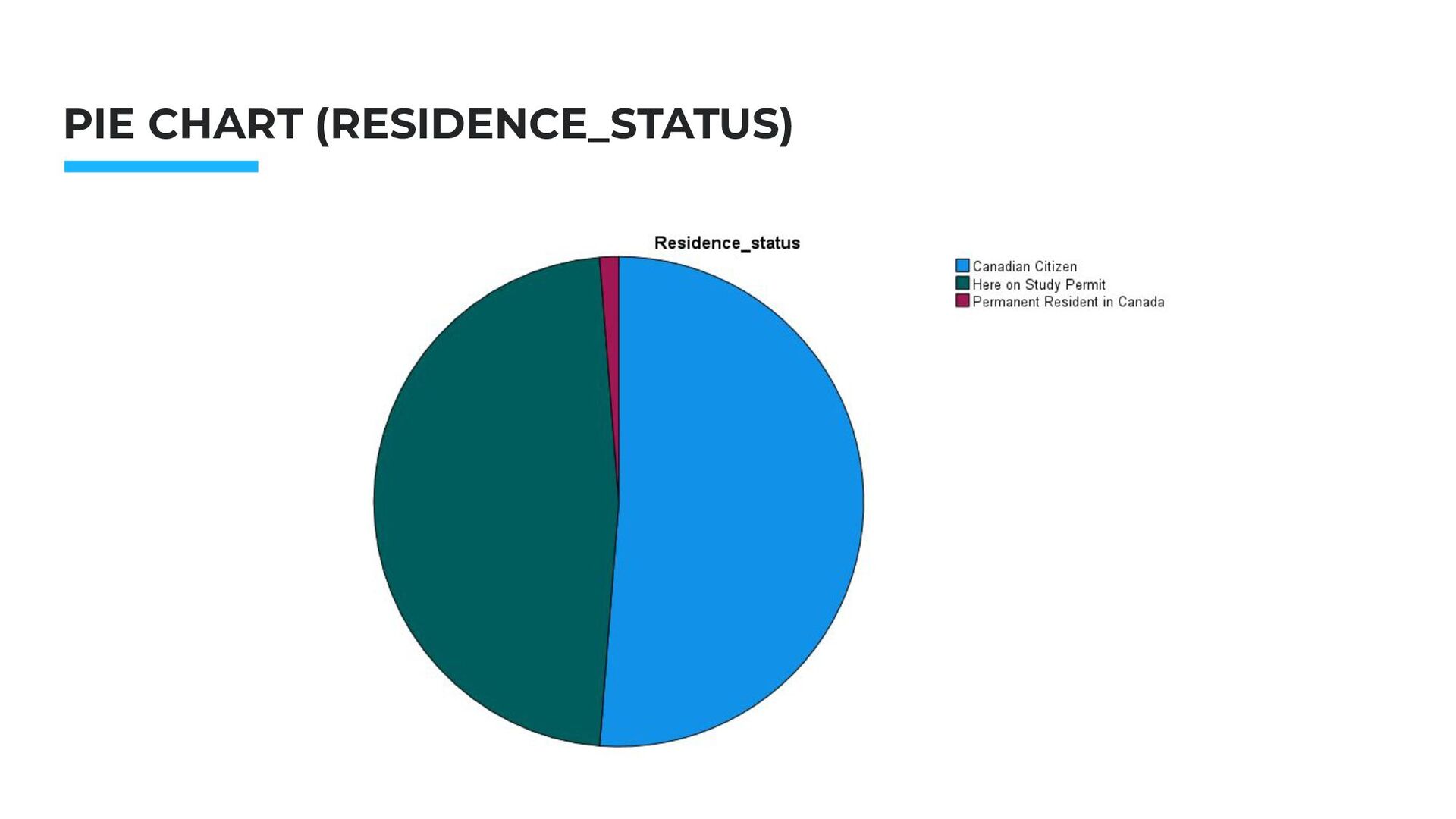
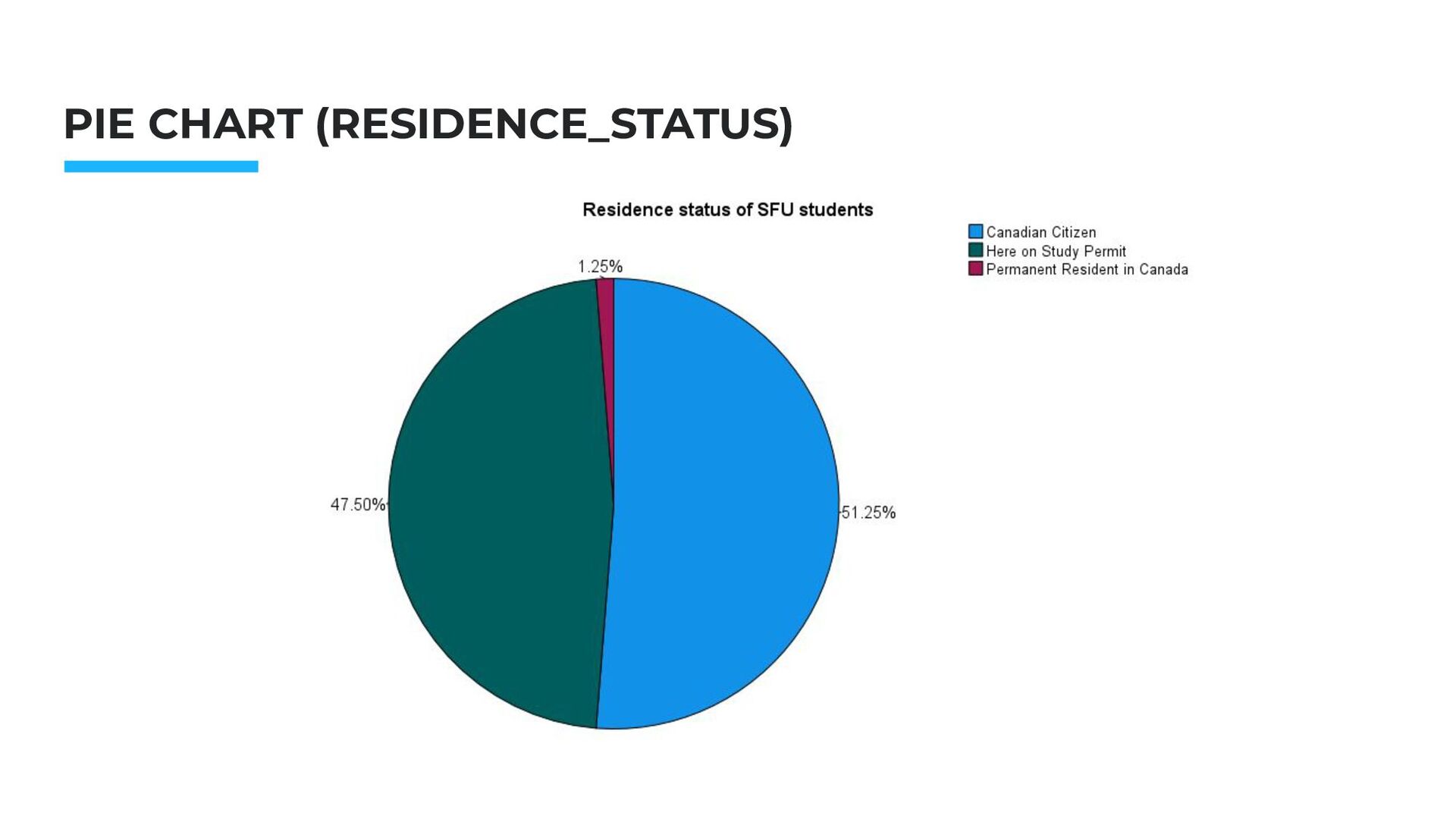
Hackathon. Nov.2014 WHICH CHART TO USE AND WHEN Bar Charts: use this chart for Nominal and Ordinal variables Pie Charts: use this chart for Nominal and Ordinal variables
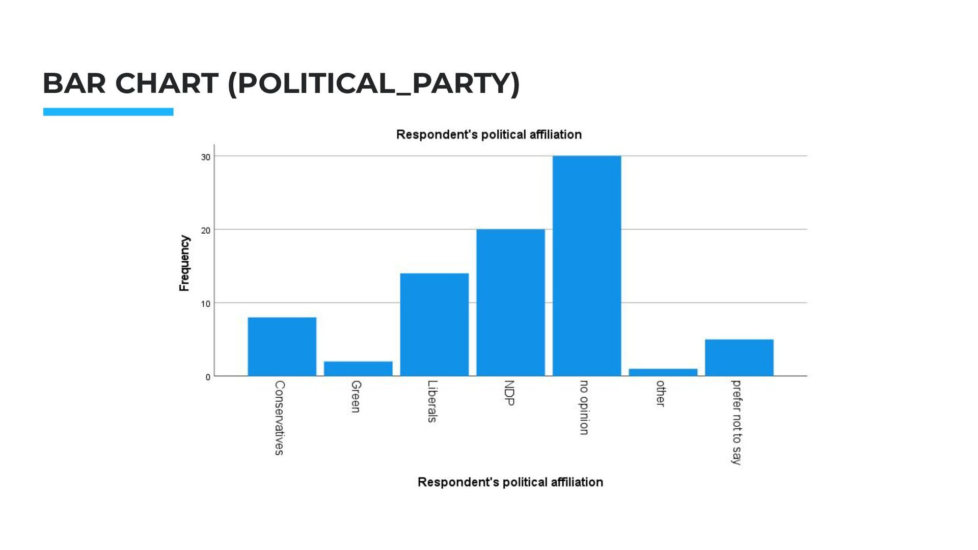
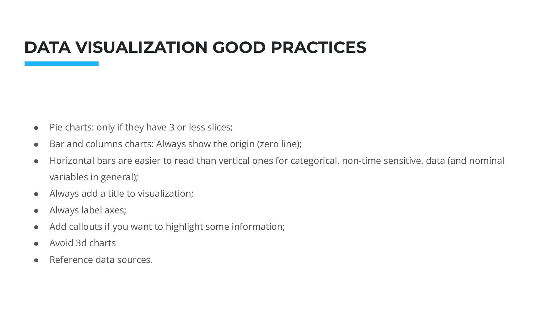
Pie charts: only if they have 3 or less slices; • Bar and columns charts: Always show the origin (zero line); • Horizontal bars are easier to read than vertical ones for categorical, non-time sensitive, data (and nominal variables in general); • Always add a title to visualization; • Always label axes; • Add callouts if you want to highlight some information; • Avoid 3d charts • Reference data sources.
you Outpt window as a separate file. .SPV files do not include the dataset, but can very helpful in case you want to share a chart with someone else on your team.
![THANK YOU Alberto Lusoli [email protected] Office hour: Thursday, 12.30pm -](https://files.speakerdeck.com/presentations/2afc83bf7368451991b2d100618e07ff/slide_22.jpg)