Upgrade to Pro — share decks privately, control downloads, hide ads and more …

Tableau Course @DHIL - Day 1

Tableau Course @DHIL - Day 1

Slides from the Tableau intro course, kindly hosted by the Digital Humanities Lab at Simon Fraser University.
In this slides:
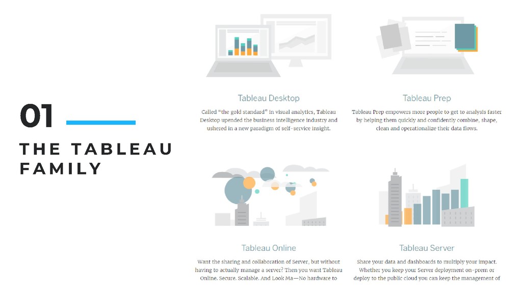
- The Tableau software suite
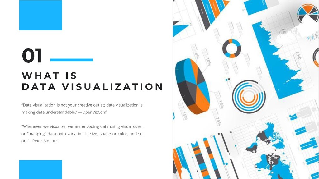
- Intro to data visualization
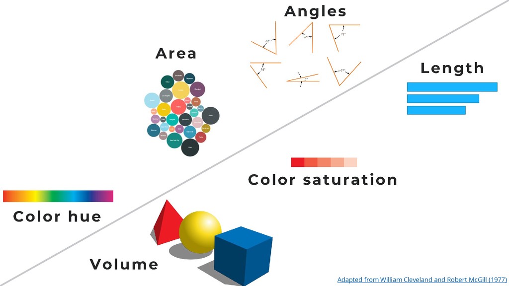
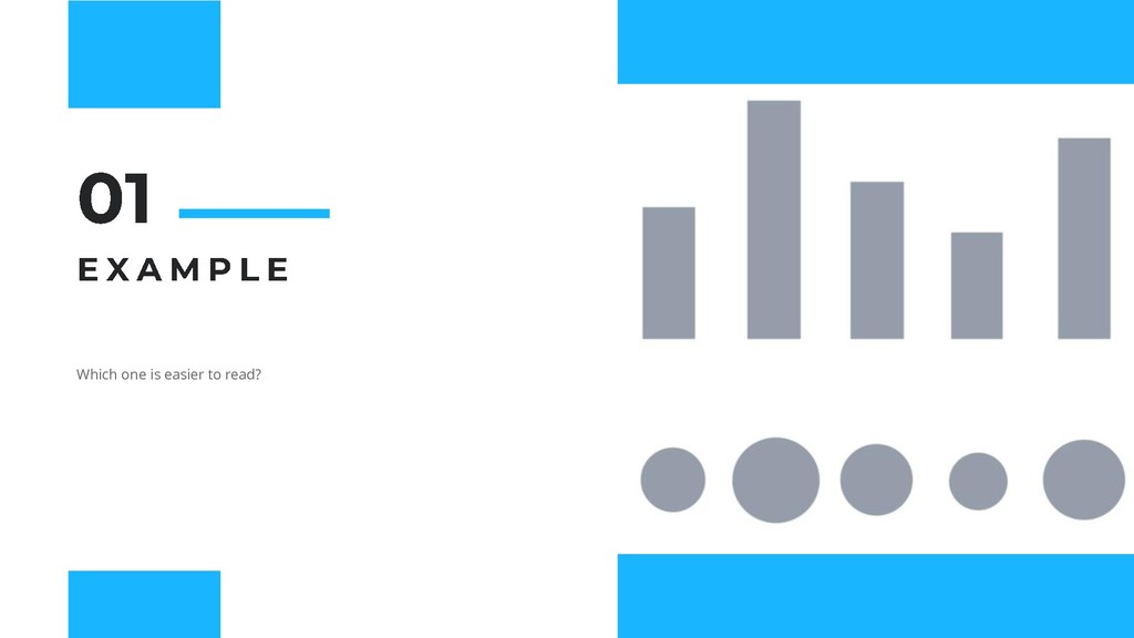
-- Dos and Donts
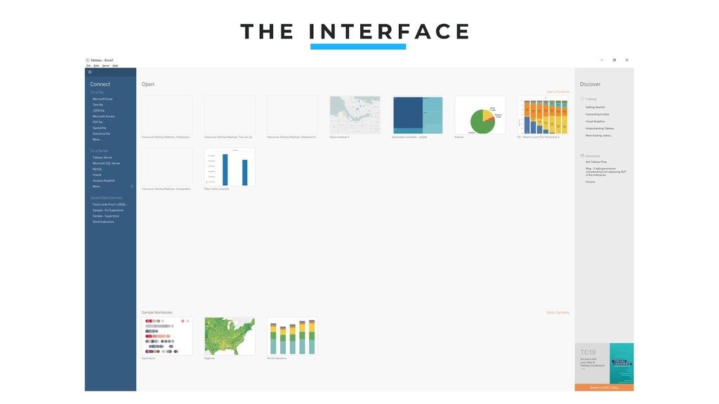
- First steps in Tableau
- The first visualization
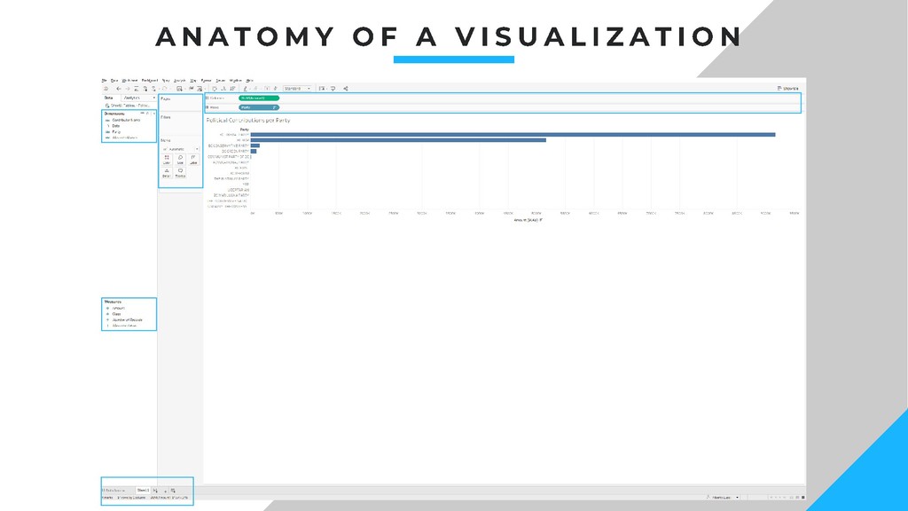
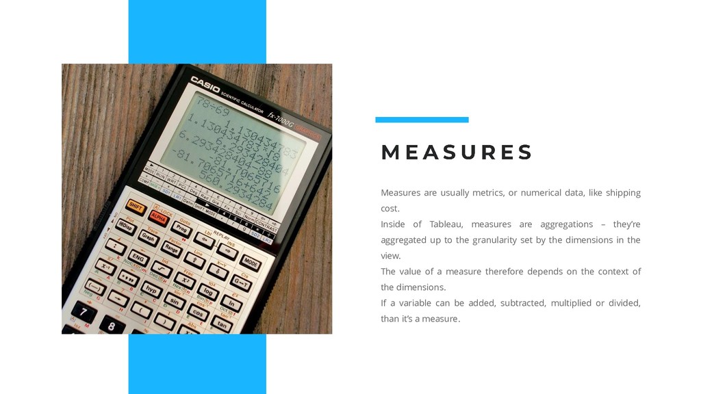
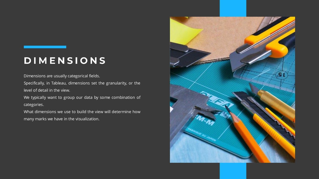
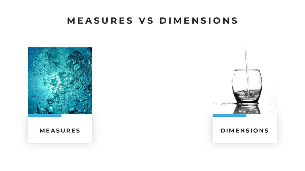
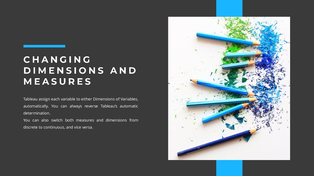
- Measures and Dimensions
- Discrete and Continuous variables

Alberto Lusoli

May 09, 2019
Tweet

More Decks by Alberto Lusoli

Other Decks in Education

Transcript

  1. In case you still have questions at the end of

    this course, check the online trainings available on Lynda.com (free full access via SFU account) and the official free training videos available at: https://www.tableau.com/learn/training.
  2. “Data visualization is not your creative outlet; data visualization is

    making data understandable.” —OpenVizConf “Whenever we visualize, we are encoding data using visual cues, or “mapping” data onto variation in size, shape or color, and so on.” - Peter Aldhous
  3. So, should we be using only bars and lines? No

    of course. We can combine different ways to encode information combining several visual cues. A good practice is to always encode the most important information using cues at the top of the perceptual hierarchy.
  4. 1. Pie charts: only if they have 3 or less

    slices; 2. Bar and columns charts: Always show the origin (zero line); 3. Horizontal bars are easier to read than vertical ones for categorical, non-time sensitive, data; 4. Square areas are easier to interpret that circles; 5. Always add a title to visualization; 6. Always label axes; 7. If you use shapes or colors to encode information, add a legend to explain their meaning; 8. Add callouts if you want to highlight some information; 9. Avoid 3d charts (Tableau doesn’t have them luckily) 10.Reference data sources.
  5. Measures are usually metrics, or numerical data, like shipping cost.

    Inside of Tableau, measures are aggregations – they’re aggregated up to the granularity set by the dimensions in the view. The value of a measure therefore depends on the context of the dimensions. If a variable can be added, subtracted, multiplied or divided, than it’s a measure.
  6. Dimensions are usually categorical fields. Specifically, in Tableau, dimensions set

    the granularity, or the level of detail in the view. We typically want to group our data by some combination of categories. What dimensions we use to build the view will determine how many marks we have in the visualization.
  7. Tableau assign each variable to either Dimensions of Variables, automatically.

    You can always reverse Tableau’s automatic determination. You can also switch both measures and dimensions from discrete to continuous, and vice versa.