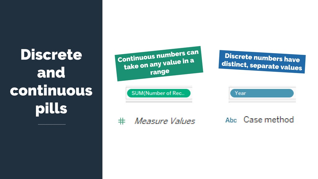
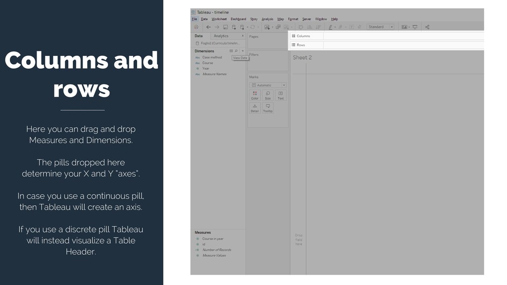
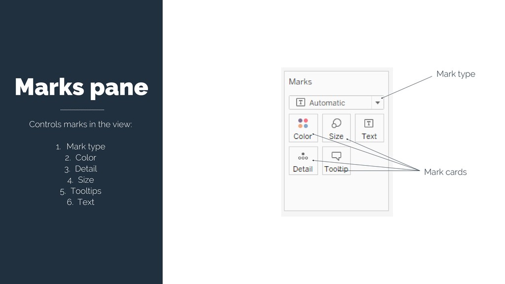
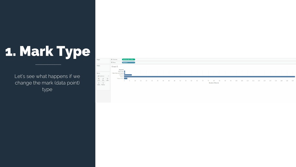
and Dimensions. The pills dropped here determine your X and Y “axes”. In case you use a continuous pill, then Tableau will create an axis. If you use a discrete pill Tableau will instead visualize a Table Header.
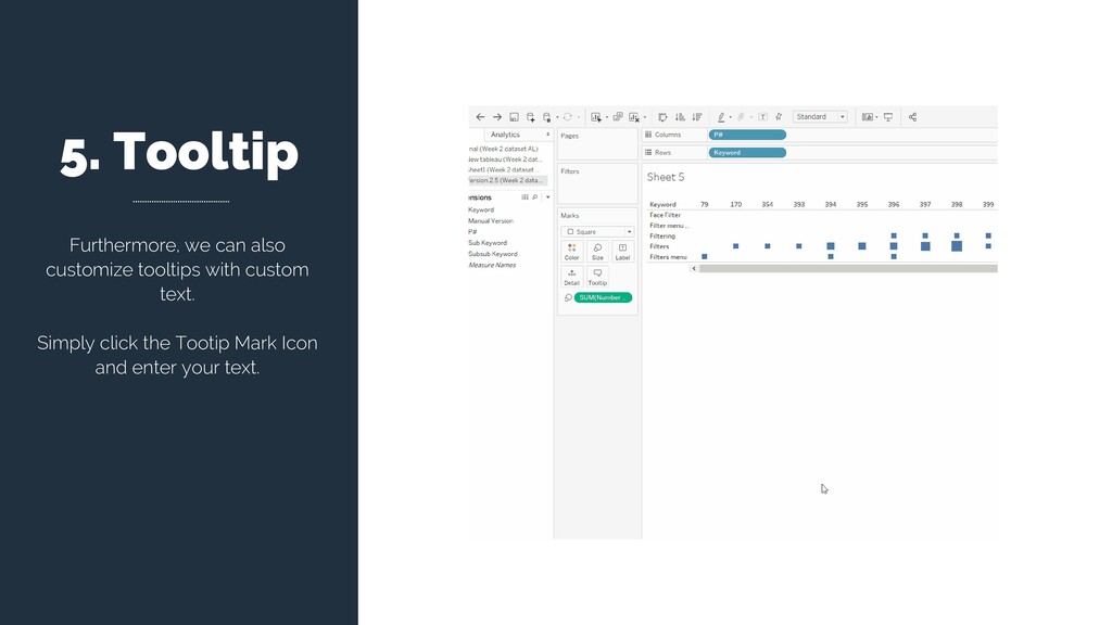
or Columns shelf, Tableau uses the categorical members of the dimension to create table headers. The headers show how Tableau is sorting the underlying row data into specific categories. FILL THE BLANKS For example, the “___” dimension separates the “___” measure into ___ levels of detail.
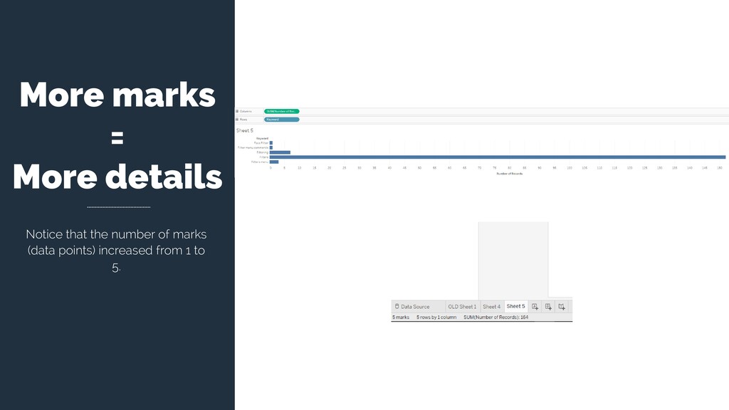
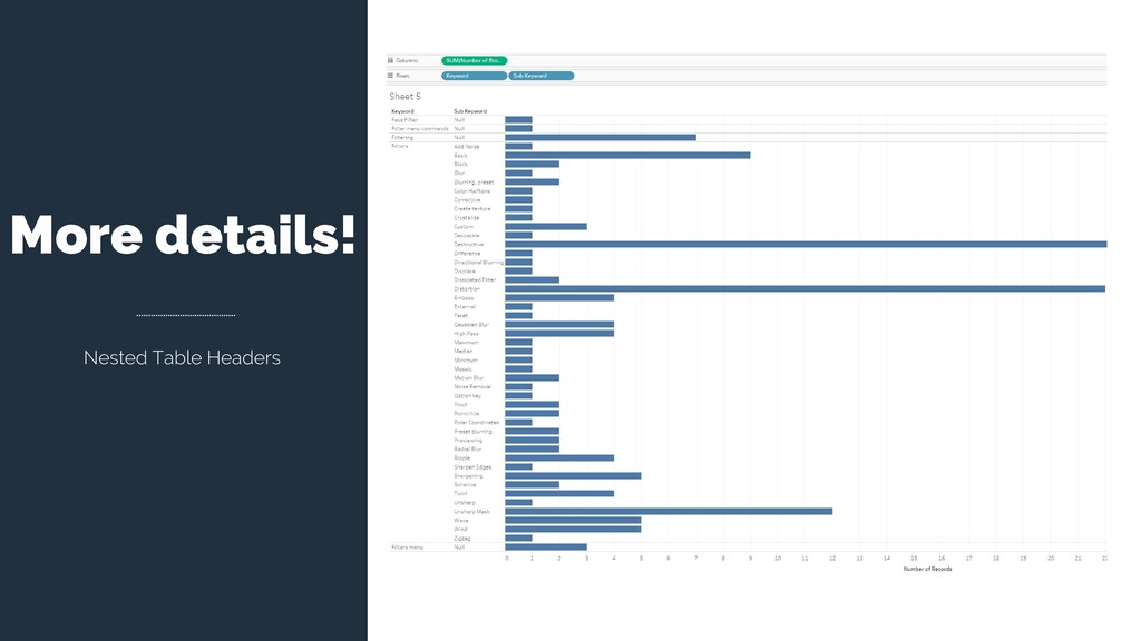
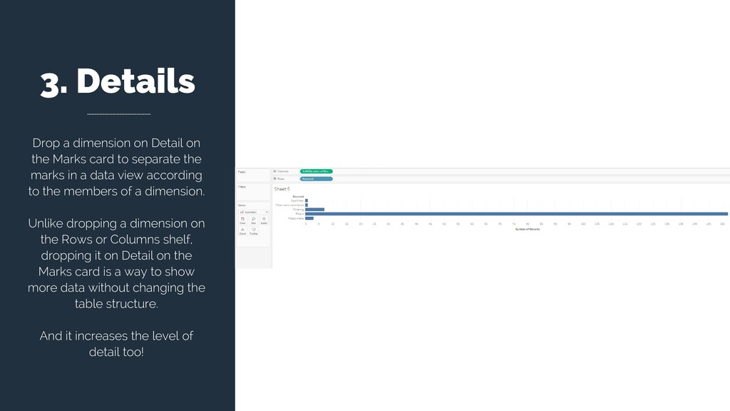
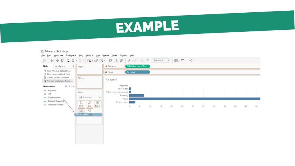
card to separate the marks in a data view according to the members of a dimension. Unlike dropping a dimension on the Rows or Columns shelf, dropping it on Detail on the Marks card is a way to show more data without changing the table structure. And it increases the level of detail too!
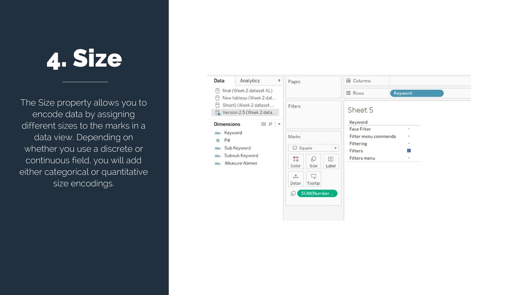
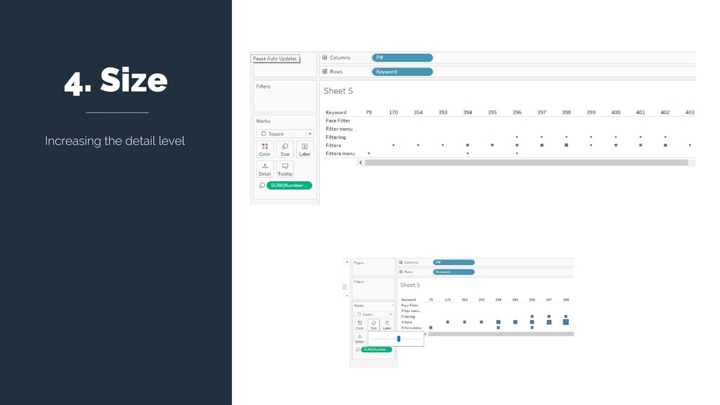
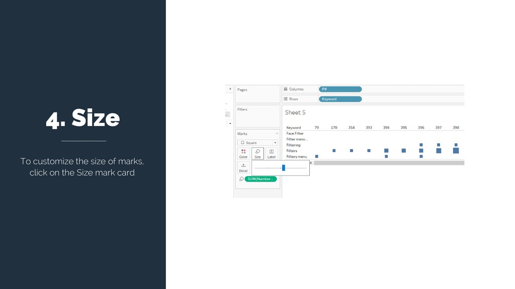
by assigning different sizes to the marks in a data view. Depending on whether you use a discrete or continuous field, you will add either categorical or quantitative size encodings.
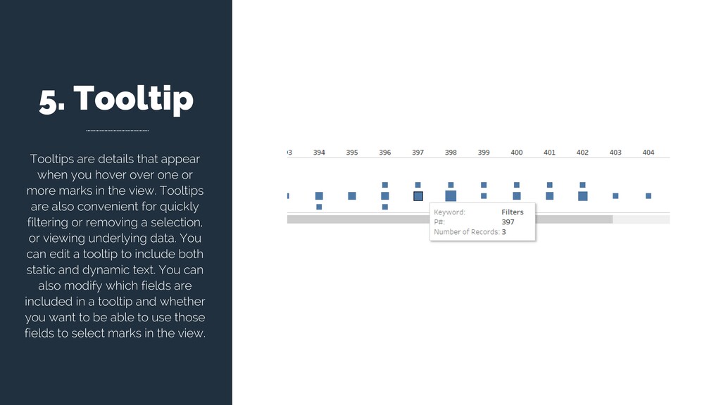
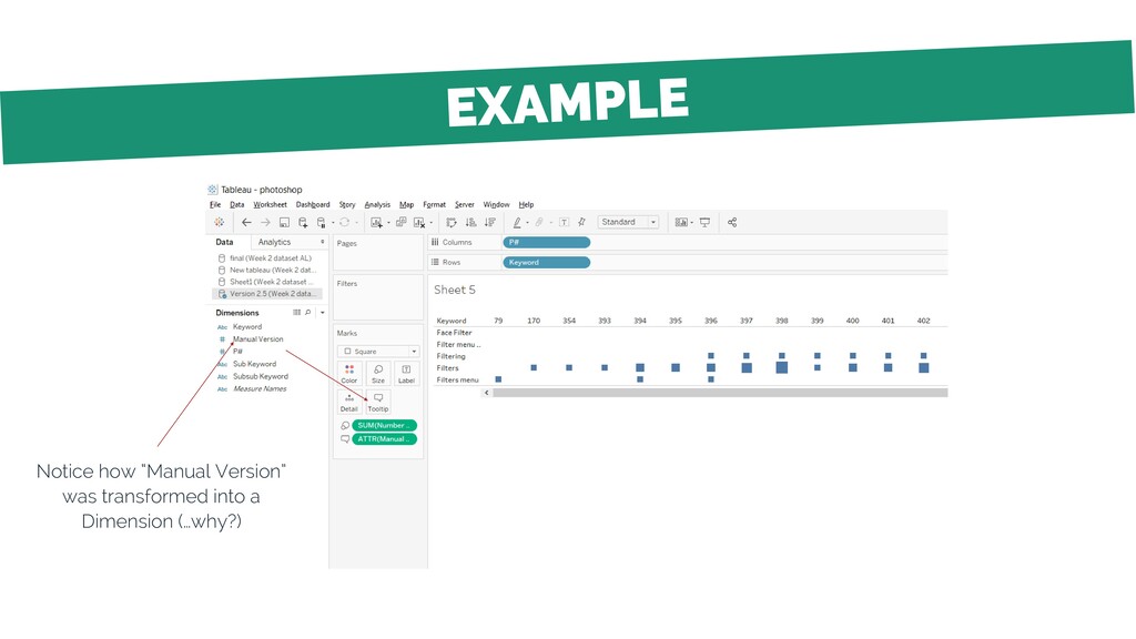
over one or more marks in the view. Tooltips are also convenient for quickly filtering or removing a selection, or viewing underlying data. You can edit a tooltip to include both static and dynamic text. You can also modify which fields are included in a tooltip and whether you want to be able to use those fields to select marks in the view.
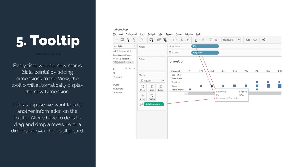
by adding dimensions to the View, the tooltip will automatically display the new Dimension. Let’s suppose we want to add another information on the tooltip. All we have to do is to drag and drop a measure or a dimension over the Tooltip card.
a graph? (Table means I have 2 table headers, on both rows and columns > I have 2 dimensions on both rows and columns) Text then corresponds to the value displayed at the intersection of each Row and Column
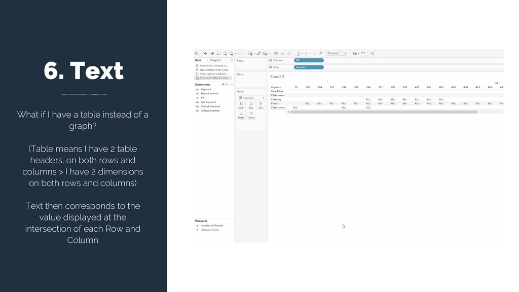
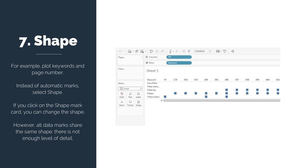
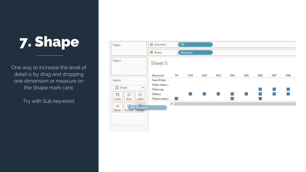
visualization. Thanks to it, we can change the shape of our data points on the basis of measures or dimensions. Since it adds further detail to the visualization, it might add detail.
of automatic marks, select Shape. If you click on the Shape mark card, you can change the shape. However, all data marks share the same shape: there is not enough level of detail.
![For questions or help, write me at: [email protected] THANK YOU](https://files.speakerdeck.com/presentations/3add7f2512954d16a86780a97cc85c52/slide_36.jpg)