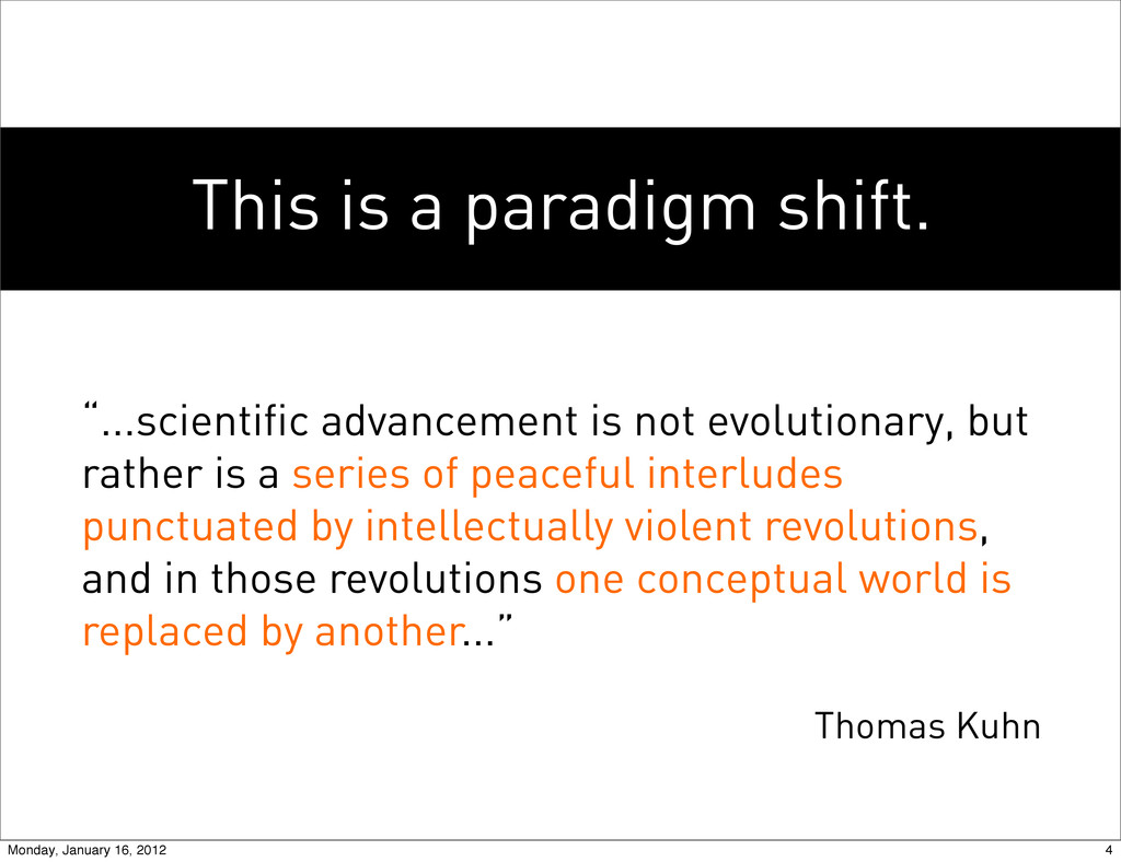
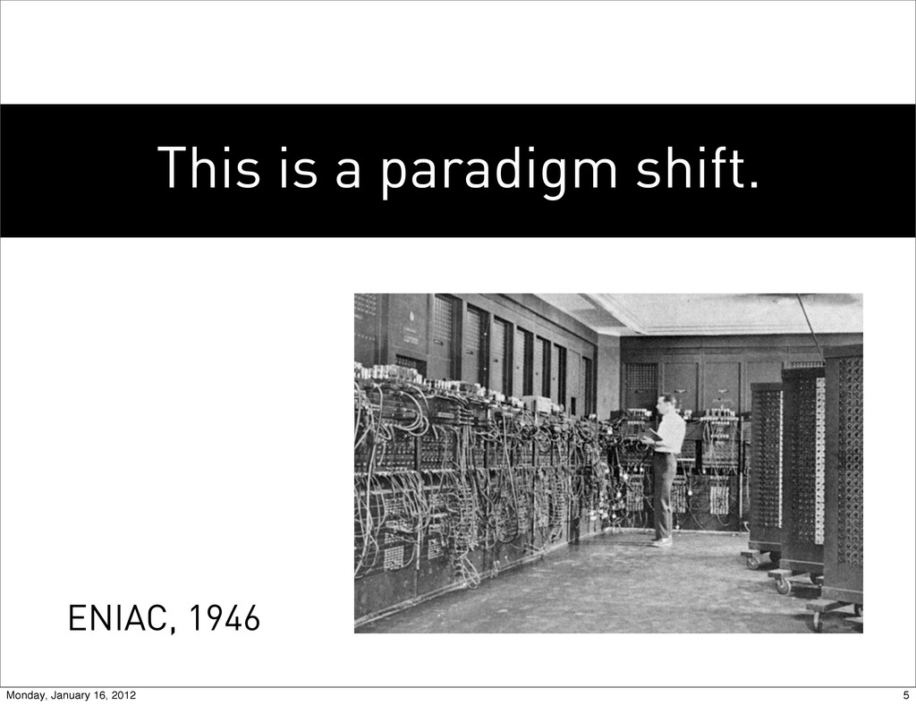
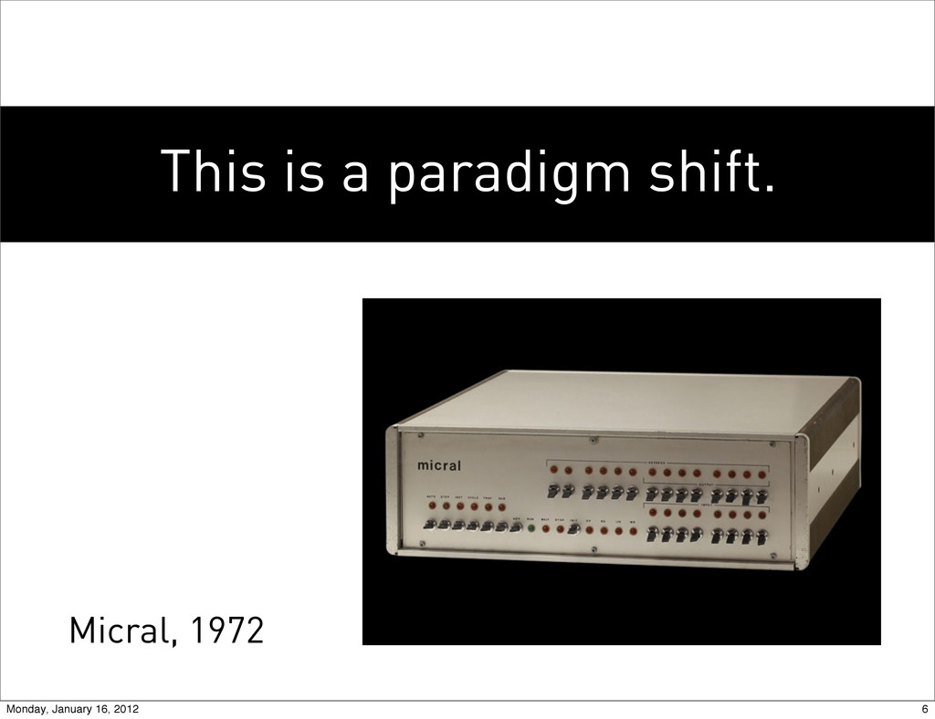
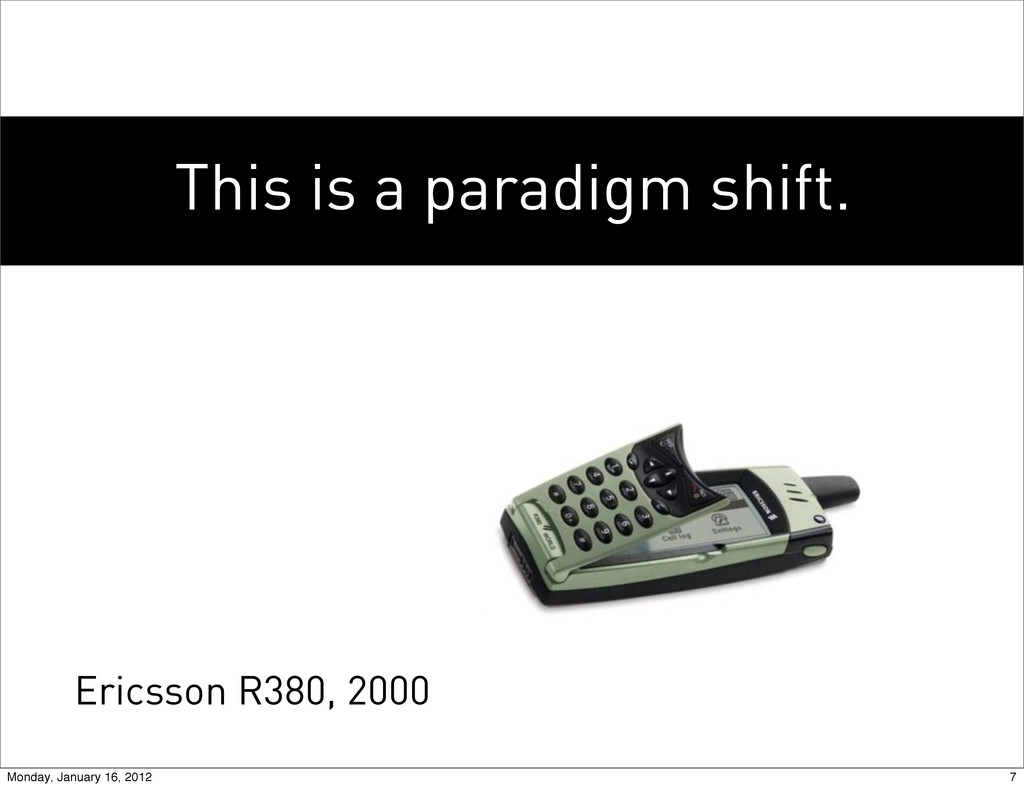
but rather is a series of peaceful interludes punctuated by intellectually violent revolutions, and in those revolutions one conceptual world is replaced by another...” Thomas Kuhn 4 Monday, January 16, 2012
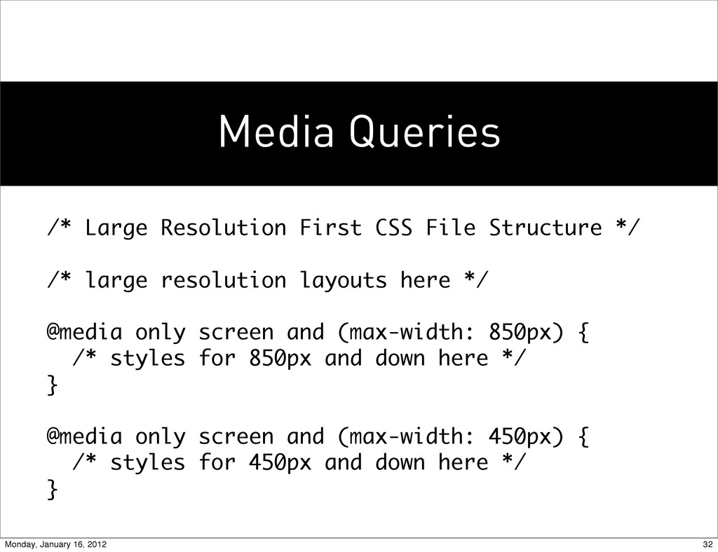
/* large resolution layouts here */ @media only screen and (max-width: 850px) { /* styles for 850px and down here */ } @media only screen and (max-width: 450px) { /* styles for 450px and down here */ } 32 Monday, January 16, 2012
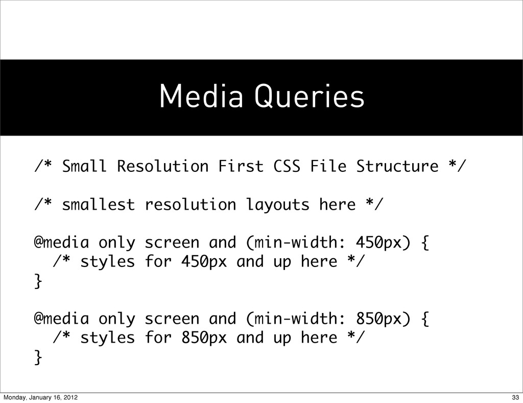
/* smallest resolution layouts here */ @media only screen and (min-width: 450px) { /* styles for 450px and up here */ } @media only screen and (min-width: 850px) { /* styles for 850px and up here */ } 33 Monday, January 16, 2012
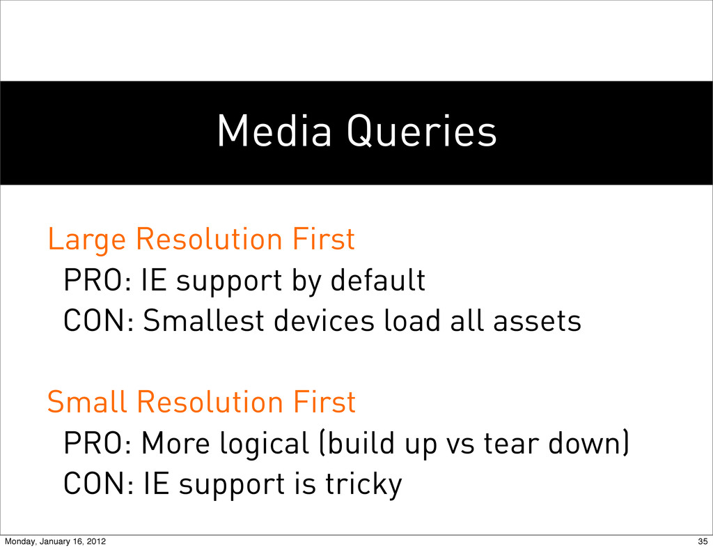
CON: Smallest devices load all assets Small Resolution First PRO: More logical (build up vs tear down) CON: IE support is tricky 34 Monday, January 16, 2012
CON: Smallest devices load all assets Small Resolution First PRO: More logical (build up vs tear down) CON: IE support is tricky 35 Monday, January 16, 2012
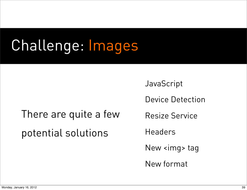
tag New format <img src="tiny.jpg"> <source src="bigger.jpg" media="min-width:600px"> <source src="biggest.jpg" media="min-width:900px"> </img> 40 Monday, January 16, 2012
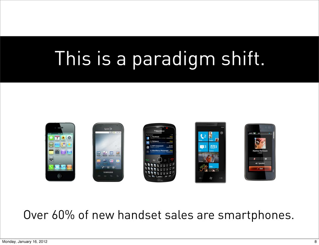
web design is always the right decision, but it’s not always the only decision. (a bit of controversy to discuss instead of questions...) 53 Monday, January 16, 2012
 bencallahan
 shosira
 mhand01
 lynteo
 hiromimaeo
 hicard
 saka2jp
 mottox2
 chiemitaki
 r5ni4
r5ni4
 a2k
a2k
 kumanoayumi
 sarafernandez
 garrettdimon
 michielstock
 aleyda
 reverentgeek
 chikuwait
 kevinliebholz
 joshbly
 csswizardry
 addyosmani
 seathinner