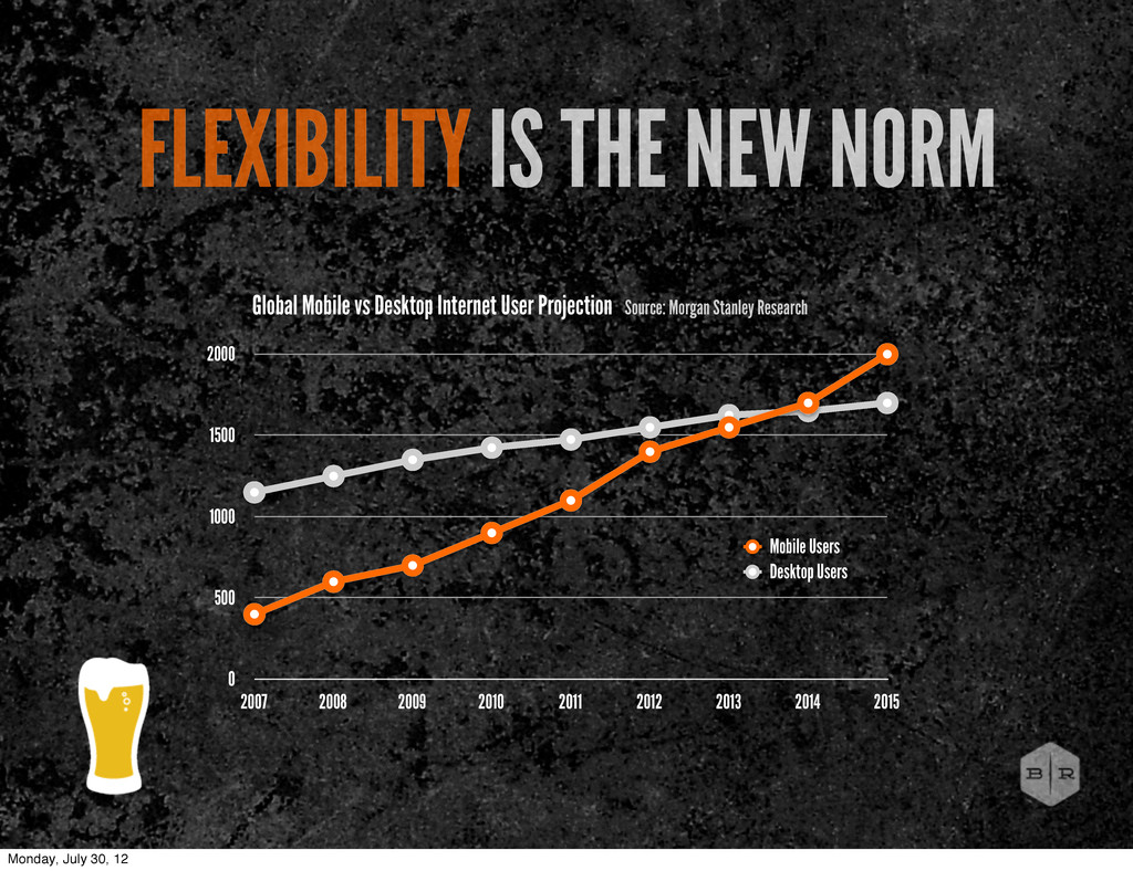
2007 2008 2009 2010 2011 2012 2013 2014 2015 Mobile Users Desktop Users Global Mobile vs Desktop Internet User Projection Source: Morgan Stanley Research Monday, July 30, 12
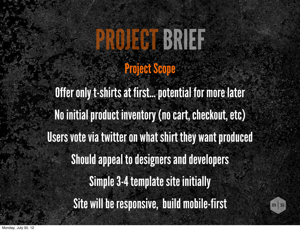
for more later No initial product inventory (no cart, checkout, etc) Users vote via twitter on what shirt they want produced Should appeal to designers and developers Simple 3-4 template site initially Site will be responsive, build mobile-first Monday, July 30, 12
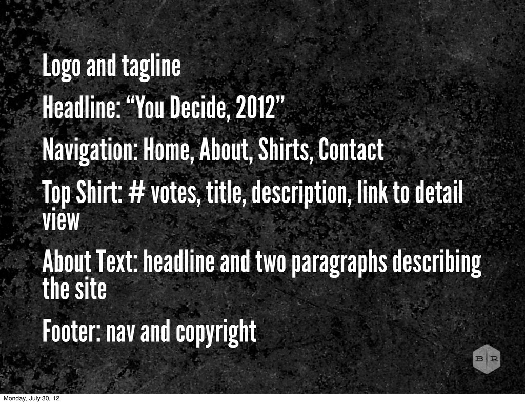
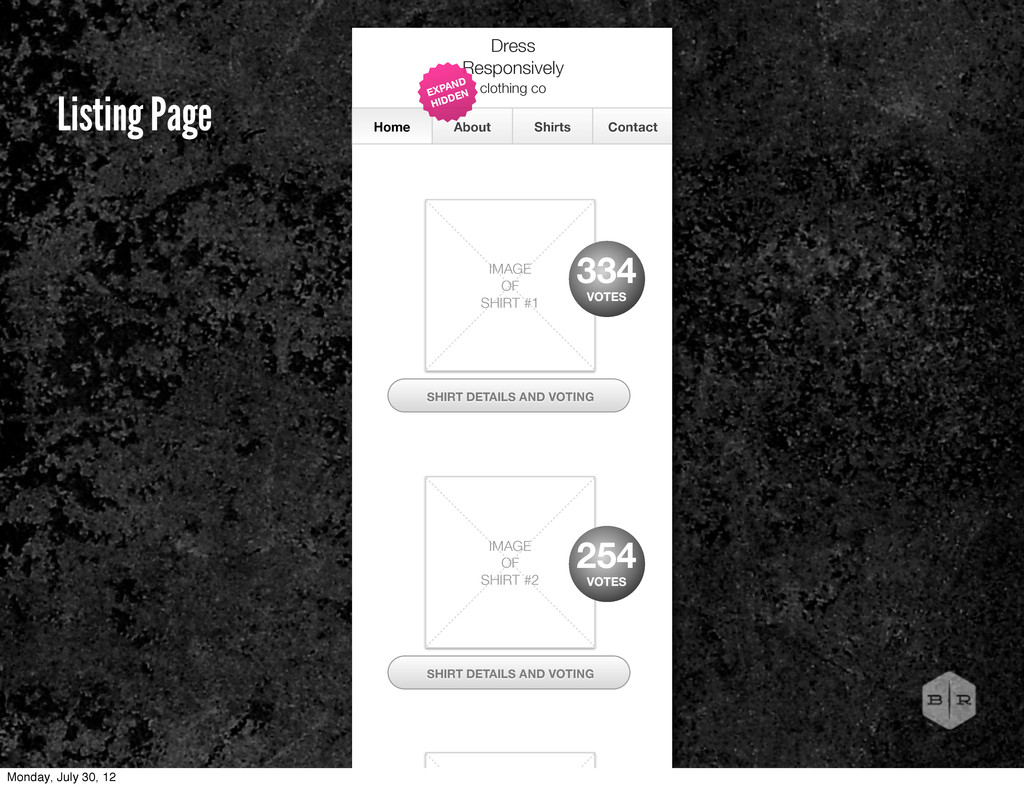
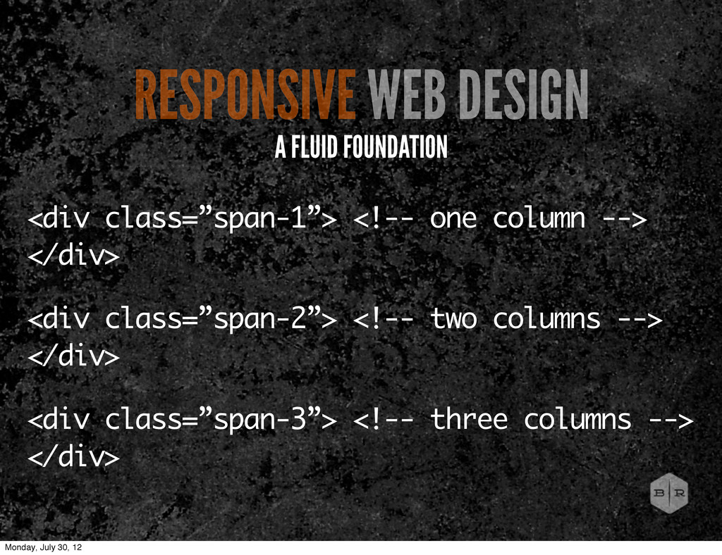
Shirts, Contact Top Shirt: # votes, title, description, link to detail view About Text: headline and two paragraphs describing the site Footer: nav and copyright Monday, July 30, 12
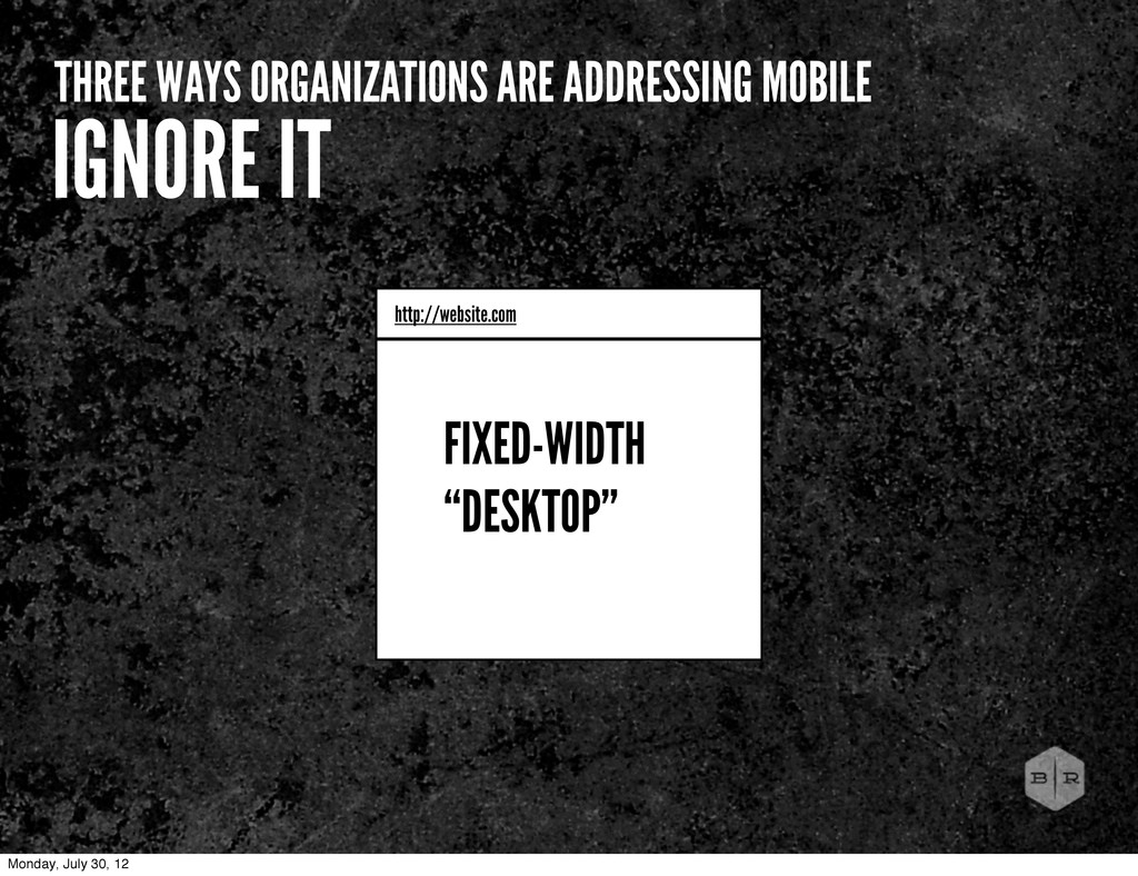
about inadequate tools. Get creative and explore other possibilities with the tools and practices we have available today. BROKEN PROCESS Monday, July 30, 12
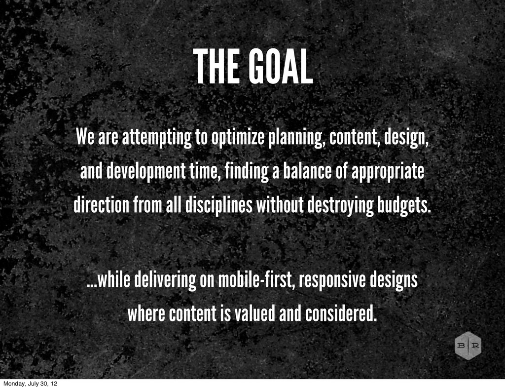
time, finding a balance of appropriate direction from all disciplines without destroying budgets. ...while delivering on mobile-first, responsive designs where content is valued and considered. THE GOAL Monday, July 30, 12
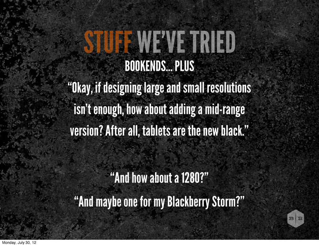
small resolutions isn’t enough, how about adding a mid-range version? After all, tablets are the new black.” “And how about a 1280?” “And maybe one for my Blackberry Storm?” Monday, July 30, 12
time, finding a balance of appropriate direction from all disciplines without destroying budgets. ...while delivering on mobile-first, responsive designs where content is valued and considered. THE GOAL Monday, July 30, 12
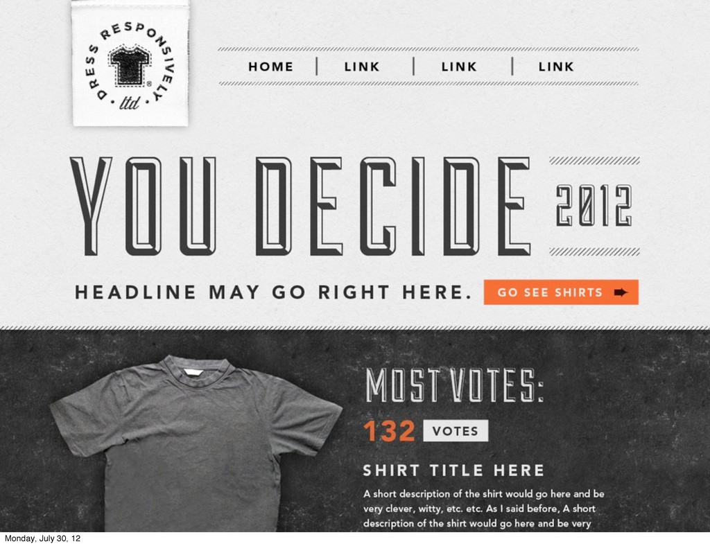
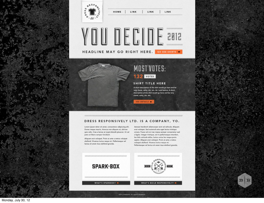
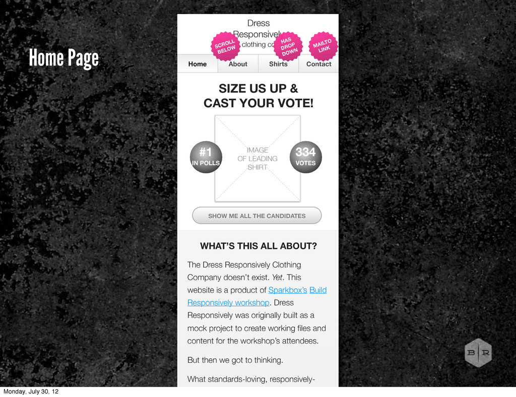
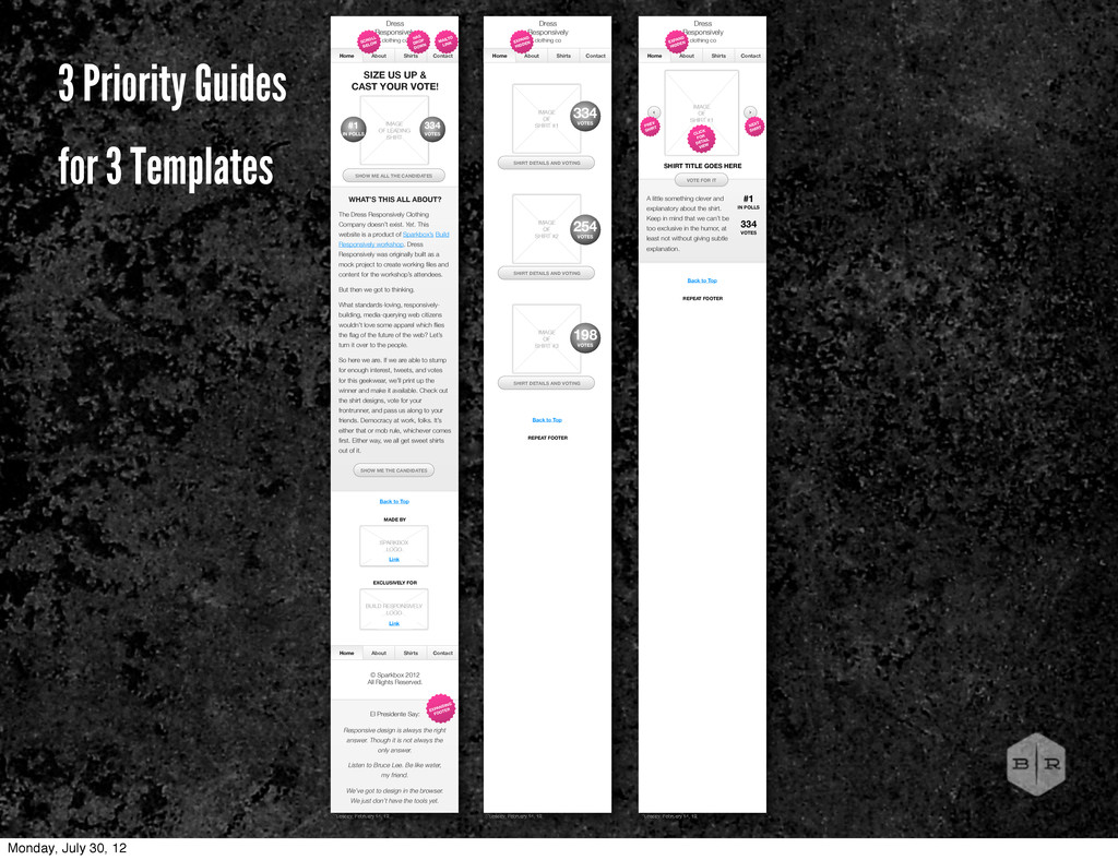
UP & CAST YOUR VOTE! IMAGE OF LEADING SHIRT WHAT’S THIS ALL ABOUT? SHOW ME ALL THE CANDIDATES The Dress Responsively Clothing Company doesn’t exist. Yet. This website is a product of Sparkbox’s Build Responsively workshop. Dress Responsively was originally built as a mock project to create working files and content for the workshop’s attendees. But then we got to thinking. What standards-loving, responsively- building, media-querying web citizens HAS DROP DOWN MAILTO LINK SCROLL BELOW 334 VOTES #1 IN POLLS Home Page Monday, July 30, 12
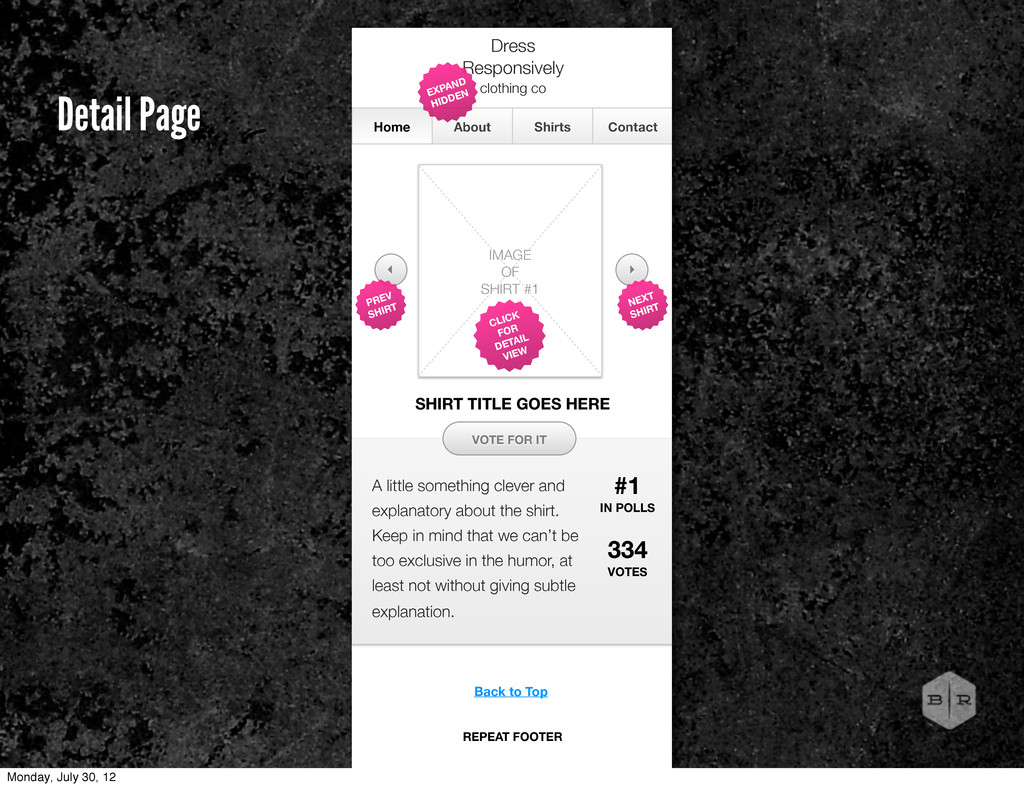
in mind that we can’t be too exclusive in the humor, at least not without giving subtle explanation. Home About Shirts Contact Dress Responsively clothing co IMAGE OF SHIRT #1 VOTE FOR IT EXPAND HIDDEN 334 VOTES CLICK FOR DETAIL VIEW #1 IN POLLS SHIRT TITLE GOES HERE NEXT SHIRT PREV SHIRT Back to Top REPEAT FOOTER Detail Page Monday, July 30, 12
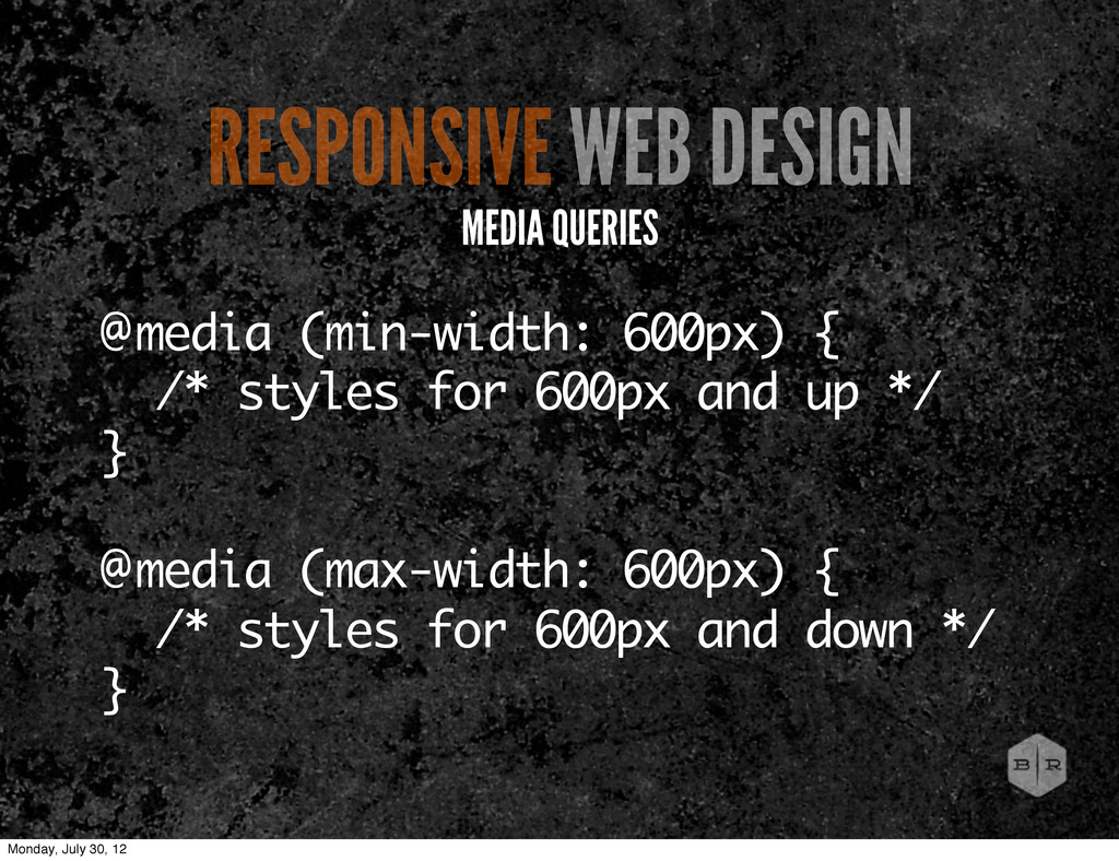
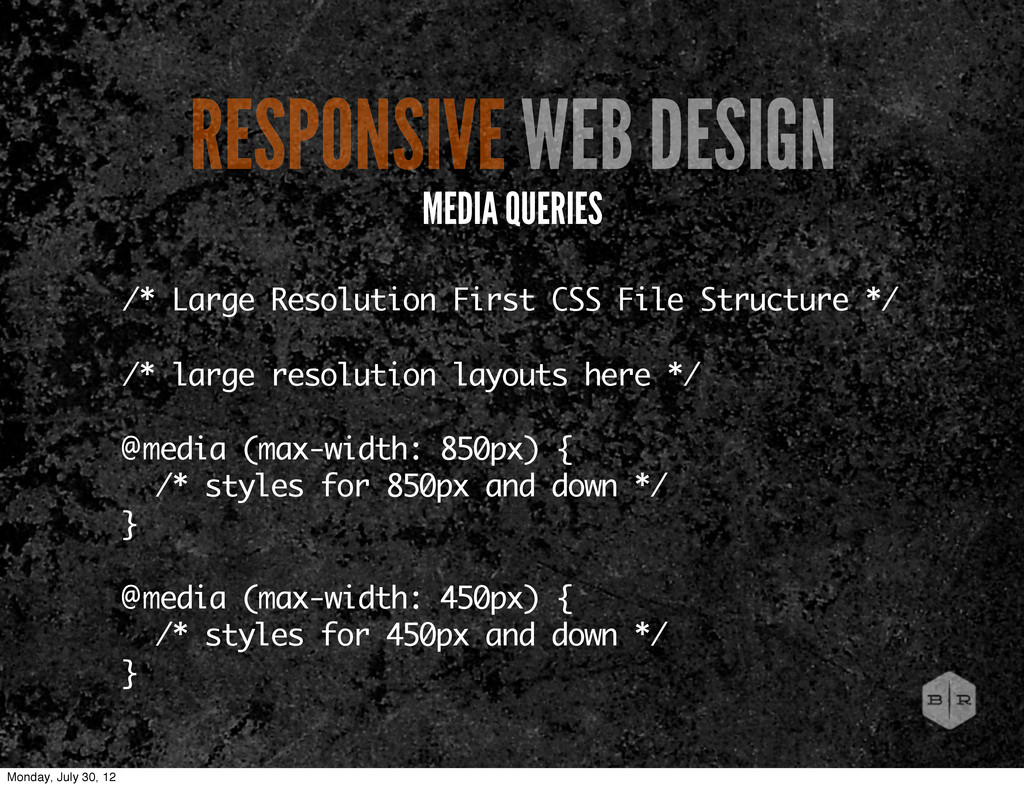
resolution layouts here */ @media (max-width: 850px) { /* styles for 850px and down */ } @media (max-width: 450px) { /* styles for 450px and down */ } RESPONSIVE WEB DESIGN MEDIA QUERIES Monday, July 30, 12
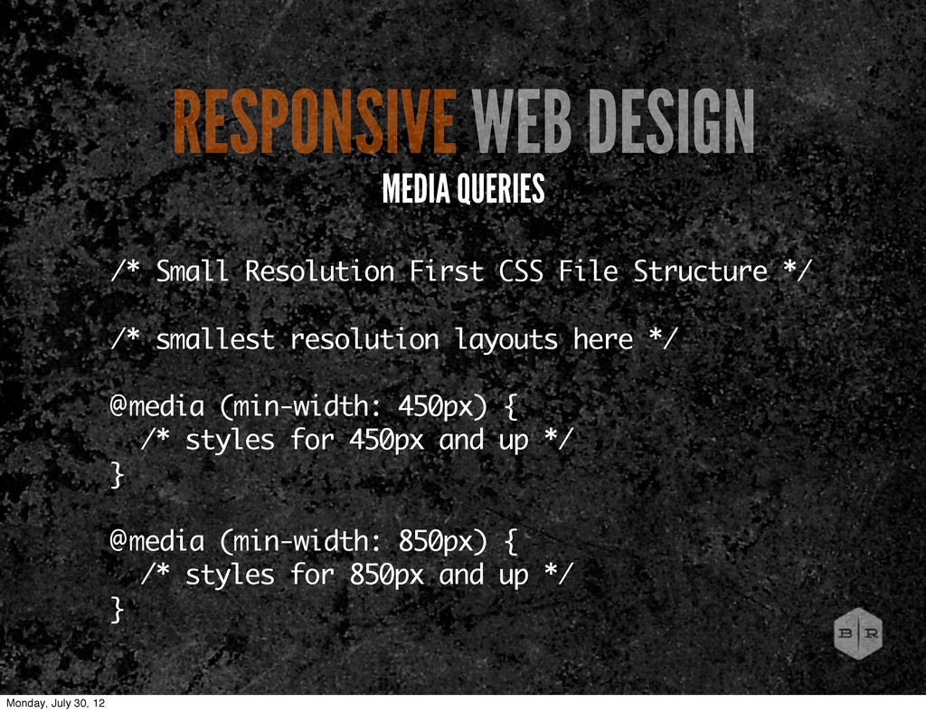
resolution layouts here */ @media (min-width: 450px) { /* styles for 450px and up */ } @media (min-width: 850px) { /* styles for 850px and up */ } RESPONSIVE WEB DESIGN MEDIA QUERIES Monday, July 30, 12
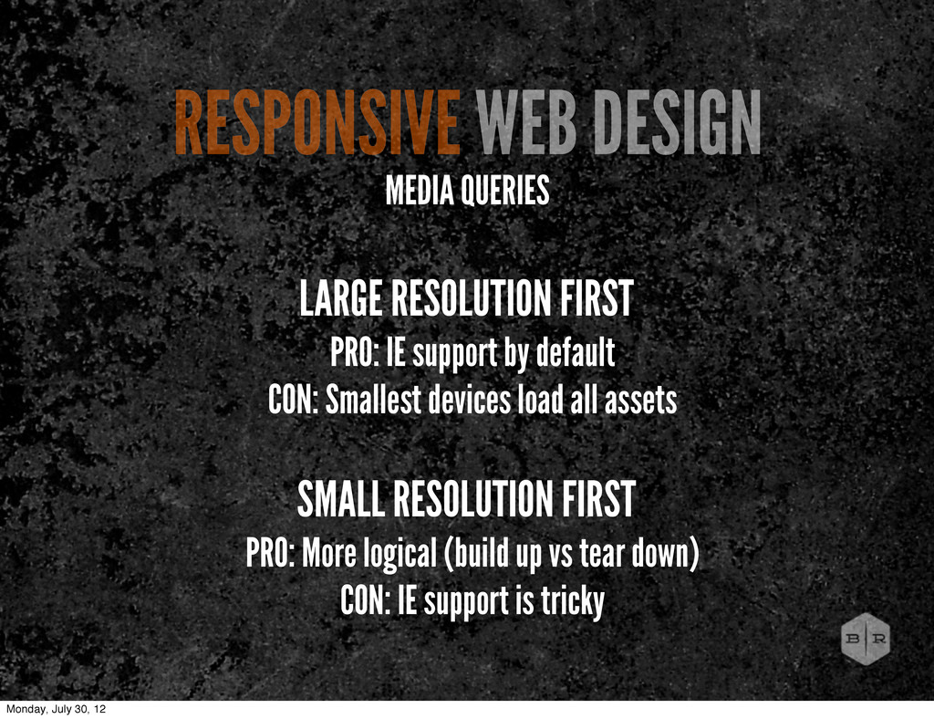
devices load all assets SMALL RESOLUTION FIRST PRO: More logical (build up vs tear down) CON: IE support is tricky RESPONSIVE WEB DESIGN MEDIA QUERIES Monday, July 30, 12
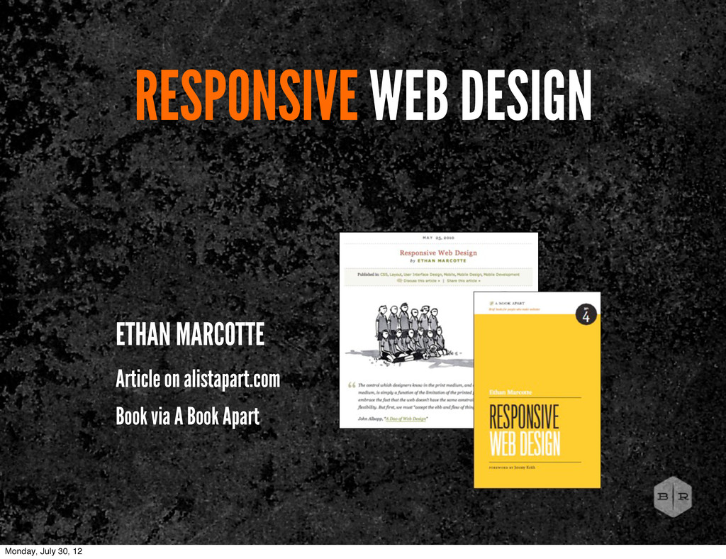
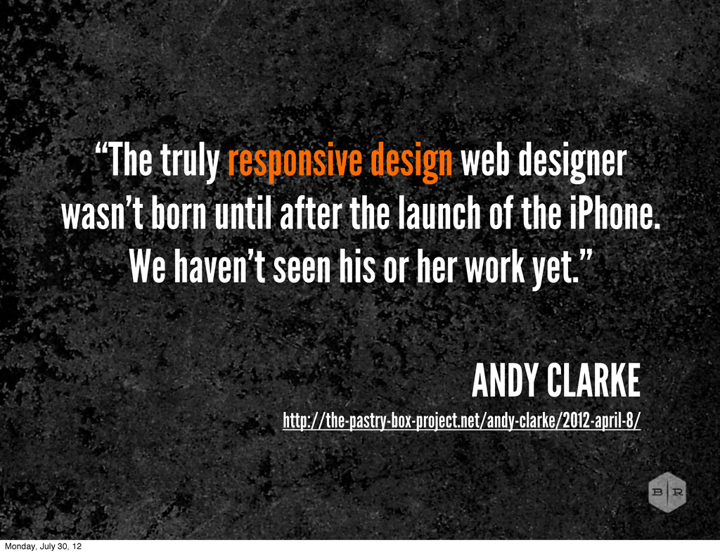
the launch of the iPhone. We haven’t seen his or her work yet.” ANDY CLARKE http://the-pastry-box-project.net/andy-clarke/2012-april-8/ Monday, July 30, 12
 bencallahan
 calpin
 takaikanako
 hypebeans
 hiranotomoki
 usagimaru
.jpg) rwang05
rwang05
 ashapiro
 toshihidemurata
 bebe
bebe
 sony
sony
 centou
 ukaoli
 inesmontani
 iamctodd
 jonyablonski
.png) helenjbeal
helenjbeal
 sabderemane
 ryanjones
 szymonslowik
 sarafernandez
 bcantrill
 mkilby
 joshbly
 colly
colly