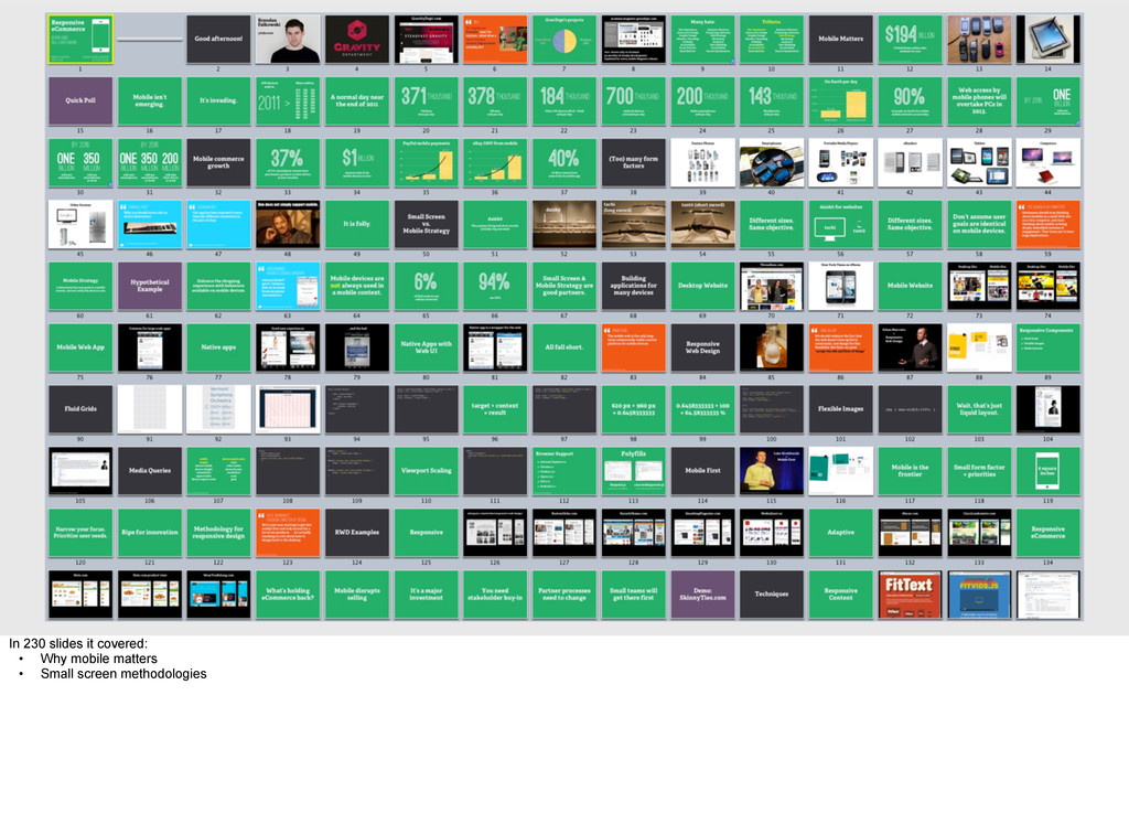
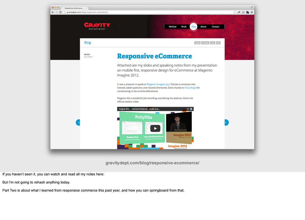
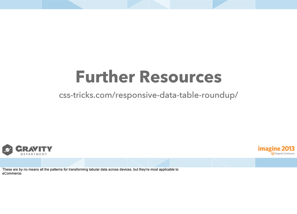
Last year I made the case for responsive, many-device eCommerce websites: http://gravitydept.com/blog/responsive-ecommerce/
I demonstrated why it was important, what approaches could be taken, why it hadn’t been done, and how to form a convincing strategy to get it done.
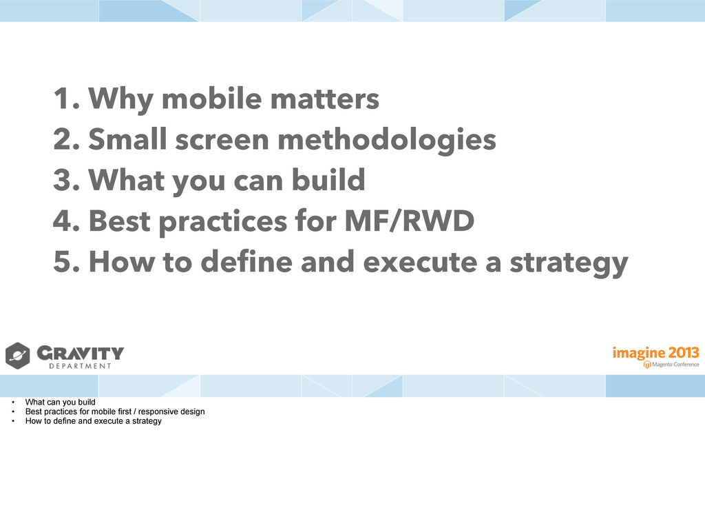
This year I showed how the many-device landscape continues to explode and change user behavior, review concrete examples of companies that have embraced this and the financial benefits, and pinpoint the key problem areas when building responsive eCommerce applications with insights/examples from my experiences doing so on the front lines.
More info: http://gravitydept.com/blog/responsive-ecommerce-part-two/
Conference: Magento Imagine 2013
Speaker: Brendan Falkowski @ http://gravitydept.com
Location: Las Vegas, USA
Date: April 10, 2013
 brendanfalkowski
 koyaman
 kakukoki
 klemens
 nishame
 ashapiro
 shoko_seven11
 keroyama
 mhand01
 a2k
a2k
 yuri_ohashi
 bebe
bebe
 hypebeans
 addyosmani
 twada
twada
 garrettdimon
 morganepeng
 tammyeverts
 cassininazir
 kneath
 jdejongh
 signer
 danielanewman
 stephenakadiri
 3n
3n
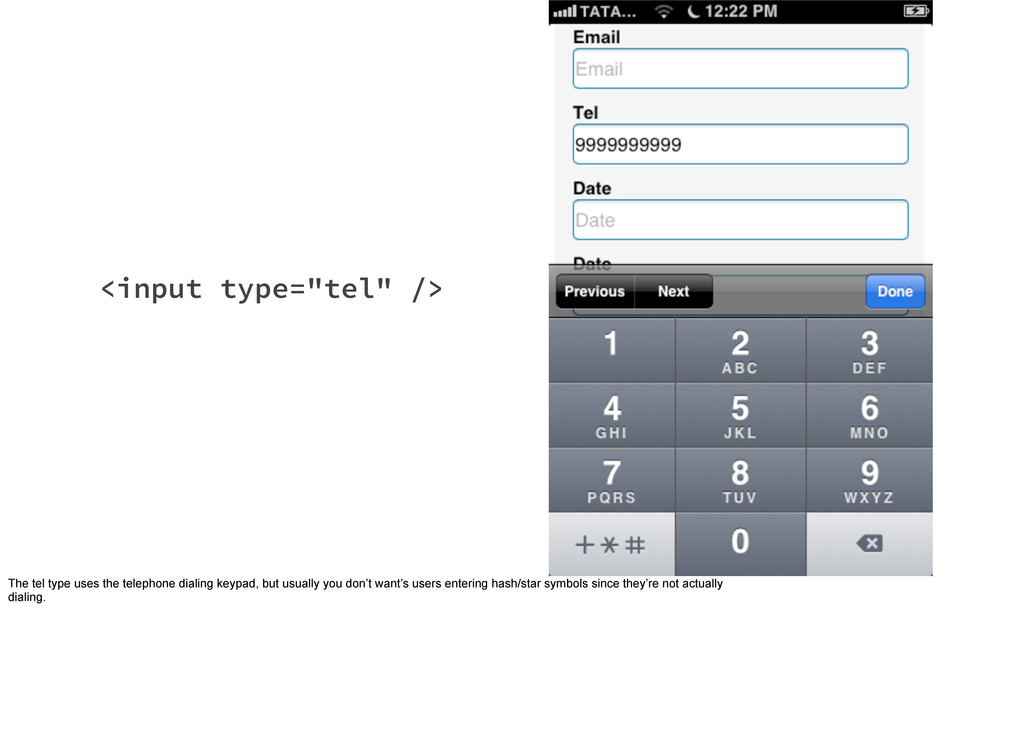
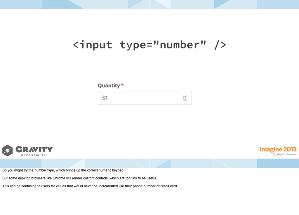
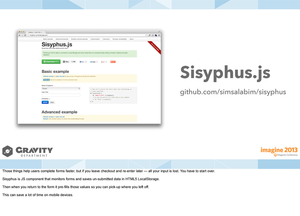
![<input type="text" pattern="[0-9]*" /> So instead use a regular text](https://files.speakerdeck.com/presentations/aebcce908daf0130efa412313926fc13/slide_159.jpg)