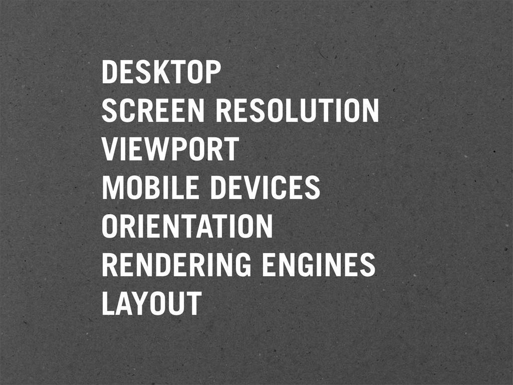
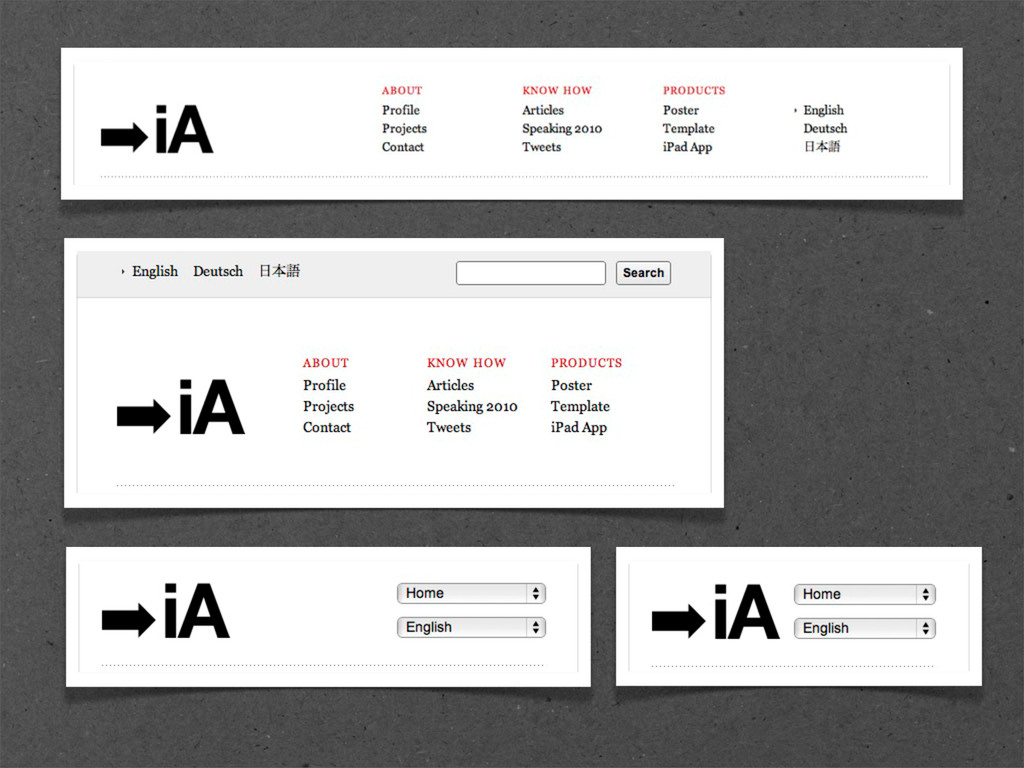
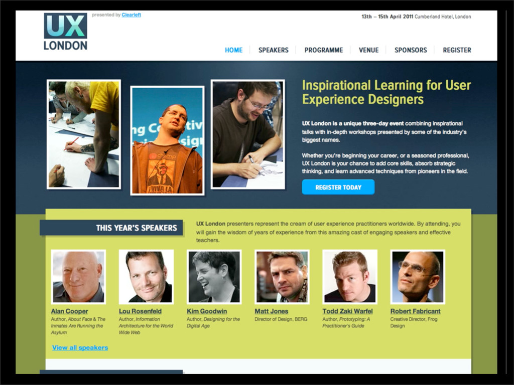
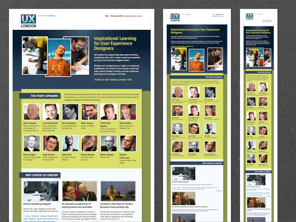
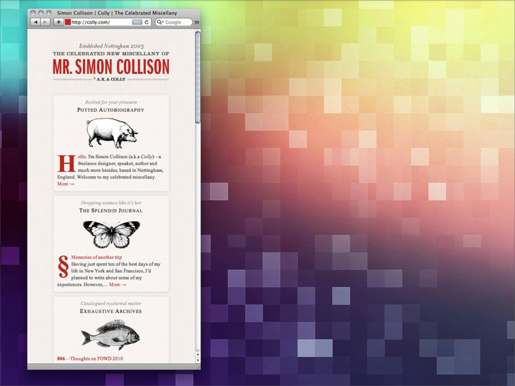
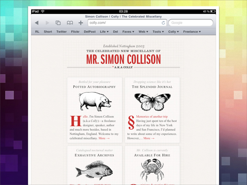
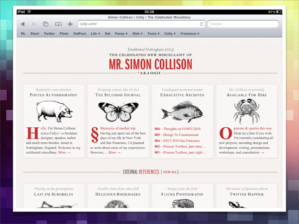
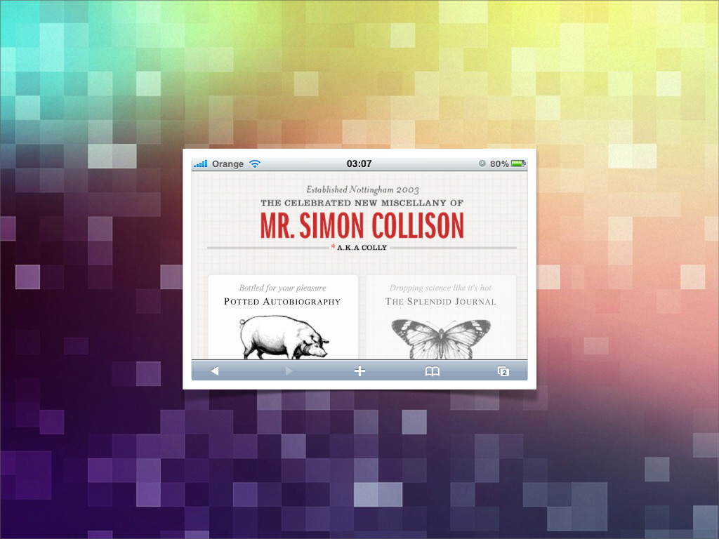
Simon will explore CSS media queries and other methods for creating incredibly flexible adaptive layouts for varying devices, viewports and orientations.
visual design, some of which occur exclusively in interactive media. It’s unrealistic to think our old methods can fill in all the gaps, but new interaction patterns and visual languages emerge everyday. These are the building blocks for our new design principles. JASON SANTA MARIA, 2008
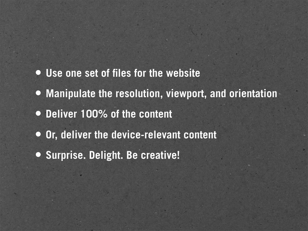
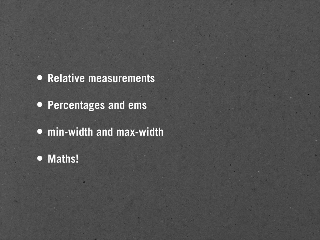
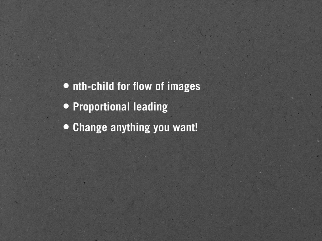
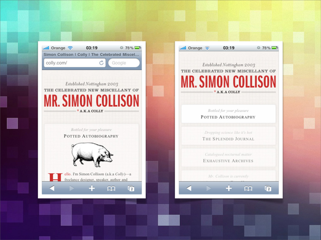
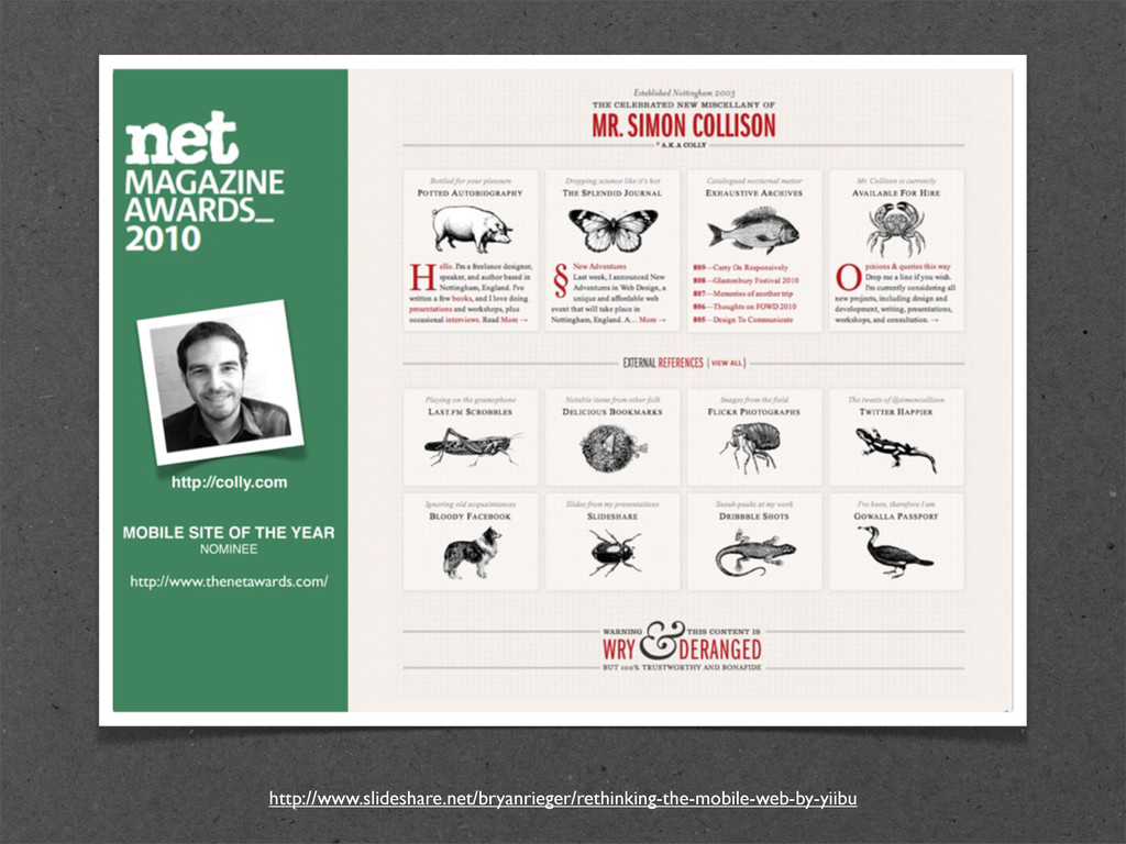
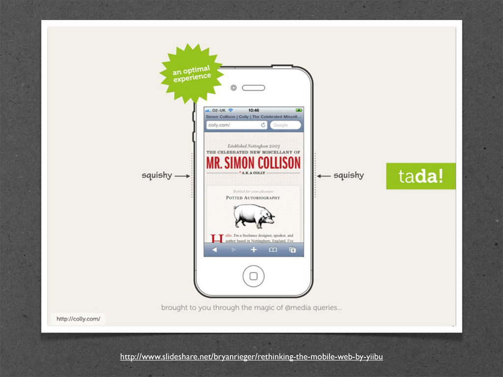
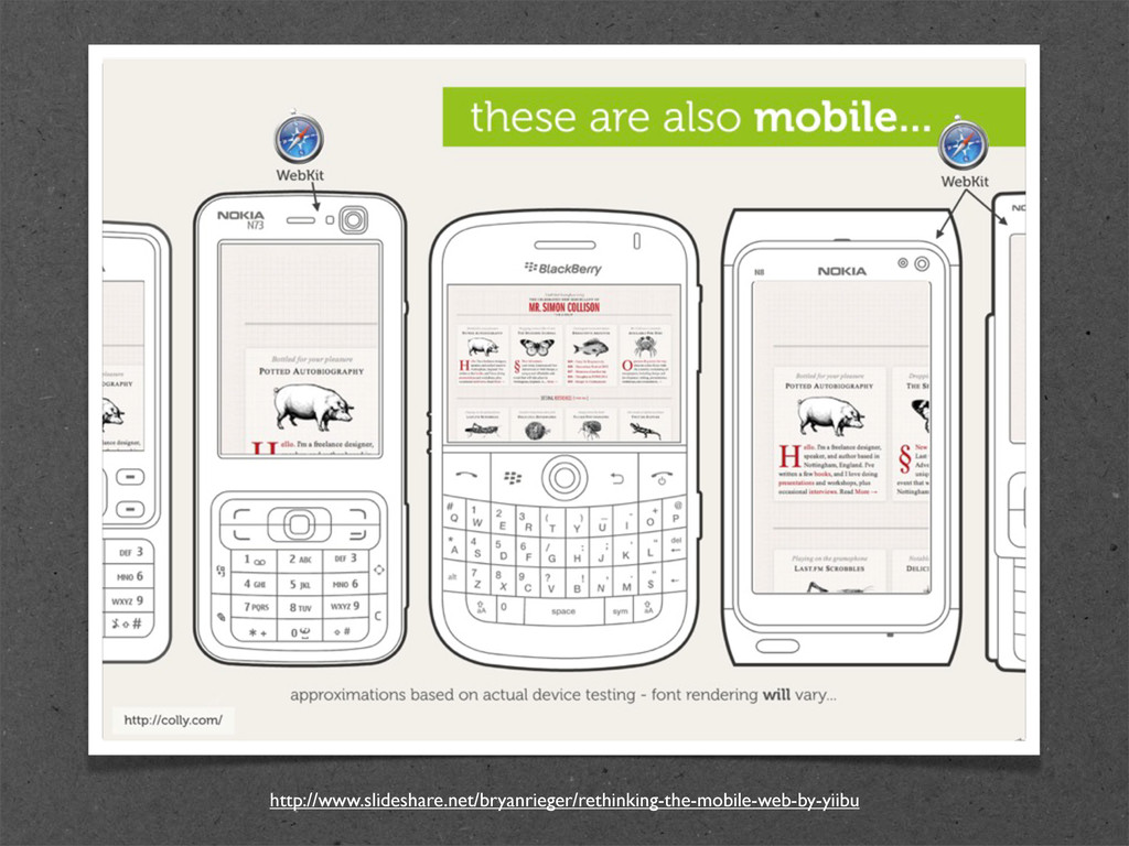
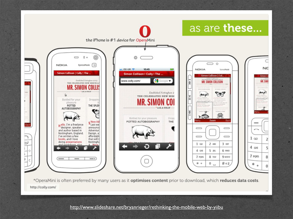
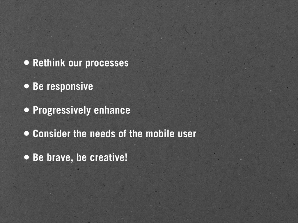
Manipulate the resolution, viewport, and orientation • Deliver 100% of the content • Or, deliver the device-relevant content • Surprise. Delight. Be creative!
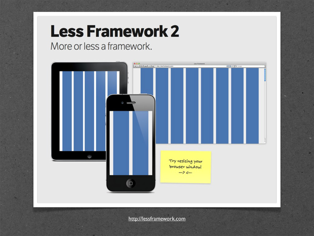
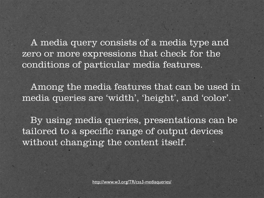
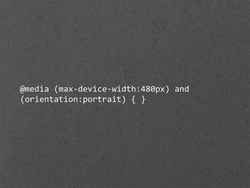
or more expressions that check for the conditions of particular media features. Among the media features that can be used in media queries are ‘width’, ‘height’, and ‘color’. By using media queries, presentations can be tailored to a specific range of output devices without changing the content itself. http://www.w3.org/TR/css3-mediaqueries/
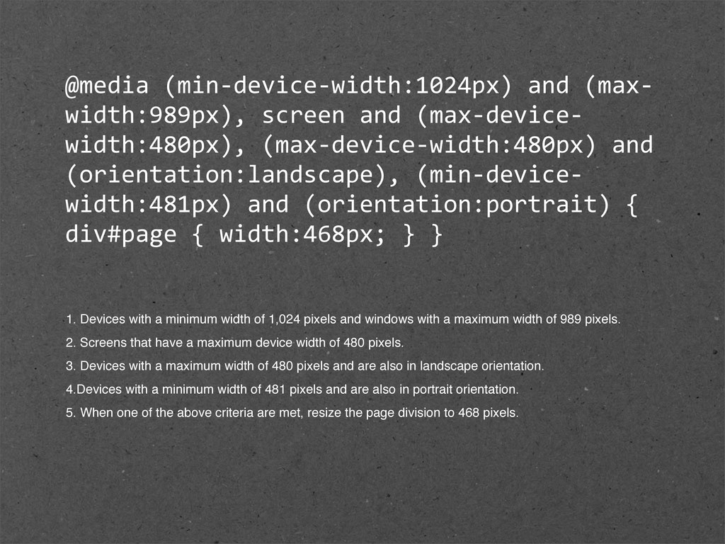
and (orientation:landscape), (min-‐device-‐ width:481px) and (orientation:portrait) { div#page { width:468px; } } 1. Devices with a minimum width of 1,024 pixels and windows with a maximum width of 989 pixels. 2. Screens that have a maximum device width of 480 pixels. 3. Devices with a maximum width of 480 pixels and are also in landscape orientation. 4.Devices with a minimum width of 481 pixels and are also in portrait orientation. 5. When one of the above criteria are met, resize the page division to 468 pixels.
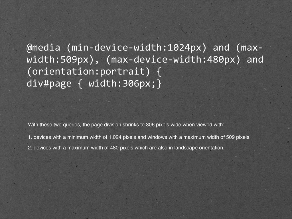
div#page { width:306px;} With these two queries, the page division shrinks to 306 pixels wide when viewed with: 1. devices with a minimum width of 1,024 pixels and windows with a maximum width of 509 pixels. 2. devices with a maximum width of 480 pixels which are also in landscape orientation.
 colly
colly
 takanorip
 ashapiro
 centou
 terencebasart
 nishame
 keita_yoshikawa
 kumanoayumi
 kgsi
kgsi
 ajstarks
 hypebeans
 ryu1013
 deadlinepoet
 marcduiker
 palkan
 ryanjones
 baasie
 cassininazir
 bkeepers
 gurzu
gurzu
 skipperchong
 nonsquared
 aleyda
 addyosmani
 eileencodes