Upgrade to Pro — share decks privately, control downloads, hide ads and more …

Themes and Styles and ?Attrs, Oh My!

Themes and Styles and ?Attrs, Oh My!

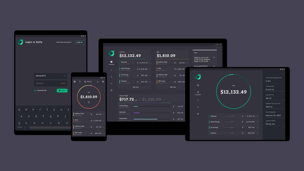
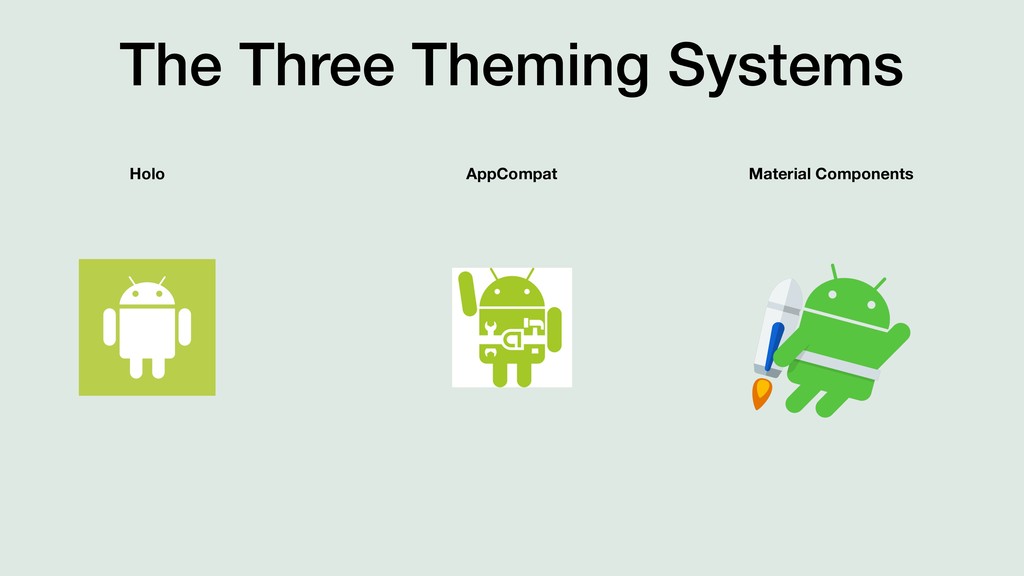
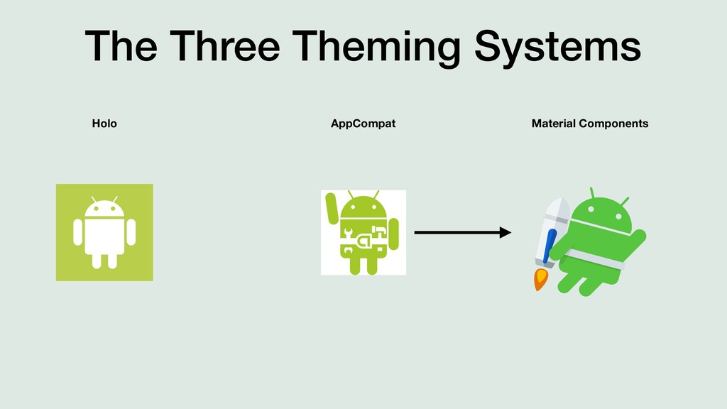
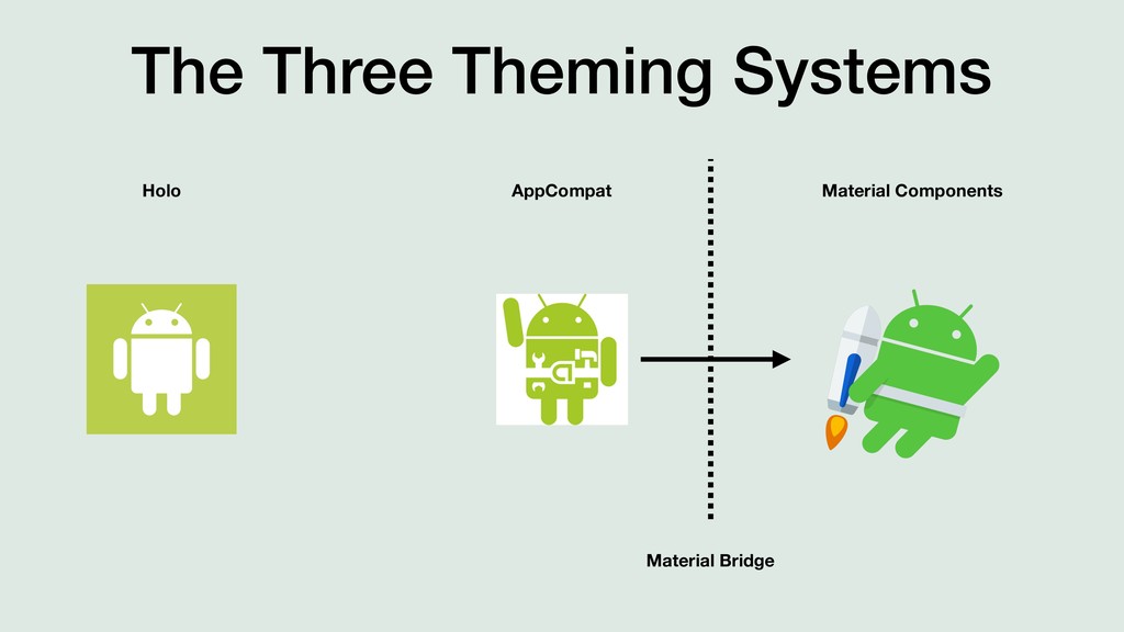
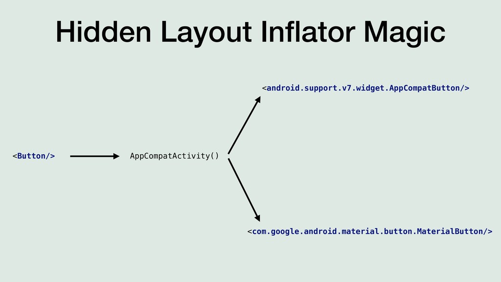
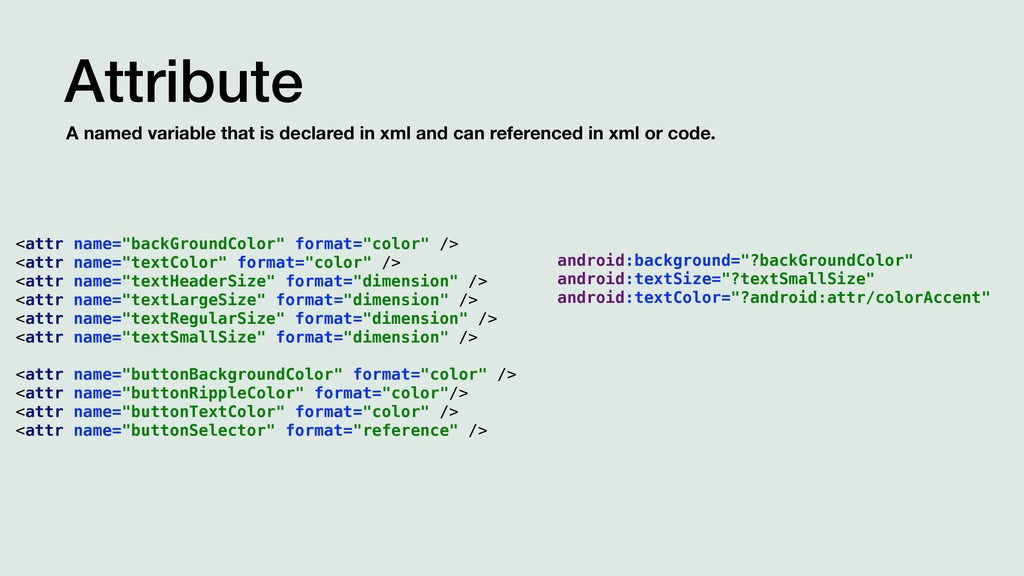
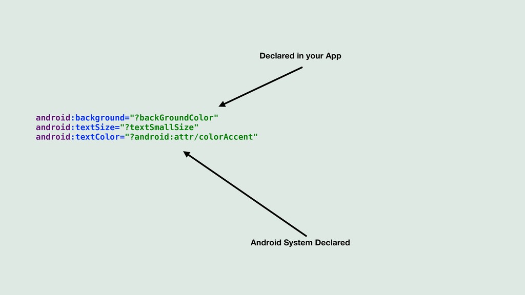
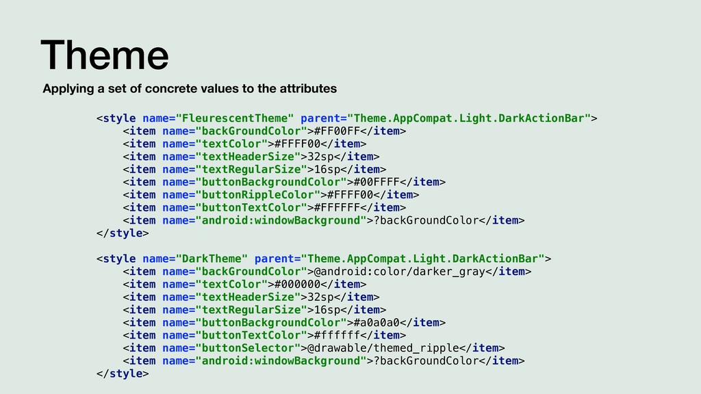
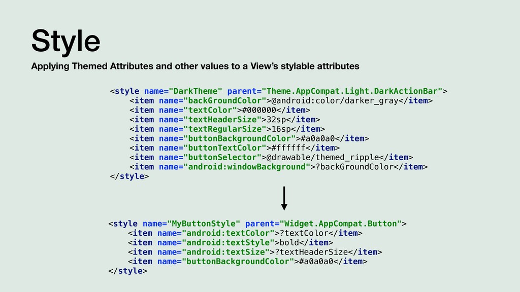
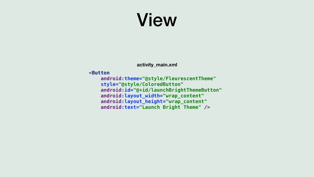
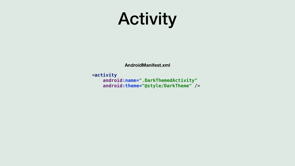
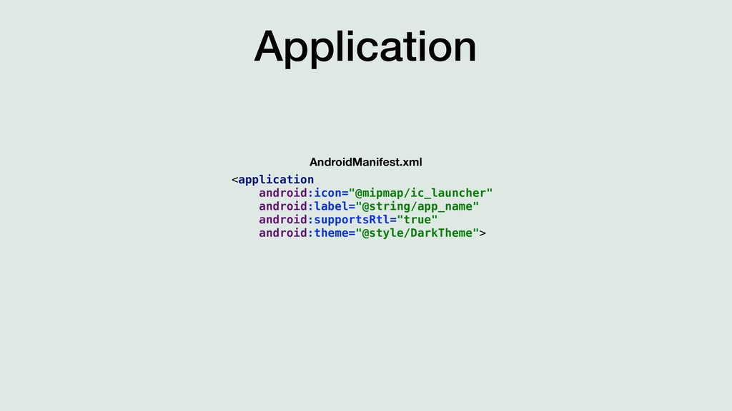
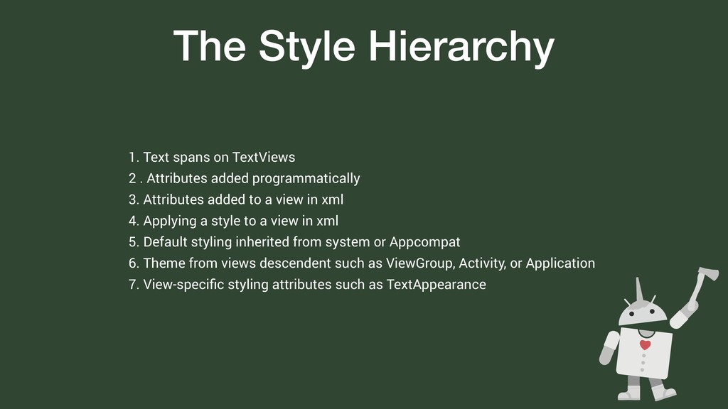
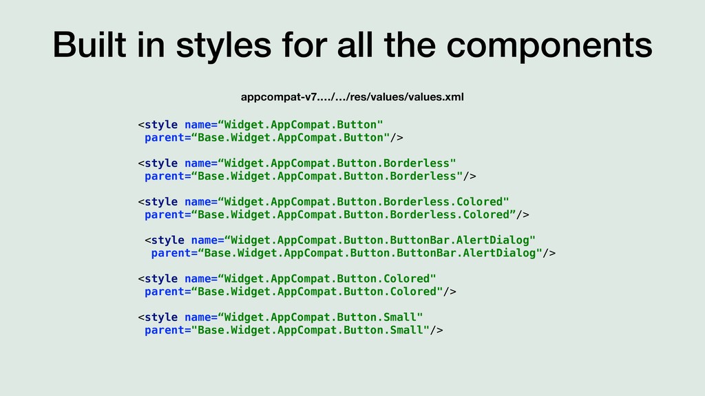
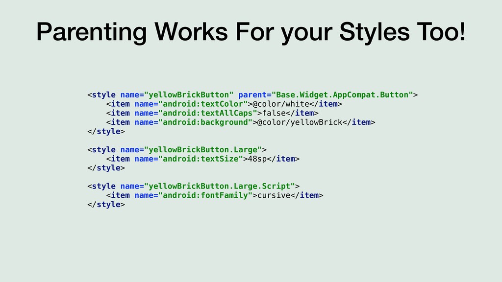
Demystifying the depths of android themes and styles by exploring and answering the scary questions like: How does it all work under the hood? What is the difference between AppCompat, Material Components, and Holo? How to find the right values to change when styling your app? What is the difference between a theme and style and how are they related? How to apply a theme or style to an App, Activity, or View?

EmmettWilson

January 26, 2019
Tweet

More Decks by EmmettWilson

Other Decks in Programming

Transcript

  1. Styles.xml <resources> <!-- Base application theme. --> <style name="AppTheme" parent="Theme.AppCompat.Light.DarkActionBar">

    <!-- Customize your theme here. --> <item name="colorPrimary">@color/colorPrimary</item> <item name="colorPrimaryDark">@color/colorPrimaryDark</item> <item name="colorAccent">@color/colorAccent</item> </style> </resources>
  2. The Goals 1. Match the design 2. Material Design Recommendations

    3. Match the Brand 4. DRY - Don’t Repeat Yourself 5. Easy to apply modifications across application 6. Shared naming conventions with design team
  3. Style the view programmatically val yellowBrick = ContextCompat.getColor(this, R.color.yellowBrick) incrementCountButton.setBackgroundColor(yellowBrick)

    val cursiveType = Typeface.create("cursive", Typeface.DEFAULT) incrementCountButton.setTypeface(cursiveType) incrementCountButton.isAllCaps = false
  4. Style within the xml <Button android:id="@+id/incrementCountButton" android:layout_width="wrap_content" android:layout_height="wrap_content" android:layout_gravity="center" android:textColor="@color/white"

    android:fontFamily="cursive" android:textAllCaps="false" android:background="@color/yellowBrick" android:text="@string/increment_count_button_title"/>
  5. Extract a style for re-useability <style name="yellowBrickButton"> <item name="android:textColor">@color/white</item> <item

    name="android:fontFamily">cursive</item> <item name="android:textAllCaps">false</item> <item name="android:background">@color/yellowBrick</item> </style> styles.xml <Button style="@style/yellowBrickButton" android:id="@+id/incrementCountButton" android:layout_width="wrap_content" android:layout_height="wrap_content" android:layout_gravity="center" android:text="@string/increment_count_button_title"/> activity_main.xml
  6. Attribute A named variable that is declared in xml and

    can referenced in xml or code. <attr name="backGroundColor" format="color" /> <attr name="textColor" format="color" /> <attr name="textHeaderSize" format="dimension" /> <attr name="textLargeSize" format="dimension" /> <attr name="textRegularSize" format="dimension" /> <attr name="textSmallSize" format="dimension" /> <attr name="buttonBackgroundColor" format="color" /> <attr name="buttonRippleColor" format="color"/> <attr name="buttonTextColor" format="color" /> <attr name="buttonSelector" format="reference" /> android:background="?backGroundColor" android:textSize="?textSmallSize" android:textColor="?android:attr/colorAccent"
  7. Theme Applying a set of concrete values to the attributes

    <style name="FleurescentTheme" parent="Theme.AppCompat.Light.DarkActionBar"> <item name="backGroundColor">#FF00FF</item> <item name="textColor">#FFFF00</item> <item name="textHeaderSize">32sp</item> <item name="textRegularSize">16sp</item> <item name="buttonBackgroundColor">#00FFFF</item> <item name="buttonRippleColor">#FFFF00</item> <item name="buttonTextColor">#FFFFFF</item> <item name="android:windowBackground">?backGroundColor</item> </style> <style name="DarkTheme" parent="Theme.AppCompat.Light.DarkActionBar"> <item name="backGroundColor">@android:color/darker_gray</item> <item name="textColor">#000000</item> <item name="textHeaderSize">32sp</item> <item name="textRegularSize">16sp</item> <item name="buttonBackgroundColor">#a0a0a0</item> <item name="buttonTextColor">#ffffff</item> <item name="buttonSelector">@drawable/themed_ripple</item> <item name="android:windowBackground">?backGroundColor</item> </style>
  8. Style Applying Themed Attributes and other values to a View’s

    stylable attributes <style name="DarkTheme" parent="Theme.AppCompat.Light.DarkActionBar"> <item name="backGroundColor">@android:color/darker_gray</item> <item name="textColor">#000000</item> <item name="textHeaderSize">32sp</item> <item name="textRegularSize">16sp</item> <item name="buttonBackgroundColor">#a0a0a0</item> <item name="buttonTextColor">#ffffff</item> <item name="buttonSelector">@drawable/themed_ripple</item> <item name="android:windowBackground">?backGroundColor</item> </style> <style name="MyButtonStyle" parent="Widget.AppCompat.Button"> <item name="android:textColor">?textColor</item> <item name="android:textStyle">bold</item> <item name="android:textSize">?textHeaderSize</item> <item name="buttonBackgroundColor">#a0a0a0</item> </style>
  9. But Themes are Styles? It is all really just several

    ways of applying attributes to views!!!
  10. The Style Hierarchy 1. Text spans on TextViews 2 .

    Attributes added programmatically 3. Attributes added to a view in xml 4. Applying a style to a view in xml 5. Default styling inherited from system or Appcompat 6. Theme from views descendent such as ViewGroup, Activity, or Application 7. View-specific styling attributes such as TextAppearance
  11. Built in styles for all the components appcompat-v7.…/…/res/values/values.xml <style name=“Widget.AppCompat.Button"

    parent=“Base.Widget.AppCompat.Button"/> <style name=“Widget.AppCompat.Button.Borderless" parent=“Base.Widget.AppCompat.Button.Borderless"/> <style name=“Widget.AppCompat.Button.Borderless.Colored" parent=“Base.Widget.AppCompat.Button.Borderless.Colored”/> <style name=“Widget.AppCompat.Button.ButtonBar.AlertDialog" parent=“Base.Widget.AppCompat.Button.ButtonBar.AlertDialog"/> <style name=“Widget.AppCompat.Button.Colored" parent=“Base.Widget.AppCompat.Button.Colored"/> <style name=“Widget.AppCompat.Button.Small" parent="Base.Widget.AppCompat.Button.Small"/>
  12. Parenting Works For your Styles Too! <style name="yellowBrickButton" parent="Base.Widget.AppCompat.Button"> <item

    name="android:textColor">@color/white</item> <item name="android:textAllCaps">false</item> <item name="android:background">@color/yellowBrick</item> </style> <style name="yellowBrickButton.Large"> <item name="android:textSize">48sp</item> </style> <style name="yellowBrickButton.Large.Script"> <item name="android:fontFamily">cursive</item> </style>
  13. Style Spelunking 1. Start at components style in values.xml and

    ctrl+click 2. Explore where that takes you 3. Likely there will be paths and branches to choose 4. Explore all of them!
  14. Style Spelunking <style name="Widget.AppCompat.Button" parent="Base.Widget.AppCompat.Button"/> <style name="Base.Widget.AppCompat.Button" parent="android:Widget"> <item name="android:background">@drawable/abc_btn_default_mtrl_shape</item>

    <item name="android:textAppearance">?android:attr/textAppearanceButton</item> <item name="android:minHeight">48dip</item> <item name="android:minWidth">88dip</item> <item name="android:focusable">true</item> <item name="android:clickable">true</item> <item name="android:gravity">center_vertical|center_horizontal</item> </style> <style name=“Base.Widget.AppCompat.Button" parent="android:Widget.Material.Button"/> <style name="Widget.Material.Button"> <item name="background">@drawable/btn_default_material</item> <item name="textAppearance">?attr/textAppearanceButton</item> <item name="minHeight">48dip</item> <item name="minWidth">88dip</item> <item name="stateListAnimator">@anim/button_state_list_anim_material</item> <item name="focusable">true</item> <item name="clickable">true</item> <item name="gravity">center_vertical|center_horizontal</item> </style> values-v21 values
  15. Practical Recommendations 1. Start by styling in activity.xml 2. Extract

    finished style into styles.xml for re-use 3. Use the built in styles, BUT extend them to enable future modification 4. When built in styles do not work create your own 5. When all else fails create your own custom views
  16. Thanks For Coming! And Happy Theming! Emmett Wilson / @MathematicalFnk

    https://speakerdeck.com/emmettwilson/themes-and-styles-and-attrs-oh-my Slides can be viewed at