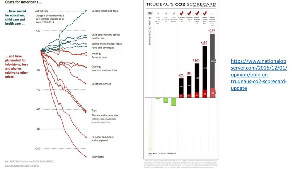
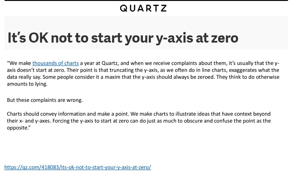
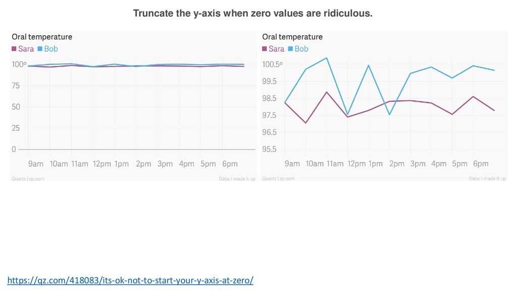
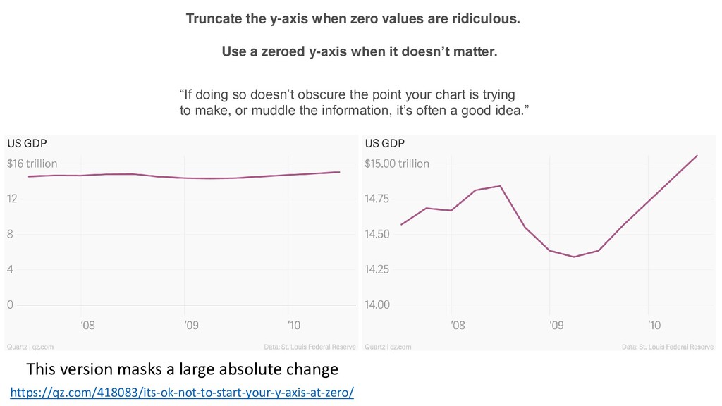
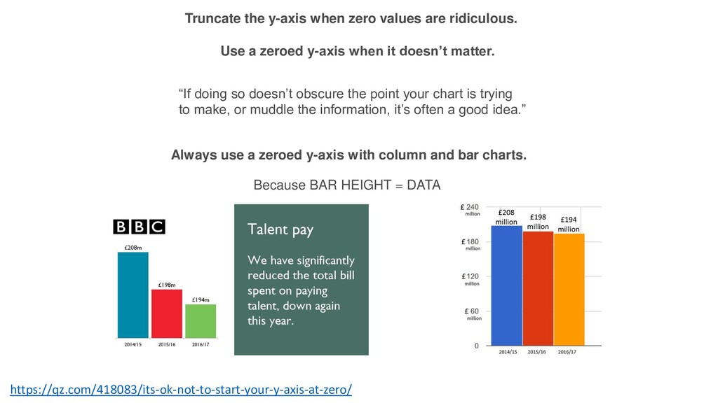
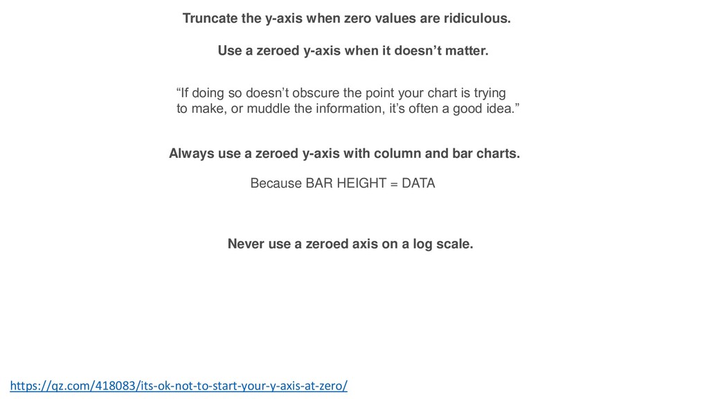
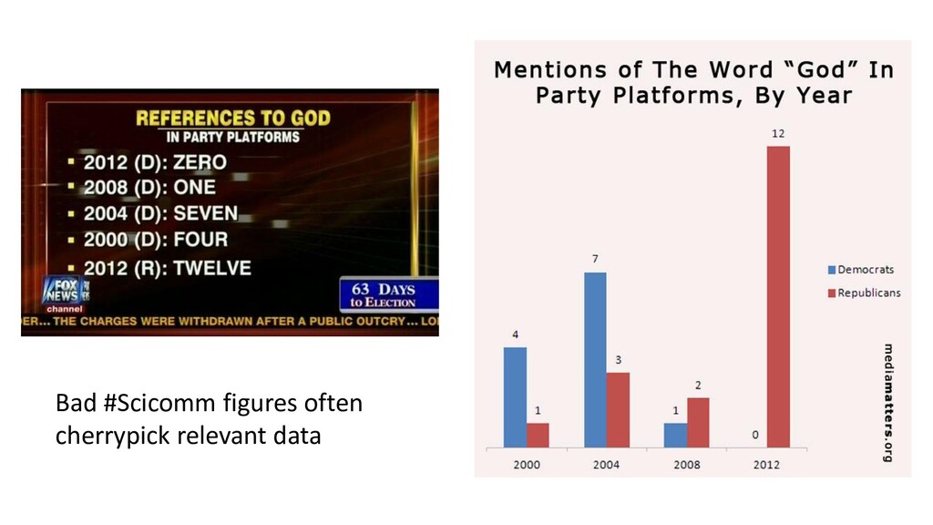
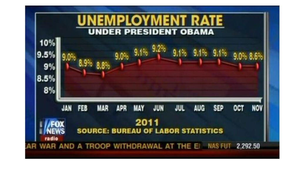
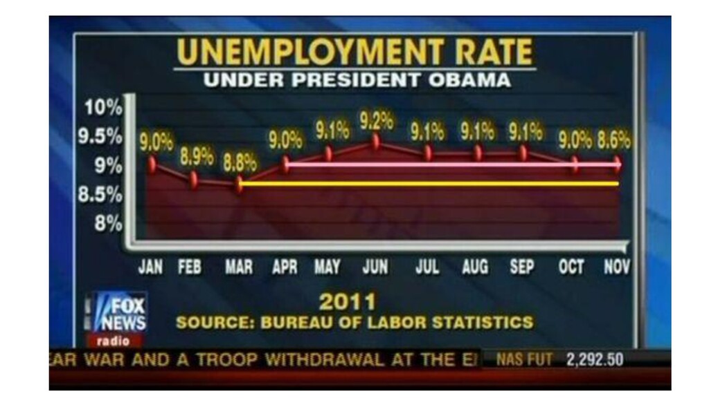
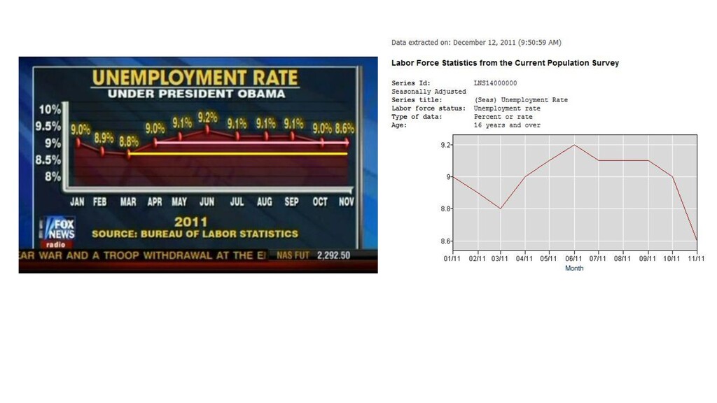
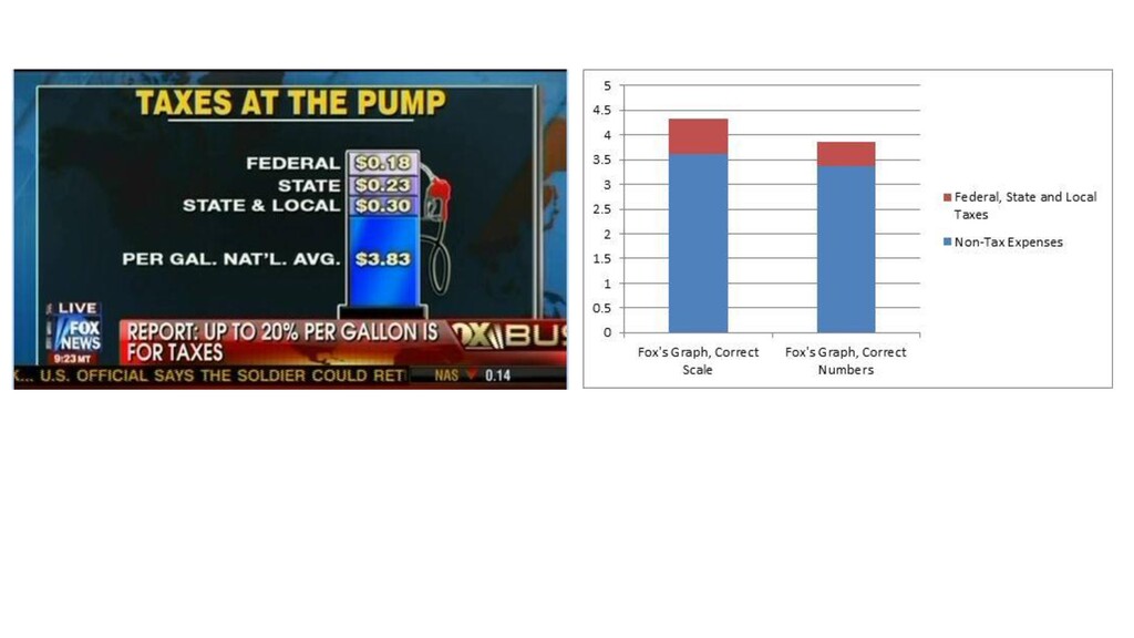
and when we receive complaints about them, it’s usually that the y- axis doesn’t start at zero. Their point is that truncating the y-axis, as we often do in line charts, exaggerates what the data really say. Some people consider it a maxim that the y-axis should always be zeroed. They think to do otherwise amounts to lying. But these complaints are wrong. Charts should convey information and make a point. We make charts to illustrate ideas that have context beyond their x- and y-axes. Forcing the y-axis to start at zero can do just as much to obscure and confuse the point as the opposite.”