Upgrade to Pro — share decks privately, control downloads, hide ads and more …

HTML5: Mobile Approaches

HTML5: Mobile Approaches

The HTML version of this slide is on: http://girliemac.github.io/presentation-slides/html5-mobile-approach/

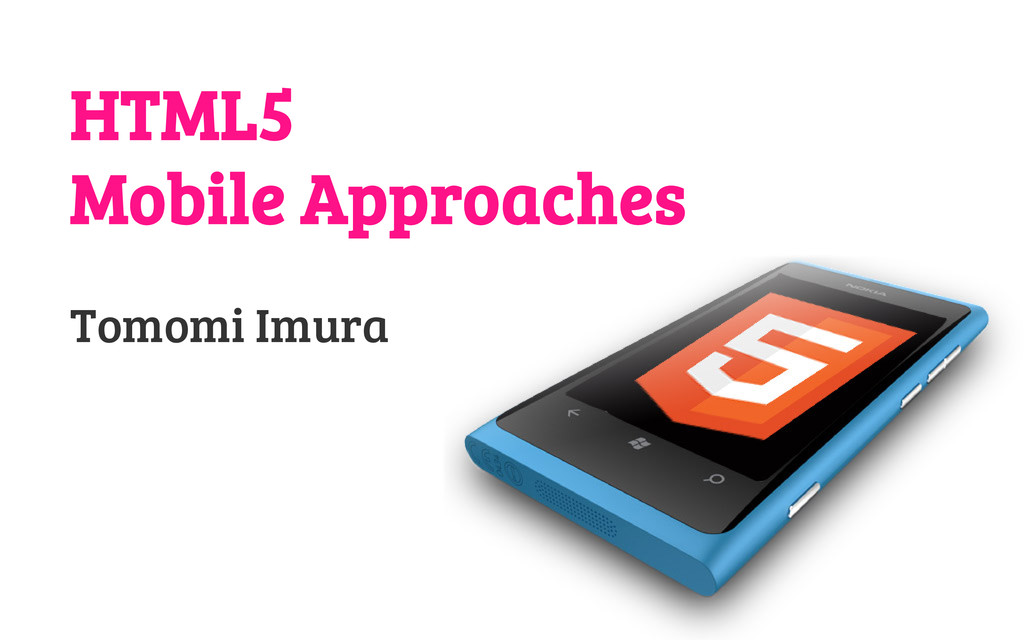
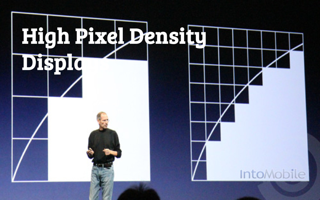
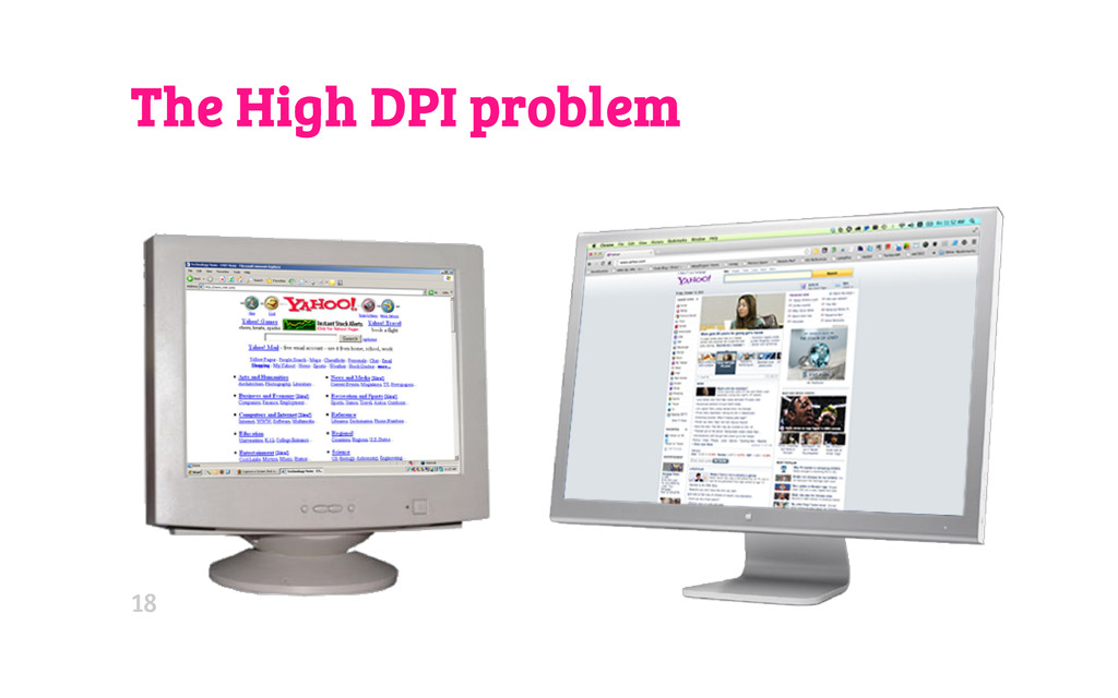
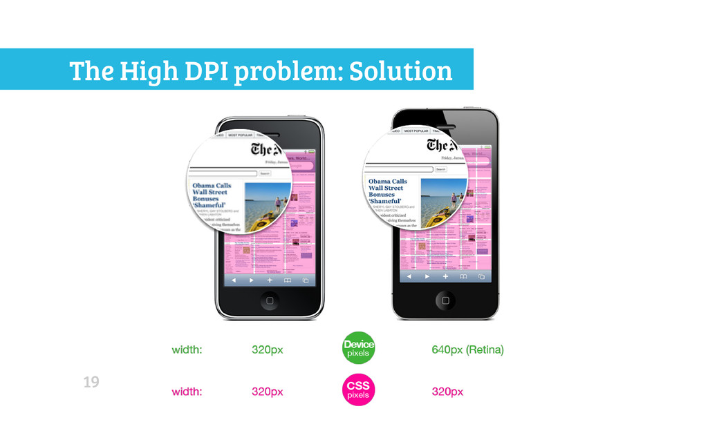
Building a mobile web no longer means dumbing down an existing desktop website. With ever-evolving HTML5 and smartphone capabilities, now you can create amazing web apps running on mobile browsers.
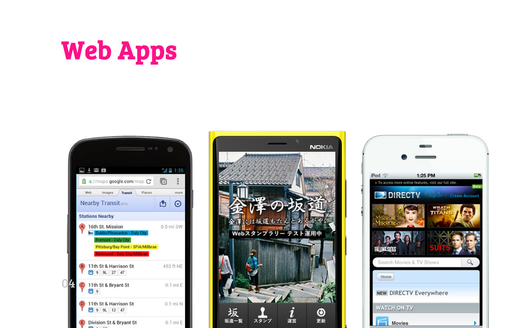
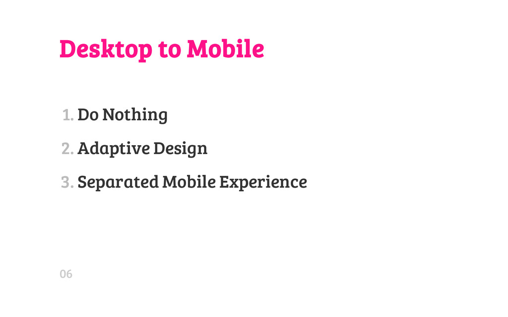
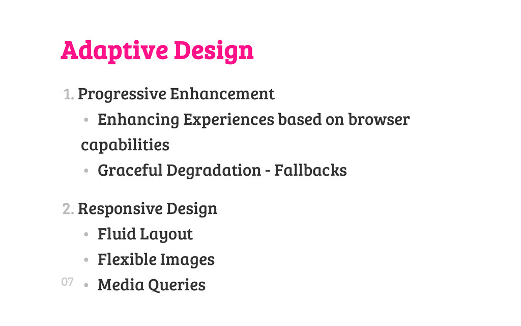
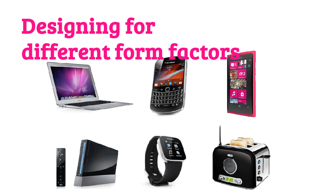
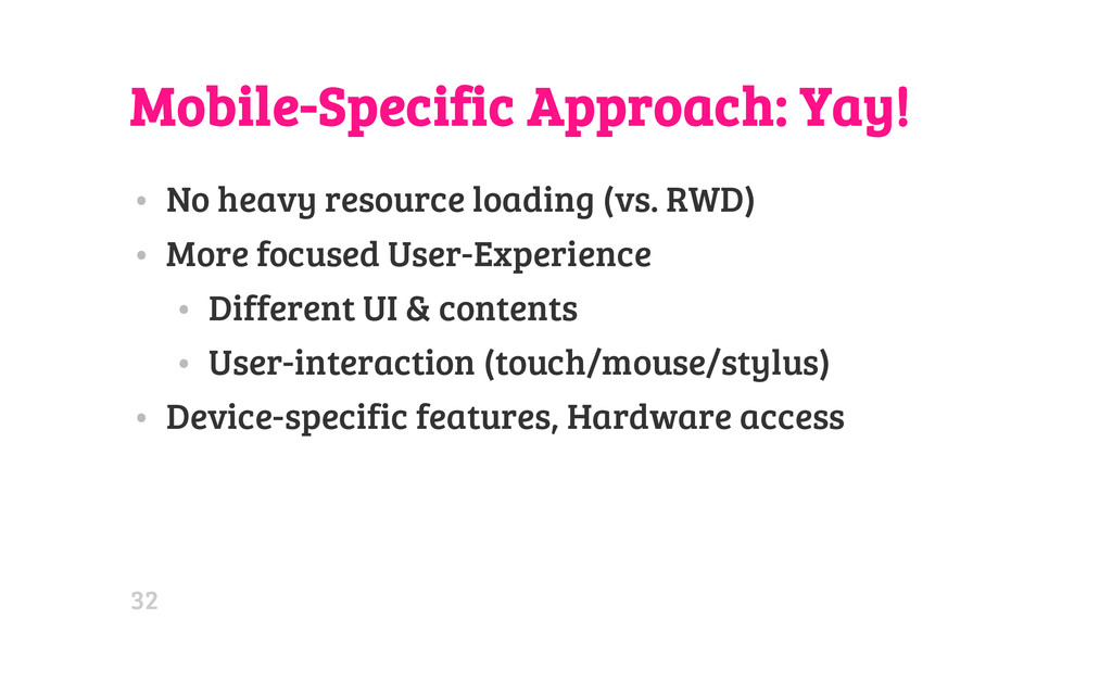
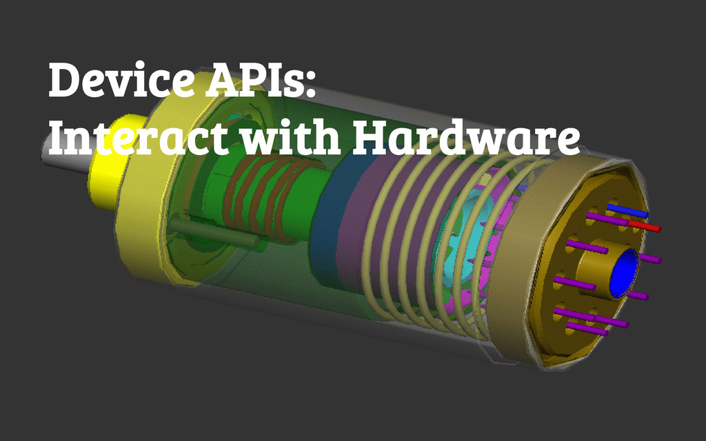
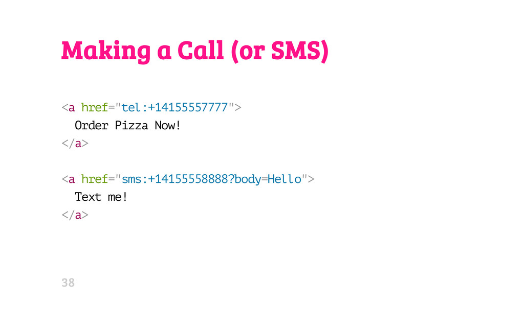
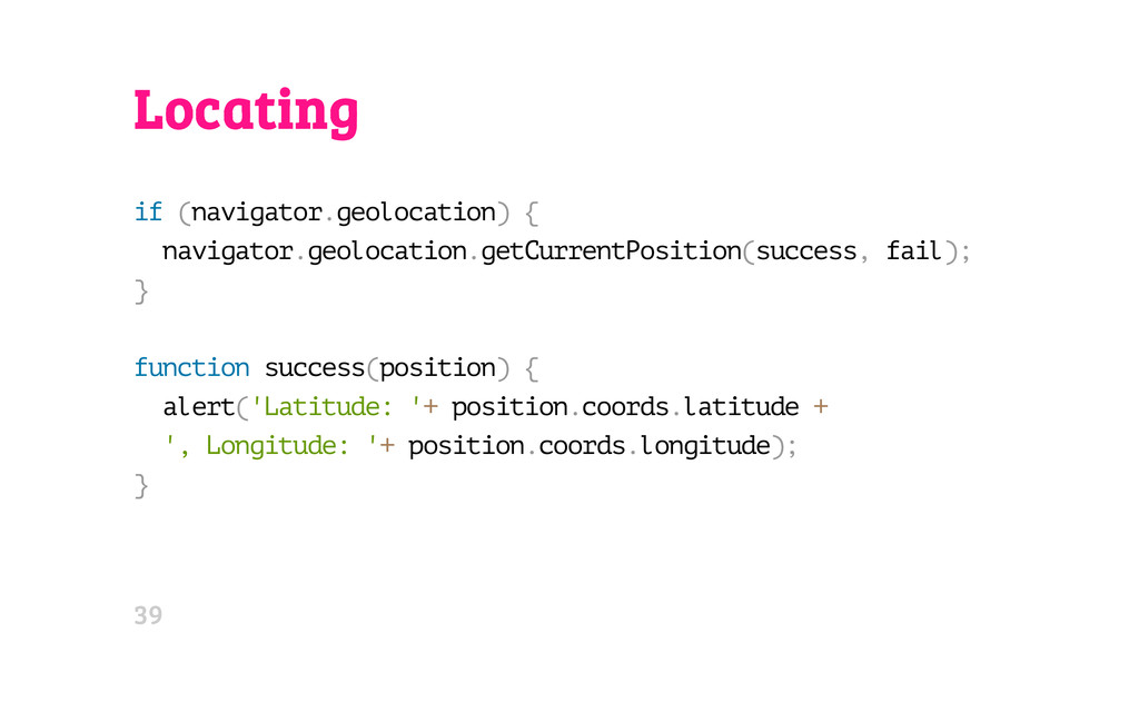
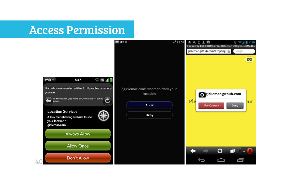
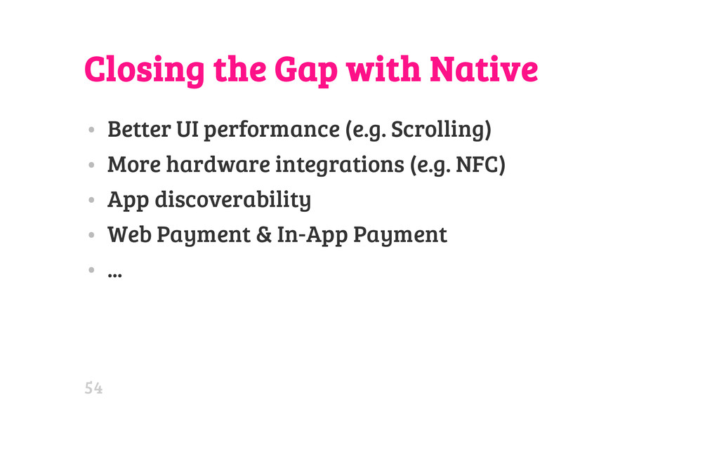
In my talk, I will cover the adaptive and responsive design approach to support multiple form-factors from desktop to mobile phones, also the mobile-specific approach with HTML5 APIs, including device APIs that make communication between a browser and hardware possible, and enable web to have "native" like experiences.

Avatar for Tomomi Imura

Tomomi Imura

April 16, 2013
Tweet

More Decks by Tomomi Imura

Other Decks in Technology

Transcript

  1. H E L L O M Y N A M

    E I S Tomomi @girlie_mac 02
  2. Adaptive Design 1. Progressive Enhancement • Enhancing Experiences based on

    browser capabilities • Graceful Degradation - Fallbacks 2. Responsive Design • Fluid Layout • Flexible Images • Media Queries 07
  3. Why Should You Consider RWD? • One URL works across

    the browsers • No redirect • No User-Agent sniffing • Maintainable • A single content • No separate markup 09
  4. CSS2 Media-Types @ m e d i a h a

    n d h e l d { / * S o m e m o b i l e - s p e c i f i c C S S h e r e * / } Only supported by: • Opera Mini • OpenWave • Obigo • PIE (partial) 11
  5. CSS3: Media-Queries Separate styles by the width of the target

    viewport @ m e d i a o n l y s c r e e n a n d ( m i n - w i d t h : 7 6 8 p x ) a n d ( m a x - w i d t h : 1 0 2 4 p x ) { / * S t y l e s * / } 13
  6. CSS3: Media-Queries by device-width, the width of the device's screen

    size @ m e d i a o n l y s c r e e n a n d ( m i n - d e v i c e - w i d t h : 3 2 0 p x ) a n d ( m a x - d e v i c e - w i d t h : 4 8 0 p x ) { / * S t y l e s * / } 14
  7. CSS3: Media-Queries combined with screen orientations @ m e d

    i a o n l y s c r e e n a n d ( m i n - d e v i c e - w i d t h : 7 6 8 p x ) a n d ( m a x - d e v i c e - w i d t h : 1 0 2 4 p x ) a n d ( o r i e n t a t i o n : l a n d s c a p e ) { / * S t y l e s * / } . . . 15
  8. CSS Pixel vs. Device Pixel • Pixel in CSS is

    relative • 1 CSS pixel != 1 device pixel 20
  9. Pixel Density in DOM w i n d o w

    . d e v i c e P i x e l R a t i o Device Browser Pixel Density Nexus One Android browser 1.5 Galaxy Nexus Chrome 2.0 Galaxy Nexus Opera Mobile 2.25 21
  10. Media-Queries for "Retina" @ m e d i a o

    n l y s c r e e n a n d ( m i n - d e v i c e - p i x e l - r a t i o : 2 ) { / * s o m e h i - r e s c s s * / } 22
  11. WTF Vendor Prefix! @ m e d i a o

    n l y s c r e e n a n d ( - w e b k i t - m i n - d e v i c e - p i x e l - r a t i o : 1 . 5 ) { . . . } @ m e d i a o n l y s c r e e n a n d ( m i n - - m o z - d e v i c e - p i x e l - r a t i o : 1 . 5 ) { . . . } @ m e d i a o n l y s c r e e n a n d ( - o - m i n - d e v i c e - p i x e l - r a t i o : 3 / 2 ) { . . . } 23
  12. Unprefix: resolution media query @ m e d i a

    ( - w e b k i t - m i n - d e v i c e - p i x e l - r a t i o : 2 ) , ( m i n - r e s o l u t i o n : 1 9 2 d p i ) { . . . } Typical Screen: 96dpi (96px = 1in in CSS units) 24
  13. ...even easier @ m e d i a ( -

    w e b k i t - m i n - d e v i c e - p i x e l - r a t i o : 2 ) , ( m i n - r e s o l u t i o n : 2 d p p x ) { . . . } 21 16 25
  14. 26

  15. Up-Res Images . b a n n e r {

    b a c k g r o u n d - i m a g e : u r l ( b a n n e r . p n g ) ; w i d t h : 3 2 0 p x ; h e i g h t : 1 6 0 p x ; } @ m e d i a o n l y s c r e e n a n d ( - w e b k i t - m i n - d e v i c e - p i x e l - r a t i o : 2 ) , o n l y s c r e e n a n d ( m i n - r e s o l u t i o n : 1 9 2 d p i ) { . b a n n e r { b a c k g r o u n d - i m a g e : u r l ( b a n n e r - 2 x . p n g ) ; b a c k g r o u n d - s i z e : 1 0 0 % ; } } 27
  16. SVG < i m g s r c = "

    l o g o . s v g " w i d t h = "4 3 2 " > 28
  17. Proposal: Responsive Images < p i c t u r

    e w i d t h = " 5 0 0 " h e i g h t = " 5 0 0 " > < s o u r c e m e d i a = " ( m i n - w i d t h : 4 5 e m ) " s r c = " l a r g e . j p g " > < s o u r c e m e d i a = " ( m i n - w i d t h : 1 8 e m ) " s r c = " m e d . j p g " > < s o u r c e s r c = " s m a l l . j p g " > < i m g s r c = " f a l l b a c k . j p g " > < p > A c c e s s i b l e t e x t < / p > < / p i c t u r e > 29
  18. Responsive, wut? • Heavy resource loading • Extra http requests

    • Large images • Image resizing performance • Data transfer can be costly • Battery consumption • Impressing developer, not users 30
  19. Mobile-Specific Approach: Yay! • No heavy resource loading (vs. RWD)

    • More focused User-Experience • Different UI & contents • User-interaction (touch/mouse/stylus) • Device-specific features, Hardware access 32
  20. Touch Screen User Interaction • Touch Events • Touch Events

    v.1 (note: ) • Pointer Events • CSS L4 Media-queries (Future) • p o i n t e r - accuracy of a pointing device. none, coarse, fine. "Fat Finger" • h o v e r - 0 or 1 34
  21. Pointer Events For any input devices: touch, mouse, pen... i

    f ( n a v i g a t o r . p o i n t e r E n a b l e d ) { e l . a d d E v e n t L i s t e n e r ( ' p o i n t e r d o w n ' , s t a r t H a n d l e r , f a l s e ) ; e l . a d d E v e n t L i s t e n e r ( ' p o i n t e r m o v e ' , . . . ) ; e l . a d d E v e n t L i s t e n e r ( ' p o i n t e r u p ' , . . . ) ; } 35
  22. Pointer Events Only IE10 supports so far... i f (

    n a v i g a t o r . m s P o i n t e r E n a b l e d ) { e l . a d d E v e n t L i s t e n e r ( ' M S P o i n t e r D o w n ' , s t a r t H a n d l e r , f a l s e ) ; e l . a d d E v e n t L i s t e n e r ( ' M S P o i n t e r M o v e ' , m o v e H a n d l e r , f a l s e ) ; e l . a d d E v e n t L i s t e n e r ( ' M S P o i n t e r U p ' , e n d H a n d l e r , f a l s e ) ; } 10 36
  23. Making a Call (or SMS) < a h r e

    f = " t e l : + 1 4 1 5 5 5 5 7 7 7 7 " > O r d e r P i z z a N o w ! < / a > < a h r e f = " s m s : + 1 4 1 5 5 5 5 8 8 8 8 ? b o d y = H e l l o " > T e x t m e ! < / a > 38
  24. Locating i f ( n a v i g a

    t o r . g e o l o c a t i o n ) { n a v i g a t o r . g e o l o c a t i o n . g e t C u r r e n t P o s i t i o n ( s u c c e s s , f a i l ) ; } f u n c t i o n s u c c e s s ( p o s i t i o n ) { a l e r t ( ' L a t i t u d e : ' + p o s i t i o n . c o o r d s . l a t i t u d e + ' , L o n g i t u d e : ' + p o s i t i o n . c o o r d s . l o n g i t u d e ) ; } 39
  25. Device Orientation Events DOM events for obtaining information about the

    physical orientation and movement of the hosting device • Gyroscope • Accelerometer • Compass 41
  26. Device Orientation Events Events: d e v i c e

    o r i e n t a t i o n, d e v i c e m o t i o n, c o m p a s s n e e d s c a l i b r a t i o n Dev Opera (Diagram) 42
  27. Watch the demo video on Vemeo Try it on supported

    browsers: http://goo.gl/5Cj4d 43
  28. Media Capture and Streams API WebRTC "Web Real Time Communications"

    v a r g u m = n a v i g a t o r . g e t U s e r M e d i a | | n a v i g a t o r . m o z G e t U s e r M e d i a | | n a v i g a t o r . w e b k i t G e t U s e r M e d i a ; n a v i g a t o r . g e t U s e r M e d i a ( { v i d e o : t r u e , a u d i o : t r u e } , s u c c e s s C a l l b a c k , e r r o r C a l l b a c k ) ; 10 The super silly demo again: RespongeBob Web / Make Me Bob! 21* 17* 44
  29. HTML Media Capture < ! - - C u r

    r e n t i m p l e m e n t a t i o n ( i f s u p p o r t e d ) - - > < i n p u t t y p e = " f i l e " a c c e p t = " i m a g e / * " c a p t u r e = " c a m e r a " > < ! - - N e w l y p r o p o s e d s p e c i f i c a t i o n - - > < i n p u t t y p e = " f i l e " a c c e p t = " i m a g e / * " c a p t u r e > 18 3 6* 10* 10 10* 45
  30. Battery Status API v a r b a t t

    e r y = n a v i g a t o r . b a t t e r y | | n a v i g a t o r . m o z B a t t e r y ; b a t t e r y . a d d E v e n t L i s t e n e r ( ' c h a r g i n g c h a n g e ' , u p d a t e S t a t u s ) ; f u n c t i o n u p d a t e S t a t u s ( ) { a l e r t ( ' B a t t e r y s t a t u s : ' + b a t t e r y . l e v e l * 1 0 0 + ' % ' ) ; i f ( b a t t e r y . c h a r g i n g ) { a l e r t ( ' B a t t e r y i s c h a r g i n g . . . ' ) ; } } 10* 16 47
  31. Vibration API v a r v i b r a

    t e = n a v i g a t o r . v i b r a t e | | n a v i g a t o r . m o z V i b r a t e ; v i b r a t e ( 1 0 0 0 ) ; / / v i b r a t e f o r 1 s e c v i b r a t e ( [ 1 0 0 0 , 5 0 0 , 2 0 0 0 ] ) ; / / v i b r a t e s f o r 1 s e c , s t i l l f o r 0 . 5 s e c o n d s , / / a n d v i b r a t e s a g a i n f o r 2 s e c 14 Try it on Firefox Mobile: http://goo.gl/EWPmL 49
  32. Ambient Light Events w i n d o w .

    a d d E v e n t L i s t e n e r ( ' d e v i c e l i g h t ' , f u n c t i o n ( e ) { a l e r t ( e . v a l u e ) ; } ) ; Sensor Value Lightning Condition My Observation on Galaxy Nexus < 300 lux Dim Indoor 400-1000 lux Normal By window. Outdoor (Cloudy) > 1000 lux Light Outdoor Daylight? Can't test in foggy SF :-p 15 50
  33. Light Sensor Demo Watch the demo video on Vemeo Try

    it on Firefox Mobile: http://goo.gl/WynKX 51
  34. Proximity Events The distance of a nearby physical object using

    the proximity sensor of a device. w i n d o w . a d d E v e n t L i s t e n e r ( ' d e v i c e p r o x i m i t y ' , f u n c t i o n ( e ) { a l e r t ( e . v a l u e ) ; } ) ; 52
  35. More APIs and related APIs • The Network Information API

    • Network Service Discovery • Clipboard API • Fullscreen API • Gamepad API • Calendar and Contacts APIs • ... 53
  36. Closing the Gap with Native • Better UI performance (e.g.

    Scrolling) • More hardware integrations (e.g. NFC) • App discoverability • Web Payment & In-App Payment • ... 54