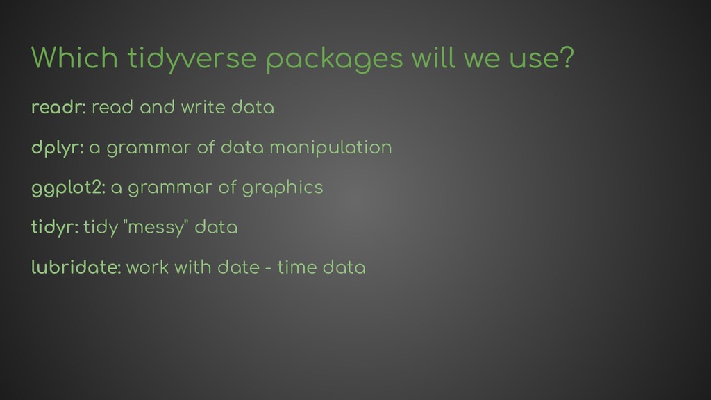
provides a consistent syntax: The first argument is always the data, which means we can use the pipe: %>% All functions are designed with a consistent grammar in mind with verbs, nouns, adverbs and pronouns. The design of harp tries to follow and make use of the tidyverse where possible.
on The Grammar of Graphics. You provide the data, tell ggplot2 how to map variables to aesthetics, what graphical primitives to use, and it takes care of the details."
on The Grammar of Graphics. You provide the data, tell ggplot2 how to map variables to aesthetics, what graphical primitives to use, and it takes care of the details." You would begin by giving it a data frame (or tibble!), telling it which columns to map to which aesthetics and then add on layers, scales, facet specifications, coordinate systems and themes.
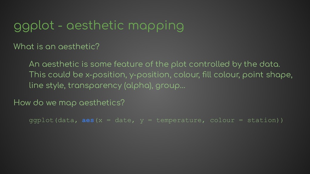
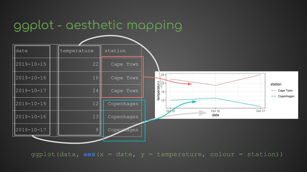
is some feature of the plot controlled by the data. This could be x-position, y-position, colour, fill colour, point shape, line style, transparency (alpha), group… How do we map aesthetics? ggplot(data, aes(x = date, y = temperature, colour = station))
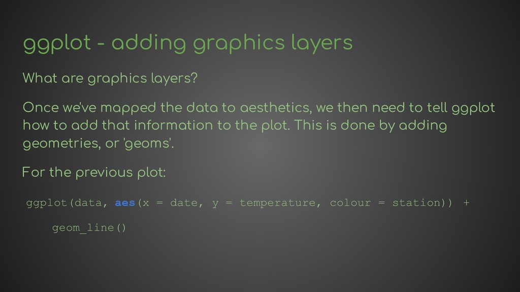
we've mapped the data to aesthetics, we then need to tell ggplot how to add that information to the plot. This is done by adding geometries, or 'geoms'. For the previous plot: ggplot(data, aes(x = date, y = temperature, colour = station)) + geom_line()
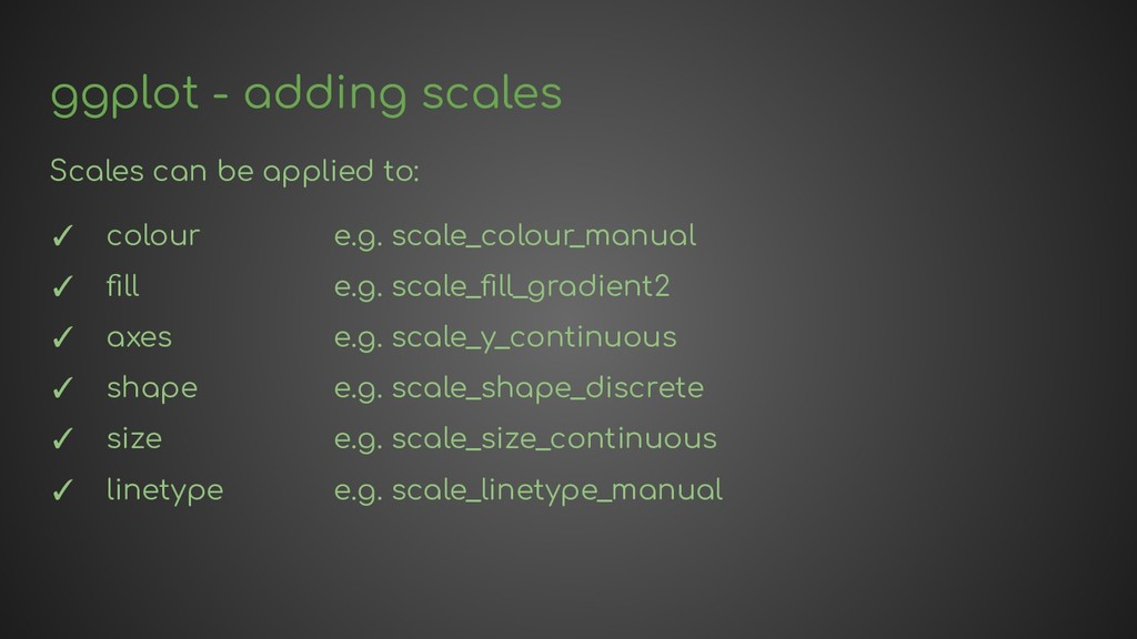
colour e.g. scale_colour_manual ✓ fill e.g. scale_fill_gradient2 ✓ axes e.g. scale_y_continuous ✓ shape e.g. scale_shape_discrete ✓ size e.g. scale_size_continuous ✓ linetype e.g. scale_linetype_manual
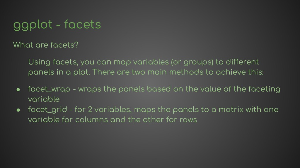
map variables (or groups) to different panels in a plot. There are two main methods to achieve this: • facet_wrap - wraps the panels based on the value of the faceting variable • facet_grid - for 2 variables, maps the panels to a matrix with one variable for columns and the other for rows
the temperature time series in a panel for each station. date temperature station 2019-10-15 22 Cape Town 2019-10-16 19 Cape Town 2019-10-17 24 Cape Town 2019-10-15 12 Copenhagen 2019-10-16 13 Copenhagen 2019-10-17 9 Copenhagen ggplot(data, aes(x = date, y = temperature)) + geom_line() + facet_wrap(vars(station), ncol = 1)
1. Combine the two position aesthetics to produce a 2d position on the plot. 2. In coordination with the faceter, coordinate systems draw axes and panel backgrounds. We are mostly working in cartesian coordinates, so will concentrate on those, other systems exist too, such as polar coordinates and map coordinates.
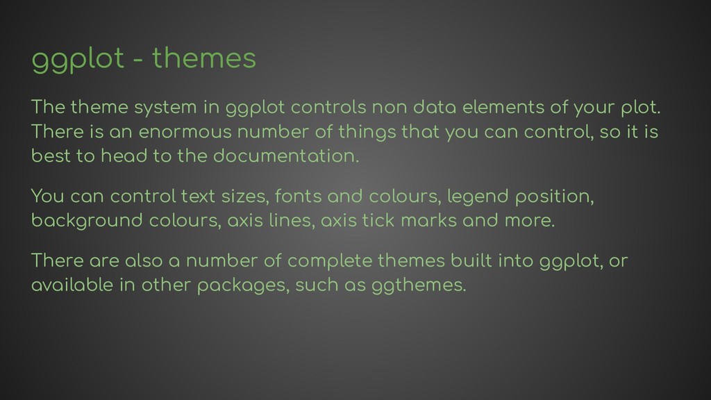
data elements of your plot. There is an enormous number of things that you can control, so it is best to head to the documentation. You can control text sizes, fonts and colours, legend position, background colours, axis lines, axis tick marks and more. There are also a number of complete themes built into ggplot, or available in other packages, such as ggthemes.
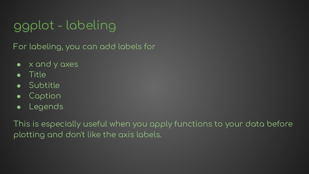
• x and y axes • Title • Subtitle • Caption • Legends This is especially useful when you apply functions to your data before plotting and don't like the axis labels.


 harp
harp
 camel_404
 2720japanoke
 hiola
hiola
 ainischool
 kekekenta
 signer
 bvr7352
 mariooc
 pawan_pharm
 uranoken
 cassininazir
 katiecoart
 zakiyama
 kevinliebholz
 codingconduct
 marketingsoph
 uxyall
 andyhume
 tenderlove
 sonatard
 sferik
 tonyrice