Upgrade to Pro — share decks privately, control downloads, hide ads and more …

Data Visualization Workshop Part 1 - Visualizing Summarized Data

Data Visualization Workshop Part 1 - Visualizing Summarized Data

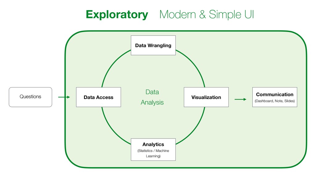
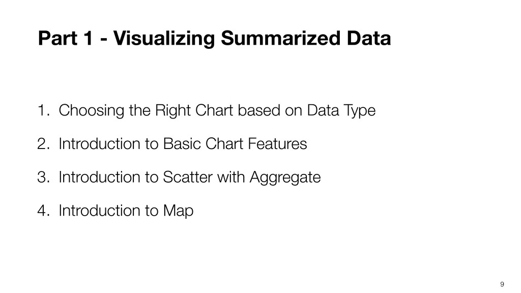
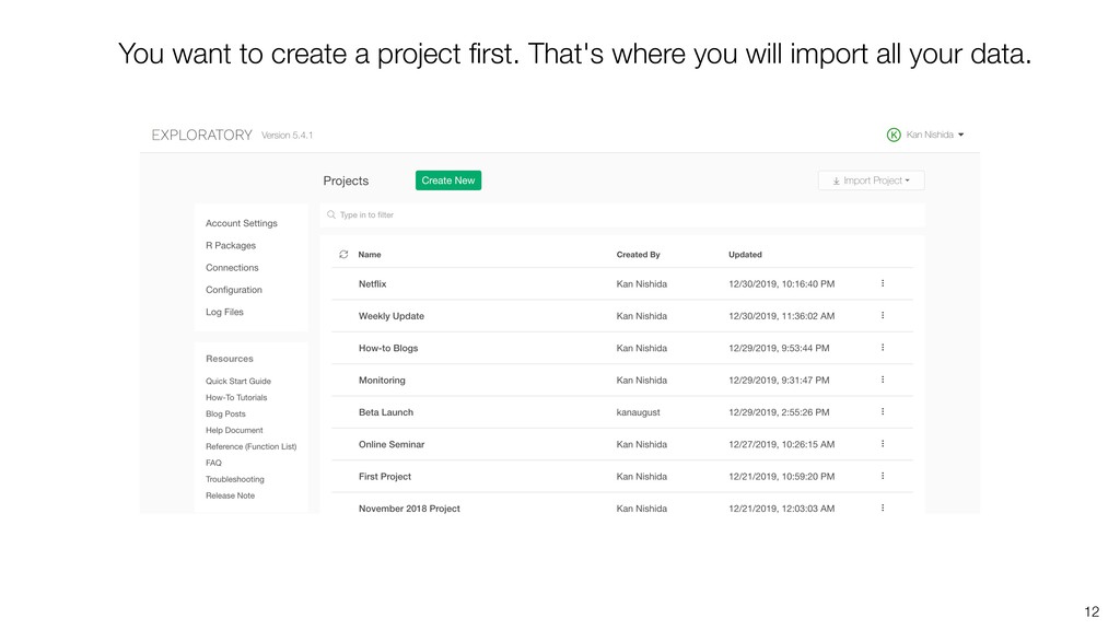
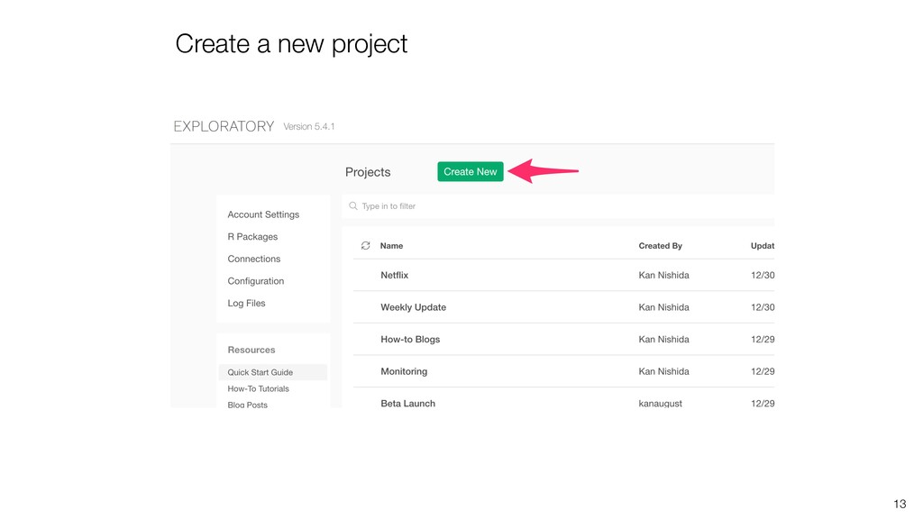
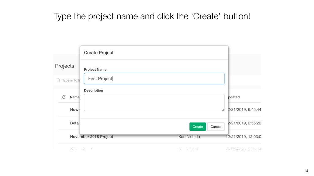
I'm starting the Data Visualization workshop by introducing the basics of how to use the charts to visualize data effectively.

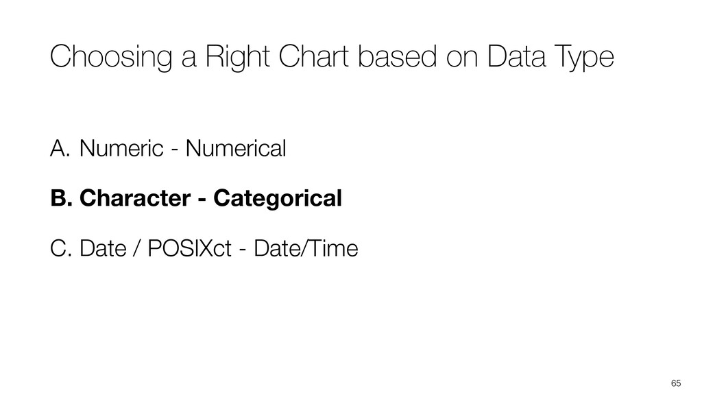
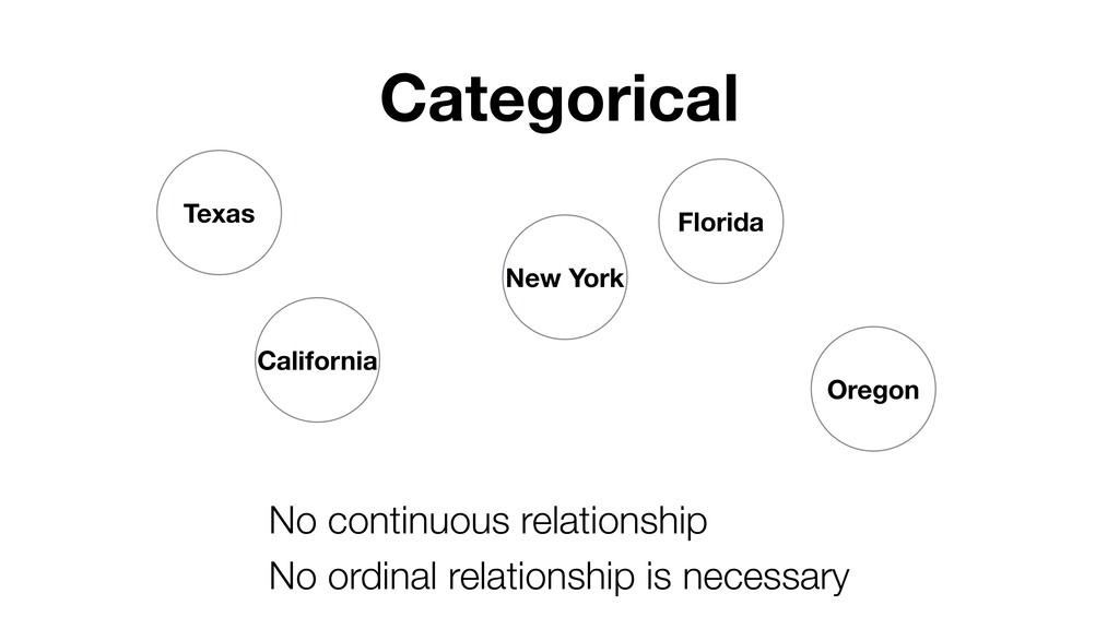
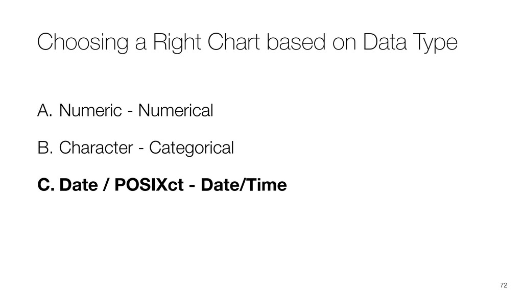
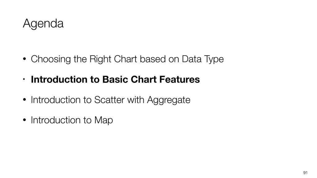
* Choosing the right charts based on the data type
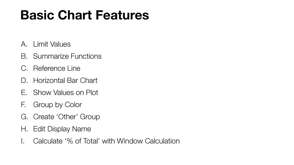
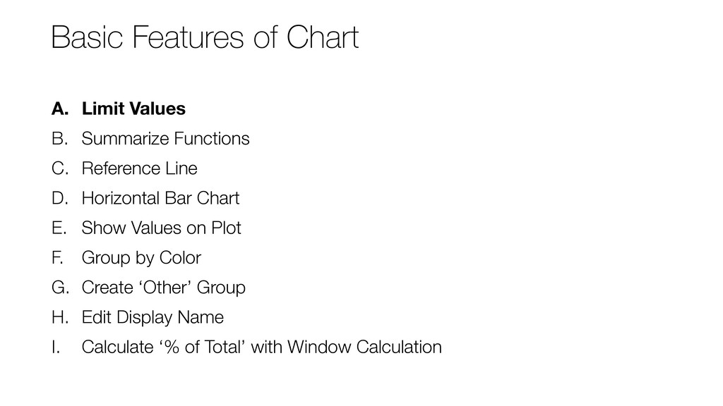
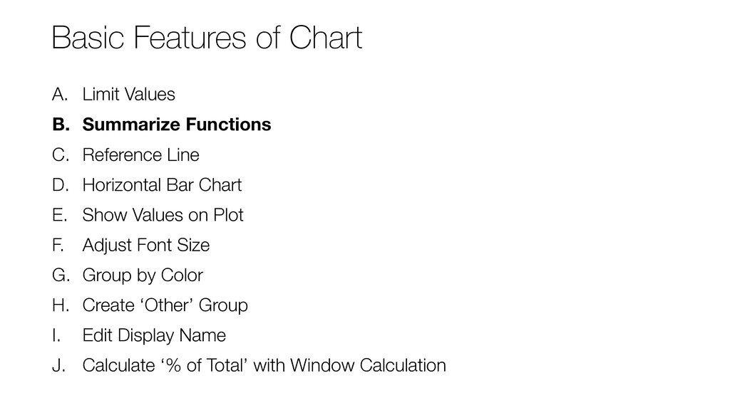
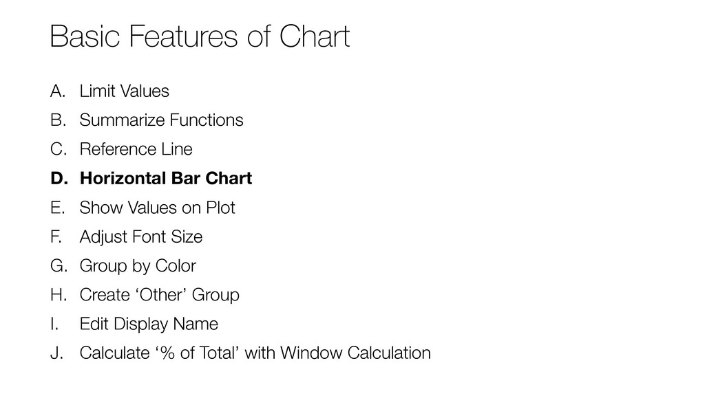
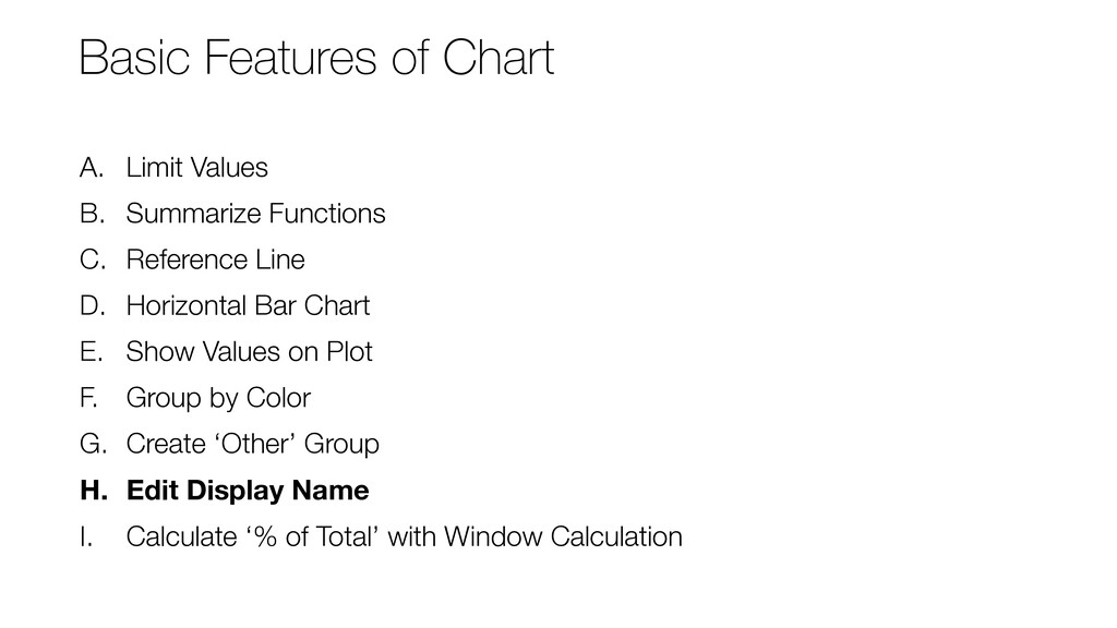
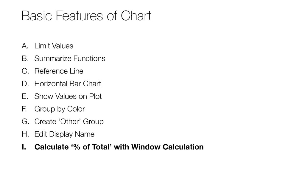
* Basic Chart Features in Exploratory
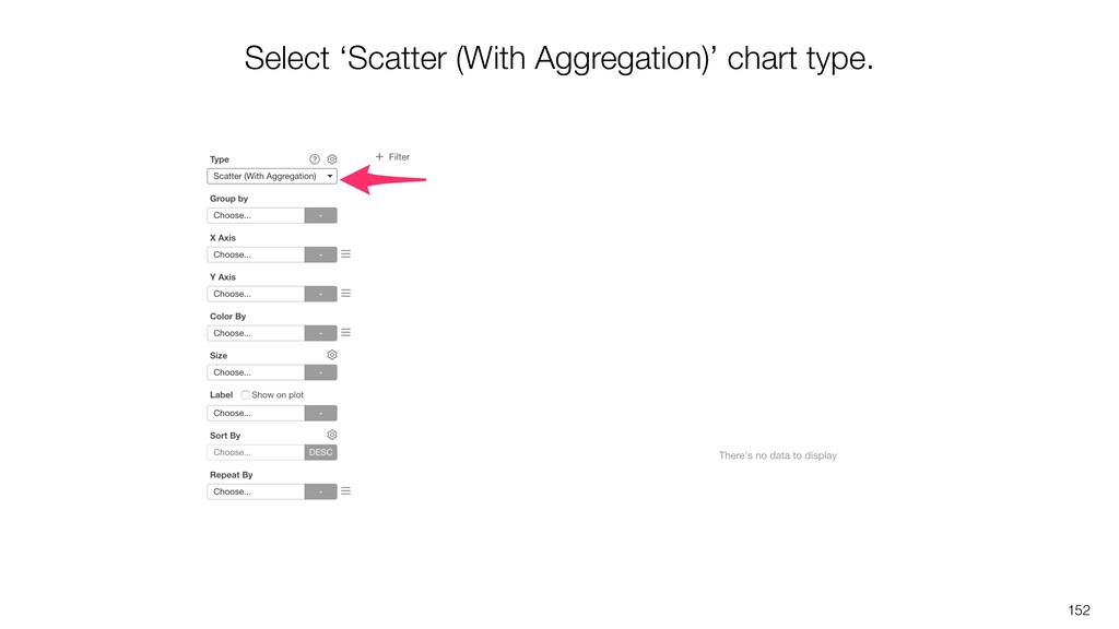
* Introduction to Bubble (Scatter) Chart
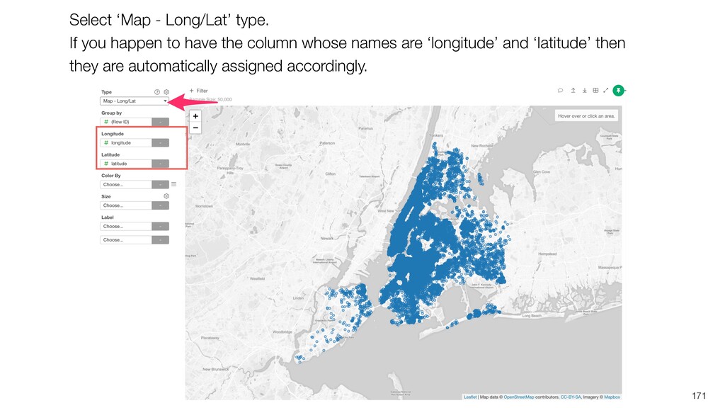
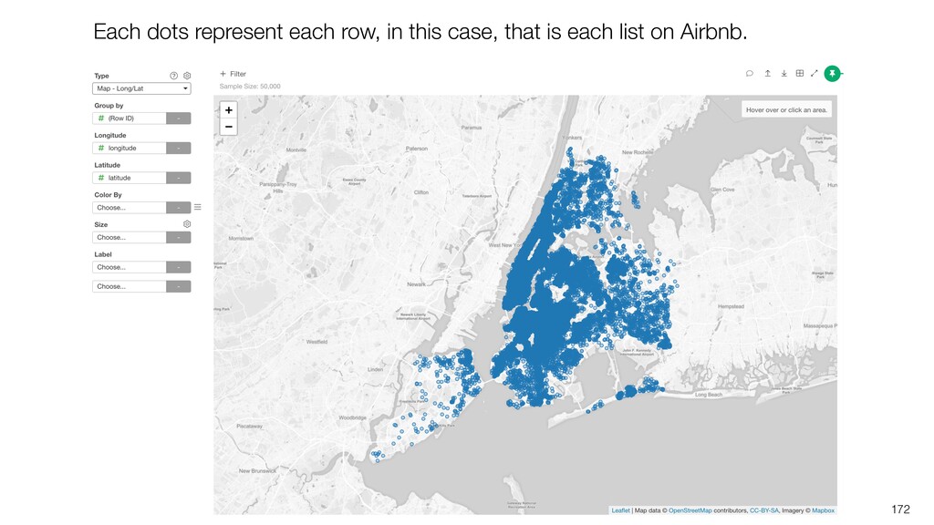
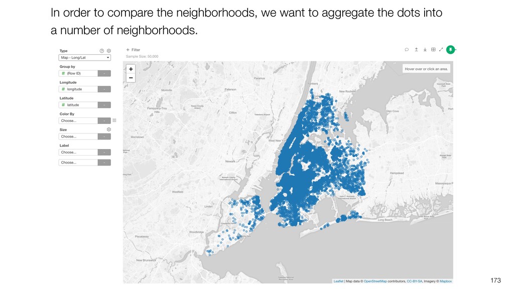
* Introduction to Map

Kan Nishida

April 29, 2020
Tweet

More Decks by Kan Nishida

Other Decks in Technology

Transcript

  1. Kan Nishida CEO/co-founder Exploratory Summary Beginning of 2016, launched Exploratory,

    Inc. to democratize Data Science. Prior to Exploratory, Kan was a director of product development at Oracle leading teams for building various Data Science products in areas including Machine Learning, BI, Data Visualization, Mobile Analytics, Big Data, etc. While at Oracle, Kan also provided training and consulting services to help organizations transform with data. @KanAugust Speaker
  2. Data Science is not just for Engineers and Statisticians. Exploratory

    makes it possible for Everyone to do Data Science. The Third Wave
  3. Questions Communication (Dashboard, Note, Slides) Data Access Data Wrangling Visualization

    Analytics (Statistics / Machine Learning) Data Analysis ExploratoryɹModern & Simple UI
  4. • Part 1 - Visualizing Summarized Data • Part 2

    - Visualizing Time Series Data • Part 3 - Visualizing Distribution & Correaltion • Part 4 - Visualizing Uncertainty • Part 5 - Data Wrangling for Data Visualization Exploratory - Data Visualization Workshop
  5. Part 1 - Visualizing Summarized Data 1. Choosing the Right

    Chart based on Data Type 2. Introduction to Basic Chart Features 3. Introduction to Scatter with Aggregate 4. Introduction to Map 9
  6. 1. Open Airbnb New York Data Page 2. Download the

    Data 3. Import the Data Import Data
  7. Part 1 - Visualizing Summarized Data 1. Choosing the Right

    Chart based on Data Type 2. Introduction to Basic Chart Features 3. Introduction to Scatter with Aggregate 4. Introduction to Map 24
  8. A different type of charts and Summary Statistics are shown

    for each column depending on the data type. 25
  9. A. Numeric - Numerical B. Character - Categorical C. Date

    / POSIXct - Date/Time D. Logical - Logical E. Factor - Ordinal Data Type 26
  10. 28

  11. Numerical 0 10 20 30 40 50 11 22 45

    Continuous Ordinal Relationship
  12. You can change the data type for multiple columns at

    once. Select multiple columns by using Command key (Mac) or Control key (Windows).
  13. The selected columns are listed and ‘Convert Data Type’ is

    selected in the Calculation Type in the dialog. Simply, click ‘Run’ button.
  14. Note that these operations are recorded at the right hand

    side as the Data Wrangling Steps. We’ll go into more details about the data wrangling in Part 4.
  15. 36 Let’s create the 1st chart to answer the following

    questions. • What is the price range from the lowest to the highest? • What are the common prices for the majority of the lists? • How much is the most expensive list?
  16. 39 Histogram Divide the numerical values into a set of

    range groups (e.g. from 10 to 100) and show the data size (number of rows) for each group as a height of bar.
  17. 40 1,000 1,500 2,200 2,500 3,000 6,500 7,100 2,200 3,800

    4,500 2,200 5,300 3,400 4,200 5,200 5,800 8,100 9,000 7,800
  18. 41 1,000 1,500 3,000 6,500 7,100 2,200 3,800 4,500 5,300

    3,400 4,200 5,200 5,800 8,100 7,800
  19. price 0 - 2,000 2,001 - 4,000 4,001 - 6,000

    6,001 - 8,000 8,001 - 10,000 42 Number of Rows
  20. 44 There are a few lists that are extremely high

    prices. These extreme values are called ‘Outliers’. We’ll go into more details about the outliers in the ‘Part 3 - Visualizing Variance & Correlation’
  21. 47 We can change the ‘Number of Bars’ to find

    the data distribution patterns at more granular level.
  22. 51 Let’s create another chart to answer the following questions.

    • What is the range of the accommodate type? • What are the most common accommodate types?
  23. 53 We can bring back the outliers to see all

    the accommodate types. Now we can see the highest number is 25.
  24. 54 The accommodate column is integer data, this means that

    we have only 25 unique values. This can be considered as a categorical column!
  25. 57 This time, we have only a handful number of

    values for the accommodate column so we want to see all the numbers as they are. We can select ‘As Number’ to show all the numerical values at X-Axis.
  26. 58 We can see how many lists there are for

    each of the accommodate values. Most of the lists are less than 4 people accommodation, and 2 people is the most common type.
  27. 61 When you assign a numerical column with a lot

    of unique values, the bar chart create a bar for each of the unique values. This makes it harder to recognize any patterns in the data.
  28. 63 We can see each of the unique price point

    has its own bar, but this would give you too much noise rather than presenting visual patterns you can recognize well.
  29. 64 With Histogram, we can see the overall patterns about

    how the data is distributed better.
  30. A. Numeric - Numerical B. Character - Categorical C. Date

    / POSIXct - Date/Time Choosing a Right Chart based on Data Type 65
  31. 67 Let’s create another chart to answer the following questions.

    • What are the neighborhoods with the most lists? • How many lists do they have and how much more compared to other neighborhoods?
  32. 69 We can see the number of lists by the

    neighborhoods, but there are too many.
  33. A. Numeric - Numerical B. Character - Categorical C. Date

    / POSIXct - Date/Time Choosing a Right Chart based on Data Type 72
  34. 74 Let’s create another chart to answer the following questions.

    • Are there more lists that have been added recently? • Have the number been increasing or decreasing? • Do more properties get listed on Airbnb in particular time of year?
  35. 77 When the column is Date (or POSIXct) column you’ll

    have a control of how you want to aggregate the data. And the chart respects the date order and intervals. Date order / interval are respected. Control the data aggregation level.
  36. Position Length Angle Slope Size Shape Volume Color Intensity Color

    Hue Visual Cue 83 Easier to Recognize Harder to Recognize
  37. Length 86 We are comparing the lengths of the bars.

    Easier to recognize how much a given bar is longer (higher) than the other bars.
  38. 87 Slope With Line chart, it’s easier to understand if

    the trend is going upward or downward and how steep the slope is.
  39. 89 The number of new lists increased from 2010 to

    2014, then decreased till 2018.
  40. 90 Visualizing the time series data has a lot more

    to explore! We’ll go into more details at the next workshop ‘Part 2 - Visualizing Time Series Data’!
  41. Agenda • Choosing the Right Chart based on Data Type

    • Introduction to Basic Chart Features • Introduction to Scatter with Aggregate • Introduction to Map 91
  42. A. Limit Values B. Summarize Functions C. Reference Line D.

    Horizontal Bar Chart E. Show Values on Plot F. Group by Color G. Create ‘Other’ Group H. Edit Display Name I. Calculate ‘% of Total’ with Window Calculation Basic Chart Features
  43. A. Limit Values B. Summarize Functions C. Reference Line D.

    Horizontal Bar Chart E. Show Values on Plot F. Group by Color G. Create ‘Other’ Group H. Edit Display Name I. Calculate ‘% of Total’ with Window Calculation Basic Features of Chart
  44. 96 Select the ‘neighborhood’ column for X-Axis and select ‘Y1

    Axis’ for Sort By to show the number of rows (or lists) for each bar and sort them from the highest to the lowest.
  45. 97 There are too many neighborhoods to show. How about

    showing only the top 30 neighborhoods based on the number of lists.
  46. A. Limit Values B. Summarize Functions C. Reference Line D.

    Horizontal Bar Chart E. Show Values on Plot F. Adjust Font Size G. Group by Color H. Create ‘Other’ Group I. Edit Display Name J. Calculate ‘% of Total’ with Window Calculation Basic Features of Chart
  47. 103 Assign the ‘price’ column to Y-Axis and select ‘Mean

    (Average)’ as the aggregate function.
  48. A. Limit Values B. Summarize Functions C. Reference Line D.

    Horizontal Bar Chart E. Show Values on Plot F. Adjust Font Size G. Group by Color H. Create ‘Other’ Group I. Edit Display Name J. Calculate ‘% of Total’ with Window Calculation Basic Features of Chart
  49. 111 We have limited the neighborhoods to the top 30.

    Let’s show all the neighborhoods.
  50. 112 Remove the Limit setting to show all the neighborhoods

    and see the neighborhoods that are cheaper than the overall average.
  51. A. Limit Values B. Summarize Functions C. Reference Line D.

    Horizontal Bar Chart E. Show Values on Plot F. Adjust Font Size G. Group by Color H. Create ‘Other’ Group I. Edit Display Name J. Calculate ‘% of Total’ with Window Calculation Basic Features of Chart
  52. 114 Click ‘Horizontal’ for the Orientation to show the bar

    chart in a horizontal way. This makes it easier to read the neighborhood names.
  53. A. Limit Values B. Summarize Functions C. Reference Line D.

    Horizontal Bar Chart E. Show Values on Plot F. Group by Color G. Create ‘Other’ Group H. Edit Display Name I. Calculate ‘% of Total’ with Window Calculation Basic Features of Chart
  54. A. Limit Values B. Summarize Functions C. Reference Line D.

    Horizontal Bar Chart E. Show Values on Plot F. Group by Color G. Create ‘Other’ Group H. Edit Display Name I. Calculate ‘% of Total’ with Window Calculation Basic Features of Chart
  55. 120 Let’s see what types of properties are more common

    for each neighborhood. Also, let’s find out there are common patterns or differences among the neighborhoods.
  56. 125 Looks the Apartment type is the most common for

    most of the neighborhoods. Some neighborhoods like Flushing seem to have less apartment type ratio.
  57. A. Limit Values B. Summarize Functions C. Reference Line D.

    Horizontal Bar Chart E. Show Values on Plot F. Group by Color G. Create ‘Other’ Group H. Edit Display Name I. Calculate ‘% of Total’ with Window Calculation Basic Features of Chart
  58. 128 When you assign a column with more than 20

    unique values, it automatically creates a ‘Others’ group. It keeps the 20 most frequent categories and combine everything else into the ‘Others’ group.
  59. 129 What if we want to show only the top

    10 property types and make everything else to be ‘Others’?
  60. 130 Click the green text ‘Frequency 20 (35)’ to open

    the ‘Other Group’ setting dialog.
  61. 131 Set 10 to keep the top 10 categories and

    make everything else as the ‘Others’ group.
  62. 132

  63. A. Limit Values B. Summarize Functions C. Reference Line D.

    Horizontal Bar Chart E. Show Values on Plot F. Group by Color G. Create ‘Other’ Group H. Edit Display Name I. Calculate ‘% of Total’ with Window Calculation Basic Features of Chart
  64. 134 We want to edit the names inside the legend.

    Also, we want to combine some categories by editing the names. For example: • Make ‘Boutique hotel’ and ‘Hotel’ as ‘Hotel’. • Make ‘Condominium’ and ‘Apartment’ as ‘Apartment’.
  65. 135

  66. 137 Enter the display names for the ones you want

    to change. Boutique hotel -> Hotel Condominium -> Apartment
  67. A. Limit Values B. Summarize Functions C. Reference Line D.

    Horizontal Bar Chart E. Show Values on Plot F. Group by Color G. Create ‘Other’ Group H. Edit Display Name I. Calculate ‘% of Total’ with Window Calculation Basic Features of Chart
  68. 140 Are there any differences among the neighborhoods based on

    the property types? We want to show the ratio of each property type for each neighborhood.
  69. 142 Select ‘% of’ for the Calculation Type and keep

    ‘Sum (Total)’ as the Summarize option.
  70. 143 Now we can see the ratio of each property

    type for each neighborhood.
  71. 144 Overall, the apartment type is the most frequent type

    for all the neighborhoods. Some neighborhoods like East Flatbush and Flushing have higher ratio of the house property type.
  72. Agenda • Choosing the Right Chart based on Data Type

    • Introduction to Basic Chart Features • Introduction to Scatter with Aggregate (Bubble chart) • Introduction to Map 145
  73. 148

  74. 150 We want to compare the neighborhoods by using these

    2 numerical columns and answer the following questions. • Which neighborhoods are more expensive and with higher review scores? • Also, which neighborhoods are more expensive but with lower scores?
  75. 155 There is a circle that shows the overall average

    of the review score and the overall average of the price.
  76. 156 Assign the ‘neighborhood’ column to ‘Group By’ so that

    we can break down the circle into neighborhoods.
  77. 157 This neighborhood has the lowest score and is cheaper.

    This neighborhood is the most expensive but the score is not that great.
  78. 159 Assign ‘neighborhood’ to ‘Group By’ so that we can

    break down the circle into number of the groups.
  79. 160 Let’s create 4 regions based on the price and

    the review score. Low Price / High Review Score High Price / High Review Score High Price / Low Review Score Low Price / Low Review Score
  80. 161 Add a reference line for X Axis to show

    the overall average score.
  81. 165

  82. 167 Looks that the neighborhoods in Manhattan (Green) tend to

    be more expensive but have lower review scores.
  83. Agenda • Choosing the Right Chart based on Data Type

    • Introduction to Basic Chart Features • Introduction to Scatter with Aggregate • Introduction to Map 169
  84. 170 • Which neighborhoods have more properties? • Which neighborhoods

    are more expensive? These questions can be answered by using Bar and Bubble charts. But can we see the geographical patterns at the same time? Map!!
  85. 171 Select ‘Map - Long/Lat’ type. If you happen to

    have the column whose names are ‘longitude’ and ‘latitude’ then they are automatically assigned accordingly.
  86. 173 In order to compare the neighborhoods, we want to

    aggregate the dots into a number of neighborhoods.
  87. 175 We can see that each dot represents each neighborhood.

    Now, we want to see how many lists each neighborhood has.
  88. 176 Assign ‘Number of Rows’ to the Size to visualize

    the numbers by using the circle size.
  89. 182 You can select a different color palette from the

    menu and also set higher value for the Opacity to make the color less transparent.
  90. 184 You can also change the background to ‘Dark’ so

    that it’s even easier to see all the circles and spot the ones with higher price values.
  91. • Part 1 - Basics: Visualizing Summarized Data • Part

    2 - Visualizing Time Series Data • Part 3 - Visualizing Distribution & Correaltion • Part 4 - Visualizing Uncertainty • Part 5 - Data Wrangling for Data Visualization Data Visualization Workshop