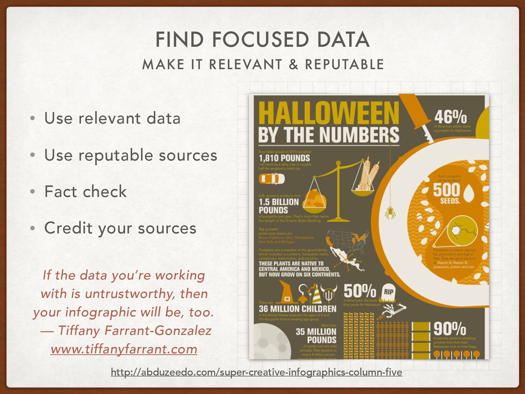
relevant data • Use reputable sources • Fact check • Credit your sources If the data you’re working with is untrustworthy, then your infographic will be, too. — Tiffany Farrant-Gonzalez www.tiffanyfarrant.com http://abduzeedo.com/super-creative-infographics-column-five
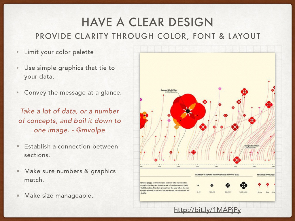
DESIGN • Limit your color palette • Use simple graphics that tie to your data. • Convey the message at a glance. Take a lot of data, or a number of concepts, and boil it down to one image. - @mvolpe • Establish a connection between sections. • Make sure numbers & graphics match. • Make size manageable. http://bit.ly/1MAPjPy
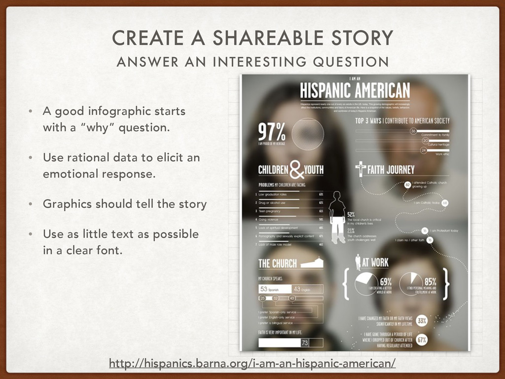
good infographic starts with a “why” question. • Use rational data to elicit an emotional response. • Graphics should tell the story • Use as little text as possible in a clear font. http://hispanics.barna.org/i-am-an-hispanic-american/