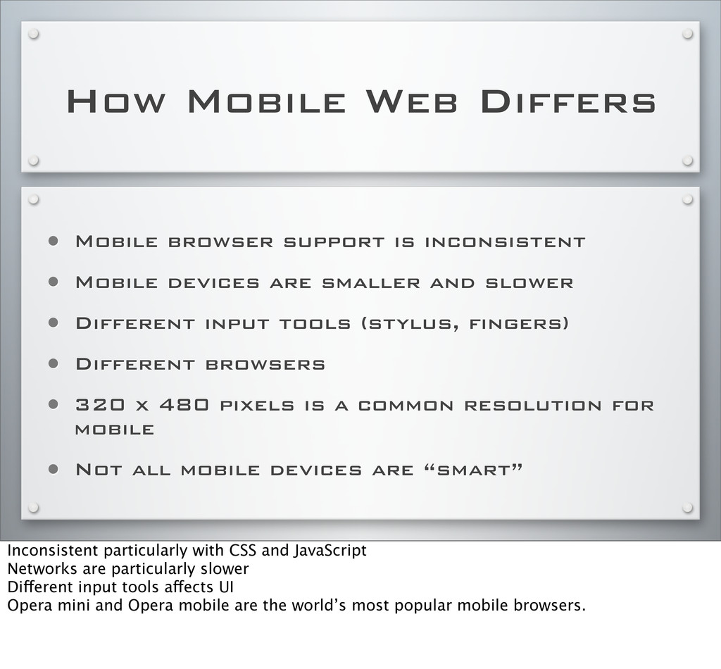
• Mobile devices are smaller and slower • Different input tools (stylus, fingers) • Different browsers • 320 x 480 pixels is a common resolution for mobile • Not all mobile devices are “smart” Inconsistent particularly with CSS and JavaScript Networks are particularly slower Different input tools affects UI Opera mini and Opera mobile are the world’s most popular mobile browsers.
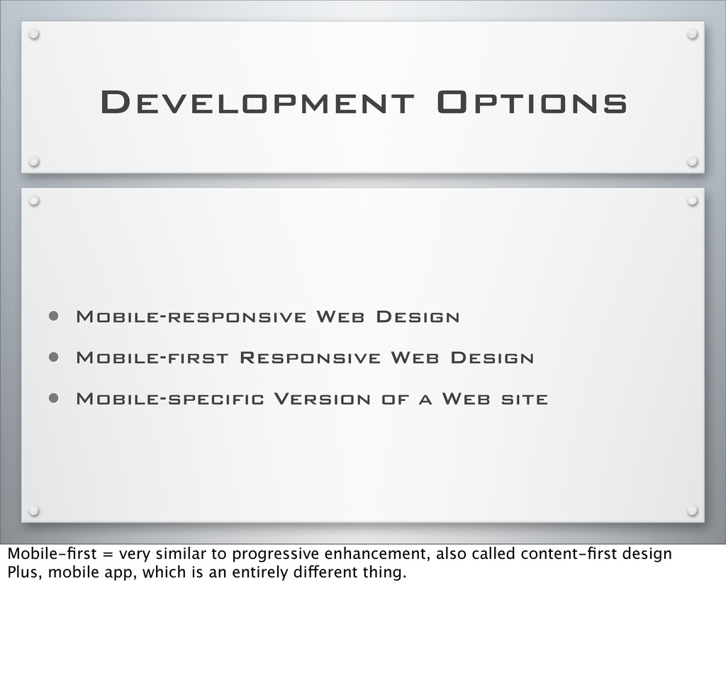
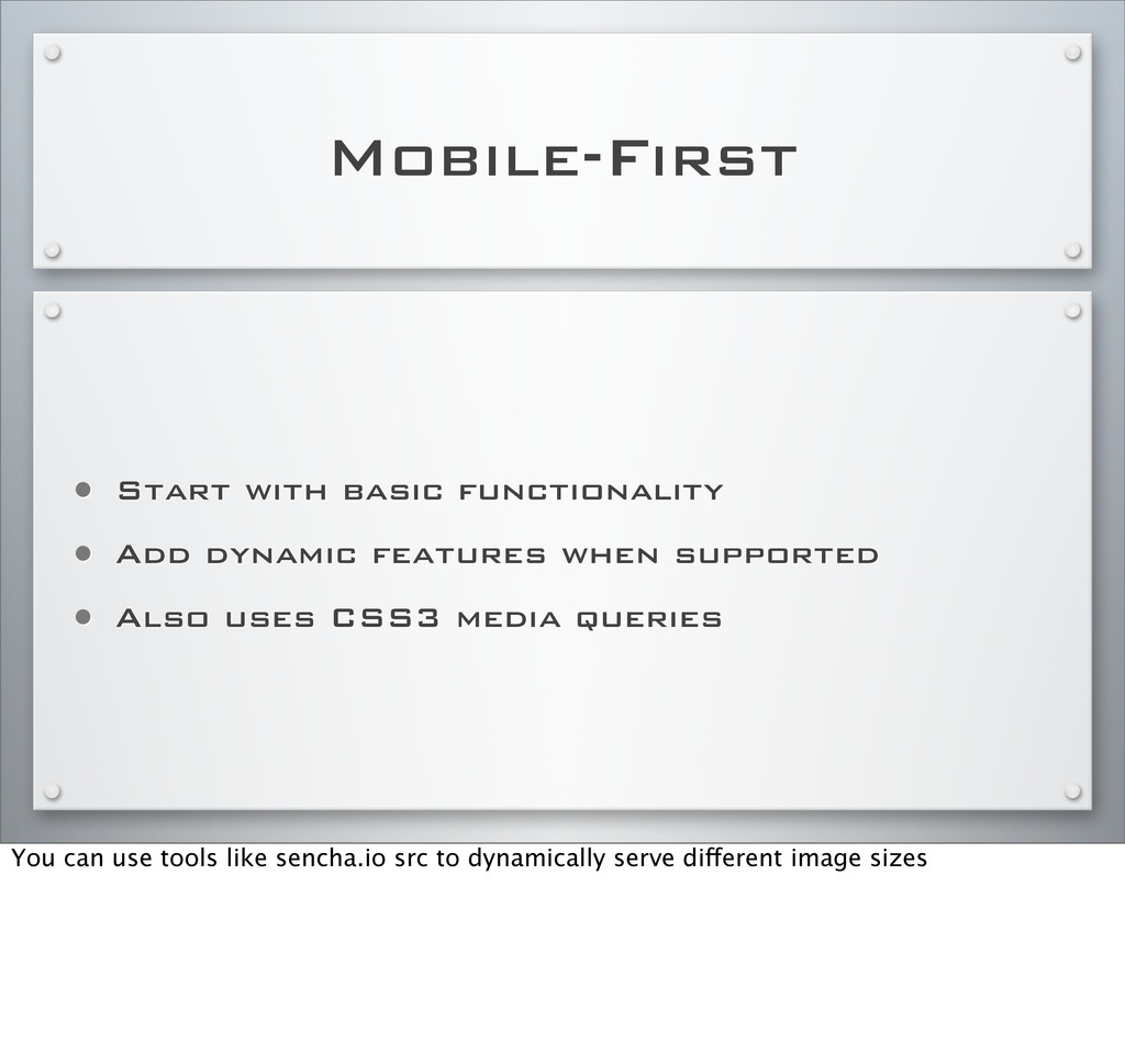
Design • Mobile-specific Version of a Web site Mobile-first = very similar to progressive enhancement, also called content-first design Plus, mobile app, which is an entirely different thing.
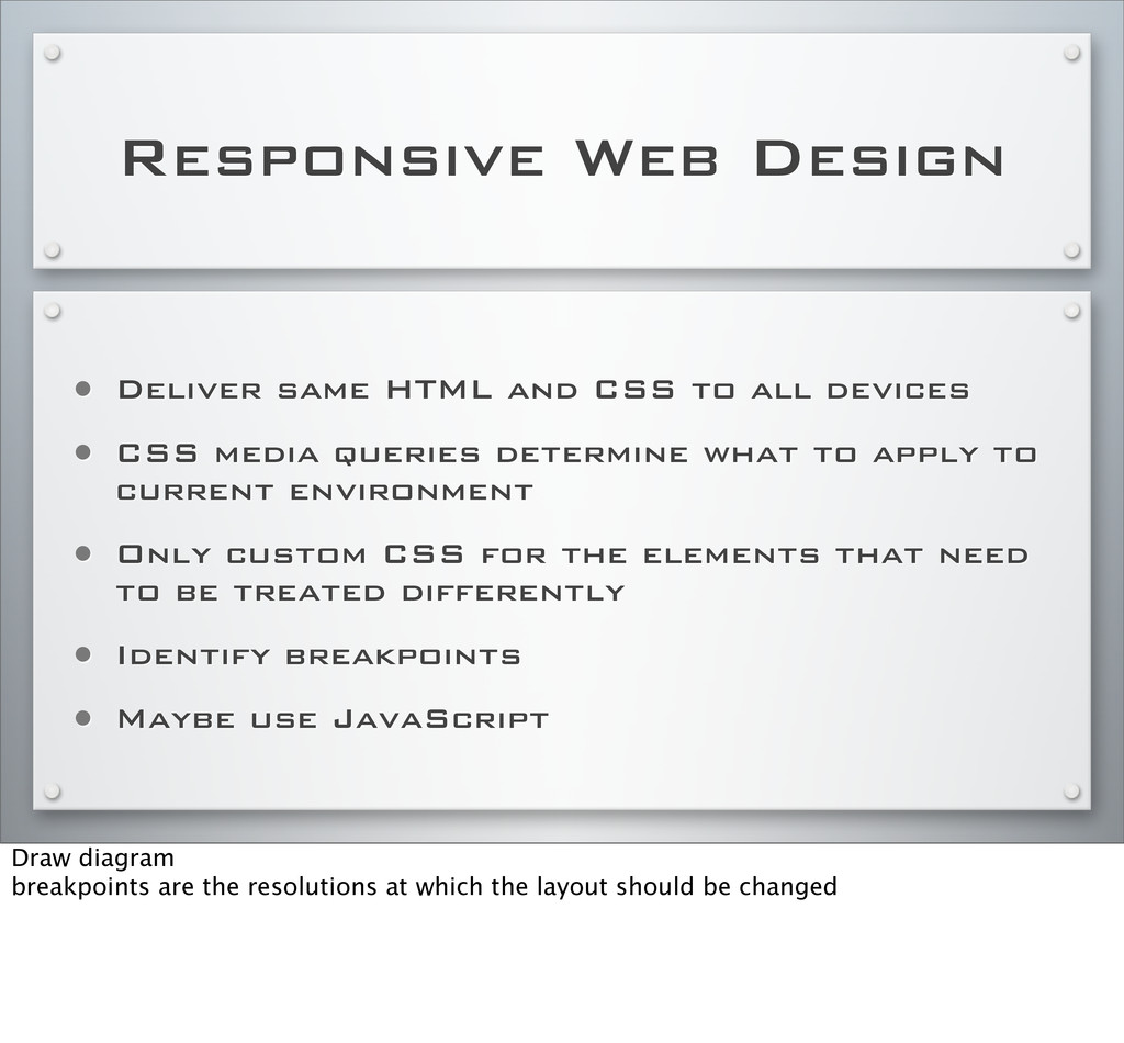
all devices • CSS media queries determine what to apply to current environment • Only custom CSS for the elements that need to be treated differently • Identify breakpoints • Maybe use JavaScript Draw diagram breakpoints are the resolutions at which the layout should be changed
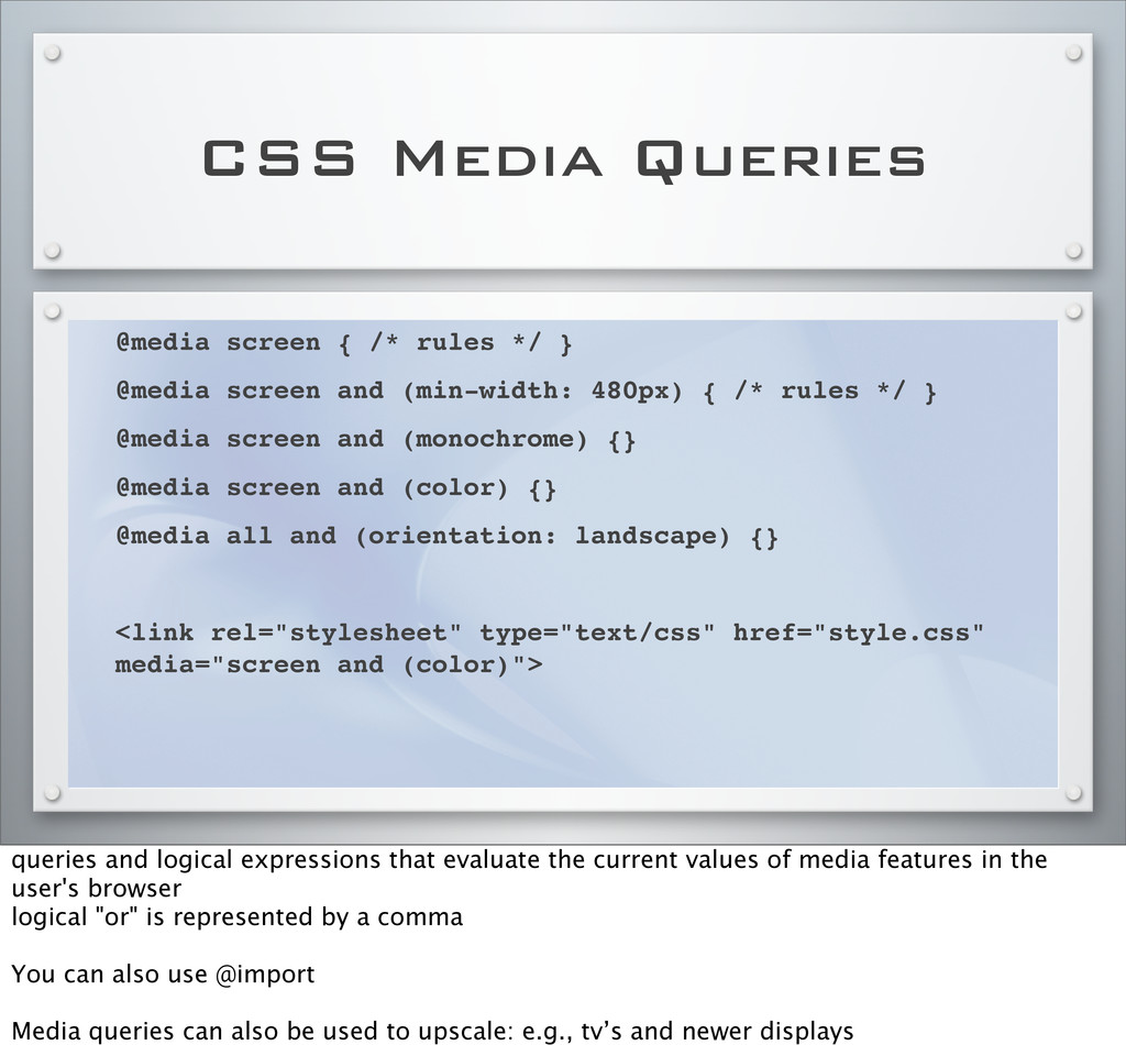
@media screen and (min-width: 480px) { /* rules */ } @media screen and (monochrome) {} @media screen and (color) {} @media all and (orientation: landscape) {} <link rel="stylesheet" type="text/css" href="style.css" media="screen and (color)"> queries and logical expressions that evaluate the current values of media features in the user's browser logical "or" is represented by a comma You can also use @import Media queries can also be used to upscale: e.g., tv’s and newer displays
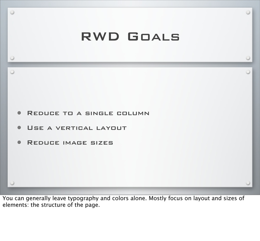
a vertical layout • Reduce image sizes You can generally leave typography and colors alone. Mostly focus on layout and sizes of elements: the structure of the page.
rel="stylesheet" type="text/css" href="layout.css" media="all" /> <![endif]--> Not supported in IE8 and earlier You can use the conditional comments, only supported by IE, to add in IE specific CSS.
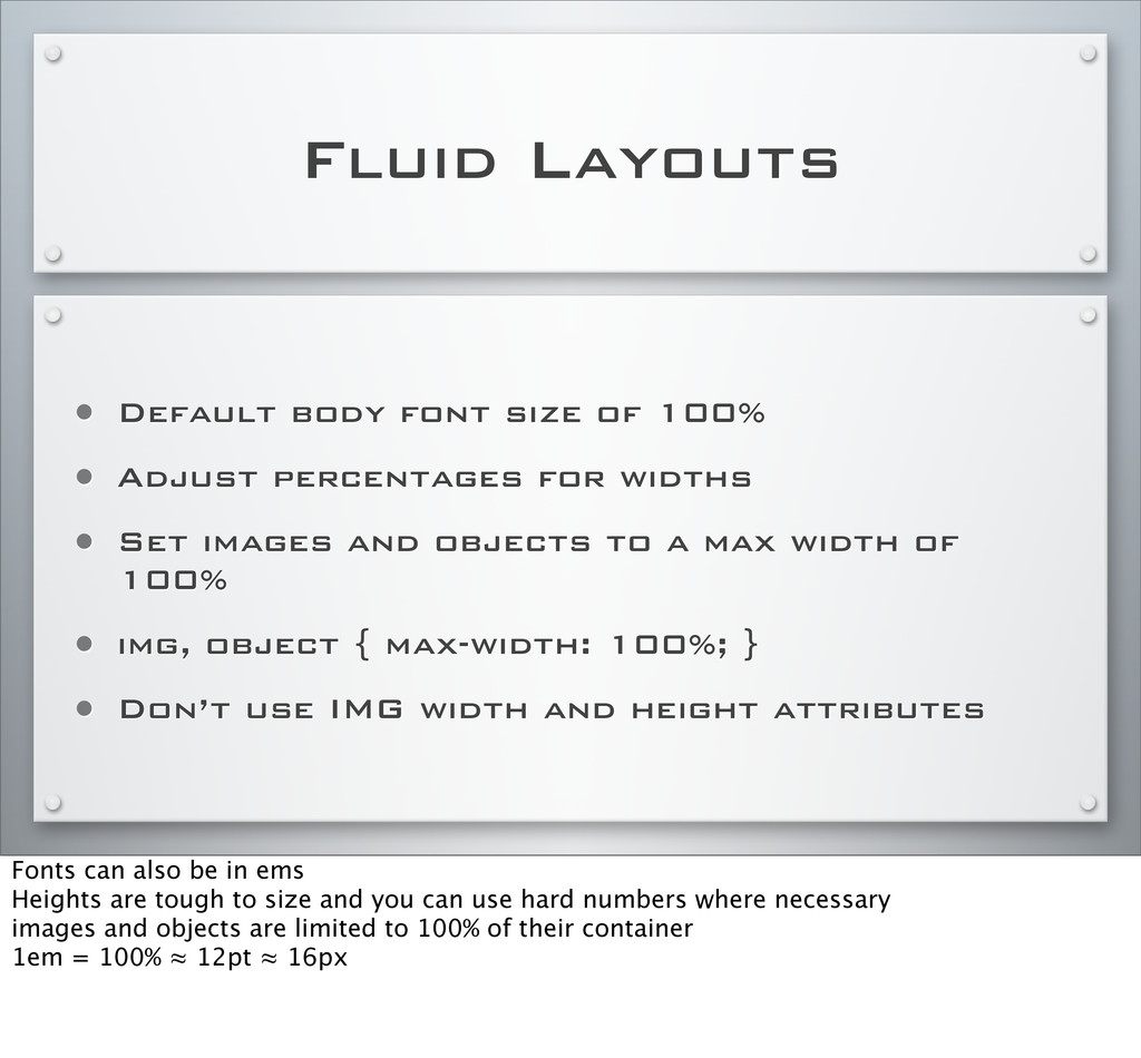
Adjust percentages for widths • Set images and objects to a max width of 100% • img, object { max-width: 100%; } • Don’t use IMG width and height attributes Fonts can also be in ems Heights are tough to size and you can use hard numbers where necessary images and objects are limited to 100% of their container 1em = 100% ≈ 12pt ≈ 16px
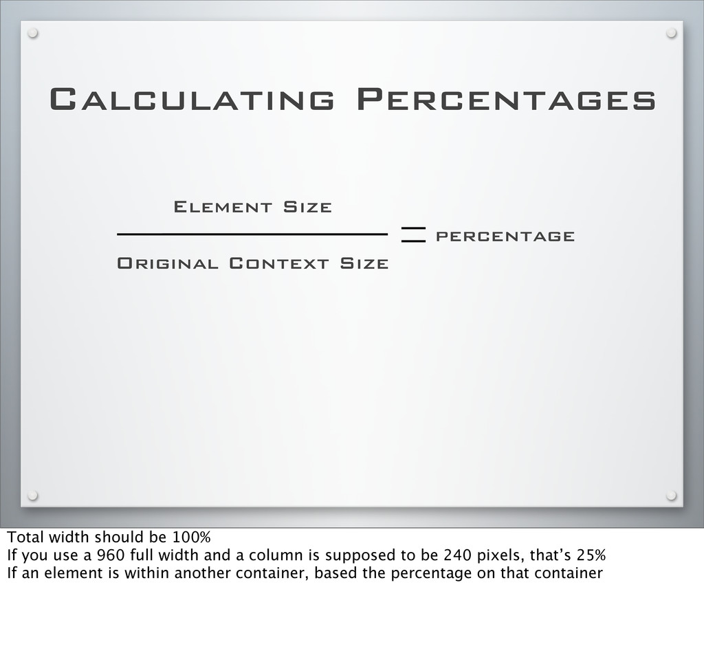
should be 100% If you use a 960 full width and a column is supposed to be 240 pixels, that’s 25% If an element is within another container, based the percentage on that container
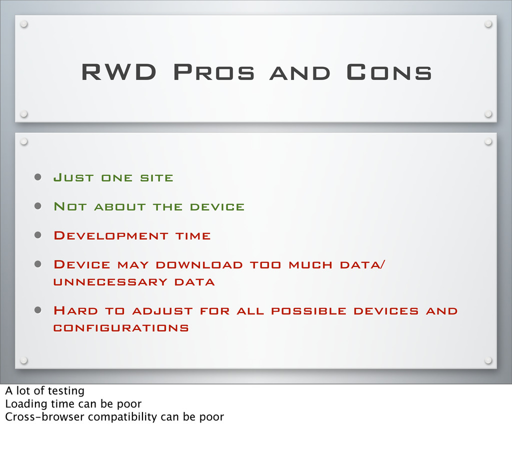
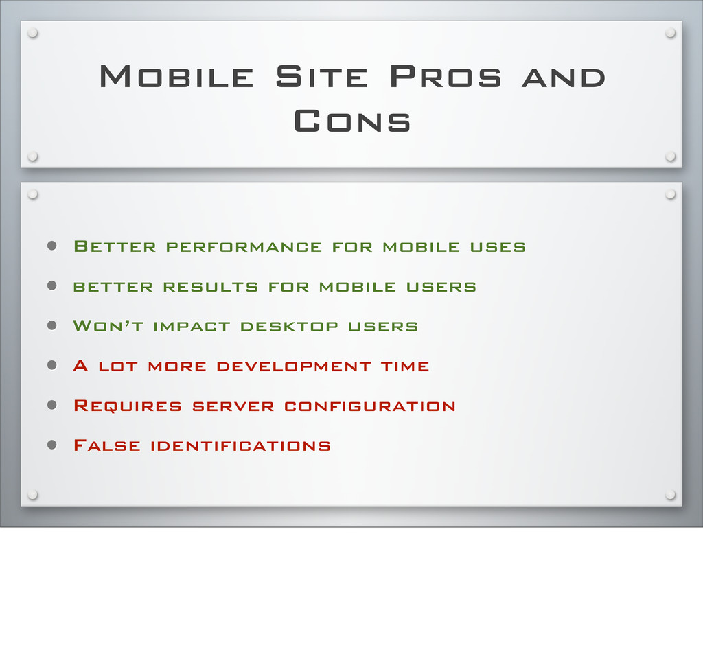
about the device • Development time • Device may download too much data/ unnecessary data • Hard to adjust for all possible devices and configurations A lot of testing Loading time can be poor Cross-browser compatibility can be poor
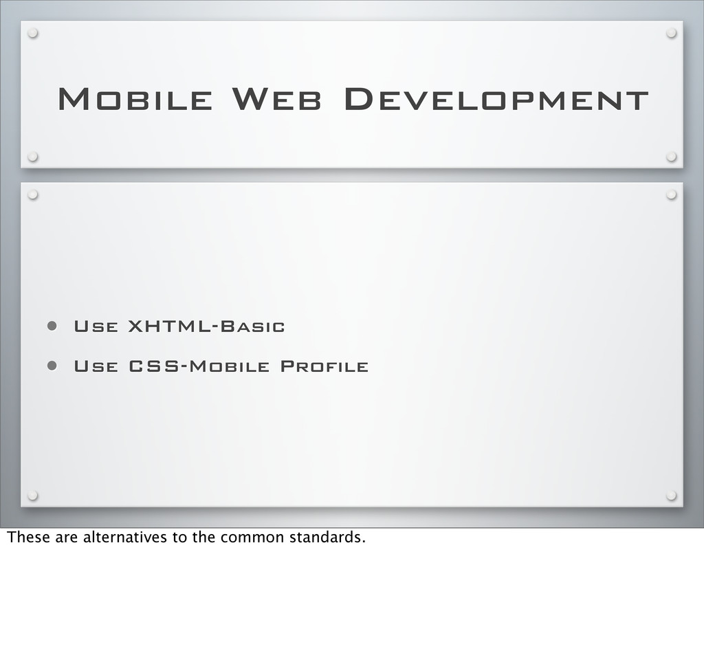
users go to main domain • Detect and redirect Detection is done via user-agent sniffing. Most major Web sites do do this. www.detectmobilebrowsers.com XHTML-Basic replaces XHMTL-MP
uses • better results for mobile users • Won’t impact desktop users • A lot more development time • Requires server configuration • False identifications
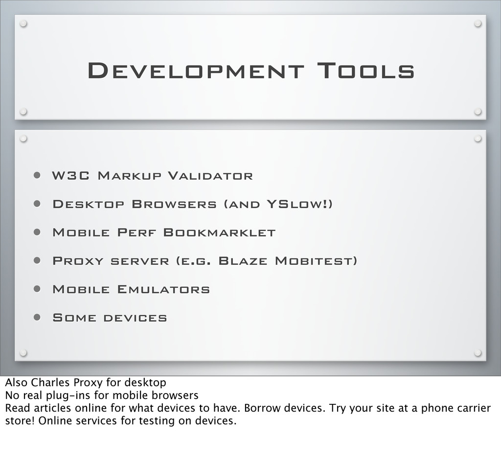
YSlow!) • Mobile Perf Bookmarklet • Proxy server (e.g. Blaze Mobitest) • Mobile Emulators • Some devices Also Charles Proxy for desktop No real plug-ins for mobile browsers Read articles online for what devices to have. Borrow devices. Try your site at a phone carrier store! Online services for testing on devices.
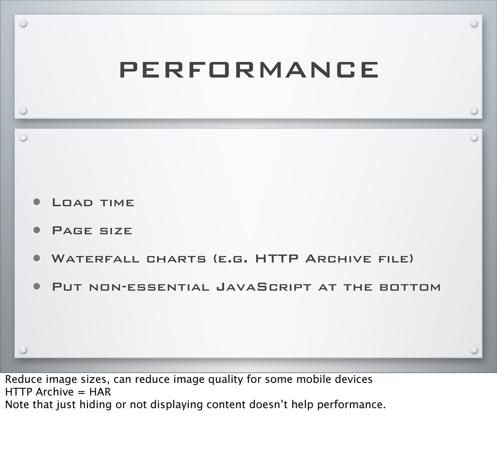
(e.g. HTTP Archive file) • Put non-essential JavaScript at the bottom Reduce image sizes, can reduce image quality for some mobile devices HTTP Archive = HAR Note that just hiding or not displaying content doesn’t help performance.
separate, mobile version of a Web site You can use CSS Media Queries with this, for example, to create a tablet version that’s different than a phone version.
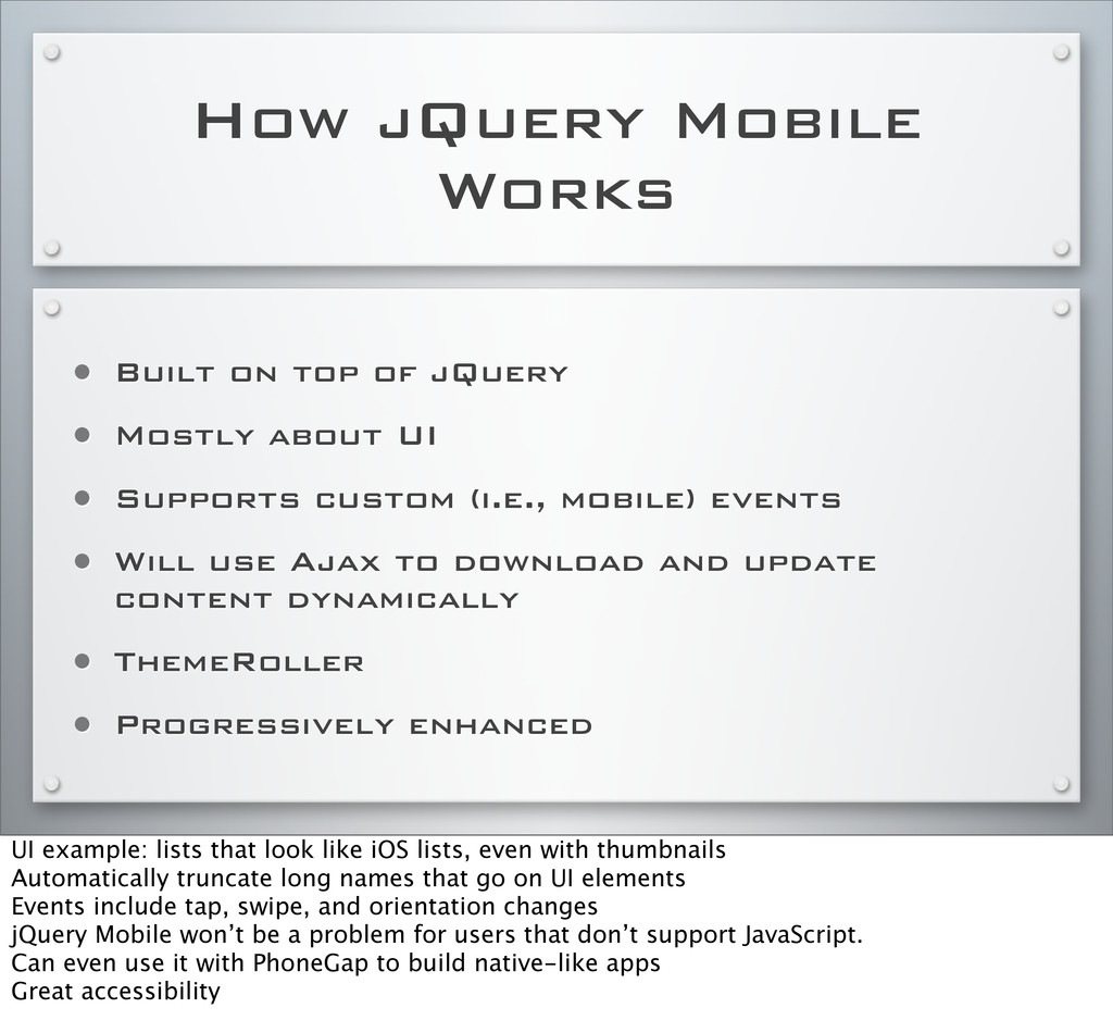
• Mostly about UI • Supports custom (i.e., mobile) events • Will use Ajax to download and update content dynamically • ThemeRoller • Progressively enhanced UI example: lists that look like iOS lists, even with thumbnails Automatically truncate long names that go on UI elements Events include tap, swipe, and orientation changes jQuery Mobile won’t be a problem for users that don’t support JavaScript. Can even use it with PhoneGap to build native-like apps Great accessibility
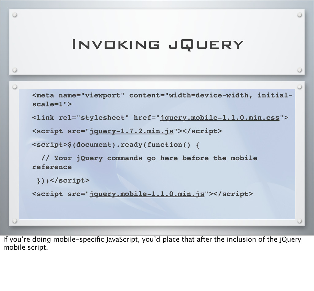
<script src="jquery-1.7.2.min.js"></script> <script>$(document).ready(function() { // Your jQuery commands go here before the mobile reference });</script> <script src="jquery.mobile-1.1.0.min.js"></script> If you’re doing mobile-specific JavaScript, you’d place that after the inclusion of the jQuery mobile script.
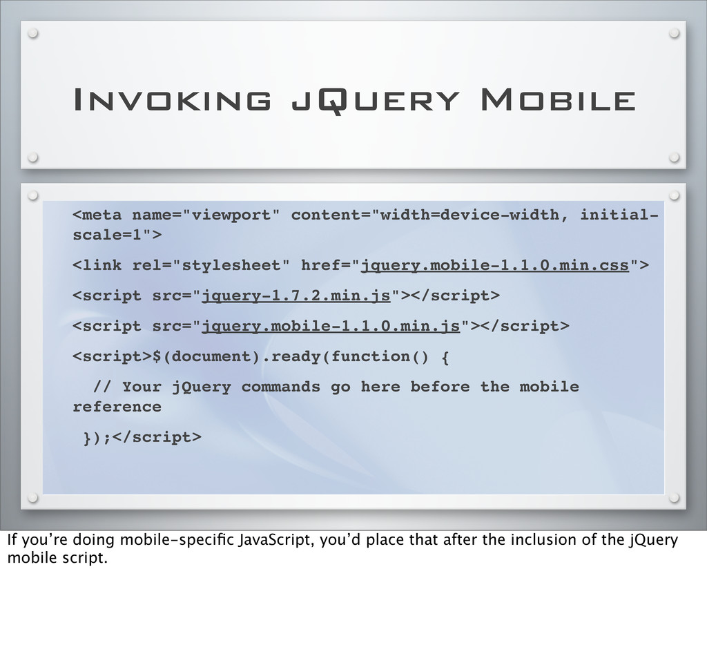
href="jquery.mobile-1.1.0.min.css"> <script src="jquery-1.7.2.min.js"></script> <script src="jquery.mobile-1.1.0.min.js"></script> <script>$(document).ready(function() { // Your jQuery commands go here before the mobile reference });</script> If you’re doing mobile-specific JavaScript, you’d place that after the inclusion of the jQuery mobile script.
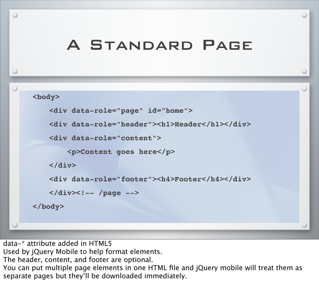
data-role="header"><h1>Header</h1></div> ! <div data-role="content"> ! <p>Content goes here</p> ! </div> ! <div data-role="footer"><h4>Footer</h4></div> ! </div><!-- /page --> </body> data-* attribute added in HTML5 Used by jQuery Mobile to help format elements. The header, content, and footer are optional. You can put multiple page elements in one HTML file and jQuery mobile will treat them as separate pages but they’ll be downloaded immediately.
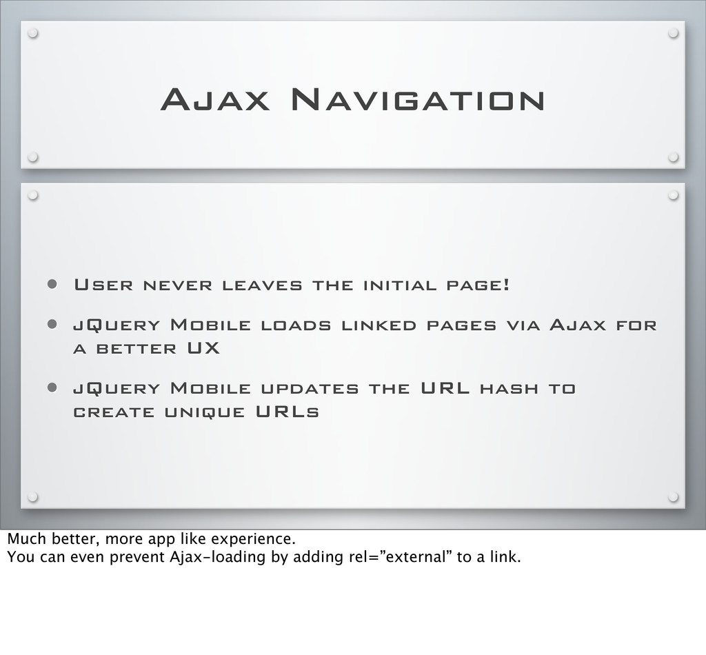
jQuery Mobile loads linked pages via Ajax for a better UX • jQuery Mobile updates the URL hash to create unique URLs Much better, more app like experience. You can even prevent Ajax-loading by adding rel=”external” to a link.
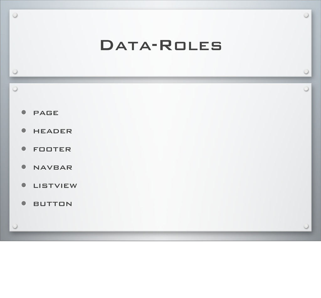
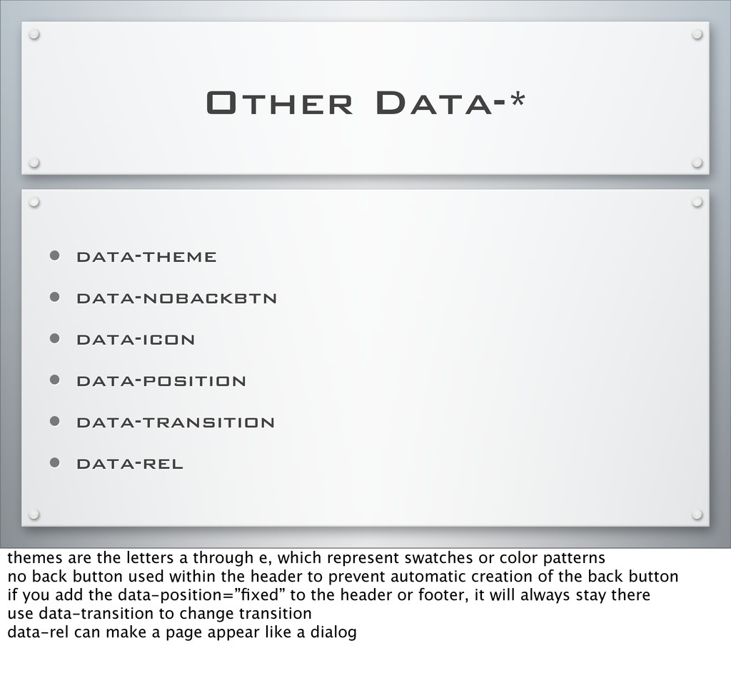
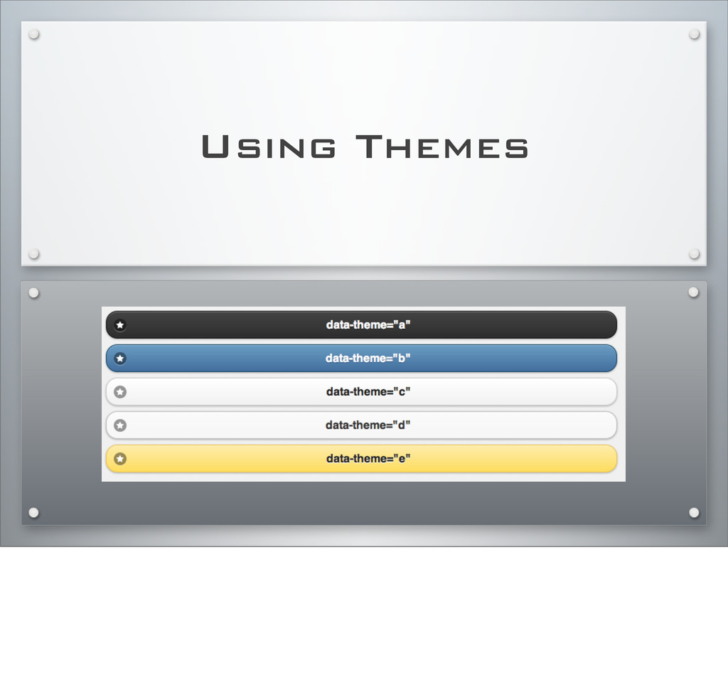
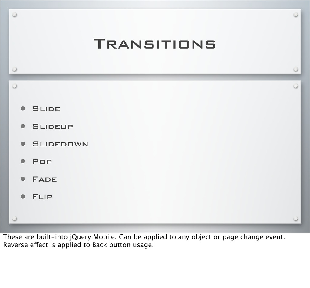
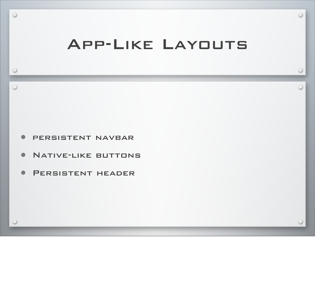
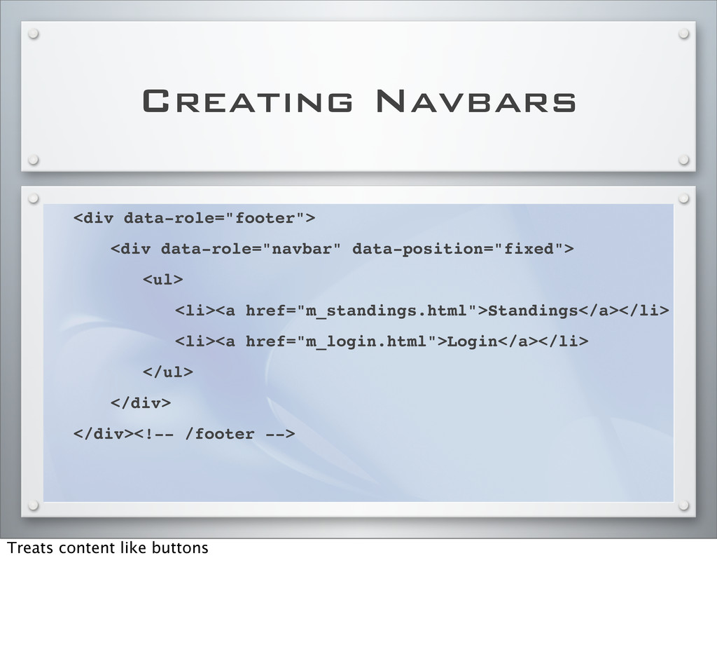
• data-transition • data-rel themes are the letters a through e, which represent swatches or color patterns no back button used within the header to prevent automatic creation of the back button if you add the data-position=”fixed” to the header or footer, it will always stay there use data-transition to change transition data-rel can make a page appear like a dialog
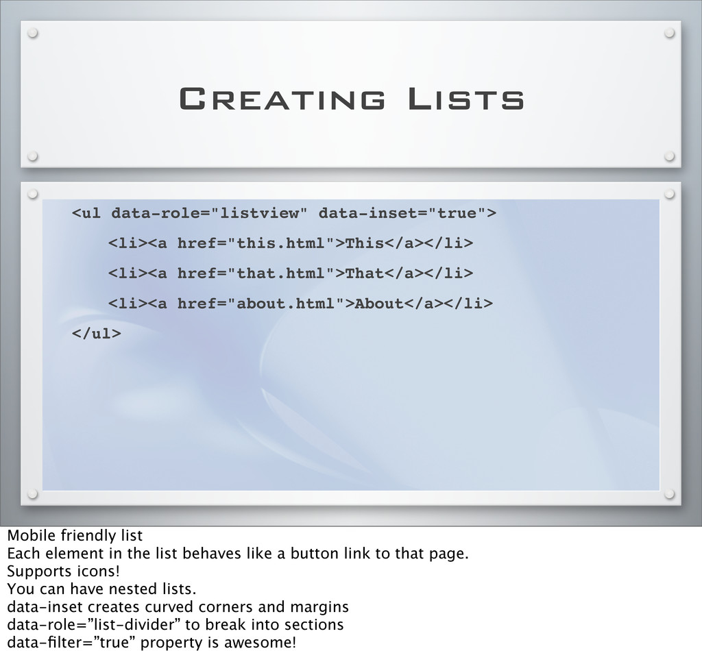
href="that.html">That</a></li> ! <li><a href="about.html">About</a></li> </ul> Mobile friendly list Each element in the list behaves like a button link to that page. Supports icons! You can have nested lists. data-inset creates curved corners and margins data-role=”list-divider” to break into sections data-filter=”true” property is awesome!
data-rel=”dialog” attribute. Must be a reference to a complete HTML jQuery Mobile page. Rounded corners, margins, dark background. May want to specify the transition for it.
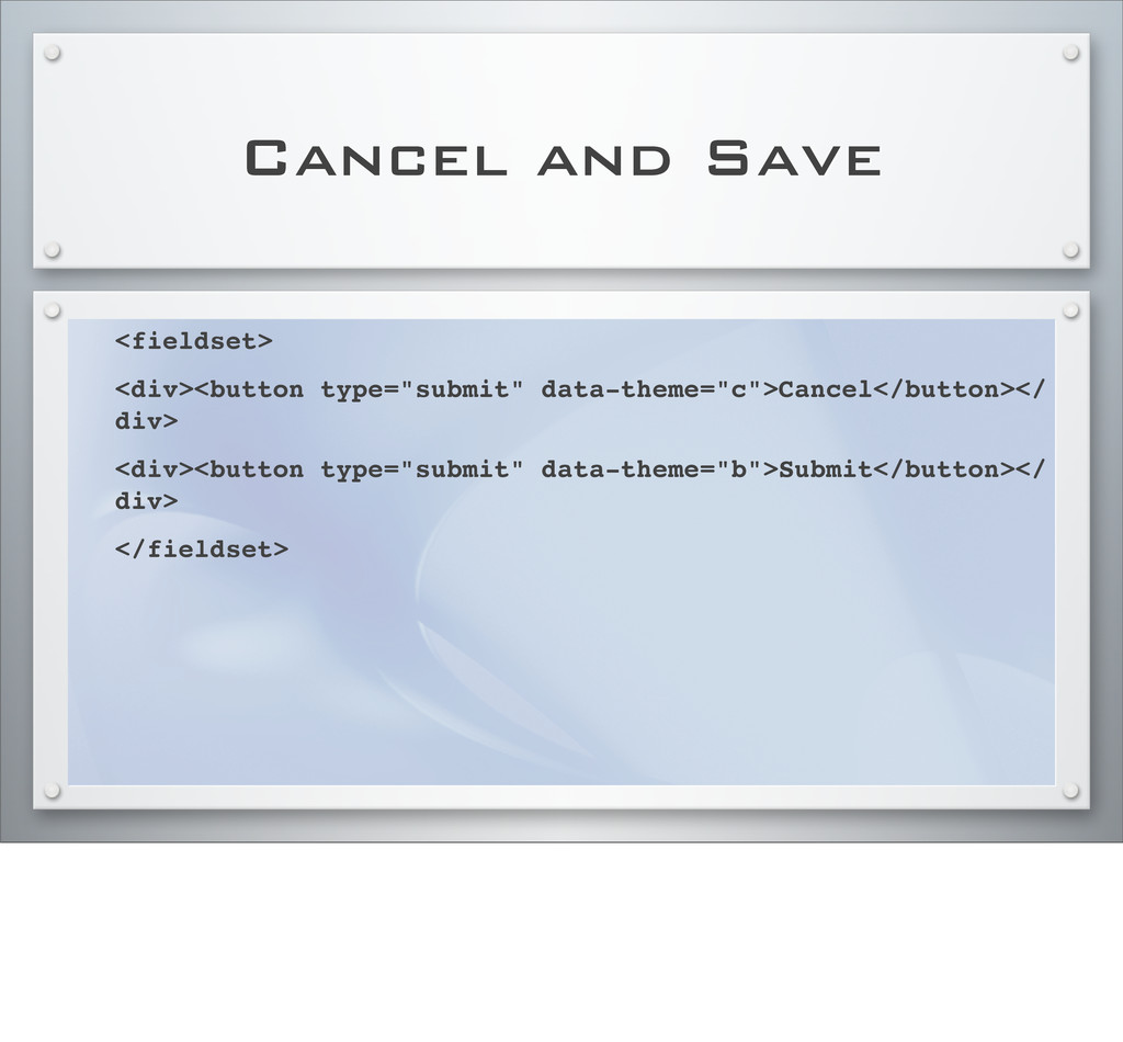
type="text" name="name" id="name" value=""> </div> </form> Use full path for the action attribute Form elements are touch optimized versions of standard inputs. Wrap each label-input pair in a div with a data-role of “fieldcontain” Labels and fields will be arranged based upon the available width
 larryullman
 jnchito
 appleboy
 odan611
 isaoshimizu
 shift_evolve
 maf_0521
 gotok365
 yoshiki0705
 iotcomjpadmin
 ks91
ks91
 ymty
ymty
 rkendrick25
 addyosmani
 bryan
bryan
 axbom
axbom
 rasagy
 greggifford
 427marketing
 gurzu
gurzu
 carmenintech
 dougneiner
 soudai
 morganepeng
![CSS Media Queries & IE <!--[if (lt IE 9)&(!IEMobile)]> <link](https://files.speakerdeck.com/presentations/4ffa185cf7c9f100090022f1/slide_9.jpg)