Hi all. Today, I'd like to talk about information visualization and GIS. Infovis is one of the reasons that helped me to decide on studying GIS. So you may understand my surprise since starting the GIS program, despite the amount of maps we make from data we're given, there's little or no reference to the maps as an infovis. So I'll go over why it's important to relate GIS into that context.
fit into information visualization? • What are some tools to present GIS information visualization? • Resources And I’ll include examples for each of the items.
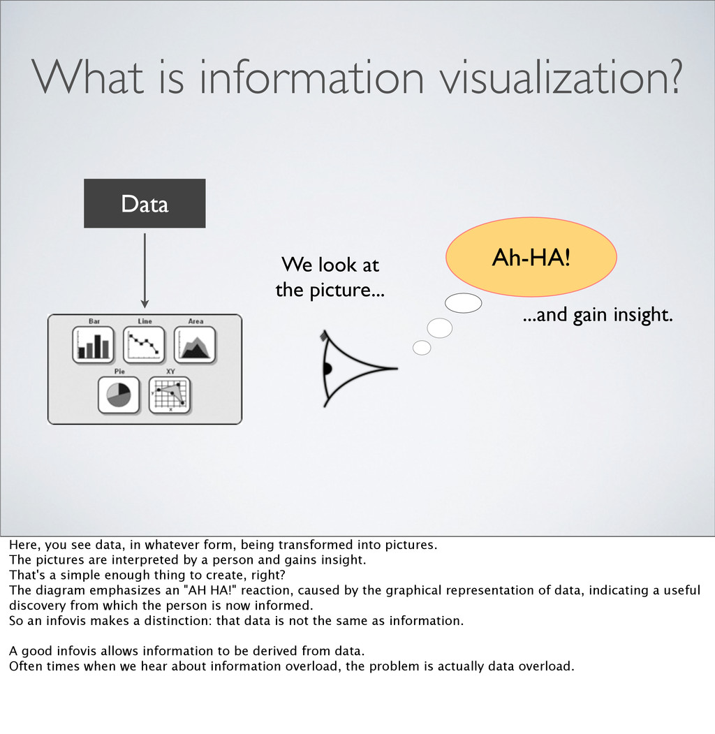
What is information visualization? Here, you see data, in whatever form, being transformed into pictures. The pictures are interpreted by a person and gains insight. That's a simple enough thing to create, right? The diagram emphasizes an "AH HA!" reaction, caused by the graphical representation of data, indicating a useful discovery from which the person is now informed. So an infovis makes a distinction: that data is not the same as information. A good infovis allows information to be derived from data. Often times when we hear about information overload, the problem is actually data overload.
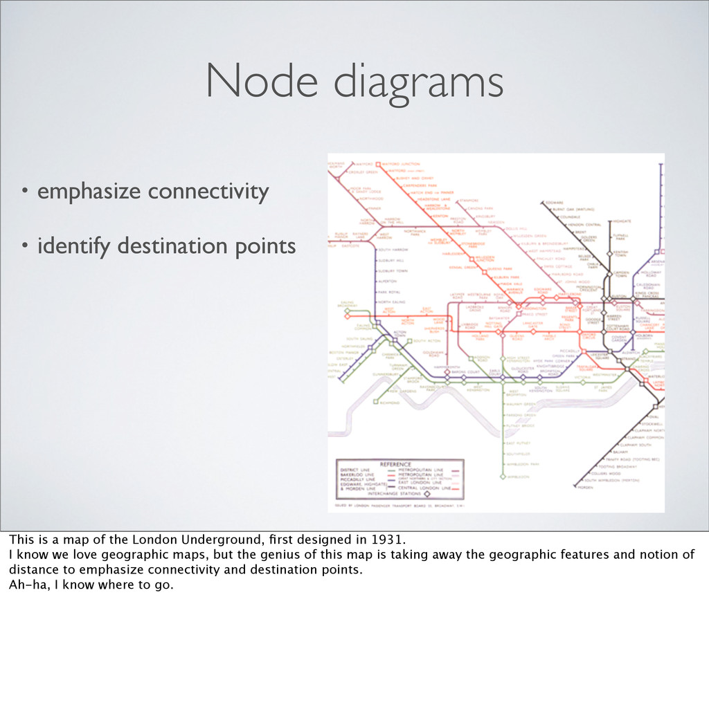
is a map of the London Underground, first designed in 1931. I know we love geographic maps, but the genius of this map is taking away the geographic features and notion of distance to emphasize connectivity and destination points. Ah-ha, I know where to go.
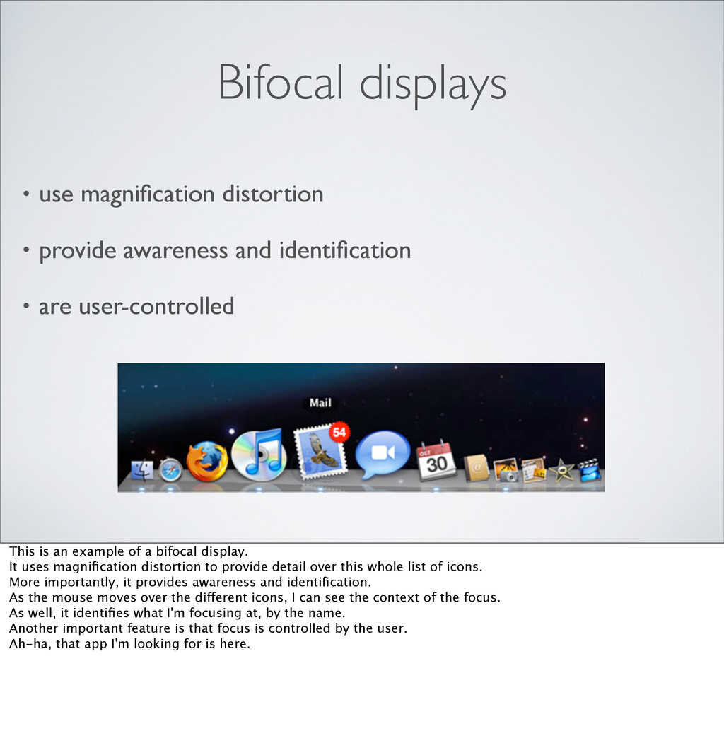
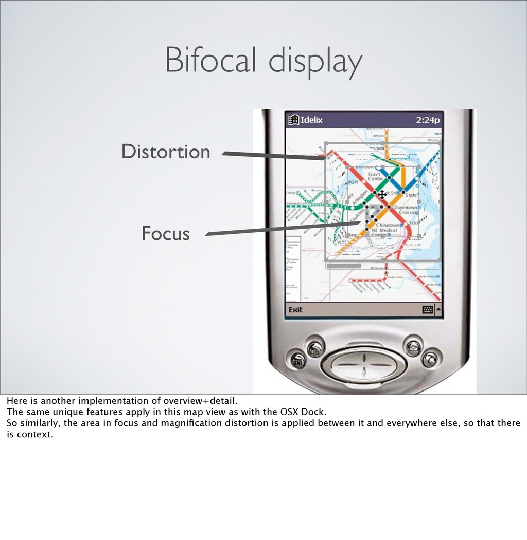
identification • are user-controlled This is an example of a bifocal display. It uses magnification distortion to provide detail over this whole list of icons. More importantly, it provides awareness and identification. As the mouse moves over the different icons, I can see the context of the focus. As well, it identifies what I'm focusing at, by the name. Another important feature is that focus is controlled by the user. Ah-ha, that app I'm looking for is here.
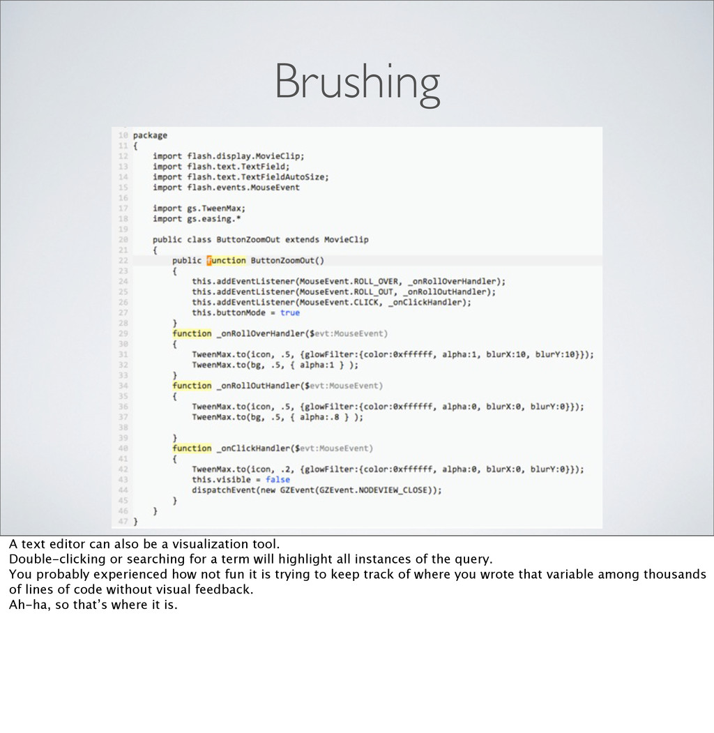
Double-clicking or searching for a term will highlight all instances of the query. You probably experienced how not fun it is trying to keep track of where you wrote that variable among thousands of lines of code without visual feedback. Ah-ha, so that’s where it is.
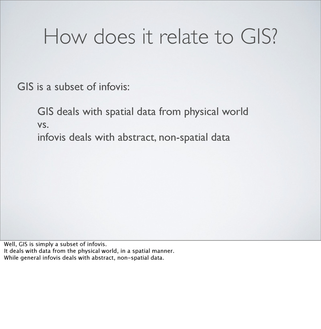
of infovis: GIS deals with spatial data from physical world vs. infovis deals with abstract, non-spatial data Well, GIS is simply a subset of infovis. It deals with data from the physical world, in a spatial manner. While general infovis deals with abstract, non-spatial data.
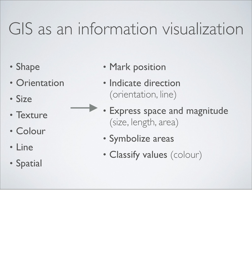
Size • Texture • Colour • Line • Spatial • Mark position • Indicate direction (orientation, line) • Express space and magnitude (size, length, area) • Symbolize areas • Classify values (colour)
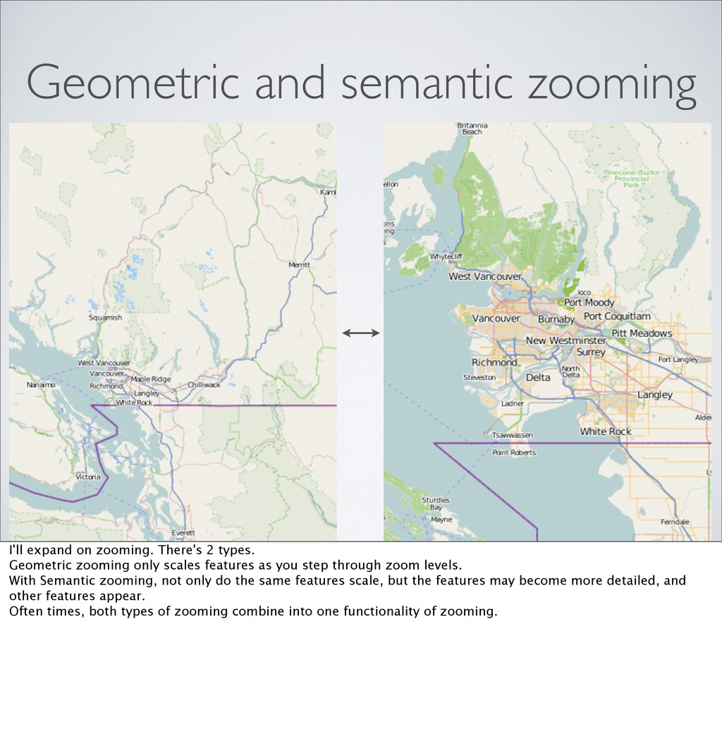
types. Geometric zooming only scales features as you step through zoom levels. With Semantic zooming, not only do the same features scale, but the features may become more detailed, and other features appear. Often times, both types of zooming combine into one functionality of zooming.
The same unique features apply in this map view as with the OSX Dock. So similarly, the area in focus and magnification distortion is applied between it and everywhere else, so that there is context.
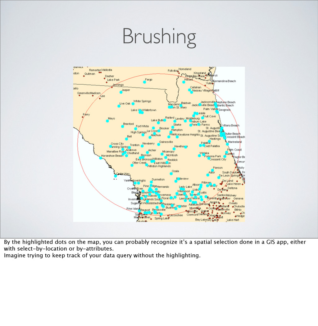
probably recognize it’s a spatial selection done in a GIS app, either with select-by-location or by-attributes. Imagine trying to keep track of your data query without the highlighting.
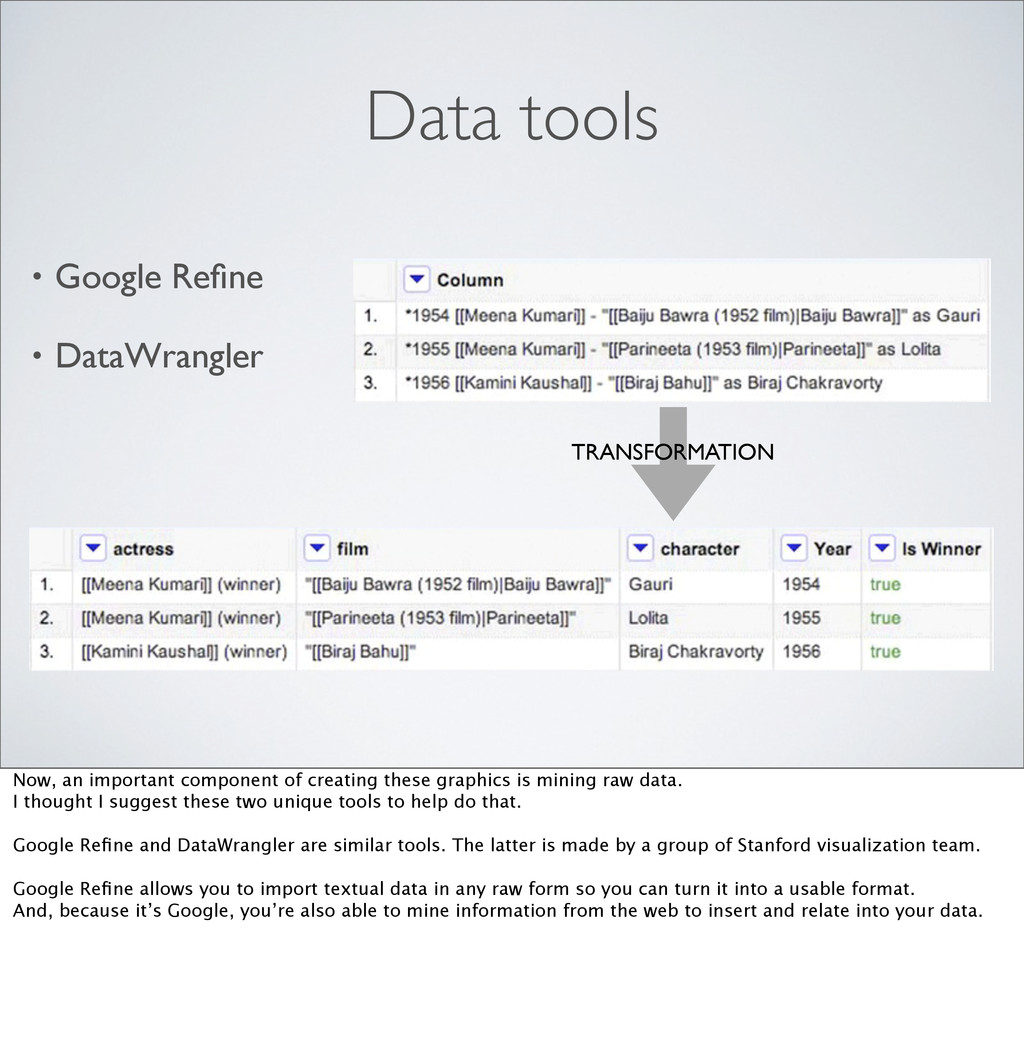
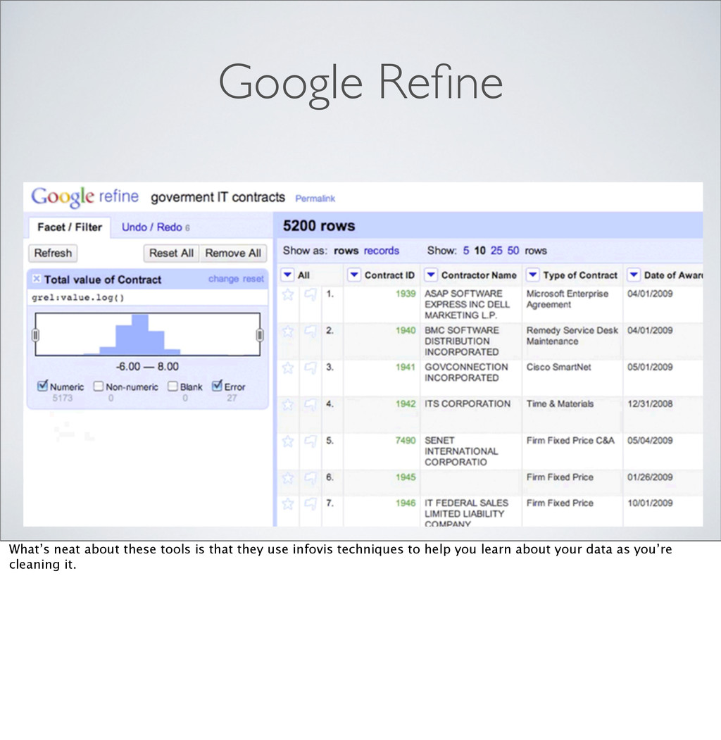
important component of creating these graphics is mining raw data. I thought I suggest these two unique tools to help do that. Google Refine and DataWrangler are similar tools. The latter is made by a group of Stanford visualization team. Google Refine allows you to import textual data in any raw form so you can turn it into a usable format. And, because it’s Google, you’re also able to mine information from the web to insert and relate into your data.
ProtoVis: mbostock.github.com/protovis/ • PolyMaps: polymaps.org • R spatial projects (R sp): r-spatial.sourceforge.net ‣ R Project for Statistical Computing: r-project.org [Go through gallery of R-sp website.]
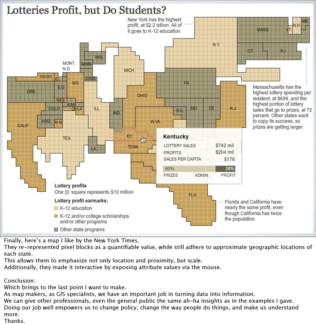
Times. They re-represented pixel blocks as a quantifiable value, while still adhere to approximate geographic locations of each state. This allows them to emphasize not only location and proximity, but scale. Additionally, they made it interactive by exposing attribute values via the mouse. Conclusion: Which brings to the last point I want to make. As map makers, as GIS specialists, we have an important job in turning data into information. We can give other professionals, even the general public the same ah-ha insights as in the examples I gave. Doing our job well empowers us to change policy, change the way people do things, and make us understand more. Thanks.