Upgrade to Pro — share decks privately, control downloads, hide ads and more …

Future Friendly Style Guides

Luke Brooker
February 28, 2012

Future Friendly Style Guides

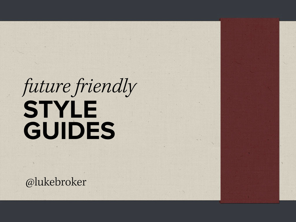
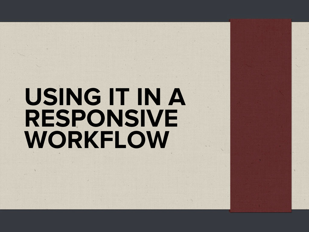
How style guides can help in a responsive design workflow.

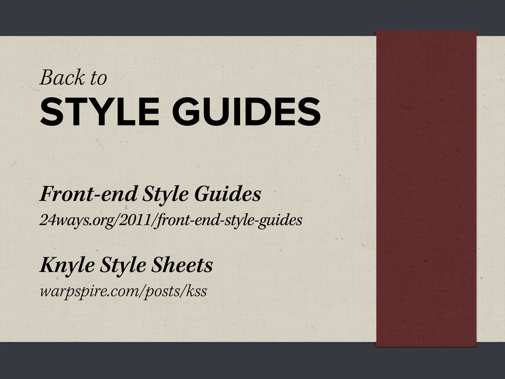
Find out more here: http://blog.lukebrooker.com/future-friendly-style-guides

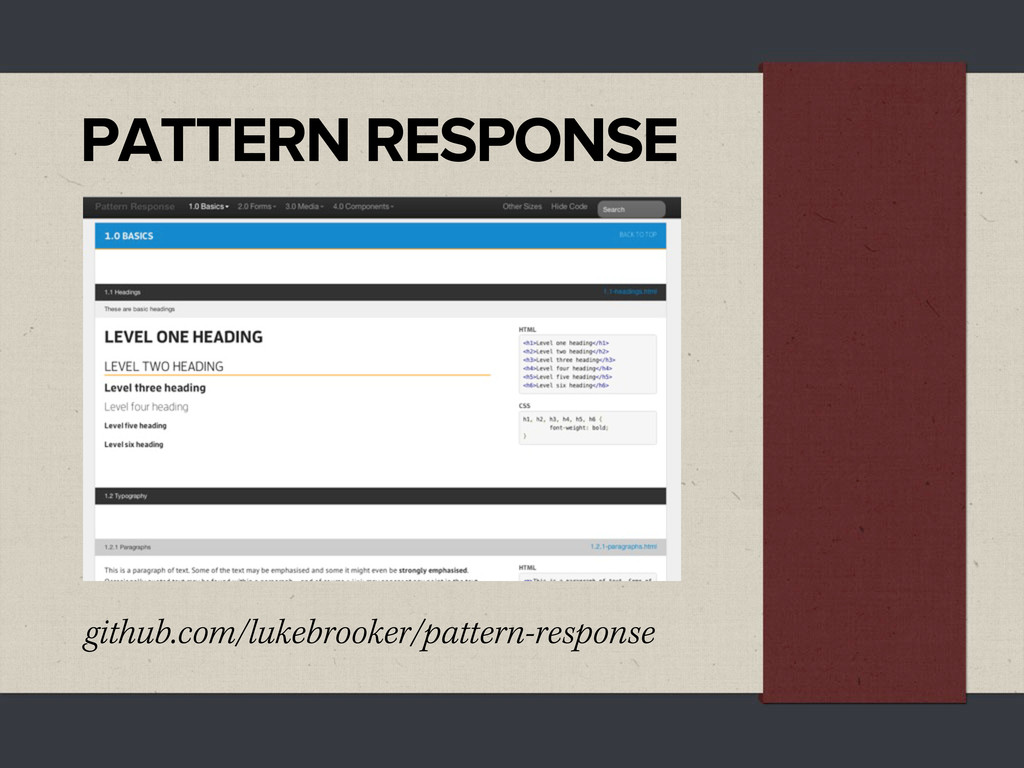
Pattern Response - Github
https://github.com/lukebrooker/pattern-response

Slides from my talk at What Do You Know - Brisbane: http://whatdoyouknow.webdirections.org/brisbane

Luke Brooker

February 28, 2012
Tweet

More Decks by Luke Brooker

Other Decks in Design

Transcript

  1. future friendly
    STYLE
    GUIDES
    @lukebroker

    View Slide

  2. Hold up
    RESPONSIVE
    DESIGN!

    View Slide

  3. My work ow doesn’t
    WORK or FLOW

    View Slide

  4. How is it
    REALLY
    going to look?

    View Slide

  5. and how do
    we get there
    QUICKLY?

    View Slide

  6. HOW I GET THERE

    View Slide

  7. HOW I GET THERE
    • Wireframes - sketched only, multiple width.

    View Slide

  8. HOW I GET THERE
    • Wireframes - sketched only, multiple width.
    • Initial prototyping - very top level, mostly
    for a “live” feel of the layout from the
    wireframes, but able to be seen on many
    devices.

    View Slide

  9. HOW I GET THERE
    • Wireframes - sketched only, multiple width.
    • Initial prototyping - very top level, mostly
    for a “live” feel of the layout from the
    wireframes, but able to be seen on many
    devices.
    • Style tiles - design in Photoshop without
    “designing mockups” in Photoshop.

    View Slide

  10. and...
    STYLE GUIDES

    View Slide

  11. WHY
    a style guide?

    View Slide

  12. “Websites are systems
    rather than pages and
    as soon as we stop
    perceiving them as that,
    the better.”
    ANNA DEBENHAM

    View Slide

  13. ELEMENTS,
    COMPONENTS
    & PATTERNS

    View Slide

  14. Component Example
    NAVIGATION
    MENUS

    View Slide

  15. Component Example
    NAVIGATION
    MENUS

    View Slide

  16. Component Example
    NAVIGATION
    MENUS

    View Slide

  17. PATTERN
    LIBRARIES
    ey’re popping up everywhere

    View Slide

  18. PEARS
    pea.rs

    View Slide

  19. PATTERN PRIMER
    github.com/adactio/Pattern-Primer

    View Slide

  20. Back to
    STYLE GUIDES
    Front-end Style Guides
    24ways.org/2011/front-end-style-guides
    Knyle Style Sheets
    warpspire.com/posts/kss

    View Slide

  21. KNYLE STYLE SHEETS

    View Slide

  22. AN IDEA

    View Slide

  23. PATTERN RESPONSE
    github.com/lukebrooker/pattern-response

    View Slide

  24. More than a
    STYLE GUIDE

    View Slide

  25. More than a
    STYLE GUIDE
    • Team Members - Document all
    components of a project and how to
    implement them.

    View Slide

  26. More than a
    STYLE GUIDE
    • Team Members - Document all
    components of a project and how to
    implement them.
    • Yourself - Keep as a starter style guide and
    another for a pattern library.

    View Slide

  27. More than a
    STYLE GUIDE
    • Team Members - Document all
    components of a project and how to
    implement them.
    • Yourself - Keep as a starter style guide and
    another for a pattern library.
    • Clients - Style guide, WYSIWYG Guide.

    View Slide

  28. USING IT IN A
    RESPONSIVE
    WORKFLOW

    View Slide

  29. • From wireframes - List out all components
    needed.

    View Slide

  30. • From wireframes - List out all components
    needed.
    • In the style guide - Add the structure
    (HTML) of each component.

    View Slide

  31. • From wireframes - List out all components
    needed.
    • In the style guide - Add the structure
    (HTML) of each component.
    • Design/style - Using the style guide or
    referencing your projects CSS as you build
    it.

    View Slide

  32. • From wireframes - List out all components
    needed.
    • In the style guide - Add the structure
    (HTML) of each component.
    • Design/style - Using the style guide or
    referencing your projects CSS as you build
    it.
    • Work together - Designers and developers
    can work together and discuss how things
    will work at different sizes.

    View Slide

  33. FOR EACH COMPONENT

    View Slide

  34. FOR EACH COMPONENT
    • Widths - how this component will react. How
    wide should it get before it’s layout changes.

    View Slide

  35. FOR EACH COMPONENT
    • Widths - how this component will react. How
    wide should it get before it’s layout changes.
    • Hierarchy - where this component will be
    used in the site, and how it react to others.

    View Slide

  36. FOR EACH COMPONENT
    • Widths - how this component will react. How
    wide should it get before it’s layout changes.
    • Hierarchy - where this component will be
    used in the site, and how it react to others.
    • Density - how the content changes as the
    component adapts to it’s surroundings. (will
    some things be hidden)

    View Slide

  37. FOR EACH COMPONENT
    • Widths - how this component will react. How
    wide should it get before it’s layout changes.
    • Hierarchy - where this component will be
    used in the site, and how it react to others.
    • Density - how the content changes as the
    component adapts to it’s surroundings. (will
    some things be hidden)
    • Interaction - will the way it is interacted
    with change as it changes.

    View Slide

  38. AN EXAMPLE

    View Slide

  39. AN EXAMPLE

    View Slide

  40. AN EXAMPLE

    View Slide

  41. AND THAT
    IS WHAT I KNOW
    AN IDEA I HAD.
    ank you.
    @lukebroker

    View Slide