Upgrade to Pro
— share decks privately, control downloads, hide ads and more …
Speaker Deck
Features
Speaker Deck
PRO
Sign in
Sign up for free
Search
Search
Responsive Design
Search
Nico Verbruggen
April 22, 2013
Programming
110
0
Share
Embed
Copy iframe code
Copy JS code
Copy link
Start on current slide
Responsive Design
A very basic presentation we gave about responsive design, its history and its future.
Nico Verbruggen
April 22, 2013
More Decks by Nico Verbruggen
See All by Nico Verbruggen
OpenShowcase
nicoverbruggen
0
80
Peacocks | Rokjesweer — Apps for Ghent '14
nicoverbruggen
0
380
9K Presentation | November 28 @ Eurocities Ghent
nicoverbruggen
0
93
Presentation 9K Spotter + Builder (#oSoc13)
nicoverbruggen
2
280
Other Decks in Programming
See All in Programming
LaravelLive Japan の裏方のすべて — 第188回 PHP勉強会@東京 (2026-06-24)
suguruooki
2
140
ECSアプリログをFireLensでコスト削減しようとしたけど諦めた話 in Fargate×Node.js
akihisaikeda
2
4.2k
Contextとはなにか
chiroruxx
1
390
セキュリティの専門家じゃなくてもできる。「セキュリティ意識」をアップデートして サプライチェーン攻撃への耐性を高めよう。
tk3fftk
5
1k
Strategic Design in the Frontend: Moduliths & Micro Frontends @DDDEurope
manfredsteyer
PRO
0
140
気圧・高度・GPSを記録&可視化するアプリ「Koudo」を作った話
hjmkth
1
340
自作OSでスライド発表する
uyuki234
1
3.6k
どこまでゆるくて許されるのか
tk3fftk
0
290
Observability in Practice:Grafana 與 Edge Device SRE 的那些事
blueswen
0
180
ADKを使って簡単にAIエージェントを作ってみよう
k1mu21
0
290
Javaの型とAI時代に型が大事な理由 / java types and type in AI era
kishida
2
160
吝嗇家のためのAI活用 / AI development for miser - ChatGPT + Issue Driven Development
tooppoo
0
150
Featured
See All Featured
DBのスキルで生き残る技術 - AI時代におけるテーブル設計の勘所
soudai
PRO
67
56k
The Pragmatic Product Professional
lauravandoore
37
7.3k
Why Your Marketing Sucks and What You Can Do About It - Sophie Logan
marketingsoph
0
180
Code Review Best Practice
trishagee
74
20k
Music & Morning Musume
bryan
47
7.3k
Winning Ecommerce Organic Search in an AI Era - #searchnstuff2025
aleyda
1
2.1k
Making the Leap to Tech Lead
cromwellryan
135
9.9k
<Decoding/> the Language of Devs - We Love SEO 2024
nikkihalliwell
1
270
Un-Boring Meetings
codingconduct
0
330
Highjacked: Video Game Concept Design
rkendrick25
PRO
1
400
Stewardship and Sustainability of Urban and Community Forests
pwiseman
0
240
Refactoring Trust on Your Teams (GOTO; Chicago 2020)
rmw
35
3.5k
Transcript
RESPONSIVE DESIGN by Tim Vermaercke, Gertjan Vermeir & Nico Verbruggen
Contents • Introduction • History of mobile browsing & design
• Why implement a responsive design? • Implementation (how-to) • Short demonstration
Introduction A brief explanation of responsive design
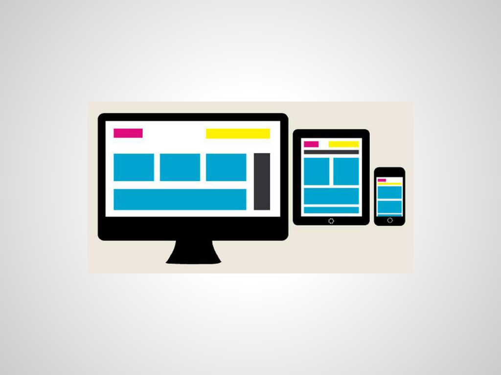
What is responsive design? • creating a website design that
supports: ◦ multiple screen sizes using a grid-based system
None
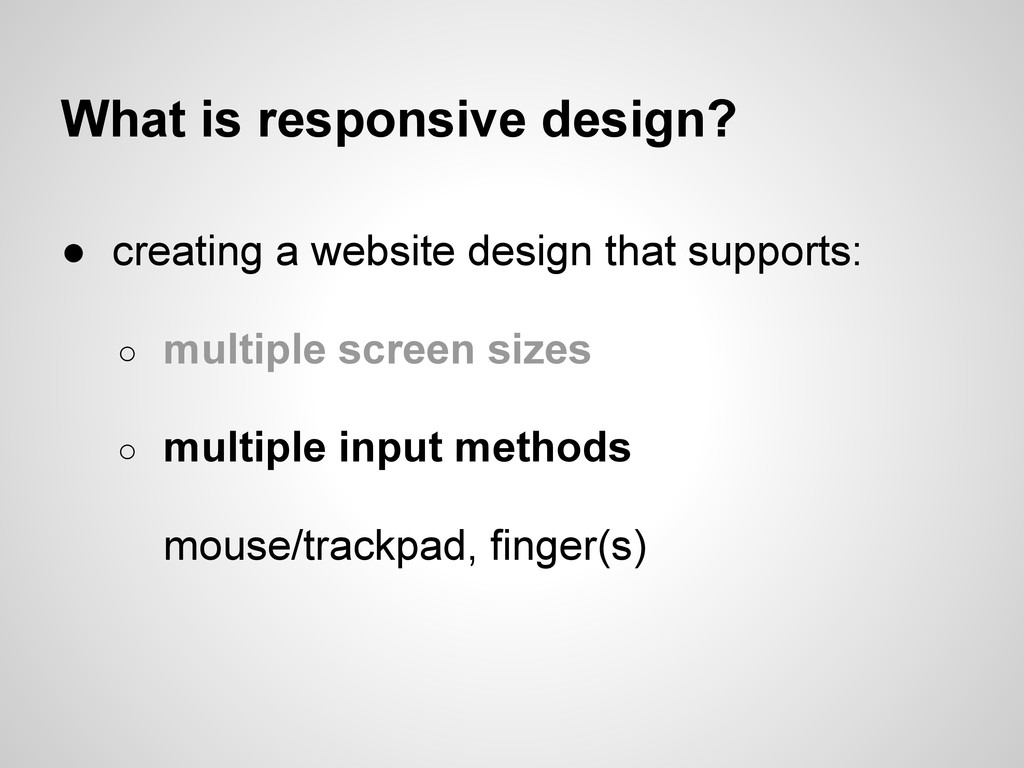
What is responsive design? • creating a website design that
supports: ◦ multiple screen sizes ◦ multiple input methods mouse/trackpad, finger(s)
None
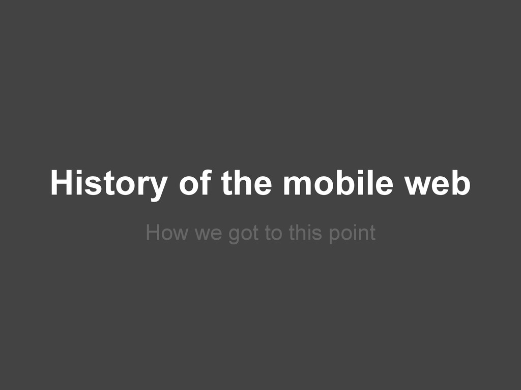
History of the mobile web How we got to this
point
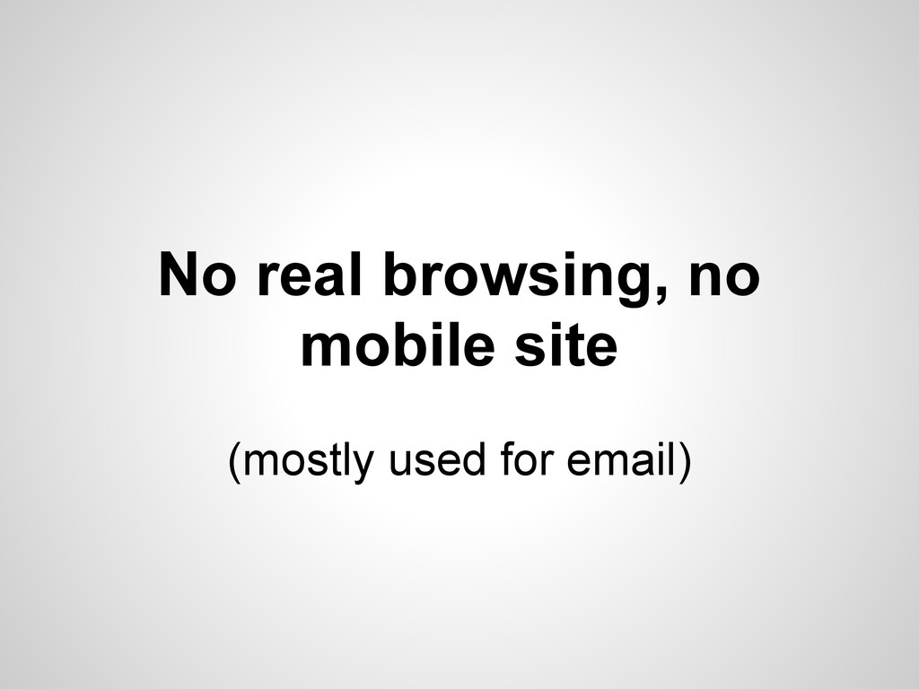
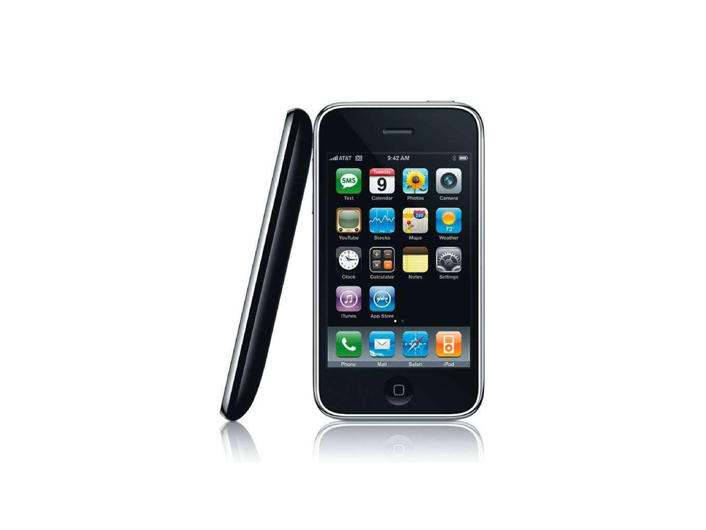
2007 Year of the new smartphones
None
None
No real browsing, no mobile site (mostly used for email)
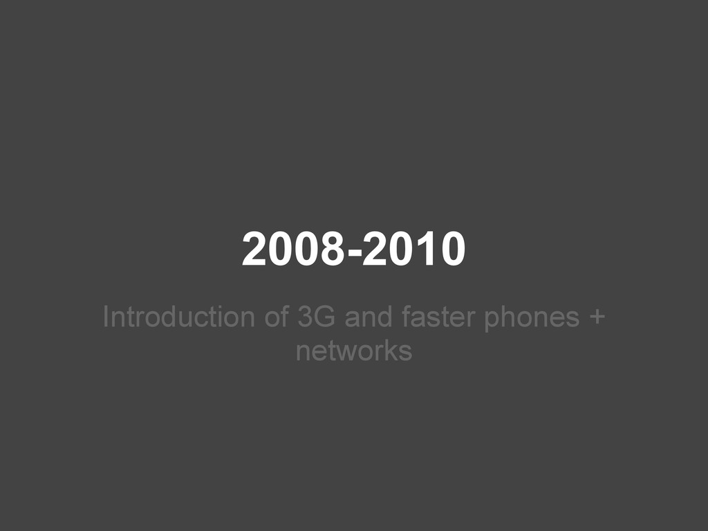
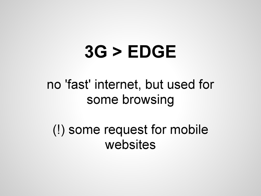
2008-2010 Introduction of 3G and faster phones + networks
None
3G > EDGE no 'fast' internet, but used for some
browsing (!) some request for mobile websites
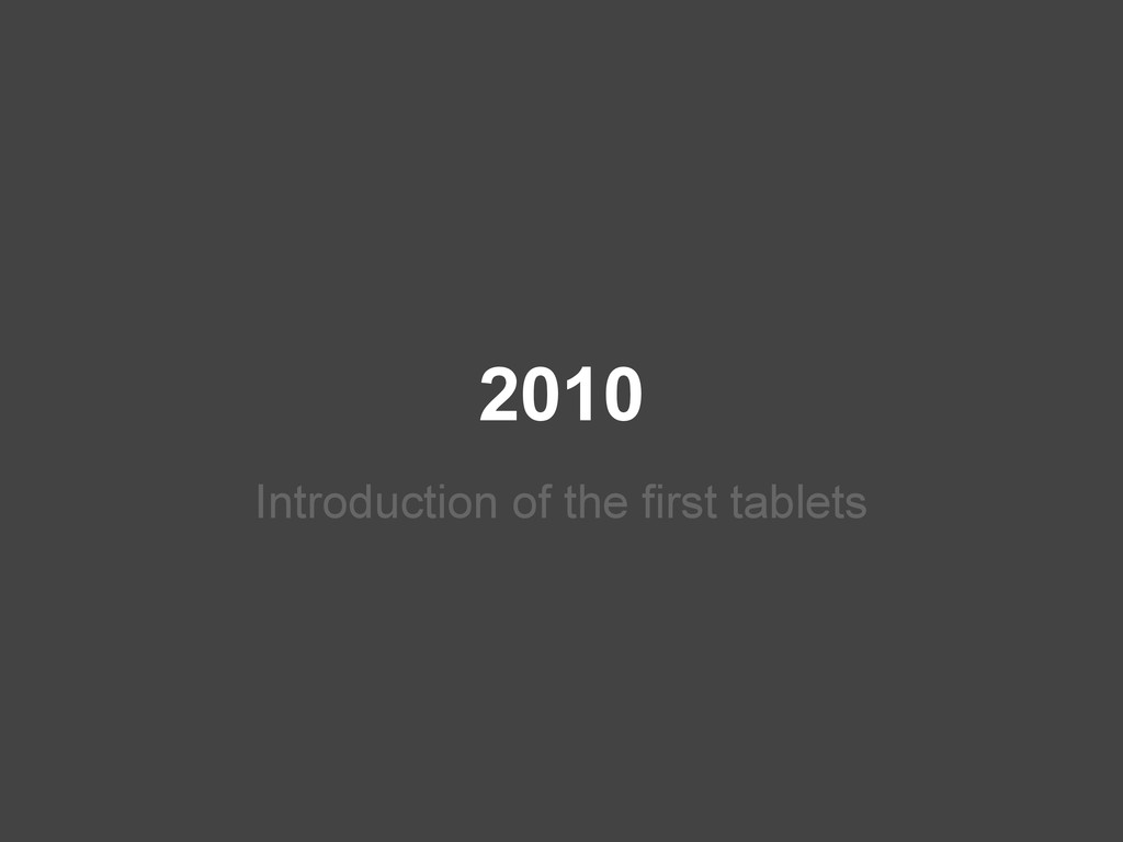
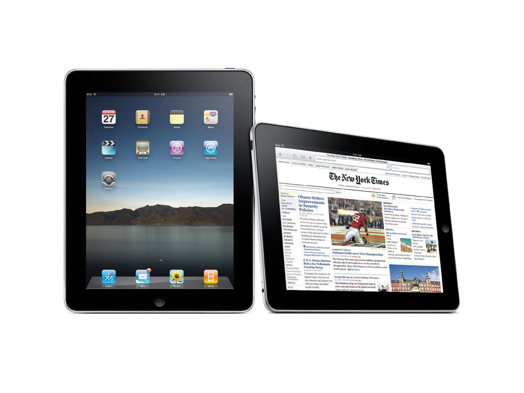
2010 Introduction of the first tablets
None
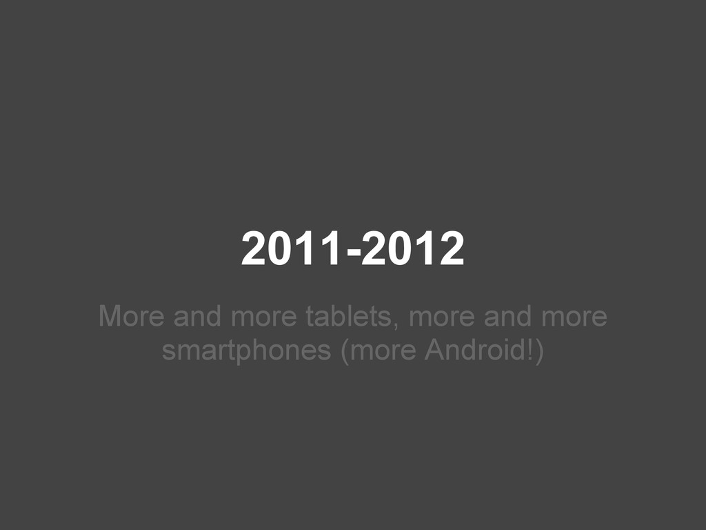
2011-2012 More and more tablets, more and more smartphones (more
Android!)
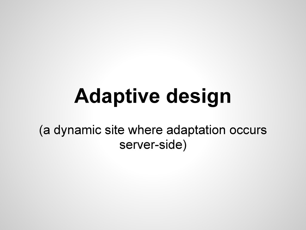
Adaptive design (a dynamic site where adaptation occurs server-side)
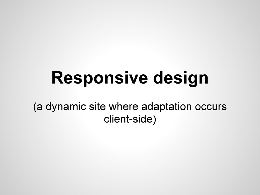
Responsive design (a dynamic site where adaptation occurs client-side)
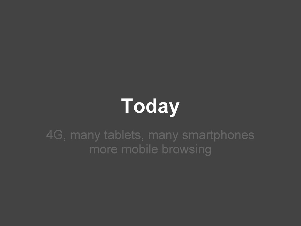
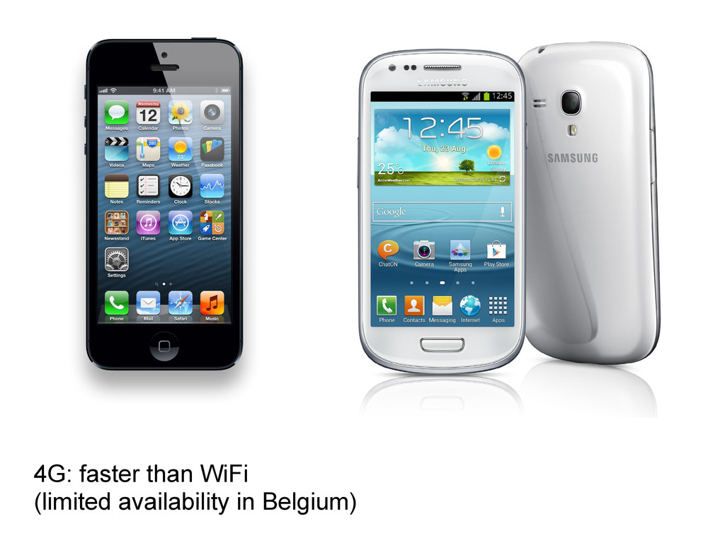
Today 4G, many tablets, many smartphones more mobile browsing
4G: faster than WiFi (limited availability in Belgium)
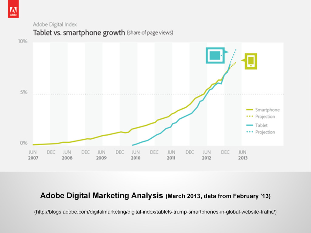
Adobe Digital Marketing Analysis (March 2013, data from February '13)
(http://blogs.adobe.com/digitalmarketing/digital-index/tablets-trump-smartphones-in-global-website-traffic/)
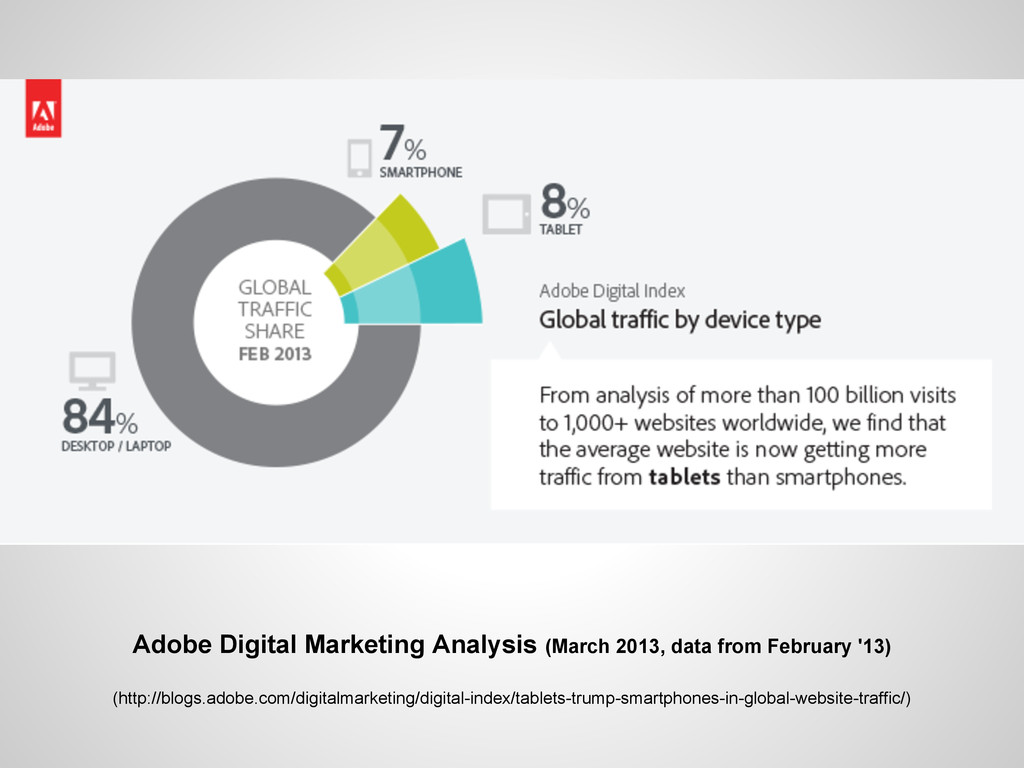
Adobe Digital Marketing Analysis (March 2013, data from February '13)
(http://blogs.adobe.com/digitalmarketing/digital-index/tablets-trump-smartphones-in-global-website-traffic/)
Why we chose responsive design
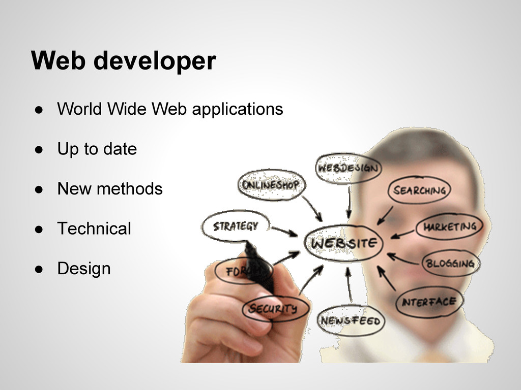
Web developer • World Wide Web applications • Up to
date • New methods • Technical • Design
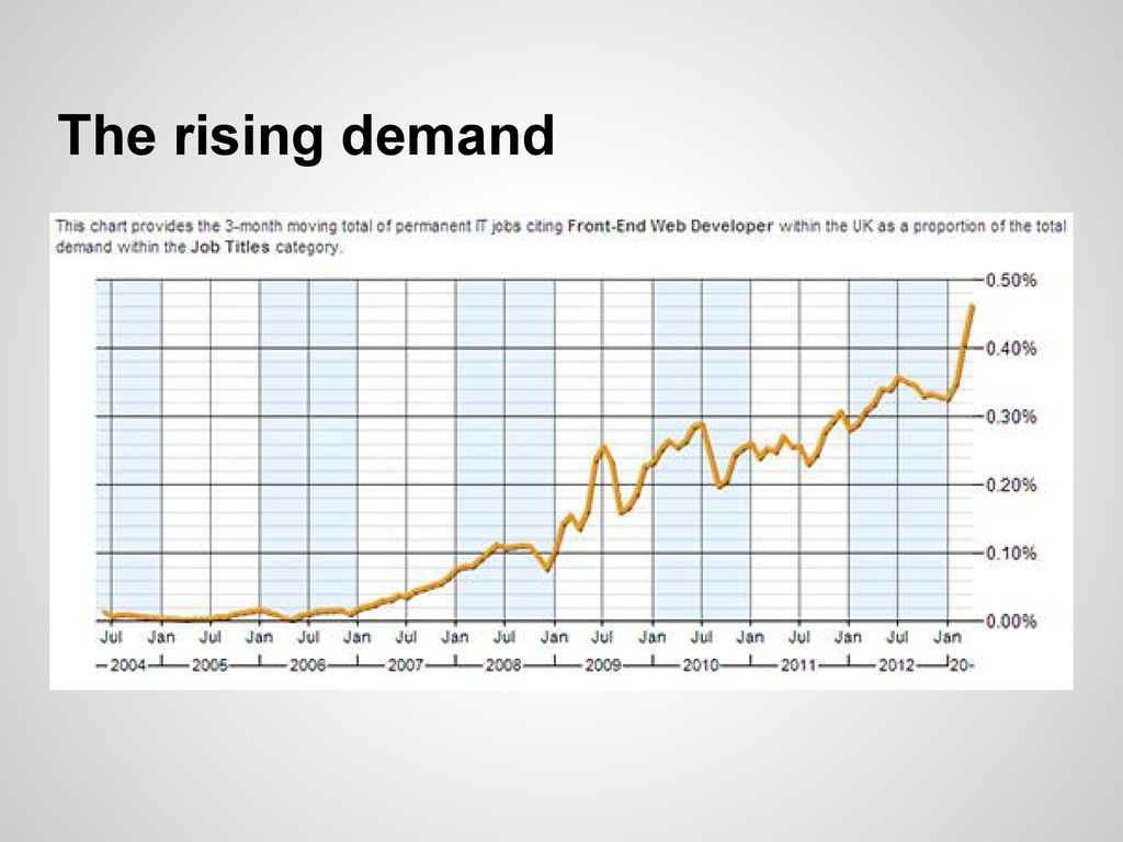
The rising demand
Why implement a responsive design?
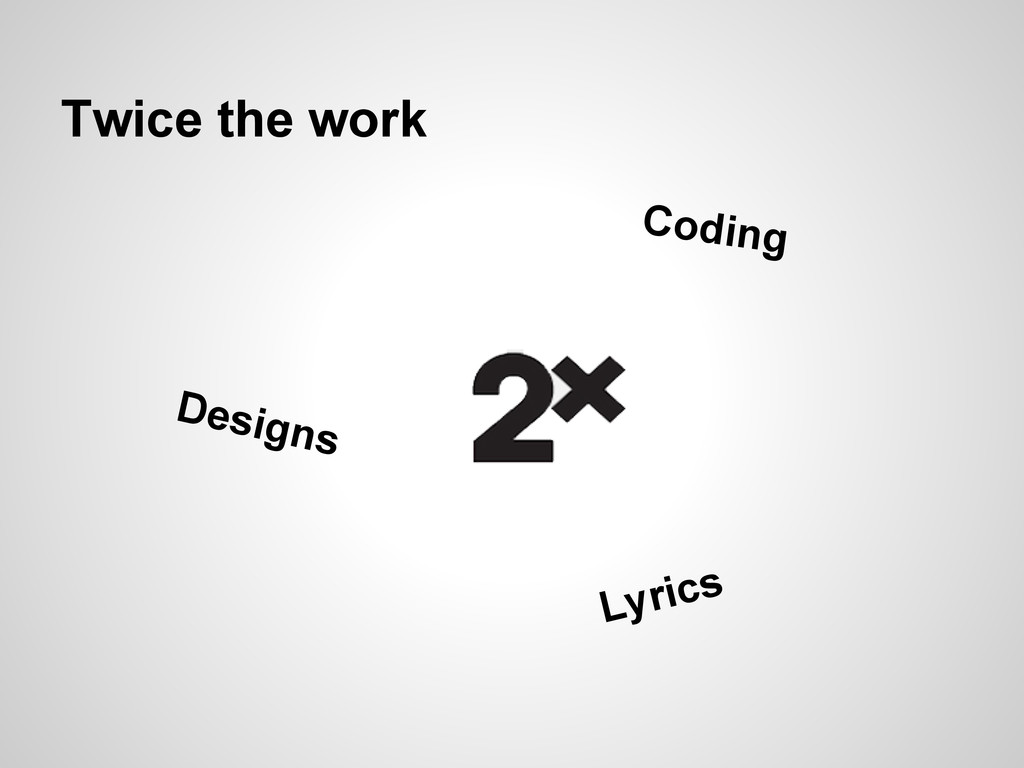
Twice the work Lyrics Designs Coding
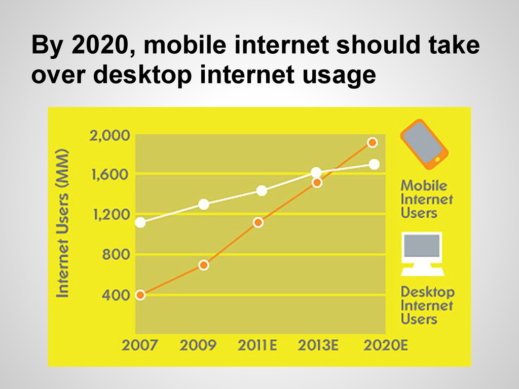
By 2020, mobile internet should take over desktop internet usage
None
Techniques
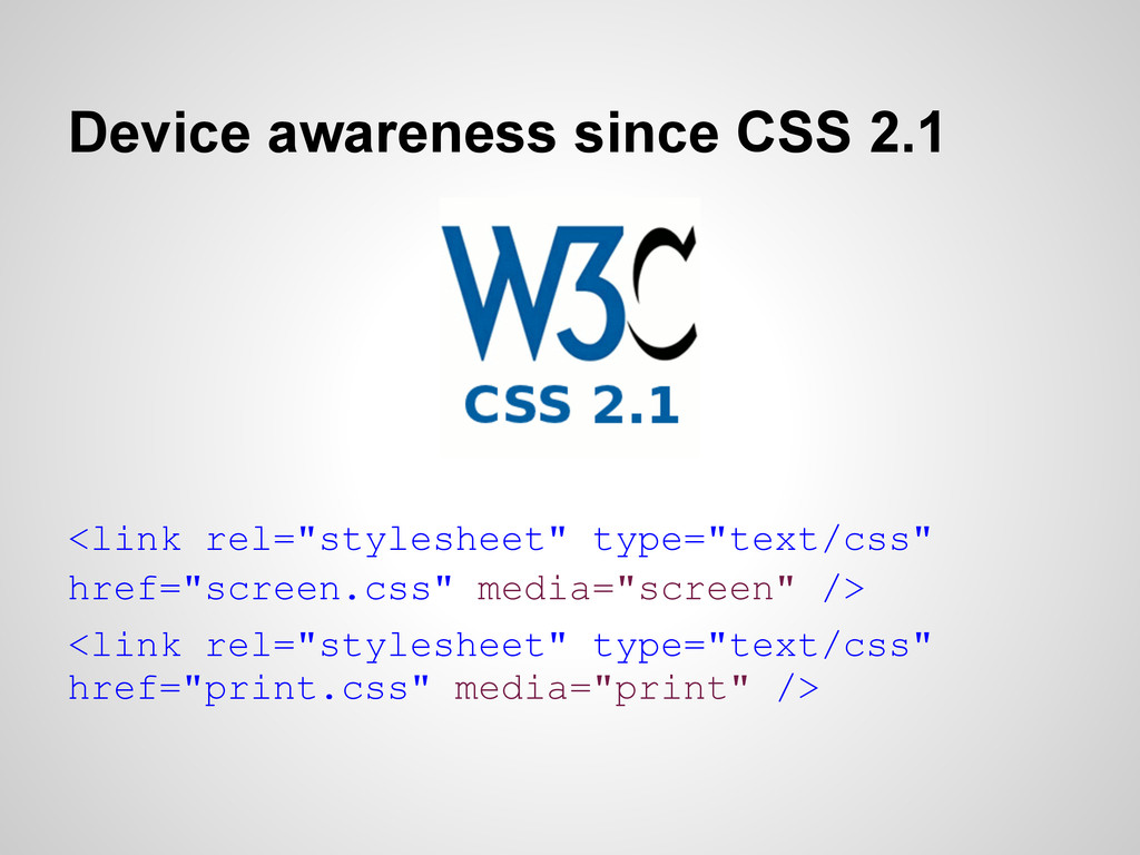
Device awareness since CSS 2.1 <link rel="stylesheet" type="text/css" href="screen.css" media="screen"
/> <link rel="stylesheet" type="text/css" href="print.css" media="print" />
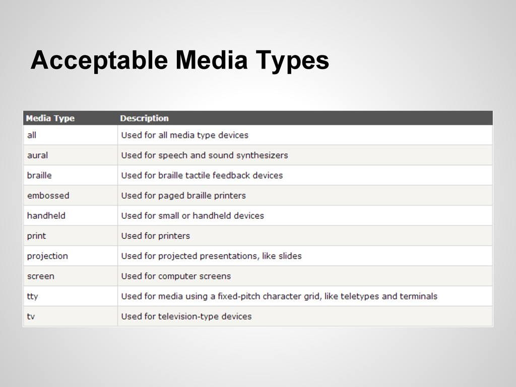
Acceptable Media Types
None
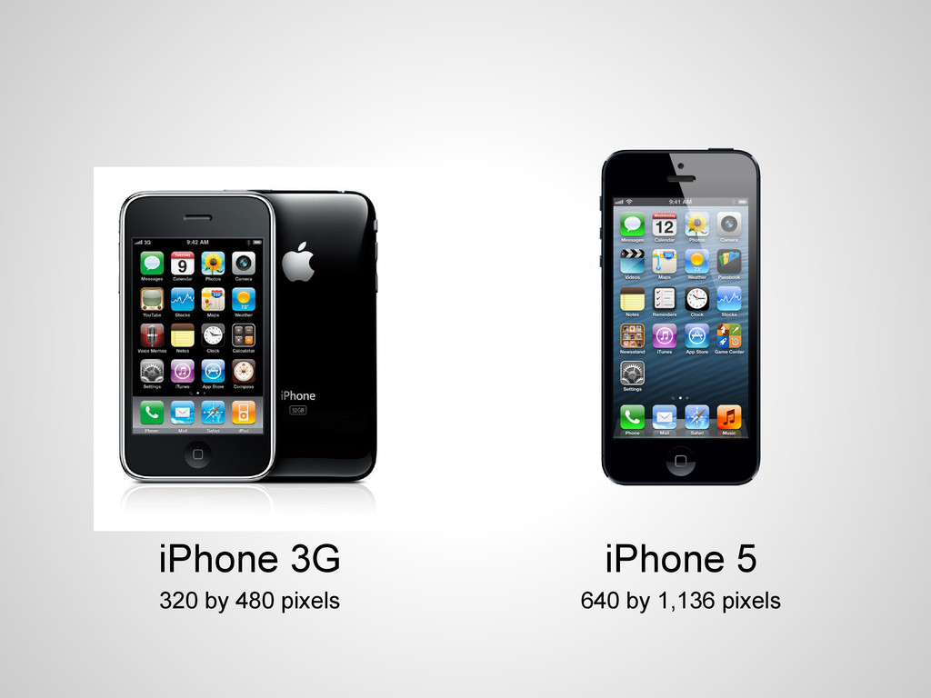
iPhone 3G 320 by 480 pixels iPhone 5 640 by
1,136 pixels
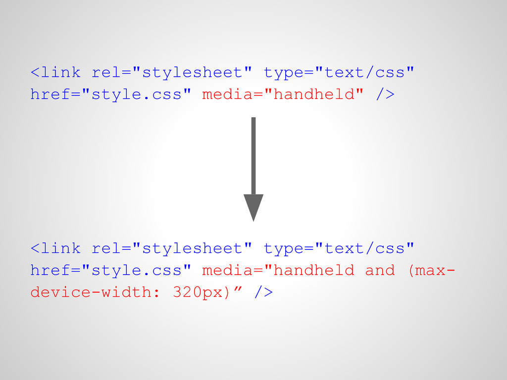
<link rel="stylesheet" type="text/css" href="style.css" media="handheld" /> <link rel="stylesheet" type="text/css" href="style.css"
media="handheld and (max- device-width: 320px)” />
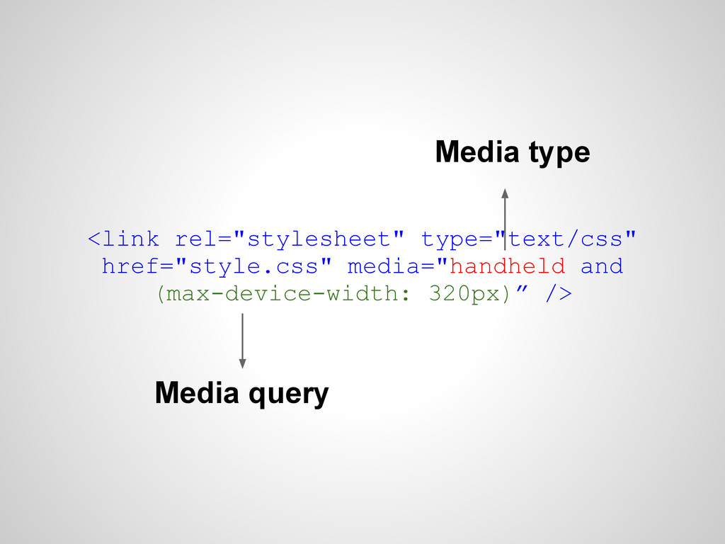
<link rel="stylesheet" type="text/css" href="style.css" media="handheld and (max-device-width: 320px)” /> Media
type Media query
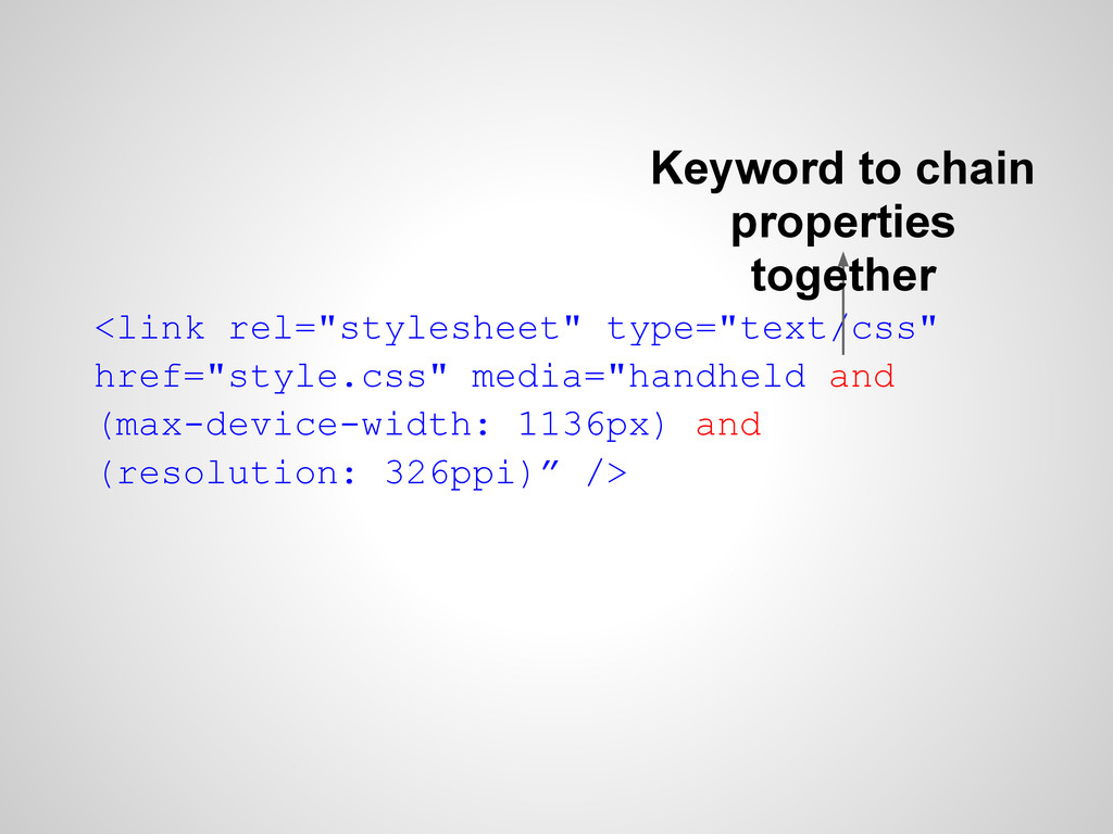
<link rel="stylesheet" type="text/css" href="style.css" media="handheld and (max-device-width: 1136px) and (resolution:
326ppi)” /> Keyword to chain properties together
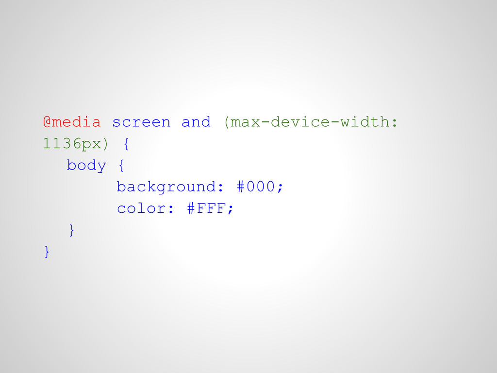
@media screen and (max-device-width: 1136px) { body { background: #000;
color: #FFF; } }
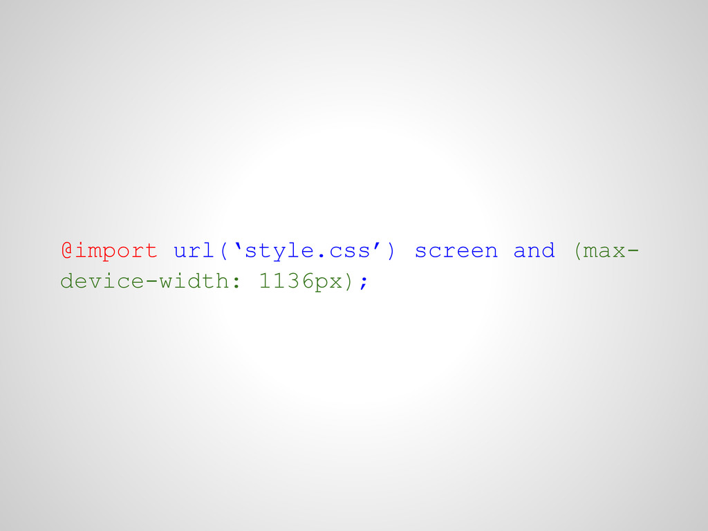
@import url(‘style.css’) screen and (max- device-width: 1136px);
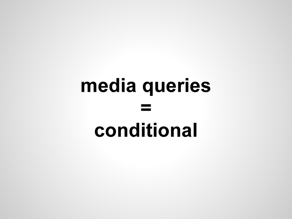
media queries = conditional
Questions?
Some extra time Here's some examples
a list apart
designed to move
and many more...
Thank you for your attention!
 nicoverbruggen
 suguruooki
 akihisaikeda
 chiroruxx
 tk3fftk
 manfredsteyer
 hjmkth
 uyuki234
 blueswen
 k1mu21
 kishida
 tooppoo
 soudai
 lauravandoore
 marketingsoph
 trishagee
 bryan
bryan
 aleyda
 cromwellryan
 nikkihalliwell
 codingconduct
 rkendrick25
 pwiseman
 rmw
rmw