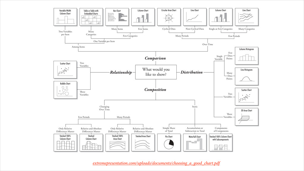
Scatter Chart 3D Area Chart Pie Chart Waterfall Chart Stacked 100% Column Chart with Subcomponents Stacked Area Chart Stacked 100% Area Chart Stacked Column Chart Stacked 100% Column Chart Bubble Chart Scatter Chart Variable Width Column Chart Table or Table with Embedded Charts Bar Chart Column Chart Column Histogram Line Histogram ree Variables Two Variables Single Variable Many Periods Few Periods Two Variables per Item Many Categories One Variable per Item Among Items What would you like to show? Many Items Few Categories Few Items Many Periods Cyclical Data Non-Cyclical Data Few Periods Single or Few Categories Many Categories Over Time Comparison Distribution Few Data Points Many Data Points Two Variables ree Variables Relationship Composition Simple Share of Total Accumulation or Subtraction to Total Components of Components Static Only Relative Diff erences Matter Relative and Absolute Diff erences Matter Only Relative Diff erences Matter Relative and Absolute Diff erences Matter Changing Over Time
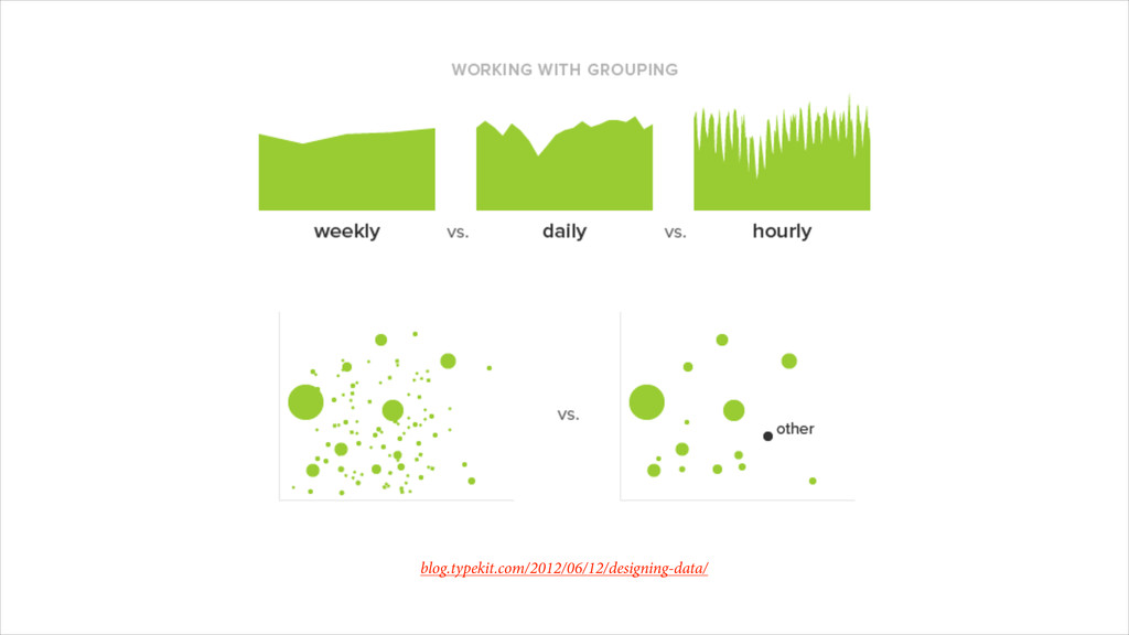
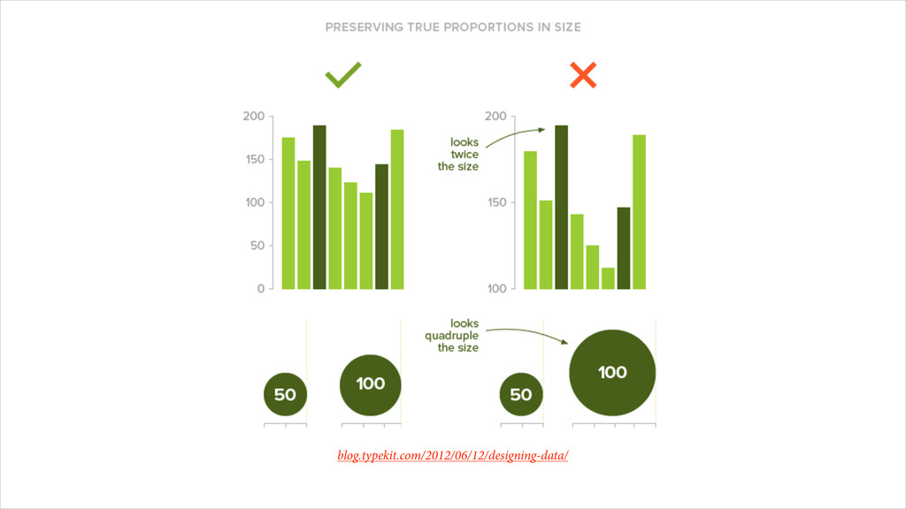
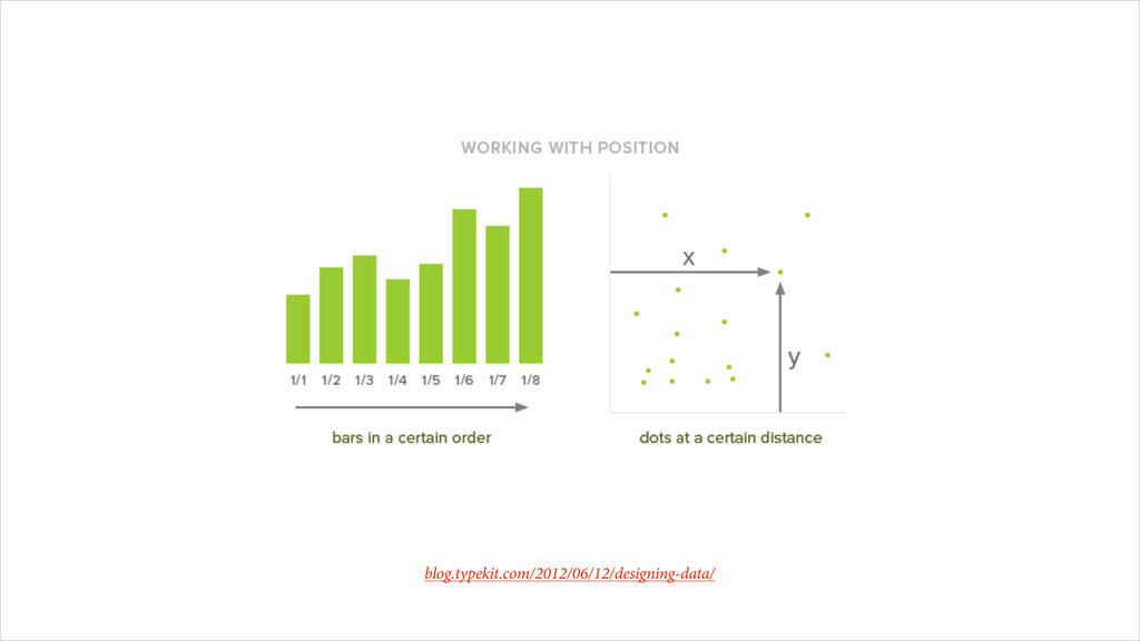
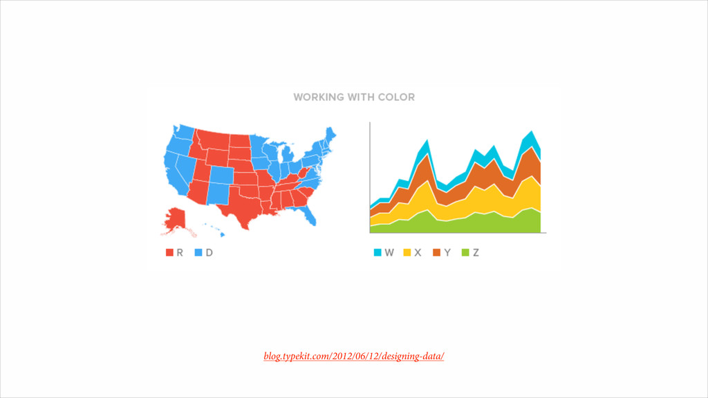
Need http://37signals.com/svn/posts/3388-three-charts-is-all-i-need ! Designing Data http://blog.typekit.com/2012/06/12/designing-data/ ! Visual Display of Quantitative Information http://www.amazon.com/The-Visual-Display-Quantitative-Information/dp/0961392142 ! Envisioning Information http://www.amazon.com/Envisioning-Information-Edward-R-Tufte/dp/0961392118/
(General Assembly Lecture) http://www.slideshare.net/GeneralAssembly_SF/data-visualization-16265937 ! A Case Study in How Infographics Can Bend the Truth http://www.fastcodesign.com/1669222/a-case-study-in-how-infographics-can-bend-the-truth ! 16 Useless Infographics http://www.theguardian.com/news/datablog/gallery/2013/aug/01/16-useless-infographics ! Advanced Presentations By Design http://www.extremepresentation.com/books/advanced_presentation_by_design ! Tufte's Principles for Visualizing Quantitative Information http://thedoublethink.com/2009/08/tufte%E2%80%99s-principles-for-visualizing-quantitative-information/