to Modern Dr. Naeema Al Hosani Assistant Professor of Cartography Geography & Urban Planning Dept. Faculty of Humani?es & Social Sciences United Arab Emirates University P. O. Box 17771, Al Ain, UAE Tel: +9713-‐7136411 Fax: +9713-‐7136937 E-‐mail: [email protected]
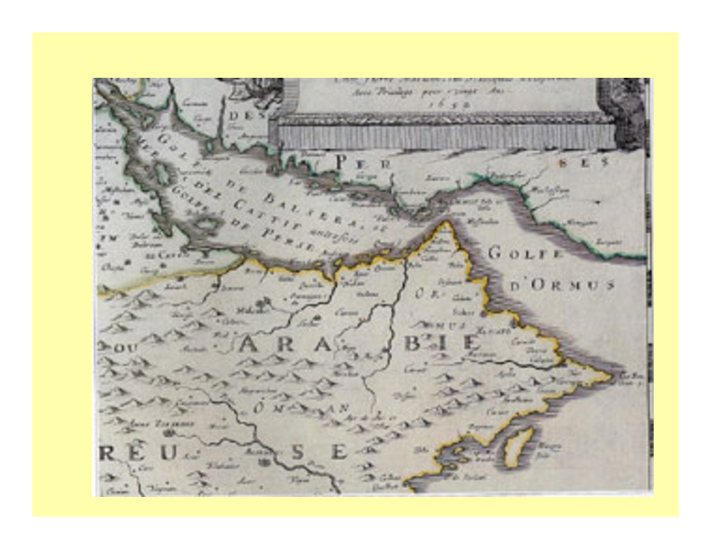
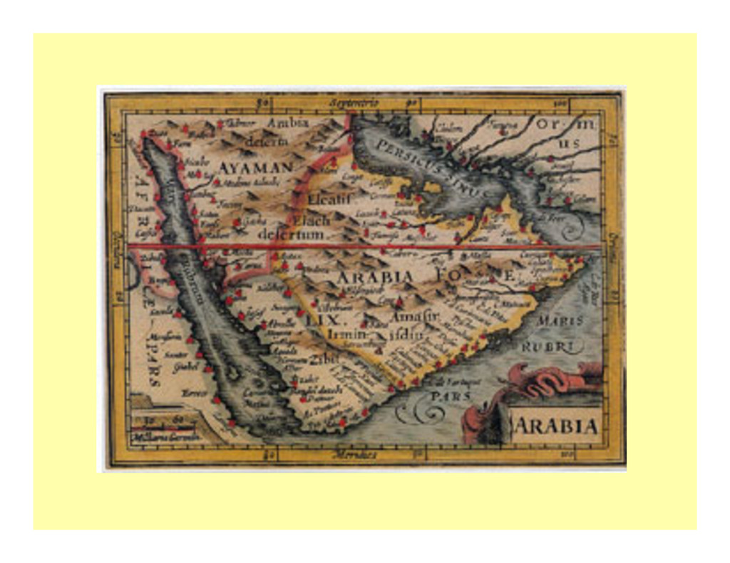
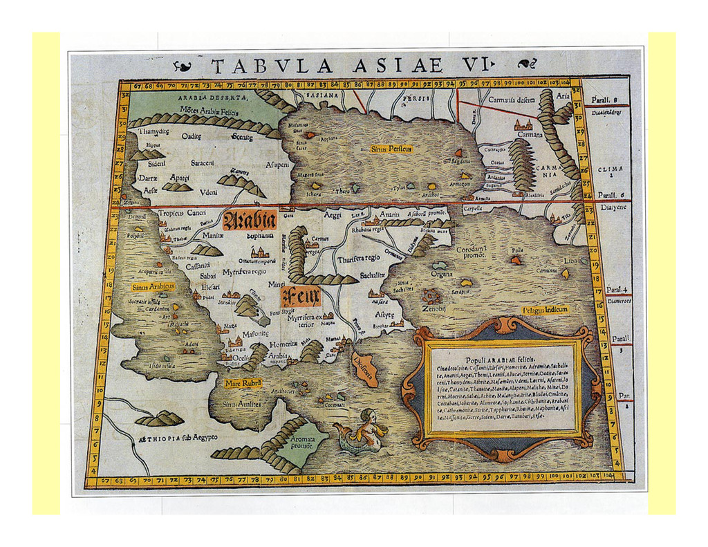
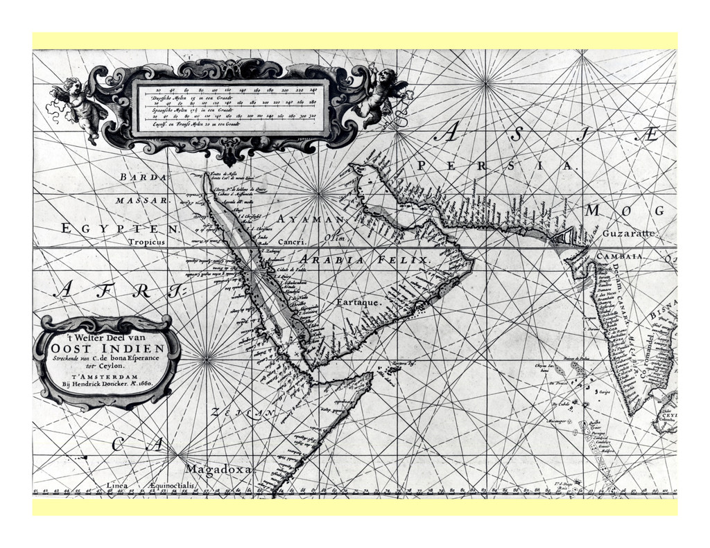
the Arabian Peninsula had liSle need for maps and created few, since most of them depended on tradi?onal knowledge of desert landmarks, the movements of the stars, and the direc?ons of the winds for wayfinding. In contrast, Europeans created many maps of Arabia for various reasons ranging from intellectual curiosity to poli?cal, economic, and military interests. This paper trace sand seeks to explain the changing representa?on of the Arabian Peninsula on maps from the medieval period to the modern day. It considers the historical development of map symbols, like wri?ng, from pictures to conven?onal pictorial signs to abstract symbols. It looks at the differences between Arabian and European mapmakers and their underlying cultural biases. It explores how the maps were designed to serve different purposes. Out of this study of map symboliza?on emerges a mul?-‐faceted view of the Arabian Peninsula and its history as seen through the eyes of many mapmakers, medieval to modern. Keywords: history of cartography, maps symbols, map design, Arabian Peninsula
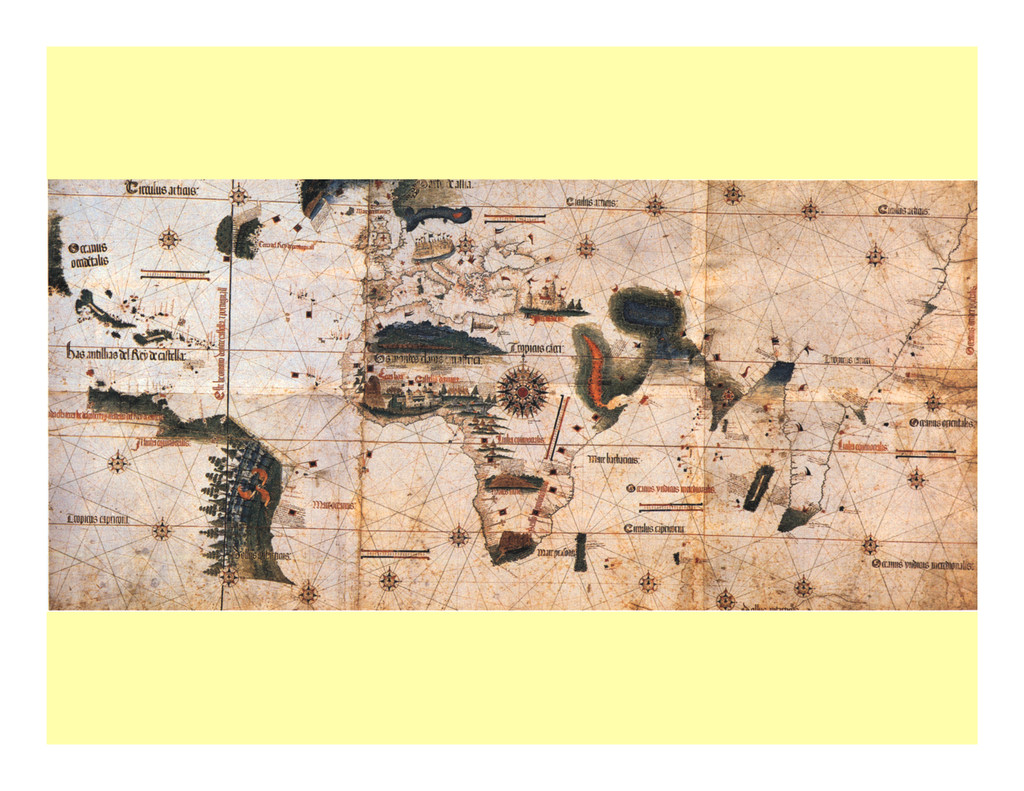
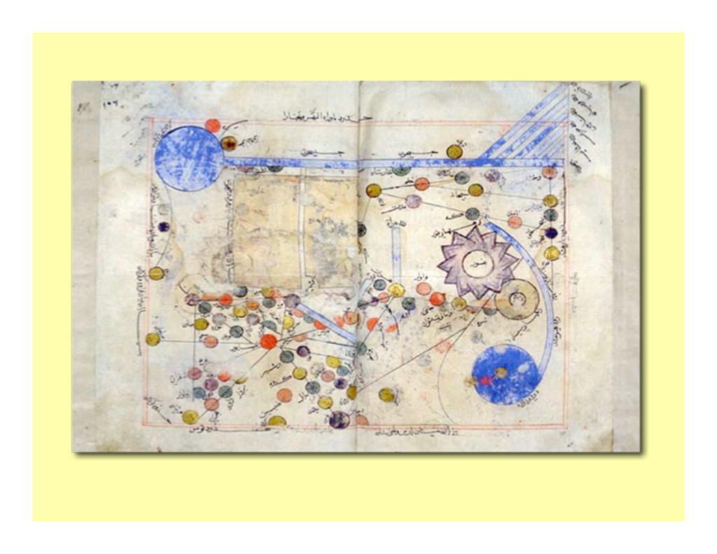
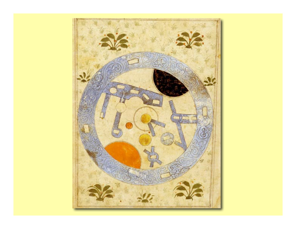
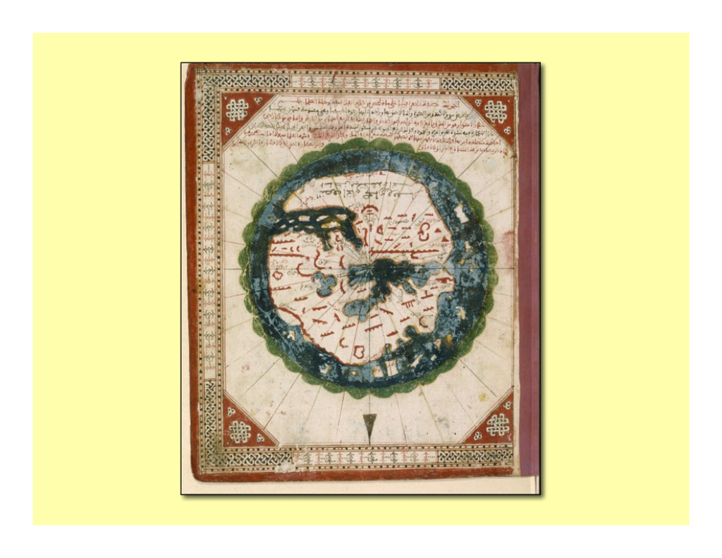
environment that conveys geographic informa?on. Maps are communica?on tool and easily understood regardless of language or culture; since it abstracts phenomena (features, or objects) by different kinds of graphics symbols. Old maps provide much informa?on about what was known in that ?me; also it delivers the culture basis of the map, which was different from modern cartography (Merriam 1996).
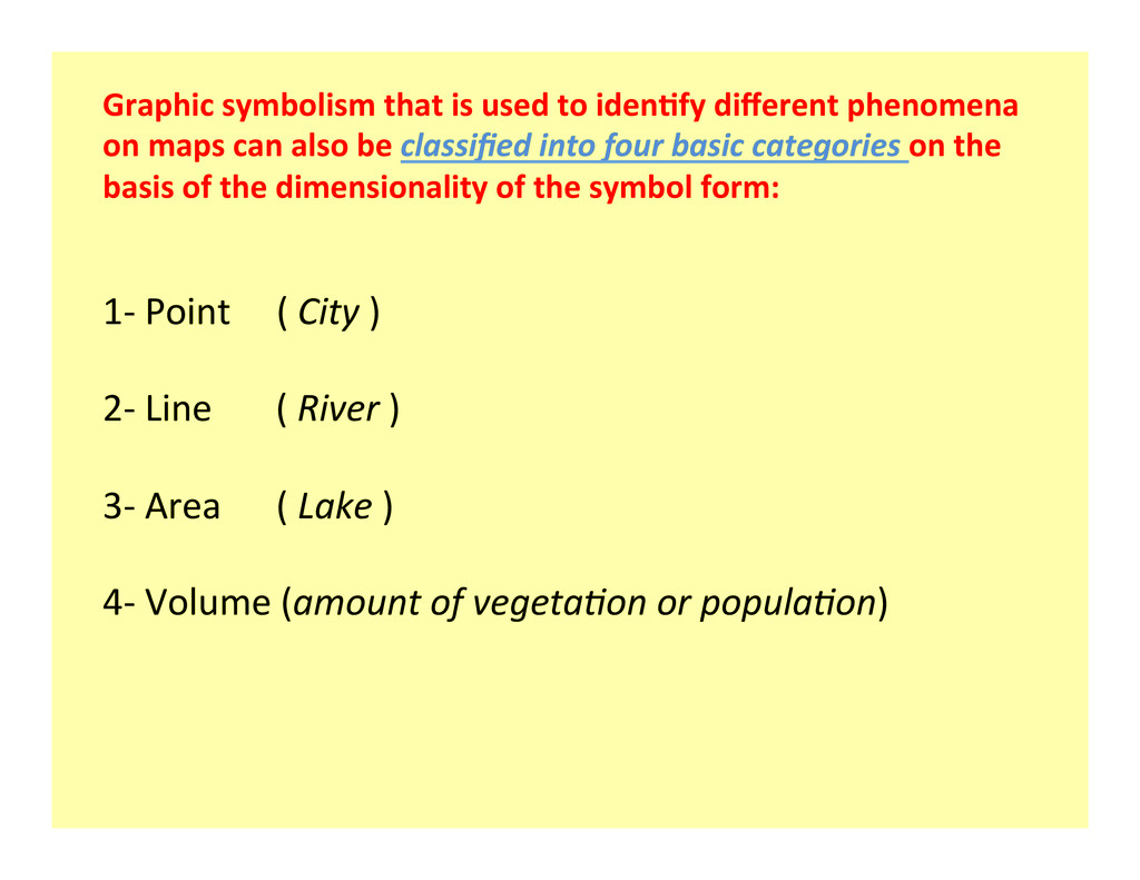
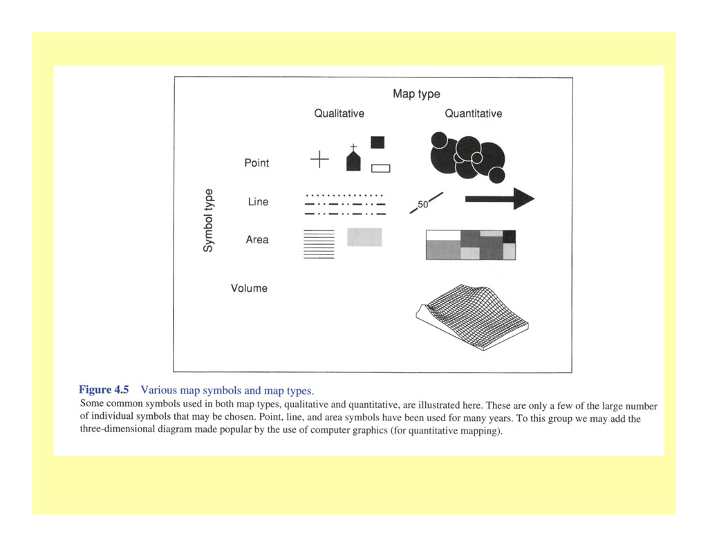
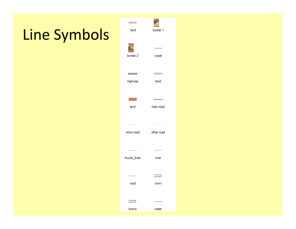
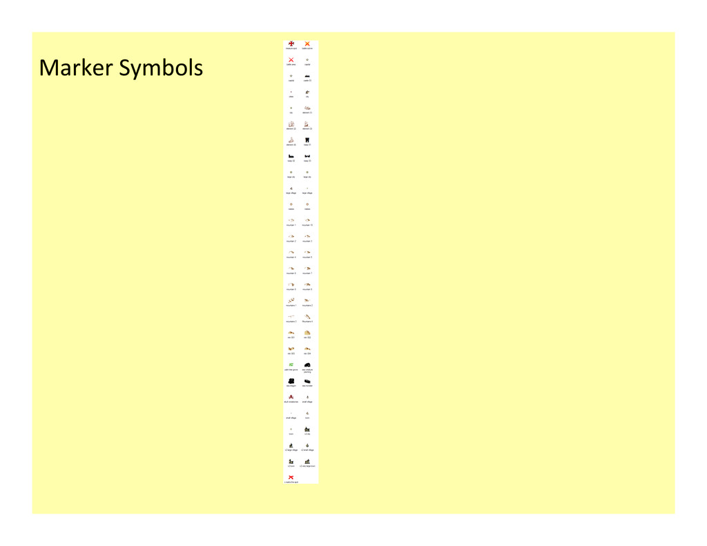
on maps can also be classified into four basic categories on the basis of the dimensionality of the symbol form: 1-‐ Point ( City ) 2-‐ Line ( River ) 3-‐ Area ( Lake ) 4-‐ Volume (amount of vegeta3on or popula3on)
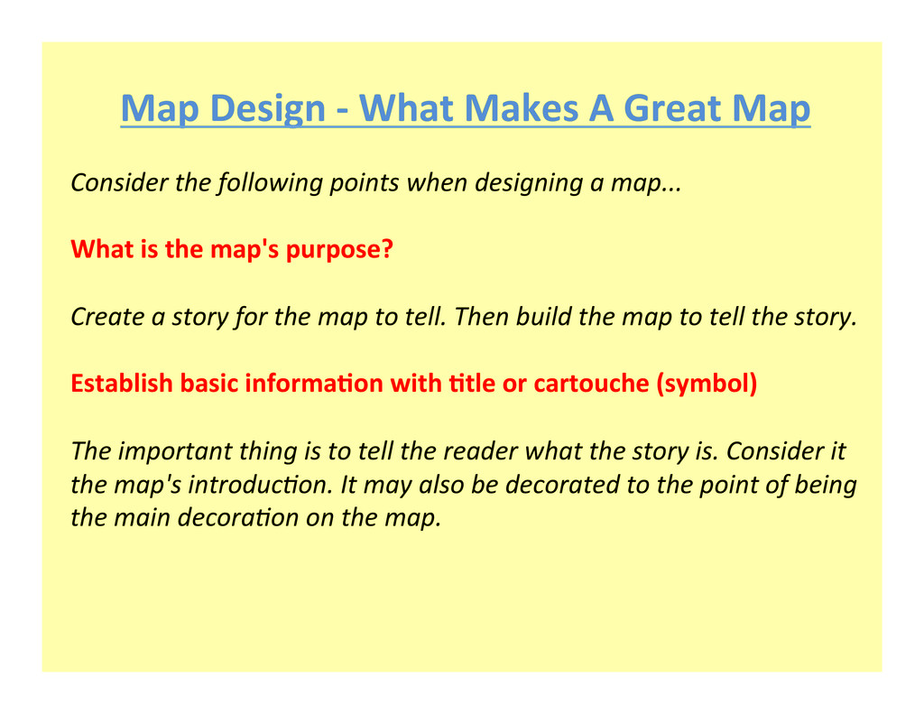
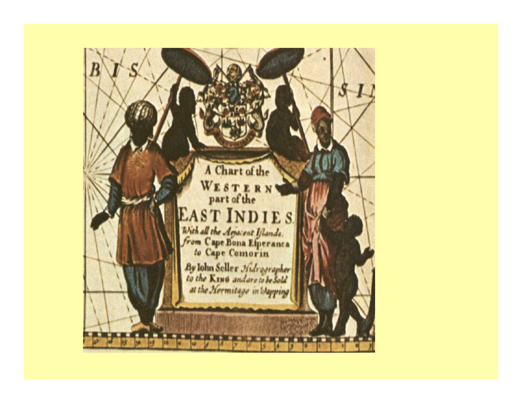
the following points when designing a map... What is the map's purpose? Create a story for the map to tell. Then build the map to tell the story. Establish basic informa?on with ?tle or cartouche (symbol) The important thing is to tell the reader what the story is. Consider it the map's introduc3on. It may also be decorated to the point of being the main decora3on on the map.
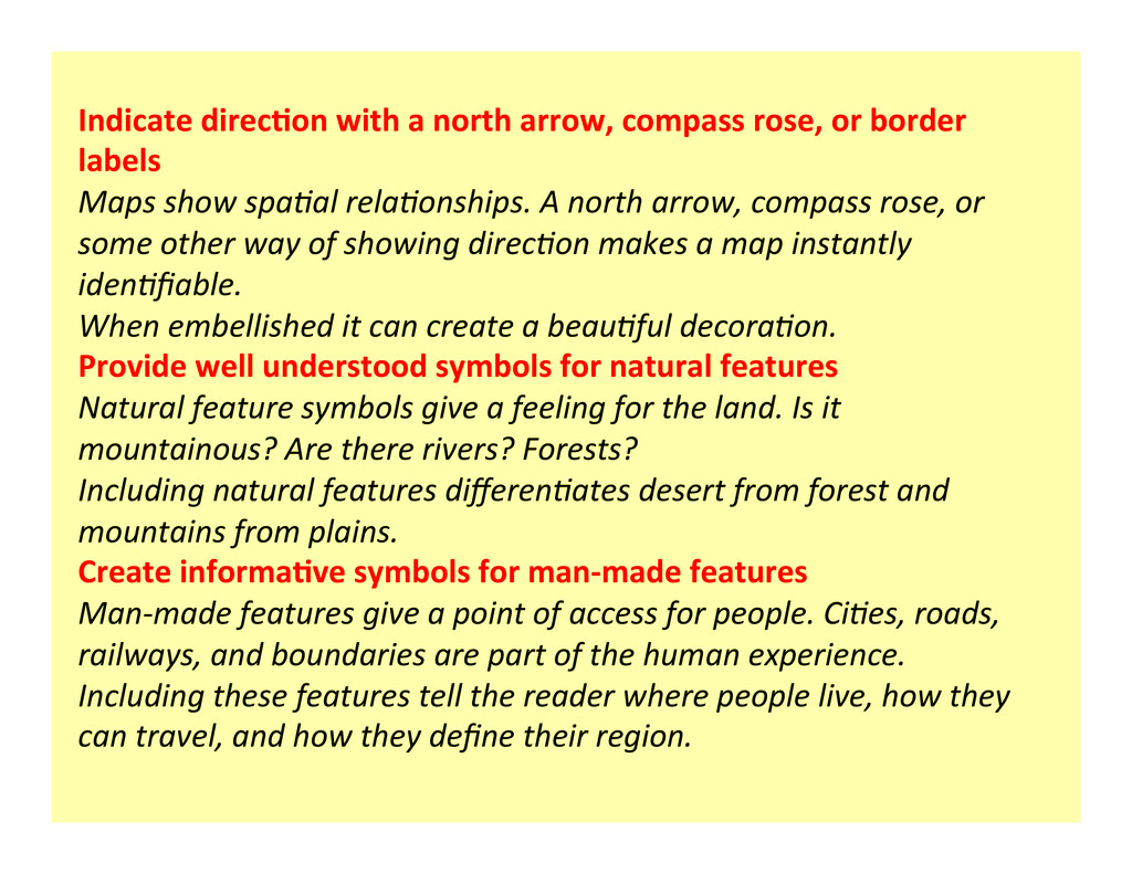
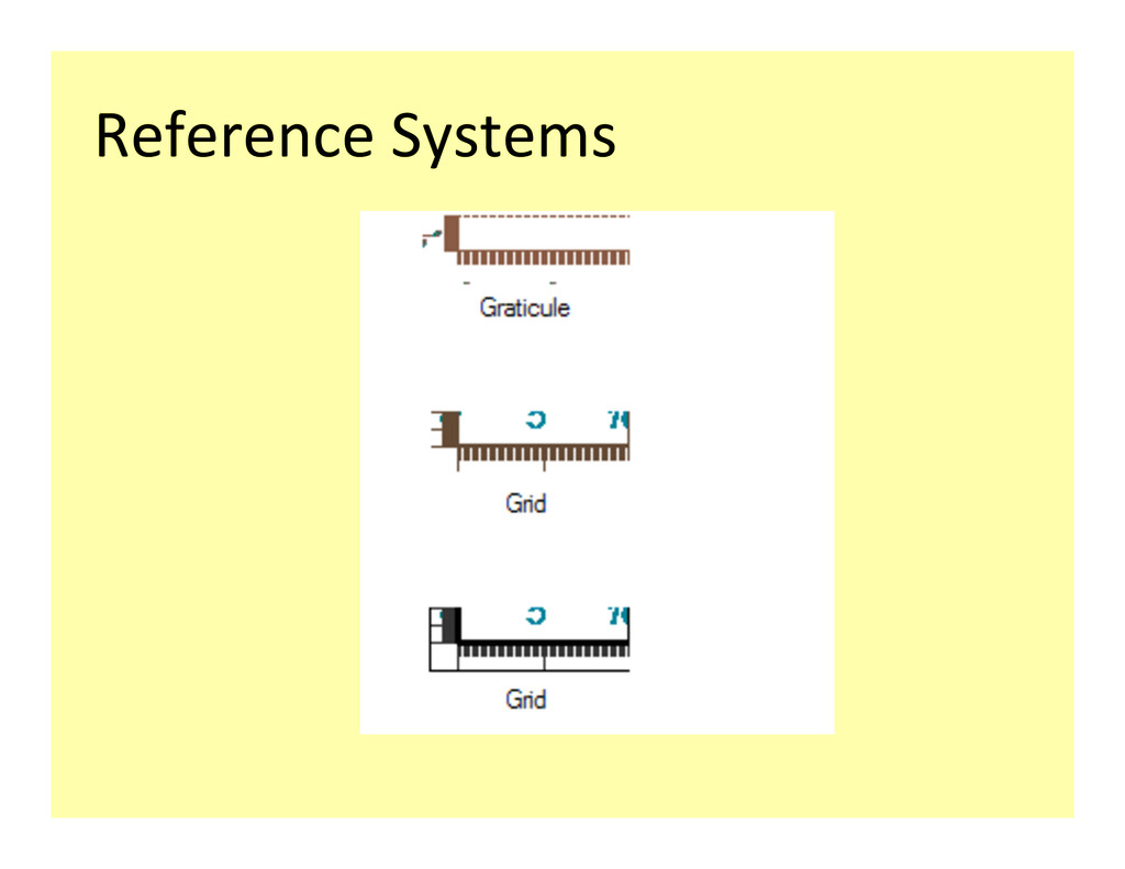
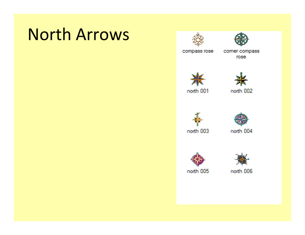
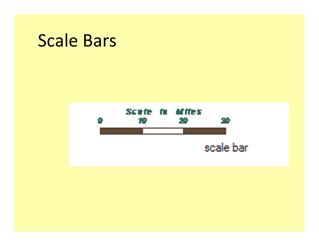
labels Maps show spa3al rela3onships. A north arrow, compass rose, or some other way of showing direc3on makes a map instantly iden3fiable. When embellished it can create a beau3ful decora3on. Provide well understood symbols for natural features Natural feature symbols give a feeling for the land. Is it mountainous? Are there rivers? Forests? Including natural features differen3ates desert from forest and mountains from plains. Create informa?ve symbols for man-‐made features Man-‐made features give a point of access for people. Ci3es, roads, railways, and boundaries are part of the human experience. Including these features tell the reader where people live, how they can travel, and how they define their region.
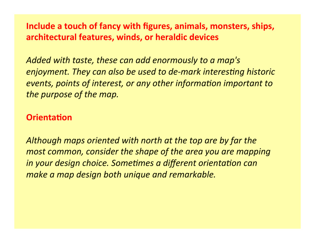
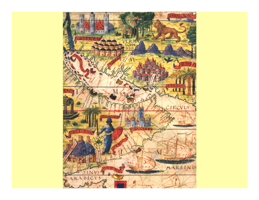
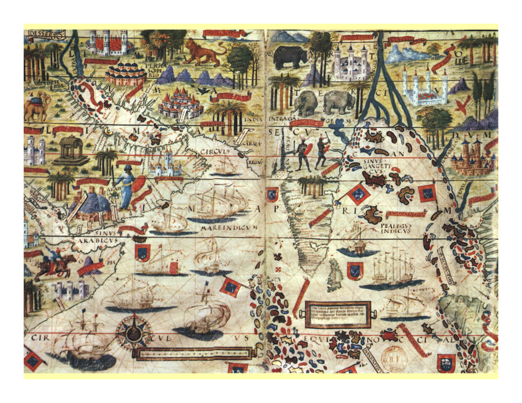
architectural features, winds, or heraldic devices Added with taste, these can add enormously to a map's enjoyment. They can also be used to de-‐mark interes3ng historic events, points of interest, or any other informa3on important to the purpose of the map. Orienta?on Although maps oriented with north at the top are by far the most common, consider the shape of the area you are mapping in your design choice. Some3mes a different orienta3on can make a map design both unique and remarkable.
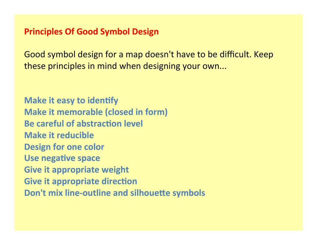
for a map doesn't have to be difficult. Keep these principles in mind when designing your own... Make it easy to iden?fy Make it memorable (closed in form) Be careful of abstrac?on level Make it reducible Design for one color Use nega?ve space Give it appropriate weight Give it appropriate direc?on Don't mix line-‐outline and silhoueSe symbols
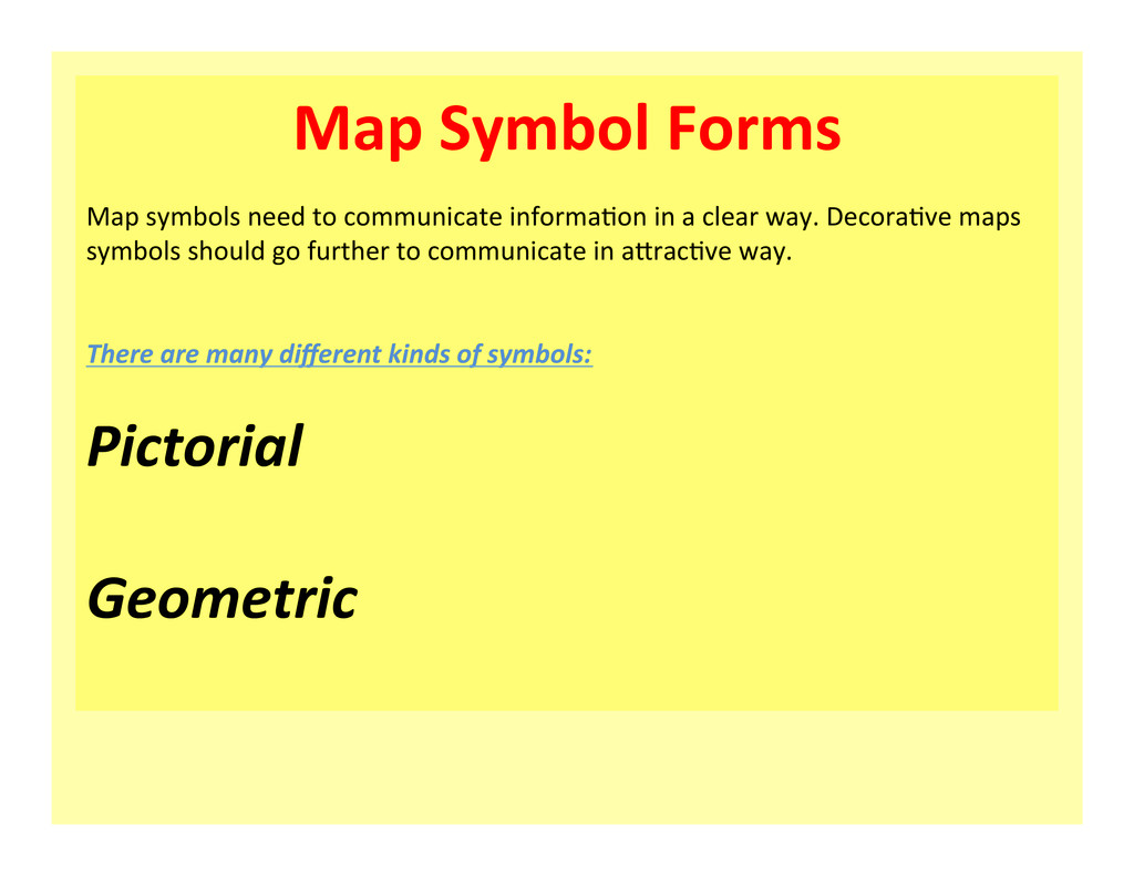
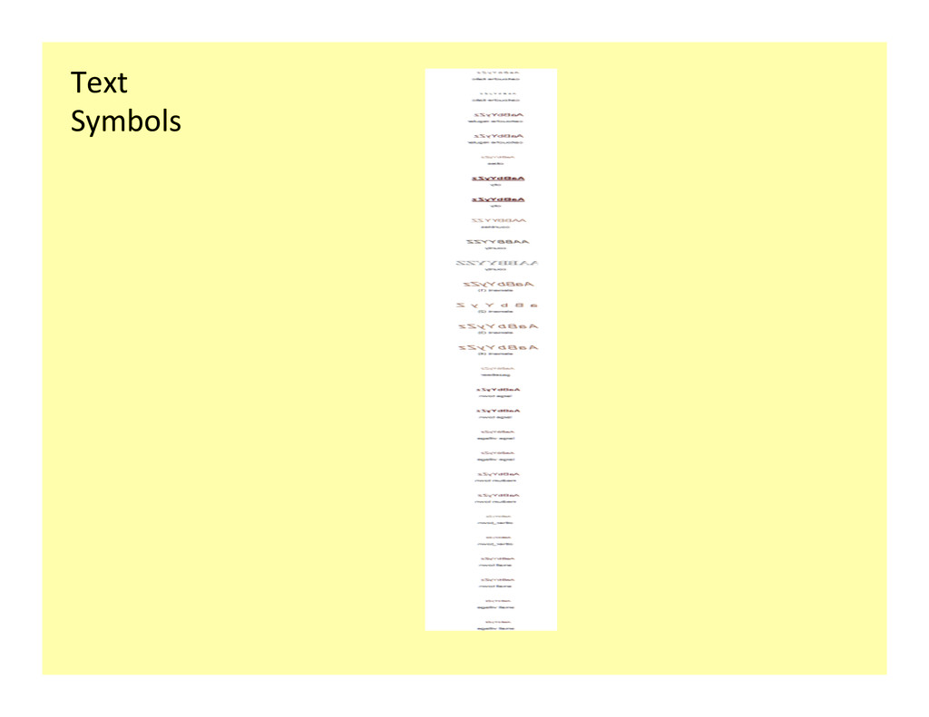
informa1on in a clear way. Decora1ve maps symbols should go further to communicate in a6rac1ve way. There are many different kinds of symbols: Pictorial Geometric
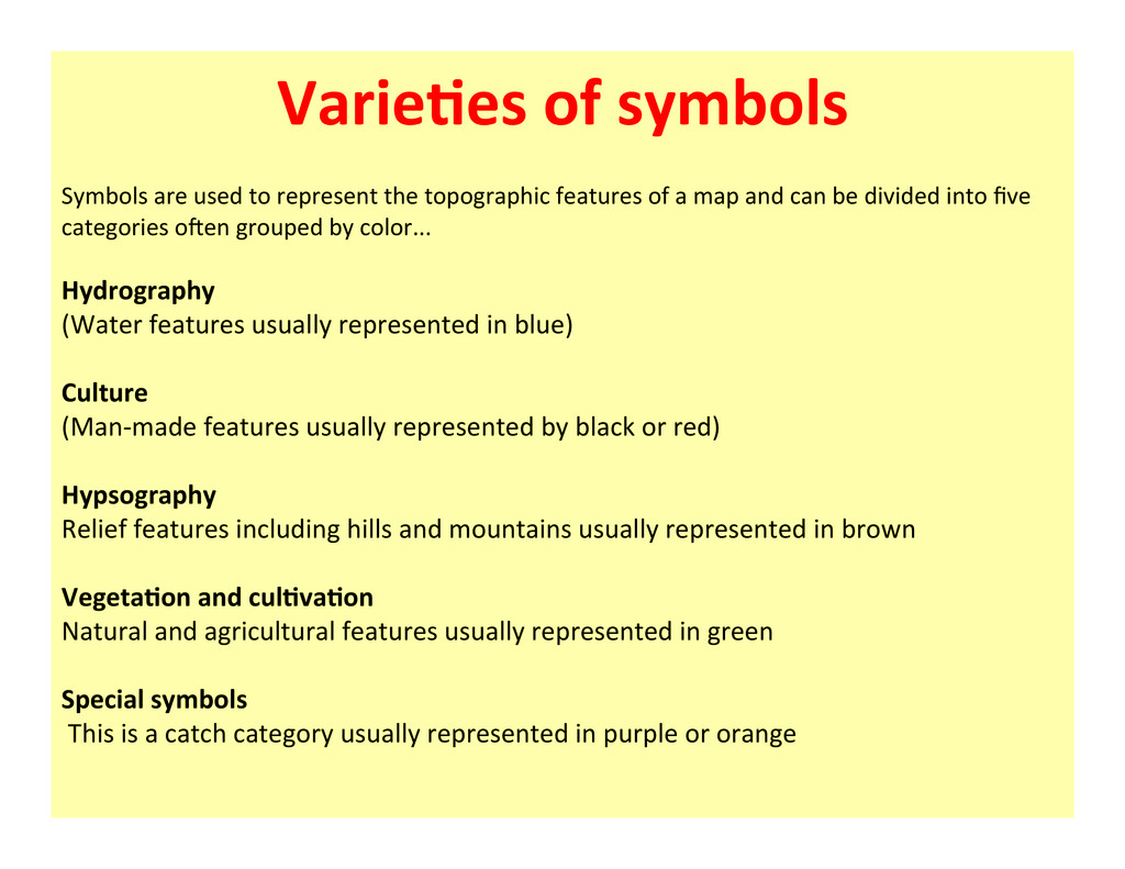
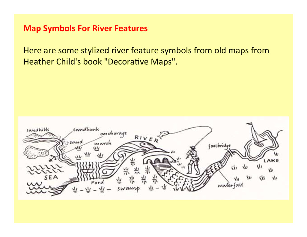
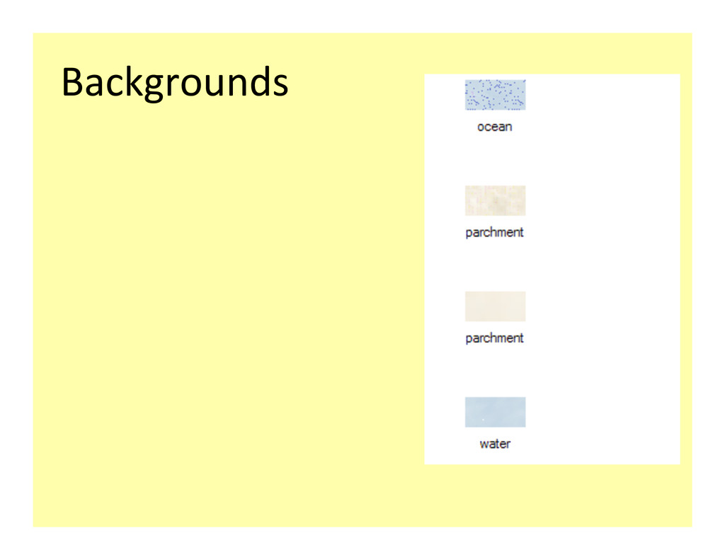
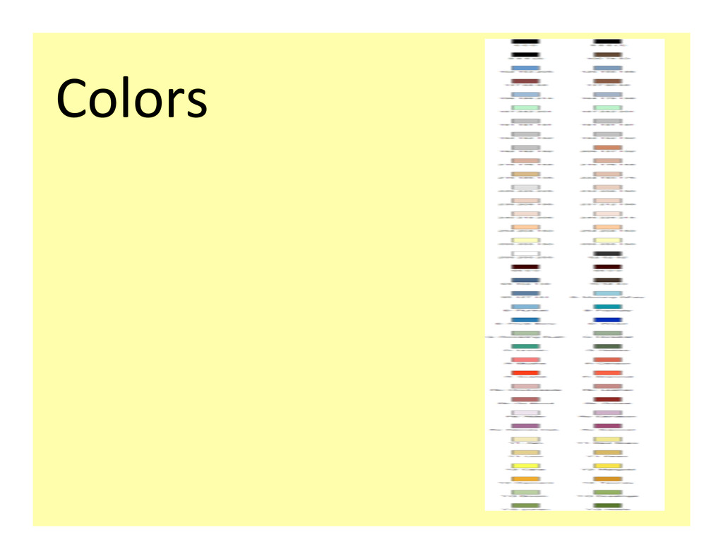
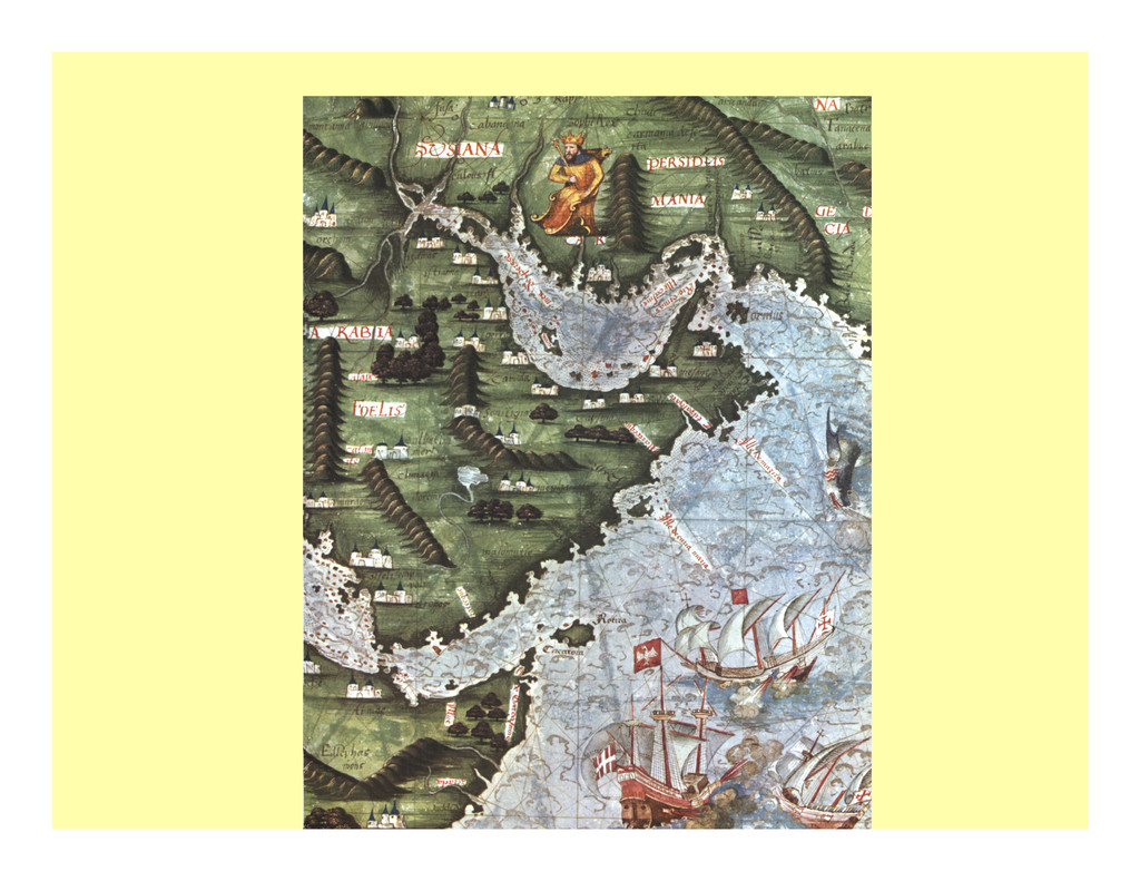
the topographic features of a map and can be divided into five categories oPen grouped by color... Hydrography (Water features usually represented in blue) Culture (Man-‐made features usually represented by black or red) Hypsography Relief features including hills and mountains usually represented in brown Vegeta?on and cul?va?on Natural and agricultural features usually represented in green Special symbols This is a catch category usually represented in purple or orange
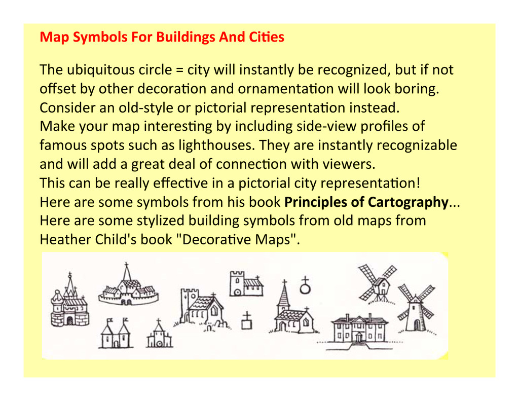
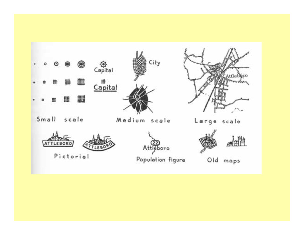
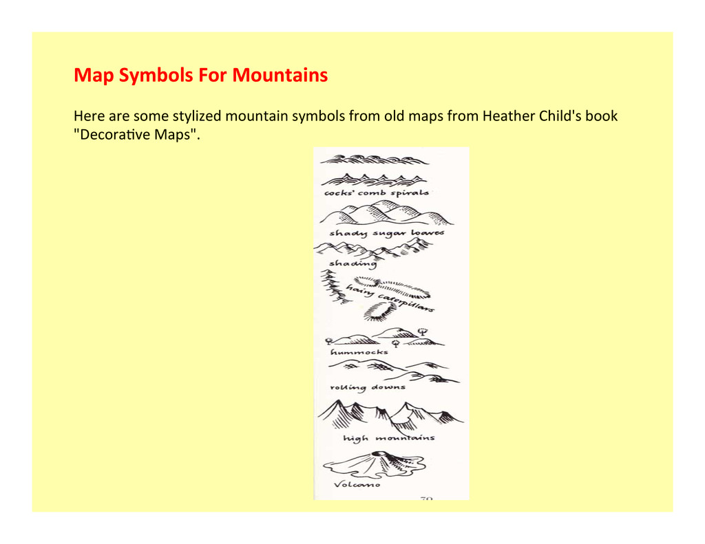
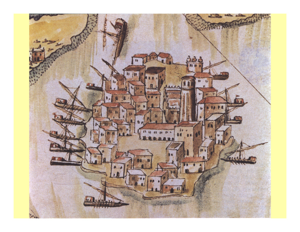
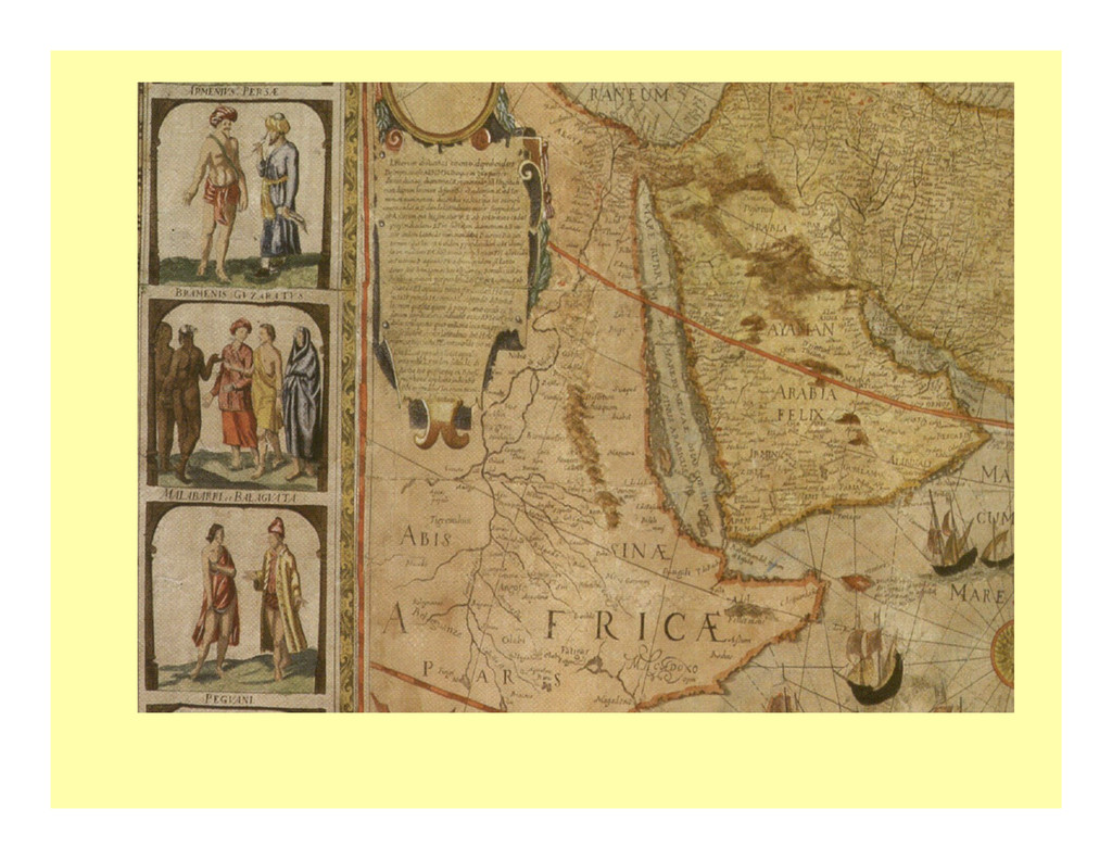
circle = city will instantly be recognized, but if not offset by other decora1on and ornamenta1on will look boring. Consider an old-‐style or pictorial representa1on instead. Make your map interes1ng by including side-‐view profiles of famous spots such as lighthouses. They are instantly recognizable and will add a great deal of connec1on with viewers. This can be really effec1ve in a pictorial city representa1on! Here are some symbols from his book Principles of Cartography... Here are some stylized building symbols from old maps from Heather Child's book "Decora1ve Maps".
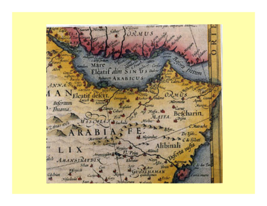
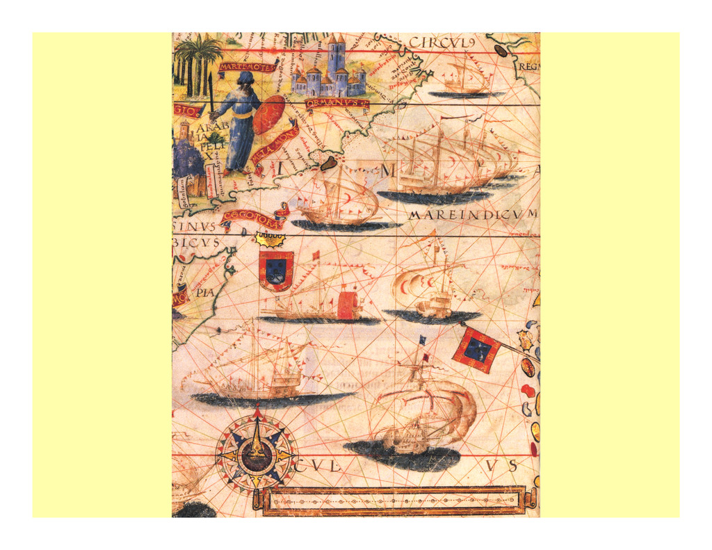
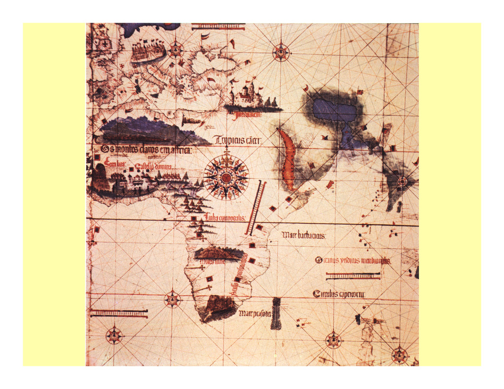
the different map design elements that were used for example: 1-‐ Texture: becomes the representa1on of water body waves (gulf). The movement of the water makes it a great piece of art. The waves are designed to relate to the actual height of waves. Simple gradated lines or waves near the shoreline can add interes1ng texture, also... 2-‐ Color: Colored an1que maps also have varia1on... It adds a lot of visual interest. Even large spaces such as the city and the surrounding country have variability so that it feels like organic land.
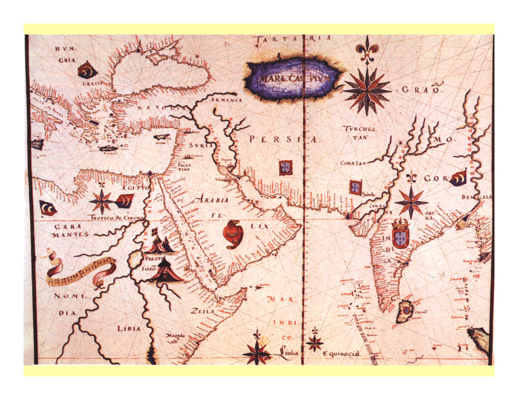
a historical use of maps for naviga1on. That purpose required a need for finding a bearing, or direc1on of movement, from a point on the map to another point on the map. An an1que compass rose tends to be more elaborate than modern, simplified designs. They oPen have a complex stack of direc1onal layers with an elaborate center and oPen a fleur de lis or some other symbol for the north point... The ornate an1que compass rose is the opposite of the streamlined simplified modern north arrow compass rose. This complex design fits in with the ornate nature of an1que maps. This is the reason a map designer should take the gestalt, or overall look of a map, into considera1on... A highly ornate an1que compass rose just doesn't fit into a simplified map. And a design emula1ng an an1que maps doesn't look right without an ornate compass rose... However, deriving a simplified version can really bring a decora1ve map to life.
are simply pictures that stand in for words. Modern maps tend to use simple, smaller, abstract symbols to represent features on maps. These stylized symbols are efficient, but not very decora1ve or compelling to look at. But this simplicity and smallness of mapping symbols is necessary because the density of informa1on on the map demands it.
it adds a lot of expressiveness to the map and allows the map ar1st to express a point of view. I also tend to like organic representa1ons. What are your preferences? Look at maps you really enjoy and decide what about the symbols appeals to you.