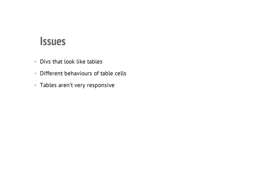
Laying out websites has traditionally been a pain. In the past lie a hundred thousand discarded HTML table elements and twisted, disfigured floated elements. In the future are the bright lights of flexbox and grid layouts. But where do we stand now? How should we be laying sites out in 2013?
Links from the presentation:
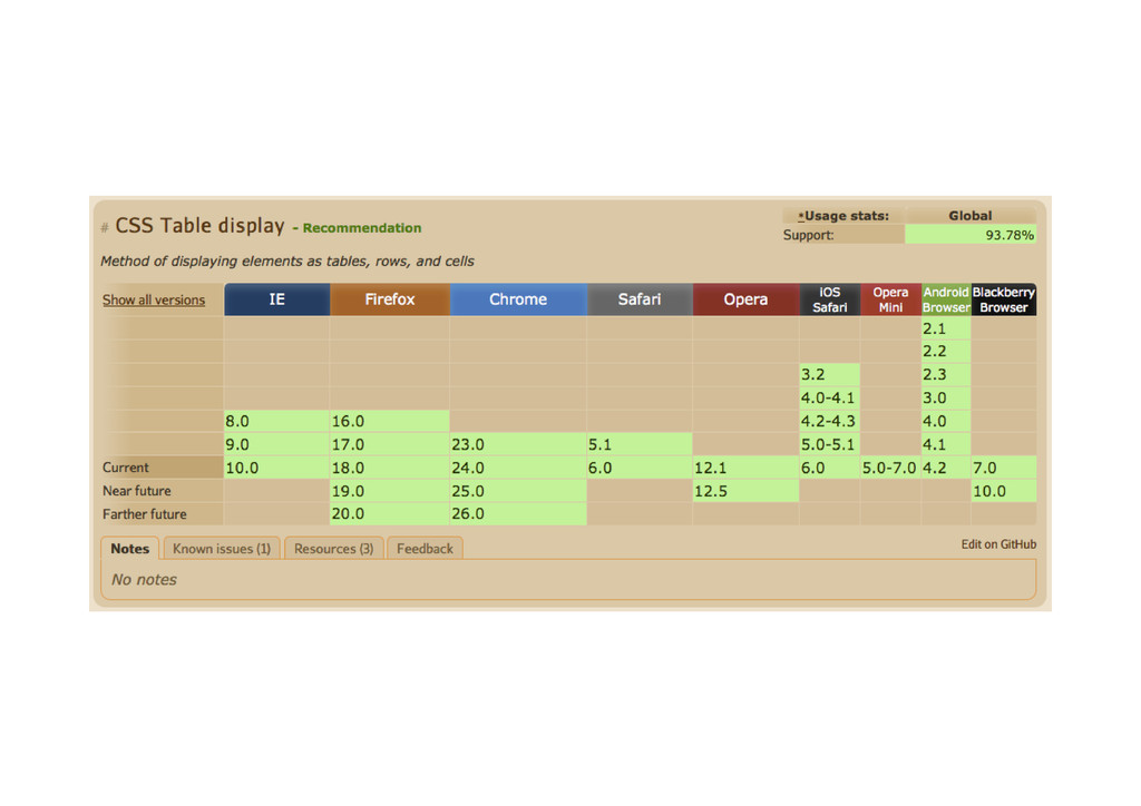
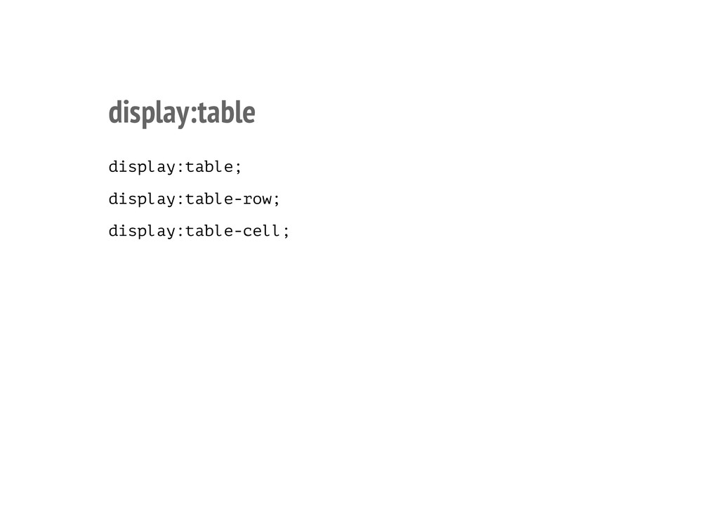
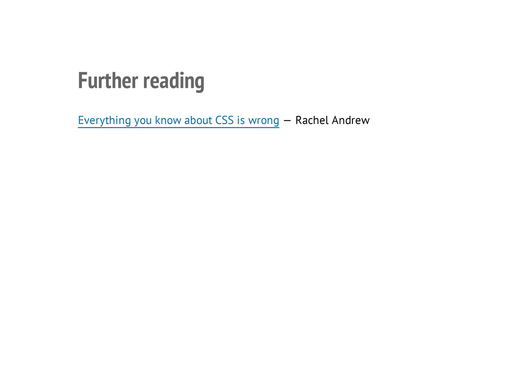
Table layouts:
Everything you know about CSS is wrong — Rachel Andrew — http://www.digital-web.com/articles/everything_you_know_about_CSS_Is_wrong/
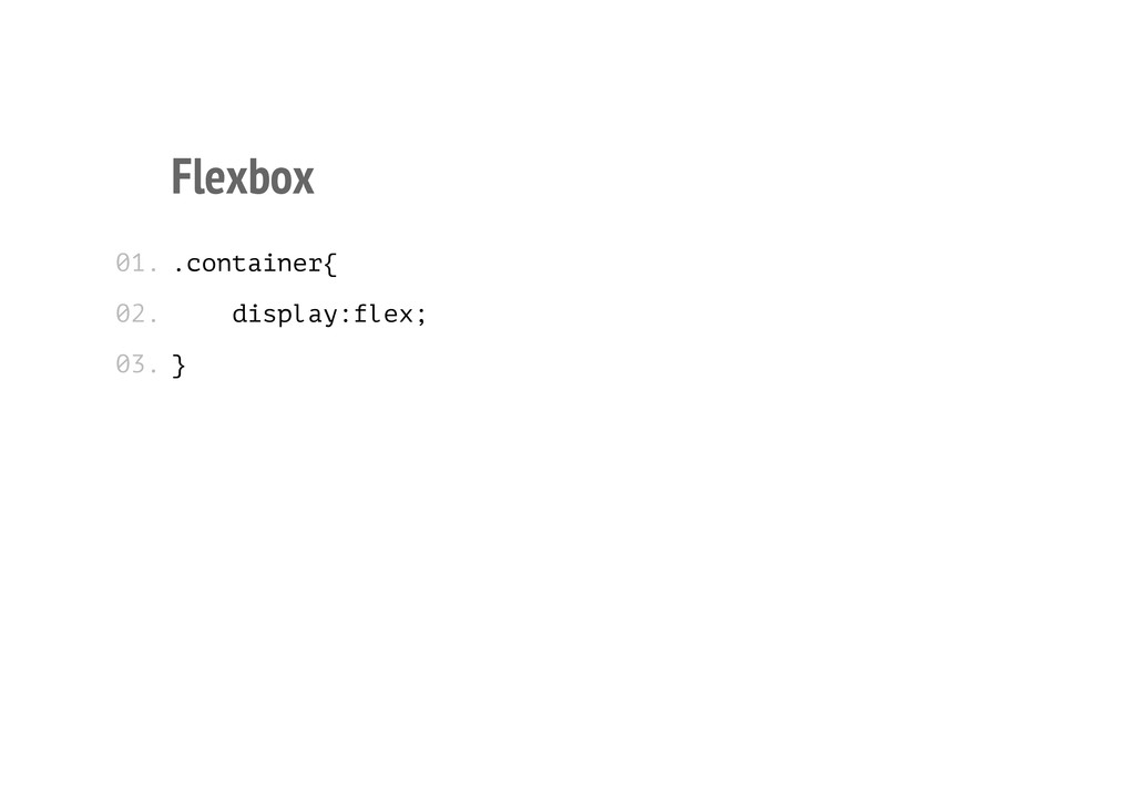
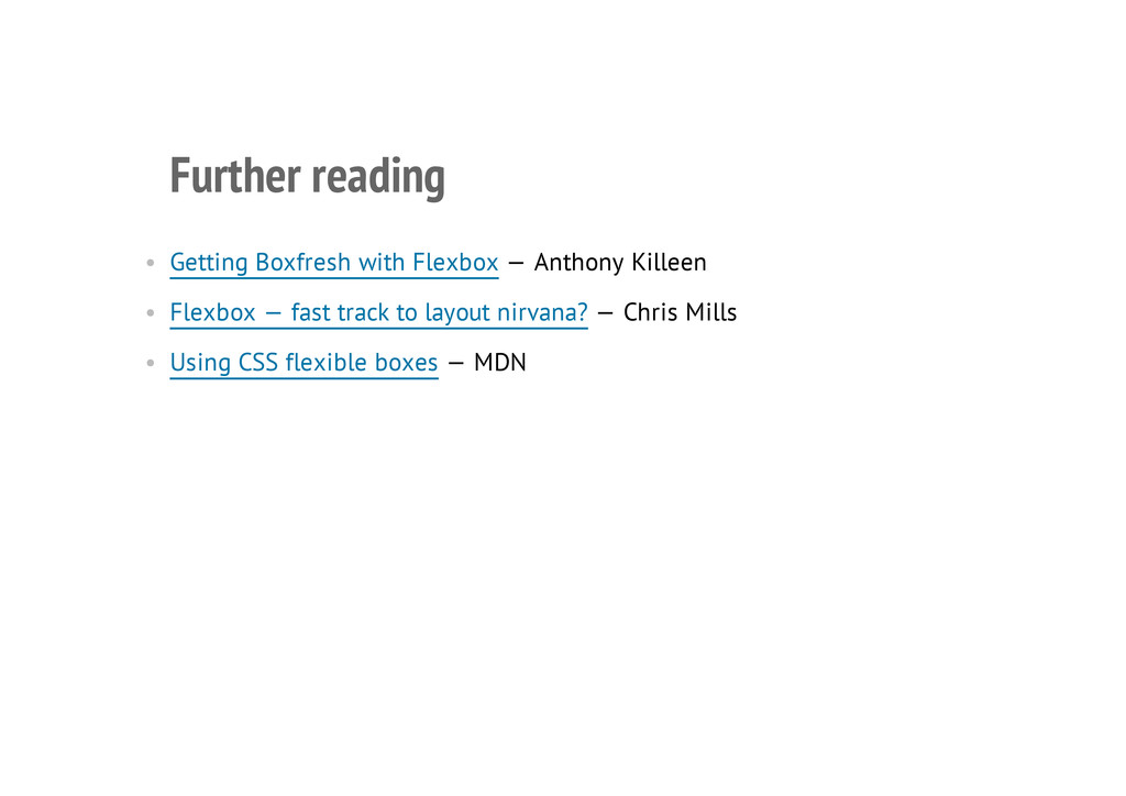
Flex box:
Getting Boxfresh with Flexbox — Anthony Killeen — http://www.12devsofxmas.co.uk/post/2013-01-02-day-8-getting-boxfresh-with-flexbox
Flexbox — fast track to layout nirvana? — Chris Mills — http://dev.opera.com/articles/view/flexbox-basics/
Using CSS flexible boxes — MDN — https://developer.mozilla.org/en-US/docs/CSS/Using_CSS_flexible_boxes
Grids:
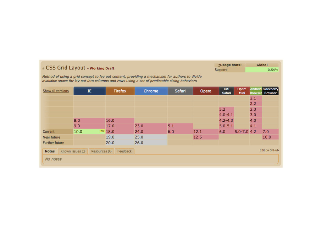
Giving Content Priority with CSS3 Grid Layout — Rachel Andrew — http://24ways.org/2012/css3-grid-layout/
The presentation and demos can be found at http://philnash.github.com/css-laid-out
 philnash
 yuppeeng
 yug1224
 panda728
 manfredsteyer
 maroon1st
 wakana0222
 niftycorp
 yusukebe
 athug
athug
 naoya
naoya
 sumedhbala
 schroneko
 frankvandijk
 inesmontani
 irinanazarova
 ianozsvald
 tamaranovitovic
 ryanjones
 coloredviolet
 mongodb
 caitiem20
 ipullrank
 iamctodd
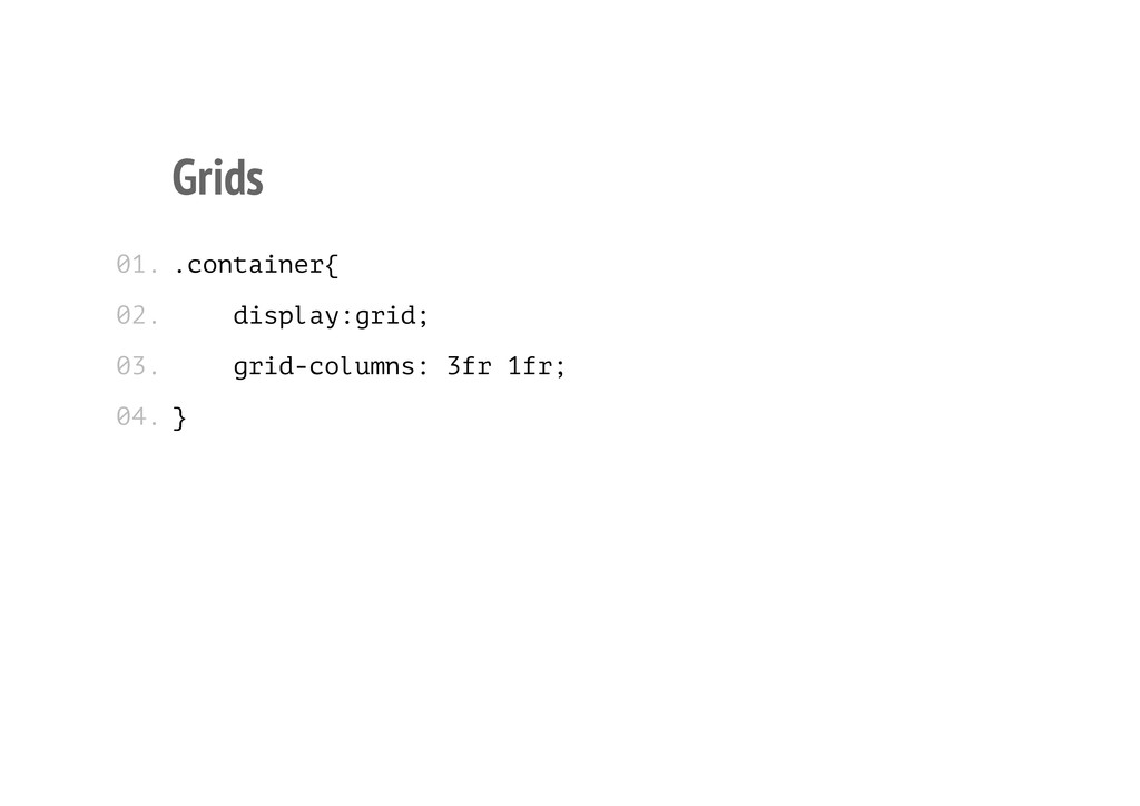
![Grids .container{ display:grid; grid-columns: (3fr 1fr)[11] 3fr; } 01. 02.](https://files.speakerdeck.com/presentations/3e5f892045350130bd1922000a9182a6/slide_33.jpg)