Upgrade to Pro — share decks privately, control downloads, hide ads and more …

Introduction to Responsive Web Design

Introduction to Responsive Web Design

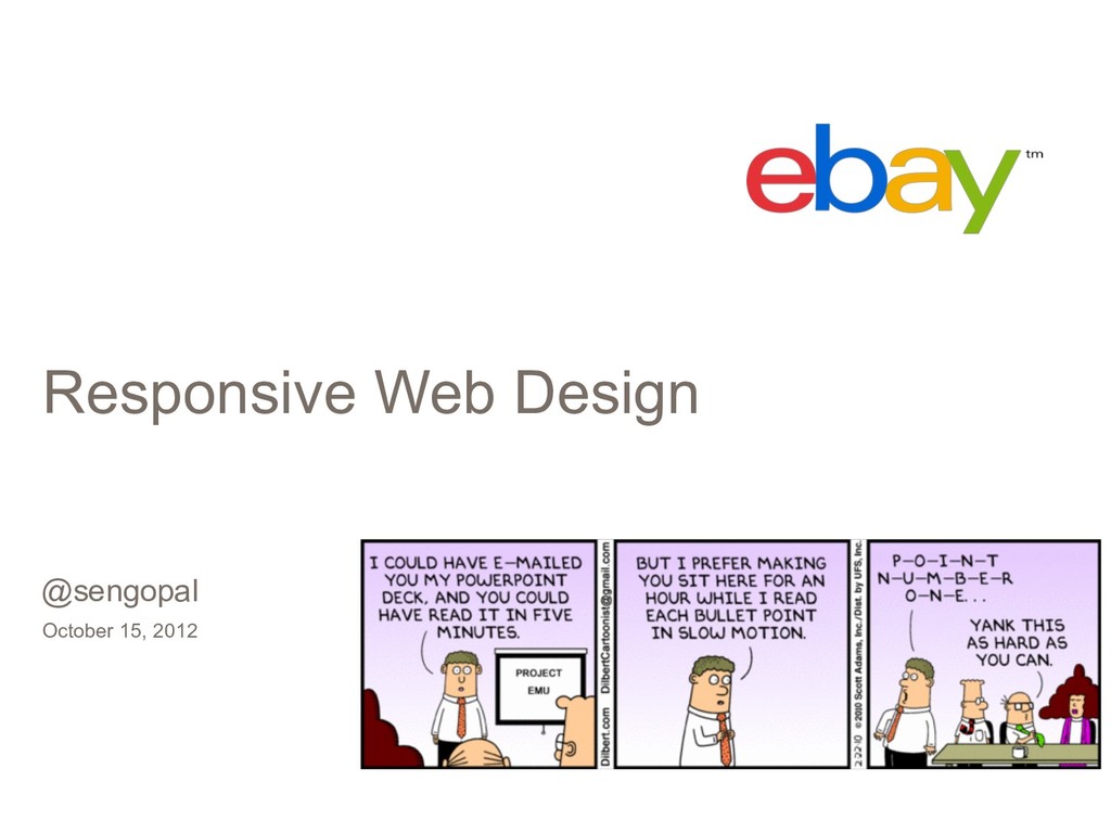
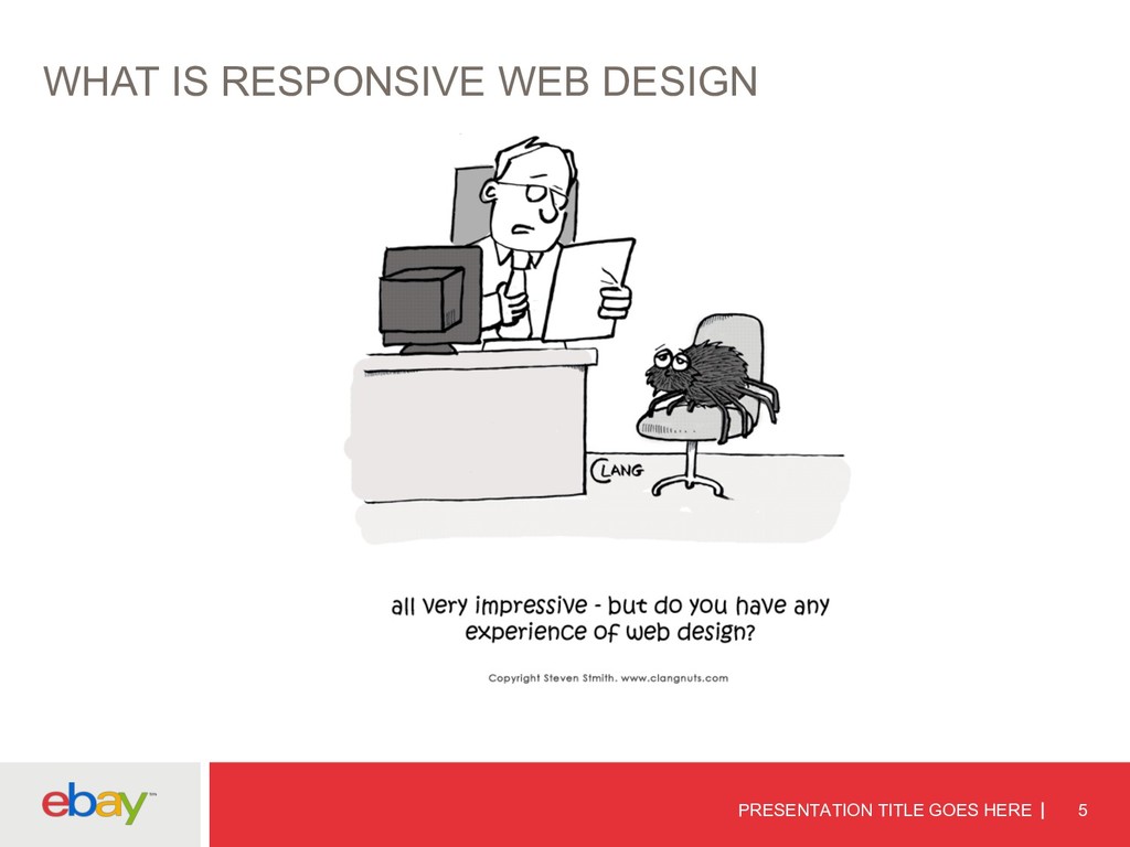
Introduction to Responsive Web Design - An presentation done in 2011 introducing the concept of responsive design and how to build an end-to-end pipeline from design, development and testing.

Senthilkumar Gopal

May 18, 2011
Tweet

More Decks by Senthilkumar Gopal

Other Decks in Programming

Transcript

  1. WHO ARE WE? PRESENTATION TITLE GOES HERE 2 Mahendar Madhavan

    - @mmahendar Senthil Gopal - @sengopal
  2. PRESENTATION TITLE GOES HERE 6 WHAT IS RESPONSIVE DESIGN A

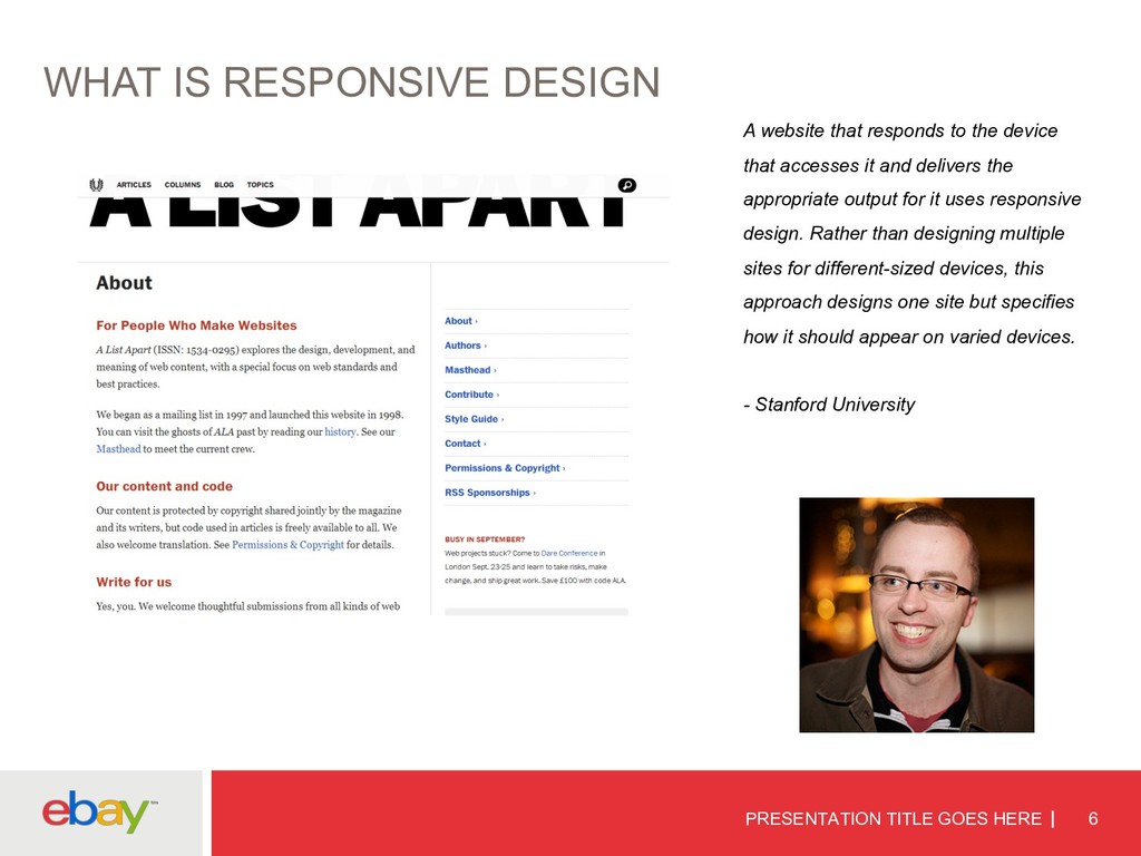
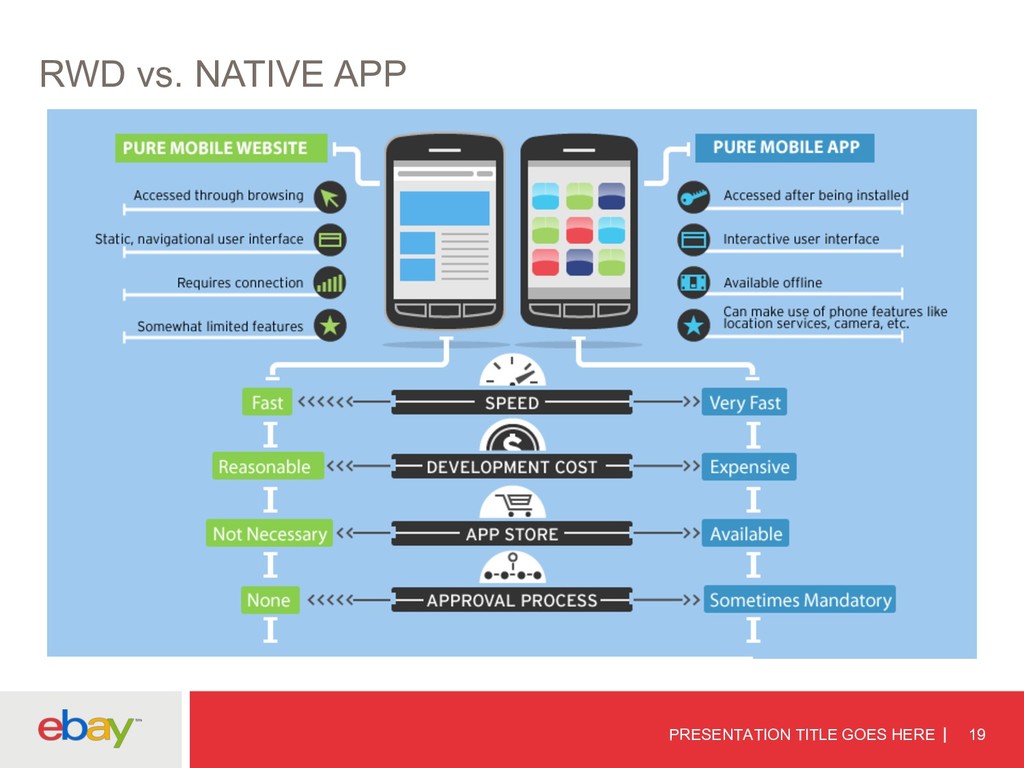
    website that responds to the device that accesses it and delivers the appropriate output for it uses responsive design. Rather than designing multiple sites for different-sized devices, this approach designs one site but specifies how it should appear on varied devices. - Stanford University
  3. WHY IS RWD POPULAR q MOBILE DEVELOPMENT q INCREASE IN

    REACH q ANALYTICS AND REPORTING q SEARCH ENGINES q SINGULAR CODE BASE q FASTER DEPLOYMENT q FUTURE-PROOFED
  4. DRAWBACKS PRESENTATION TITLE GOES HERE 14 q H/w features q

    Page size q Native experience q Legacy browser q Longer development time
  5. PRESENTATION TITLE GOES HERE 15 ADDRESSING THEM Harry: But I'm

    not allowed a broom. Professor Moody: You're allowed a wand...
  6. ADDRESSING THEM PRESENTATION TITLE GOES HERE 16 DRAWBACK MITIGATION H/W

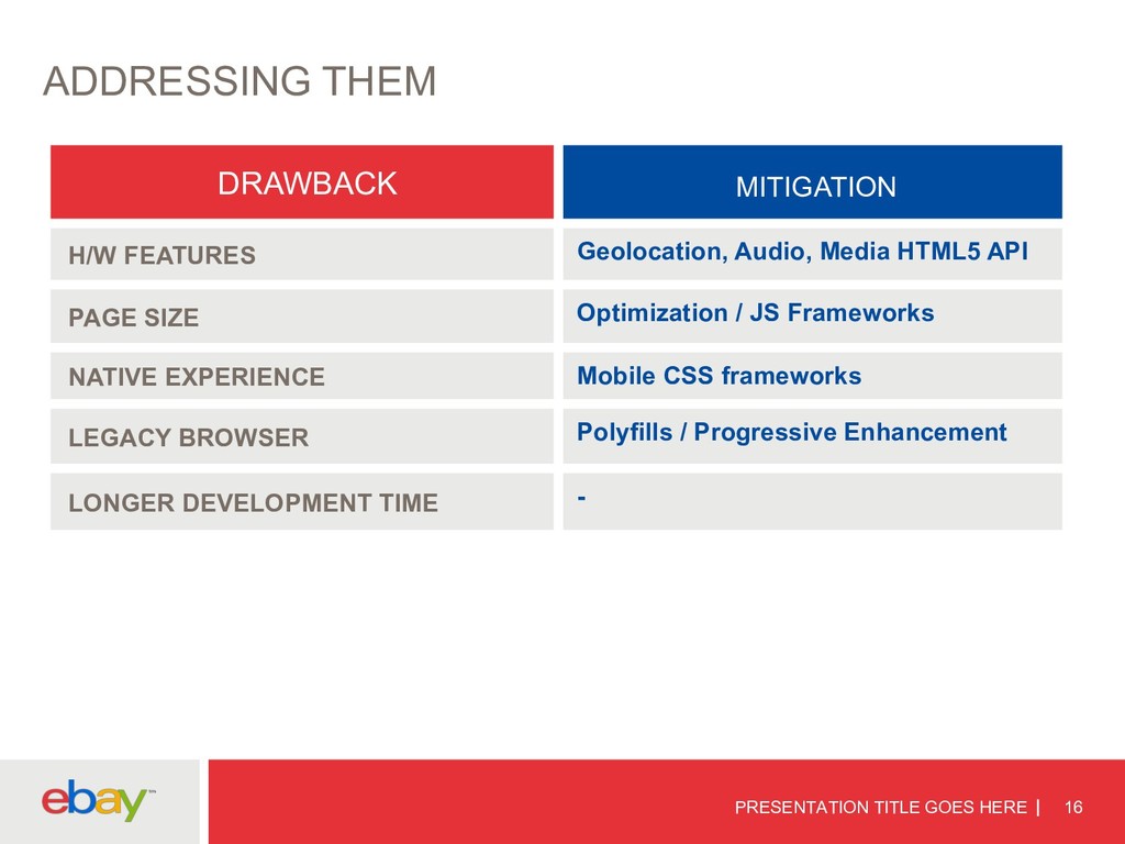
    FEATURES Geolocation, Audio, Media HTML5 API PAGE SIZE Optimization / JS Frameworks NATIVE EXPERIENCE Mobile CSS frameworks LEGACY BROWSER Polyfills / Progressive Enhancement LONGER DEVELOPMENT TIME -
  7. FACEBOOK STORY VS. SENCHA PRESENTATION TITLE GOES HERE 17 http://vimeo.com/55486684

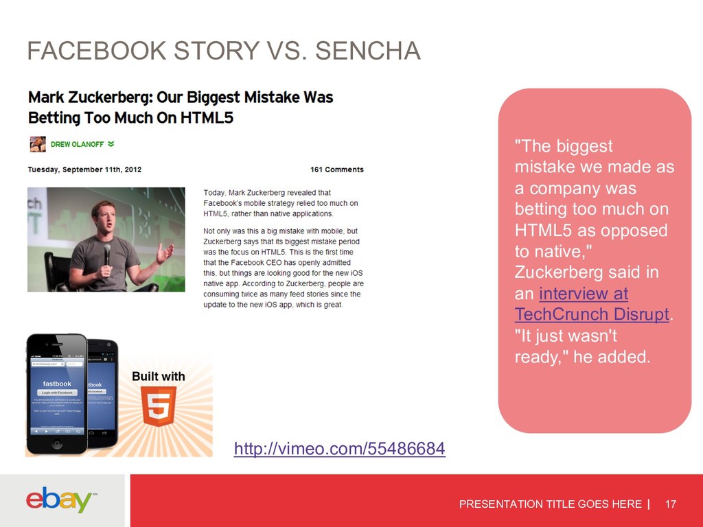
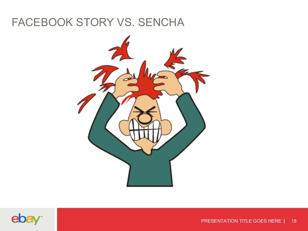
    "The biggest mistake we made as a company was betting too much on HTML5 as opposed to native," Zuckerberg said in an interview at TechCrunch Disrupt. "It just wasn't ready," he added.
  8. PRESENTATION TITLE GOES HERE 20 RWD vs. NATIVE APP in

    eBay q Api Requirements q Information Security q Multiple Device Releases
  9. CSS MEDIA QUERIES A media query consists of a media

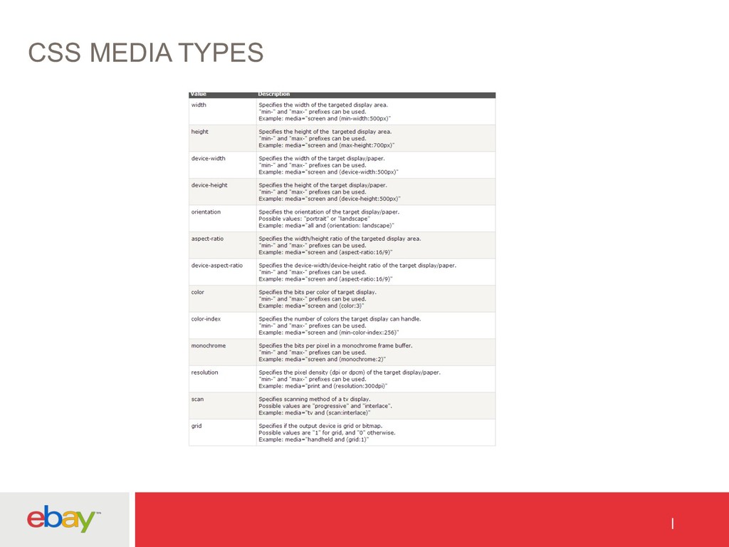
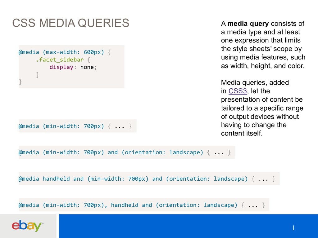
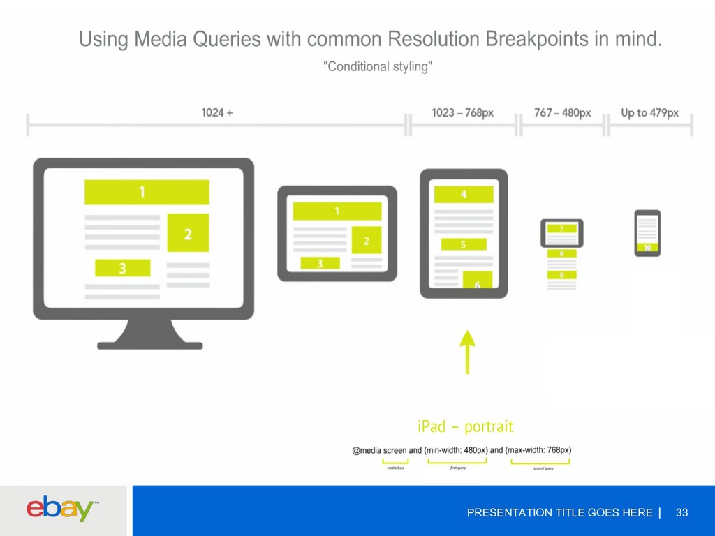
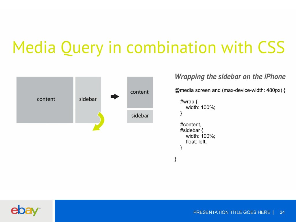
    type and at least one expression that limits the style sheets' scope by using media features, such as width, height, and color. Media queries, added in CSS3, let the presentation of content be tailored to a specific range of output devices without having to change the content itself. @media (max-width: 600px) { .facet_sidebar { display: none; } } @media (min-width: 700px) { ... } @media (min-width: 700px) and (orientation: landscape) { ... } @media handheld and (min-width: 700px) and (orientation: landscape) { ... } @media (min-width: 700px), handheld and (orientation: landscape) { ... }
  10. PRESENTATION TITLE GOES HERE 35 FINAL THOUGHTS q Start with

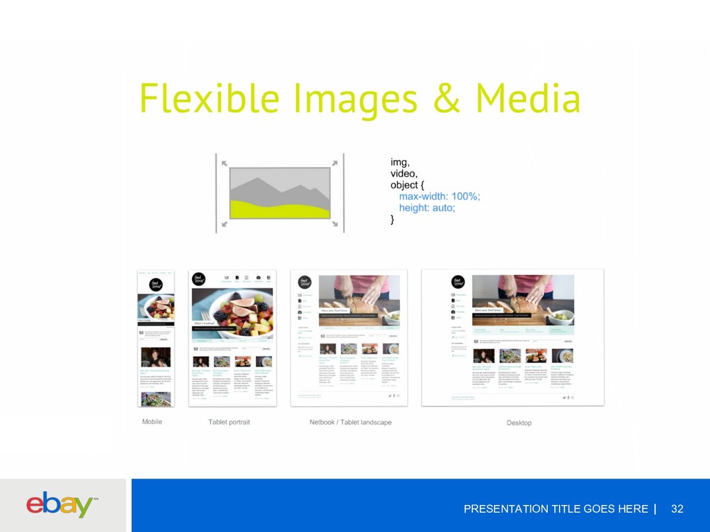
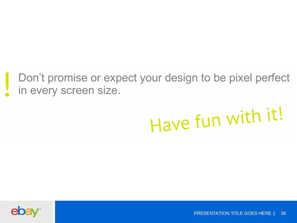
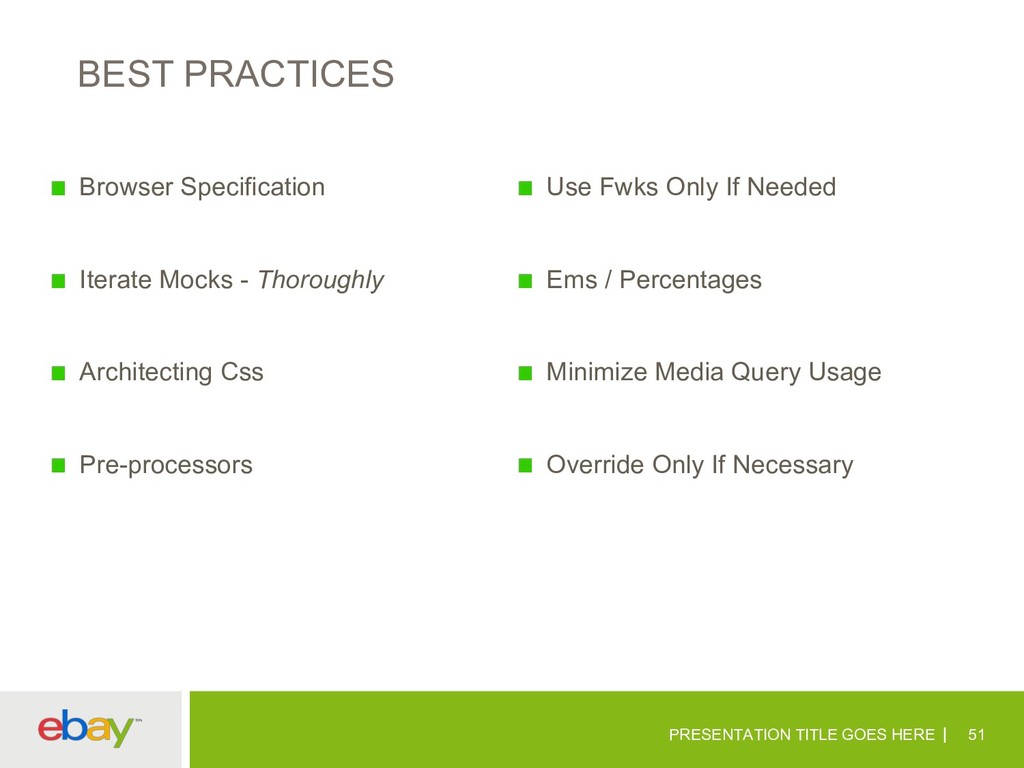
    the Grid – Make it Flexible q Make Images flexible q Set breakpoints wherever you need them – make choices based on the design rather than the device. q Don’t assume that mobile users want “less” content q Mobile-first design. q Then focus on the details.
  11. PRESENTATION TITLE GOES HERE 44 POLYFILLS https://github.com/Modernizr/Modernizr/wiki/HTML5-Cross-Browser-Polyfills A polyfill, or

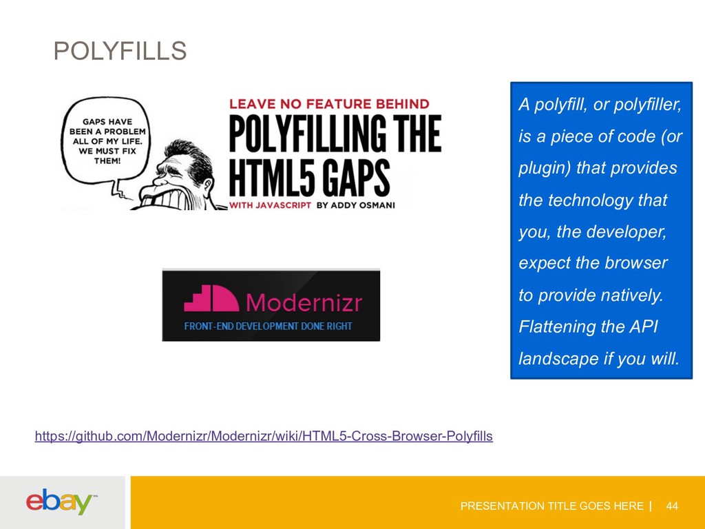
    polyfiller, is a piece of code (or plugin) that provides the technology that you, the developer, expect the browser to provide natively. Flattening the API landscape if you will.
  12. PRESENTATION TITLE GOES HERE 49 UED q Mocks For All

    Aspect Ratios q 1-1 Page Mapping q Specifications q Adobe Reflow q Images Delivery q Component Re-use q Iterations
  13. PRESENTATION TITLE GOES HERE 51 BEST PRACTICES Browser Specification Iterate

    Mocks - Thoroughly Architecting Css Pre-processors Use Fwks Only If Needed Ems / Percentages Minimize Media Query Usage Override Only If Necessary
  14. PRESENTATION TITLE GOES HERE 52 TESTING Ui Testing Side-by-side Comparison

    Interactive Resizers Bookmarklets Mobile Device Testing Accessibility Performance
  15. PRESENTATION TITLE GOES HERE 54 NEXT – PROGRESSIVE ENHANCEMENT Progressive

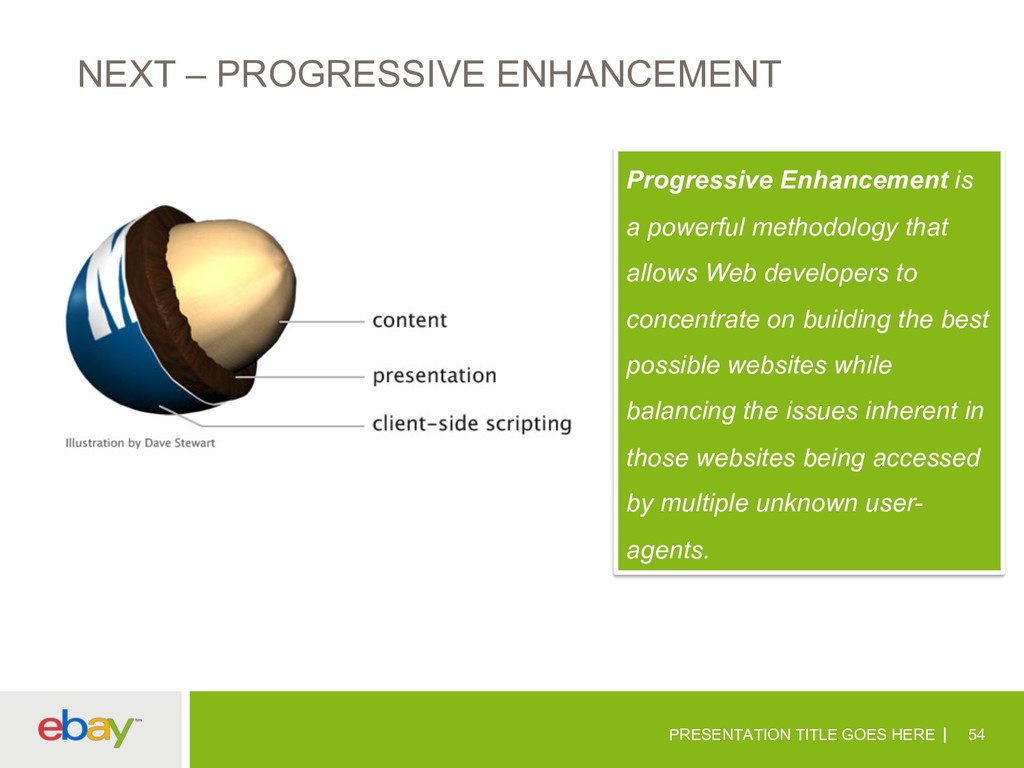
    Enhancement is a powerful methodology that allows Web developers to concentrate on building the best possible websites while balancing the issues inherent in those websites being accessed by multiple unknown user- agents.
  16. KEEP YOURSELF UPDATED PRESENTATION TITLE GOES HERE 56 @boagworl @zeldman

    @alistapart @smashingmag @snookca @beep @paul_irish @addyosmani @chriscoyier @csswizardry @codepo8
  17. APPENDIX – I PRESENTATION TITLE GOES HERE 58 1) Ethan

    Marcotte coined the term responsive web design (RWD) in a May 2010 article in A List Apart. 2) http://alistapart.com/article/responsive-web-design FRAMEWORKS 1) http://getbootstrap.com/2.3.2/ 2) http://lessframework.com/ 3) http://www.getskeleton.com/ 4) http://foundation.zurb.com/ 5) http://fluidbaselinegrid.com/ 6) http://gumbyframework.com/ 7) http://matthewhartman.github.io/base/ 8) http://semantic.gs/ 9) http://responsive.gs/ 10)http://www.columnal.com/ 11)http://fluidbaselinegrid.com/ 12)http://www.profoundgrid.com/ 13)http://thatcoolguy.github.io/gridless-boilerplate/ 14)http://goldilocksapproach.com/ 15)http://inuitcss.com/ 16)http://www.blueprintcss.org/ GRIDS 1) http://purecss.io/ 2) http://neat.bourbon.io/ 3) http://imperavi.com/kube/ 4) http://rwdgrid.com/ 5) http://thisisdallas.github.io/Simple-Grid/
  18. APPENDIX – III (TESTING TOOLS) PRESENTATION TITLE GOES HERE 59

    UI Testing http://dfcb.github.io/Responsivator/ http://lab.maltewassermann.com/viewport-resizer/ http://responsivetest.net/ http://designmodo.com/responsive-test/ http://quirktools.com/screenfly/ http://beta.screenqueri.es/ http://ami.responsivedesign.is/ http://deviceponsive.com/ http://responsive.is/typecast.com Bookmarklets http://lab.maltewassermann.com/viewport-resizer http://codebomber.com/jquery/resizer http://responsive.victorcoazulon.fr/ Interactive resizers http://responsive.is http://screenqueri.es http://bradfrostweb.com/demo/ish http://designmodo.com/responsive-test http://cybercrab.com/screencheck http://responsivepx.com Side-by-side comparison http://mattkersley.com/responsive http://www.studiopress.com/responsive http://responsive.pixeltuner.de http://ami.responsivedesign.is/
  19. APPENDIX – III – Images used are copyrighted PRESENTATION TITLE

    GOES HERE 60 1) http://dilbert.com/strips/comic/2010-02-22/ 2) http://www.waysandmeanstechnology.com/BlogImages/Advantages-of-HTML5-in-App-Development.png 3) http://theeastwing.s3.amazonaws.com/wp-content/uploads/2012/06/ethan-cover.png 4) http://www.alphabetix.net/images/b_images2008/webdesign_cartoon.png 5) http://www.dvdbeaver.com/film2/DVDReviews49/spider-man_blu-ray/large/large_spider-man_blu-ray4s.jpg 6) http://1.bp.blogspot.com/_O4qgpChbarw/TJmWsUdQsYI/AAAAAAAABLk/Tuh7tvkHMWI/s400/tearing-hair-out.gif 7) http://www.mdgadvertising.com/blog/wp-content/uploads/2013/06/should-you-build-a-mobile-app-or-mobile-website.png 8) http://31.media.tumblr.com/05ac3cb897737072d77a37d29d3cf7bb/tumblr_mpa92h2AId1sxr185o1_500.gif 9) http://i0.kym-cdn.com/photos/images/original/000/346/560/157.jpg 10) http://cdn.impressivewebs.com/2011-12/html5-4.jpg 11) http://cdn.memegenerator.net/instances/400x/36448402.jpg 12) http://076dd0a50e0c1255009e-bd4b8aabaca29897bc751dfaf75b290c.r40.cf1.rackcdn.com/images/files/000/273/792/original/original.jpg 13) https://blog.twitter.com/sites/all/themes/gazebo/img/twitter-bird-white-on-blue.png 14) http://dogbert.zymichost.com/resource/dilbert/dilbert2003081524509.gif 15) http://www.firstfoundation.ca/images/made/uploads/featuredImages/Any_Questions_438_292.jpg 16) http://www.techrepublic.com/blog/web-designer/responsive-web-design-vs-mobile-app-development/ 17) http://img-cache.cdn.gaiaonline.com/40b26308e61df26ddd895ce46d0c890c/http://i632.photobucket.com/albums/uu45/TwiliteLuvr/Harry%20Potter/devonmurray.jpg 18) http://i0.kym-cdn.com/photos/images/original/000/344/852/300.jpg 19) http://3.bp.blogspot.com/_QUC0Qp8XAR8/TPgG4ICdQUI/AAAAAAAAAyc/qkOkmMBdYGI/s400/homer-slap-forehead.jpg