Upgrade to Pro — share decks privately, control downloads, hide ads and more …

Responsive images and how to implement them in Neos

Responsive images and how to implement them in Neos

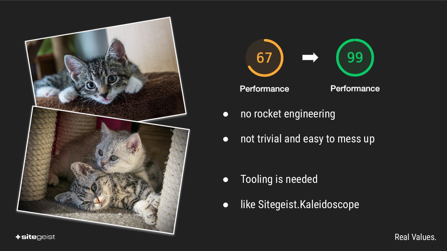
Rendering images with optimal quality and minimal payload size is surprisingly complex because of the range of user-devices and network conditions. The talk will cover the standards behind responsive images and show the implementation in vanilla Neos and with Sitegeist.Kaleidoscope.

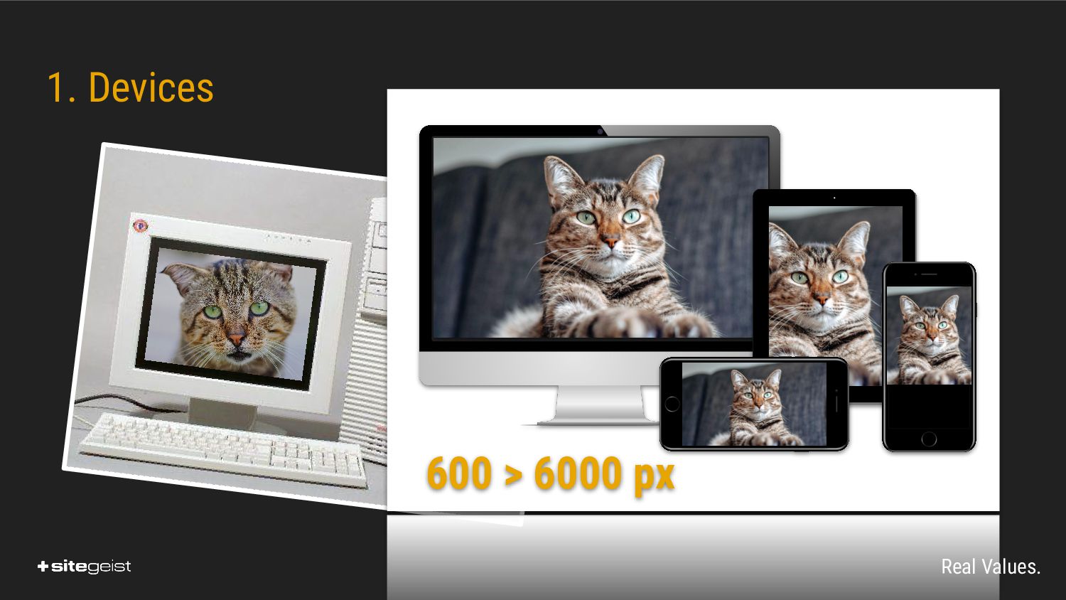
Usertracking aside images are the major payload of recent websites and while the standards regarding image rendering in HTML are not overly complex the details get complicated fast. Especially in a CMS like Neos where most of the work has to be automated.

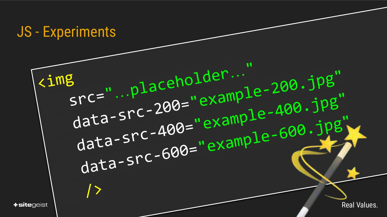
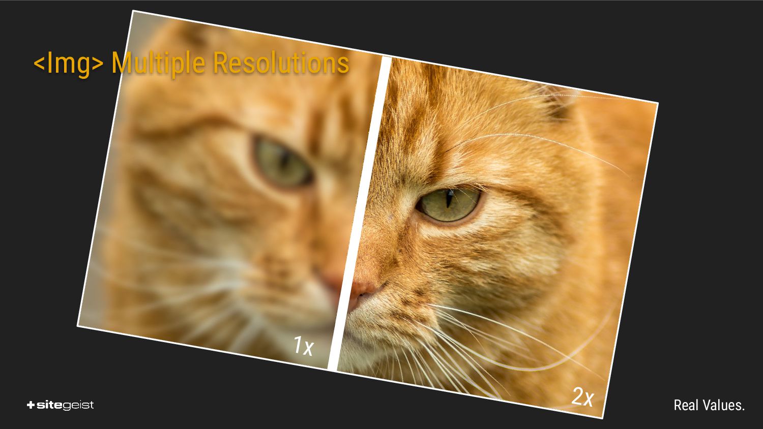
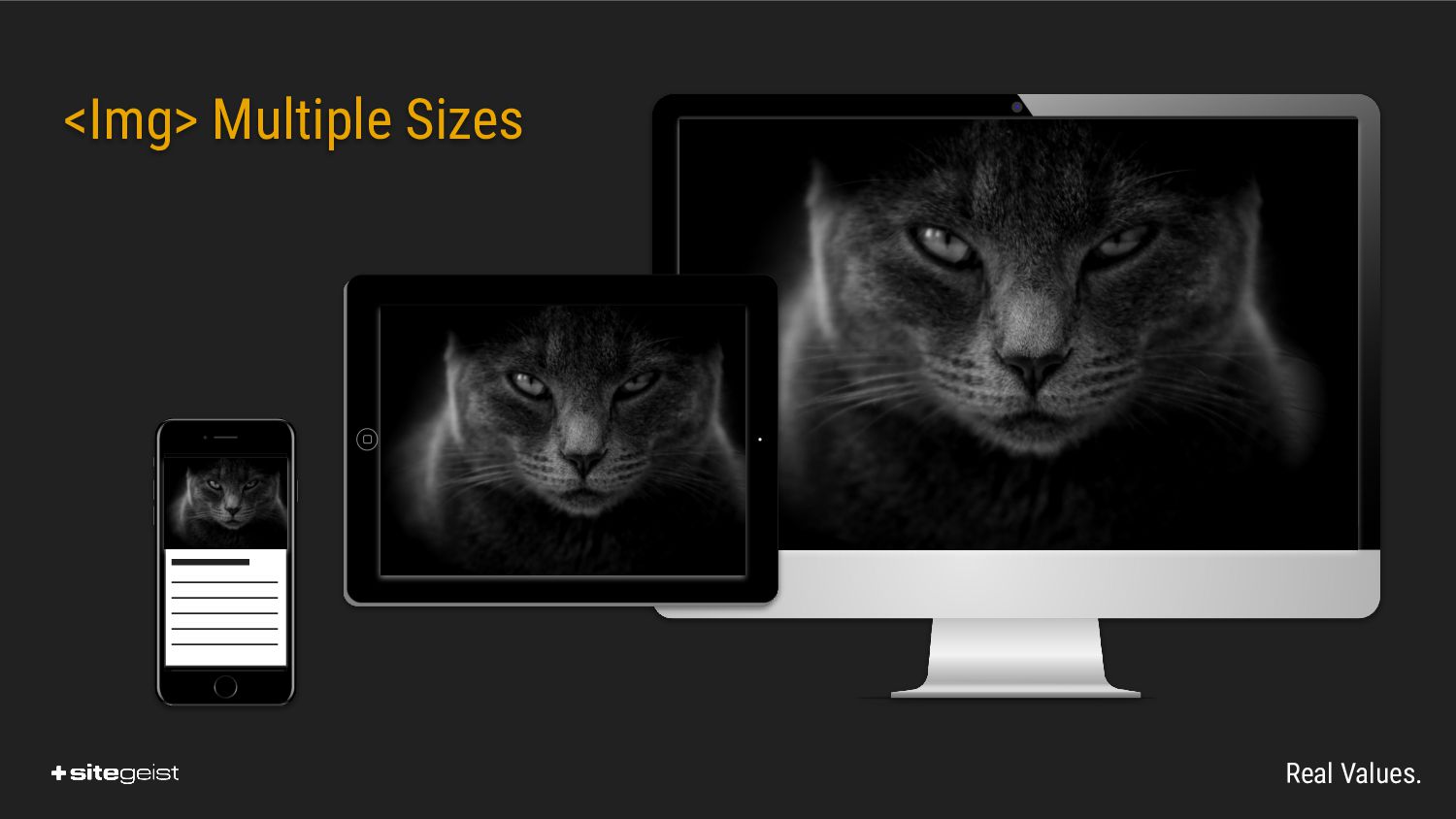
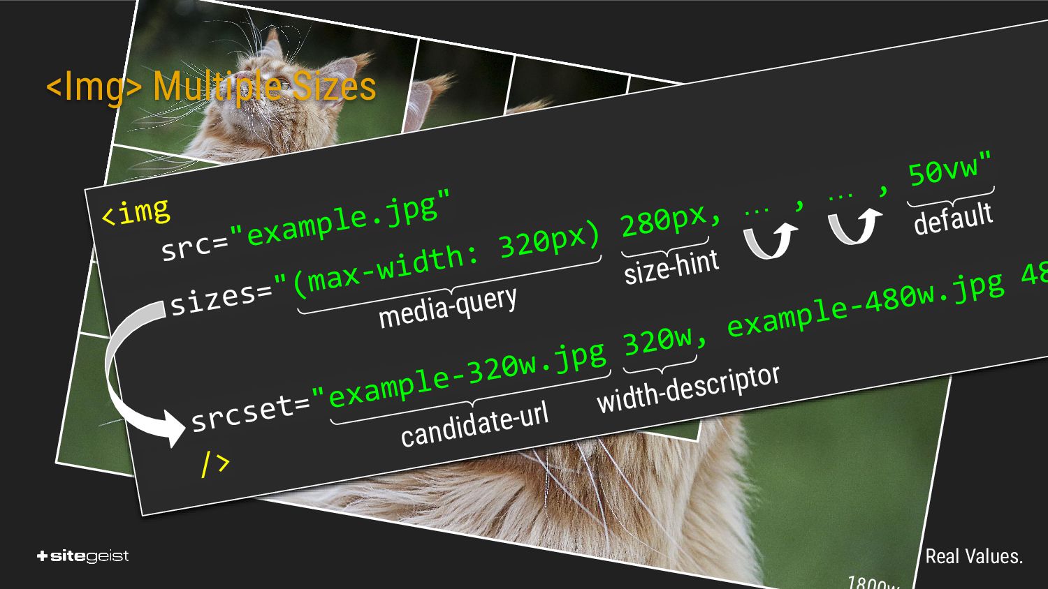
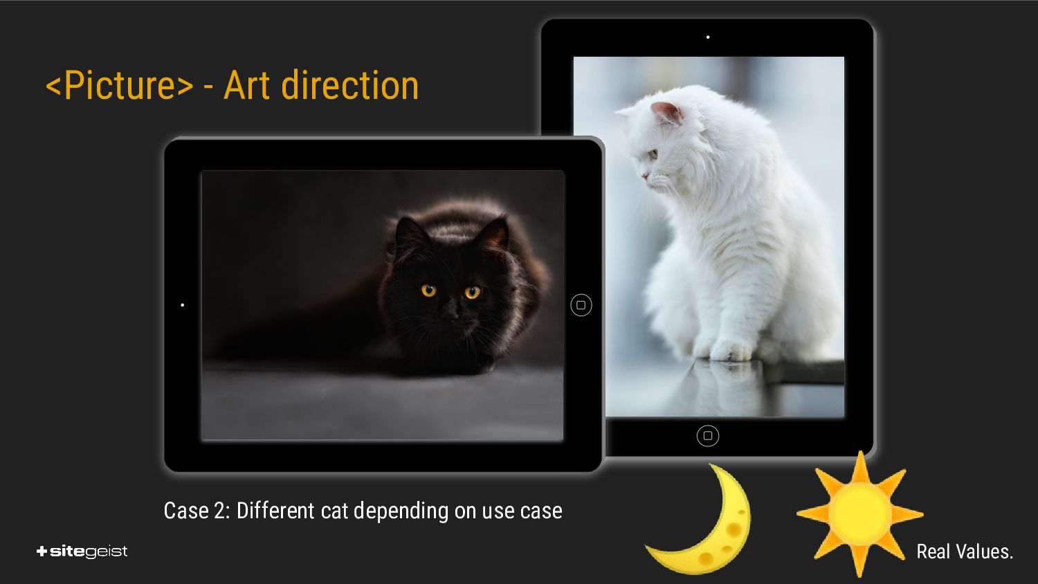
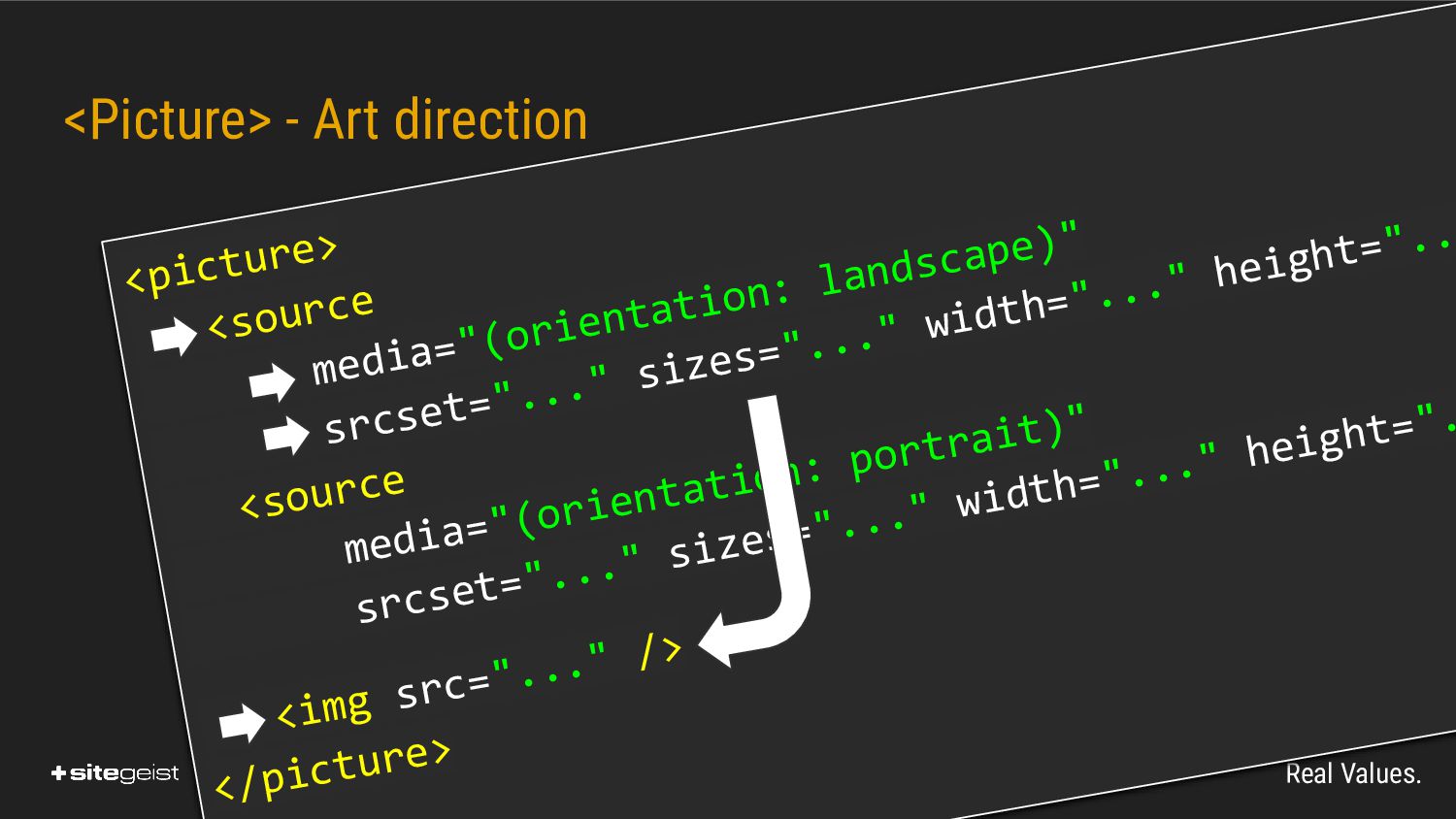
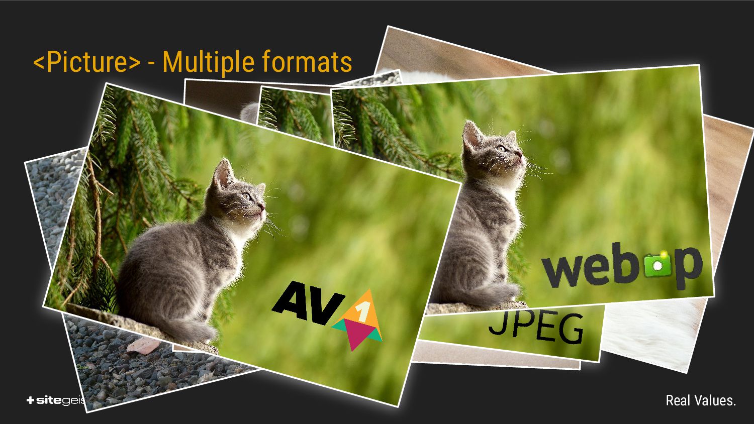
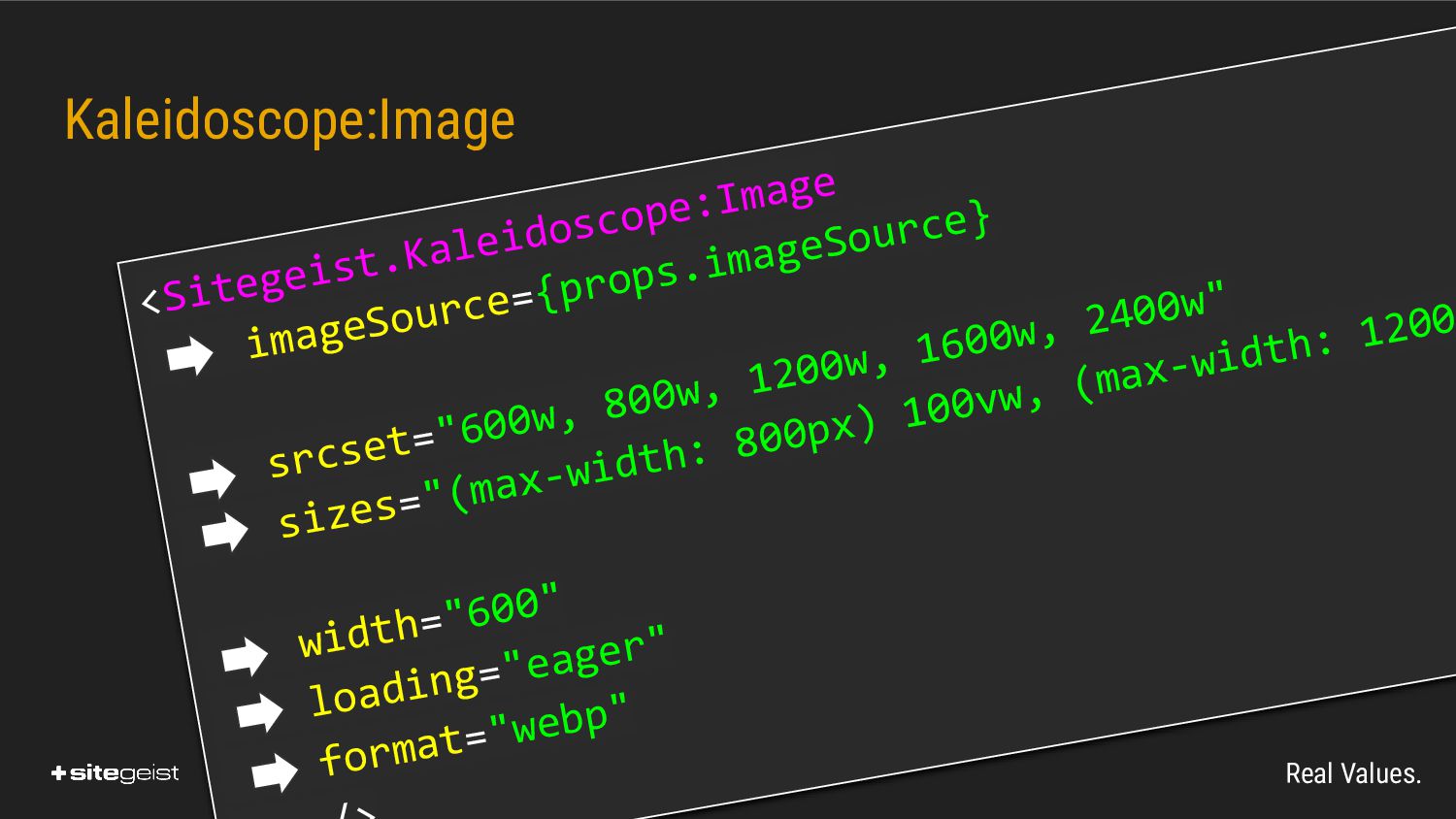
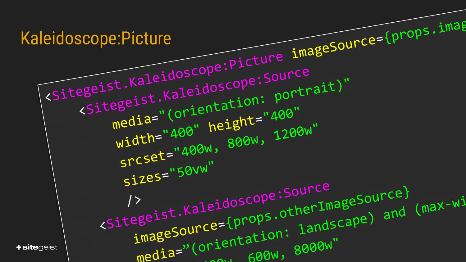
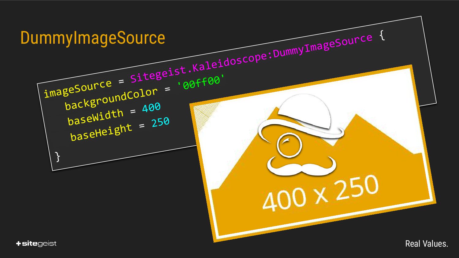
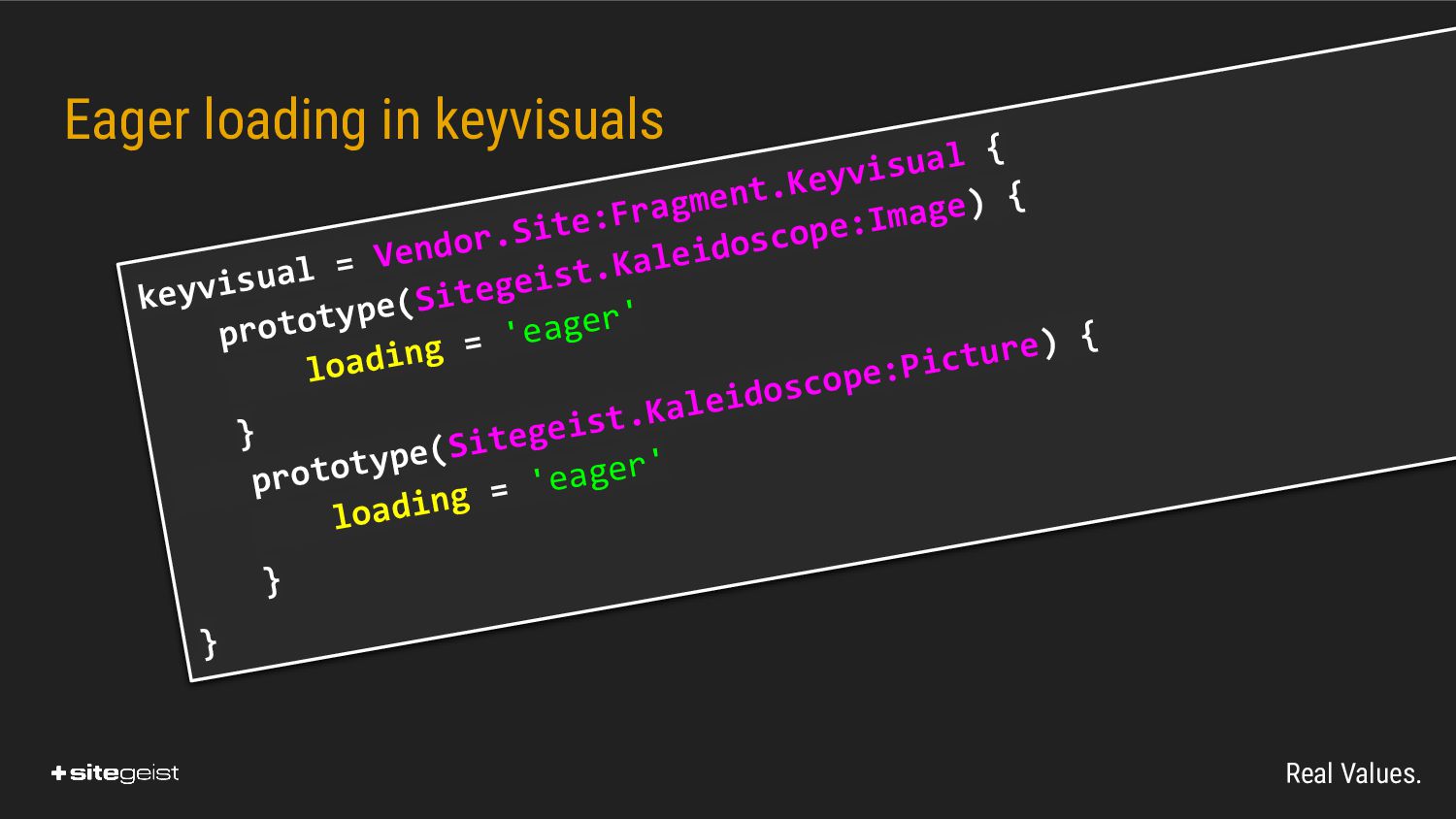
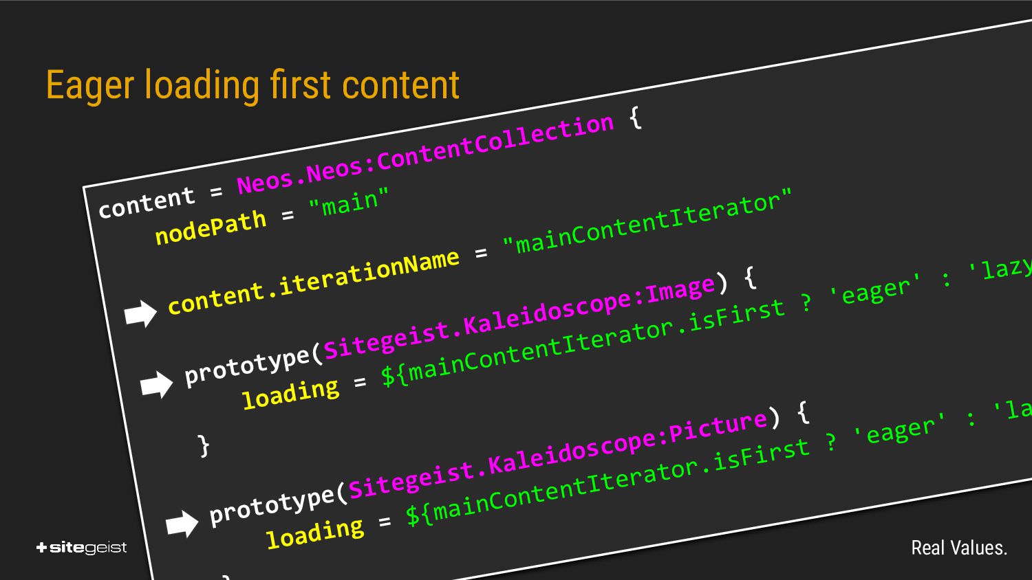
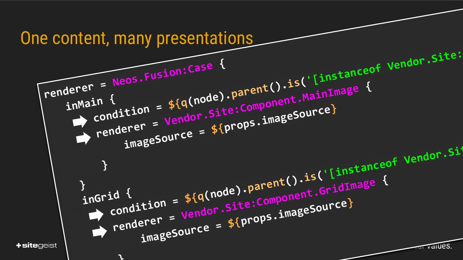
In the main part of the talk I will give an overview about the relevant html-standards for responsive images like img.sizes, img.srcset and picture + source, how those actually work and should be used for optimal user experience. Following that I will demonstrate how this is implemented using off the shelf Neos and compare this to the optimized workflow we implemented with our package Sitegeist.Kaleidoscope.

Sitegeist

April 29, 2022
Tweet

More Decks by Sitegeist

Other Decks in Programming

Transcript

  1. Real Values. Responsive images and how to implement them HTML

    & Sitegeist.Kaleidoscope Martin Ficzel Photo by Malcolm Lightbody on Unsplash
  2. Real Values. Martin Ficzel • Backend Developer • fi[email protected]

    twitter/slack: @kopfaufholz • Neos Team-Member Atomic-Fusion, AFX, Fusion-Forms • Sitegeist.Monocle, Sitegeist.Kaleidoscope, Sitegeist.MagicWand
  3. Real Values. Quick Poll: Who are you ? • Who

    is Backend Developer • Who is Integrator • Who is Frontend Developer • Who is Project Management • Who has not raised the hand yet 󰢧 󰢨 󰢨
  4. Real Values. Responsive images and how to implement them •

    Why is that relevant • The relevant HTML standards • CMS specific challenges & the solution we ended up with • Questions
  5. Real Values. 3. Timing • Images are requested during parsing

    • At the same time as CSS and JS • Browsers only know about the HTML at that stage ⏰
  6. Real Values. 4. Payload • HTML 10 > 100 KB

    • CSS 10 > 100 KB • JS 100 > 500 KB • Images 1000 > 2500 KB * unscientific guestimation
  7. Real Values. You can mess up performance in many ways

    but you cannot achieve great performance without caring for responsive-images!
  8. Real Values. HTML 2.0 - 4.0 <img src="example.jpg" alt="Image showing

    things" title="Example image" width="600" height="400" />
  9. Real Values. The long sleep • One highres image will

    be fine for all once bandwidth becomes cheap • Then Smartphones and Tablets became popular • And mobile use became common
  10. Real Values. 600w 800w 1000w 1200w <img src="example.jpg" sizes="(max-width: 320px)

    280px, … , … , 50vw" srcset="example-320w.jpg 320w, example-480w.jpg 48 /> media-query size-hint candidate-url width-descriptor <Img> Multiple Sizes default
  11. Real Values. <Picture> - Art direction 🌙 ☀ Case 2:

    Different cat depending on use case
  12. Real Values. <Picture> - Art direction <picture> <source media="(orientation: landscape)"

    srcset="..." sizes="..." width="..." height=".. <source media="(orientation: portrait)" srcset="..." sizes="..." width="..." height=". <img src="..." /> </picture>
  13. Real Values. <Picture> - Multiple formats <picture> <source type="image/webp" srcset="..."

    sizes="..." width="..." height=".. <source type="image/avif" srcset="..." sizes="..." width="..." height=" <img src="example.jpg" /> /picture>
  14. Real Values. Image loading behavior <img src="example.jpg" loading="eager" loading="lazy" />

    Request when close to viewport Or never Request immediately during parsing
  15. Real Values. Image appearance behavior CSS Request immediately during parsing

    <img src="example.jpg" width="600" height="400" style="aspect-ratio: 4/3;" />
  16. Real Values. Future • Smarter Browsers? ◦ Consider current bandwidth

    ◦ Consider CSS for lazy images • Successor for JPEG / PNG? of cat images
  17. Real Values. Non trivial to implement • Editors can select

    images with different aspects • Content Elements may be used in different contexts • Separation of Integration and Presentation requires error prone communication of many urls
  18. Real Values. Hard to verify • You can only spot

    low resolutions • Offices have fast networks • Browsers other than Firefox stick to highres Versions
  19. Real Values. Quick Poll: Who knows Kaleidoscope ? • Who

    has heard about Kaleidoscope • Who actually tested it • Who uses it all the time 󰢧 󰢨 󰢨
  20. Real Values. the idea • Avoid creating dozens of urls

    • Decide on dimensions in presentation • Make mistakes visible • In other aspects stay close to HTML
  21. Real Values. AssetImageSource imageSource = Sitegeist.Kaleidoscope:AssetImageSource { asset = ${q(node).property("image")}

    title = ${q(node).property("title")} alt = ${q(node).property("alternateText")} }
  22. Real Values. Kaleidoscope:Image <Sitegeist.Kaleidoscope:Image imageSource={props.imageSource} srcset="600w, 800w, 1200w, 1600w, 2400w"

    sizes="(max-width: 800px) 100vw, (max-width: 1200 width="600" loading="eager" format="webp"
  23. Real Values. Kaleidoscope:Picture <Sitegeist.Kaleidoscope:Picture imageSource={props.imag <Sitegeist.Kaleidoscope:Source media="(orientation: portrait)" width="400" height="400"

    srcset="400w, 800w, 1200w" sizes="50vw" /> <Sitegeist.Kaleidoscope:Source imageSource={props.otherImageSource} edia=”(orientation: landscape) and (max-wi 00w, 8000w"
  24. Real Values. Eager loading in keyvisuals keyvisual = Vendor.Site:Fragment.Keyvisual {

    prototype(Sitegeist.Kaleidoscope:Image) { loading = 'eager' } prototype(Sitegeist.Kaleidoscope:Picture) { loading = 'eager' } }
  25. Real Values. Eager loading first content content = Neos.Neos:ContentCollection {

    nodePath = "main" content.iterationName = "mainContentIterator" prototype(Sitegeist.Kaleidoscope:Image) { loading = ${mainContentIterator.isFirst ? 'eager' : 'lazy } prototype(Sitegeist.Kaleidoscope:Picture) { loading = ${mainContentIterator.isFirst ? 'eager' : 'la
  26. Real Values. renderer = Neos.Fusion:Case { inMain { condition =

    ${q(node).parent().is('[instanceof Vendor.Site: renderer = Vendor.Site:Component.MainImage { imageSource = ${props.imageSource} } } inGrid { condition = ${q(node).parent().is('[instanceof Vendor.Sit renderer = Vendor.Site:Component.GridImage { imageSource = ${props.imageSource} One content, many presentations
  27. Real Values. Enforcing dummy images # Root.fusion prototype(Sitegeist.Kaleidoscope:Image) { [email protected]

    = Sitegeist.Kaleidoscope:DummyImage baseWidth = ${value.width()} baseHeight = ${value.height()} } } prototype(Sitegeist.Kaleidoscope:Picture) { [email protected] = Sitegeist.Kaleidoscope:DummyIm baseWidth = ${value.width()} baseHeight = ${value.height()} ⚠
  28. Real Values. • no rocket engineering • not trivial and

    easy to mess up • Tooling is needed • like Sitegeist.Kaleidoscope