Upgrade to Pro
— share decks privately, control downloads, hide ads and more …
Speaker Deck
Features
Speaker Deck
PRO
Sign in
Sign up for free
Search
Search
Edición de bolisillo: la web en dispositivos mó...
Search
Swwweet
January 25, 2012
Programming
230
3
Share
Embed
Copy iframe code
Copy JS code
Copy link
Start on current slide
Edición de bolisillo: la web en dispositivos móviles
Swwweet
January 25, 2012
More Decks by Swwweet
See All by Swwweet
Wonders from the Full Stack Fest website
swwweet
1
400
How to be the best web designer in the world.
swwweet
6
1.3k
Design for loading
swwweet
5
590
Mobile First: as difficult as doing things right
swwweet
225
10k
One Size Fits None
swwweet
12
920
One Size Fits None - From the Front 2013
swwweet
2
770
Responsively Responsive
swwweet
23
1.7k
La letra con píxel entra
swwweet
0
1.2k
The future of code
swwweet
4
670
Other Decks in Programming
See All in Programming
継続モナドとリアクティブプログラミング
yukikurage
3
490
SLOをサービス品質の共通言語にするために 取り組んできたこと
wakana0222
0
480
鹿野さんに聞く!『TypeScriptコードレシピ集』で磨く実践力
tonkotsuboy_com
4
1.1k
コンテキストの使い捨てをやめる — ビジネスルール駆動開発と miko —
ioki
0
270
Creating Composable Callables in Contemporary C++
rollbear
0
200
はてなアカウント基盤 State of the Union
cockscomb
1
1.3k
トークンをケチるな、設計しろ:GitHub Copilotを賢く使うコンテキスト戦略
ochtum
0
310
そのテスト、説明できますか?~LWテスト戦略FW~のご紹介
nakahara
0
200
分散システム、なんですぐ死んでしまうん?耐障害性を高めたいあなたのためのレジリエンスパターン入門
mshibuya
7
5.7k
1B+ /day規模のログを管理する技術
broadleaf
0
130
JAWS-UG横浜 #102 AWSサ終供養LT会 成仏できない AWS サービスたち 〜本日、三体供養します〜
maroon1st
0
110
Developing with AI Agents — Codex, Claude Code & Cowork Practical Guide
x5gtrn
PRO
0
1.4k
Featured
See All Featured
Pawsitive SEO: Lessons from My Dog (and Many Mistakes) on Thriving as a Consultant in the Age of AI
davidcarrasco
0
190
HTML-Aware ERB: The Path to Reactive Rendering @ RubyCon 2026, Rimini, Italy
marcoroth
2
320
More Than Pixels: Becoming A User Experience Designer
marktimemedia
3
460
How GitHub (no longer) Works
holman
316
150k
I Don’t Have Time: Getting Over the Fear to Launch Your Podcast
jcasabona
34
2.8k
Darren the Foodie - Storyboard
khoart
PRO
3
3.4k
Practical Orchestrator
shlominoach
191
11k
The State of eCommerce SEO: How to Win in Today's Products SERPs - #SEOweek
aleyda
2
11k
Why You Should Never Use an ORM
jnunemaker
PRO
61
9.9k
Designing for humans not robots
tammielis
254
26k
The Invisible Side of Design
smashingmag
301
52k
A Guide to Academic Writing Using Generative AI - A Workshop
ks91
PRO
1
350
Transcript
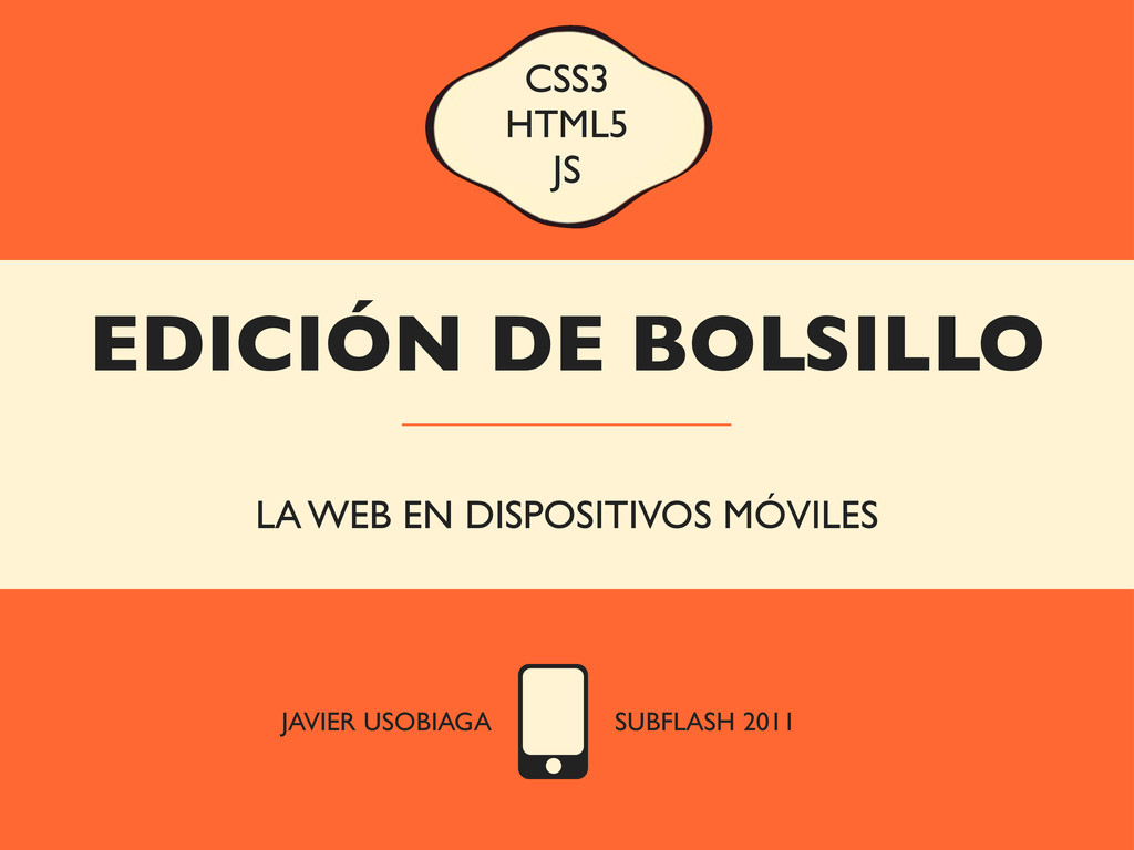
EDICIÓN DE BOLSILLO LA WEB EN DISPOSITIVOS MÓVILES CSS3 HTML5
JS JAVIER USOBIAGA SUBFLASH 2011
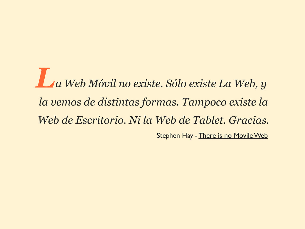
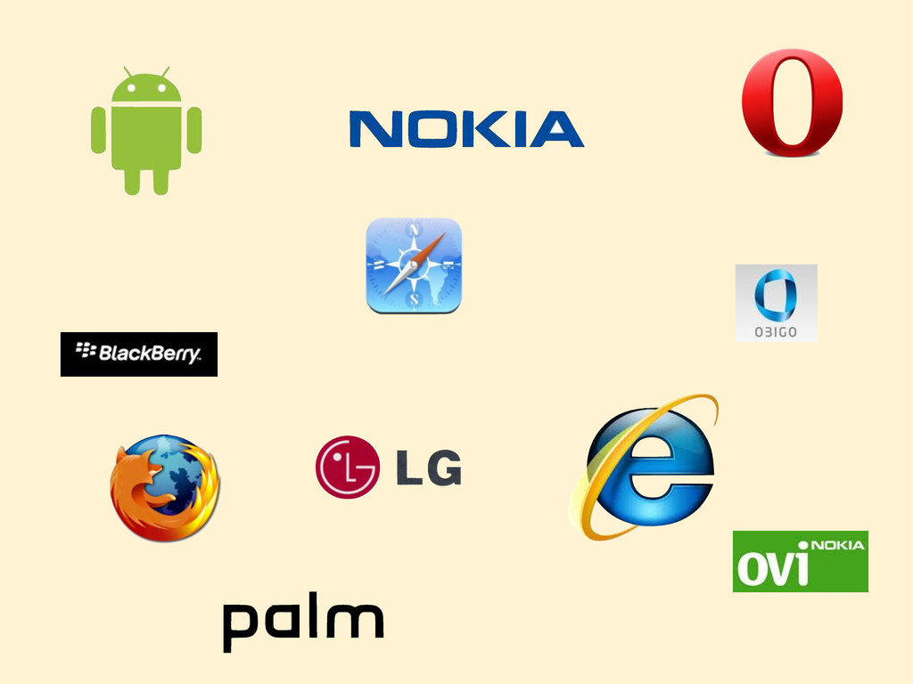
a Web Móvil no existe. Sólo existe La Web, y
la vemos de distintas formas. Tampoco existe la Web de Escritorio. Ni la Web de Tablet. Gracias. L Stephen Hay - There is no Movile Web
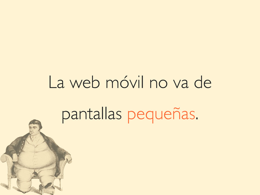
La web móvil no va de pantallas pequeñas.
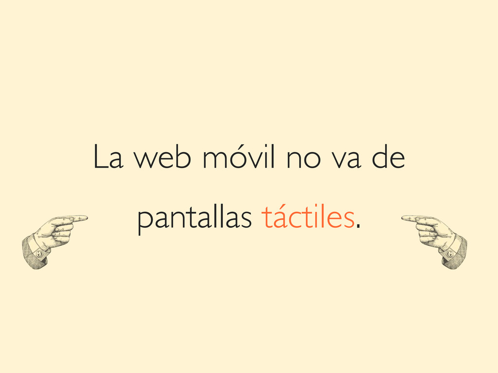
La web móvil no va de pantallas táctiles.
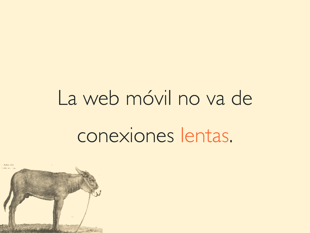
La web móvil no va de conexiones lentas.
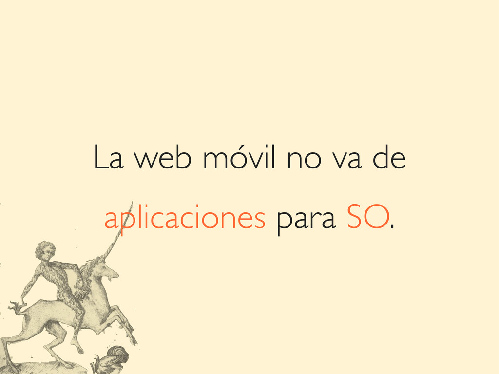
La web móvil no va de aplicaciones para SO.
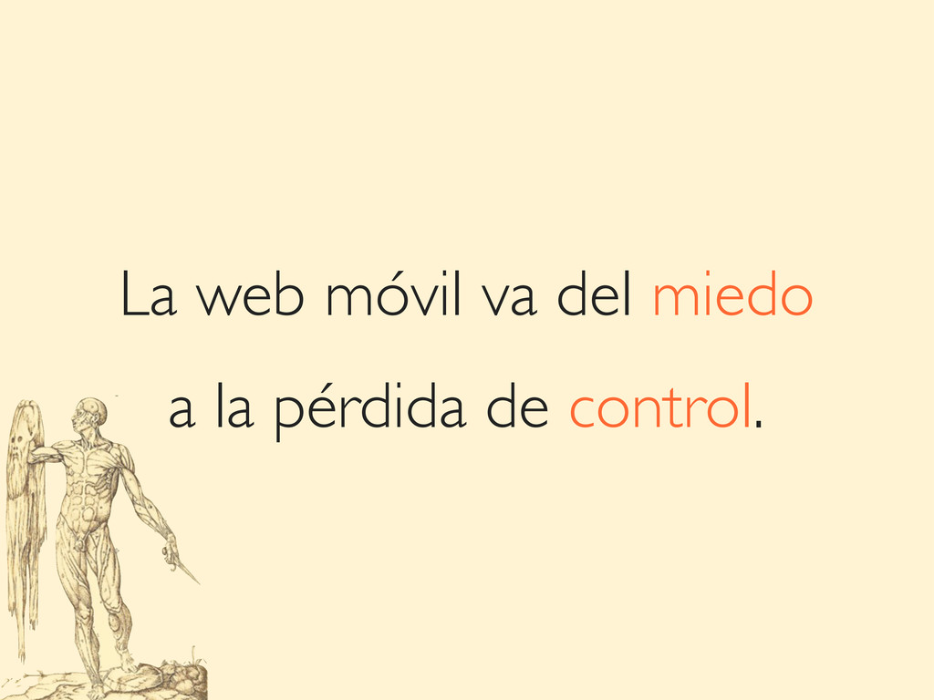
La web móvil va del miedo a la pérdida de
control.
optimiza siempre
None
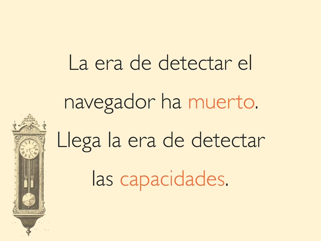
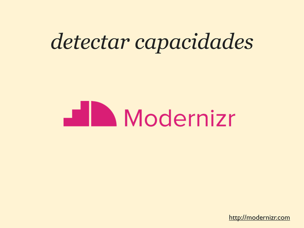
La era de detectar el navegador ha muerto. Llega la
era de detectar las capacidades.
ESTRATEGIAS 1 3 SOLUCIONES A UN MISMO RETO
No hacer nada.
No hacer nada. Hacer una plantilla diferente.
No hacer nada. Hacer una plantilla diferente. Adaptar la web.
No hacer nada. Hacer una plantilla diferente. Adaptar la web.
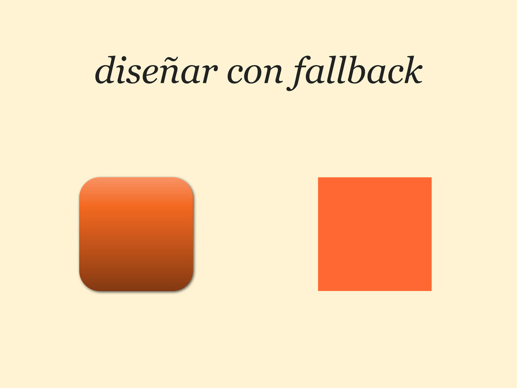
diseñar con fallback
detectar capacidades http://modernizr.com
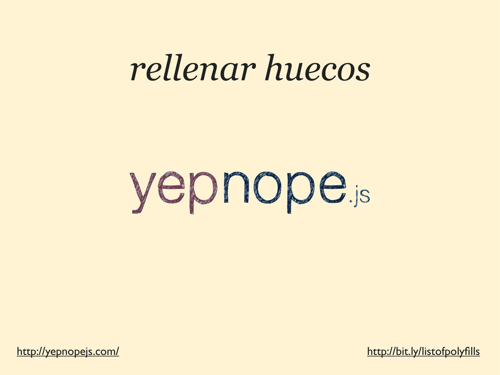
rellenar huecos http://yepnopejs.com/ http://bit.ly/listofpolyfills
CSS3 2 OPTIMIZANDO RECURSOS
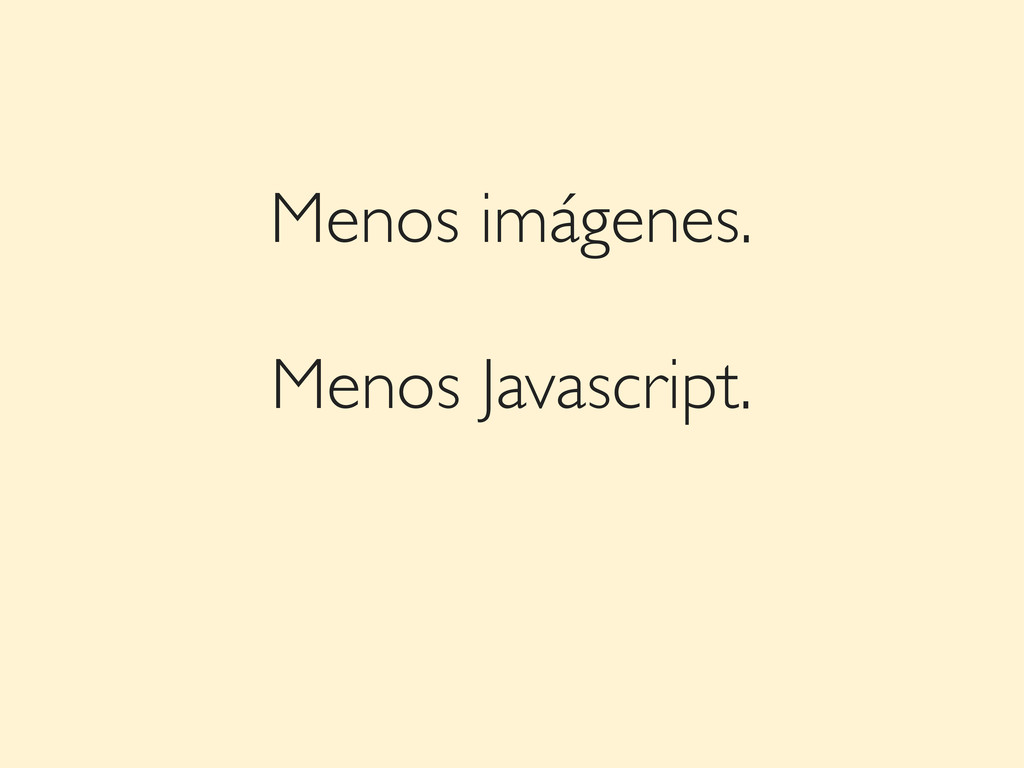
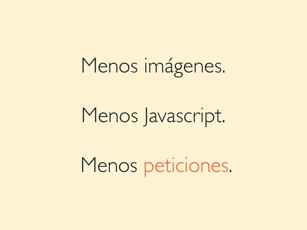
Menos imágenes.
Menos imágenes. Menos Javascript.
Menos imágenes. Menos Javascript. Menos peticiones.
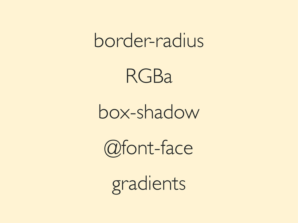
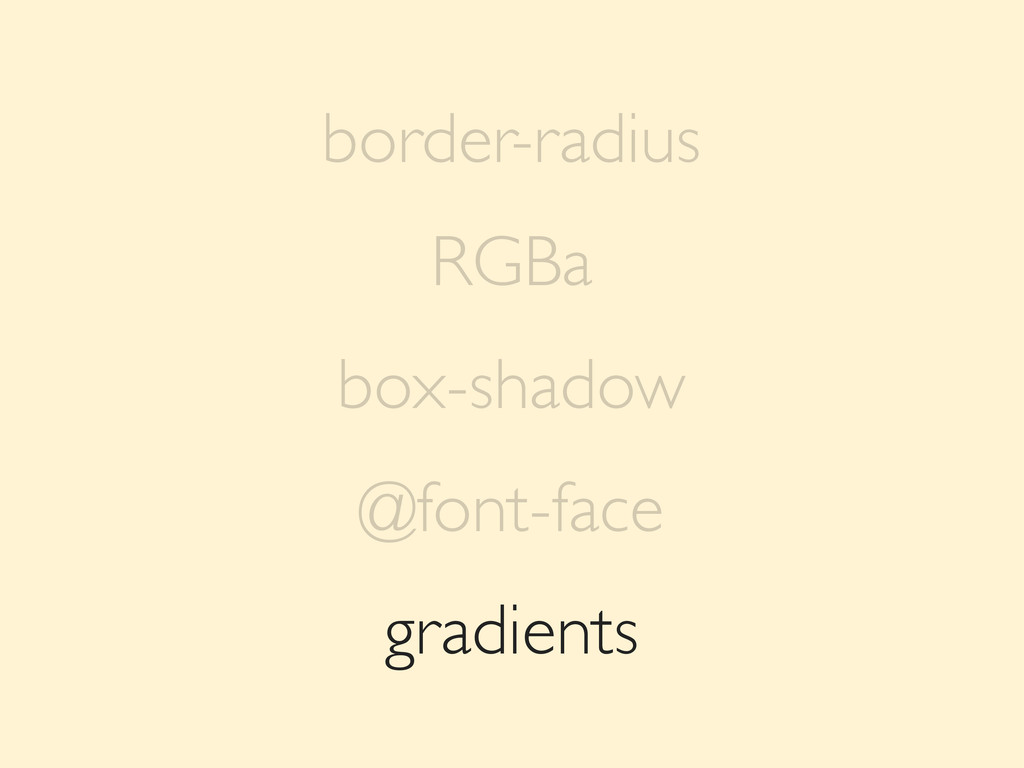
gradients border-radius RGBa box-shadow @font-face
gradients border-radius RGBa box-shadow @font-face
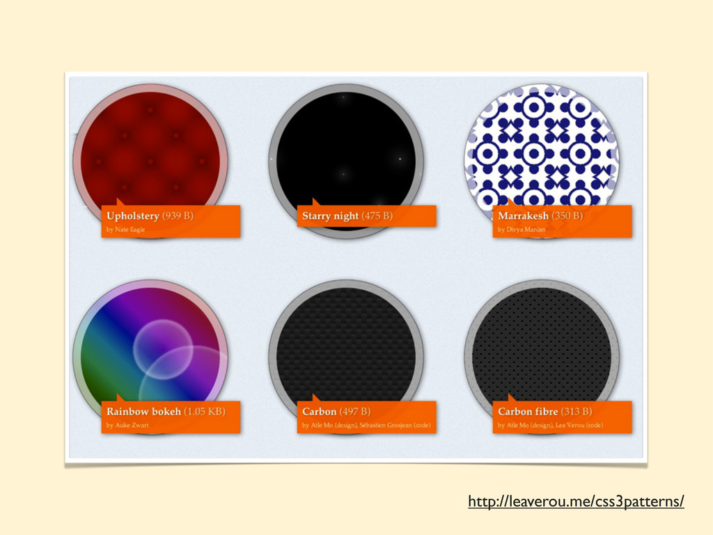
http://leaverou.me/css3patterns/
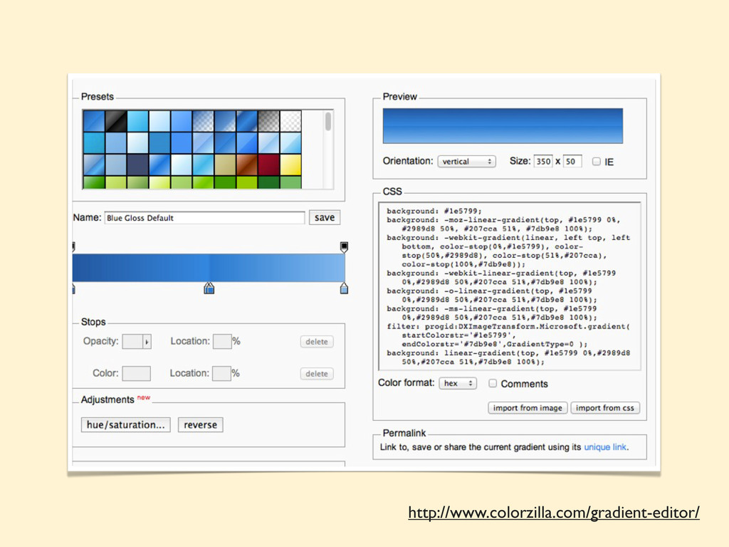
http://www.colorzilla.com/gradient-editor/
CSS transforms: scale rotate skew translate
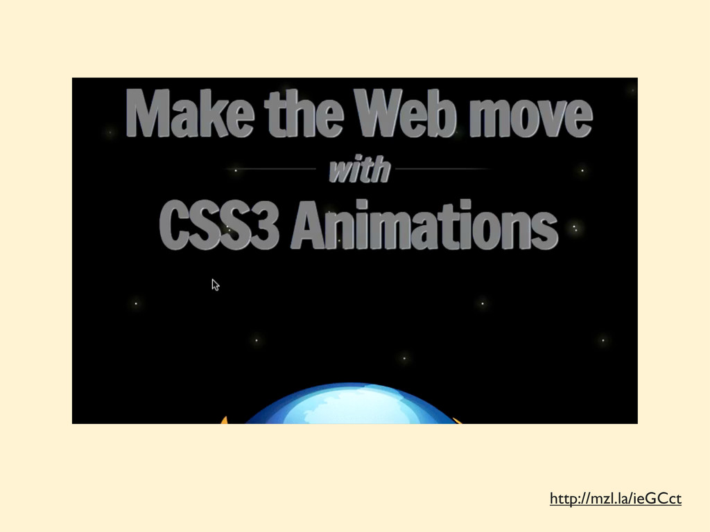
Transitions & Animations
http://mzl.la/ieGCct
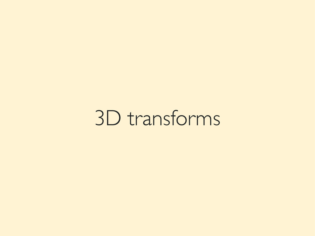
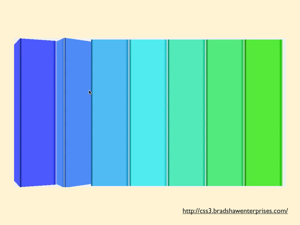
3D transforms
http://css3.bradshawenterprises.com/
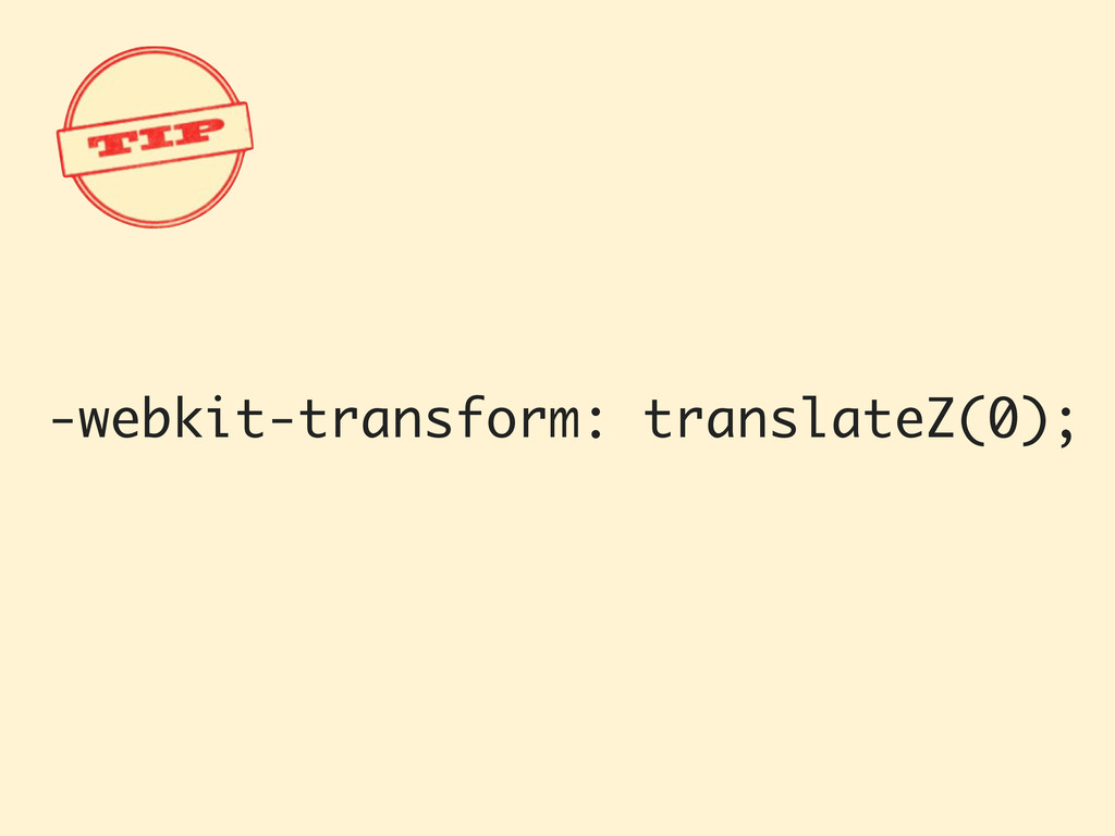
-webkit-transform: translateZ(0);
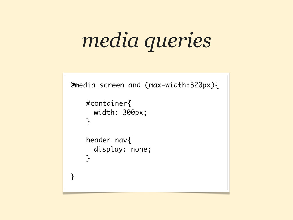
media queries @media screen and (max-width:320px){ #container{ width: 300px; }
header nav{ display: none; } }
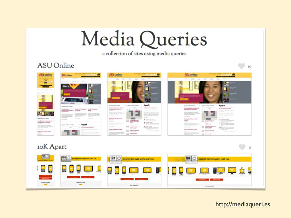
http://mediaqueri.es
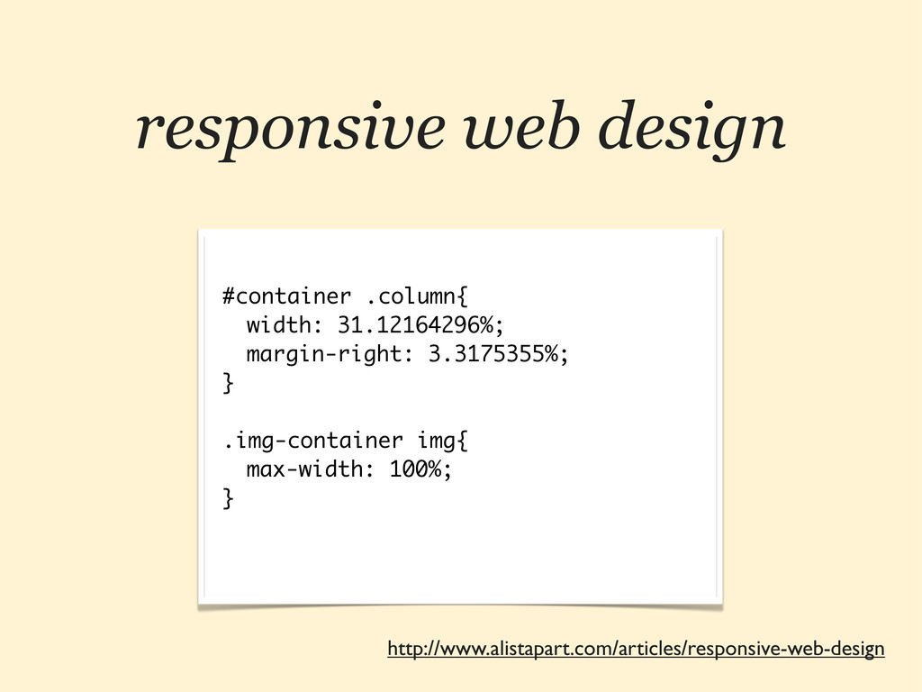
responsive web design #container .column{ width: 31.12164296%; margin-right: 3.3175355%; }
.img-container img{ max-width: 100%; } http://www.alistapart.com/articles/responsive-web-design
responsive web design http://www.abookapart.com/products/responsive-web-design
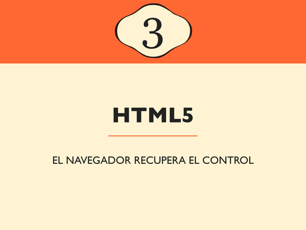
HTML5 3 EL NAVEGADOR RECUPERA EL CONTROL
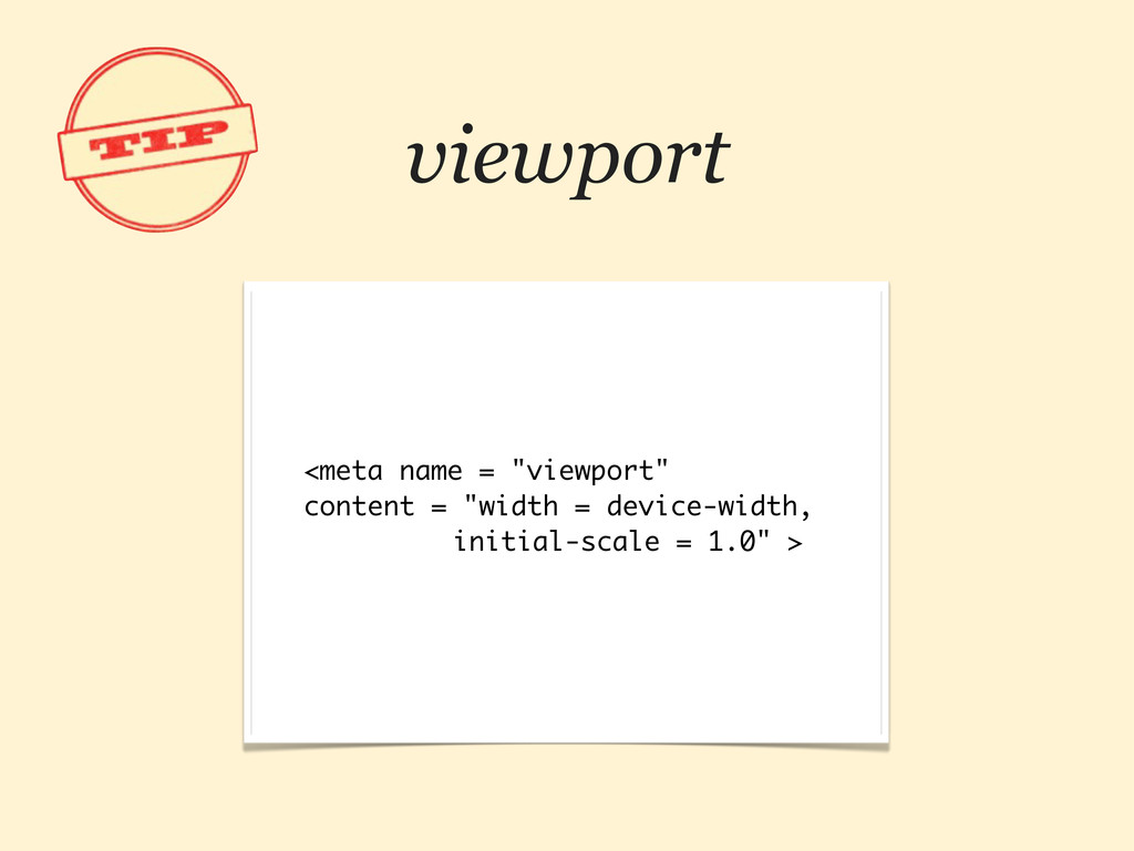
viewport <meta name = "viewport" content = "width = device-width,
initial-scale = 1.0" >
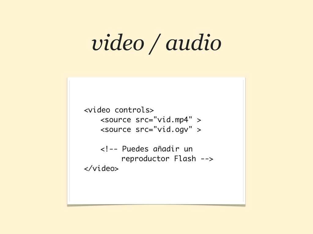
video / audio <video controls> <source src="vid.mp4" > <source src="vid.ogv"
> <!-- Puedes añadir un reproductor Flash --> </video>
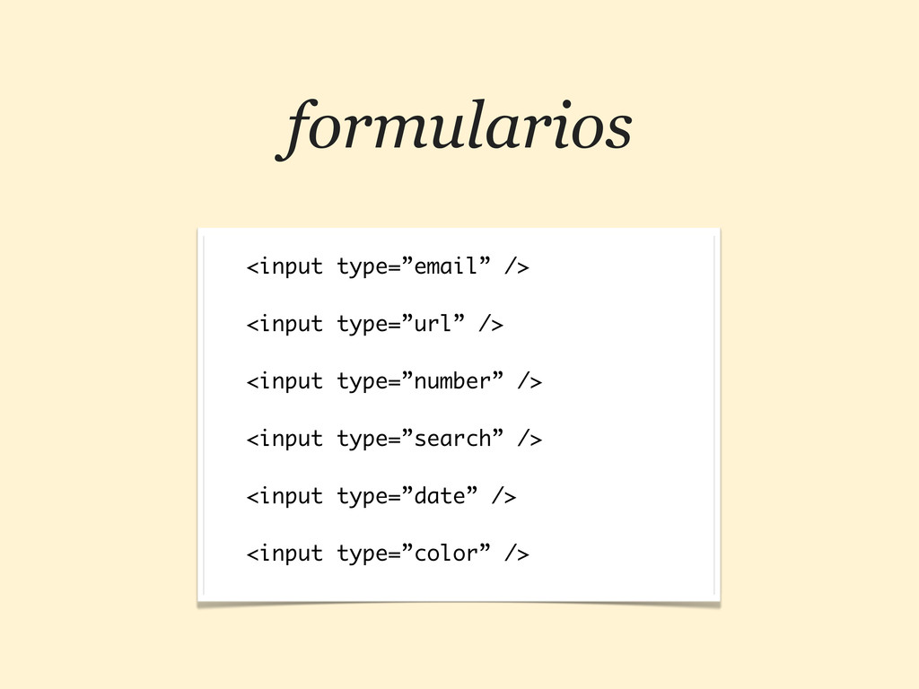
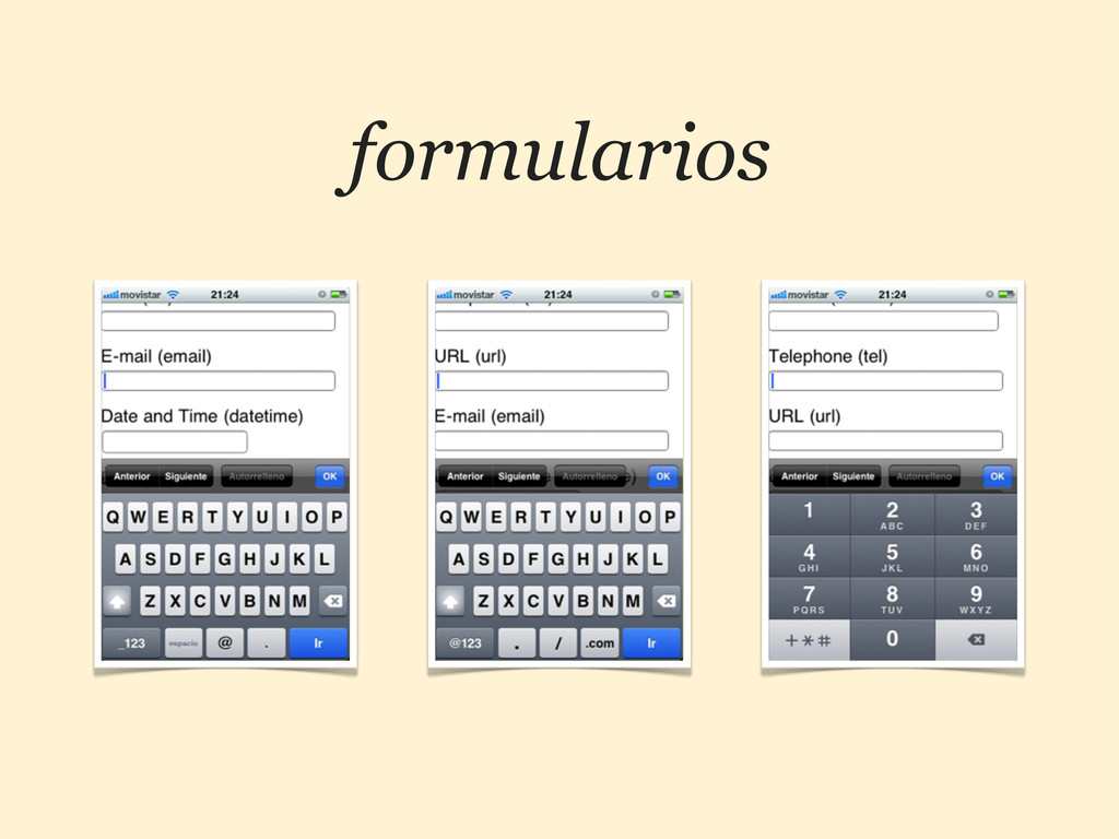
formularios <input type=”email” /> <input type=”url” /> <input type=”number” />
<input type=”search” /> <input type=”date” /> <input type=”color” />
formularios
HTML5 — JS 4 AMPLIANDO FUNCIONALIDADES
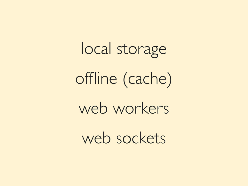
local storage offline (cache) web workers web sockets
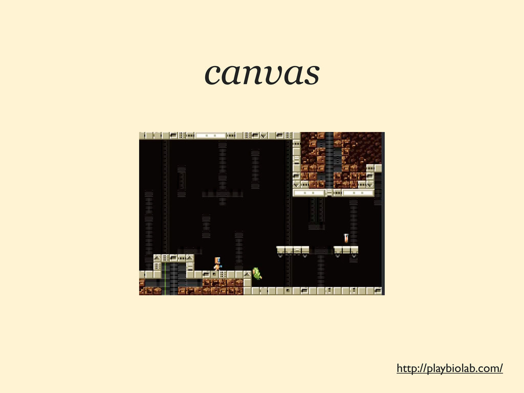
canvas http://playbiolab.com/
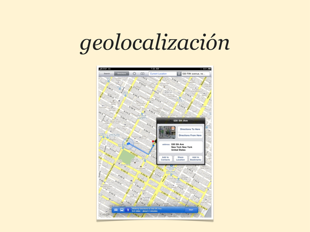
geolocalización
TOUCH 5 DÍSELO CON GESTOS
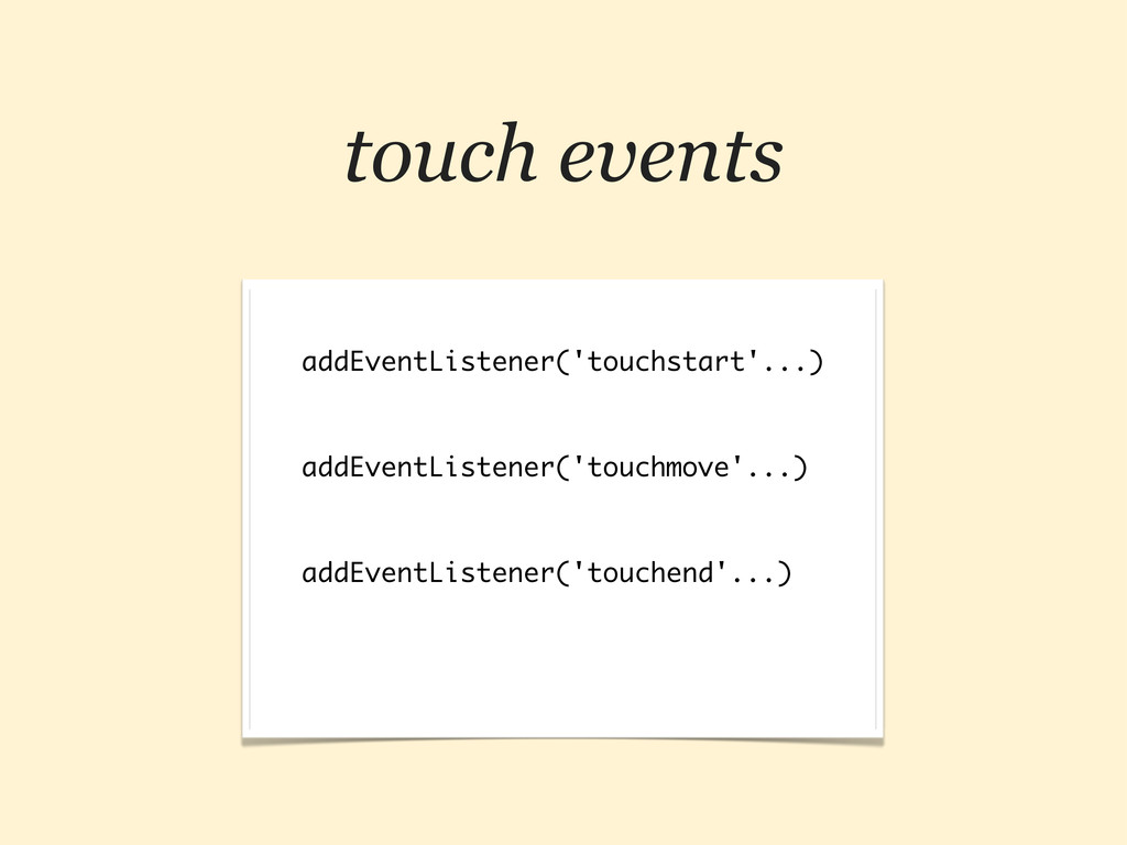
touch events addEventListener('touchstart'...) addEventListener('touchmove'...) addEventListener('touchend'...)
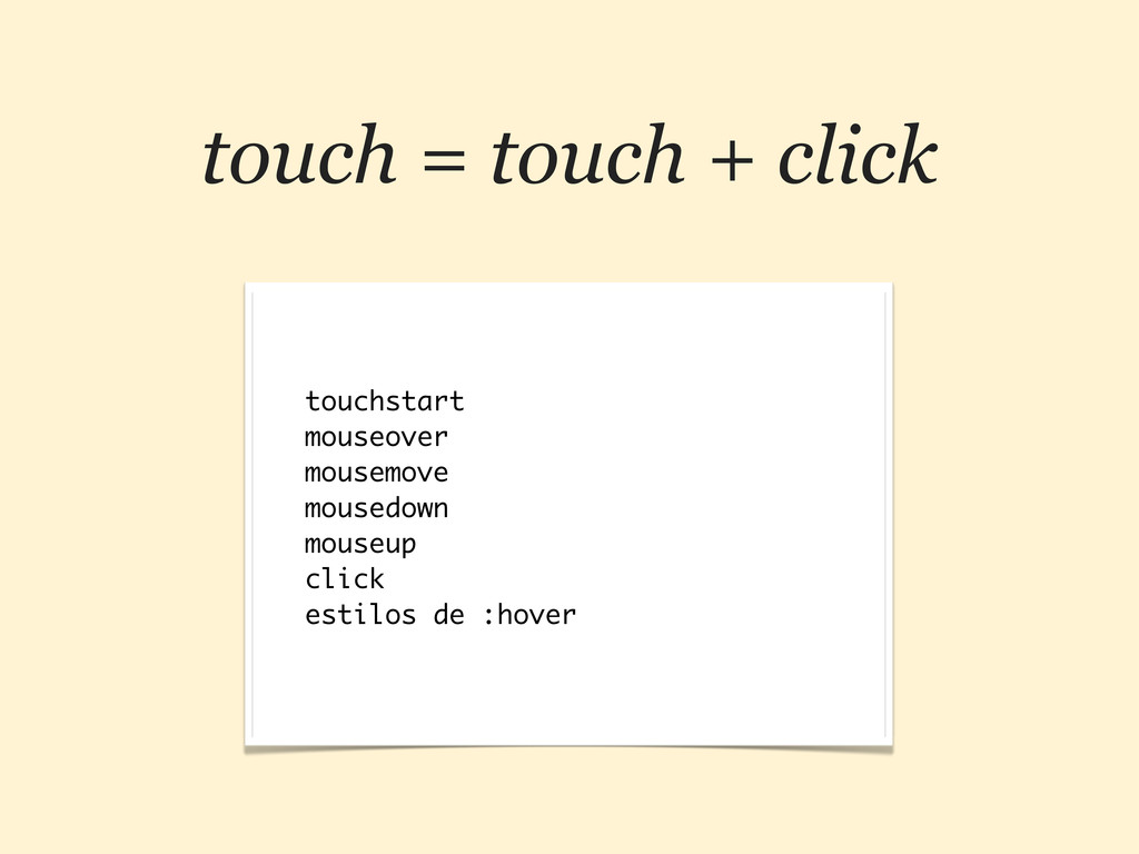
touch = touch + click touchstart mouseover mousemove mousedown mouseup
click estilos de :hover
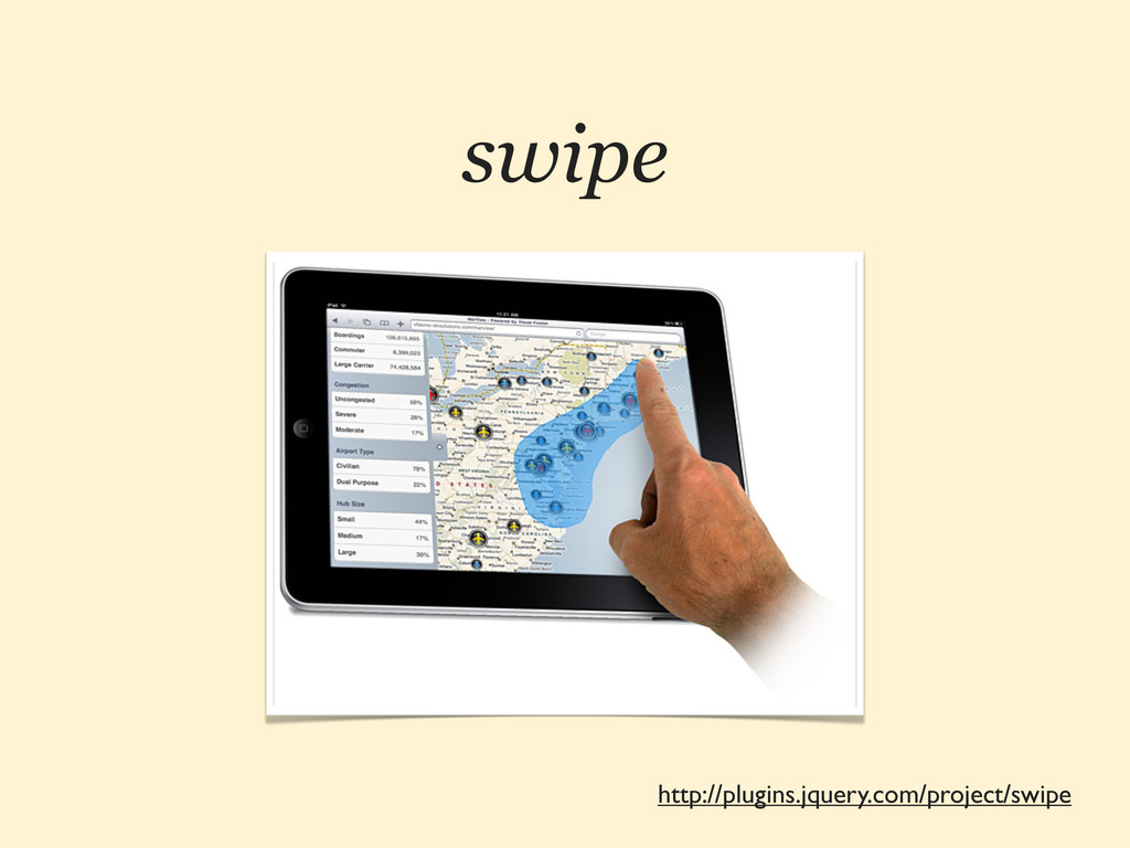
http://plugins.jquery.com/project/swipe swipe
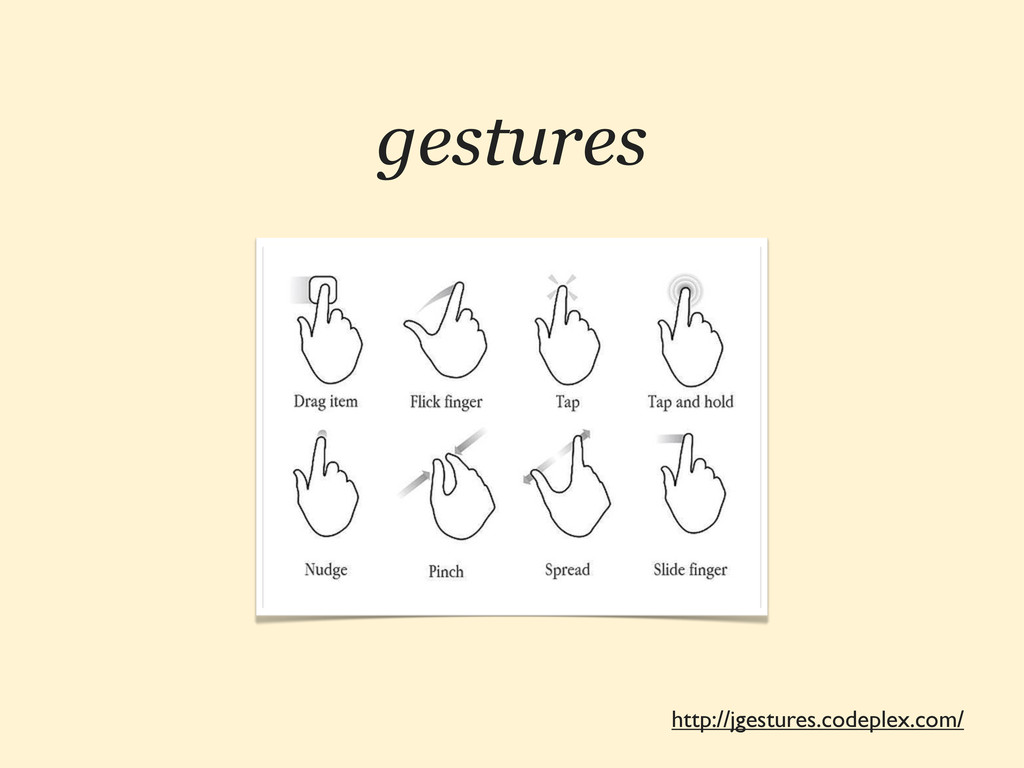
http://jgestures.codeplex.com/ gestures
FRAMEWORKS JS 6 ¿SON NECESARIOS?
http://jqtouch.com http://jquerymobile.com http://www.sencha.com/products/touch http://zeptojs.com
pausa dramática
¡GRACIAS! ¿PREGUNTAS? :-) @HTMLBOY SWWWEET.COM
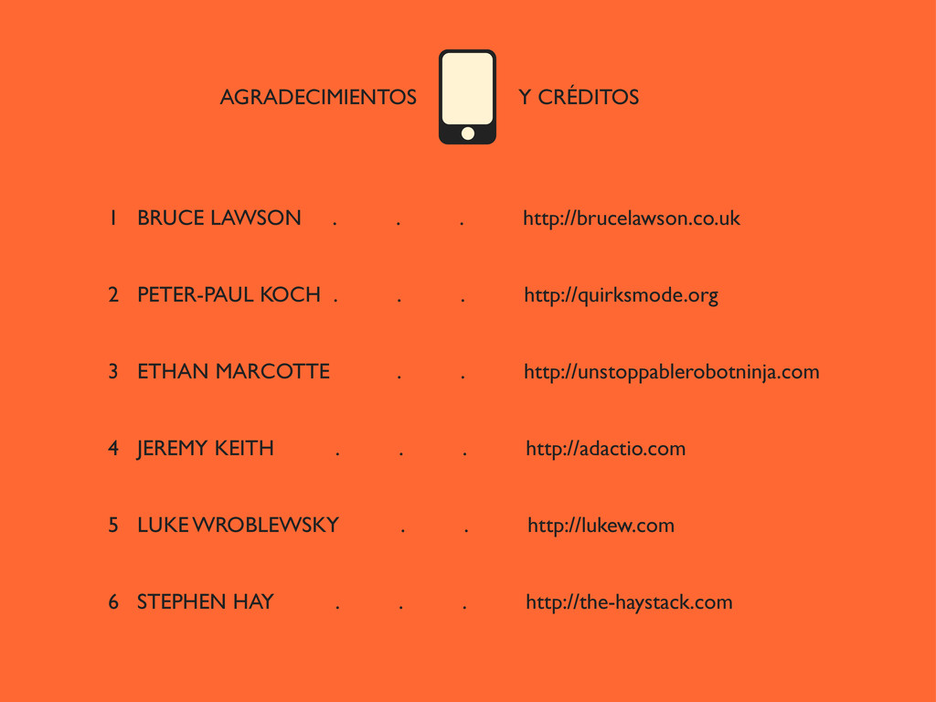
AGRADECIMIENTOS Y CRÉDITOS 1 BRUCE LAWSON . . . http://brucelawson.co.uk
2 PETER-PAUL KOCH . . . http://quirksmode.org 3 ETHAN MARCOTTE . . http://unstoppablerobotninja.com 4 JEREMY KEITH . . . http://adactio.com 5 LUKE WROBLEWSKY . . http://lukew.com 6 STEPHEN HAY . . . http://the-haystack.com
 swwweet
 yukikurage
 wakana0222
 tonkotsuboy_com
 ioki
ioki
 rollbear
 cockscomb
 ochtum
 nakahara
 mshibuya
 broadleaf
 maroon1st
 x5gtrn
 davidcarrasco
 marcoroth
 marktimemedia
 holman
 jcasabona
 khoart
 shlominoach
 aleyda
 jnunemaker
 tammielis
 smashingmag
 ks91
ks91