Upgrade to Pro
— share decks privately, control downloads, hide ads and more …
Speaker Deck
Features
Speaker Deck
PRO
Sign in
Sign up for free
Search
Search
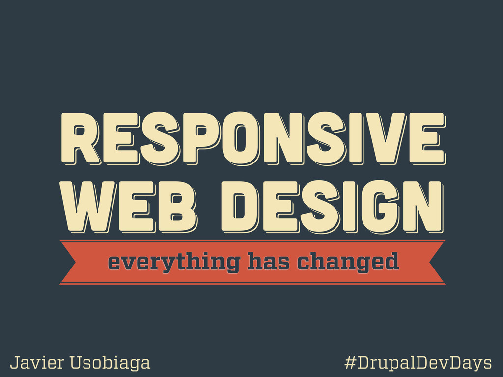
Responsive Web Design: Everything has Changed
Search
Swwweet
June 17, 2012
Technology
750
6
Share
Embed
Copy iframe code
Copy JS code
Copy link
Start on current slide
Responsive Web Design: Everything has Changed
Presentation by @htmlboy at Drupal Developers Day Barcelona 2012.
Swwweet
June 17, 2012
More Decks by Swwweet
See All by Swwweet
Wonders from the Full Stack Fest website
swwweet
1
390
How to be the best web designer in the world.
swwweet
6
1.3k
Design for loading
swwweet
5
590
Mobile First: as difficult as doing things right
swwweet
225
10k
One Size Fits None
swwweet
12
920
One Size Fits None - From the Front 2013
swwweet
2
760
Responsively Responsive
swwweet
23
1.7k
La letra con píxel entra
swwweet
0
1.2k
The future of code
swwweet
4
660
Other Decks in Technology
See All in Technology
脱SaaS!FDEを支えるプロビジョニングと分離設計
knih
0
240
[AWS Summit Japan 2026]迷っているあなたへ_小さな一歩が、やがて自分を助けてくれる
sh_fk2
1
160
Kubernetesにおける学習基盤とLLMOpsの概要
ry
1
320
FPGAの開発コンペでZephyrを使ってみた
iotengineer22
0
140
AI-DLCを “そのまま導入しなかった”話 ~組織に合わせてアジャストした 私たちの実践共有~
hiroramos4
PRO
0
200
あなたの知らないPDFのアクセシビリティ
lycorptech_jp
PRO
0
220
SteampipeとExcel Power QueryでAWS構成定義書の作成を自動化する
jhashimoto
0
150
Lightning近況報告
kozy4324
0
190
FPC(フレキシブル)基板にZephyr実装してみた。
iotengineer22
0
120
2026TECHFRESH畢業分享會 - AI 時代的人生存檔點
line_developers_tw
PRO
0
1.3k
Oracle AI Database@Azure:サービス概要のご紹介
oracle4engineer
PRO
6
2k
不要なレビューをAIにまかせて AIコーディングの環境改善を加速した
shoota
1
220
Featured
See All Featured
Test your architecture with Archunit
thirion
1
2.3k
Why You Should Never Use an ORM
jnunemaker
PRO
61
9.9k
The AI Revolution Will Not Be Monopolized: How open-source beats economies of scale, even for LLMs
inesmontani
PRO
3
3.5k
16th Malabo Montpellier Forum Presentation
akademiya2063
PRO
0
150
Data-driven link building: lessons from a $708K investment (BrightonSEO talk)
szymonslowik
1
1.1k
The Art of Programming - Codeland 2020
erikaheidi
57
14k
The browser strikes back
jonoalderson
0
1.3k
Deep Space Network (abreviated)
tonyrice
0
210
Hiding What from Whom? A Critical Review of the History of Programming languages for Music
tomoyanonymous
2
860
Build The Right Thing And Hit Your Dates
maggiecrowley
39
3.2k
How to build an LLM SEO readiness audit: a practical framework
nmsamuel
1
780
HTML-Aware ERB: The Path to Reactive Rendering @ RubyCon 2026, Rimini, Italy
marcoroth
1
200
Transcript
RESPoNSIVE WEB DESIGN RESPoNSIVE WEB DESIGN RESPoNSIVE WEB DESIGN everything
has changed Javier Usobiaga #DrupalDevDays
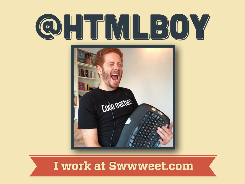
@htmlboy @htmlboy @htmlboy I work at Swwweet.com
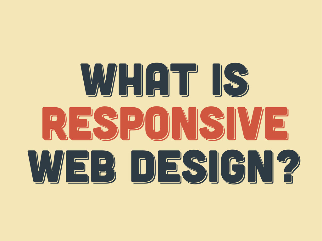
WHAT IS responsive web design? WHAT IS responsive web design?
WHAT IS respoNsive web design?
WHAT IS THE web? WHAT IS THE web? WHAT IS
THE web?
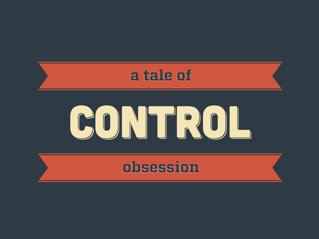
CONTROL CONTROL CONTROL a tale of obsession
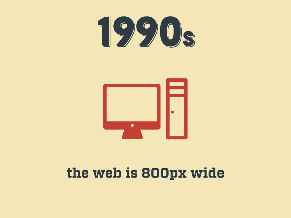
1990s 1990s 1990s the web is 800px wide
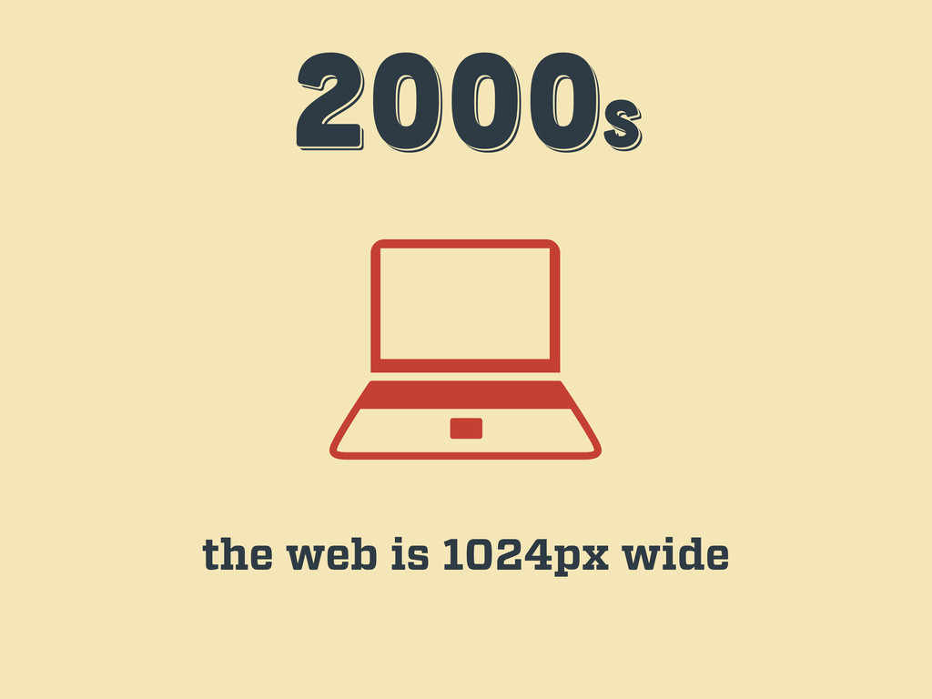
2000s 2000s 2000s the web is 1024px wide
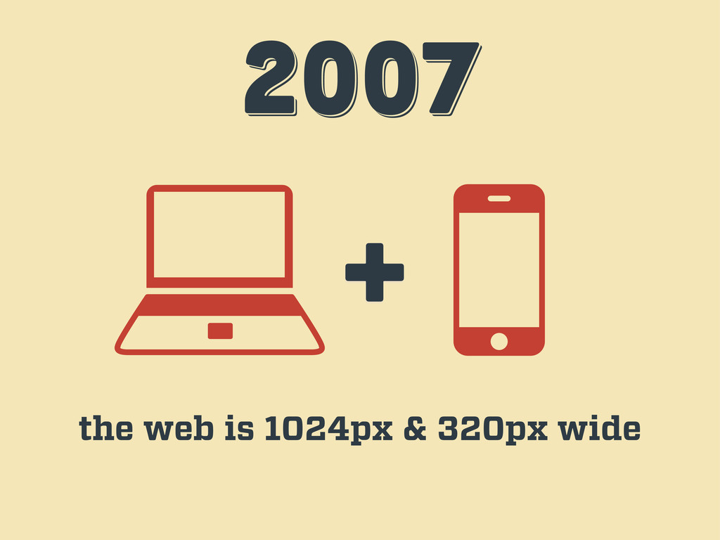
2007 2007 2007 + the web is 1024px & 320px
wide
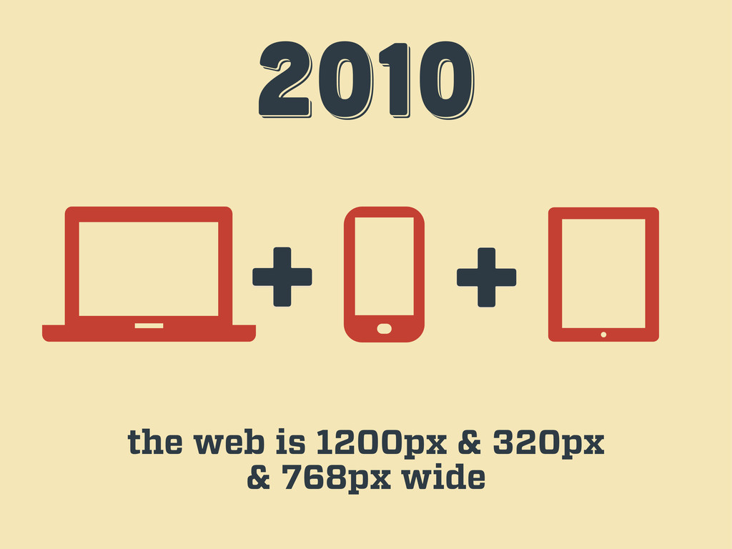
2010 2010 2010 + + the web is 1200px &
320px & 768px wide
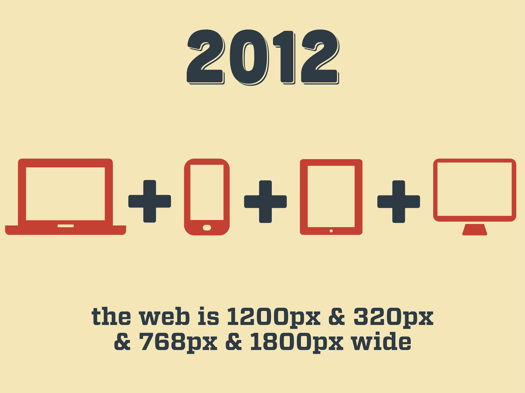
2012 2012 2012 + + the web is 1200px &
320px & 768px & 1800px wide +
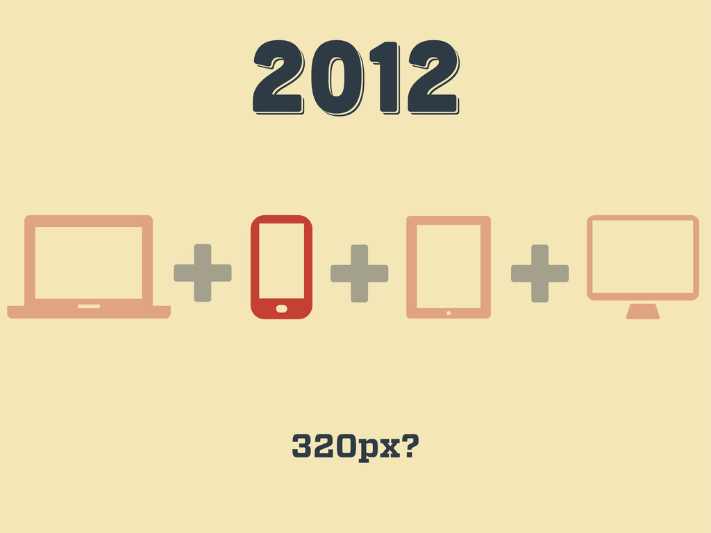
2012 2012 2012 + + 320px? +
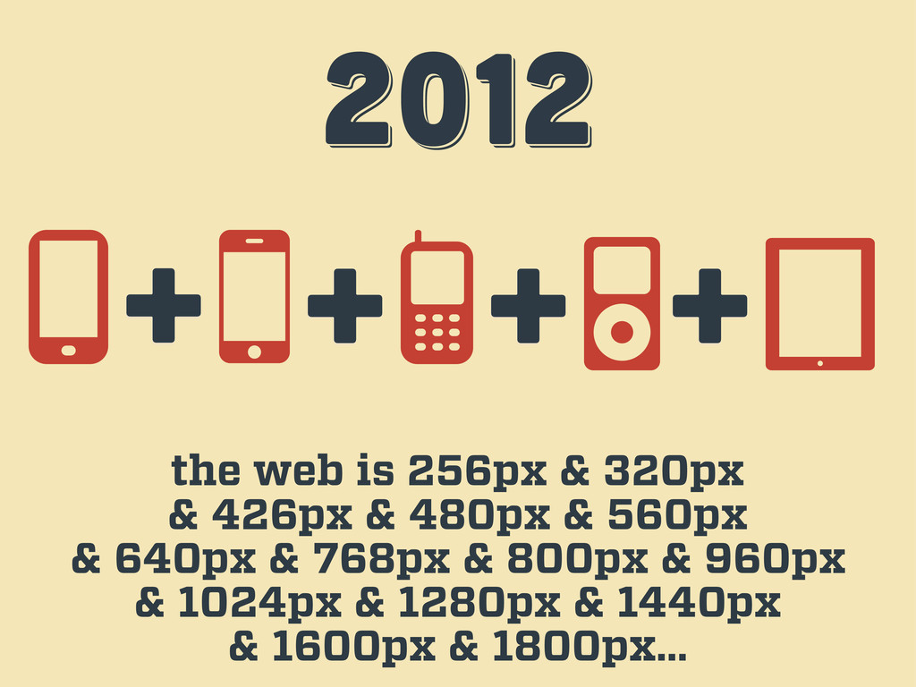
2012 2012 2012 the web is 256px & 320px &
426px & 480px & 560px & 640px & 768px & 800px & 960px & 1024px & 1280px & 1440px & 1600px & 1800px… + + + +
ENOUGH! ENOUGH! ENOUGH!
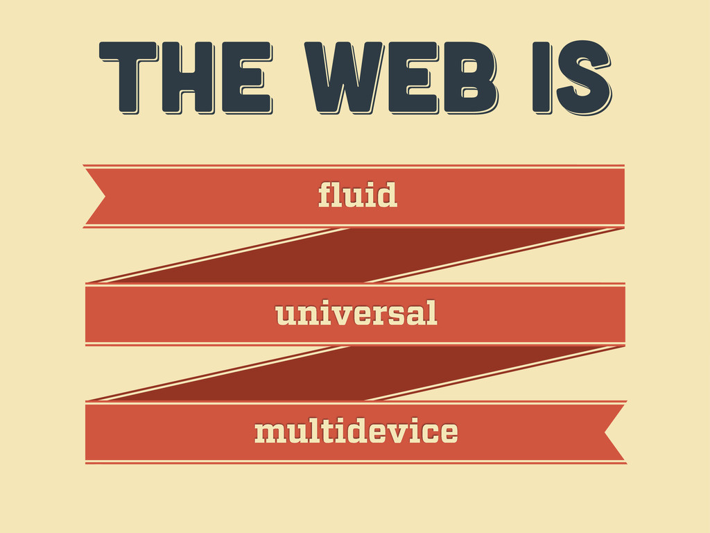
ENOUGH! ENOUGH! ENOUGH! it’s time to accept the web’s nature
THE WEB IS THE WEB IS THE WEB IS fluid
universal multidevice
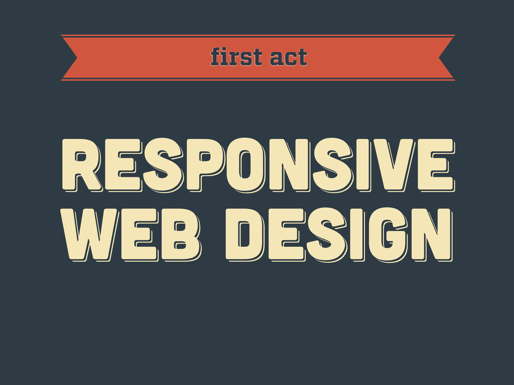
first act RESPoNSIVE WEB DESIGN RESPoNSIVE WEB DESIGN RESPoNSIVE WEB
DESIGN
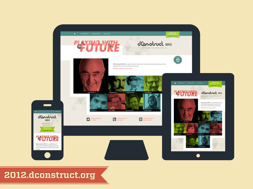
2012.dconstruct.org
mediaqueri.es
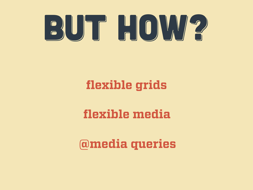
BUT HOW? BUT HOW? BUT HOW? flexible grids flexible media
@media queries
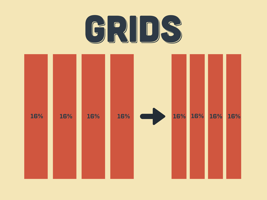
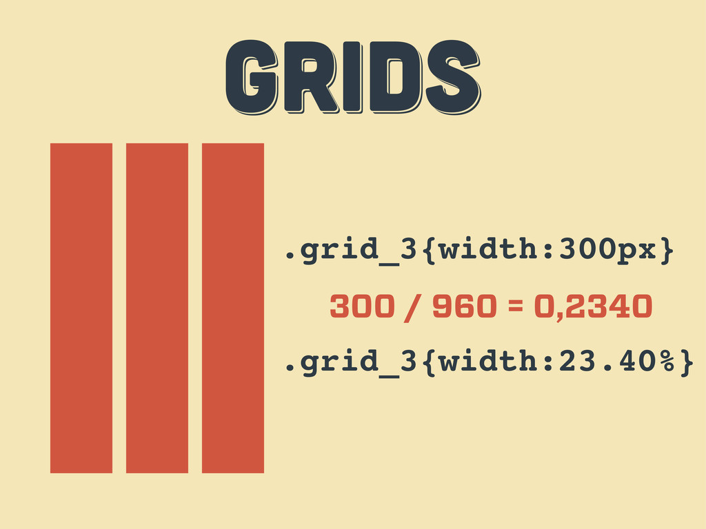
GRIDS GRIDS GRIDS 16% 16% 16% 16% 16% 16% 16%
16%
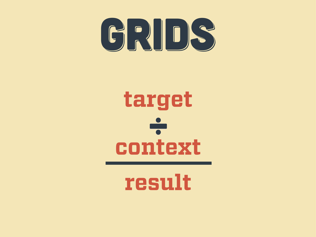
target context ÷ result GRIDS GRIDS GRIDS
.grid_3{width:300px} 300 / 960 = 0,2340 .grid_3{width:23.40%} GRIDS GRIDS GRIDS
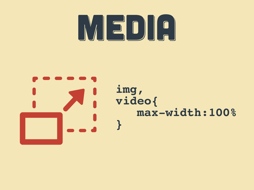
MEDIA MEDIA MEDIA img, video{ max-width:100% }
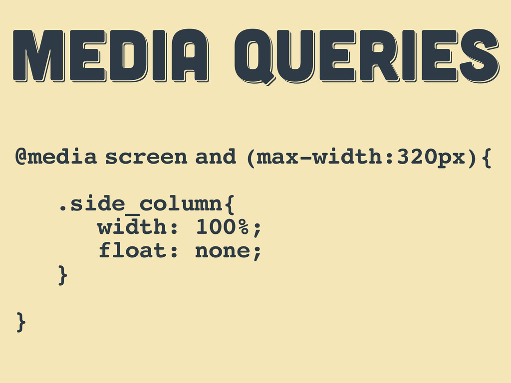
MEDIA QUERIES MEDIA QUERIES MEDIA QUERIES @media screen and (max-width:320px){
.side_column{ width: 100%; float: none; } }
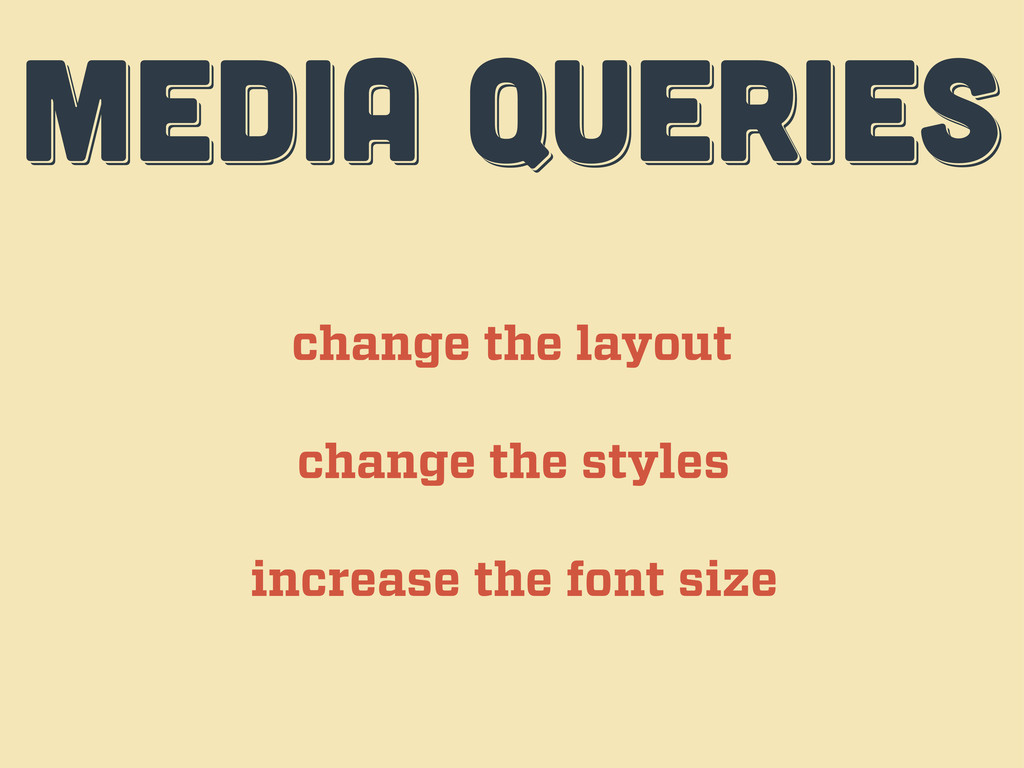
MEDIA QUERIES MEDIA QUERIES MEDIA QUERIES change the layout change
the styles increase the font size
RESPoNSIVE challenges RESPoNSIVE challenges Responsive challenges second act
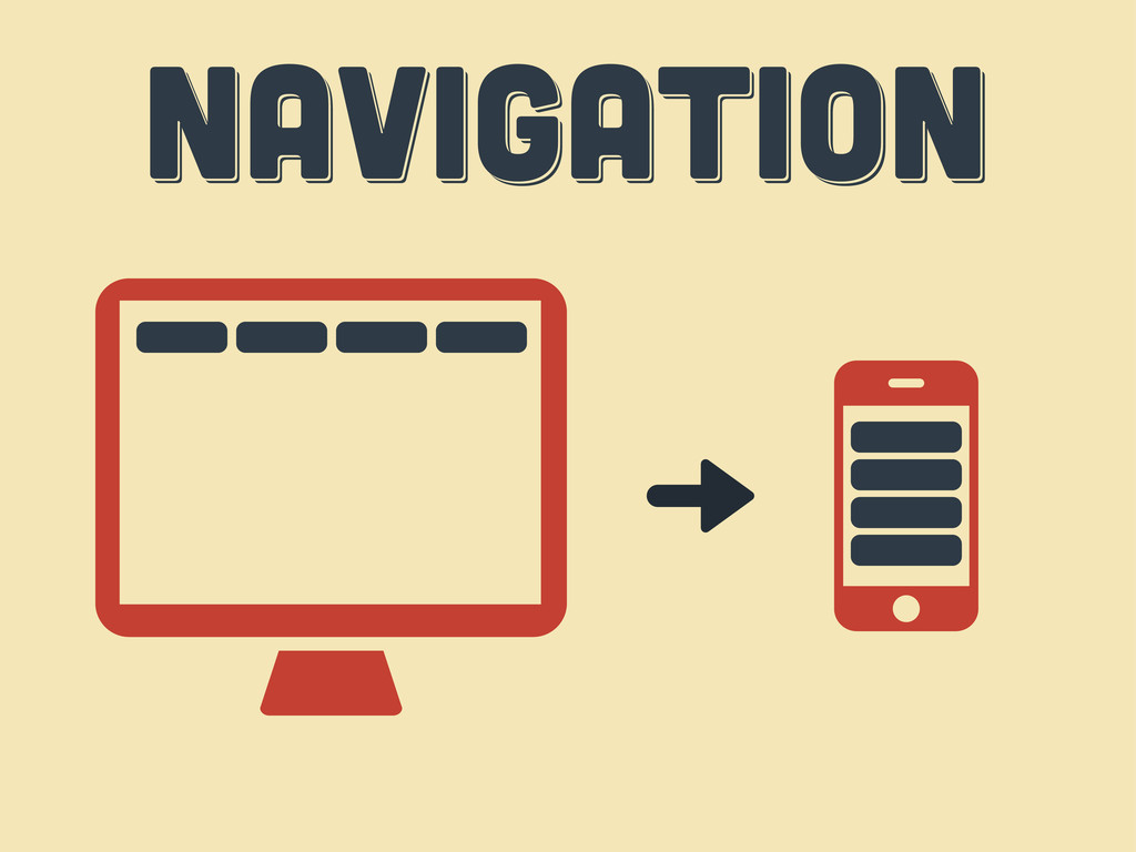
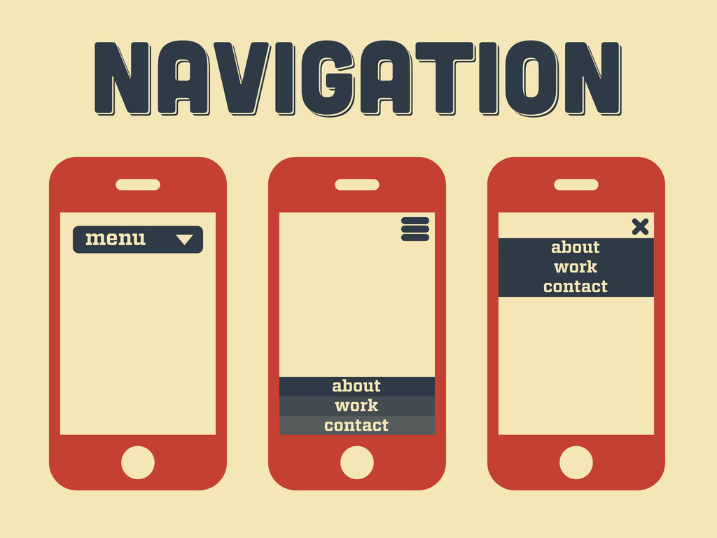
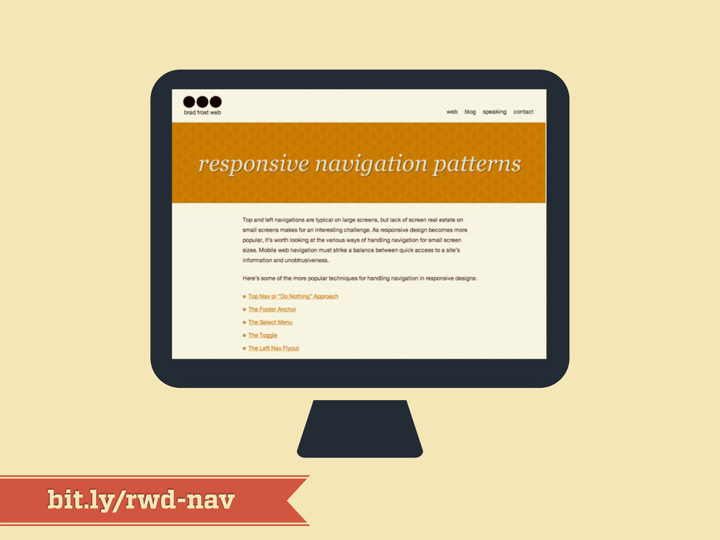
Navigation Navigation Navigation
Navigation Navigation Navigation menu contact work about contact work about
bit.ly/rwd-nav
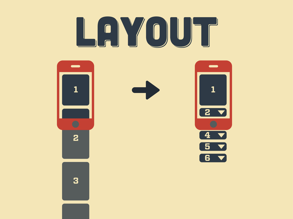
LAYOUT LAYOUT layout 1 2 3 4 6 5
3 2 LAYOUT LAYOUT layout 1 3 1 2 4
5 6
LAYOUT LAYOUT layout
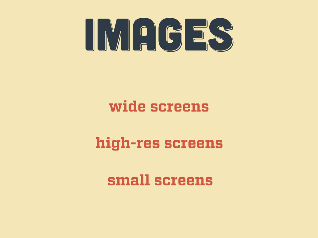
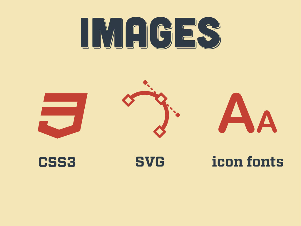
IMAGES IMAGES images wide screens high-res screens small screens
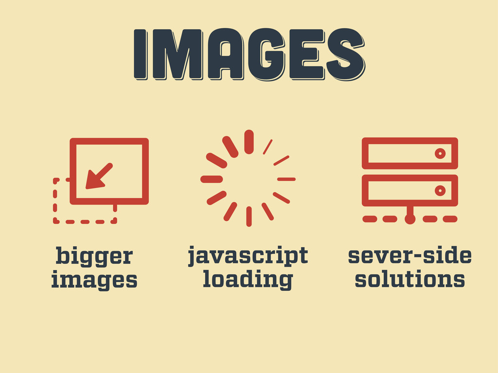
IMAGES IMAGES images bigger images javascript loading sever-side solutions
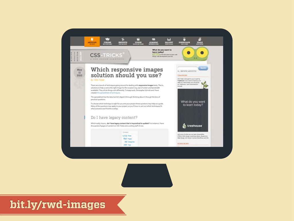
bit.ly/rwd-images
IMAGES IMAGES images CSS3 SVG icon fonts
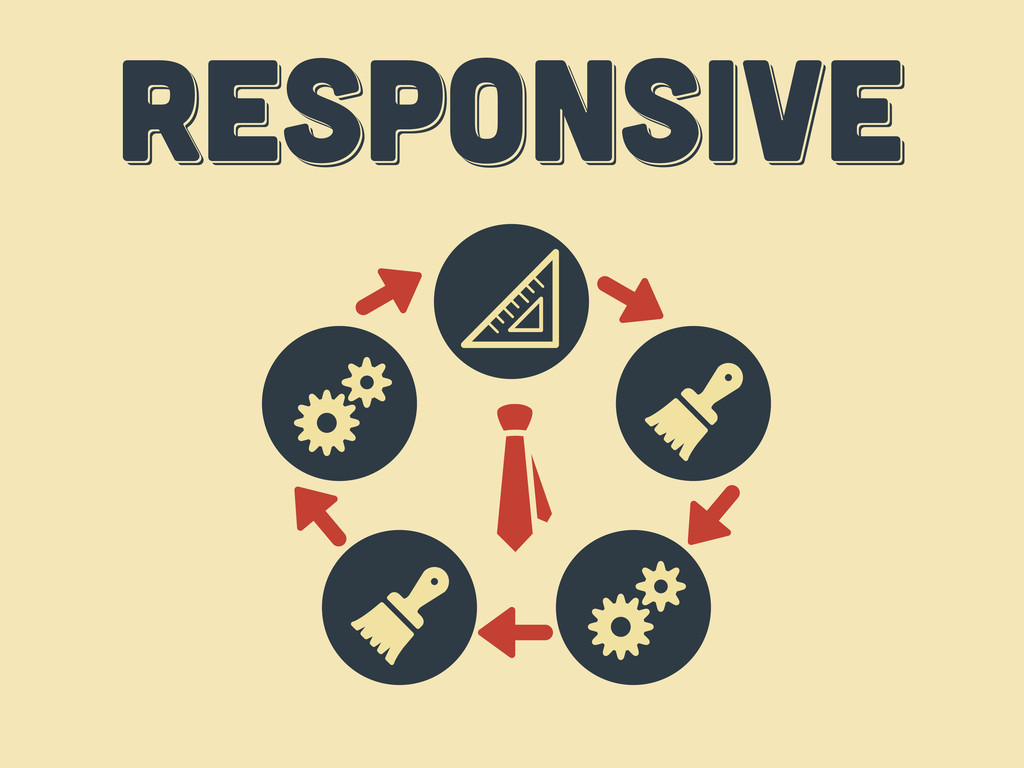
workflow workflow workflow third act
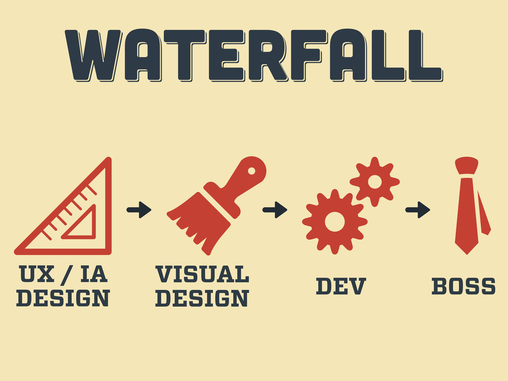
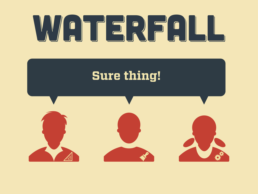
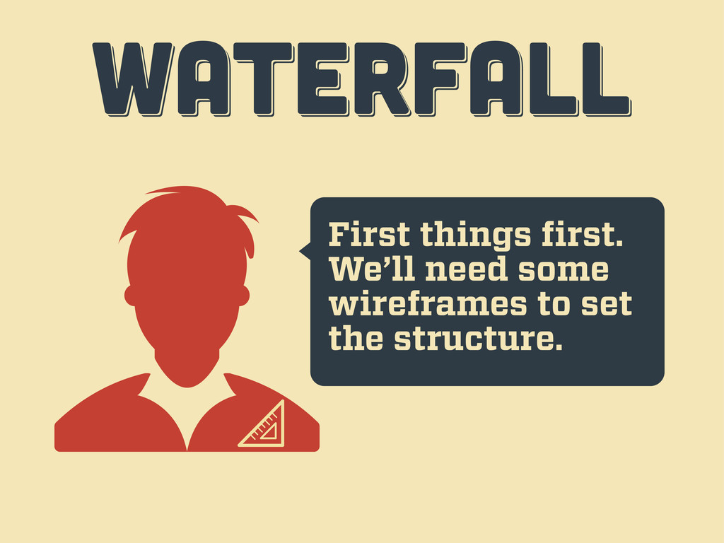
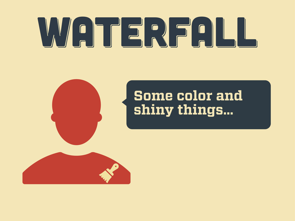
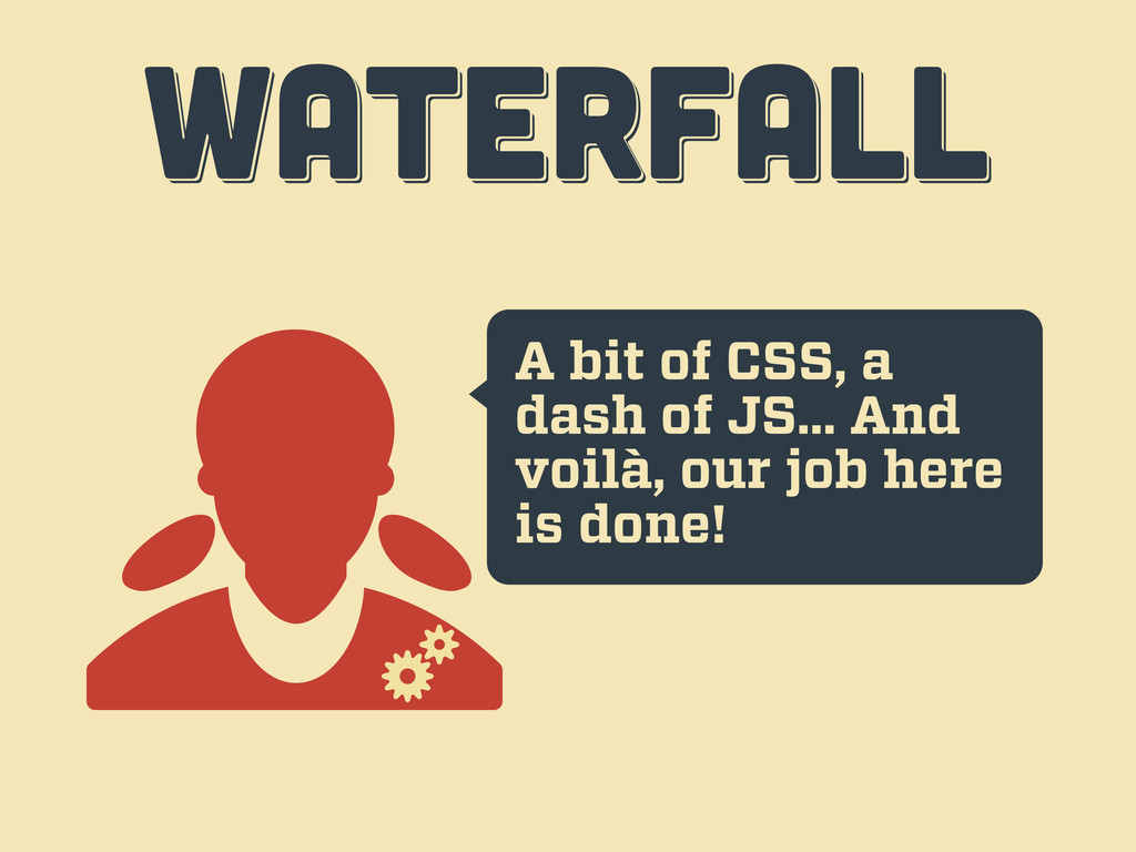
WATERFALL WATERFALL WATERFALL UX / IA DESIGN VISUAL DESIGN DEV
BOSS
Hi, I want a website… WATERFALL WATERFALL WATERFALL
Sure thing! WATERFALL WATERFALL WATERFALL
First things first. We’ll need some wireframes to set the
structure. WATERFALL WATERFALL WATERFALL
Some color and shiny things… WATERFALL WATERFALL WATERFALL
A bit of CSS, a dash of JS... And voilà,
our job here is done! WATERFALL WATERFALL WATERFALL
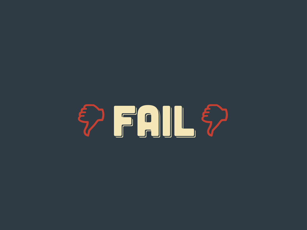
Er... guys... WATERFALL WATERFALL WATERFALL
FAIL fail Fail
responsive responsive Responsive
ten tips ten tips ten tips fourth act
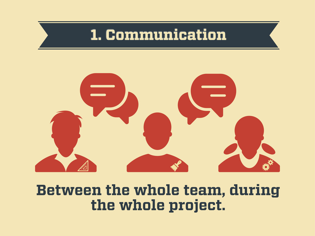
1. Communication Between the whole team, during the whole project.
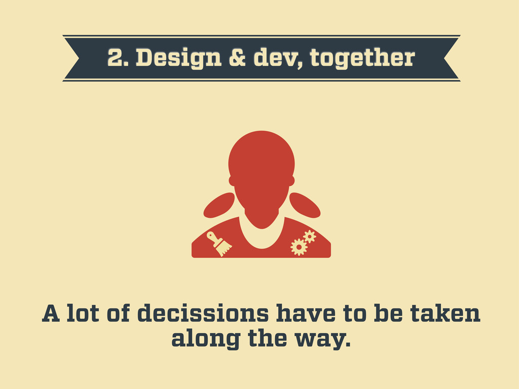
2. Design & dev, together A lot of decissions have
to be taken along the way.
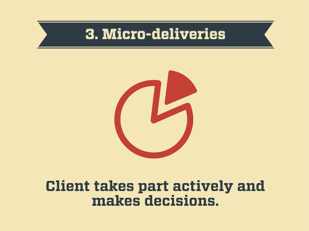
3. Micro-deliveries Client takes part actively and makes decisions.
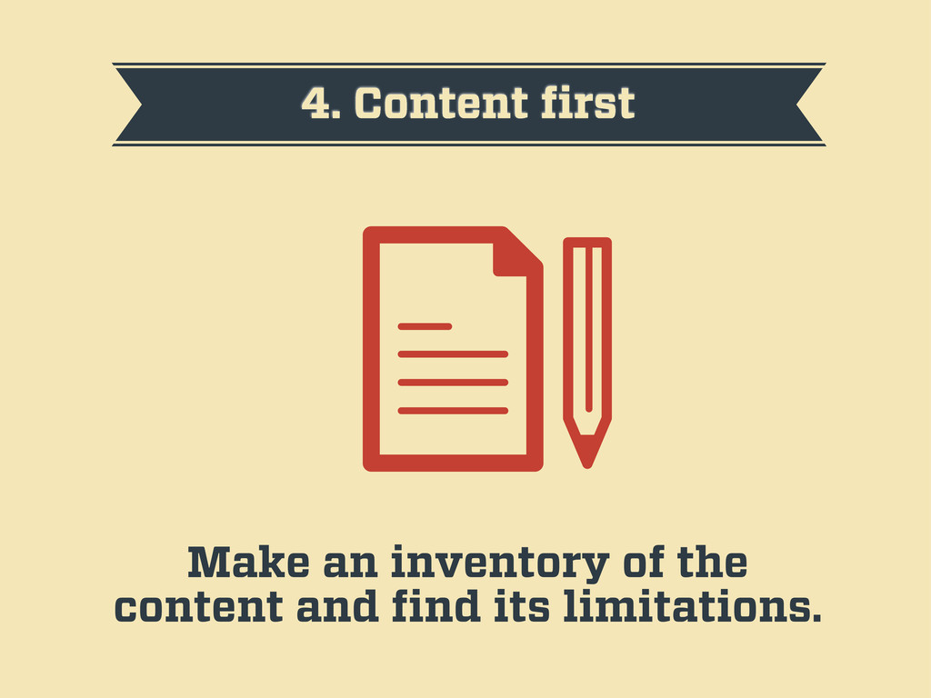
4. Content first Make an inventory of the content and
find its limitations.
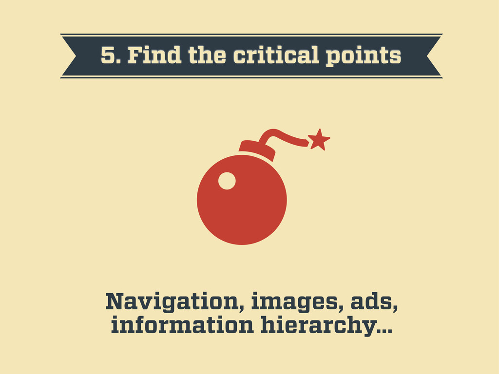
5. Find the critical points Navigation, images, ads, information hierarchy…
6. Mobile first The small screen is the first limit.
7. Reference sketches Make basic sketches to help with the
hierarchy of the content.
8. Prototype fast The sooner you start coding your HTML,
the better.
9. Design in the browser Make design decisions as you
see the result on the browser.
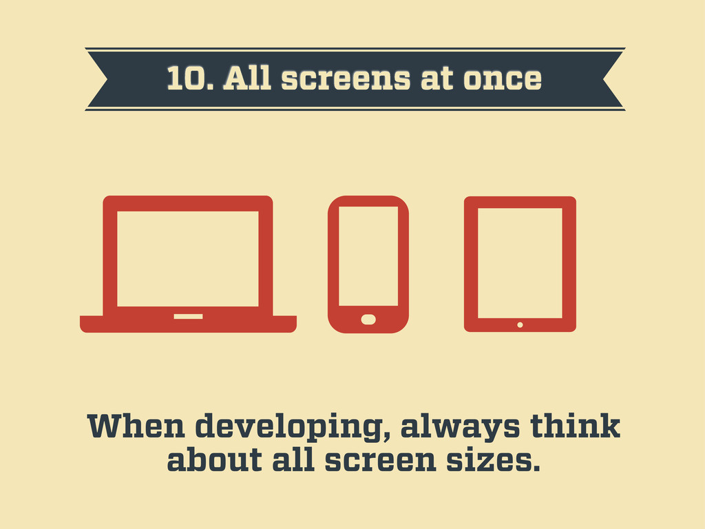
10. All screens at once When developing, always think about
all screen sizes.
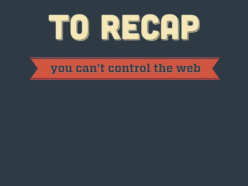
TO RECAP TO RECAP TO RECAP
TO RECAP TO RECAP TO RECAP you can’t control the
web
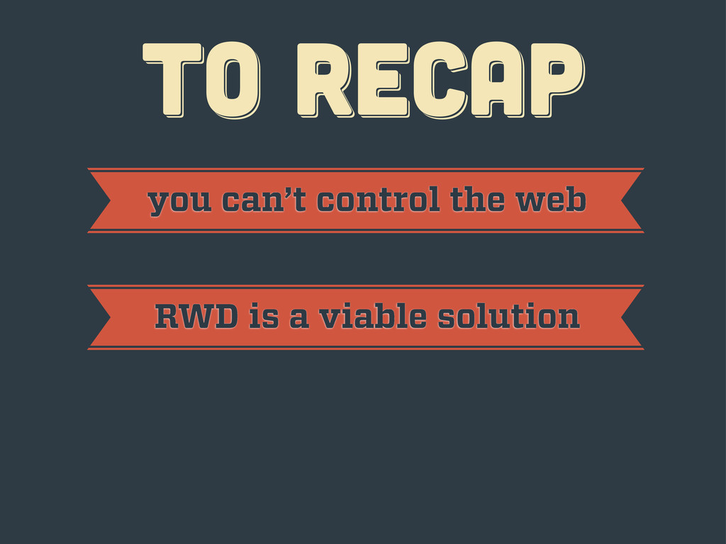
TO RECAP TO RECAP TO RECAP you can’t control the
web RWD is a viable solution
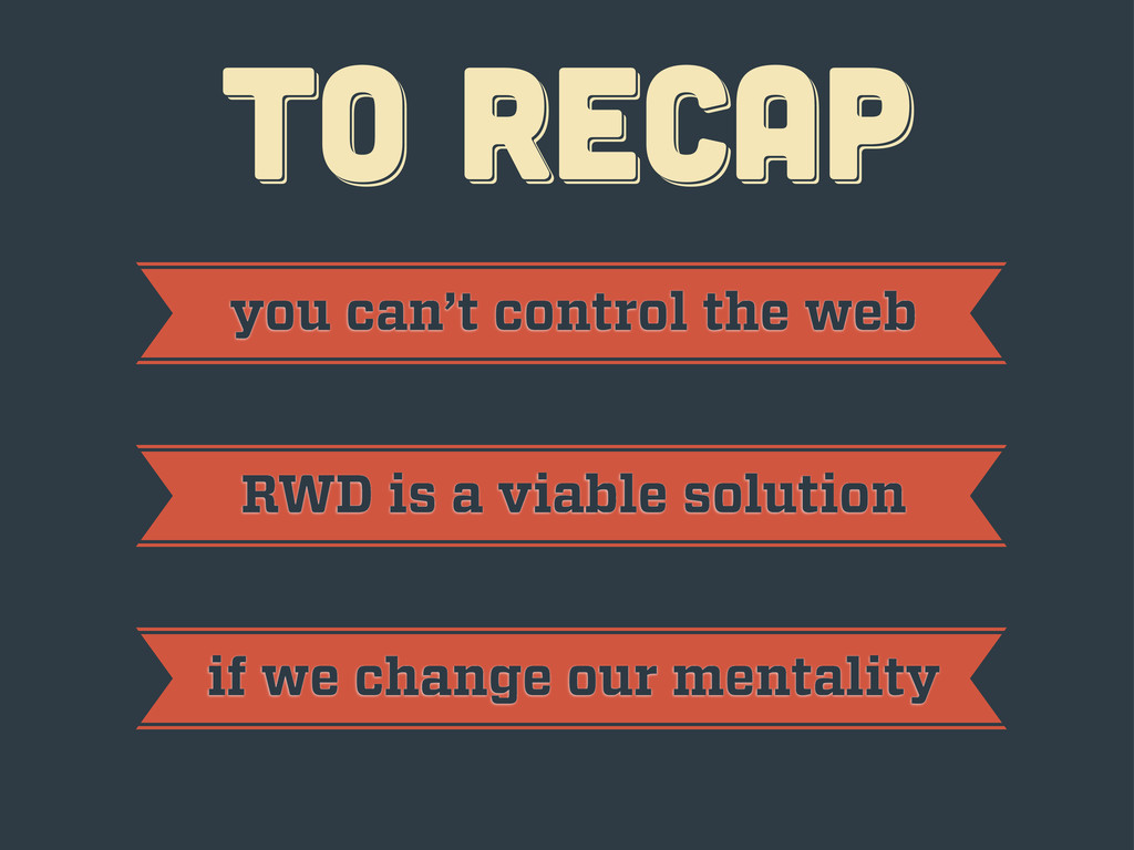
TO RECAP TO RECAP TO RECAP you can’t control the
web RWD is a viable solution if we change our mentality
thanks! thanks! thanks! Javier Usobiaga · http://Swwweet.com · @htmlboy
 swwweet
 knih
knih
 sh_fk2
 ry
ry
 iotengineer22
 hiroramos4
 lycorptech_jp
 jhashimoto
 kozy4324
 line_developers_tw
 oracle4engineer
 shoota
 thirion
 jnunemaker
 inesmontani
 akademiya2063
 szymonslowik
 erikaheidi
 jonoalderson
 tonyrice
 tomoyanonymous
 maggiecrowley
 nmsamuel
 marcoroth