Upgrade to Pro — share decks privately, control downloads, hide ads and more …

UX14 - UX Strategy: Design For Future (Punit Dutt Mathur)

uxindia
October 10, 2014

UX14 - UX Strategy: Design For Future (Punit Dutt Mathur)

Talk will cover the following:
Device/Platform spectrum available in market
Multi-device shopping
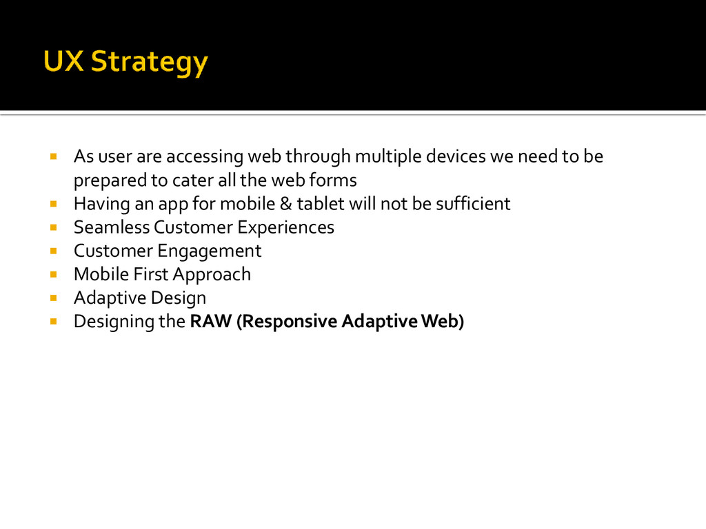
How Responsive Design help in driving seamless customer experience?
UX approach for multi-device
Combination of Responsive & Adaptive Design
Framework for Responsive Adaptive Web
Impact & ROI on business
What's the future

uxindia

October 10, 2014
Tweet

More Decks by uxindia

Other Decks in Design

Transcript

  1. The mass adoption of smart phones and tablets has changed the way we view
    the web. No longer tied to a single location, websites need to be accessible at any
    time from any place on any device. The answer ?
    Responsive Design

    View Slide

  2. View Slide

  3. View Slide

  4. View Slide

  5.  More than 20 percent of Google searches are now being performed on
    some sort of mobile device.
     In 2012 over half of all local searches were done on a mobile device.
     25 percent of Internet users only access the internet via a mobile device
    in the United States.
     25.85 percent of all emails are opened on mobile phones, with another
    10.16 percent being opened on tablets.
     In 2014 mobile Internet usage is expected to overtake desktop usage.
     Out of the 4 billion mobile phones in the world, 1.08 billion are
    smartphones and 3.05 are SMS enabled.

    View Slide

  6.  As user are accessing web through multiple devices we need to be
    prepared to cater all the web forms
     Having an app for mobile & tablet will not be sufficient
     Seamless Customer Experiences
     Customer Engagement
     Mobile First Approach
     Adaptive Design
     Designing the RAW (Responsive Adaptive Web)

    View Slide

  7.  Time & Money
     Browser Support
     Performance
     Content
     Website vs. Web App

    View Slide

  8.  Improved UX
     Common UI & Code for Desktop, Tablets & Mobile*
     Boost in conversion rates with multi-device
     Lean Team with common UI, Dev & QA for Desktop & Mobile*
     Faster time to market for Desktop & Mobile* deliveries
     Custom reusable elements across devices
     Consistent experience across site/channels
     Improved SEO

    View Slide

  9.  Identify a framework that can be used for going Responsive
     Major breakpoint from resolution point of view for which we need to design
     Benchmarking the sites which have already adopted the responsive approach
     Also keep in mind that the mobile app & web should have a similar
    experience.
     Classify different data points and define their behavior across devices
     Working between the Portrait & Landscape mode for handheld devices is a
    challenge
     Define the new visual design language maintaining the brand color & identity

    View Slide

  10. View Slide

  11. • What’s the use of framework?
    • Multiple framework are available for responsive design like: Bootstrap,
    Foundation, Golden Grid System, Fluid Baseline Grid and many more…
    • We choose Bootstrap
    • Understand the grid system
    • Balance between the limitation of framework and the design

    View Slide

  12.  Increased Productivity
     Reduced Costs (development cycle)
     Better Customer Experience
     Upside in sales
     Website serving multiple devices with seamless customer experience
     SEO friendly
     Low maintenance required
     Increase in traffic for handheld devices
     Data speak about the success

    View Slide

  13.  Grid structure customization
     Tackle future devices
     Content optimization
     What’s the future?

    View Slide

  14. https://www.google.com
    http://getbootstrap.com/
    https://makemytrip.com
    http://johnpolacek.github.io/
    http://www.thesteveropergroup.com/
    http://www.socialmedia.ie/

    View Slide

  15. Punit Mathur
    Assistant Manager – User Experience Design
    MakeMyTrip.com

    View Slide