$30 off During Our Annual Pro Sale. View Details »

Mobile Rage - What causes it & how to fix it

Mobile Rage - What causes it & how to fix it

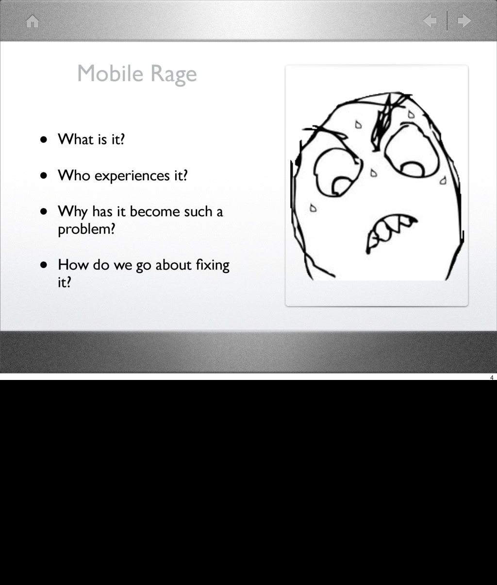
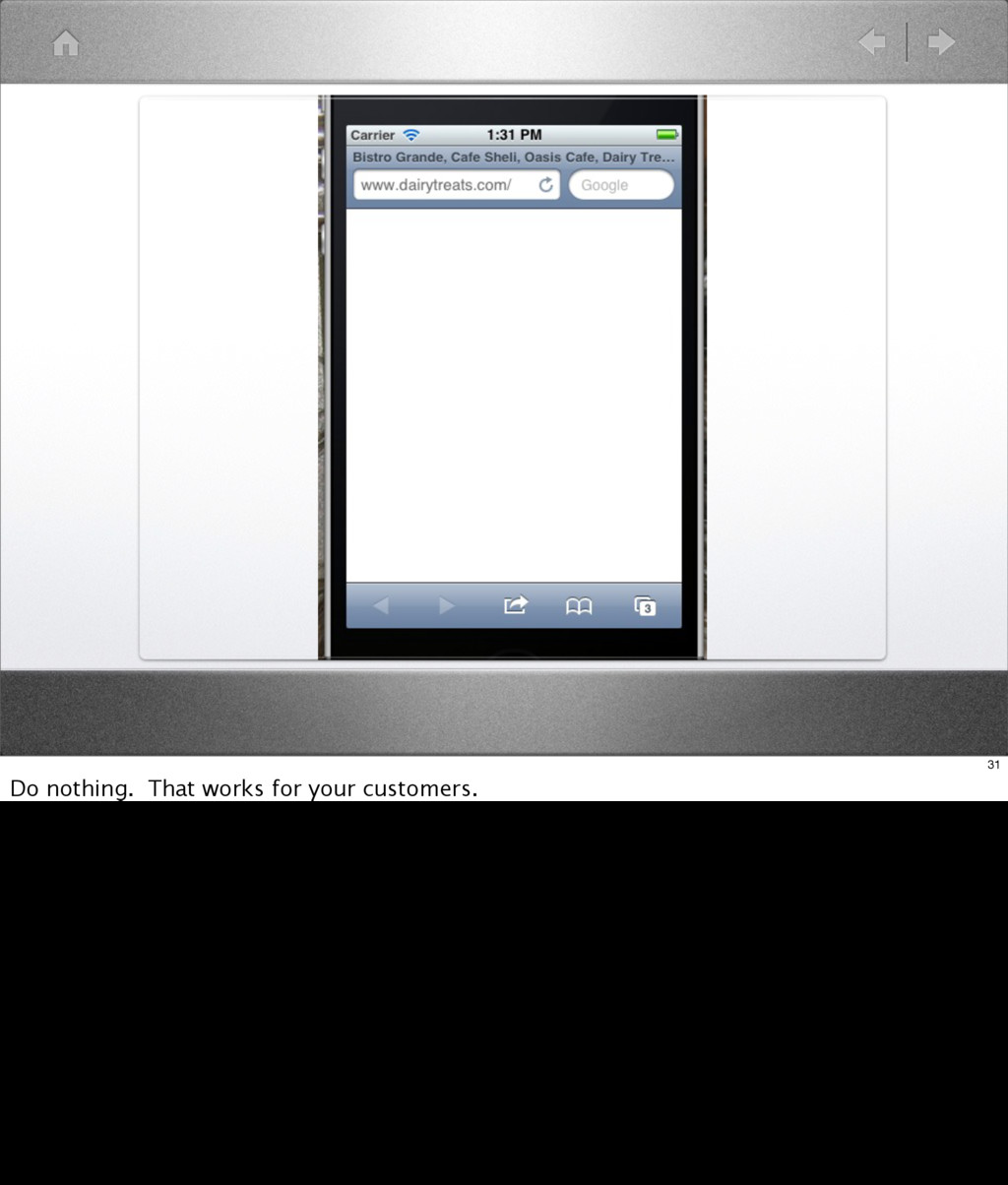
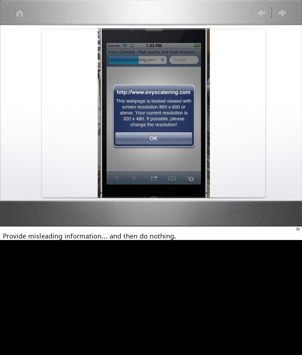
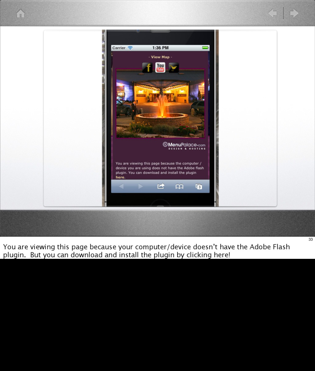
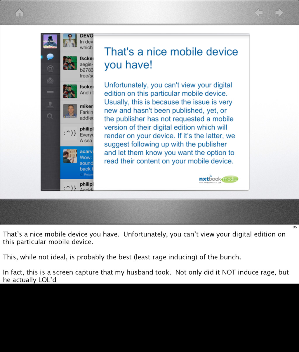
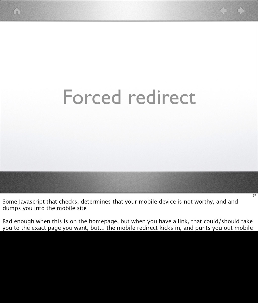
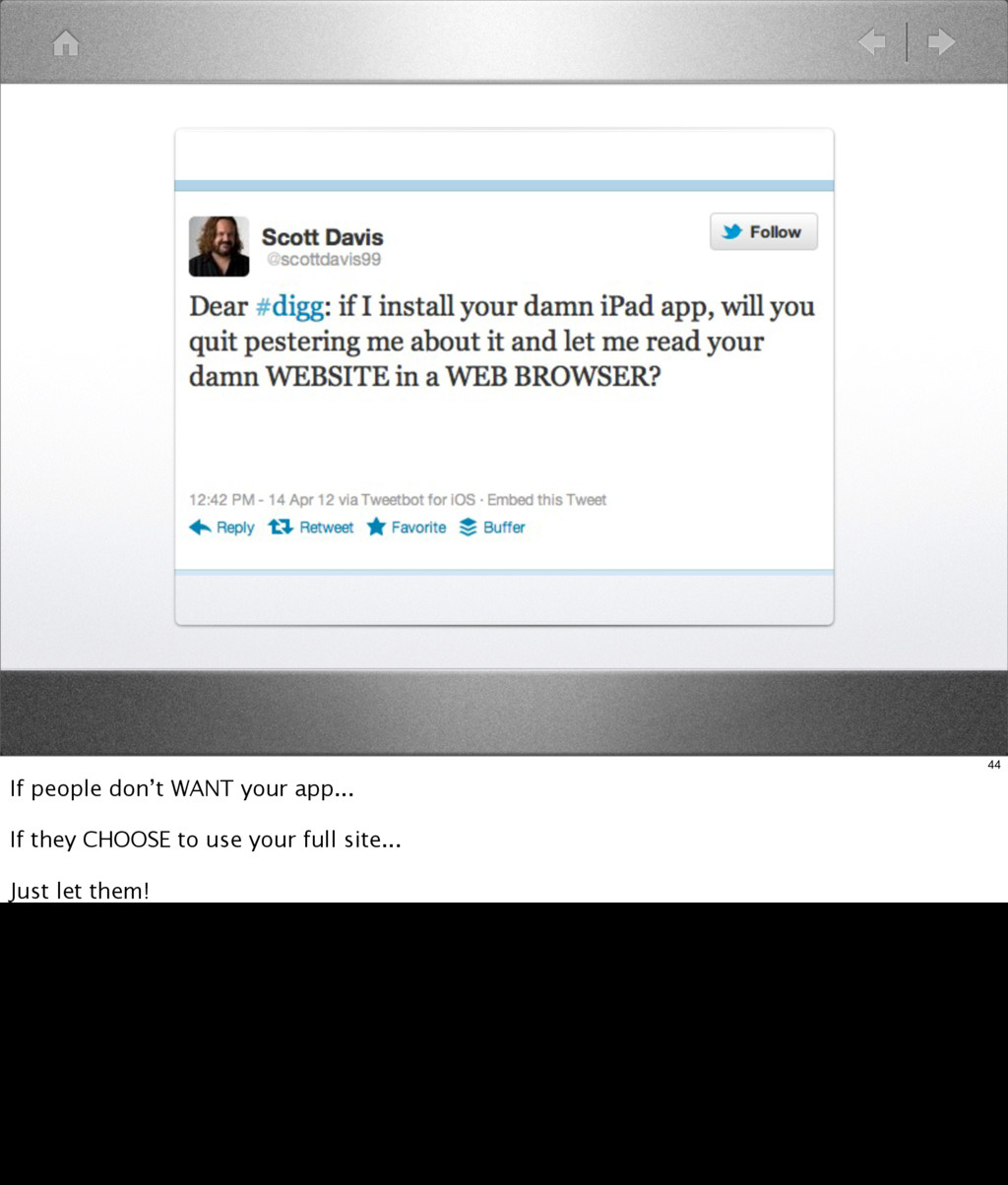
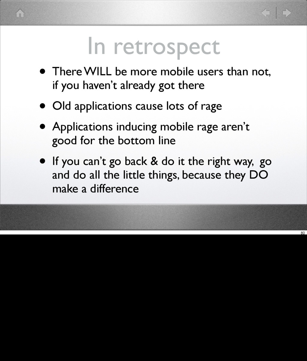
That website you want to use, from your mobile, that just refuses to cooperate. From the annoying "we have an app", to the can't f**king log in, to the redirect-to-mobile-&-forget-the-context sites, there's more than enough websites that invoke Mobile Rage.
The best mobile development strategy is "mobile-first", but what if you can't? Come learn about the common mistakes most people make for mobile, & some of the simple solutions you can use.

Lori M Olson

April 23, 2012
Tweet

More Decks by Lori M Olson

Other Decks in Technology

Transcript

  1. Mobile Rage
    Lori Olson
    The WNDX Group Inc
    1

    View Slide

  2. Lori Olson
    • The WNDX Group Inc
    • Independent contractor
    • Used Rails for since 2005 (0.13?)
    • Mostly oil & gas apps
    2

    View Slide

  3. Mobile Gadgets
    • since... Windows CE
    • Palm/Treo
    • iPhone/iPad
    3

    View Slide

  4. • What is it?
    • Who experiences it?
    • Why has it become such a
    problem?
    • How do we go about fixing
    it?
    Mobile Rage
    4

    View Slide

  5. What?
    5
    What is Mobile Rage?
    Some people wouldn’t call it rage at all.
    Mobile frustrated. Mobile annoyed. Mobile peeved.

    View Slide

  6. It’s that feeling of
    intense frustration you
    experience, when using
    web applications or web
    sites from your mobile
    device, and they JUST
    DON’T WORK RIGHT.
    6
    But I call it Mobile Rage. It’s that feeling of intense frustration you experience, when using web applications or web sites from your mobile
    device, and they JUST DON’T WORK RIGHT.

    View Slide

  7. Who?
    7
    Just the fastest growing segment of the web consumer market.

    View Slide

  8. 8
    The smart phone users. The tablet users
    I’m not talking about dumb-phone users.
    I mean, T9 predictive text rage is just a given, so anything on top of that is just superfluous.

    View Slide

  9. 9
    I mean, T9 predictive text rage is just a given, so anything on top of that is just superfluous.

    View Slide

  10. 10
    Here we are, at the inflection point. Smart phone shipments will EXCEED personal computer
    shipments this year.
    http://www.webdesignshock.com/responsive-design-problems/

    View Slide

  11. Overall smartphone ownership is up by 13%
    in the past six months in Canada, according
    to Ipsos Reid. Now, more than one-third of
    Canadians own smartphones—up from just
    one quarter in August 2011. - Techvibes
    http://www.techvibes.com/blog/canadians-loyalty-to-blackberry-vanishes-as-android-and-apple-gain-
    marketshare-2012-04-20
    11
    Seriously. One third. Now that’s a market share you just can’t ignore.

    View Slide

  12. Why?
    12
    Why are things SO bad? Somehow we got to this point, where so many web sites and web applications invoke so
    much rage amongst consumers?
    How long has the web been around? I built my first website in late 1994. 18 years ago. How many websites and
    web applications are relatively static... because they work... good enough?
    Well, Rails applications have been developed for around 8 years now. Eight years ago, mobile was just barely on
    most product radars, and the iPhone *didn’t exist*, except in Steve Jobs secret little world.

    View Slide

  13. How?
    13
    So how did WE get here? And how do we fix it?
    Well, the answer for us Rails developers is simple isn’t it?
    Because Rails developers only work on greenfield projects, brand NEW web applications

    View Slide

  14. Mobile First!
    14
    So we just develop these new applications using mobile first.
    This is where you START and I would argue this is where you finish as well. Your application design should work
    on mobile first, and then you work on the desktop representation.

    View Slide

  15. Responsive Design!
    15
    Responsive design will solve the rest of our problems, won’t it?

    View Slide

  16. 16
    Our applications adapt to mobile seemlessly and everything is all rainbows and unicorns, right?
    Because we don’t have to support any old applications, that were built and designed before anyone ever heard of
    mobile first and responsive design.
    We certainly never have to integrate with old applications, or existing CMS systems or anything like that...

    View Slide

  17. 17
    Of course, if you still believe in fairy dust... I can’t help you.

    View Slide

  18. • Landing
    • Advertising
    • Navigation
    • Forms
    Problem Areas
    18
    So if we are going to talk about how to fix things, we should probably start with defining the
    problems.
    So let’s talk about the general classes of problems that induce mobile rage

    View Slide

  19. Landing
    19

    View Slide

  20. Psst! Did you know
    your app is slow on
    mobile?
    20
    Hey, did you know that your web app is slow on mobile?
    Ya, that’s what I thought.

    View Slide

  21. http://www.webperformancetoday.com/2011/07/20/new-findings-mobile-web-users-are-more-disappointed-than-ever/
    21
    That’s an alarming statistic

    View Slide

  22. http://www.webperformancetoday.com/2011/10/21/phone-rage-how-people-react-to-slow-mobile-sites/
    22
    That all adds up to almost 40% of mobile users... that’s not good, is it?

    View Slide

  23. Javascripts
    • jQuery/UI
    • could be replaced by Zepto.js
    • Top loading
    • Bottom Loading
    23
    We know that loading Javascripts can be a problem

    View Slide

  24. CSS
    24
    Certainly some old sites, where developers have been hacking at them for years, have big,
    bloated CSS files
    I mean, you’re never really sure that removing something won’t break something obscure,
    right? Much easier to just keep adding to it.

    View Slide

  25. Images
    25
    And then of course there are images. With the rush to support iPad retina displays, our
    images are getting even more bloated than ever.

    View Slide

  26. Asset pipeline!
    26
    But wait a minute... javascript, CSS, images.... Don’t we already
    have a way of dealing with some of this in Rails. The asset pipeline.
    Now, that’s all very fine for your new Rails apps, however

    View Slide

  27. Pre-Rails 3.1 apps?
    27
    Asset pipeline can be added, just not in the totally integrated fashion that we have now.
    But really, wouldn’t it just be better to use this as another argument in favour of upgrading
    those old apps?

    View Slide

  28. Landing Strategies
    28
    So, once we get past ts;dw we have to deal with all the different strategies that developers
    have hacked together for dealing with mobile. Some are older, some are newer.

    View Slide

  29. Flash-only
    29
    While it seemed for a while that Flash would survive the iOS onslaught, the sad fact is that
    Flash is dead on mobile. And when I say sad, I’m not really sad, but I assume there are some
    Flash developers out there who are sad.
    There is really no excuse at this point for having a Flash-only site, or even a Flash mostly site.
    Honestly, the biggest offenders here are restaurants, and other similar enterprises, that just
    wanted a “web presence”, and hired some agency to build one for them.

    View Slide

  30. Options?
    30

    View Slide

  31. 31
    Do nothing. That works for your customers.

    View Slide

  32. 32
    Provide misleading information... and then do nothing.

    View Slide

  33. 33
    You are viewing this page because your computer/device doesn’t have the Adobe Flash
    plugin. But you can download and install the plugin by clicking here!

    View Slide

  34. 34
    Hey, why not insult your web visitor while you’re at it!
    http://thetoshibatablet.com

    View Slide

  35. 35
    That’s a nice mobile device you have. Unfortunately, you can’t view your digital edition on
    this particular mobile device.
    This, while not ideal, is probably the best (least rage inducing) of the bunch.
    In fact, this is a screen capture that my husband took. Not only did it NOT induce rage, but
    he actually LOL’d

    View Slide

  36. Full Site
    36
    Leaving Flash behind us for the moment, let move on to more of the “do nothing” landing
    strategies.
    This is probably the option that causes the least amount of rage. The smart mobile browsers
    can view a lot of web sites and applications, with some issues. But if it mostly works, that’s
    pretty good.

    View Slide

  37. Forced redirect
    37
    Some Javascript that checks, determines that your mobile device is not worthy, and and
    dumps you into the mobile site
    Bad enough when this is on the homepage, but when you have a link, that could/should take
    you to the exact page you want, but... the mobile redirect kicks in, and punts you out mobile

    View Slide

  38. Mobile walled garden
    38
    This is a follow on, of the mobile redirect. Already pissed at not being able to get directly to
    the page you were after, now you discover that the mobile site is

    View Slide

  39. Limited function
    39
    1. a “limited” function version of the full site

    View Slide

  40. No “Full Site” link
    40
    2. entirely walled off from the full site and you *can’t* get back to the full site.

    View Slide

  41. Mobile detect... FAIL!
    41
    A variation on the “mobile redirect” is the mobile detection FAILURE.

    View Slide

  42. Calgary Herald
    42
    Here I am, on my iPad, but it’s been detected as an iPhone, so I get the squishy, narrow
    version that works (ok) on the phone, but is exceedingly annoying on the iPad. And, of
    course, there is a link that will take me to the “Full Site” (all the way at the bottom), but it
    takes me to the front page of the full site, not the story I was reading.
    Ok, I think we’ve come full circle here, so lets move on to the

    View Slide

  43. Apps
    43
    So another landing option is to not bother handling the mobile devices in the web browser at
    all. Instead, there’s an app for that!

    View Slide

  44. 44
    If people don’t WANT your app...
    If they CHOOSE to use your full site...
    Just let them!

    View Slide

  45. Default! Save!
    45
    Make it a default! Save a freaking cookie!

    View Slide

  46. Advertising
    46
    Advertising is, in many ways, the bane of our existence, as consumers of the web.
    However, as web app developers, we know that there’s money to be made in advertising, so
    we do it anyway.
    But maybe. since it’s so annoying anyway, we could do it better on mobile...

    View Slide

  47. Popovers
    47
    You know these. Popups. Lightboxes. You’ve never liked them on the desktop. But on
    mobile, they are even worse.
    The (sometimes) delayed popup version is even worse. You got to a page, you double tapped
    to zoom in to the text, and BLAM, there’s this annoying popover, covering up the content,
    and when you try to zoom out, you inevitably, accidentally click on something from the
    popover, and you are now on a new page. What fun!
    A more evil version of this problem, is where the popover is sized so that it extends beyond
    the edges of your mobile screen, so that you cannot immediately dismiss it. You have to
    guess... is this the once with the ‘X’ on the top right corner? Or the one with the little, tiny
    “Cancel” link, hiding neat the bottom.
    But it gets worse. Because some of these will dynamically center themselves... so, as you
    attempt to scroll around, to find the dismiss button, it will continually adjust itself, to stay in
    the center, and keep those dismiss controls properly hidden.

    View Slide

  48. National Geographic
    48
    I had this awesome example, where National Geographic had the lightbox from hell, but...
    They seem to have fixed it.
    Oh well.
    I mean, YAY!

    View Slide

  49. Redirects to ad
    49
    One mitigation strategy for popovers and lightboxes, at least in terms of advertising, is ...
    one of my least favorite bait-and-switch techniques. But, at least it’s not a lightbox.
    The link redirects to an ad or video, and then has a x second timer that will take you back to
    the link you actually wanted. While generally, this is a rage item, it’s the lesser of evils.

    View Slide

  50. Navigation
    50
    We all know that navigation on your site is important. Once you have people there, you want
    to keep them.

    View Slide

  51. Size matters
    51
    Sorry guys, but...
    On mobile, the size of the links/buttons make a huge difference in the usability of your web
    applicaiton. While those little ‘x’ close/delete buttons may seem like a good idea on the
    desktop, to maximize your available space for stuff like “text”, but missing the link can
    sometimes do... something completely different

    View Slide

  52. Spacing matters too
    52
    But it isn’t just about the size of your links and buttons. You can actually leave the size
    alone, if it seems reasonable, and readable, but then you will need to adjust the spacing
    between your links and buttons.

    View Slide

  53. 53
    Here is an example from one of my applications.
    We made a sizing change (on the accordion headers), and we made padding and margin
    changes on the rest of the links

    View Slide

  54. How much?
    54
    Of course, you can go and read the Apple Human Interface Guidelines (and you probably
    should anyway), but I’ve found that good, visual example is always superior to reading dry
    facts and figures.

    View Slide

  55. Phone Finger
    55
    PhoneFinger is a nice little Mac app that changes your mouse cursor into a full size finger, for
    use with the iPhone and iPad simulators. Reading Human Interface Guidelines is good, this
    is better. You will experience exactly the kinds of annoying missed link, wrong link clicked
    kinds of problems that your visitors are experiencing.

    View Slide

  56. Forms
    56
    And now we come to one of my personal demons. Form entry on mobile.
    I could go on for hours, but I’m running out of time, so lets just concentrate on
    signin, signup, profile editing.
    Believe me, you will find MORE than enough rage-worthy problems, on just those 3.

    View Slide

  57. signin
    57
    Starting with signin ... most services these days let you use an email address as your account
    identifier. But how many of those services actually take advantage of the mobile convenience
    known as the custom keyboard?

    View Slide

  58. 58
    Google fails here.
    Facebook wins!

    View Slide

  59. 59
    Oh, sorry, Facebook, but you fail on the iPad...
    Consistency much?

    View Slide

  60. 60
    That’s ok, Eventbrite failed too.

    View Slide

  61. 61
    Twitter - Fail
    Wordpress - Fail

    View Slide

  62. 62
    Yahoo - FAIL
    Microsoft Live - WIN!

    View Slide

  63. 63
    Amazon - WIN!
    Apple Store - FAIL?!?
    And, if you are going to say “use the app”, I’ll just have to mention that you can’t actually buy
    anything from the app, unless you’re in the US Apple Store.
    WTF?

    View Slide

  64. text_field(:user, :email, :size => 60)
    email_field(:user, :email, :size => 60)
    64
    The simple fix here, which is almost too embarrassing for words

    View Slide

  65. signup
    65
    And let’s move on to sign up.
    Here, I have a nice little anecdote, of attempting to sign up for a new service that everyone on
    Twitter was recommending a few weeks ago.

    View Slide

  66. 66
    Username. No, I don’t actually want that auto-capitalized, thanks.

    View Slide

  67. 67
    And autocompletion on this field doesn’t help me either, dammit.

    View Slide

  68. 68
    Ok, fine, at least give me the email keyboard... no?

    View Slide

  69. 69
    Are you kidding me? Autocomplete on my email? Grrrr.

    View Slide

  70. 70
    I give up. You win.

    View Slide

  71. 71
    I give up. You win.
    Or maybe I should say, you loose. Because I gave up, and iDrive lost a new customer.

    View Slide

  72. text_field(:user, :account_name, :size => 20)
    text_field(:user, :account_name, :size=>20,
    :autocomplete => 'off', :autocapitalize => off)
    72
    Here is a fix for the autocomplete, although, I understand you may have to make it a form
    attribute, as well, for Firefox browsers
    As for the password thing, it’s not really a mobile thing, but... don’t make arbitrary decisions
    about these restrictions.

    View Slide

  73. profile
    73
    Now a lot of the stuff you’ve seen is

    View Slide

  74. urls?
    74

    View Slide

  75. 75
    And here I enter in my homepage address with the custom keyboard for URL’s...
    Oh, Twitter. FAIL again.

    View Slide

  76. text_field(:user, :home_page, :size => 120)
    url_field(:user, :home_page, :size => 120)
    76
    The simple fix here, which is almost too embarrassing for words

    View Slide

  77. numbers?
    77

    View Slide

  78. 78
    Oh... I don’t think I have to demonstrate this AGAIN do I?

    View Slide

  79. text_field(:user, :cell_phone, :size => 20)
    phone_field(:user, :cell_phone, :size => 20)
    79
    The simple fix here, which is almost too embarrassing for words

    View Slide

  80. In retrospect
    • There WILL be more mobile users than not,
    if you haven’t already got there
    • Old applications cause lots of rage
    • Applications inducing mobile rage aren’t
    good for the bottom line
    • If you can’t go back & do it the right way, go
    and do all the little things, because they DO
    make a difference
    80

    View Slide

  81. @gorbypuff wants you too!
    thanks @tenderlove
    81

    View Slide

  82. Thanks!
    • Lori Olson
    • @wndxlori
    • http://wndx.posterous.com
    • Questions?
    82

    View Slide