Learn the reason behind responsive images. What is high density pixilation? How do I deliver a high-res image based on screen resolution? How does Wordpress help and what can I do to make my blog ready for next generation screens.
Is It Important? WC3 and the Two Adopted Methods. Polyfill and Javascript Requirements. Wordpress Media Library Image Settings. Updating <img> Tags in Post. Fin.
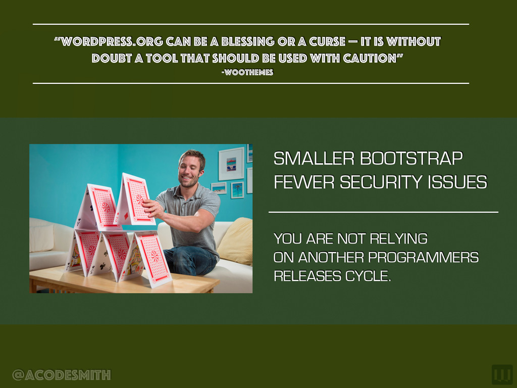
blessing or a curse — it is without doubt a tool that should be used with caution” -woothemes YOU ARE NOT RELYING ON ANOTHER PROGRAMMERS RELEASES CYCLE.
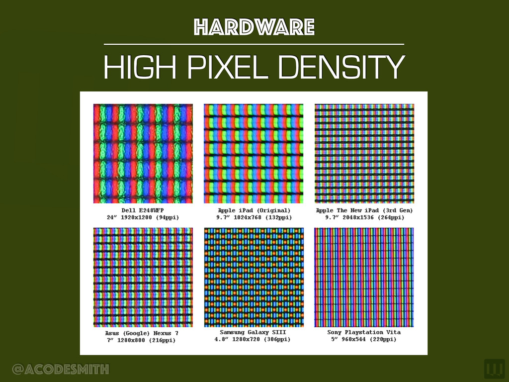
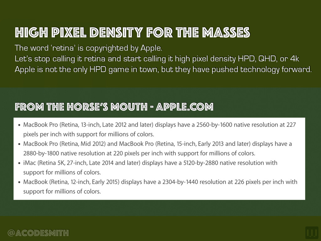
calling it retina and start calling it high pixel density HPD, QHD, or 4k Apple is not the only HPD game in town, but they have pushed technology forward. HIGH PIXEL DENSITY FOR THE MASSES FROM THE HORSE’S MOUTH - APPLE.COM
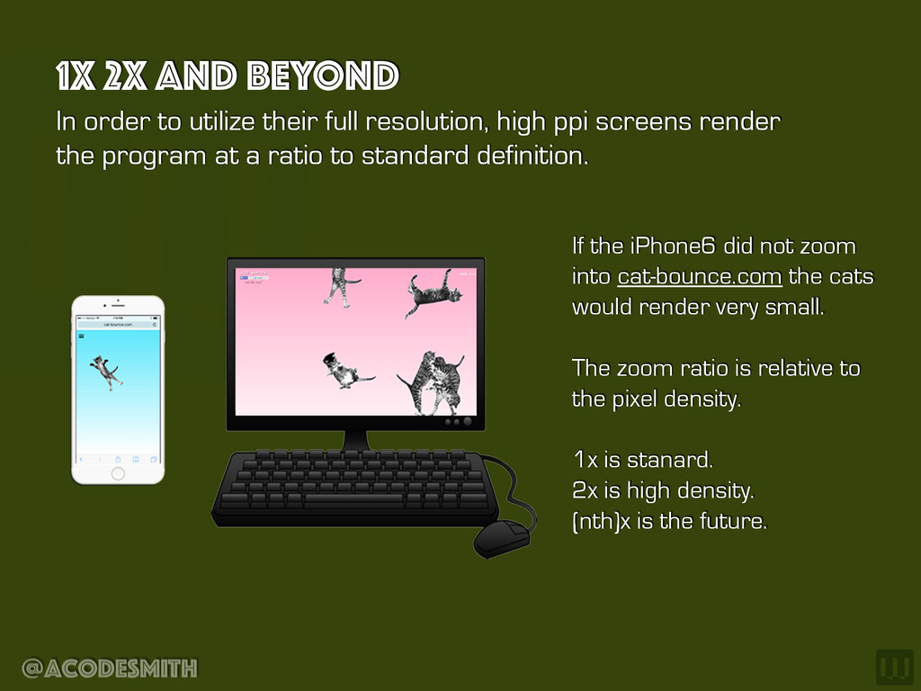
cats would render very small. The zoom ratio is relative to the pixel density. 1x is stanard. 2x is high density. (nth)x is the future. @acodesmith In order to utilize their full resolution, high ppi screens render the program at a ratio to standard definition. 1X 2X AND BEYOND
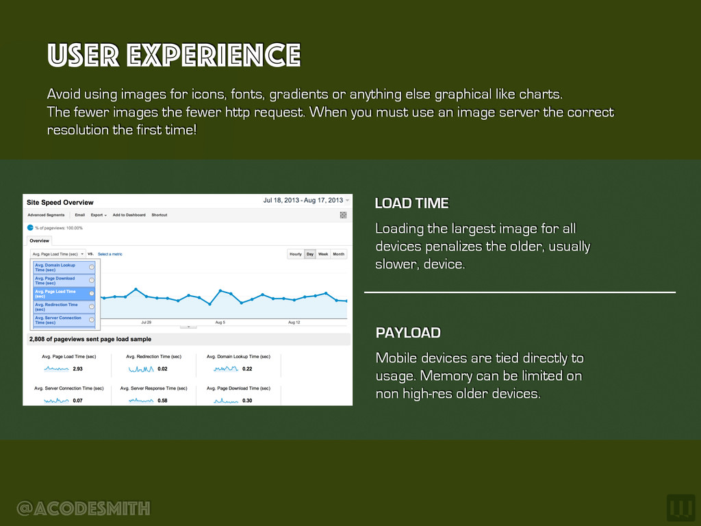
else graphical like charts. The fewer images the fewer http request. When you must use an image server the correct resolution the first time! User Experience Loading the largest image for all devices penalizes the older, usually slower, device. LOAD TIME Mobile devices are tied directly to usage. Memory can be limited on non high-res older devices. PAYLOAD
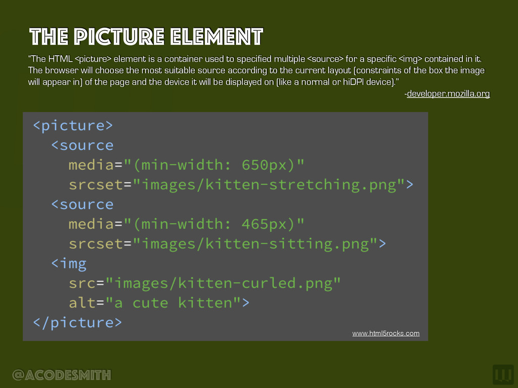
container used to specified multiple <source> for a specific <img> contained in it. The browser will choose the most suitable source according to the current layout (constraints of the box the image will appear in) of the page and the device it will be displayed on (like a normal or hiDPI device).” -developer.mozilla.org www.html5rocks.com
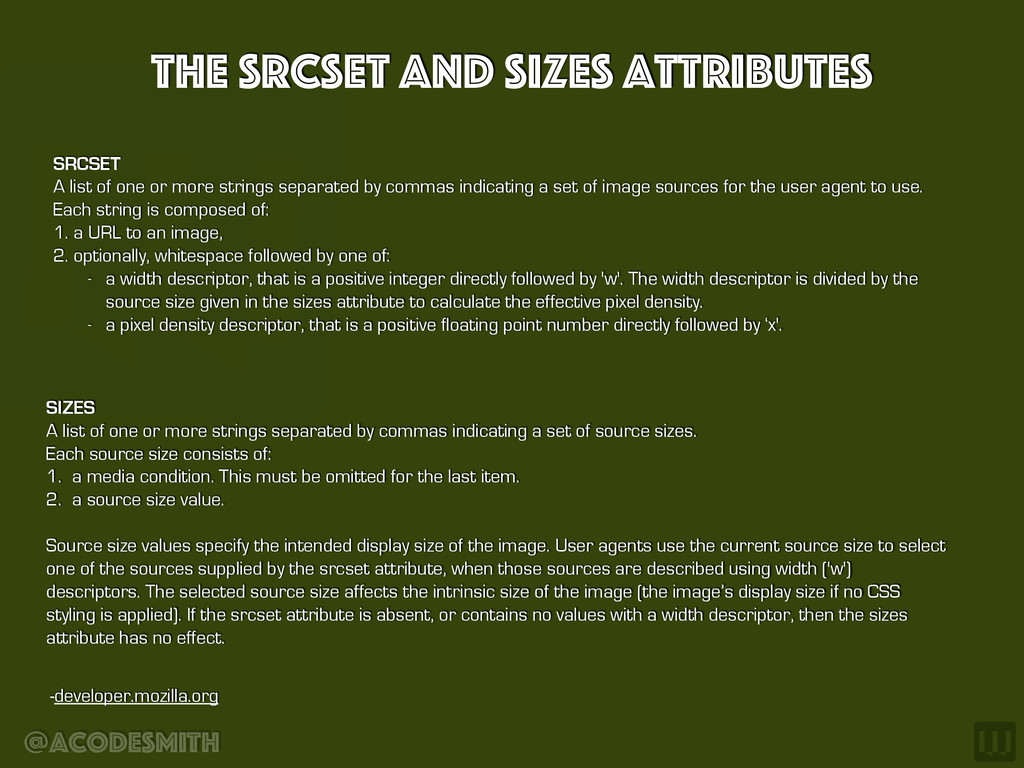
one or more strings separated by commas indicating a set of image sources for the user agent to use. Each string is composed of: 1. a URL to an image, 2. optionally, whitespace followed by one of: - a width descriptor, that is a positive integer directly followed by 'w'. The width descriptor is divided by the source size given in the sizes attribute to calculate the effective pixel density. - a pixel density descriptor, that is a positive floating point number directly followed by ‘x'. -developer.mozilla.org SIZES A list of one or more strings separated by commas indicating a set of source sizes. Each source size consists of: 1. a media condition. This must be omitted for the last item. 2. a source size value. Source size values specify the intended display size of the image. User agents use the current source size to select one of the sources supplied by the srcset attribute, when those sources are described using width ('w') descriptors. The selected source size affects the intrinsic size of the image (the image’s display size if no CSS styling is applied). If the srcset attribute is absent, or contains no values with a width descriptor, then the sizes attribute has no effect.
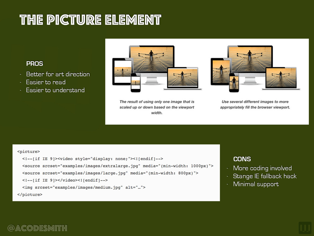
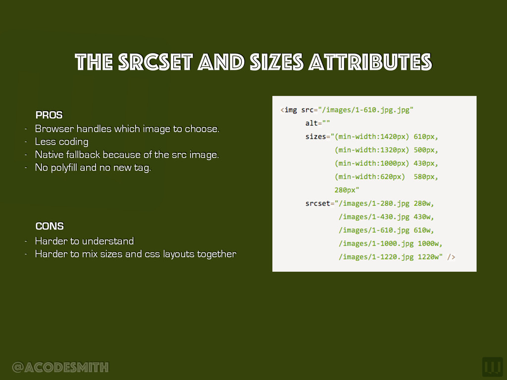
image to choose. - Less coding - Native fallback because of the src image. - No polyfill and no new tag. PROS CONS - Harder to understand - Harder to mix sizes and css layouts together
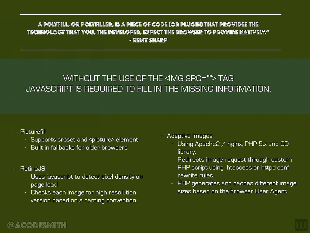
(or plugin) that provides the technology that you, the developer, expect the browser to provide natively.” - Remy Sharp WITHOUT THE USE OF THE <IMG SRC=””> TAG JAVASCRIPT IS REQUIRED TO FILL IN THE MISSING INFORMATION. - Picturefill - Supports srcset and <picture> element - Built in fallbacks for older browsers - RetinaJS - Uses javascript to detect pixel density on page load. - Checks each image for high resolution version based on a naming convention. - Adaptive Images - Using Apache2 / nginx, PHP 5.x and GD library. - Redirects image request through custom PHP script using .htaccess or httpd-conf rewrite rules. - PHP generates and caches different image sizes based on the browser User Agent.
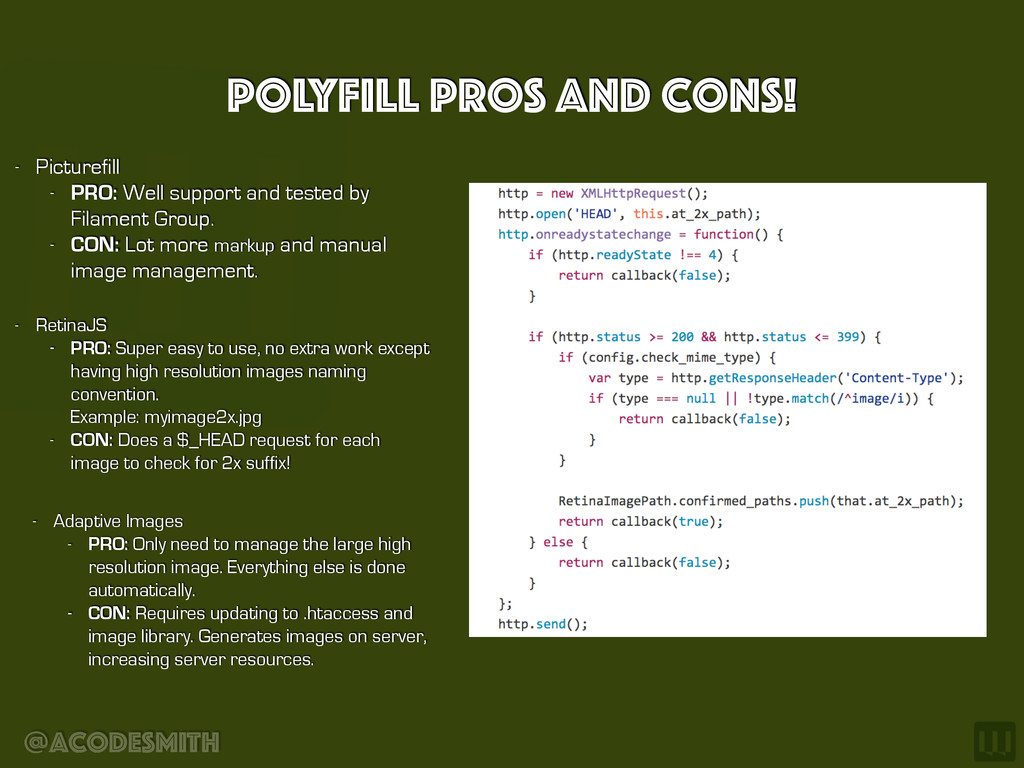
easy to use, no extra work except having high resolution images naming convention. Example: myimage2x.jpg - CON: Does a $_HEAD request for each image to check for 2x suffix! - Adaptive Images - PRO: Only need to manage the large high resolution image. Everything else is done automatically. - CON: Requires updating to .htaccess and image library. Generates images on server, increasing server resources. - Picturefill - PRO: Well support and tested by Filament Group. - CON: Lot more markup and manual image management.
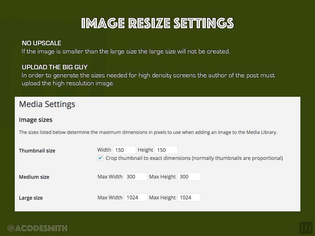
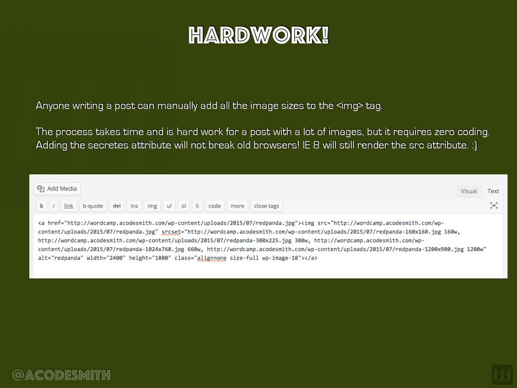
smaller than the large size the large size will not be created. UPLOAD THE BIG GUY In order to generate the sizes needed for high density screens the author of the post must upload the high resolution image.
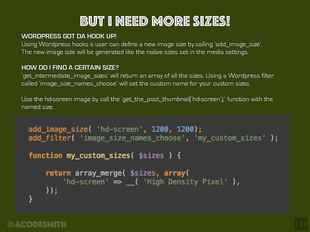
UP! Using Wordpress hooks a user can define a new image size by calling ‘add_image_size’. The new image size will be generated like the native sizes set in the media settings. HOW DO I FIND A CERTAIN SIZE? ‘get_intermediate_image_sizes’ will return an array of all the sizes. Using a Wordpress filter called ‘image_size_names_choose’ will set the custom name for your custom sizes. Use the hd-screen image by call the ‘get_the_post_thumbnail(‘hd-screen’);‘ function with the named size.
the image sizes to the <img> tag. The process takes time and is hard work for a post with a lot of images, but it requires zero coding. Adding the secretes attribute will not break old browsers! IE 8 will still render the src attribute. :)
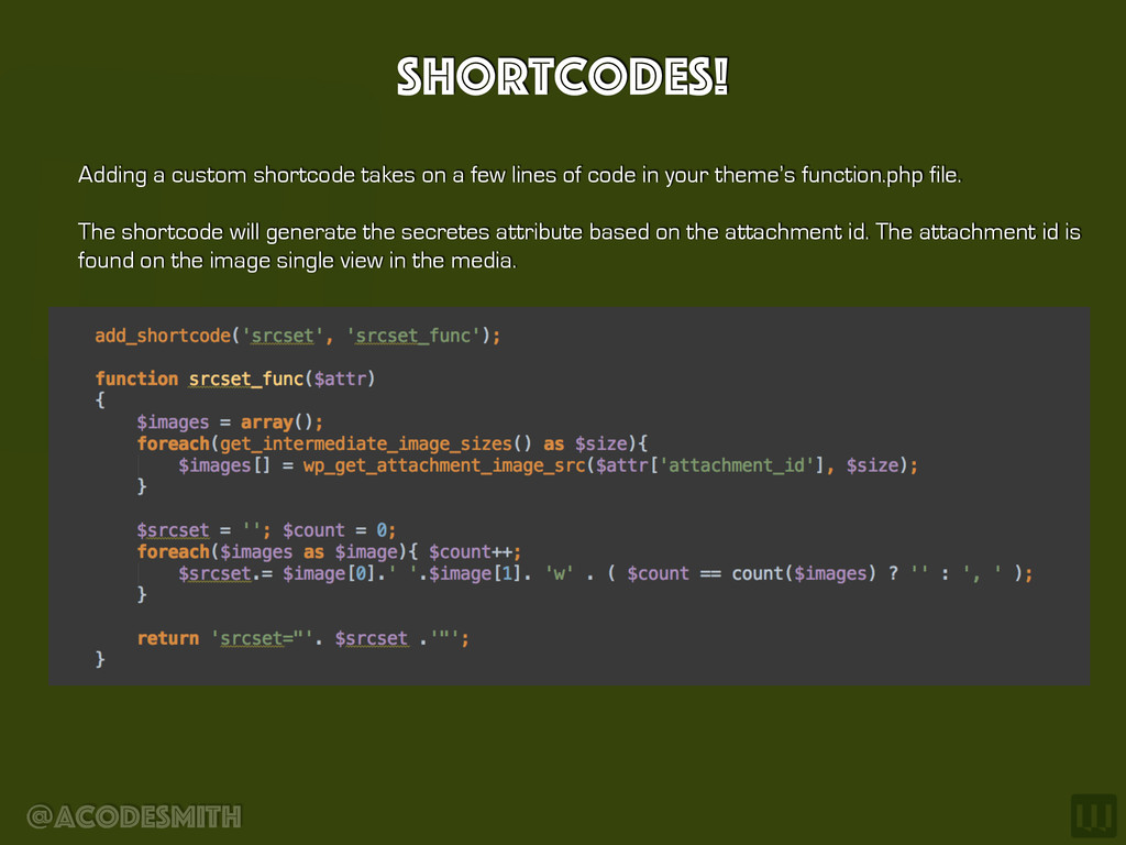
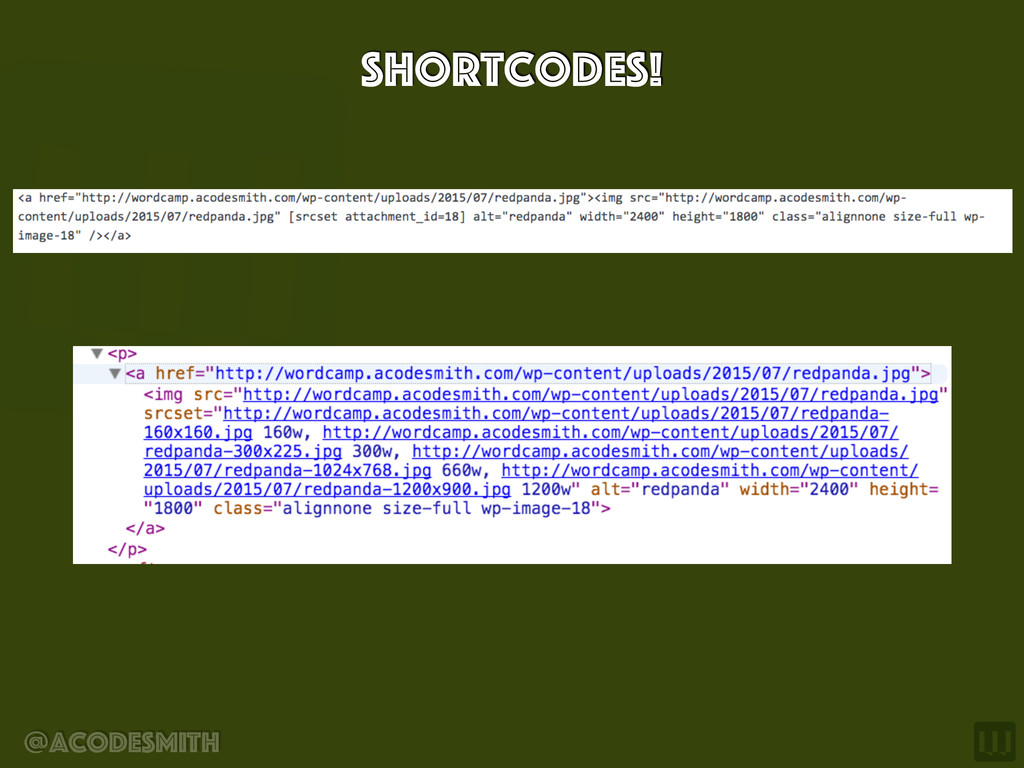
lines of code in your theme’s function.php file. The shortcode will generate the secretes attribute based on the attachment id. The attachment id is found on the image single view in the media.
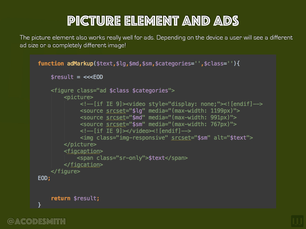
code, but usually the featured image has a stronger artistic value. Due to the nature of the featured image we can use the <picture> element when needed.
We as developers and designers need to deliver the best experience to ALL our users, not just a certain subset. WC3 will continue to refine the solution but we know secretes is here to stay and it works today! Javascript will be a requirement for older browsers for certain techniques but it’s not a requirement for just using the secretes with the <img src=“”> information. Wordpress media settings are very powerful and extending the sizes is easy. Start uploading the largest image and making Wordpress do the rest. Updating <img> tag in the post can be a struggle but shortcodes will help ease the pain. The picture element will be your friend when dealing with passionate designers and marketing advertisements. Finally, there are many plugins work great. Take the knowledge learned today to choose the right plugin.
 acodesmith
 hatyibei
 genda
genda
 shirouz
 geekplus_tech
 tonkotsuboy_com
 torumakabe
 ming_ayami
 satohy0323
 oracle4engineer
 mhrtech
 tsukamotokenji
 smt7174
 garrettdimon
 michielstock
 ryanjones
 sergeychernyshev
 mayunak
 rasmusluckow
 sabderemane
 mfonobong
 rakko
rakko
 productmarketing
 uxyall
 sstephenson