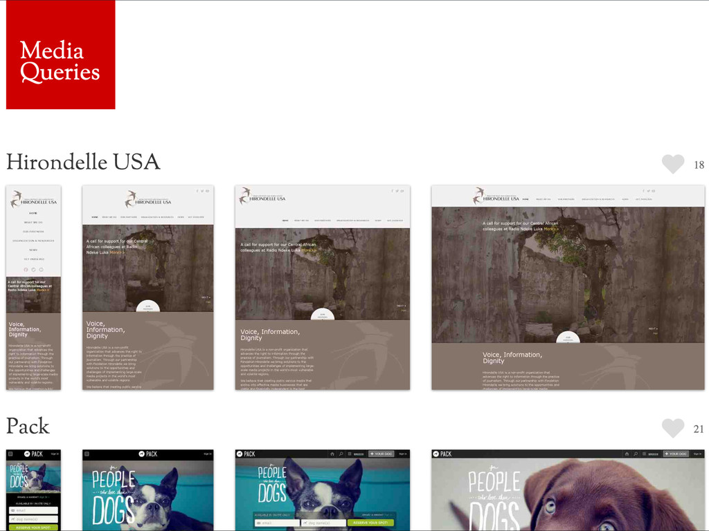
Upgrade to Pro — share decks privately, control downloads, hide ads and more …

Embrace The Vertical

Embrace The Vertical

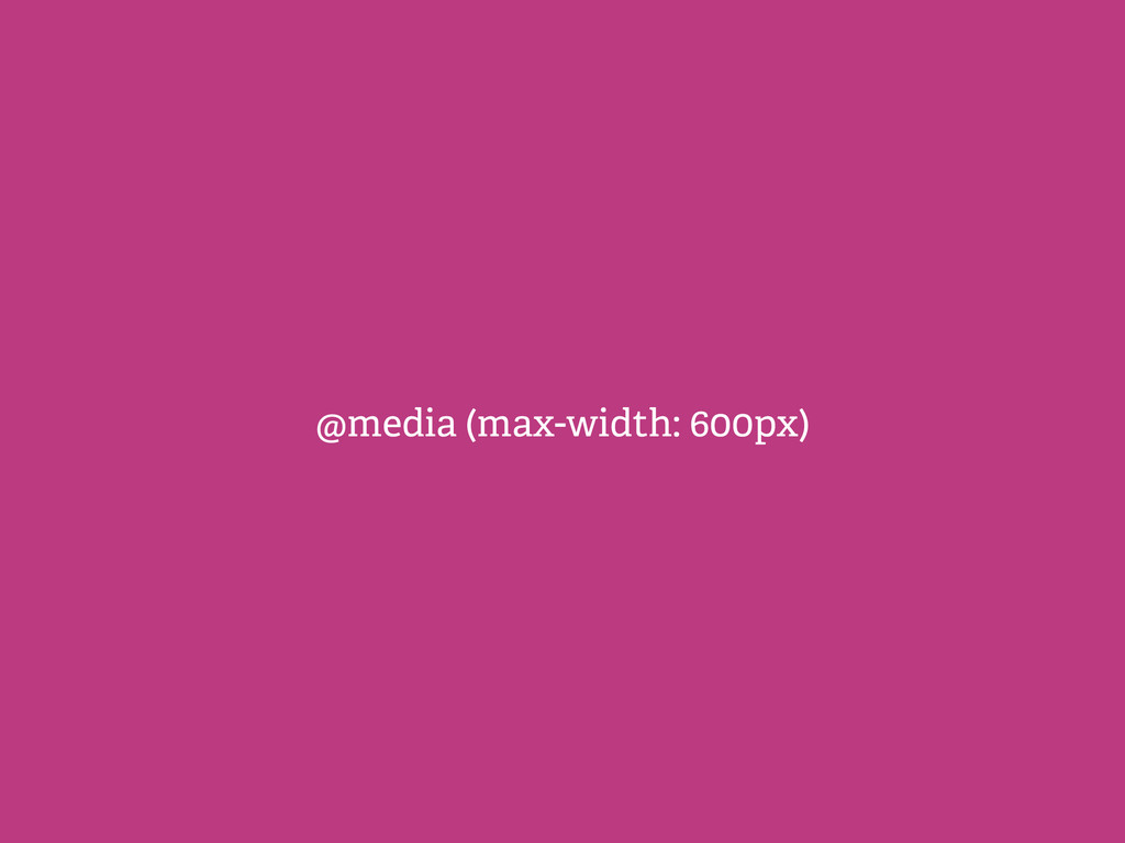
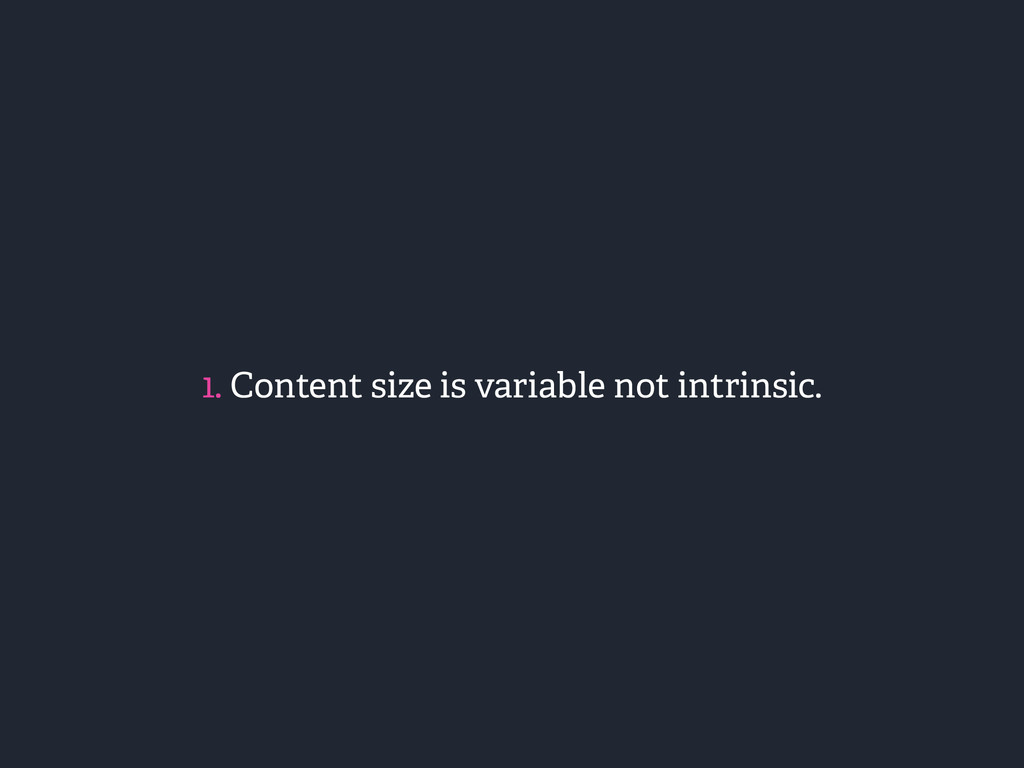
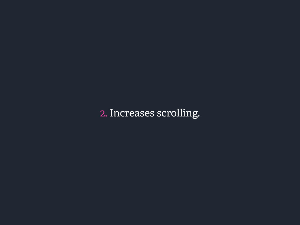
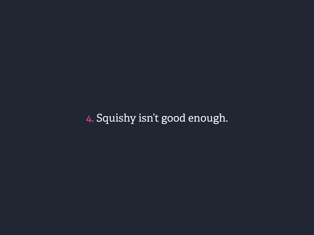
The future of height-based media queries. An argument for thinking beyond the width and supporting prototypes.

CSS Conf Presentation - https://www.youtube.com/watch?v=rNoMgCn4E-U

Antoine Butler

May 27, 2014
Tweet

Other Decks in Programming

Transcript

  1. EMBRACE THE VERTICAL The Future of Height-Based Media Queries ANTOINE

    BUTLER Front End Developer, HZDG @aebsr / aeb.sr
  2. A media query allows you to tailor your layout based

    on any number of conditions against a media type.
  3. “ – Chris Coyier “Measuring width is a nice practical

    example of media queries, but it isn't the only thing available.” css-tricks.com/css-media-queries/
  4. “ “Squishy is a legacy solution, but it is the

    foundation of responsive web design.” – Me
  5. “ “Smart organizations will see this as a benefit, not

    a drawback, and will use this chance to make a be er website, not just a squishy one.” – Karen McGrane http://alistapart.com/column/responsive-design-wont-fix-your-content-problem
  6. Users of supported mobile devices are automatically redirected to the

    official mobile version of Wikipedia. http://en.wikipedia.org/wiki/Help:Mobile_access
  7. <div id="content"> <h1>Article Title</h1> <div class=“thumb”> <img src=“…” /> </div>

    <p>Introductory text...</p> <h2 aria-role="content_block_0">Section Title</h2> <div id="content_block_0"> <p>Lorem ipsum dolor....</p> </div> </div>
  8. <article> <h1>Article Title</h1> <figure> <img src=“…” /> </figure> <p>Introductory text...</p>

    <h2 id=“section-1">Section Title</h2> <sections> <p>Lorem ipsum dolor....</p> </sections> </article>
  9. article { font: 300 1em/1.6 sans-serif; } ! article h2

    { border-bo om: 1px solid #000; } ! article figure { float: right; text-align: center; }
  10. /* roughly 650px to target small screens */ ! @media

    screen and (max-width: 40em) { figure { width: 100%; } } ! @media screen and (max-height: 40em) { article { font-family: serif; } ! article section { display: none; } }
  11. ! <nav> <ul> <!— Logo —> <li><a href=“"><img src=“…”/></a></li> <li>

    <a href=“"> <img src=“…” /> <span>Link Text</span> </a> </li> <li>…</li> </ul> </nav>
  12. @theme: #C2D6EB; @nav-font-size: 0.6875em; // 11px @nav-size: 8.636363636em; // 95px

    @logo-height: 10.454545455em; // 115px @drawer-width: 21.363636364em; // 235px @highlight-num: 6; @min-num: 3;
  13. nav { transition: all 0.15s; transform: translateX(-@drawer-width); position: fixed; background:

    #fff; width: unit(@nav-size + @drawer-width, em); top: 0; bo om: 0; text-transform: uppercase; font-weight: bold; font-size: @nav-font-size; le er-spacing: -0.036363636em; }
  14. a { padding: 1.5em; border-bo om: 0; font-weight: normal; display:

    block; color: #666; transition: all 0.15s; text-decoration: none; img, span { margin-le : 0.5em; margin-right: 0.5em; display: inline-block; vertical-align: middle; } }
  15. ul { width: @drawer-width; overflow: scroll; &:a er { content:

    ''; width: 1px; height: 100%; position: fixed; background: lighten(@theme, 10%); top: 0; right: @nav-size; } }
  16. ! // -------------------------------------------------------- // Calculate offsets, account for first link

    being the logo // -------------------------------------------------------- @offset: @highlight-num + 1; @min-offset: @min-num + 1;
  17. .highlight(@height: @nav-size) { display: table; position: absolute; right: 0; a

    { display: table-cell; border-bo om: 1px solid lighten(@theme, 10%); color: darken(@theme, 40%); height: @height; width: @nav-size; padding: 0.75rem; text-align: center; vertical-align: middle; img { margin: 0 auto; display: block; width: auto; } span { margin: 0.5em inherit } }
  18. // -------------------------------------------------------- // Position "primary" navigation links // -------------------------------------------------------- !

    .position-nav (@index) when (@index =< @offset) { li:nth-child(@{index}) { top: unit(@logo-height + (@nav-size * (@index - 2)), em); } ! .position-nav(@index + 1); } .position-nav (@index) when (@index > @offset) { .position-more(@index); } ! .position-more(@index) when (@index > @min-offset) { .more { top: unit(@logo-height + (@nav-size * (@index - 2)), em); } }
  19. nav { li:first-child { .highlight(@logo-height); top: 0; img { max-width:

    100%; } } li:nth-child(-n+@{min-offset}) { .highlight(); } .position-nav (2); // nth-child to start with }
  20. // -------------------------------------------------------- // Generate media queries // -------------------------------------------------------- ! .add-media-query

    (@index) when (@index > @min-num) { @total-nav-height: (@nav-size * @index + @logo-height); @fraction1: (@total-nav-height / 100); @fraction2: (@nav-font-size * 100); @root: unit((@fraction1 * @fraction2), em); … }
  21. .add-media-query (@index) when (@index > @min-num) { … ! nav

    { @media screen and (min-height: @root) { li:nth-child(-n+@{index}) { .highlight() } } ! @media screen and (max-height: @root) { .position-more(@index); } } .add-media-query(@index - 1); } ! .add-media-query (0) {} .add-media-query (@offset);