Upgrade to Pro — share decks privately, control downloads, hide ads and more …

“First, One Must Endure”

“First, One Must Endure”

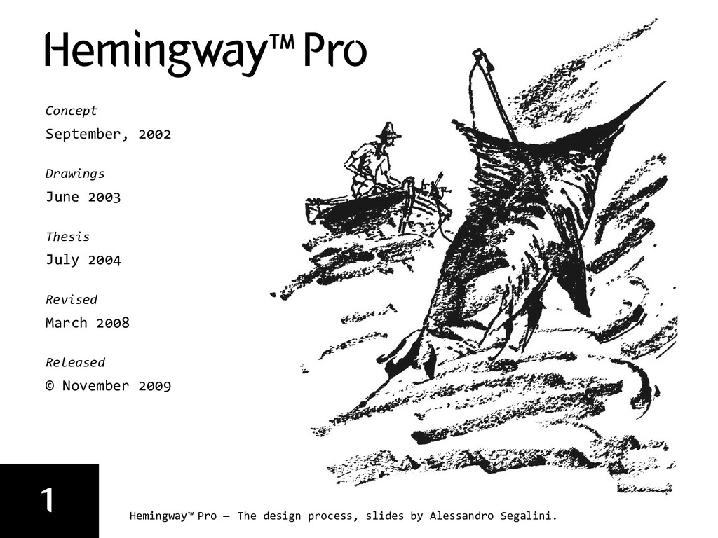
This presentation was designed for a lecture at Northern Illinois University School of Art in 2011, about my Hemingway typeface and its design process, and about my type design philosophy at large.

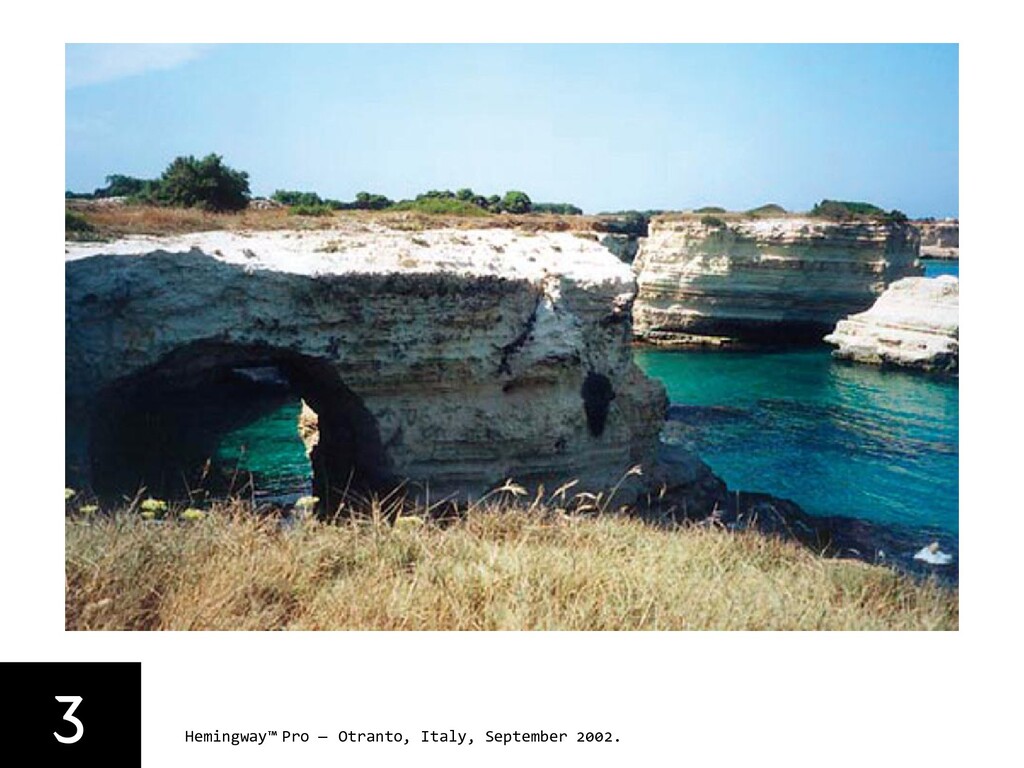
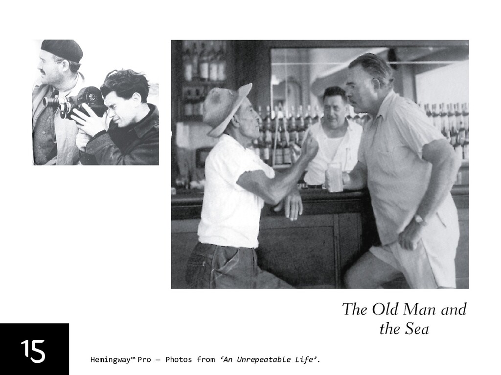
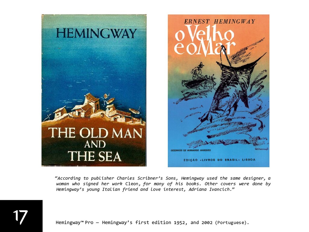
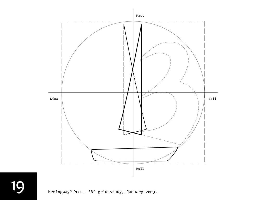
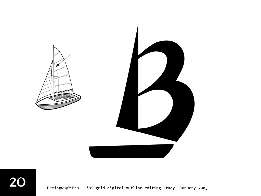
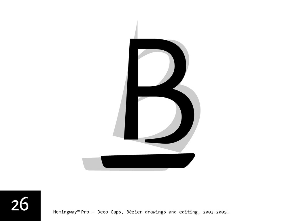
“Hemingway Pro” is the result of a personal project or I should say journey started in September 2002 after a vacation in the town of Otranto, Southern Italy. It was the time when I had to come up with a substantial idea for my master thesis at Polytechnic of Milan. I had ‘that’ book on the shelf calling me to be read, and I tossed it the bag for the trip. It was the prize winning novel “The Old Man and the Sea” by Ernest Miller Hemingway. One afternoon, after a walk, sitting by a dock in the gulf of Otranto, I happened to lay my eyes on a hand-drawn upper case ‘B’ painted inside the stern of a little fisherman’s boat. It was just beautiful: a sharp ‘B’ with the right part of the letter having the shape of two sails in full wind, the stem being the mast. After that view, I knew I had to start reading the book by Hemingway, and the time proved to be right. I found the structure of the novel suitable for a semantic translation into the high-contrast world of black and white letterforms and words. In his discussion of the prose style of “The Old Man and the Sea” in “Twentieth Century Interpretations of the Old Man and the Sea,” Malcolm Cowley notes that Hemingway “uses the oldest and shortest words, the simplest constructions, but gives them a new value.”

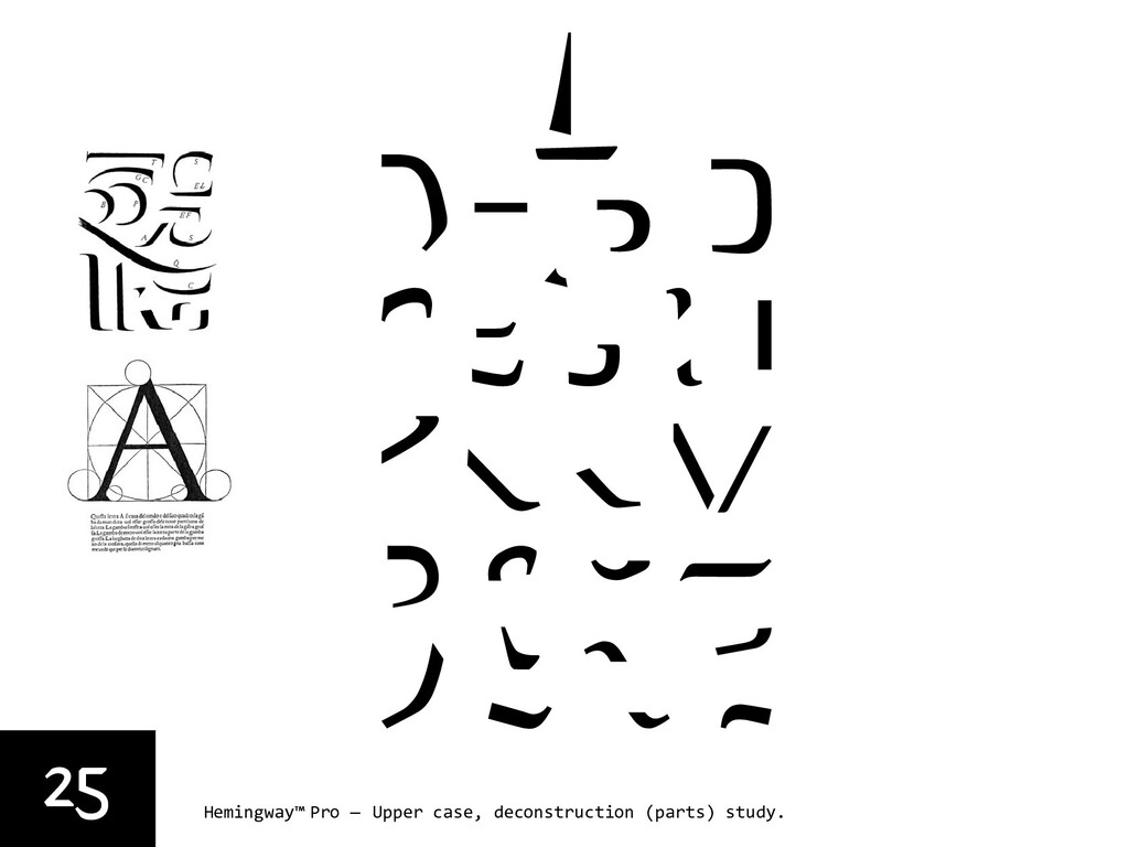
I wanted my typeface to relate to the content, to carry the meaning of sharpness and harshness, and at the same time to show a stiff and a soft quality – the same qualities in which the nature of the sea is apparently revealed in Hemingway’s novel, a book that indeed speaks about the fairness of nature. During the process of embedding a sailboat symbol into the uppercase letters, I pursued a philosophical method held dear by the writer; the theory of omitting as much as possible from his stories and relying on the sensibility of the reader, who is trusted to imagine that which was omitted. As Robert Bringhurst writes in his The Elements of Typographic Style: “We could say that a large part of typography is far removed from literature, but typography is to literature as musical performance is to composition.” I found the possibility of compressing the prose fascinating, I saw in my drawings that I could achieve the intensity I was looking for.

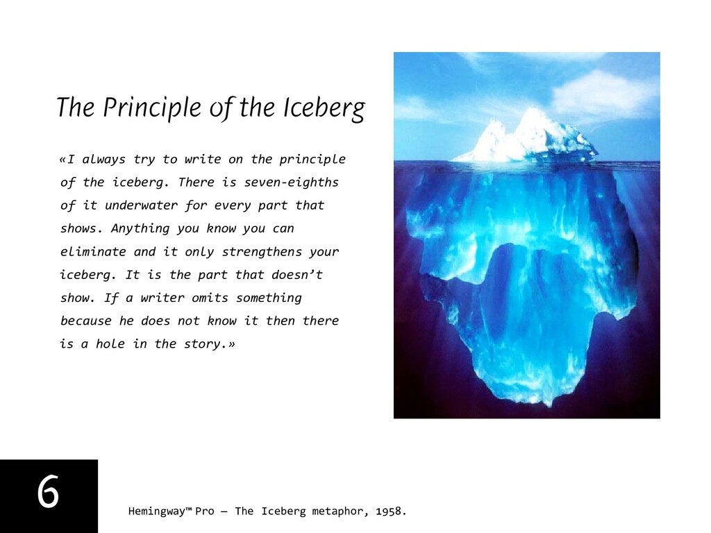
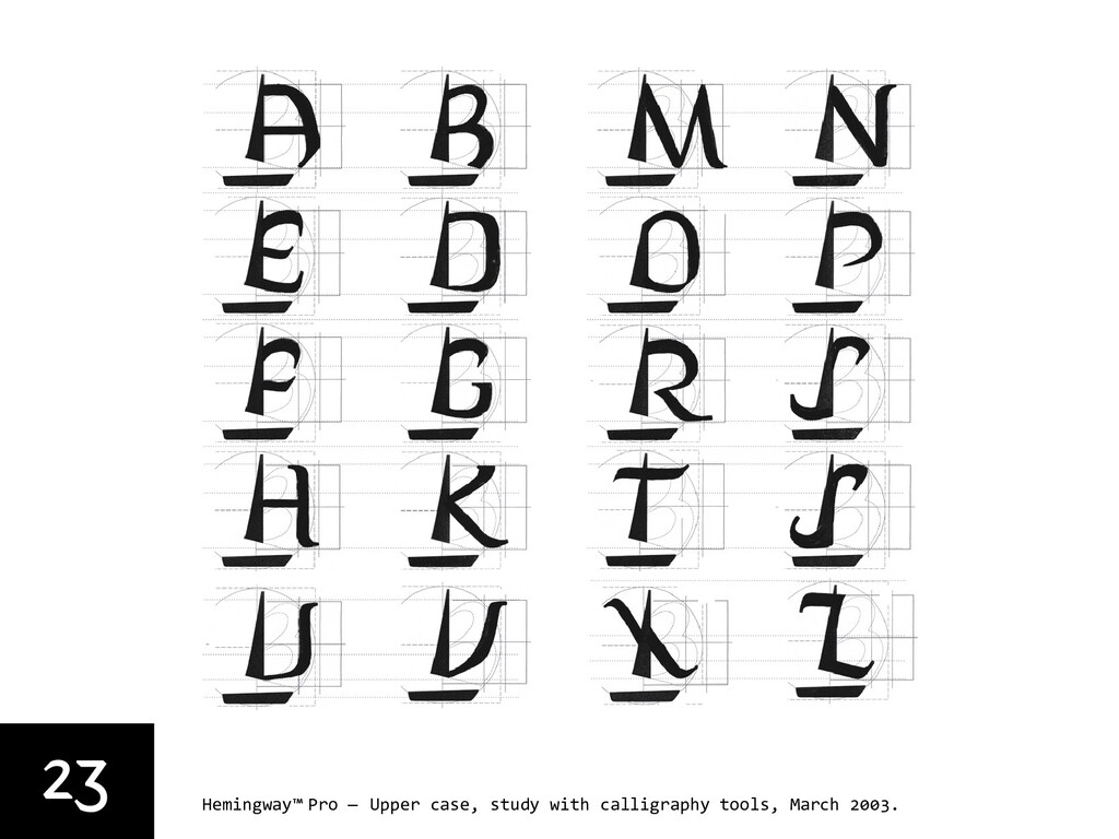
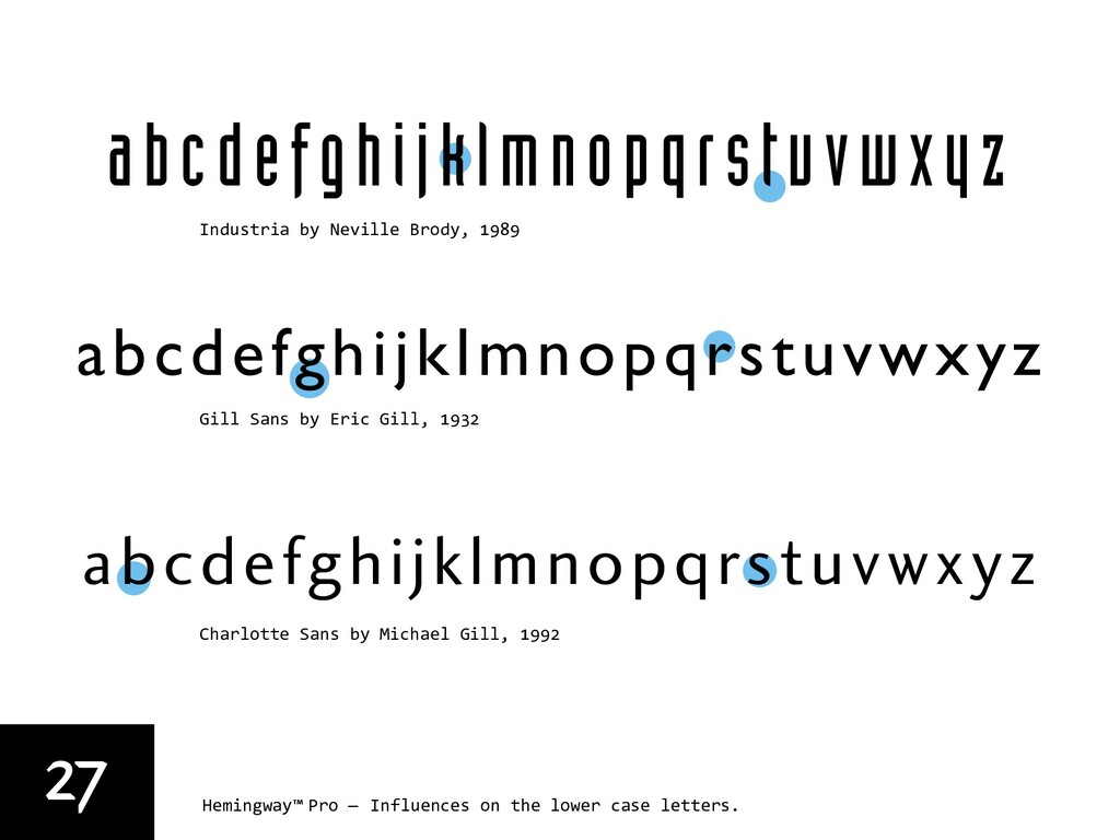
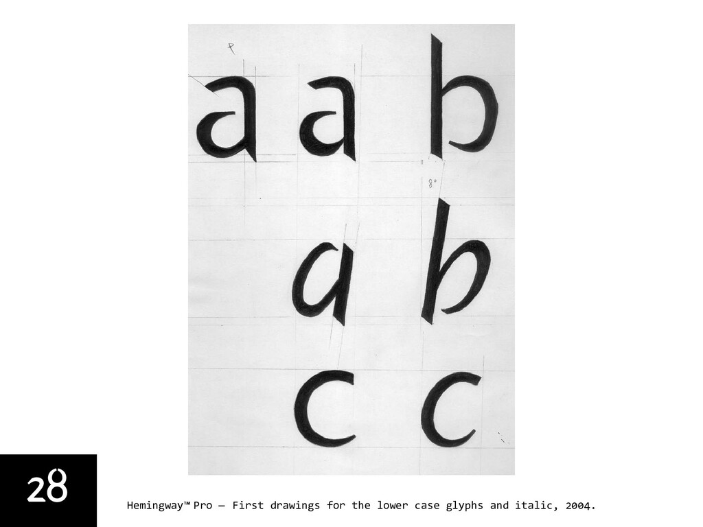
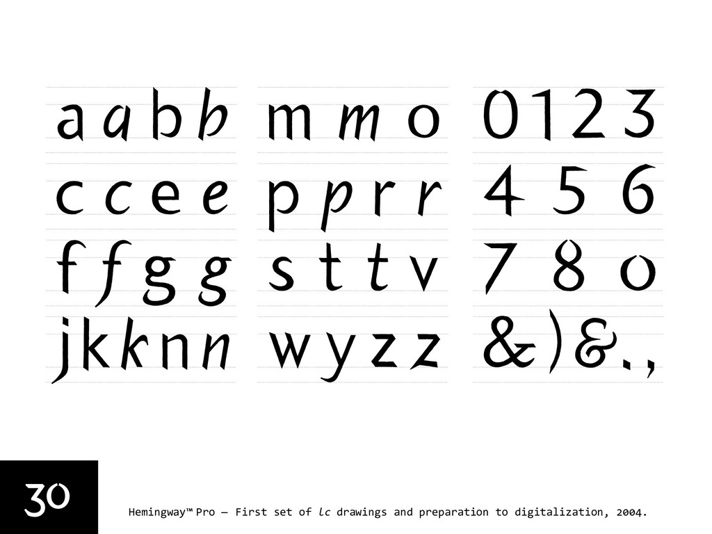
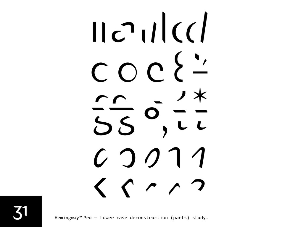
In a 1958 interview in “The Paris Review,” Hemingway described this style of writing in the following terms: «I always try to write on the principle of the iceberg. There is seven-eighths of it underwater for every part that shows. Anything you know you can eliminate and it only strengthens your iceberg. It is the part that doesn’t show. If a writer omits something because he does not know it then there is a hole in the story». I intended to use this idea as if it was an idiosyncratic relation between the uppercase and lowercase letters, and within those having large counters. Contrary perhaps to normal practice, I started to draw first all the uppercase letters, using a calligraphic broad nibbed automatic-pen, on a grid I had planned to be closely related to the proportions of the Roman Capital letter. The orientation of the sail symbols I was trying to embed in my sketches was meant to compatible with the western reading model, as if the reading direction was the wind itself. Consequently, I developed the lowercase letters and the numbers. The influences on the lowercase were mostly Neville Brody’s Industria Solid, for its rigid and industrial sharpness, and Michael Gills’ Charlotte Sans, a humanistic sans serif which I found very legible among the unseriffed typefaces I knew at the time.

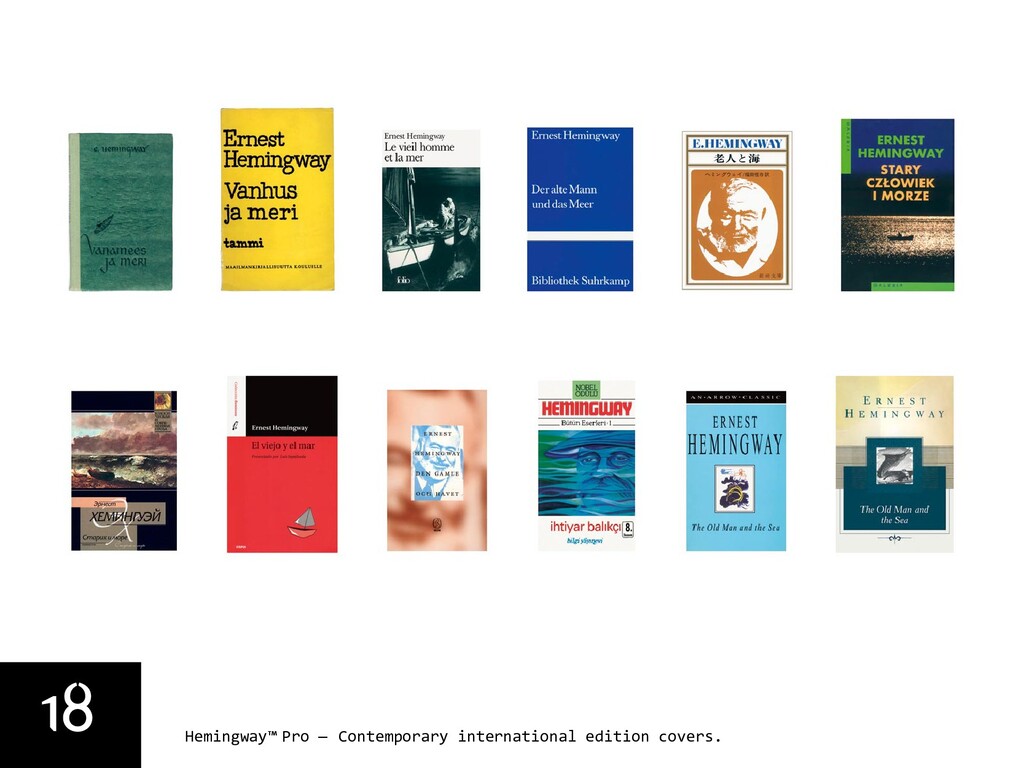
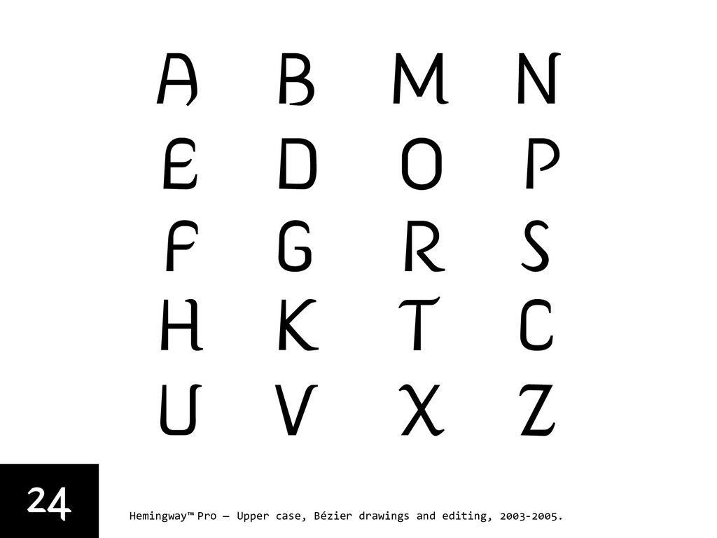
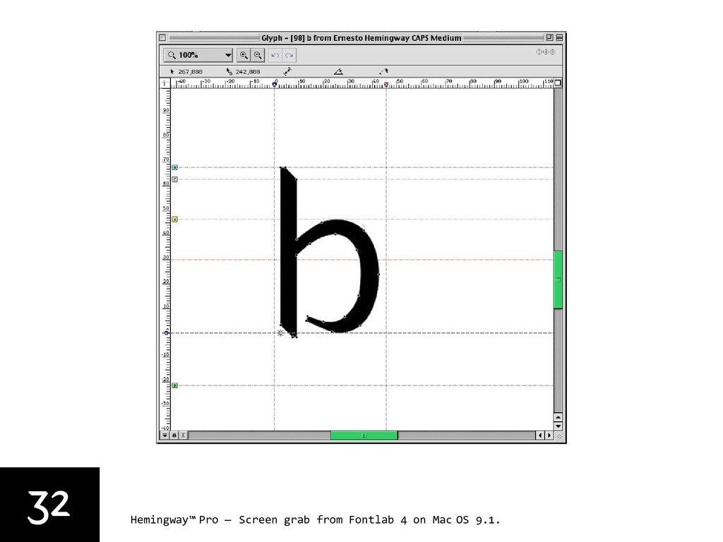
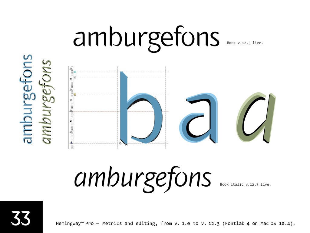
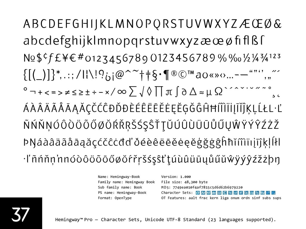
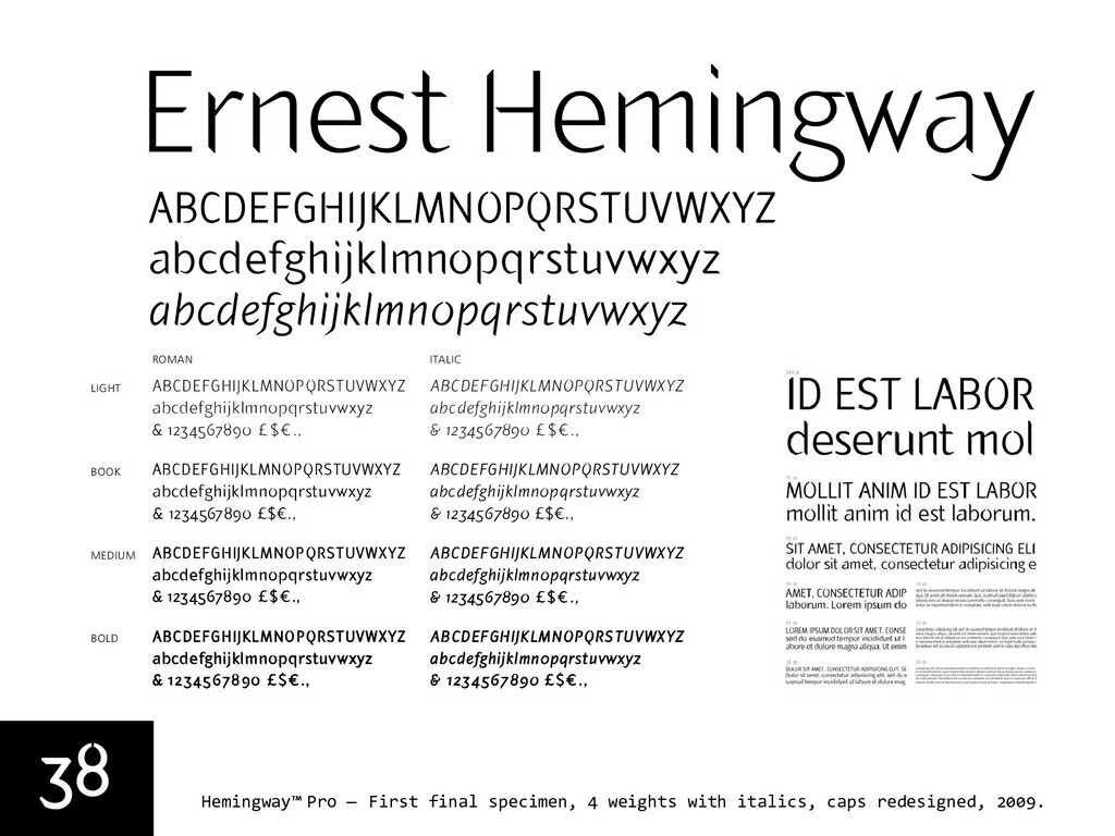
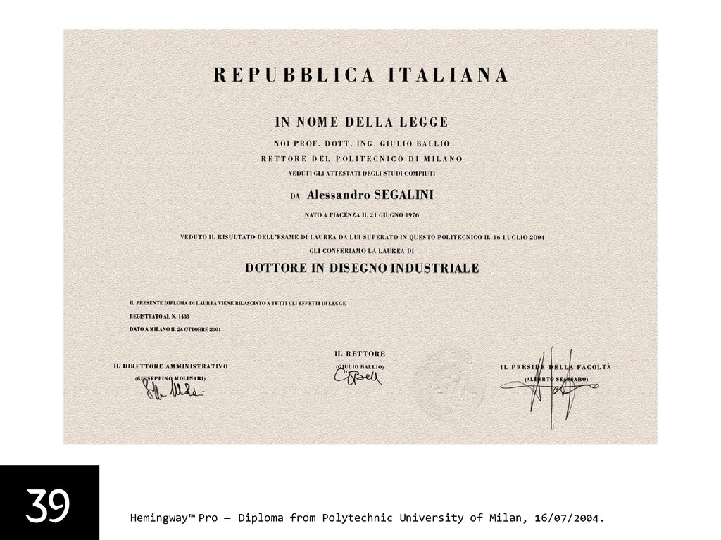
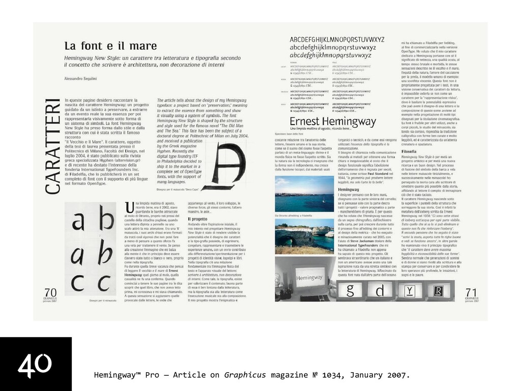
By the time I presented the thesis at the Polytechnic of Milan in July 2004, assisted by Prof. Giangiorgio Fuga, I had developed a basic yet complete set, with italics and relative kerning. In August 2004 I received a letter from Prof. Hermann Zapf to whom I had sent a copy of my thesis book. Zapf wrote back: “My personal feeling for your typeface design called ‘Hemingway’ would be that the characters are too smooth for a personality so powerful and rough as Hemingway was in all his life. Also much too elegant for him. As a specialist in bookfaces I think within a text of type your type is too narrow in the distance between each character which reduces the readability.” Later that year and in 2005, I worked on Zapf's feedback and on a new set of caps for all “cuts" further removing some decorative details. The resulting shapes turned out to be more functional and therefore more useful than the originals, without diminishing the overall concept behind the typeface. Extensive editing was done to all glyphs, maximizing and optimizing consistency and metrics, and expanding the character set (now supporting 98 languages). In January 2007 an article on my Hemingway was published on Graphicus 1034, at the time the leading Italian magazine for the graphic industry; the article included a specimen set in the updated version of the fonts.

The Hemingway font is not a bookface indeed; in a conservative view of text type, it is impossible to see this as anything except display. Still, it has something very experimental in it, that makes it perform at small body size as well. In the words of Jan Tschichold: “Both nature and technology teach us that ‘form’ is not independent, but grows out of function (purpose), out of materials used (organic or technical), and out of the ways in which they are used.”

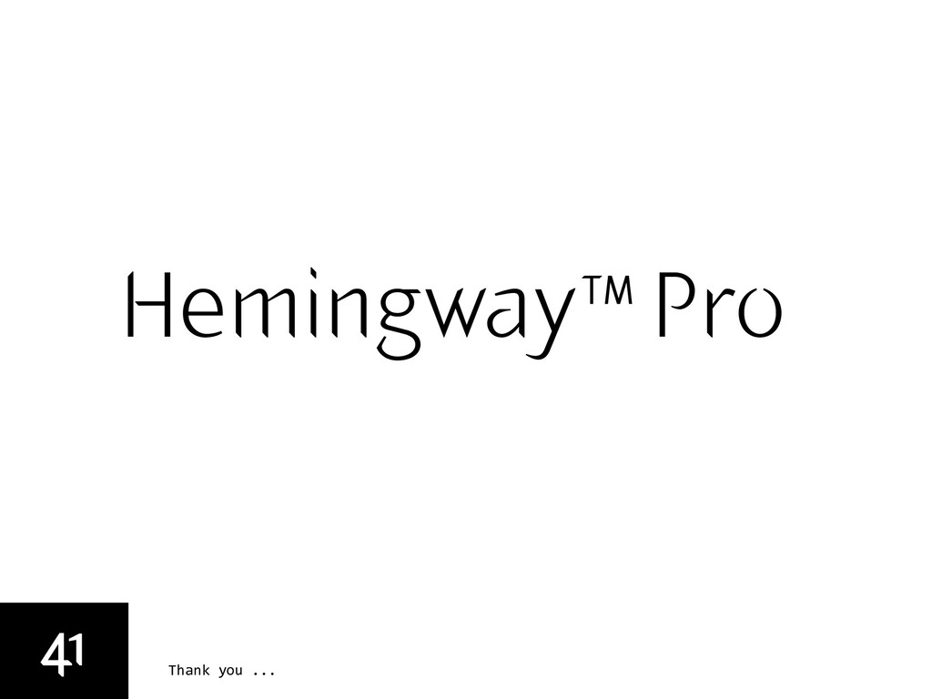
The typeface was awarded and selected for the UK “Creative Review Type Annual 2011” within the Display category.

Alessandro Segalini

February 08, 2011
Tweet

More Decks by Alessandro Segalini

Other Decks in Design

Transcript

  1. 1
    Hemingway™ Pro — The design process, slides by Alessandro Segalini.
    Hemingway™ Pro
    Concept
    September, 2002
    Drawings
    June 2003
    Thesis
    July 2004
    Revised
    March 2008
    Released
    © November 2009

    View Slide

  2. 2
    Hemingway™ Pro — The journey ...
    was a favorite expression of Ernest Hemingway.
    He used the saying in his private letters and on
    occasion inscribed the words in books he signed
    for close friends. The saying (French in origin)
    roughly translated to “ first, one must endure.”
    “Il faut d’abord durer”

    View Slide

  3. 3
    Hemingway™ Pro — Otranto, Italy, September 2002.

    View Slide

  4. 4
    Hemingway™ Pro — Hand-painted upper case ‘B’ by .

    View Slide

  5. 5
    Hemingway™ Pro — Mondadori 1961 (first) edition, and 2002 edition.

    View Slide

  6. 6
    Hemingway™ Pro — The Iceberg metaphor, 1958.
    «I always try to write on the principle
    of the iceberg. There is seven-eighths
    of it underwater for every part that
    shows. Anything you know you can
    eliminate and it only strengthens your
    iceberg. It is the part that doesn’t
    show. If a writer omits something
    because he does not know it then there
    is a hole in the story.»
    The Principle of the Iceberg

    View Slide

  7. 7
    Hemingway™ Pro — ‘The Old Man and the Sea’ illustrated by Alexander Petrov. Running: 8'
    Characters: Santiago, The Marlin, Manolin, Joe DiMaggio, Perico, Martin, Perico.

    View Slide

  8. 8
    Hemingway™ Pro — Nobel Prize Acceptance Speech, 1954. Running: 2'10"
    No writer who knows the great writers who did not receive the Prize can accept
    it other than with humility. There is no need to list these writers. Everyone
    here may make his own list according to his knowledge and his conscience.
    It would be impossible for me to ask the Ambassador of my country to read a
    speech in which a writer said all of the things which are in his heart.
    Things may not be immediately discernible in what a man writes, and in this
    sometimes he is fortunate; but eventually they are quite clear and by these
    and the degree of alchemy that he possesses he will endure or be forgotten.
    Writing, at its best, is a lonely life. Organizations for writers palliate the
    writer’s loneliness but I doubt if they improve his writing. He grows in public
    stature as he sheds his loneliness and often his work deteriorates. For he does
    his work alone and if he is a good enough writer he must face eternity, or the
    lack of it, each day. For a true writer each book should be a new beginning
    where he tries again for something that is beyond attainment. He should always
    try for something that has never been done or that others have tried and failed.
    Then sometimes, with great luck, he will succeed. How simple the writing of
    literature would be if it were only necessary to write in another way what has
    been well written. It is because we have had such great writers in the past
    that a writer is driven far out past where he can go, out to where no one can
    help him. I have spoken too long for a writer. A writer should write what he
    has to say and not speak it. Again I thank you.
    Recorded at Havana Cuba Radio station in 1954.

    View Slide

  9. 9
    Hemingway™ Pro — ‘The Old Man and the Sea’ manuscript and typed copy with corrections.

    View Slide

  10. 10
    Hemingway™ Pro — Young E.H. traveling from Genova to New York, 4/01/1919.

    View Slide

  11. 11
    Hemingway™ Pro — My Moleskine ®, 2001.

    View Slide

  12. 12
    Hemingway™ Pro — Photos from ‘Album Hemingway’ ca. 1927, 1940, 1950.

    View Slide

  13. 13
    Hemingway™ Pro — Photos from ‘An Unrepeatable Life’.

    View Slide

  14. 14
    Hemingway™ Pro — Photos from ‘An Unrepeatable Life’.

    View Slide

  15. 15
    Hemingway™ Pro — Photos from ‘An Unrepeatable Life’.

    View Slide

  16. 16
    Hemingway™ Pro — Pilar, the boat of Ernest Hemingway, Finca Vigia, Avana, Cuba.

    View Slide

  17. 17
    Hemingway™ Pro — Hemingway’s first edition 1952, and 2002 (Portuguese).
    “According to publisher Charles Scribner’s Sons, Hemingway used the same designer, a
    woman who signed her work Cleon, for many of his books. Other covers were done by
    Hemingway’s young Italian friend and love interest, Adriana Ivancich.”

    View Slide

  18. 18
    Hemingway™ Pro — Contemporary international edition covers.

    View Slide

  19. 19
    Hemingway™ Pro — ‘B’ grid study, January 2003.
    Hull
    Sail
    Wind
    Mast

    View Slide

  20. 20
    Hemingway™ Pro — ‘B’ grid digital outline editing study, January 2003.

    View Slide

  21. 21
    Hemingway™ Pro — Upper case, study with calligraphy tools, February 2003.

    View Slide

  22. 22
    Hemingway™ Pro — Upper case, ‘A’ haircut, 2002.

    View Slide

  23. 23
    Hemingway™ Pro — Upper case, study with calligraphy tools, March 2003.
    VRIWXS´‚IQMRK[E]
    ops
    #,"#µ)+µ&µ'#.,(&9µ))+6,²+0#",
    µ&--+µ*.#µ+#)(+--µ#"µ,&µo G uµ,("(µ,--µ-+#-µµ-')+µ"+µ("µ."µ)""µ.-('-#µq¿µ#µopµ''E
    !²&--+,²,!(0"²!+²("²o G u²,&²!/²"²0+#--"²(.-²0#-!²&%²(.!²0#-!²²op²''²q¾².-('-#²)"E
    ªEµvn
    VRIWXS´‚IQMRK[E]
    opt
    !* !³')³$³%!,*&$7³.))+6,€+0#",C
    ªEµvo
    VRIWXS´‚IQMRK[E]
    !* !³')³$³%!,*&$7³.))+6,€+0#",C
    VRIWXS´‚IQMRK[E]
    !* !³')³$³%!,*&$7³.))+6,€+0#",C

    View Slide

  24. 24
    Hemingway™ Pro — Upper case, Bézier drawings and editing, 2003-2005.

    View Slide

  25. 25
    Hemingway™ Pro — Upper case, deconstruction (parts) study.
    opw
    µ)+-#µ&µ'#.,(&(9µ))+6,²)+-,
    ªEµvr

    View Slide

  26. 26
    Hemingway™ Pro — Deco Caps, Bézier drawings and editing, 2003-2005.

    View Slide

  27. 27
    Hemingway™ Pro — Influences on the lower case letters.
    Industria by Neville Brody, 1989
    Gill Sans by Eric Gill, 1932
    Charlotte Sans by Michael Gill, 1992
    E²".,-+#²""²#,²²!-+²/+,#("²( ²".,-+#²(E
    µ(').-+µ"E
    19²"².,² (+²&&²,#",9²/+-#,#"9²"²-#'-&,E²#&&Y,²+((-,²"²²
    !+²0+² (!",-("Y,²("("²"++(."²-1)E²#&&²!,²,.!²,#'#&+&16
    !#,² ("-².,²²'(+"² &².²-(²#-,²&+9²"+(.,²"²(+##"&²
    "9²-!#,²-1) ² (&&(0,²)+#"#)&,²,-,!²1²0+² (!",-("E
    2389:;<=>[email protected]
    µ1,-',µ"E9µ#"(-1)µ#++1µ"µ¿))&µ(').-+µ"E
    .² (+²-!²("("²,-+"²#&019²"².,² (+²&&²,#",9²/+-#,#"9²"²-#'-&,E²#&
    ²²-1) ,²"²'(+²#+-&1²-(²!#,²-!+²0+² (!",-("Y,²("("²"++(."²-1)E²#&&²
    %,²-!-²-!²1²""(-²-&&²-!²# +"E²!#,² ("-².,²²'(+"² &².²-(²#-,²&+9²"+(.,²
    ²1²+#²#&&² (+²-!²("(-1)²(+)(+-#("9²-!#,²-1) ² (&&(0,²)+#"#)&,²,-,!²1²0+
    ,+# ²( ²#-,²%#"²-(²²+(&1²#,-+#.-E
    R´€VYXMKIV
    )E
    µ1,-',µ"Eµ"µ#"(-1)µ#++1E
    "²+.-#+²0,²(''#,,#("²-(²/&()²²,#"²"²#+-#("&²,1,-'² (+²-!²"0²!+&,²².&&²¾
    +9²² ("-²0!(,²!+-+²ª-²#"²0#-!²-!²'(+"²+!#--.+²( ²-!²#+)(+-E²+.-#+²#,²"#-!+²).+&1
    ',²,#"²,(²-!-²!²#"#/#.&²!+-+²#,²*.#%&1²"²,#&1²+("#29²/"² +('²²#,-"E²
    .-#+²-!²)+ -² ("-² (+²,#"²"²(-!+²))-#(",9²0!+²-!²#,-#"-",,²( ²!+-+,²#,²( ²!
    "²-1) E
    "#$%&'()*+,-./0123456789
    ABCDEFGHIJKLMNOPQRSTUVWXYZ
    oqn
    ,
    IP´MPPW
    ("-%E
    -#("&µ1) µ(+)(+-#("µ"µ#"(-1)µ#++1E
    ²0,²,#"²1²#!&²#&&,²-(²((+#"-²0#-!²-!²!+&(--²,+# ²-1) ,²#"²,-1&9²0#!-9²"²
    -0"²-!²!.'"#,-#²*.-#,²( ²#&&²",²"²-!²/"",,²#"²(&(+²( ²+.-#+E²!+&(--²",²#,²!#
    ,²(')-#&²0#-!²#-,²,+# ²(."-+)+-²"²( +,²,#"+,²²0#²+"²( ²)(,,##-#,E
    >LV`iv}…ˆŽ“˜œ«µÀÃÌÕÛÜÝÞâ
    "#$%&'()*+,-./0123456789
    ABCDEFGHIJKLMNOPQRSTUVWXYZ

    View Slide

  28. 28
    Hemingway™ Pro — First drawings for the lower case glyphs and italic, 2004.

    View Slide

  29. 29
    Hemingway™ Pro — My dog assisting the drawing, 2004.

    View Slide

  30. 30
    Hemingway™ Pro — First set of lc drawings and preparation to digitalization, 2004.
    VRIWXS´‚IQMRK[E]
    oqp
    !* !³')³$³%! ,*&$7³&(0+6,€+0#",C
    ªEµvt
    VRIWXS´‚IQMRK[E]
    oqq
    !* !³')³$³%! ,*&$7³&(0+6,€+0#",C
    ªEµvu
    VRIWXS´‚IQMRK[E]
    oqr
    !* !³')³$³%! ,*&$7³&(0+6,€+0#",C
    ªEµvv

    View Slide

  31. 31
    Hemingway™ Pro — Lower case deconstruction (parts) study.
    oqs
    ªEµv

    View Slide

  32. 32
    Hemingway™ Pro — Screen grab from Fontlab 4 on Mac OS 9.1.

    View Slide

  33. 33
    Hemingway™ Pro — Metrics and editing, from v. 1.0 to v. 12.3 (Fontlab 4 on Mac OS 10.4).
    VRIWXS´‚IQMRK[E]
    ouu
    '.+ (",
    '.+ (",
    '.+ (",
    '.+ (",
    '.+ (",
    '.+ (",
    '.+ (",
    '.+ (",
    '.+ (",
    '.+ (",
    '.+ (",
    '.+ (",
    '.+ (",
    '.+ (",
    '.+ (",
    '.+ (",
    upµ)-
    ("-Gµ+",-(µ'#"01µ((%µ-
    svµ)-
    rtµ)-
    qpµ)-
    prµ)-
    ovµ)-
    oqµ)-
    wµ)-
    upµ)-
    svµ)-
    rtµ)-
    qpµ)-
    prµ)-
    ovµ)-
    oqµ)-
    wµ)-
    amburgefons
    ouu
    '.+ (",
    '.+ (",
    '.+ (",
    '.+ (",
    '.+ (",
    '.+ (",
    '.+ (",
    '.+ (",
    '.+ (",
    '.+ (",
    '.+ (",
    '.+ (",
    '.+ (",
    ("-Gµ+",-(µ'#"01µ((%µ-
    qpµ)-
    prµ)-
    ovµ)-
    oqµ)-
    wµ)-
    upµ)-
    svµ)-
    rtµ)-
    qpµ)-
    prµ)-
    ovµ)-
    oqµ)-
    wµ)-
    amburgefons
    V
    '
    upµ)-
    '.+ (",
    '
    wµ)-
    upµ)-
    amburgefons
    amburgefons
    Book v. . live.
    Book italic v. . live.

    View Slide

  34. 34
    Hemingway™ Pro — Metrics glossary.
    Left bearing Right bearing
    Baseline
    Ascender
    Capital
    Descender
    x-height
    Character width

    View Slide

  35. 35
    Hemingway™ Pro — From v. 1.0 to v. 12.3 (generation of eight weights).
    Version 1.0, 2004.
    Regular Medium
    Book
    Light Light
    Bold Bold
    Version 9.0-12.3, 2005-2009.
    VRIWXS´‚IQMRK[E]
    out
    '.+ (",
    '.+ (",
    '.+ (",
    '.+ (",
    '.+ (",
    '.+ (",
    '.+ (",
    '.+ (",
    '.+ (",
    '.+ (",
    '.+ (",
    '.+ (",
    '.+ (",
    '.+ (",
    '.+ (",
    '.+ (",
    upµ)-
    ("-Gµ+",-(µ'#"01µ(&µ(&µ-
    svµ)-
    rtµ)-
    qpµ)-
    prµ)-
    ovµ)-
    oqµ)-
    wµ)-
    upµ)-
    svµ)-
    rtµ)-
    qpµ)-
    prµ)-
    ovµ)-
    oqµ)-
    wµ)-
    out
    '.+ (",
    '.+ (",
    '.+ (",
    '.+ (",
    '.+ (",
    '.+ (",
    '.+ (",
    '.+ (",
    '.+ (",
    '.+ (",
    '.+ (",
    '.+ (",
    '.+ (",
    '.+ (",
    '.+ (",
    ("-Gµ+",-(µ'#"01µ(&µ(&µ-
    svµ)-
    rtµ)-
    qpµ)-
    prµ)-
    ovµ)-
    oqµ)-
    wµ)-
    upµ)-
    svµ)-
    rtµ)-
    qpµ)-
    prµ)-
    ovµ)-
    oqµ)-
    wµ)-
    VRIWXS´‚IQMRK[E]
    '.+ (",
    '.+ (",
    '.+ (",
    '.+ (",
    '.+ (",
    '.+ (",
    '.+ (",
    '.+ (",
    '.+ (",
    '.+ (",
    '.+ (",
    '.+ (",
    '.+ (",
    '.+ (",
    upµ)-
    ("-Gµ+",-(µ'#"01µ((%µ-
    svµ)-
    rtµ)-
    qpµ)-
    prµ)-
    ovµ)-
    oqµ)-
    wµ)-
    upµ)-
    svµ)-
    rtµ)-
    qpµ)-
    prµ)-
    ovµ)-
    VRIWXS´‚IQMRK[E]
    ouu
    '.+ (",
    '.+ (",
    '.+ (",
    '.+ (",
    '.+ (",
    '.+ (",
    '.+ (",
    '.+ (",
    '.+ (",
    '.+ (",
    '.+ (",
    '.+ (",
    '.+ (",
    '.+ (",
    '.+ (",
    '.+ (",
    upµ)-
    ("-Gµ+",-(µ'#"01µ((%µ-
    svµ)-
    rtµ)-
    qpµ)-
    prµ)-
    ovµ)-
    oqµ)-
    wµ)-
    upµ)-
    svµ)-
    rtµ)-
    qpµ)-
    prµ)-
    ovµ)-
    oqµ)-
    wµ)-
    VRIWXS´‚IQMRK[E]
    %,)& *
    %,)& *
    %,)& *
    %,)& *
    %,)& *
    %,)& *
    %,)& *
    %,)& *
    '.+ (",
    upµ)-
    ("-Gµ+",-(µ'#"01µ#!-µ#!-µ-
    svµ)-
    rtµ)-
    qpµ)-
    prµ)-
    ovµ)-
    oqµ)-
    wµ)-
    upµ)-
    VRIWXS´‚IQMRK[E]
    %,)& *
    %,)& *
    %,)& *
    %,)& *
    %,)& *
    %,)& *
    %,)& *
    %,)& *
    '.+ (",
    '.+ (",
    '.+ (",
    '.+ (",
    '.+ (",
    '.+ (",
    upµ)-
    ("-Gµ+",-(µ'#"01µ#!-µ#!-µ-
    svµ)-
    rtµ)-
    qpµ)-
    prµ)-
    ovµ)-
    oqµ)-
    wµ)-
    upµ)-
    svµ)-
    rtµ)-
    qpµ)-
    prµ)-
    ovµ)-
    Hamburgefons
    Hamburgefons
    Hamburgefons
    Hamburgefons Hamburgefons
    Hamburgefons
    Hamburgefons
    Hamburgefons

    View Slide

  36. 36
    Hemingway™ Pro — Testing metrics: master side bearings test, and kerning.
    OAOBOCODOEO
    HAHBHCHDHEH
    OFOGOHOIOJO
    HFHGHHHIHJHKH
    OKOLOMONOPO
    HLHMHNHOHPH
    OQOROSOTOUO
    HQHRHSHTHUH
    OVOWOXOYOZO
    HVHWHXHYHZH
    HÌHÍHÏHÎHHÆHŒH
    HØHHÇHOÇO
    HOHIllinoi
    oaobocodoeofogo
    nanbncndnenfngn
    ohoiojokolomono
    nhninjnknlnmnnn
    ooopoqorosotouo
    nonpnqnrnsntnun
    ovowoxoyozo
    nvnwnxnynzn
    nßnænœnønnçn
    oßoæoœoøooço
    AAM ABLE ACE ADS
    AEON AFTER AGE AHEM
    AIDS AJAR AKIN ALAS
    AMEN AND LAOA APE
    AQUA ARK FASE HATAI
    FAUAO CAVAII HAWAII AXE
    RAYA JAZZ BAOR BUBBY
    BCH BEND BHARAIN
    BING BLUE BOOS BRA
    LABS OBTUSE BUCK BVO
    COBWEB BYTE CARP OCCUR CD
    CENT CG ARCH CIGS DOCK
    CLOWN COD ACQUCROW
    TICS ACTS SCUD CYCLE
    bazaar abbey ace
    adelaer aft aße age
    hair ajar ape aqua
    army astol ata aura
    cava awa axa aya
    jazz baoork abbey abcat
    bend bing blue boat
    bran cubs debt bust byte
    candy occur cd aces
    chum icing buck cycle
    icoon cream lics actual
    scud cyan dan db adcil
    add dendf edge dharma
    din idle adman odno
    001020304050 (0607080900)
    101121314151 (16171819100)
    202122324252 (26272829200)
    303132334353 (36373839300)
    404142434454 (46474849400)
    505152535455 (56575859500)
    606162636465 (6676869600)
    707172737475 (7677879700)
    808182838485 (8687889800)
    909192939495 (9697989900)
    (1)(2)(3)(4)(5)(6)(7)(8)(9)(0)
    $00 $10 $20 $30 $40
    $50 $60 $70 $80 $90
    €00 €10 €20 €30 €40
    €50 €60 €70 €80 €90
    £00 £10 £20 £30 £40
    £50 £60 £70 £80 £90
    ¥10 ¥20 ¥30 ¥40 ¥50
    ¥60 ¥70 ¥80 ¥90
    #1 #2 #3 #4 #5 #6
    #7 #8 #9 #0
    lynx tuft frogs, dolphins abduct by proxy the ever awkward klutz, dud,
    dummkopf, jinx snubnose filmgoer, orphan sgt. renfruw grudgek reyfus,
    md. sikh psych if halt tympany jewelry sri heh! twyer vs jojo pneu fylfot
    alcaaba son of nonplussed halfbreed bubbly playboy guggenheim
    daddy coccyx sgraffito effect, vacuum dirndle impossible attempt to
    disvalue, muzzle the afghan czech czar and exninja, bob bixby dvorak
    wood dhurrie savvy, dizzy eye aeon circumcision uvula scrungy picnic
    luxurious special type carbohydrate ovoid adzuki kumquat bomb?

    View Slide

  37. 37
    Hemingway™ Pro — Character Sets, Unicode UTF-8 Standard (23 languages supported).
    ABCDEFGHIJKLMNOPQRSTUV W X YZ ÆŒØ&
    abcdefghijklmnopqrstuvwxyzæœø fi flßſ
    №$¢ƒ£¥€#0123456789 0123456789 %‰½¼¾¹²³
    {[(_)]}*,.:; /|¦\!?¿¡@^~†‡§•¶®©™ao«»‹›…–—“”‘’‚„˝´
    ° ¬ + < = > ≠ ≤ ≥ ± ÷ − × ⁄ ∞ ∑ √ ◊ ∏ π ∫ ∂ ∆ ≈ μ Ω ` ´ ˆ ˇ ˙ ˘ ˝ ˜ ˚¸ ˛
    ÁÀÂÄÃÅĀĄĂÇČĆĈÐĎÐÈÉÊËĒĚĖĘĔĢĞĜĤĦÍÎÌÏİĮĪĬĴĶĻĹŁL·Ľ
    ÑŃŇŅÓÔÒÖÕŐØŎŔŘŖŠŚŞŜŤŢŬÚÛÙÜŪŮŰŲŴŸÝŶŹŻŽ
    ÞŊáàâäãåāąăçćčĉċđďðéèêëēěėęĕģğġĝĥħĭíîìïıįīĵķļĺłl
    ·ľñńňņʼnnóòôöõōőøŏŕřŗšśşŝťţúùûüūųůűŭŵÿýŷźžżþŋ
    Version: 1.000
    File size: 48,300 byte
    MD5: 7749ea010f4af7815c5d6d62b6979220
    Character Sets:
    OT Features: aalt frac kern liga onum ordn sinf subs sups
    Name: Hemingway-Book
    Family name: Hemingway Book
    Sub family name: Book
    PS name: Hemingway-Book
    Format: OpenType

    View Slide

  38. 38
    Hemingway™ Pro — First final specimen, 4 weights with italics, caps redesigned, 2009.
    {|}~€‚ƒ„…†‡ˆ‰Š‹ŒŽ‘’“”
    áh
    E
    g9./0123456-9vom
    STUVWXYZ[\]^_`abcdefghijkl
    á

    #$%&'()*+"vomÀ¾
    yz{|}~€‚ƒ„…†‡ˆ‰Š‹ŒŽ‘’
    á
    I
    t=1234567890=;,࡟
    yz{|}~€‚ƒ„…†‡ˆ‰Š‹ŒŽ‘’
    á
    I
    á

    h9‚h á
    tuvwxyz{|}~€‚ƒ„…†‡ˆ‰Š‹Œ
    á

    !%&'()*+,-$;,àL©
    lmnopqrstuvwxyz{|}~€‚ƒ„…
    á
    2
    ™(Z[\]^a_`bY(ie¿žœ
    efghijklmnopqrstuvwxyz{|}~
    á

    !"#$%&'(ie¿0.
    lmnopqrstuvwxyz{|}~€‚ƒ„…
    á
    @
    ’6*+,-./012)64‰¿—•
    ijklmnopqrstuvwxyz{|}~€‚
    á

    $%&'()*+,#4‰¿64
    2/-!.
    ,)'(4
    "//+
    -%$)5-
    "/,$
    )4!,)#

    View Slide

  39. 39
    Hemingway™ Pro — Diploma from Polytechnic University of Milan, 16/07/2004.

    View Slide

  40. 40
    Hemingway™ Pro — Article on Graphicus magazine № 1034, January 2007.

    View Slide

  41. Thank you ...
    Hemingway™ Pro
    41

    View Slide