Upgrade to Pro — share decks privately, control downloads, hide ads and more …

Handwritten Educational Font Project

Handwritten Educational Font Project

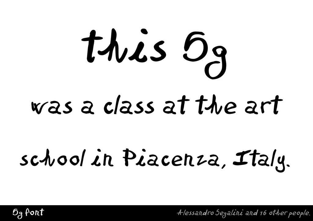
This presentation is about my experience teaching typography at the Bruno Cassinari art school in Piacenza, Italy. The name of the class was 5th G (Graphic); students were 18 years of age.

The aim of the course was to make the students aware of the basic role of letters in the process of design, within the understanding and representation of information structures, as well as the comprehension of personal design identity, i.e., developing one’s own “style” to apply to graphic projects. Lettering as a mean to know, to know how, and to act — in Italian: “il sapere, il saper fare, il saper essere.”

Each lecture was organized to stimulate sharing ideas and welcome questions. The introduction to the topic of each meeting saw the presentation of physical objects, such as wooden block letters or LP record covers (vinyl’s sleeves). Teaching topics included calligraphic styles, samples of the imaginative power of letters, principles of basic design and writing, graphology, the letter as an object, anatomy of letterforms, the Vox and Novarese type classifications, principles of book layout, introduction to digital type design and fontography, typography and poetry, introduction to calligram and palindromic compositions, typography and music covers design, typography and information architecture.

Short workshops were organized to experience the application of the ideas generated in class, using both the hands and the computer. The final workshop made use of the students’ handwriting for a chirographic font.

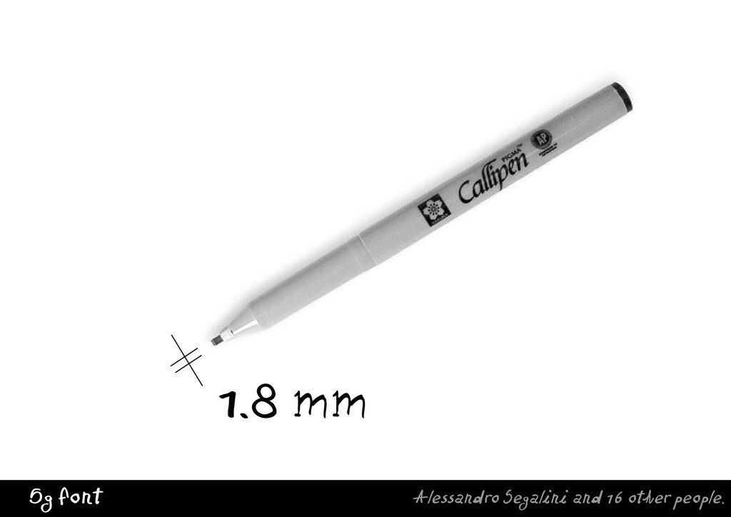
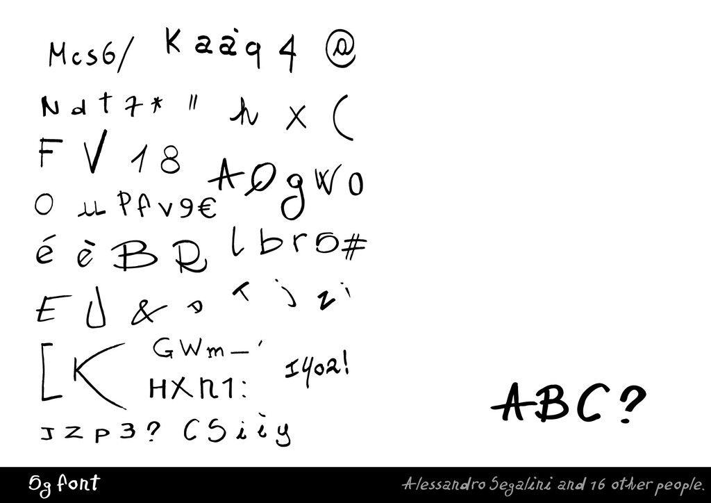
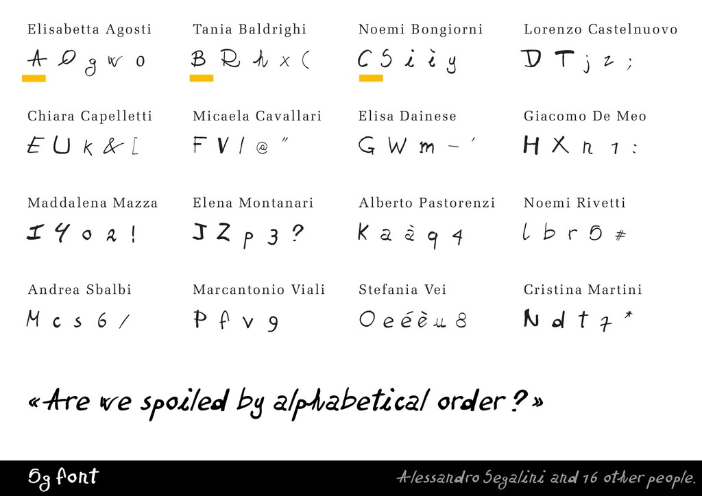
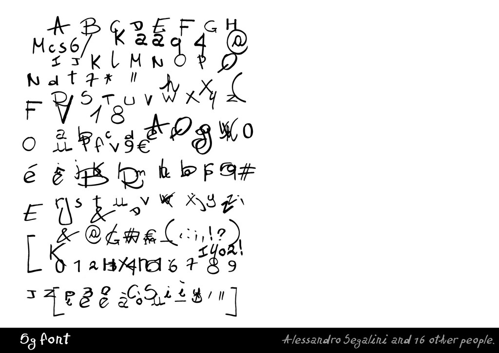
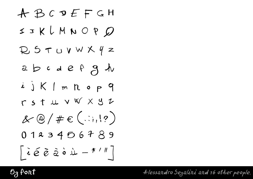
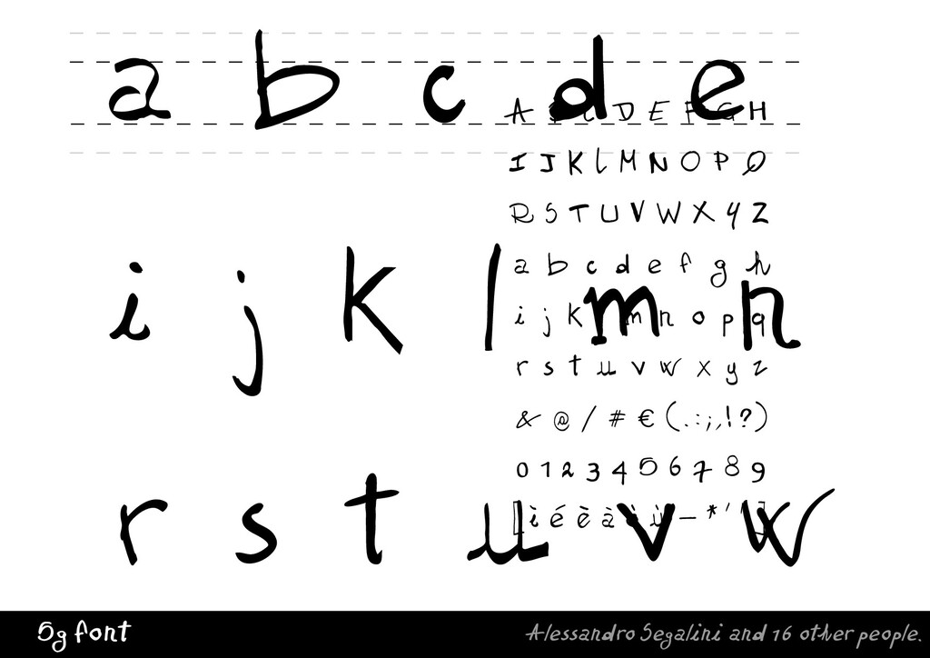
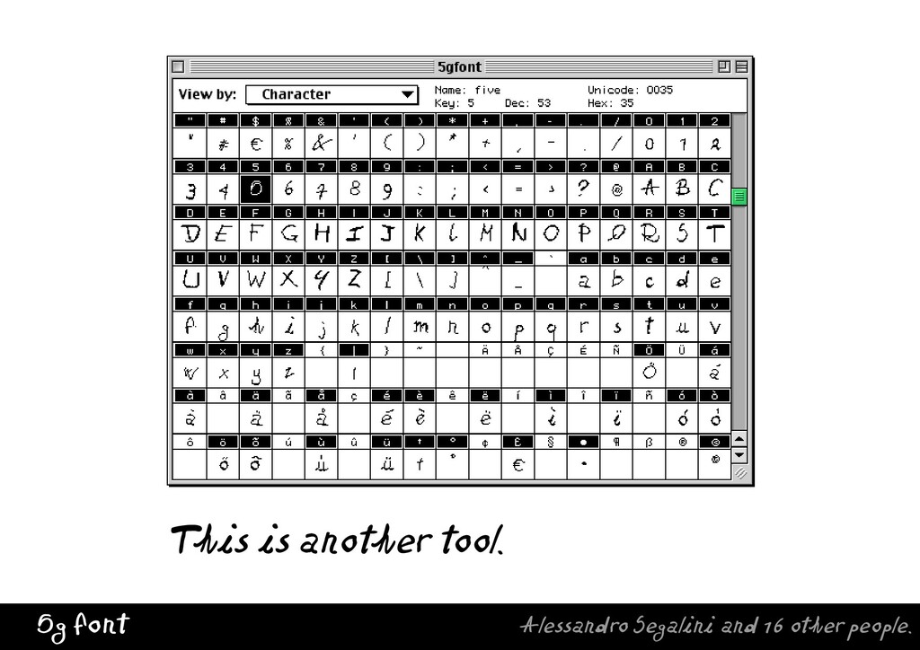
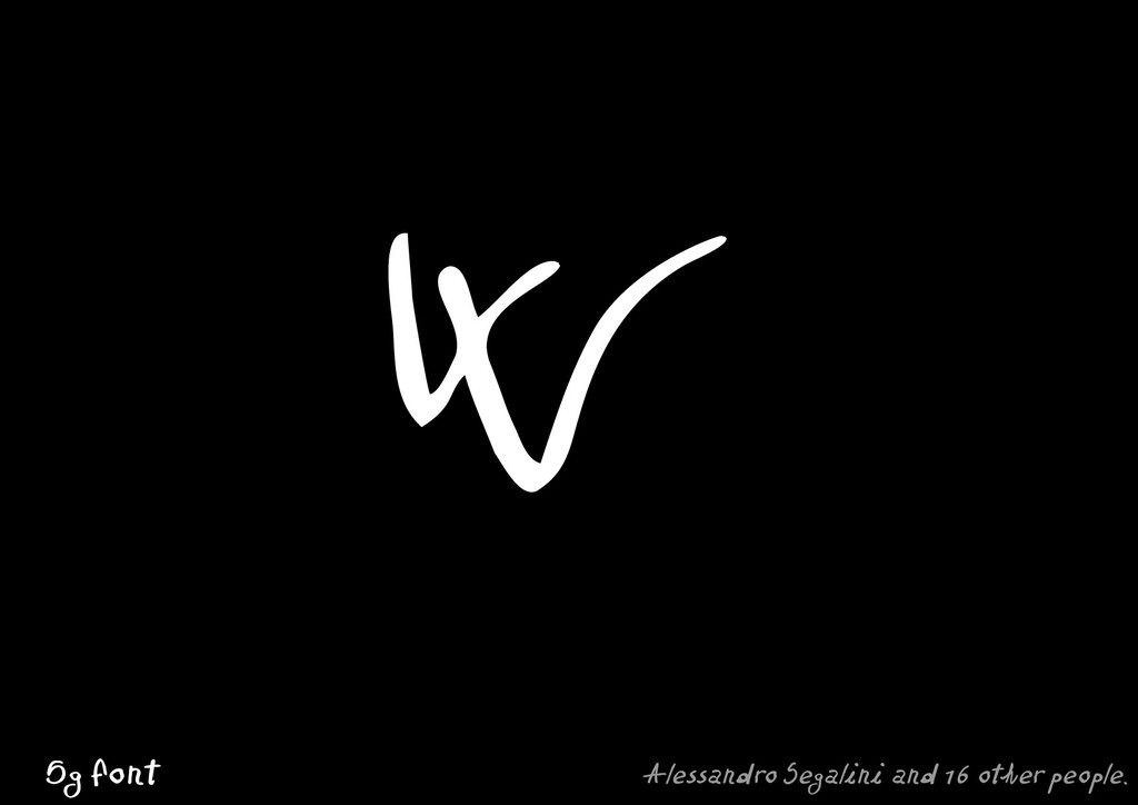
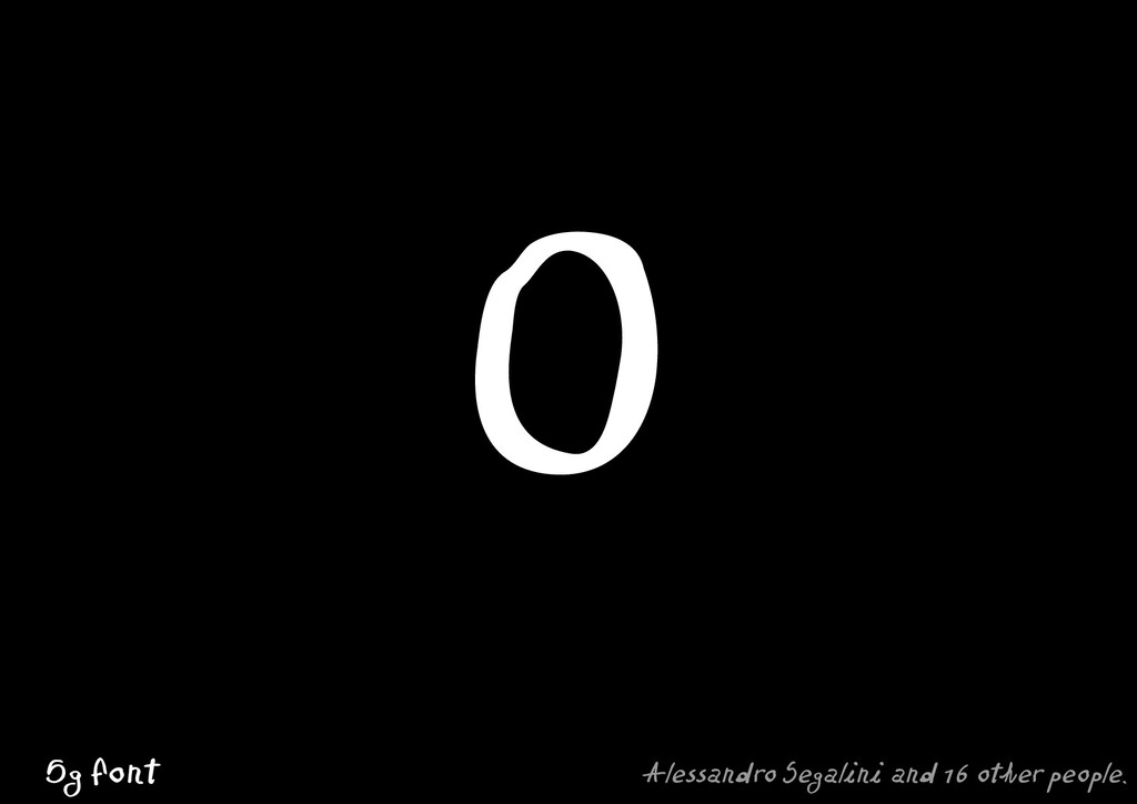
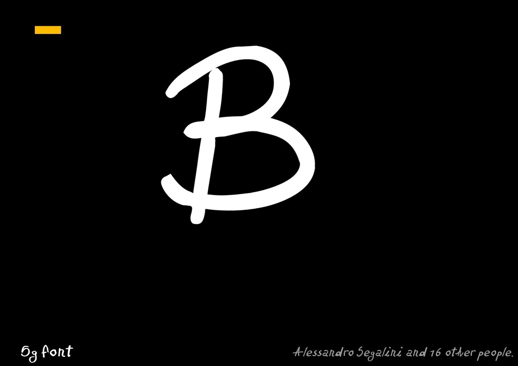
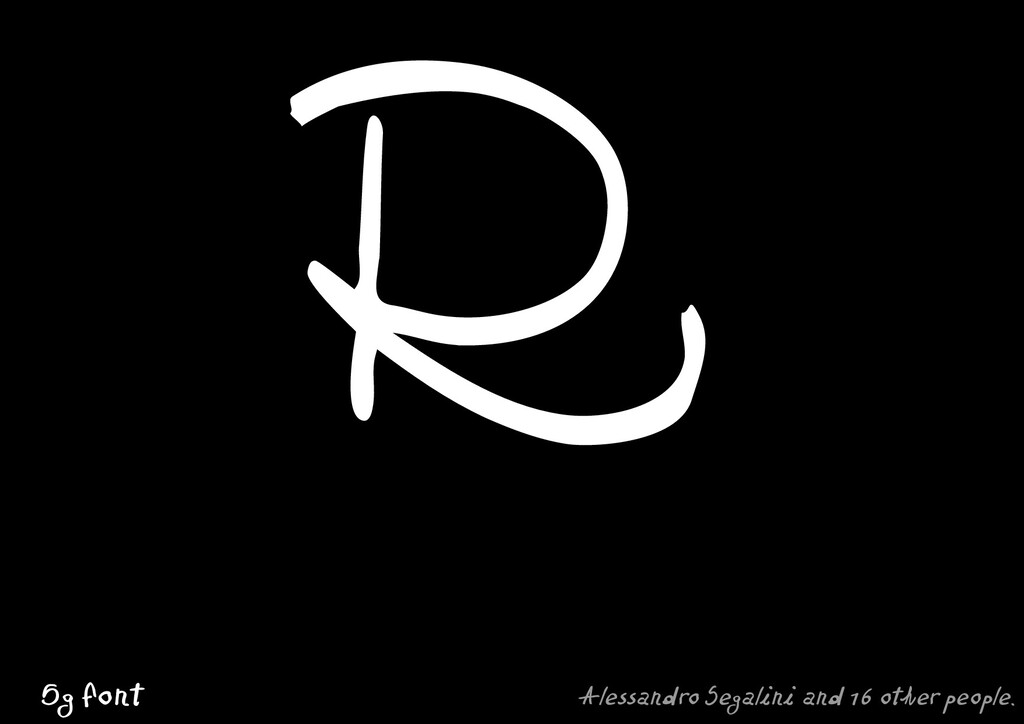
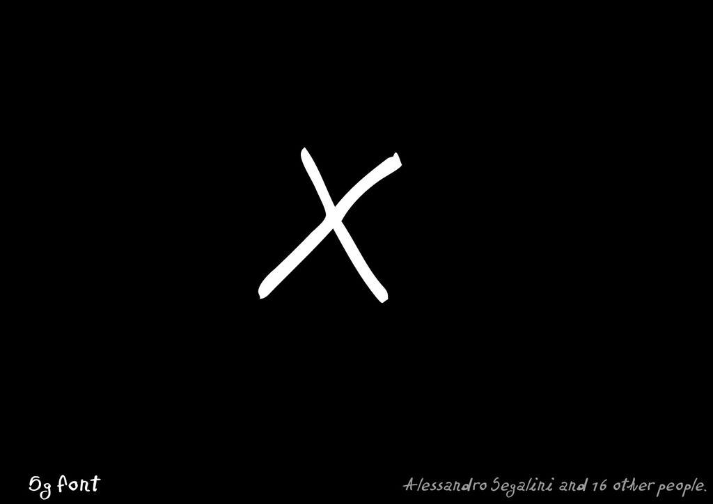
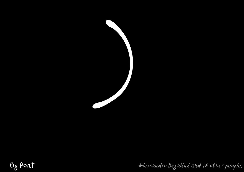
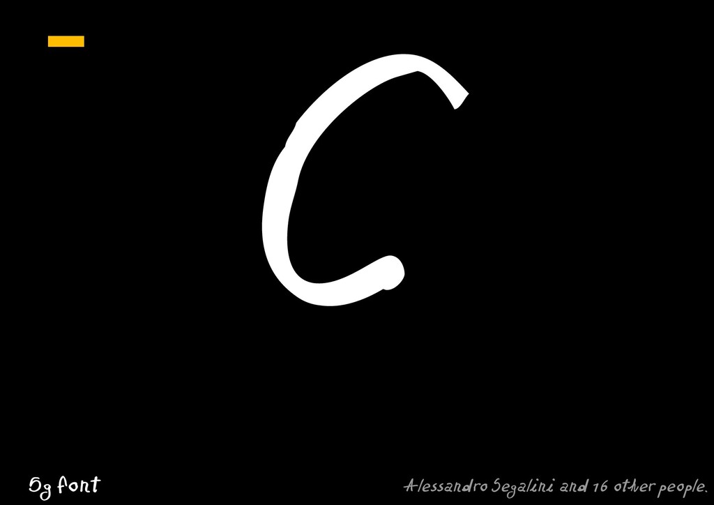
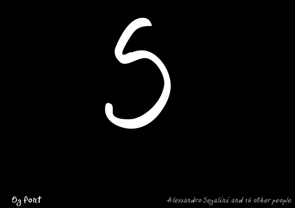
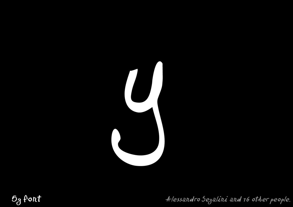
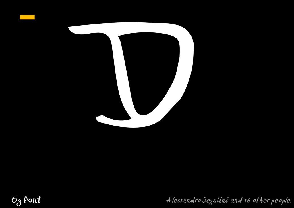
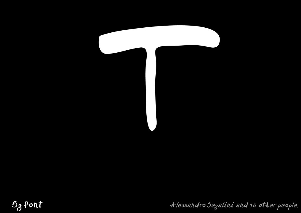
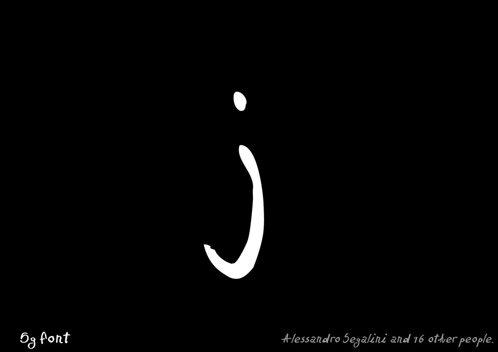
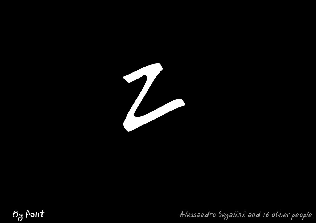
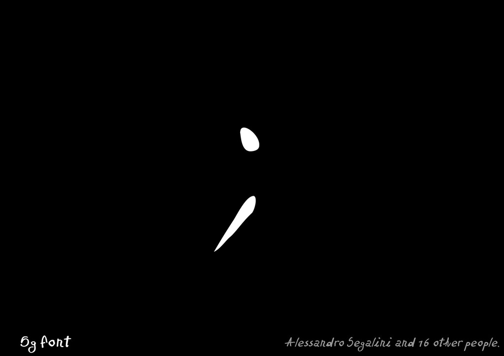
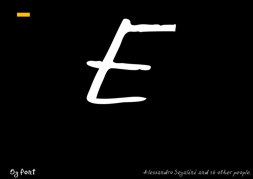
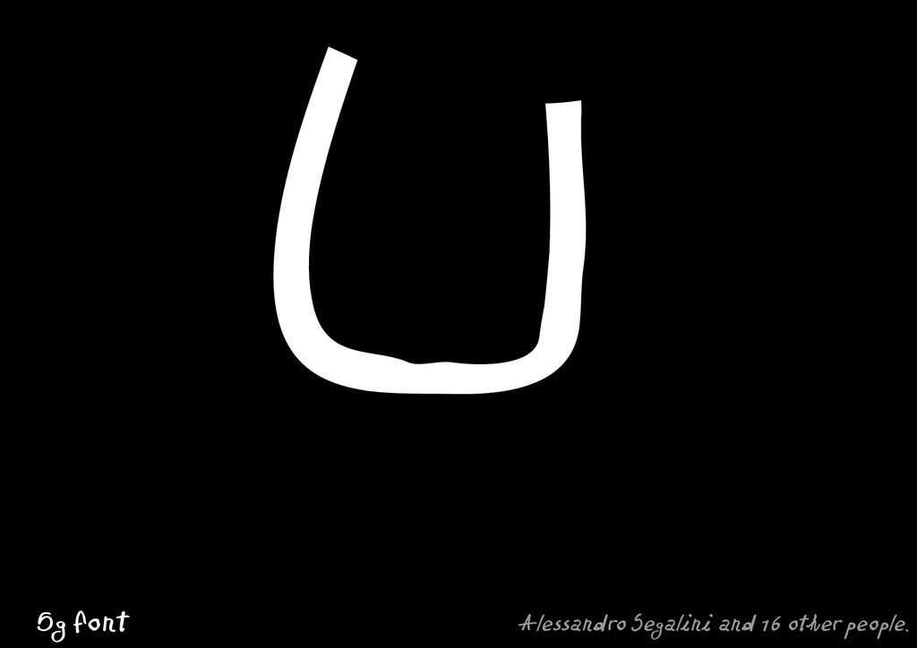
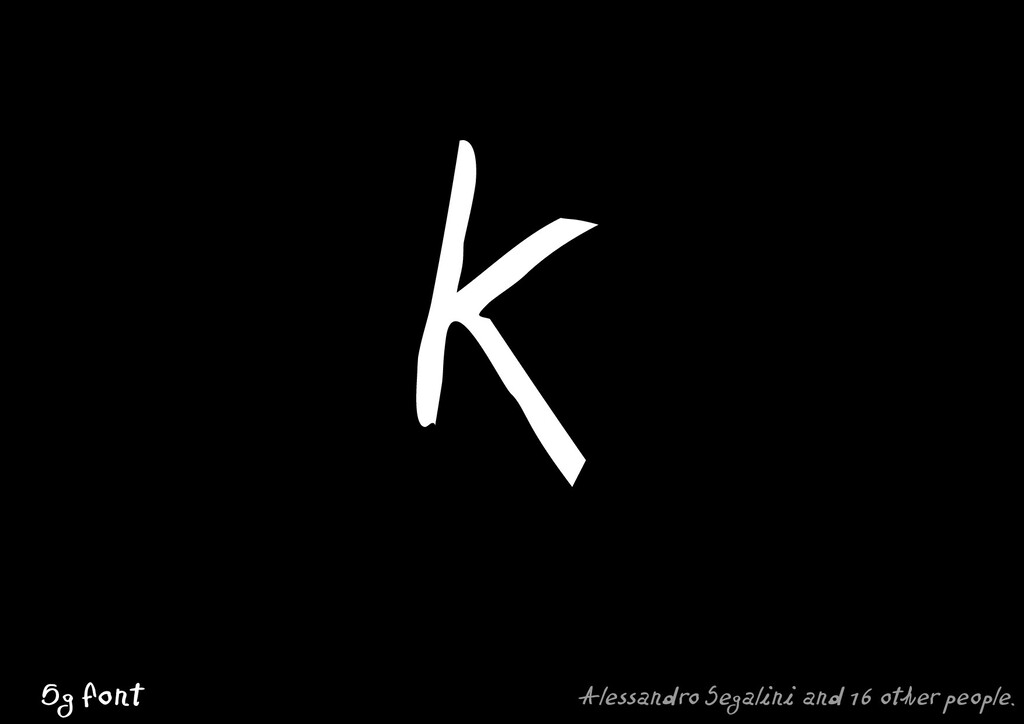
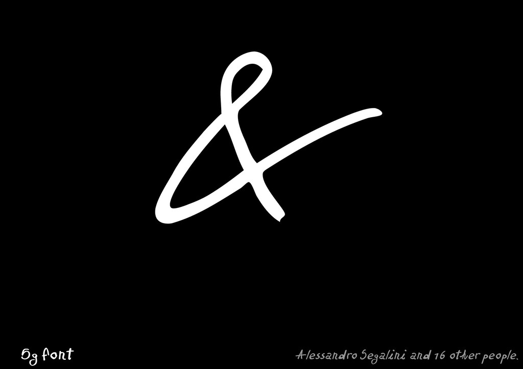
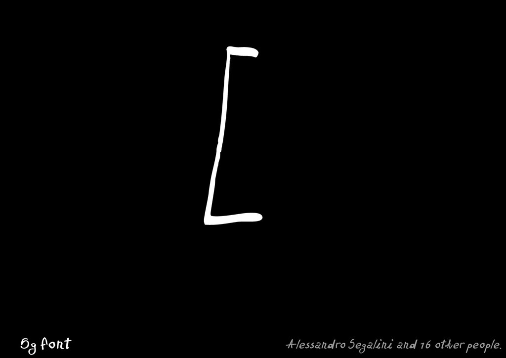
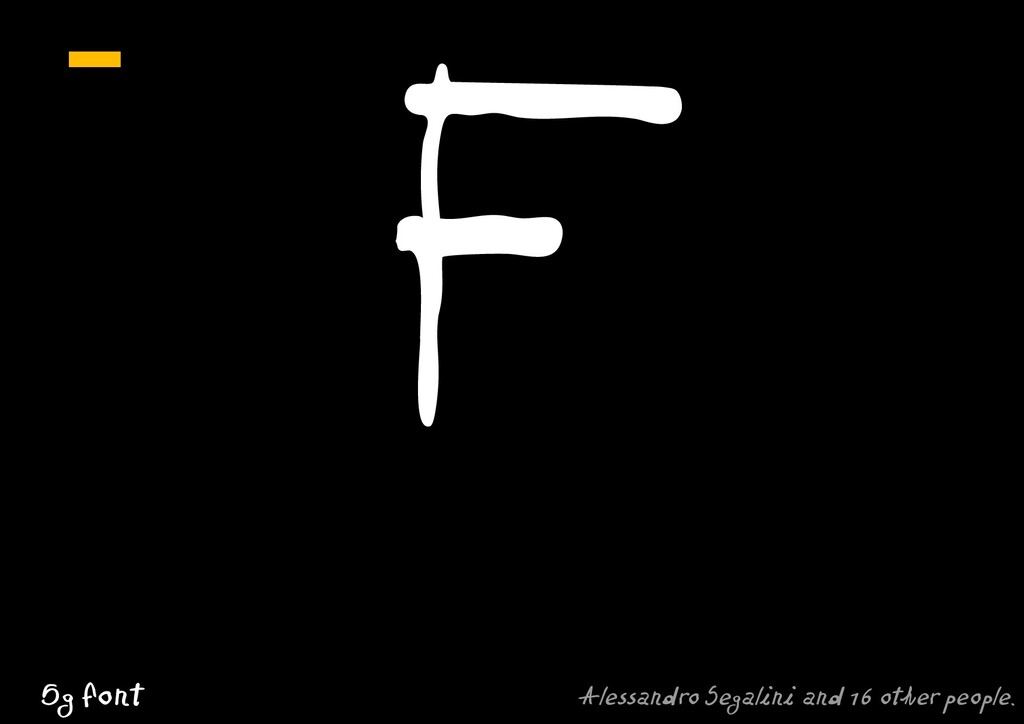
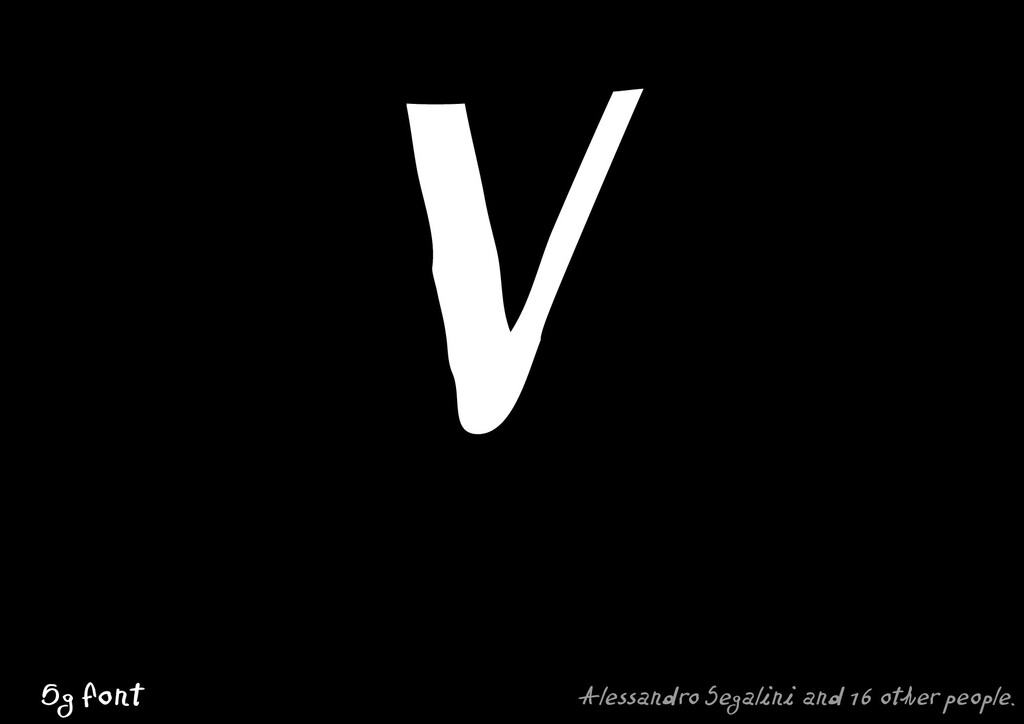
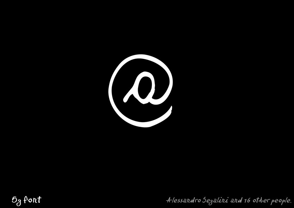
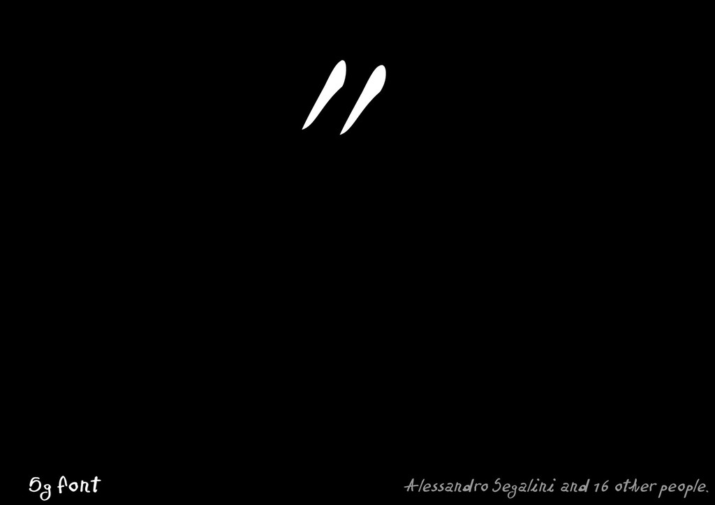
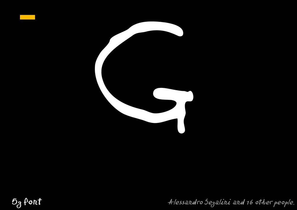
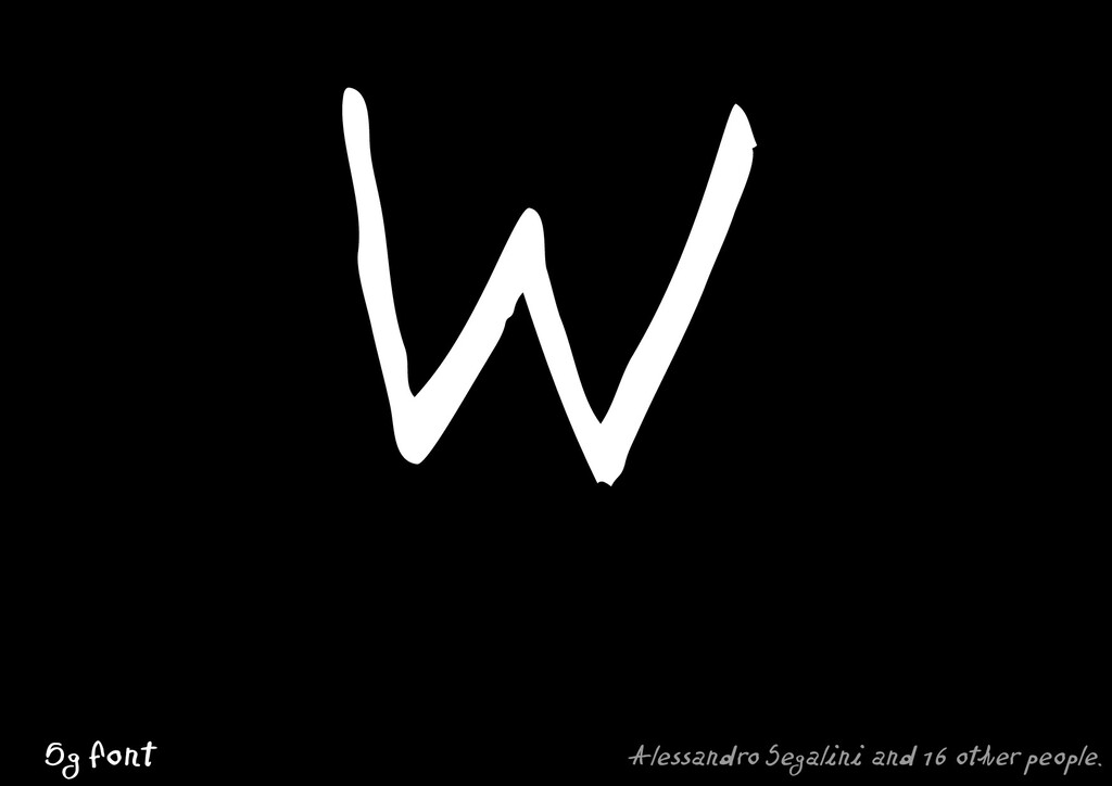
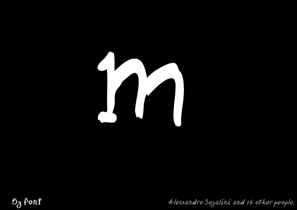
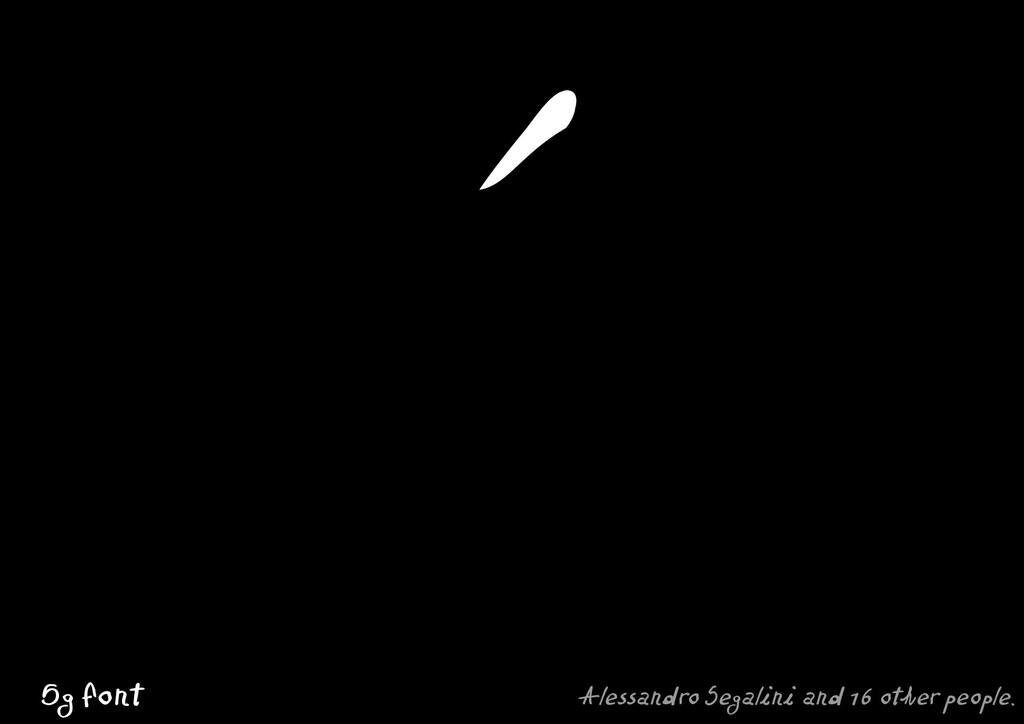
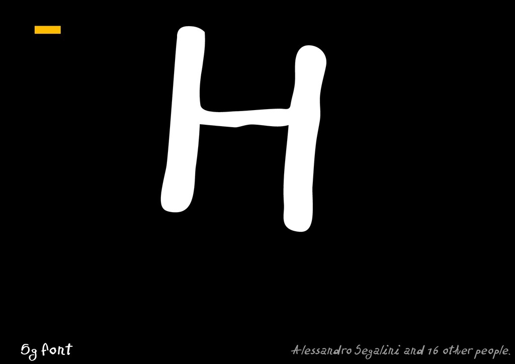
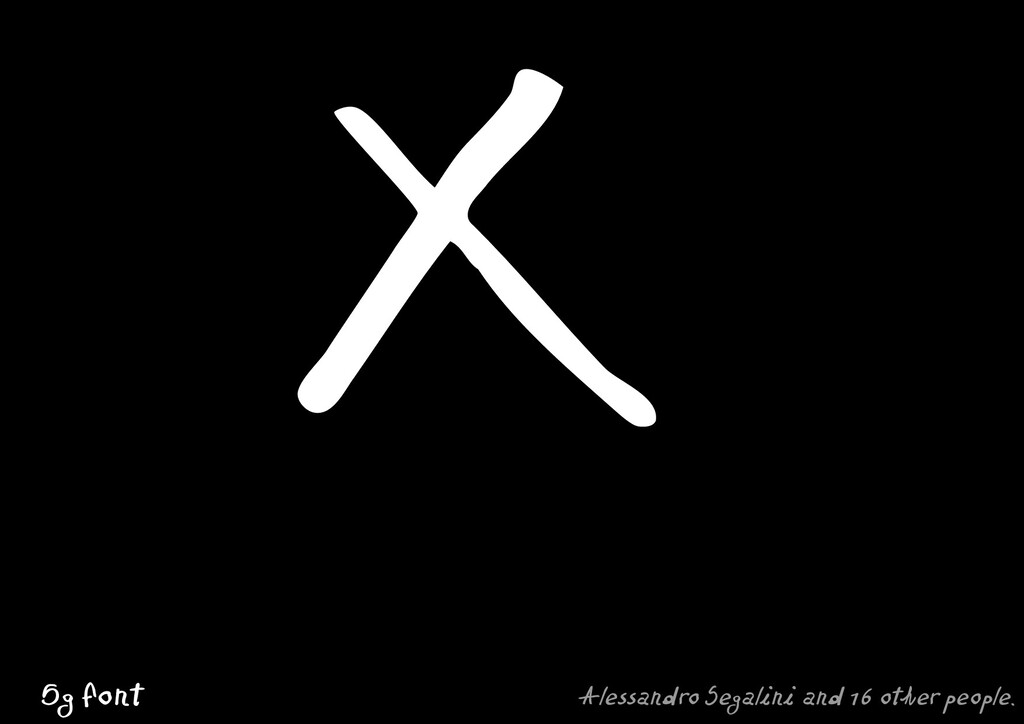
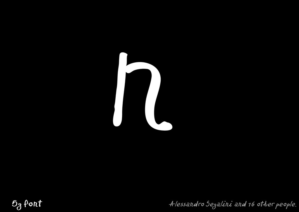
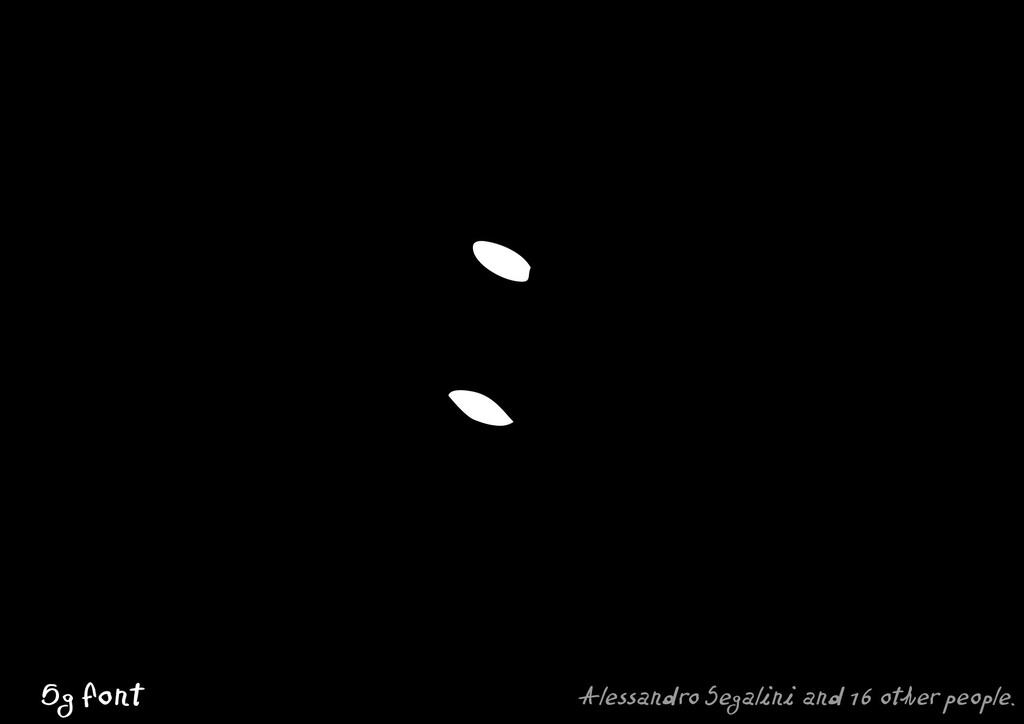
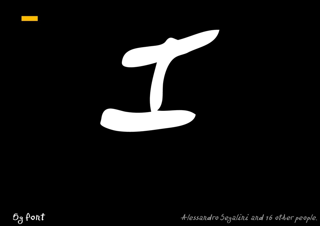
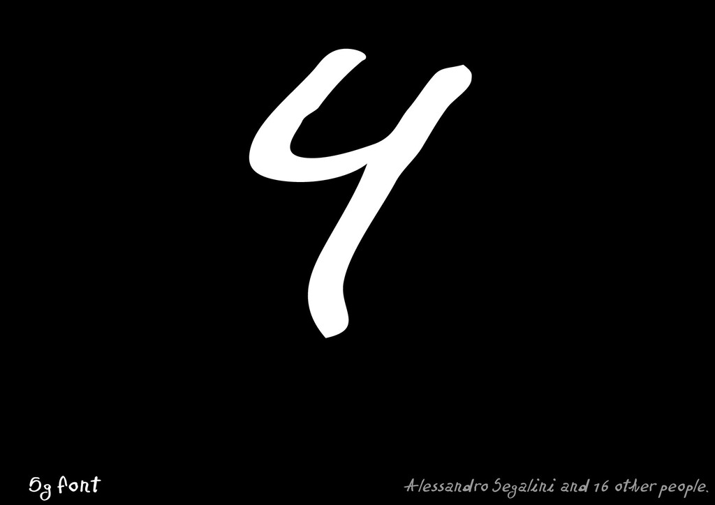
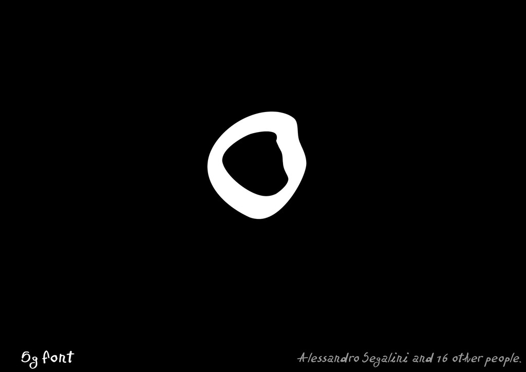
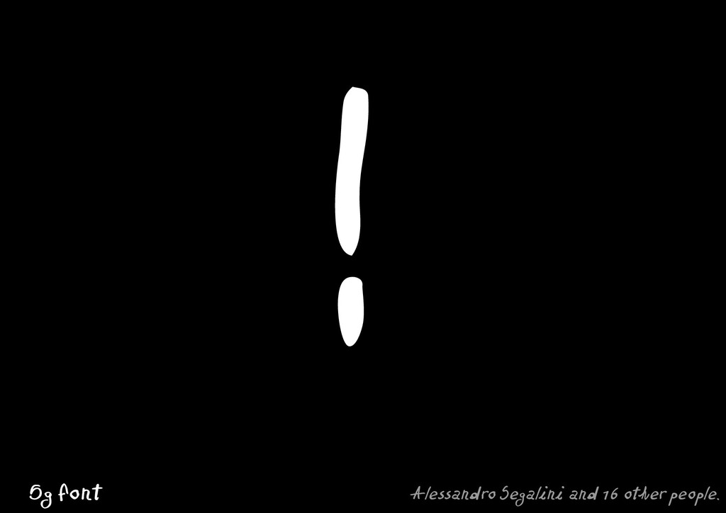
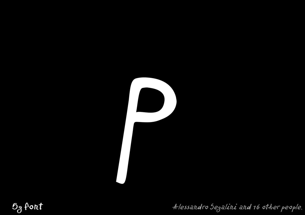
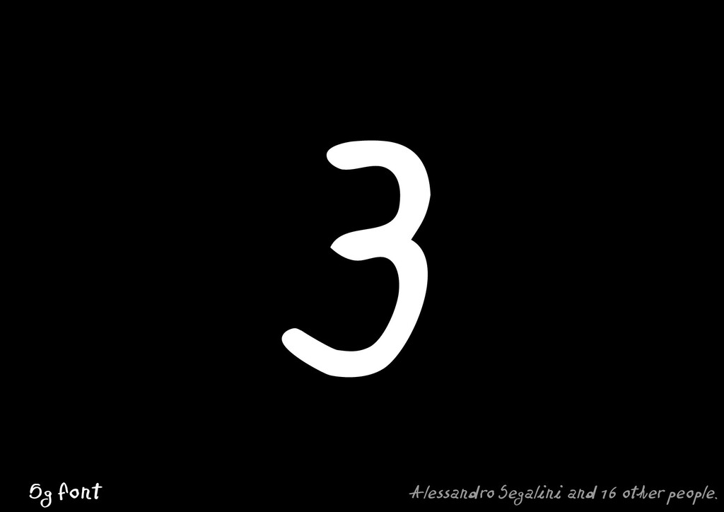
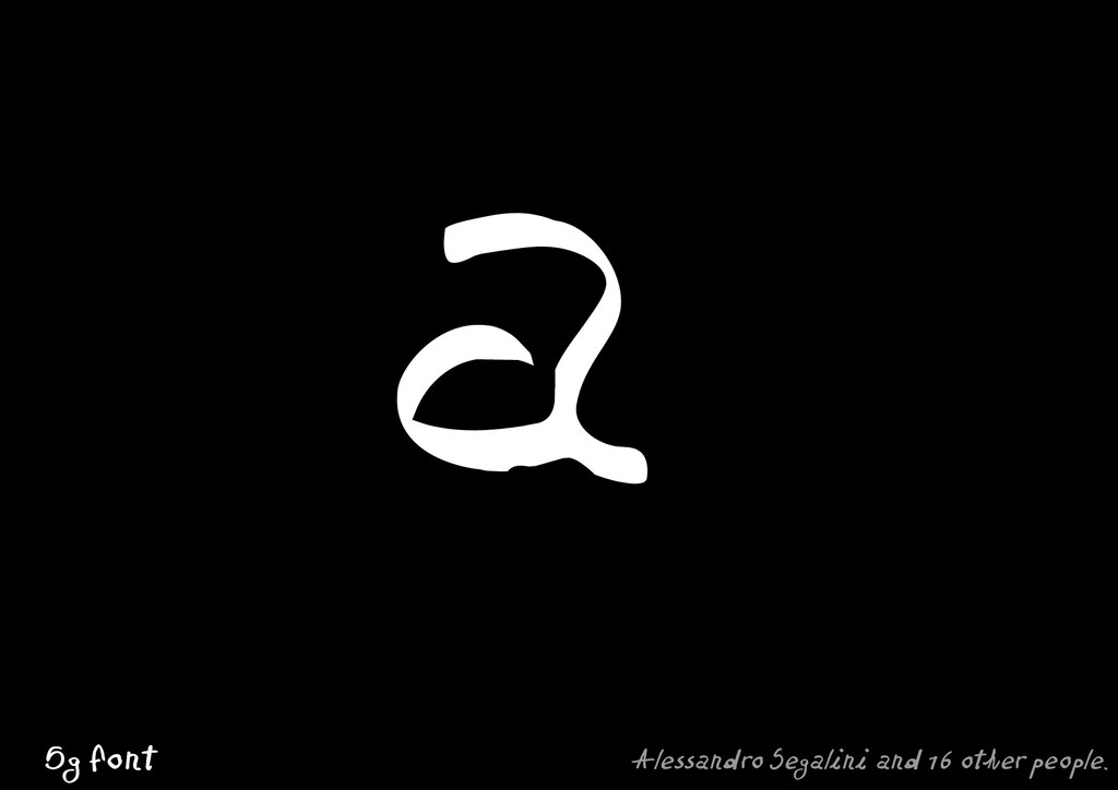
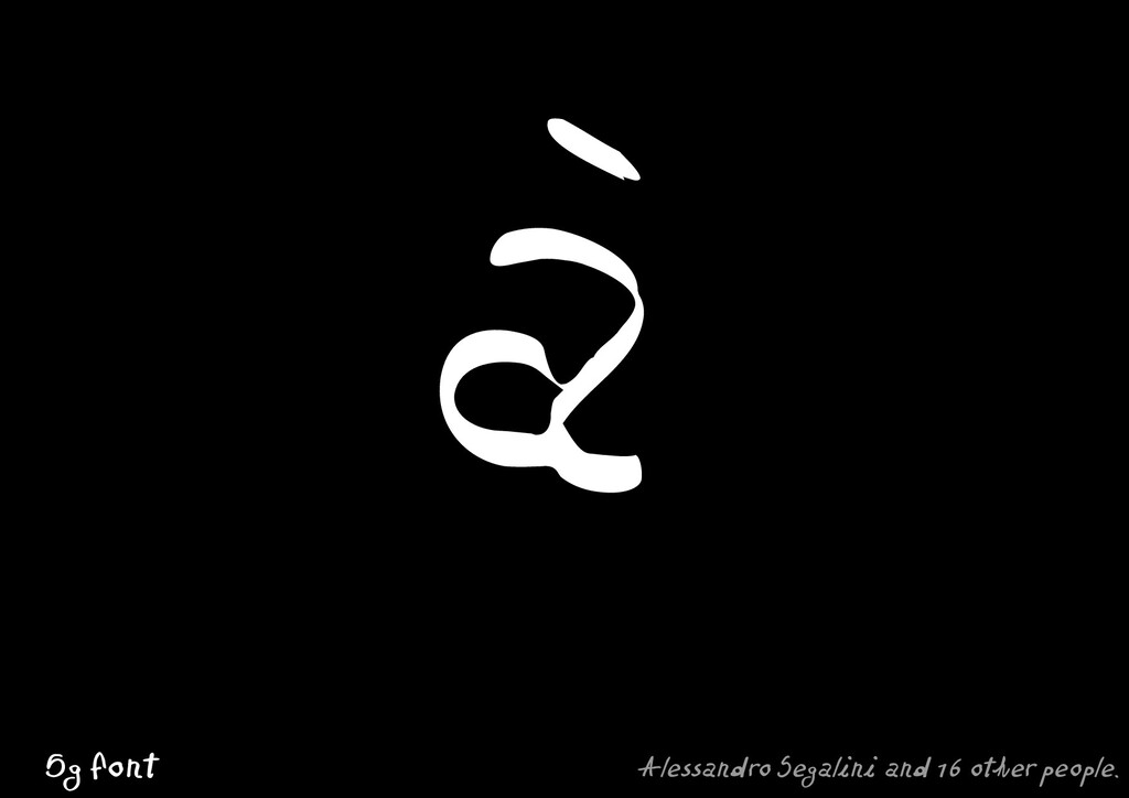
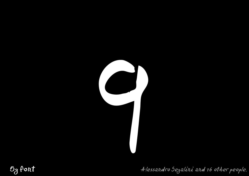
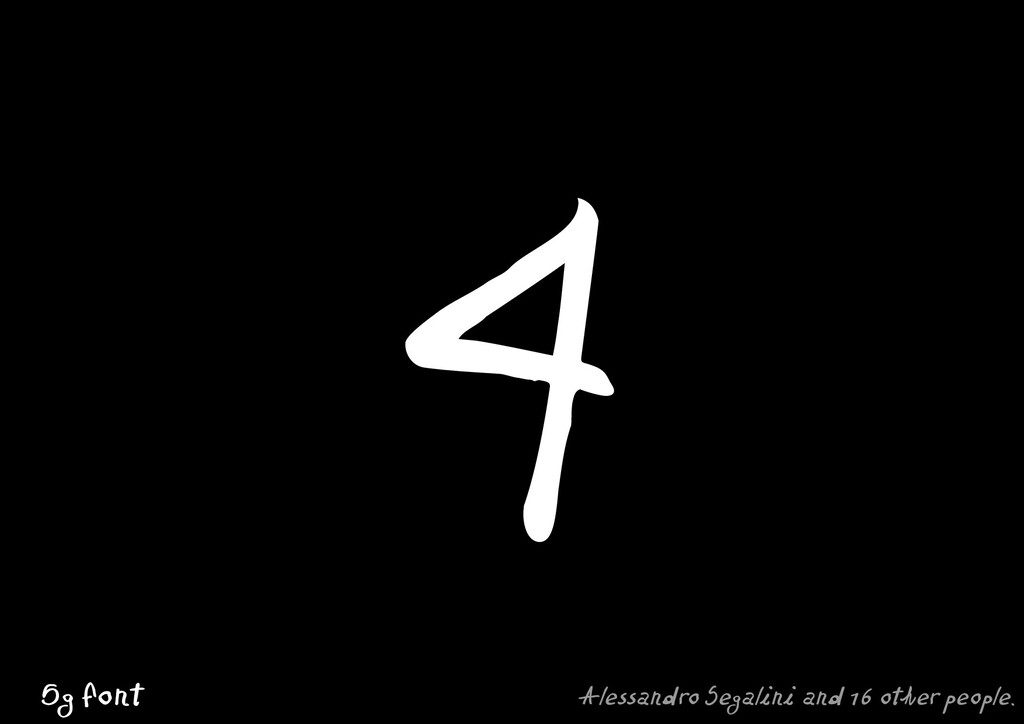
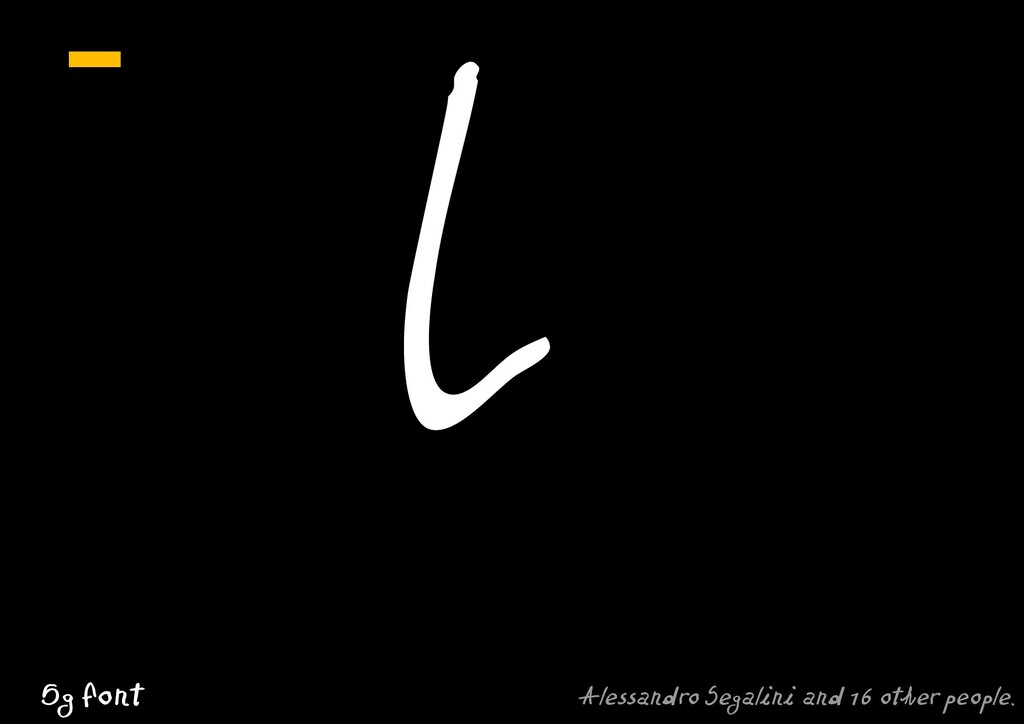
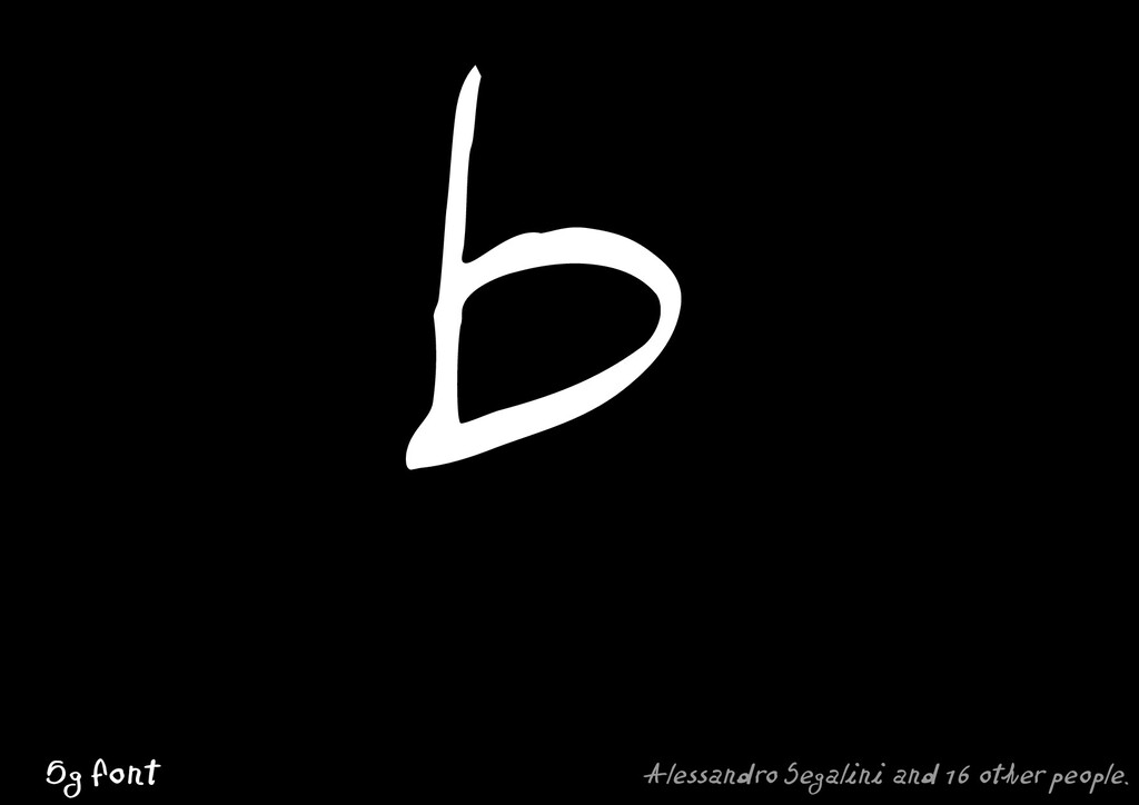
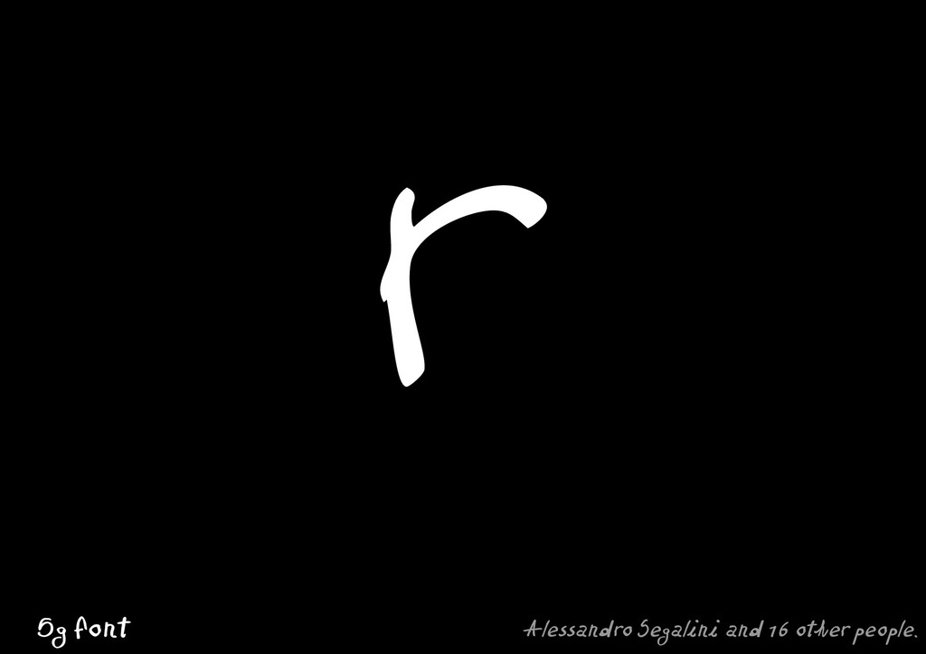
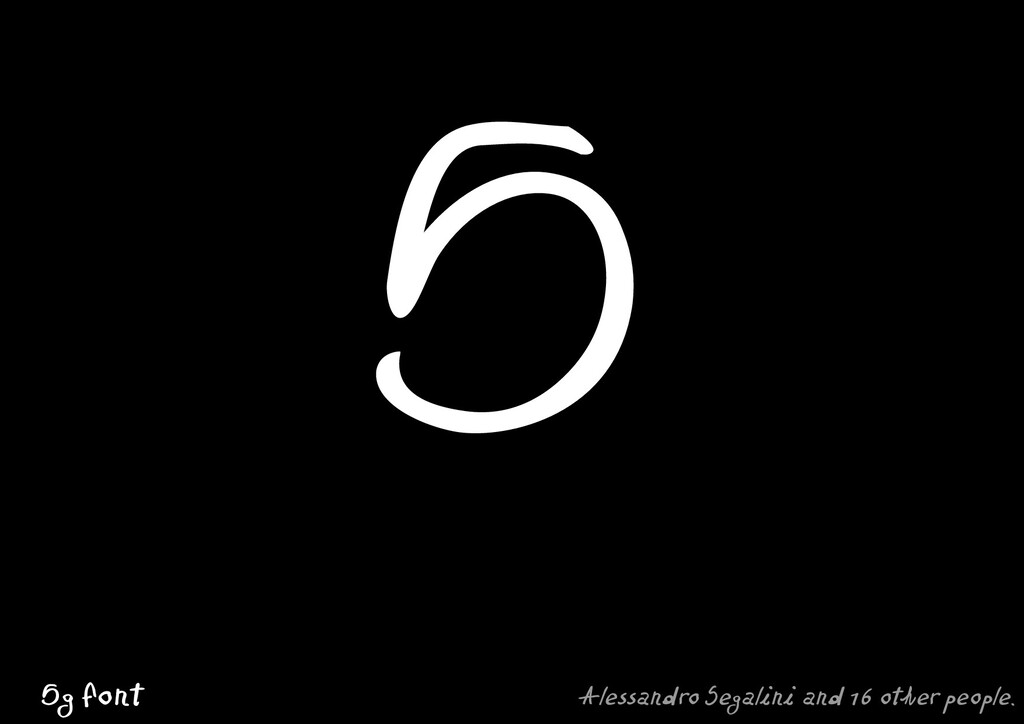
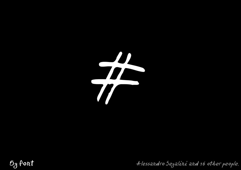
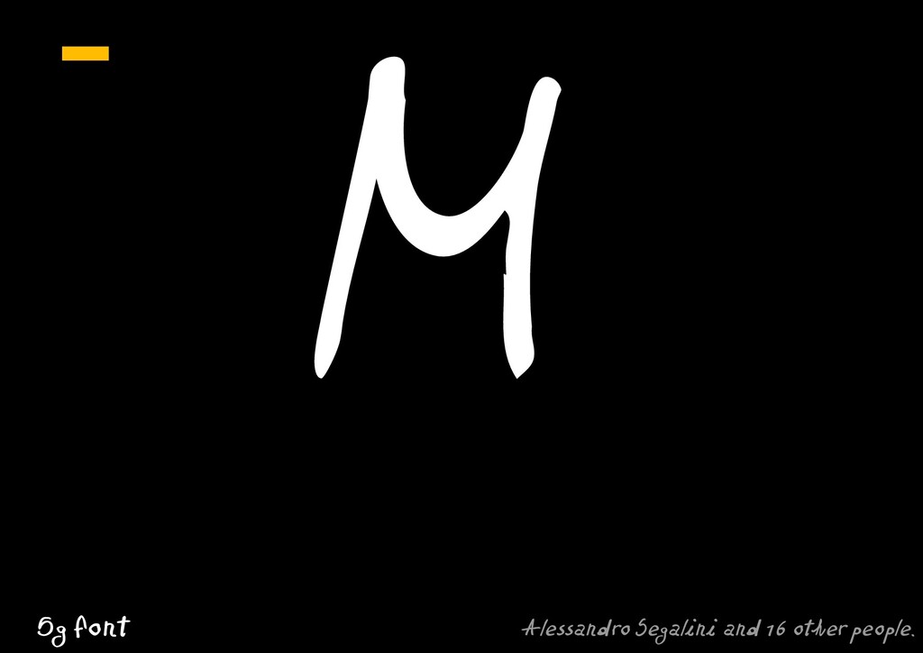
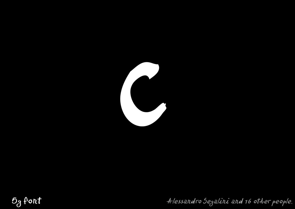
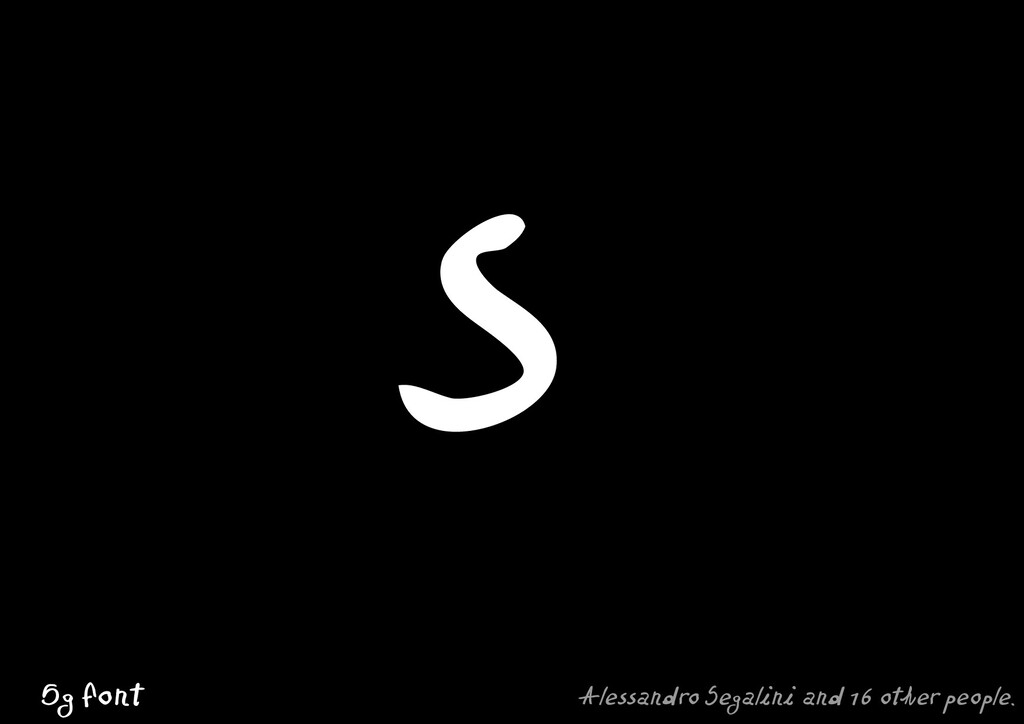
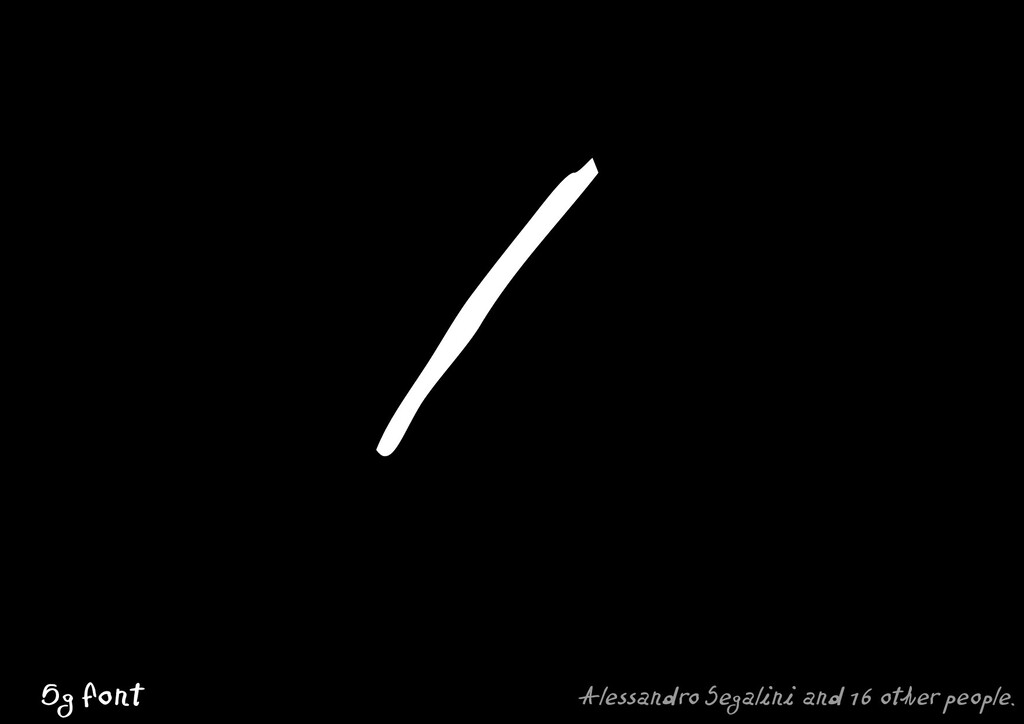
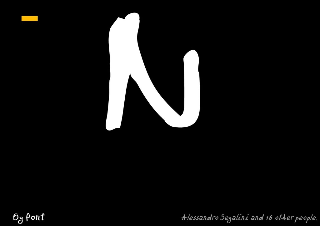
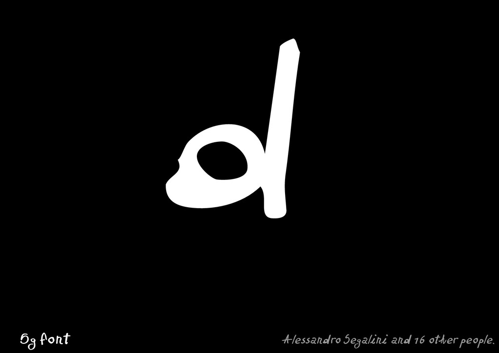
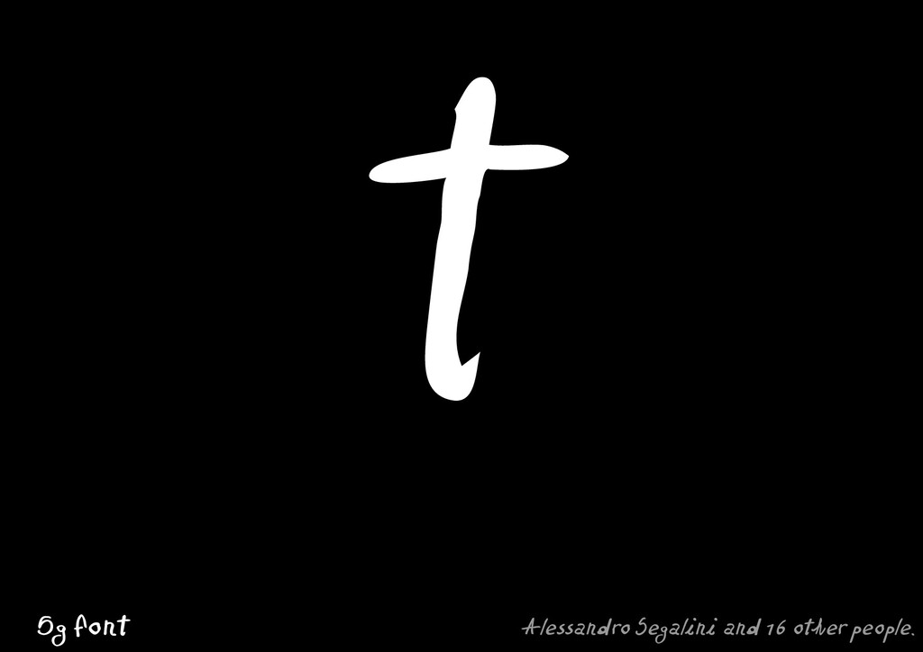
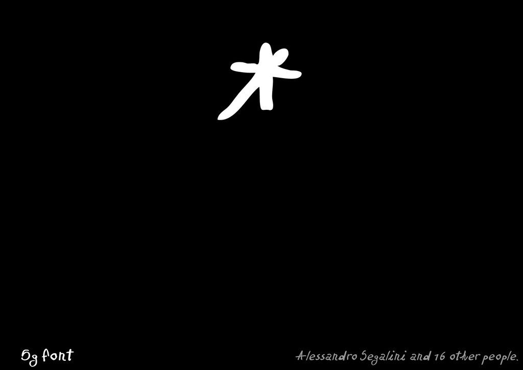
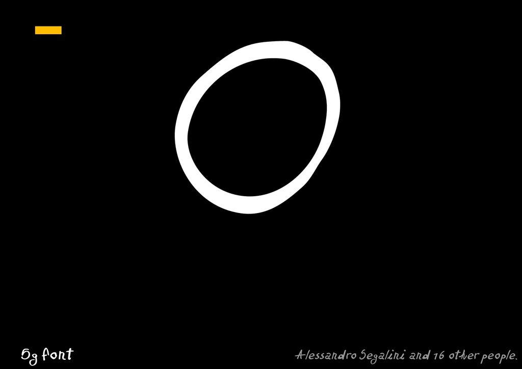
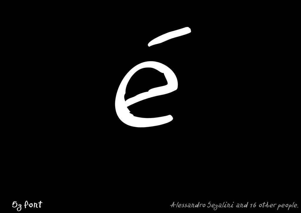
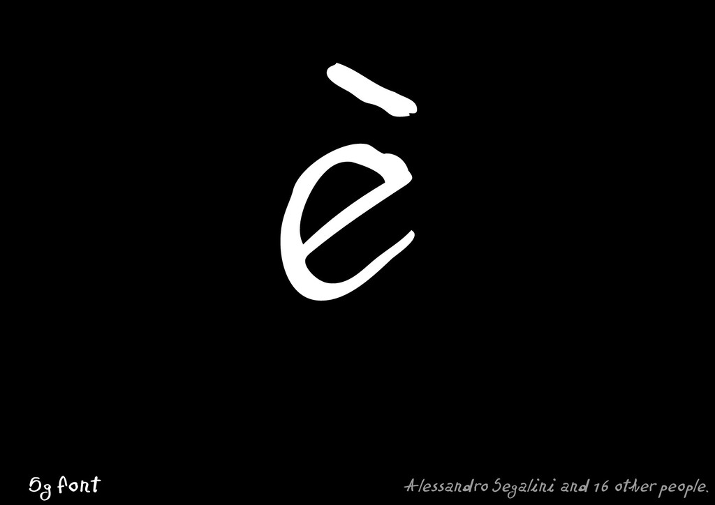
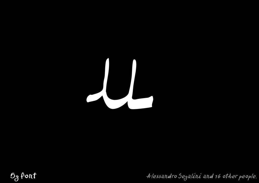
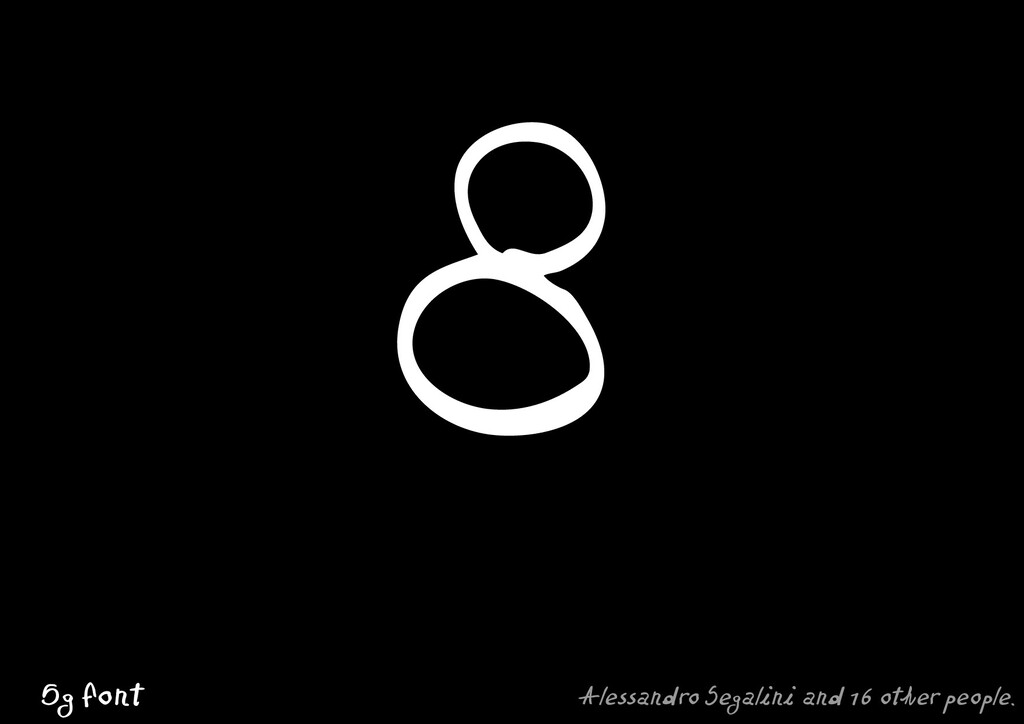
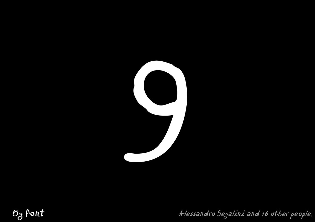
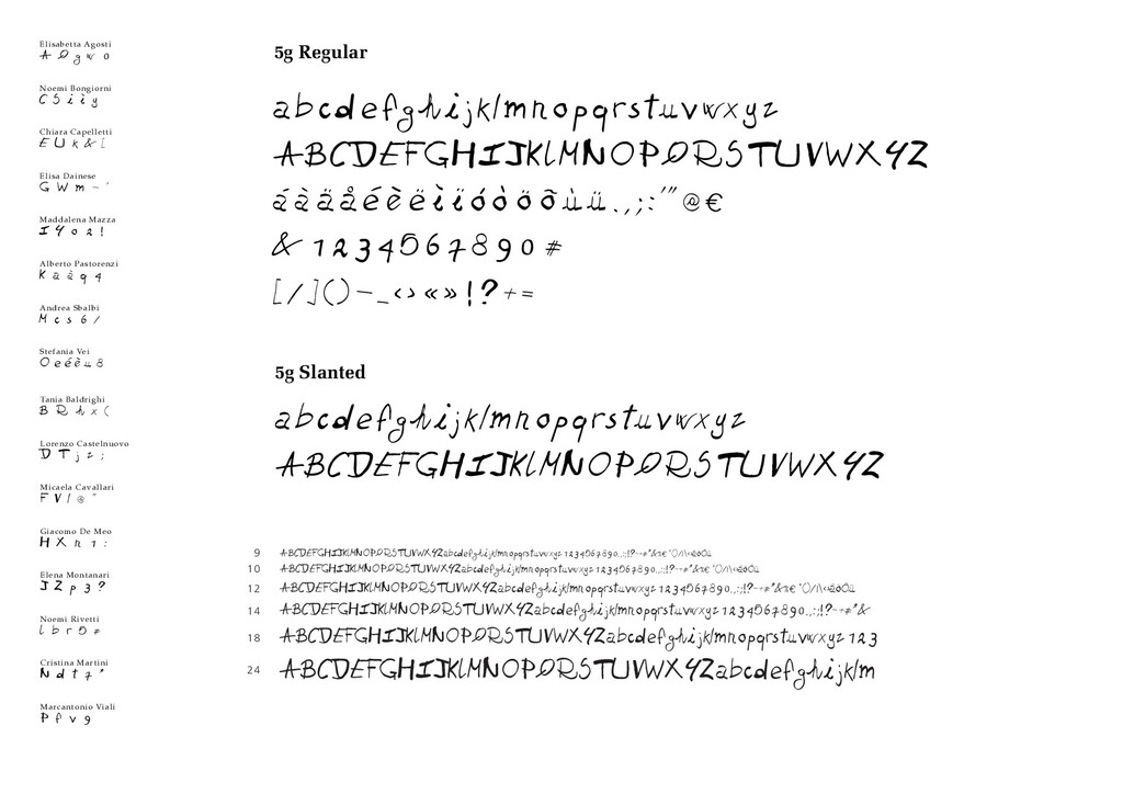
To each of the 16 students I assigned a group of glyphs so that one person did not happen to write two consecutive letters in alphabetical order. Talking about design constraints, I requested the use of a 1mm flat felt-tip pen, and 10cm square paper sheets. None of the student approached the letter-drawing task creating contours or outlines, they all wrote the characters. Once the handwritten characters were collected, we tried to get some order/structure done: students started a process of rough normalization of the signs. That was done in Macromedia Freehand. Beside the pen, I showed the student another tool to design letters; the software Fontographer.

There are several type design methods, they depend on the type of project. Sometimes it is enough to start from just a few hand-drawn rough sketches and other times from a whole alphabet of tight drawings. I think it is advisable to sketch something on paper first (rather than starting from scratch on the computer), but most of the real design work happens once the designer get the shapes on the computer screen. The iterative process of shaping letters on screen and proofing them at different sizes into words is where the designing happens.

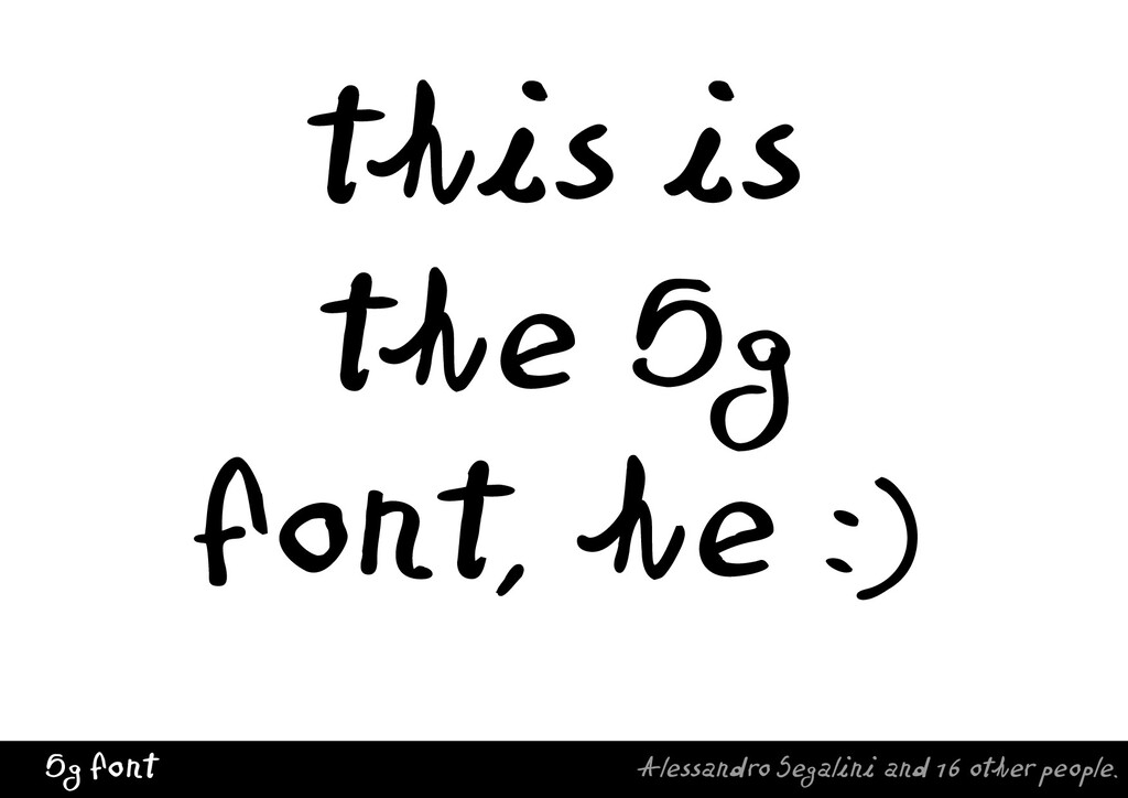
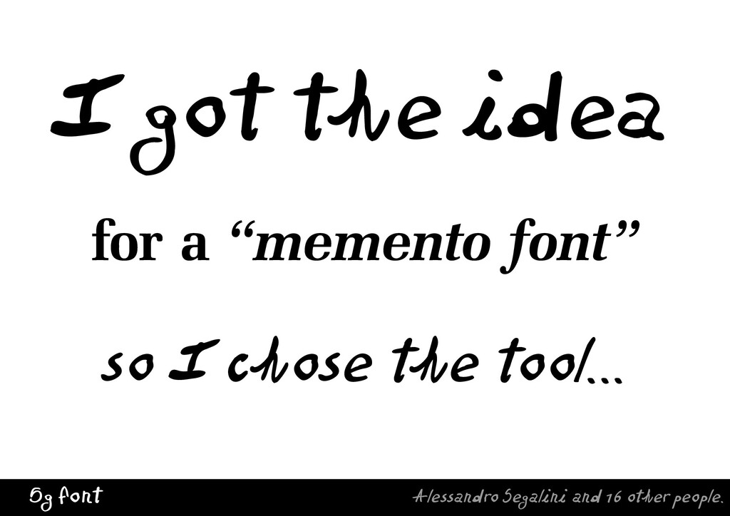
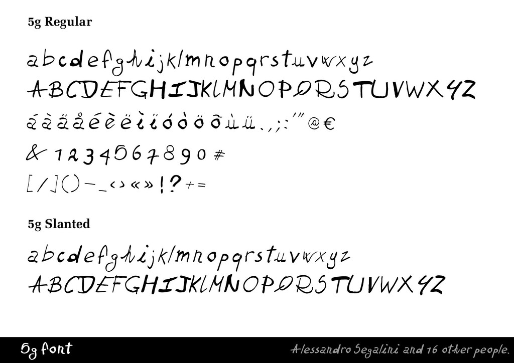
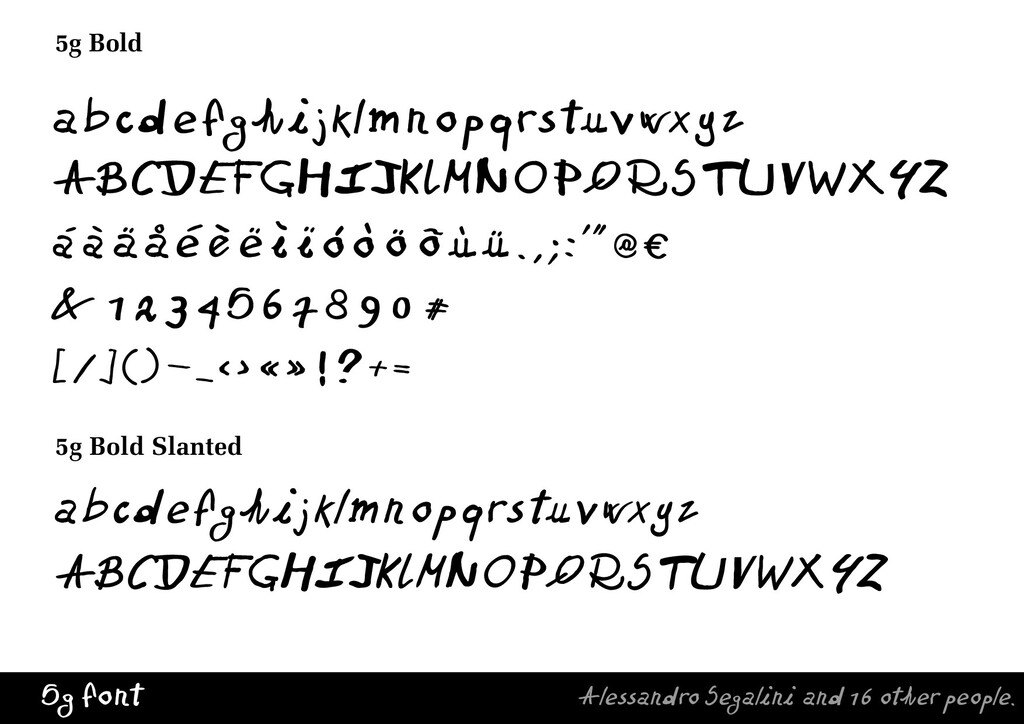
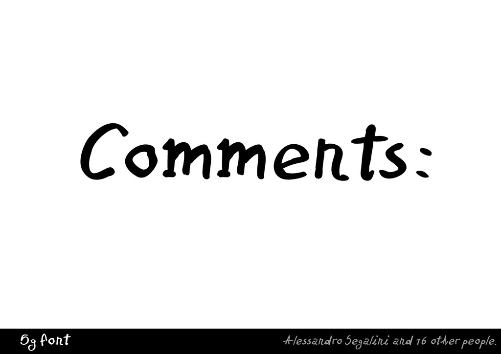
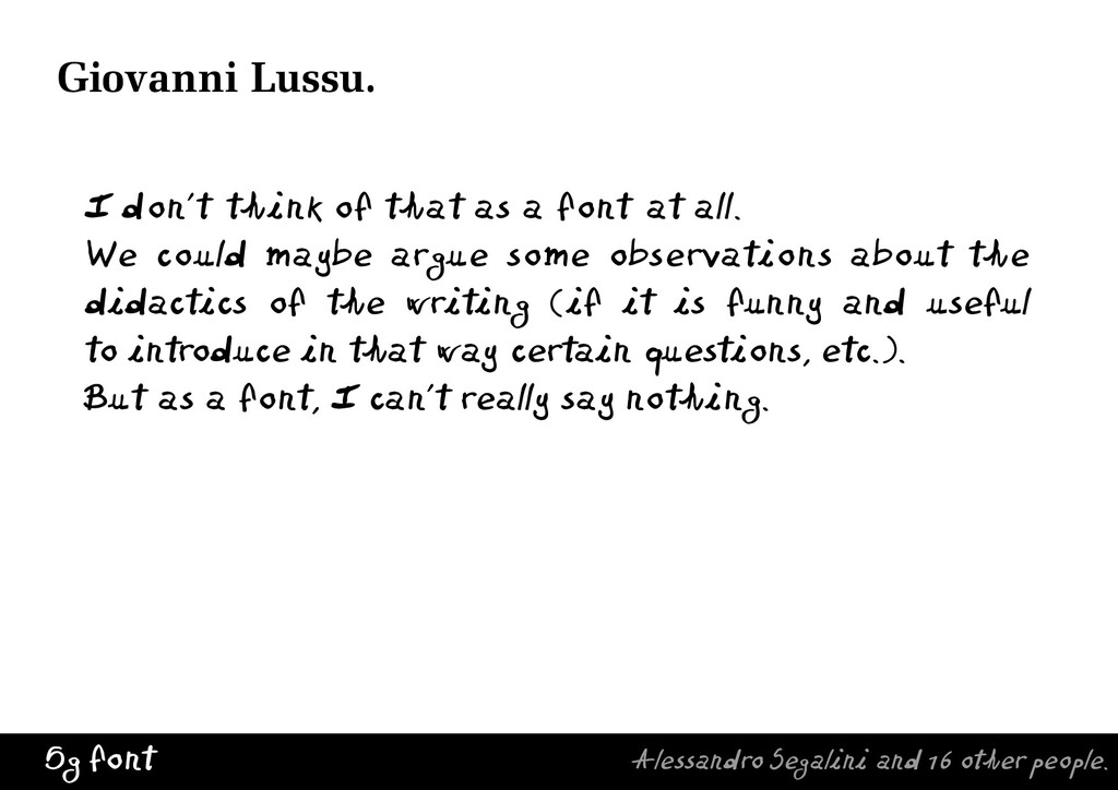
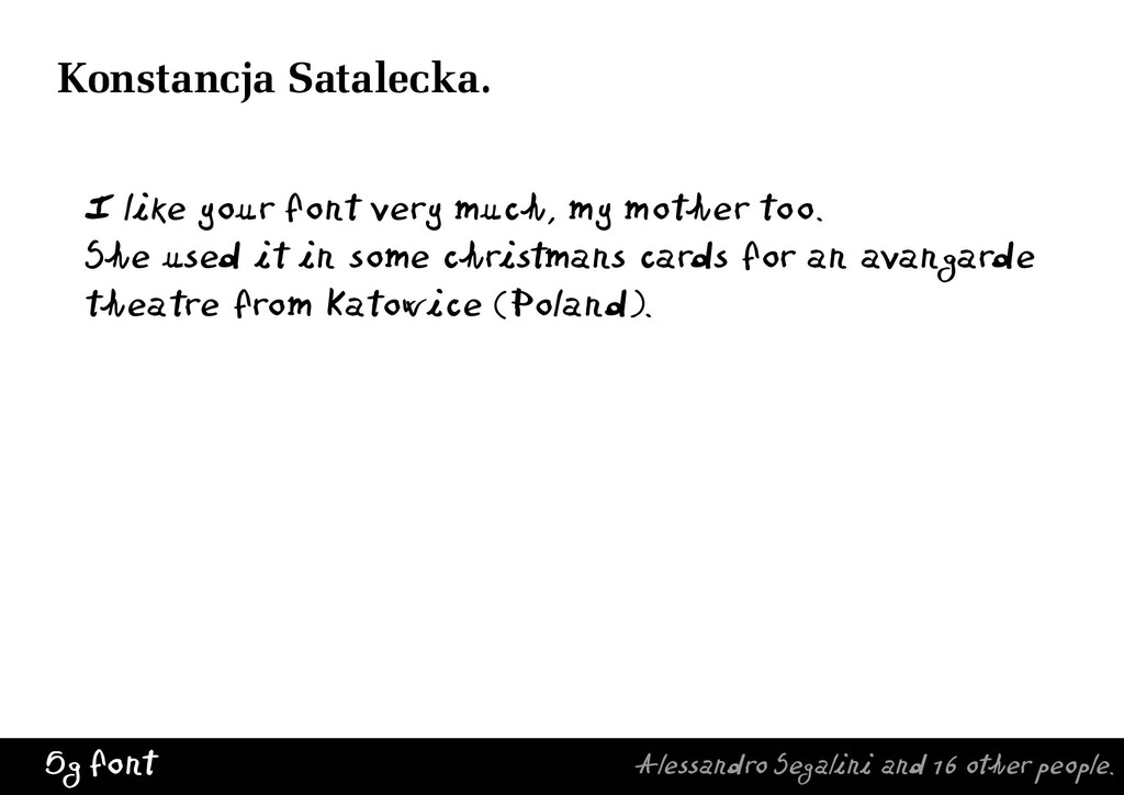
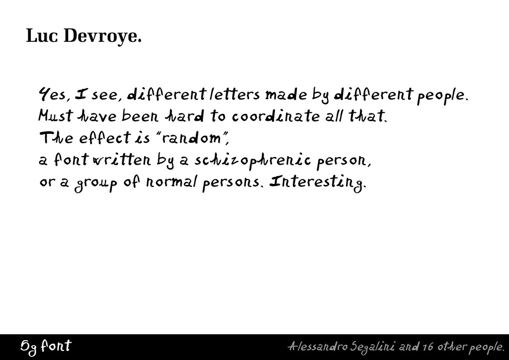
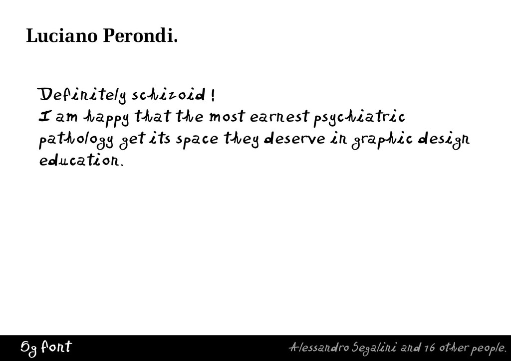
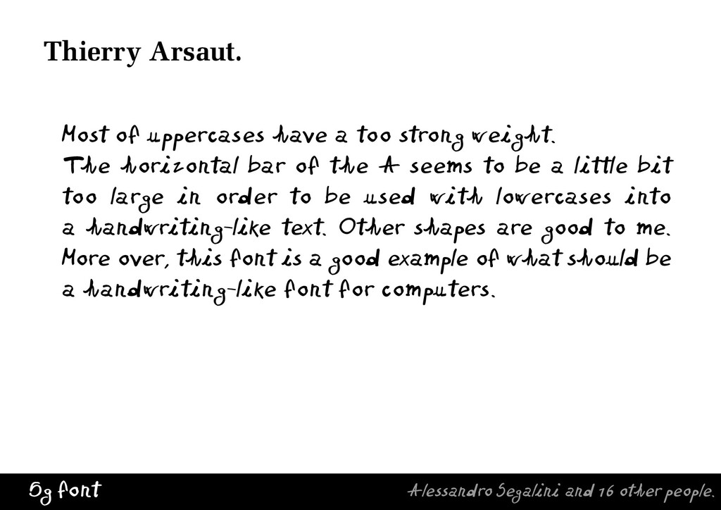
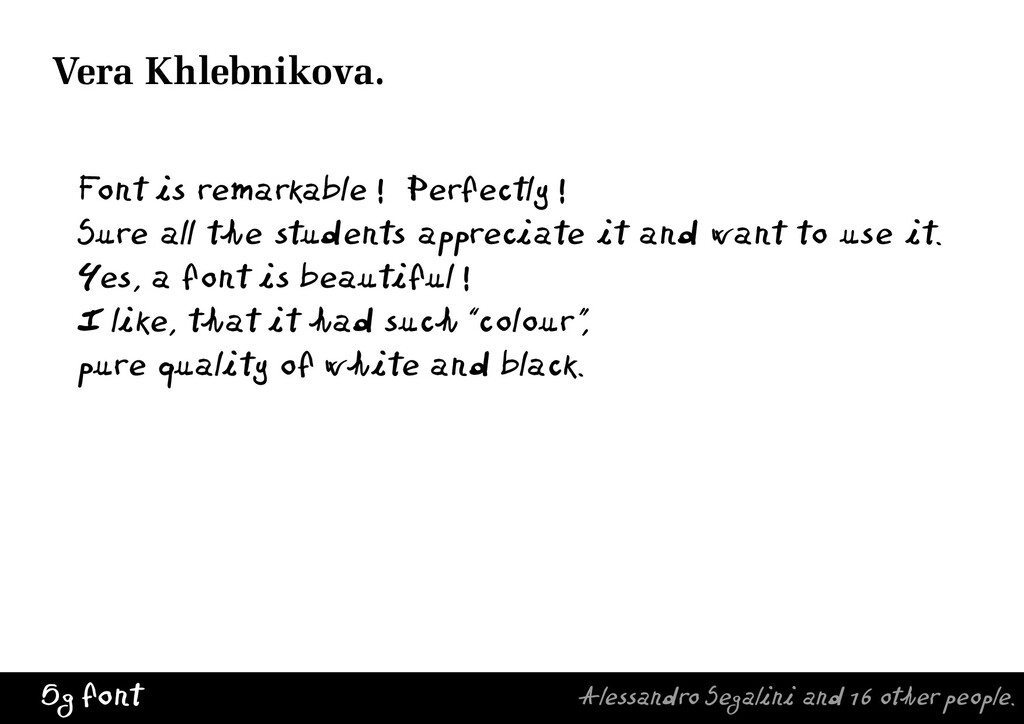
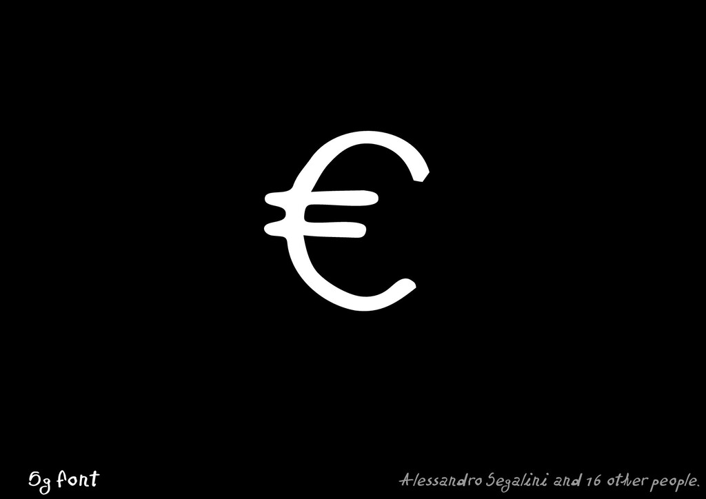
The students had to figure out how to get those letter shapes on a software grid to be designed as a font. The result or outcome was random, “a font written by a schizophrenic person or a group of normal persons,” as Luc Devroye described it. After the 5g font was done, I collected 20 reviews by friends from different countries — mostly designers and artists —, different views about that one handwritten typeface completed by several people at once.

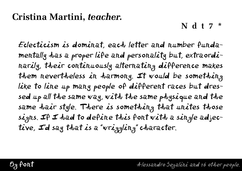
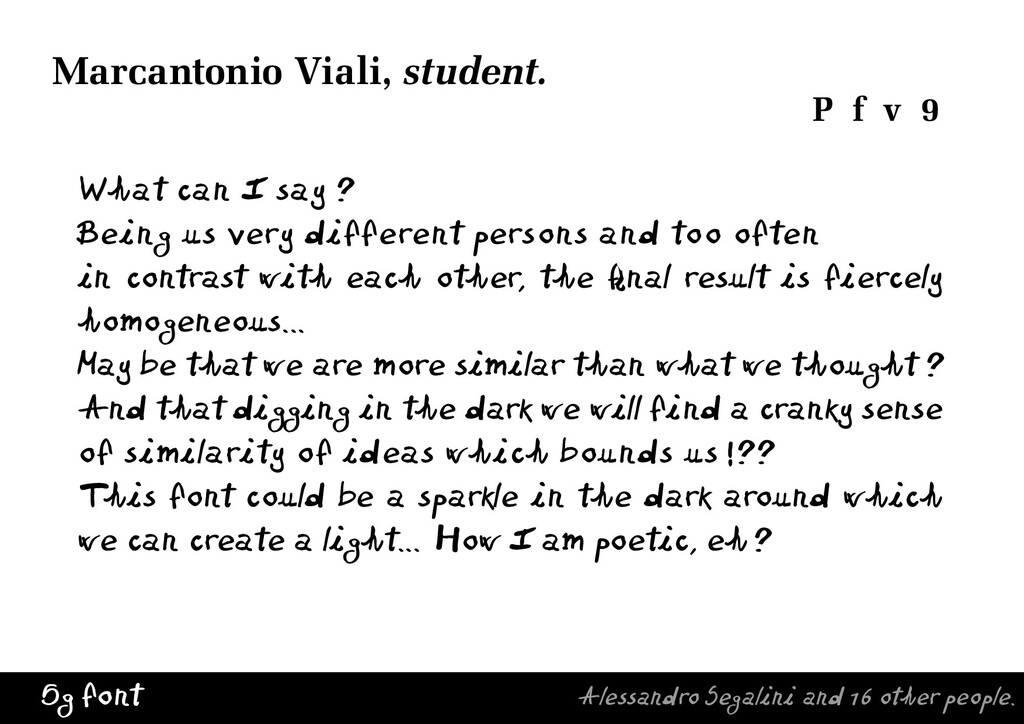
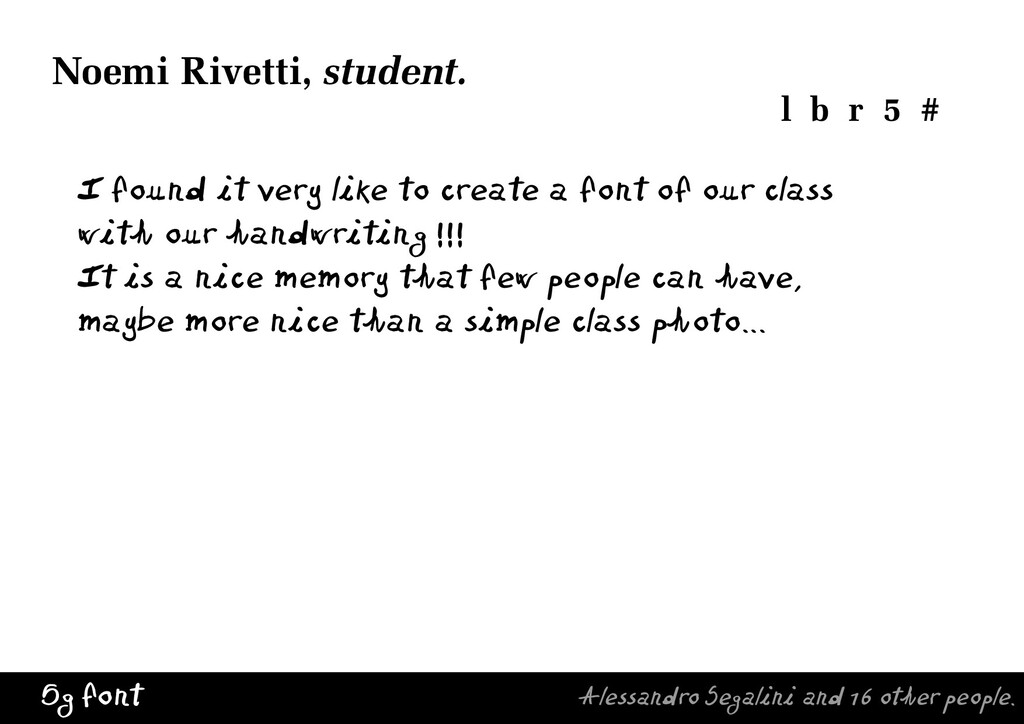
I saw in the students an unexpected interest and curiosity in how the font works — the possibility to ‘write’ with their class’ character. I asked them individually to write a short comment, a classroom memory of sort. “That was really interesting, because asking them to typeset a personal comment about how the font relates to the classmates, meant students ended up sharing things they hardly shared before” said Cristina Martini, the art teacher of the class. The font project was a social artifact.

https://vimeo.com/464382482

The participants were exposed, in an entertaining way, to the educational and architectural role of typography. The font was a real “memory object" for the students. In my opinion typography is about preservation, and it has the power to reach the essence of human communication. Teaching typography is therefore a responsibility for all educators, not only in art and design schools.

Alessandro Segalini

June 28, 2004
Tweet

More Decks by Alessandro Segalini

Other Decks in Education

Transcript

  1. 5g font Alessandro Segalini and 16 other people. this 5g

    was a class at the art school in Piacenza, Italy.
  2. 5g font Alessandro Segalini and 16 other people. I got

    the idea for a “memento font” so I chose the tool...
  3. 5g font Alessandro Segalini and 16 other people. Elisabetta Agosti

    A Q g w 0 Tania Baldrighi B R h x ( Noemi Bongiorni C S i ì y Lorenzo Castelnuovo D T j z ; Chiara Capelletti E U k & [ Micaela Cavallari F V l @ ” Elisa Dainese G W m — ’ Giacomo De Meo H X n 1 : Maddalena Mazza I Y o 2 ! Elena Montanari J Z p 3 ? Alberto Pastorenzi K a à q 4 Noemi Rivetti L b r 5 # Andrea Sbalbi M c s 6 / Marcantonio Viali P f v 9 € Stefania Vei O e é è u 8 Cristina Martini N d t 7 * «Are we spoiled by alphabetical order ?»
  4. 5g font Alessandro Segalini and 16 other people. 5g Regular

    abcdefghijklmnopqrstuvwxyz ABCDEFGHIJKLMNOPQRSTUVWXYZ á à ä å é è ë ì ï ó ò ö õ ù ü .,;:’”@£ & 1234567890 # [/]()—_<> «» !?+= 5g Slanted abcdefghijklmnopqrstuvwxyz ABCDEFGHIJKLMNOPQRSTUVWXYZ
  5. 5g font Alessandro Segalini and 16 other people. 5g Bold

    abcdefghijklmnopqrstuvwxyz ABCDEFGHIJKLMNOPQRSTUVWXYZ á à ä å é è ë ì ï ó ò ö õ ù ü .,;:’”@£ & 1234567890 # [/]()—_<> «» !?+= 5g Bold Slanted abcdefghijklmnopqrstuvwxyz ABCDEFGHIJKLMNOPQRSTUVWXYZ
  6. 5g font Alessandro Segalini and 16 other people. Eclecticism is

    dominat, each letter and number funda- mentally has a proper life and personality but, extraordi- narily, their continuously alternating difference makes them nevertheless in harmony. It would be something like to line up many people of different races but dres- sed up all the same way, with the same physique and the same hair style. There is something that unites those signs. If I had to define this font with a single adjec- tive, I’d say that is a “wriggling” character. Cristina Martini, teacher. N d t 7 *
  7. 5g font Alessandro Segalini and 16 other people. What can

    I say ? Being us very different persons and too often in contrast with each other, the final result is fiercely homogeneous... May be that we are more similar than what we thought ? And that digging in the dark we will find a cranky sense of similarity of ideas which bounds us !?? This font could be a sparkle in the dark around which we can create a light... How I am poetic, eh? Marcantonio Viali, student. P f v 9
  8. 5g font Alessandro Segalini and 16 other people. I found

    it very like to create a font of our class with our handwriting !!! It is a nice memory that few people can have, maybe more nice than a simple class photo... Noemi Rivetti, student. l b r 5 #
  9. 5g font Alessandro Segalini and 16 other people. 5g looks

    charming. I particularly like that the density in the caps is so uneven. This is something few people would dare to do. On the other hand, some of this could be the rasteri- zation, which is always amazingly defective at screen resolutions. Bill Troop.
  10. 5g font Alessandro Segalini and 16 other people. I don’t

    think of that as a font at all. We could maybe argue some observations about the didactics of the writing (if it is funny and useful to introduce in that way certain questions, etc.). But as a font, I can’t really say nothing. Giovanni Lussu.
  11. 5g font Alessandro Segalini and 16 other people. I like

    your font very much, my mother too. She used it in some christmans cards for an avangarde theatre from Katowice (Poland). Konstancja Satalecka.
  12. 5g font Alessandro Segalini and 16 other people. Yes, I

    see, different letters made by different people. Must have been hard to coordinate all that. The effect is “random”, a font written by a schizophrenic person, or a group of normal persons. Interesting. Luc Devroye.
  13. 5g font Alessandro Segalini and 16 other people. Definitely schizoid

    ! I am happy that the most earnest psychiatric pathology get its space they deserve in graphic design education. Luciano Perondi.
  14. 5g font Alessandro Segalini and 16 other people. It is

    great really ! The people’s handwritting should tell about their psichology - can you read behind the letters? And how you explain to students that to do - I mean how so many people can make one handwriting font which is look like one face? Masha Sumnina.
  15. 5g font Alessandro Segalini and 16 other people. Your project

    is very interesting. I could imagine that it could also inspire some student in Art Education department, those in the sixth floor here at TaiK. You know, the Taidekasvatuksen osasto. It is a case you showed to be possible to create and teach when knowing enough of fonts, right programs etc. Tapio Vapaasalo.
  16. 5g font Alessandro Segalini and 16 other people. Most of

    uppercases have a too strong weight. The horizontal bar of the A seems to be a little bit too large in order to be used with lowercases into a handwriting-like text. Other shapes are good to me. More over, this font is a good example of what should be a handwriting-like font for computers. Thierry Arsaut.
  17. 5g font Alessandro Segalini and 16 other people. Font is

    remarkable ! Perfectly ! Sure all the students appreciate it and want to use it. Yes, a font is beautiful ! I like, that it had such “colour” , pure quality of white and black. Vera Khlebnikova.
  18. Elisabetta Agosti A Q g w 0 Tania Baldrighi B

    R h x ( Noemi Bongiorni C S i ì y Lorenzo Castelnuovo D T j z ; Chiara Capelletti E U k & [ Micaela Cavallari F V l @ ” Elisa Dainese G W m — ’ Giacomo De Meo H X n 1 : Maddalena Mazza I Y o 2 ! Elena Montanari J Z p 3 ? Alberto Pastorenzi K a à q 4 Noemi Rivetti L b r 5 # Andrea Sbalbi M c s 6 / Cristina Martini N d t 7 * Stefania Vei O e é è u 8 Marcantonio Viali P f v 9 � Tania Baldrighi B R h x ( Lorenzo Castelnuovo D T j z ; Micaela Cavallari F V l @ ” Giacomo De Meo H X n 1 : Elena Montanari J Z p 3 ? Noemi Rivetti L b r 5 # Cristina Martini N d t 7 * Marcantonio Viali P f v 9 � 9 ABCDEFGHIJKLMNOPQRSTUVWXYZabcdefghijklmnopqrstuvwxyz1234567890.,:;!?-+#*&%$�"()/|\<>äöÖü 10 ABCDEFGHIJKLMNOPQRSTUVWXYZabcdefghijklmnopqrstuvwxyz1234567890.,:;!?-+#*&%$�"()/|\<>äöÖü 12 ABCDEFGHIJKLMNOPQRSTUVWXYZabcdefghijklmnopqrstuvwxyz1234567890.,:;!?-+#*&%$�"()/|\<>äöÖü 14 ABCDEFGHIJKLMNOPQRSTUVWXYZabcdefghijklmnopqrstuvwxyz1234567890.,:;!?-+#*& 18 ABCDEFGHIJKLMNOPQRSTUVWXYZabcdefghijklmnopqrstuvwxyz123 24 ABCDEFGHIJKLMNOPQRSTUVWXYZabcdefghijklm �������������������������� �������������������������� � � � � � � � � � � � � � � � �������� � ���������� � �������������������������� �������������������������� ���������� ��������� �������������������������� �������������������������� � � � � � � � � � � � � � � � �������� � ���������� � ��������� �� ���� ���������� ��������� �� ���� ���Slanted �������������������������� ��������������������������