Upgrade to Pro — share decks privately, control downloads, hide ads and more …

Design Systems (english) #Fluxible

Benno Loewenberg
September 21, 2017

Design Systems (english) #Fluxible

UI design becomes increasingly important for products and services. Influencing their users' expierence. UX itself determines the value of digital offerings and is their key differentiator. But "historically grown" incoherent interfaces deteriorate value and brand of products and services.

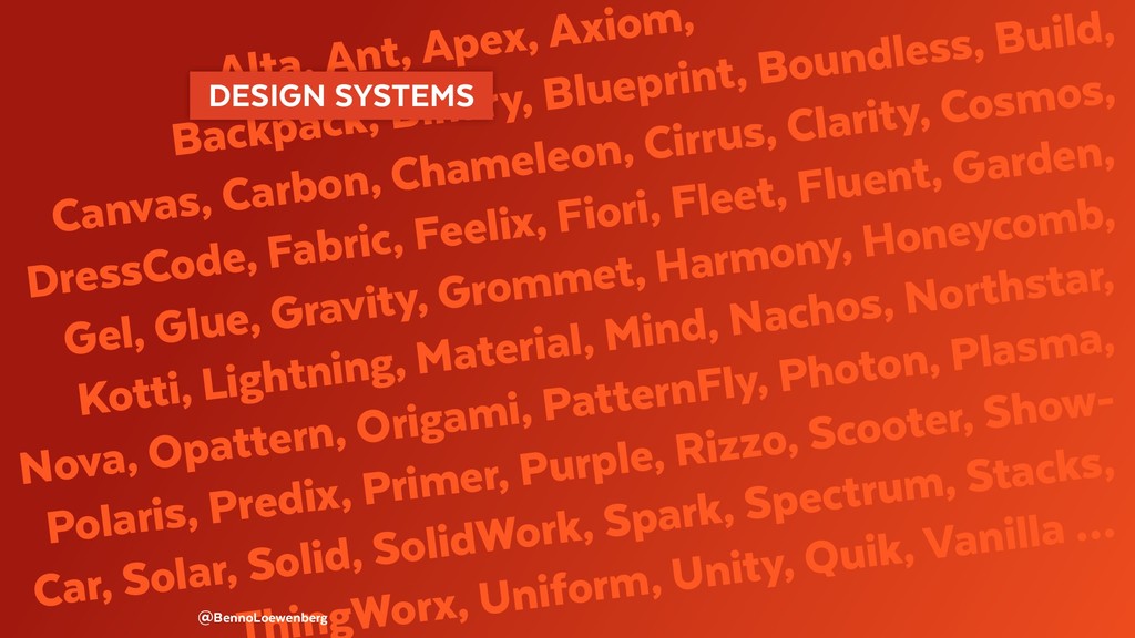
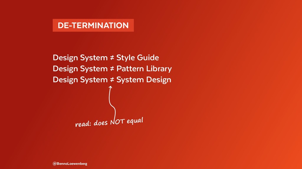
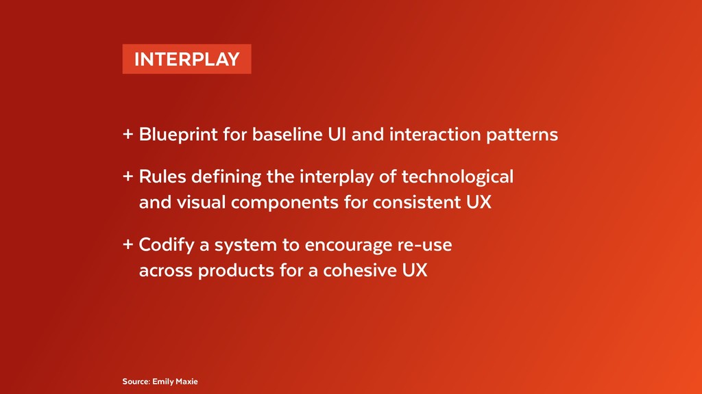
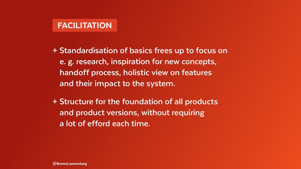
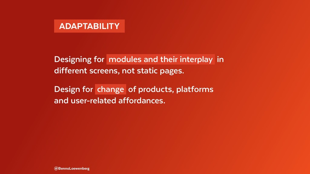
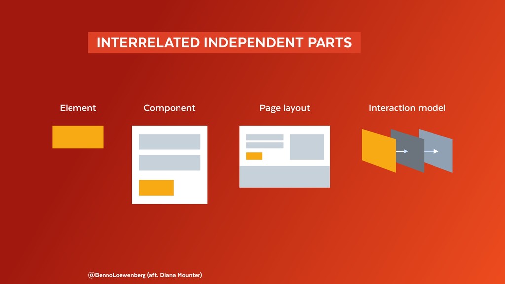
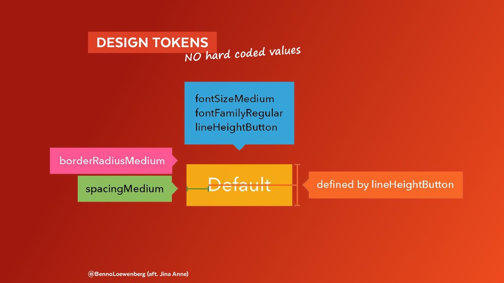
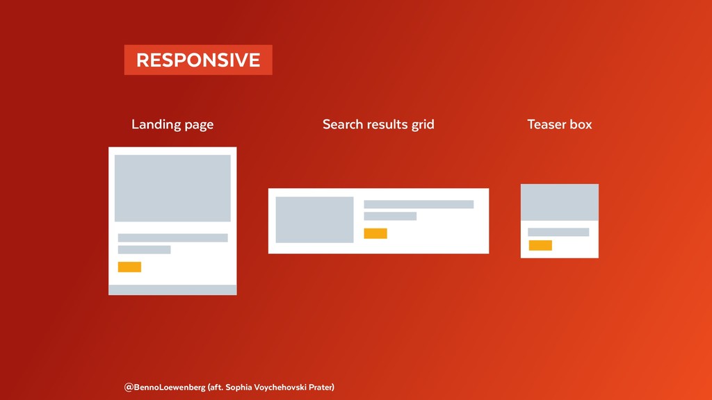
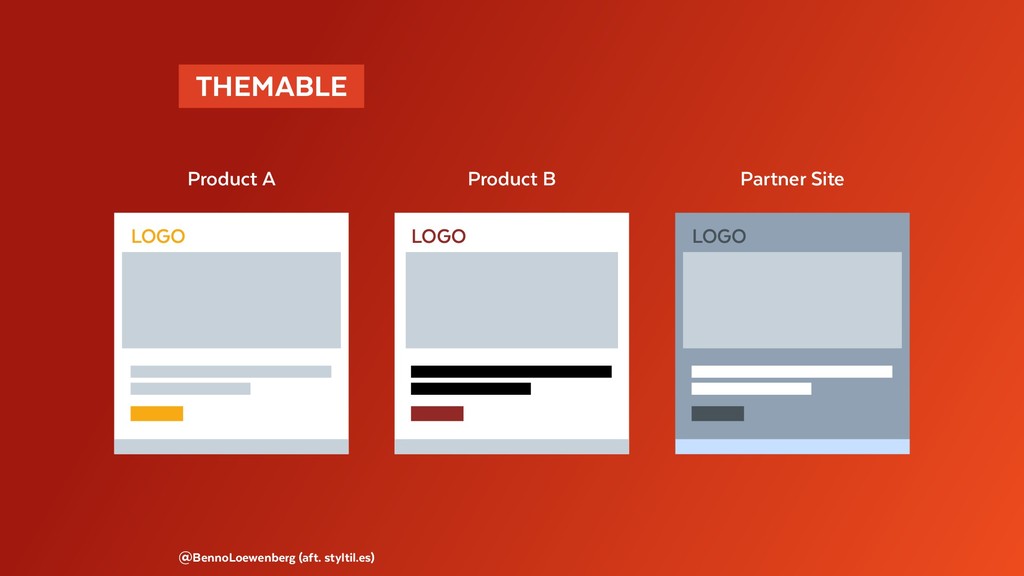
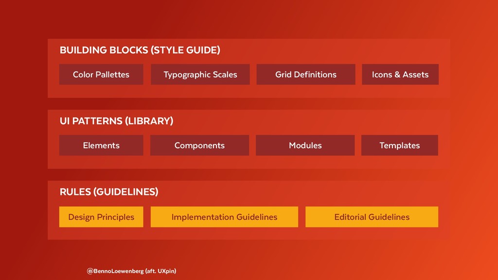
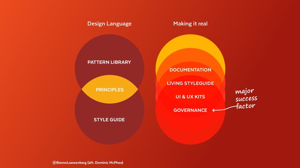
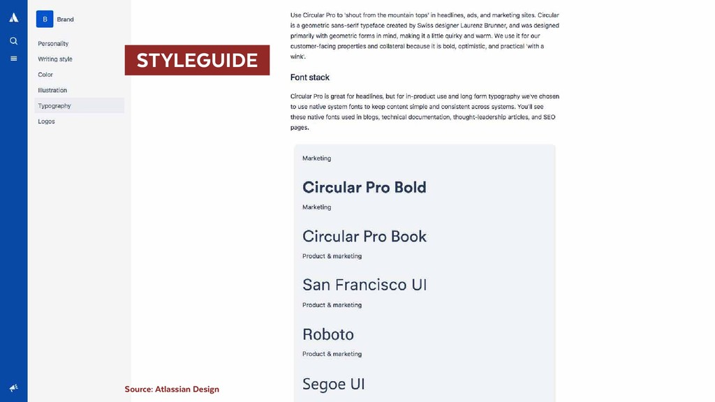
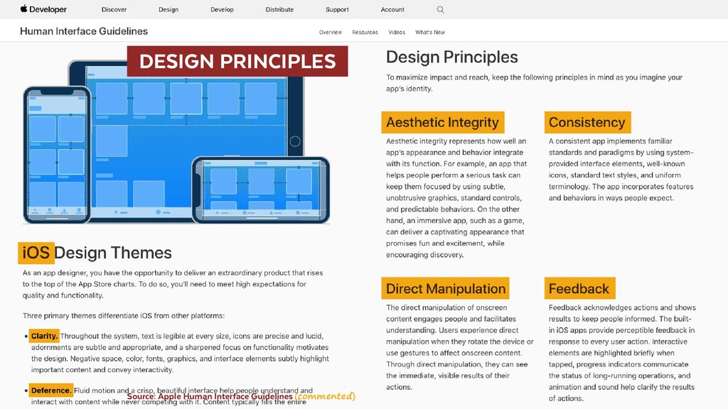
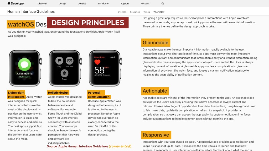
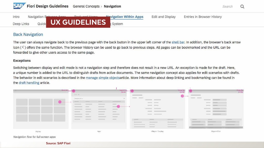
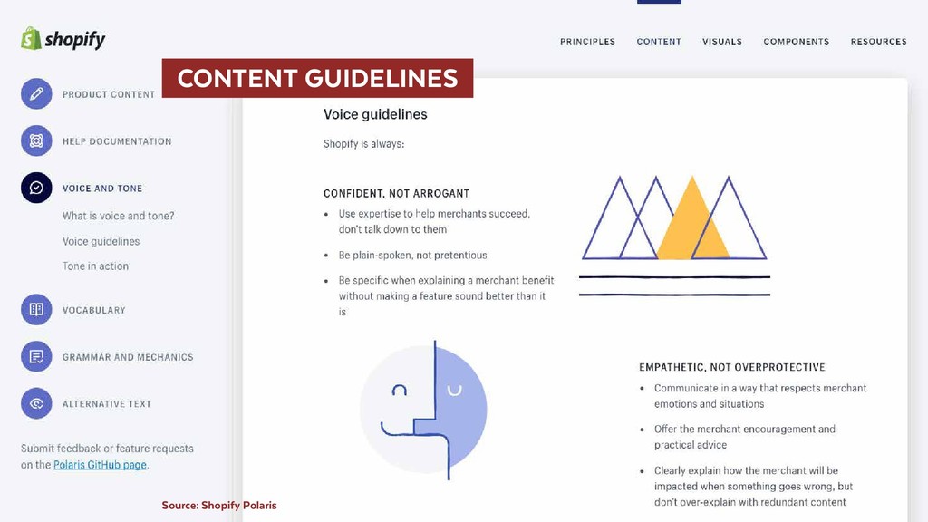
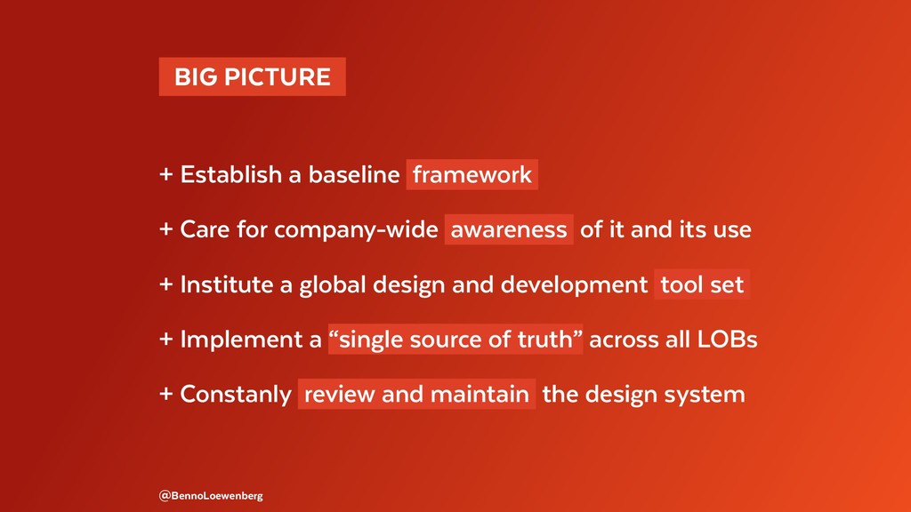
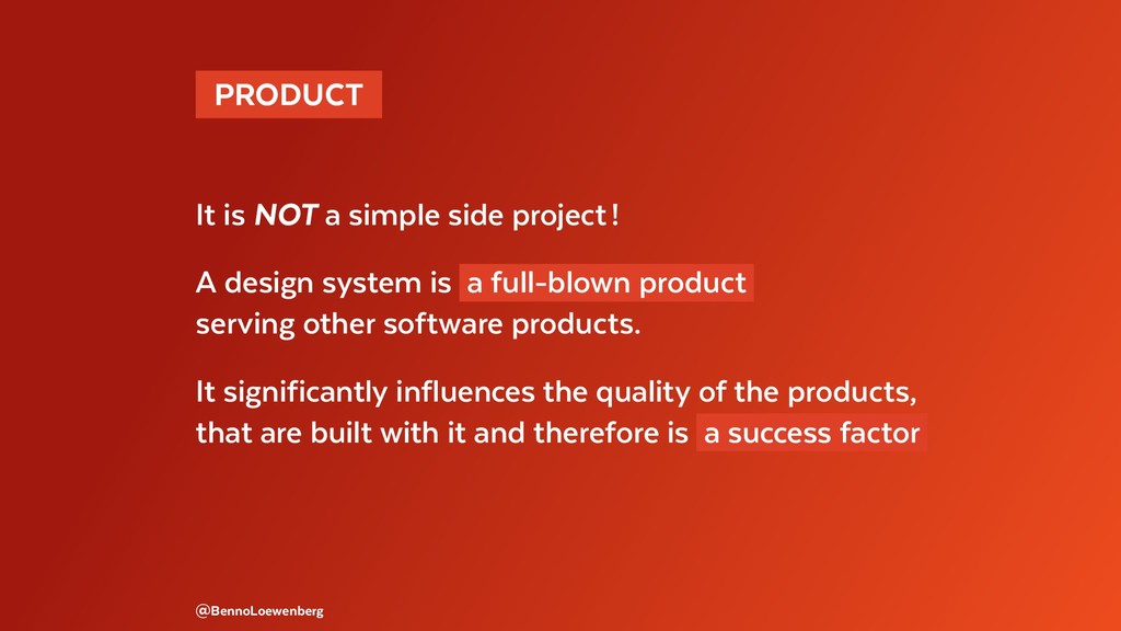
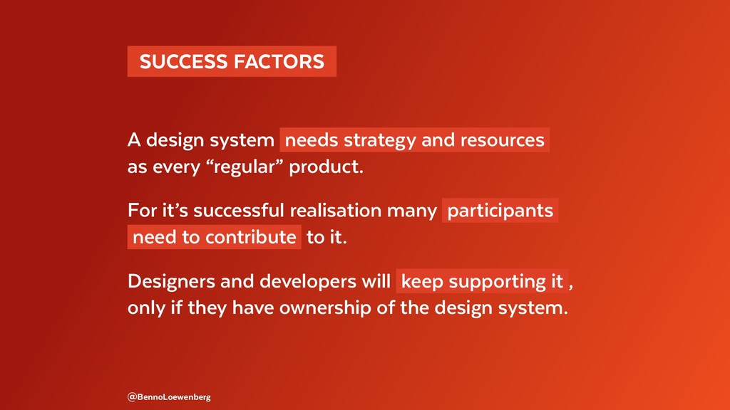
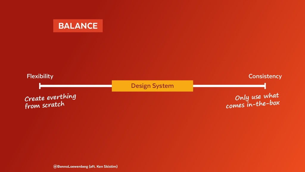
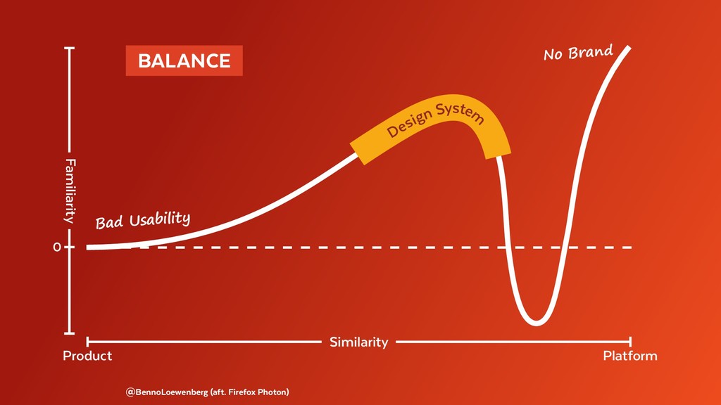
This talk is about design systems, that help to avoid (or overcome) design dept and to enable scaling UX across platforms, products and devices. Modularity and standardisation of repeatedly used aspects helps speeding up processes and increasing business value. Design systems help making user experience tangible to teams and brand values actionable.

#DesignSystems #DesignSystem #ProductDesign #DesignProcess #InteractionDesign #UserExperience #UX #UI #ModularDesign #AtomicDesign #PatternLibraries #PatternLibrary #StyleGuides #StyleGuide #Elements #Modules #Components

Benno Loewenberg

September 21, 2017
Tweet

More Decks by Benno Loewenberg

Other Decks in Business

Transcript

  1.   DESIGN SYSTEMS 
    FLUXIBLE, TORONTO
    SEPTEMBER 21, 2017
    @BENNOLOEWENBERG

    View Slide

  2. @BennoLoewenberg
     BUTTON 
    even “simple” things
    can become complicated

    View Slide

  3. Danger
    DANGER
    Danger
    Danger
    Positive Good
    Positive
    positive
    Source: Richard Saunders
    This Not this

    View Slide

  4. Source: Dominic McPhee

    View Slide

  5. Source: David Roessli
    website investors shop mobile app

    View Slide

  6.   DIVERSE CLUTTER 
    Source: open device lab Helsinki
    Products, Platforms, Devices

    View Slide

  7. “HISTORICALLY GROWN”
    @BennoLoewenberg
    Code, Tech, Design, Org

    View Slide

  8.   UX & DESIGN DEBT 
    – Lots of people and tools involved
    – Little-to-no testing (technical and UX)
    – Minimal-to-no documentation or specification
    – Disparate components across all lines of business
    @BennoLoewenberg

    View Slide

  9.   COSTLY CHAOS 
    – Time
    – Focus
    – Brand
    - Money
    – Engagement
    – Value and quality
    – Customer satisfaction
    @BennoLoewenberg

    View Slide

  10. @BennoLoewenberg
      UI-ELEMENTS DETERMINE 
      IF & HOW FUNCTIONS CAN BE USED 

    View Slide

  11.   EU SHOWER TAP 
    @BennoLoewenberg
    any amount of water
    at any temperature
    can be chosen …

    View Slide

  12.   US/CA SHOWER FAUCET 
    @BennoLoewenberg
    … easier to use,
    but limited set of choices
    (just a bit of hot water
    connot be selected)

    View Slide

  13.   MULTI-SCREEN & OMNI-CHANNEL 
    UI design becomes increasingly important
    for products and services.
    UX determines the value of digital offerings
    and is their key differentiator .
    @BennoLoewenberg

    View Slide

  14.  GOALS 
    + Design debt reduction (cohesive brand & UX)
    + More focus on UX & specialties (no redundancies)
    + Speeding up the processes (design, handover, code)
    + Increasing business value (maintainability, scalability)
    @BennoLoewenberg

    View Slide

  15. Alta, Ant, Apex, Axiom,
    Backpack, Binary, Blueprint, Boundless, Build,
    Canvas, Carbon, Chameleon, Cirrus, Clarity, Cosmos,
    DressCode, Fabric, Feelix, Fiori, Fleet, Fluent, Garden,
    Gel, Glue, Gravity, Grommet, Harmony, Honeycomb,
    Kotti, Lightning, Material, Mind, Nachos, Northstar,
    Nova, Opattern, Origami, PatternFly, Photon, Plasma,
    Polaris, Predix, Primer, Purple, Rizzo, Scooter, Show-
    Car, Solar, Solid, SolidWork, Spark, Spectrum, Stacks,
    ingWorx, Uniform, Unity, Quik, Vanilla …
    @BennoLoewenberg
      DESIGN SYSTEMS 

    View Slide

  16. @BennoLoewenberg
     DEFINITION 
      OF A DESIGN SYSTEM 

    View Slide

  17.  DE-TERMINATION 
    Design System ≠ Style Guide
    Design System ≠ Pattern Library
    Design System ≠ System Design
    @BennoLoewenberg
    read: does NOT equal

    View Slide

  18. Source: Nathan Curtis (commented)

    View Slide

  19.  INTERPLAY 
    + Blueprint for baseline UI and interaction patterns
    + Rules defining the interplay of technological
    and visual components for consistent UX
    + Codify a system to encourage re-use
    across products for a cohesive UX
    Source: Emily Maxie

    View Slide

  20.  FACILITATION 
    + Standardisation of basics frees up to focus on
    e. g. research, inspiration for new concepts,
    handoff process, holistic view on features
    and their impact to the system.
    + Structure for the foundation of all products
    and product versions, without requiring
    a lot of efford each time.
    @BennoLoewenberg

    View Slide

  21.  ANATOMY 
      OF MODULAR DESIGN 
    @BennoLoewenberg

    View Slide

  22. Source: Hidde de Vries (commented)
    Design system

    View Slide

  23.   INSTEAD OF FIXED LAYOUTS … 
    @BennoLoewenberg

    View Slide

  24.   … FLEXIBLY USABLE ELEMENTS 
    @BennoLoewenberg

    View Slide

  25. @BennoLoewenberg
     ADAPTABILITY 
    Designing for modules and their interplay in
    different screens, not static pages.
    Design for change of products, platforms
    and user-related affordances.

    View Slide

  26.   INTERRELATED INDEPENDENT PARTS 
    @BennoLoewenberg (aft. Diana Mounter)
    Element Component Page layout Interaction model

    View Slide

  27.   DESIGN TOKENS 
    @BennoLoewenberg (aft. Jina Anne)
    NO hard coded values

    View Slide

  28. @BennoLoewenberg (aft. Sophia Voychehovski Prater)
     RESPONSIVE 
    Teaser box
    Search results grid
    Landing page

    View Slide

  29. @BennoLoewenberg (aft. styltil.es)
     THEMABLE 
    LOGO LOGO
    LOGO
    Partner Site
    Product B
    Product A

    View Slide

  30. @BennoLoewenberg
     COMPOSITION 
      OF A DESIGN SYSTEM 

    View Slide

  31. SOME
    RESOURCES
    @BennoLoewenberg
    STYLE GUIDE &
    PATTERN LIB
      MANY “DESIGN SYSTEMS” 

    View Slide

  32. Source: Jeremy Keith

    View Slide

  33. @BennoLoewenberg
    most
    important
    HOW TO USE
    HOW TO USE HOW IT LOOKS
    & SOUNDS
    MADE TO USE

    View Slide

  34. @BennoLoewenberg
    most
    important
    HOW TO USE
    GUIDELINES STYLE &
    PATTERNS
    DES & DEV
    RESOURCES

    View Slide

  35. BUILDING BLOCKS (STYLE GUIDE)
    Color Pallettes Typographic Scales Grid Definitions Icons & Assets
    UI PATTERNS (LIBRARY)
    Elements Components Modules Templates
    RULES (GUIDELINES)
    Design Principles Implementation Guidelines Editorial Guidelines
    @BennoLoewenberg (aft. UXpin)

    View Slide

  36. @BennoLoewenberg (aft. Dominic McPhee)
    STYLE GUIDE
    PATTERN LIBRARY
    Design Language Making it real
    PRINCIPLES
    DOCUMENTATION
    LIVING STYLEGUIDE
    UI & UX KITS
    major
    success
    factor
    GOVERNANCE

    View Slide

  37. @BennoLoewenberg
     EXAMPLES 
      OF DESIGN SYSTEMS 

    View Slide

  38. @BennoLoewenberg
    HOW IT LOOKS

    View Slide

  39.  STYLEGUIDE 
    Source: Atlassian Design

    View Slide

  40.  STYLEGUIDE 
    Source: Atlassian Design

    View Slide

  41.   PATTERN LIBRARY 
    Source: IBM Carbon

    View Slide

  42.   PATTERN LIBRARY 
    Source: IBM Carbon

    View Slide

  43.   ANIMATION GUIDELINES 
    Source: Google Material Design

    View Slide

  44. Source: Google Material Design
      ANIMATION GUIDELINES 

    View Slide

  45. HOW TO USE
    @BennoLoewenberg
    HOW TO USE

    View Slide

  46.   DESIGN PRINCIPLES 
    Source: Apple Human Interface Guidelines (commented)

    View Slide

  47.   DESIGN PRINCIPLES 
    Source: Apple Human Interface Guidelines (commented)

    View Slide

  48. Source: SAP Fiori
      UX GUIDELINES 

    View Slide

  49. Source: SAP Fiori
      UX GUIDELINES 

    View Slide

  50. Source: Shopify Polaris
      CONTENT GUIDELINES 

    View Slide

  51. Source: Shopify Polaris
      CONTENT GUIDELINES 

    View Slide

  52. @BennoLoewenberg
    MADE TO USE

    View Slide

  53.   LIVING STYLEGUIDE 
    Source: Salesforce Lightning

    View Slide

  54.   LIVING STYLEGUIDE 
    Source: Salesforce Lightning

    View Slide

  55.   UI KITS 
    Source: Material Design Themer – Sketch Library

    View Slide

  56.   PROTOTYPING KITS 
    Source: SAP Fiori – Axure Widgets

    View Slide

  57. Source: Facebook Design – Sound Files
      MEDIA ASSET KITS 

    View Slide

  58. @BennoLoewenberg
     CREATING 
      A DESIGN SYSTEM 

    View Slide

  59.   BIG PICTURE 
    + Establish a baseline framework
    + Care for company-wide awareness of it and its use
    + Institute a global design and development tool set
    + Implement a “single source of truth” across all LOBs
    + Constanly review and maintain the design system
    @BennoLoewenberg

    View Slide

  60. Source: Nathan Curtis
      DEFINED WORKFLOW 

    View Slide

  61.  INITIATION 
    1. Element audit
    2. User research and features determination
    3. Object-repository identification
    4. Minimum viable design system
    5. Pilot project (reference design showcase)
    @BennoLoewenberg

    View Slide

  62.   AUDIT & REPOSITORY 
    Source: Design System Worksheet – Nathan Curtis

    View Slide

  63.   LITTLE STEPS 
    Start small
    core elements & assets everyone can understand & use
    Make it usable
    tokenize design options & showcase pages & elements
    Use it
    prioratize it, conduct design clinics, demos & audits
    to foster design & development convergence
    Source: Nathan Curtis

    View Slide

  64. @BennoLoewenberg
     ASPECTS 
      OF A DESIGN SYSTEM 

    View Slide

  65.  PRODUCT 
    It is NOT a simple side project !
    A design system is a full-blown product
    serving other software products.
    It significantly influences the quality of the products,
    that are built with it and therefore is a success factor
    @BennoLoewenberg

    View Slide

  66.   SUCCESS FACTORS 
    A design system needs strategy and resources
    as every “regular” product.
    For it’s successful realisation many participants
    need to contribute to it.
    Designers and developers will keep supporting it ,
    only if they have ownership of the design system.
    @BennoLoewenberg

    View Slide

  67.   NEVER DONE 
    It is NOT a one-off !
    To keep a design system alive, relevant,
    it constantly needs to be maintained .
    The bigger it grows, the shorter the cycles need to be
    for checking its affordances, quality and updating it .
    @BennoLoewenberg

    View Slide

  68. @BennoLoewenberg (aft. Ken Skistim)
     BALANCE 
    Flexibility Consistency
    Design System
    Create everthing
    from scratch
    Only use what
    comes in-the-box

    View Slide

  69. @BennoLoewenberg (aft. Firefox Photon)
     BALANCE 
    Similarity
    Platform
    Product
    Familiarity
    0
    Design System
    Bad Usability
    No Brand

    View Slide

  70.   SCALING UX 
    Design Systems are a way to make UX tangible
    to teams and to make brand values actionable .
    @BennoLoewenberg

    View Slide

  71.   BENNOLOEWENBERG 
     LINKEDIN / XING / TWITTER
     @
    Design Sprint

    View Slide