$30 off During Our Annual Pro Sale. View Details »

responsive_grids.pdf

Dan Denney
August 12, 2011

 responsive_grids.pdf

Dan Denney

August 12, 2011
Tweet

More Decks by Dan Denney

Other Decks in Design

Transcript

  1. and the browsers that hate them.

    View Slide

  2. How did we get here?

    View Slide

  3. View Slide

  4. View Slide

  5. Basic, fixed-width grid CSS
    .grid-1, .grid-2, .grid-3, .grid-4, .grid-5, .grid-6, .grid-7, .grid-8, .grid-9, .grid-10, .grid-11 {
    float: left;
    position: relative;
    margin-right: 20px;
    }
    .grid-1 { width: 77px; }
    .grid-2 { width: 174px; }
    .grid-3 { width: 271px; }
    .grid-4 { width: 368px; }
    .grid-5 { width: 465px; }
    .grid-6 { width: 562px; }
    .grid-7 { width: 659px; }
    .grid-8 { width: 756px; }
    .grid-9 { width: 853px; }
    .grid-10 { width: 950px; }
    .grid-11 { width: 1047px; }
    .grid-12 { width: 1144px; margin: 0px auto; }
    .first { clear: left; }
    .last { margin-right: 0px !important; }

    View Slide

  6. View Slide

  7. View Slide

  8. View Slide

  9. Okay, so Ethan was right.

    View Slide

  10. View Slide

  11. Our goal was to make ffGrid as flexible as possible.
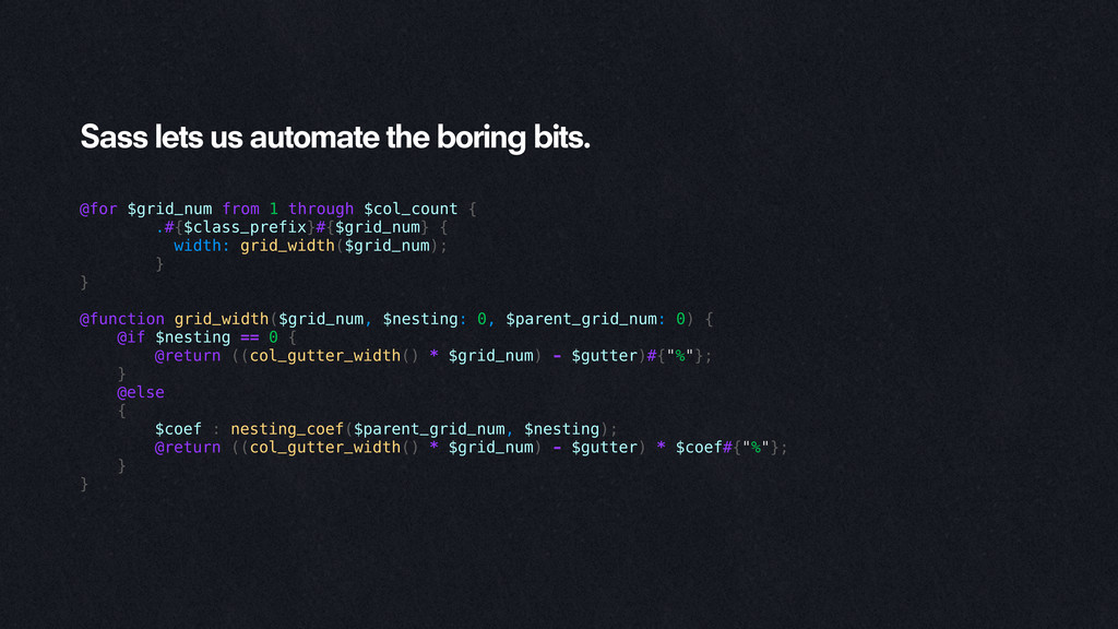
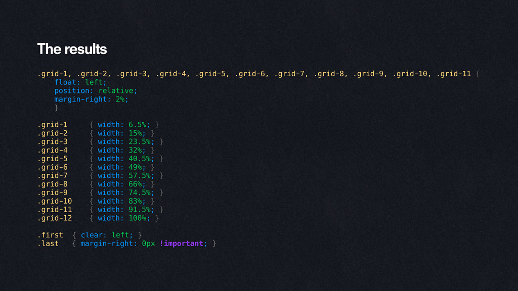
    $col_count: 12; // the total number of grid columns
    $gutter: 2; // gutter width, in %
    $nesting_level: 2; // number of levels of grid nesting
    $class_prefix: 'grid-'; // grid column class prefix
    // create push classes?
    $create_push: true;
    $push_prefix: 'push-'; // class prefix to append to push classes
    // create pull classes?
    $create_pull: true;
    $pull_prefix: 'pull-'; // class prefix to append to pull classes

    View Slide

  12. Sass lets us automate the boring bits.
    @for $grid_num from 1 through $col_count {
    .#{$class_prefix}#{$grid_num} {
    width: grid_width($grid_num);
    }
    }
    @function grid_width($grid_num, $nesting: 0, $parent_grid_num: 0) {
    @if $nesting == 0 {
    @return ((col_gutter_width() * $grid_num) - $gutter)#{"%"};
    }
    @else
    {
    $coef : nesting_coef($parent_grid_num, $nesting);
    @return ((col_gutter_width() * $grid_num) - $gutter) * $coef#{"%"};
    }
    }

    View Slide

  13. The results
    .grid-1, .grid-2, .grid-3, .grid-4, .grid-5, .grid-6, .grid-7, .grid-8, .grid-9, .grid-10, .grid-11 {
    float: left;
    position: relative;
    margin-right: 2%;
    }
    .grid-1 { width: 6.5%; }
    .grid-2 { width: 15%; }
    .grid-3 { width: 23.5%; }
    .grid-4 { width: 32%; }
    .grid-5 { width: 40.5%; }
    .grid-6 { width: 49%; }
    .grid-7 { width: 57.5%; }
    .grid-8 { width: 66%; }
    .grid-9 { width: 74.5%; }
    .grid-10 { width: 83%; }
    .grid-11 { width: 91.5%; }
    .grid-12 { width: 100%; }
    .first { clear: left; }
    .last { margin-right: 0px !important; }

    View Slide

  14. But then, WebKit was like
    SRY, NOPE.

    View Slide

  15. The problem is pixels.

    View Slide

  16. 25% 25% 25% 25%
    453px
    113.25px 113.25px 113.25px 113.25px

    View Slide

  17. Further reading on sub-pixel issues:
    http://bit.ly/badpx

    View Slide

  18. So we’re left with… Javascript?

    View Slide

  19. We need your help!

    View Slide

  20. ffGrid is on GitHub:
    http://github.com/jaredfager/ffGrid

    View Slide