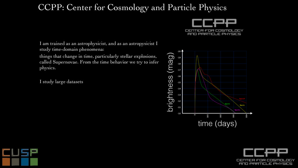
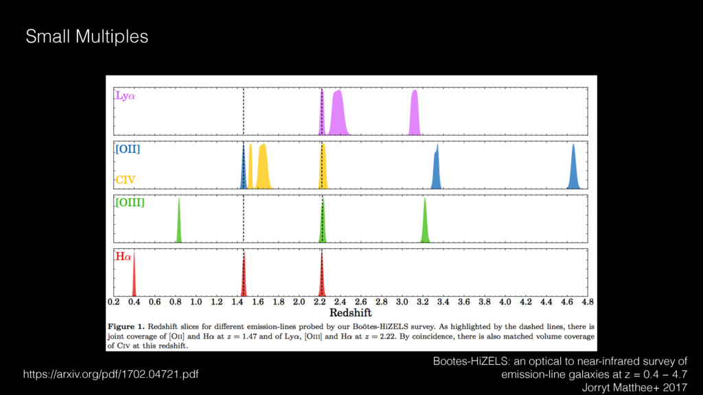
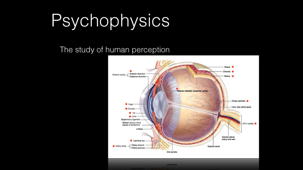
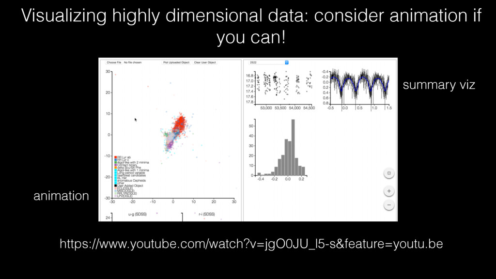
as an astrophysicist, and as an astropysicist I study time-domain phenomena: things that change in time, particularly stellar explosions, called Supernovae. From the time behavior we try to infer physics. I study large datasets CCPP: Center for Cosmology and Particle Physics time (days) brightness (mag)
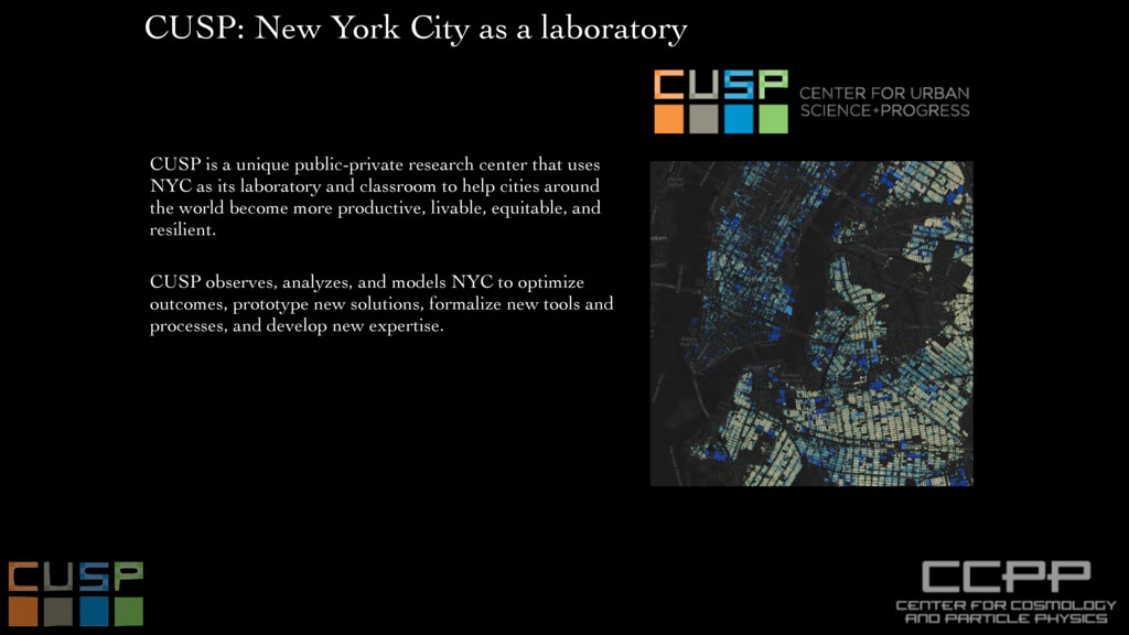
unique public-private research center that uses NYC as its laboratory and classroom to help cities around the world become more productive, livable, equitable, and resilient. CUSP observes, analyzes, and models NYC to optimize outcomes, prototype new solutions, formalize new tools and processes, and develop new expertise. CUSP: New York City as a laboratory
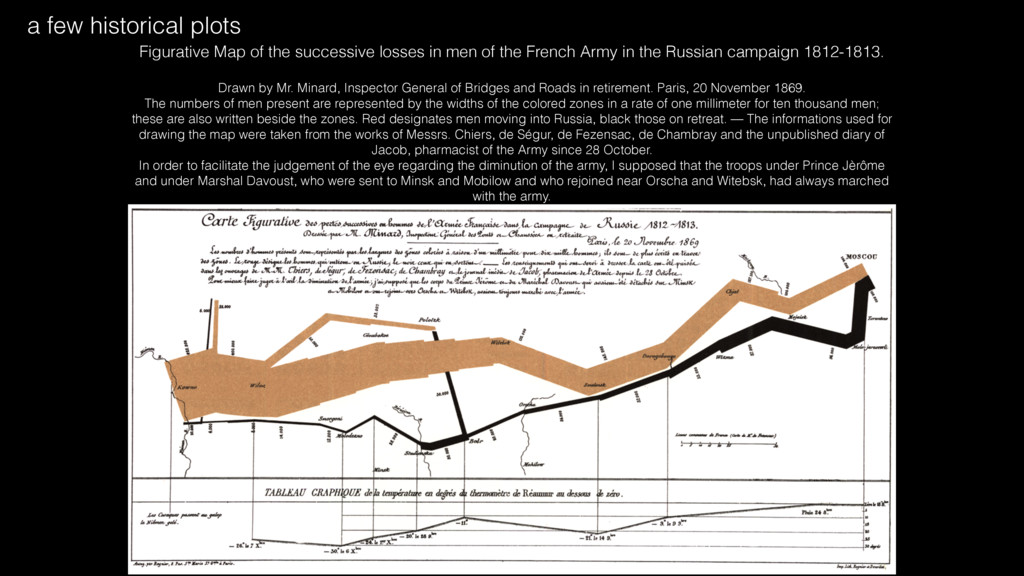
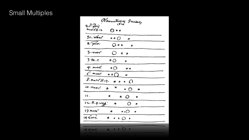
French Army in the Russian campaign 1812-1813. Drawn by Mr. Minard, Inspector General of Bridges and Roads in retirement. Paris, 20 November 1869. The numbers of men present are represented by the widths of the colored zones in a rate of one millimeter for ten thousand men; these are also written beside the zones. Red designates men moving into Russia, black those on retreat. — The informations used for drawing the map were taken from the works of Messrs. Chiers, de Ségur, de Fezensac, de Chambray and the unpublished diary of Jacob, pharmacist of the Army since 28 October. In order to facilitate the judgement of the eye regarding the diminution of the army, I supposed that the troops under Prince Jèrôme and under Marshal Davoust, who were sent to Minsk and Mobilow and who rejoined near Orscha and Witebsk, had always marched with the army. a few historical plots
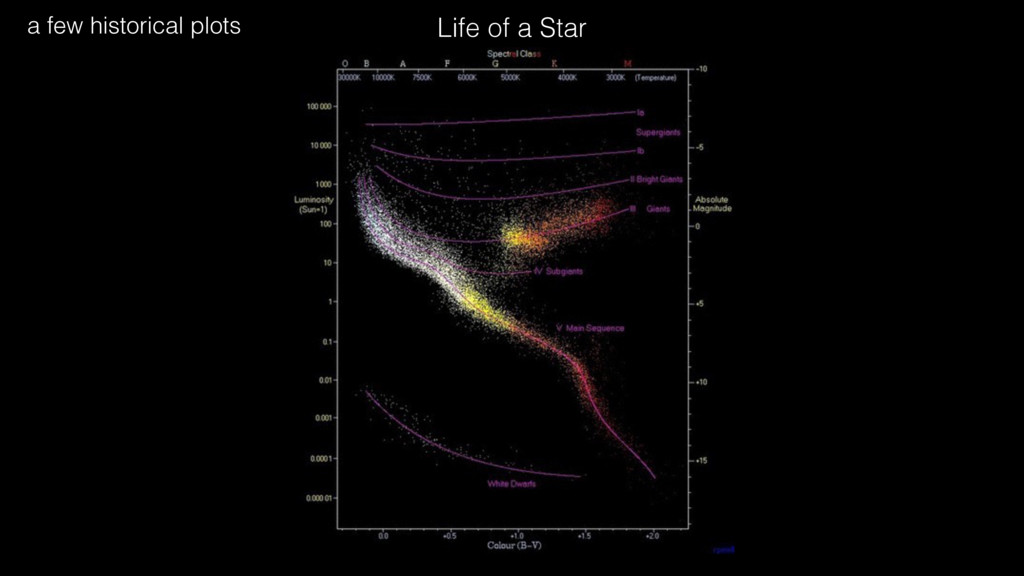
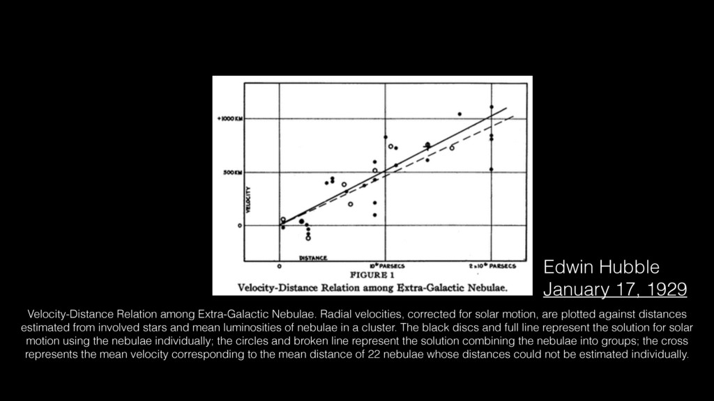
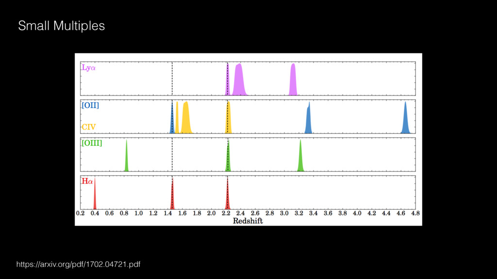
motion, are plotted against distances estimated from involved stars and mean luminosities of nebulae in a cluster. The black discs and full line represent the solution for solar motion using the nebulae individually; the circles and broken line represent the solution combining the nebulae into groups; the cross represents the mean velocity corresponding to the mean distance of 22 nebulae whose distances could not be estimated individually. Edwin Hubble January 17, 1929
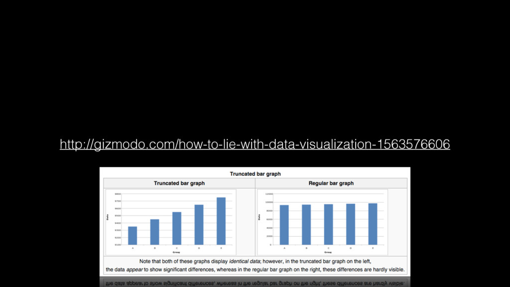
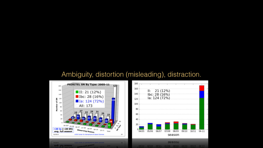
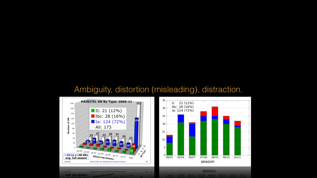
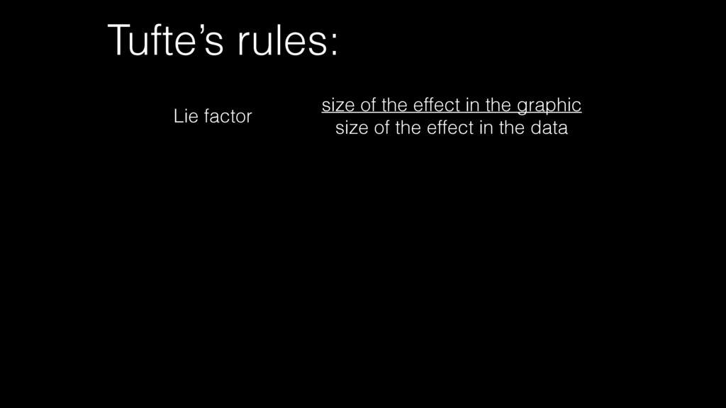
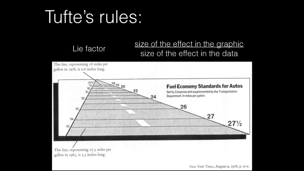
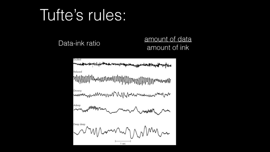
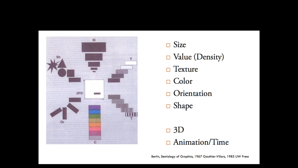
surface of the graph itself, should be directly proportional to the numerical quantities represented-effect size 2. Clear, detailed and thorough labeling should be used to defeat graphical distortion and ambiguity. Write out explanations of the data on the graph itself. Label important events in the data-data/ink Tufte’s rules:
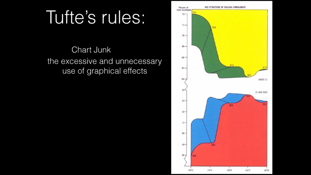
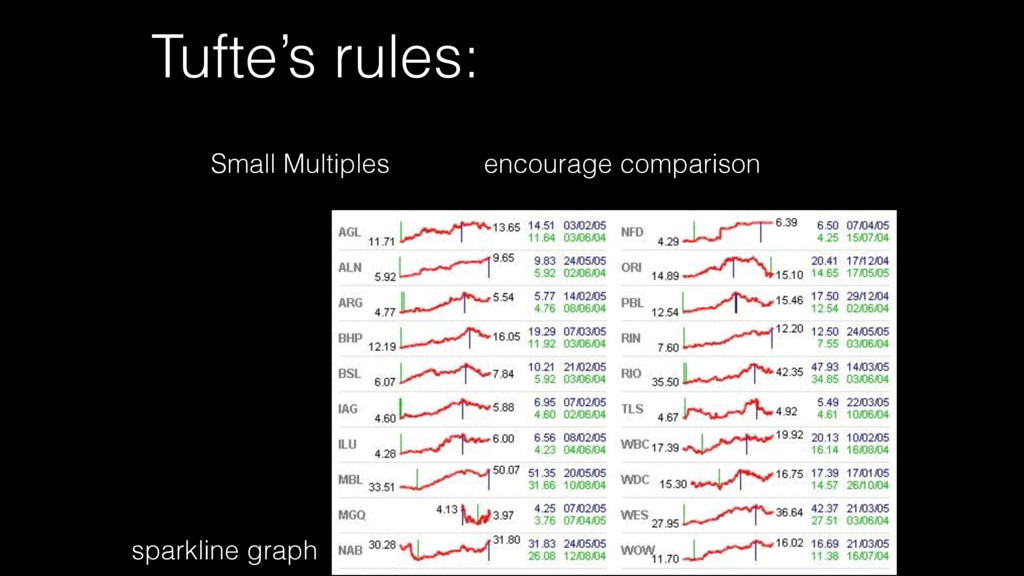
surface of the graph itself, should be directly proportional to the numerical quantities represented-effect size 2. Clear, detailed and thorough labeling should be used to defeat graphical distortion and ambiguity. Write out explanations of the data on the graph itself. Label important events in the data-data/ink 3. Show data variation, not design variation-chart junk Tufte’s rules:
surface of the graph itself, should be directly proportional to the numerical quantities represented-effect size 2. Clear, detailed and thorough labeling should be used to defeat graphical distortion and ambiguity. Write out explanations of the data on the graph itself. Label important events in the data-data/ink 3. Show data variation, not design variation-chart junk 4. In time-series displays of money, deflated and standardized units of monetary measurement are nearly always better than nominal units. Tufte’s rules:
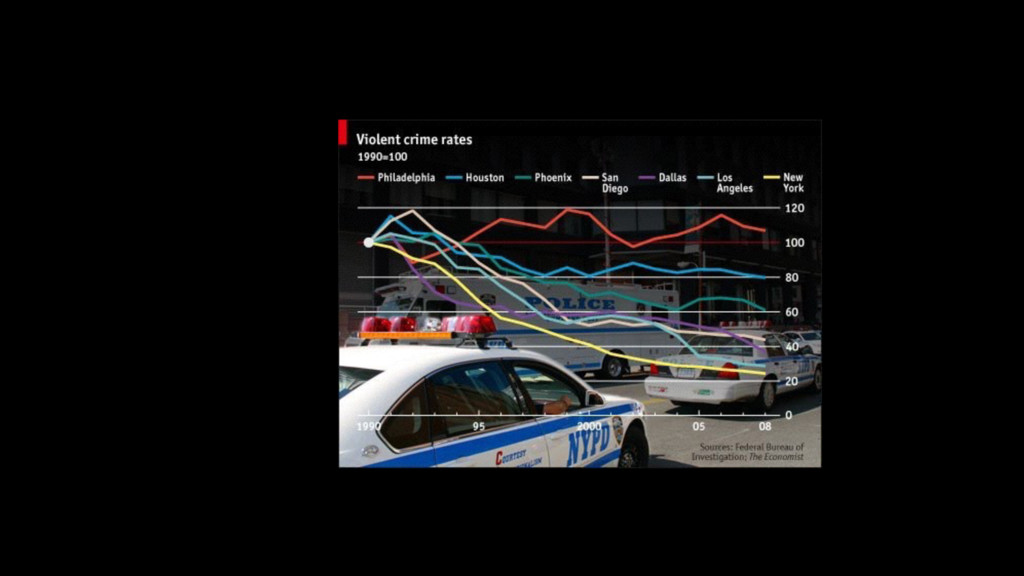
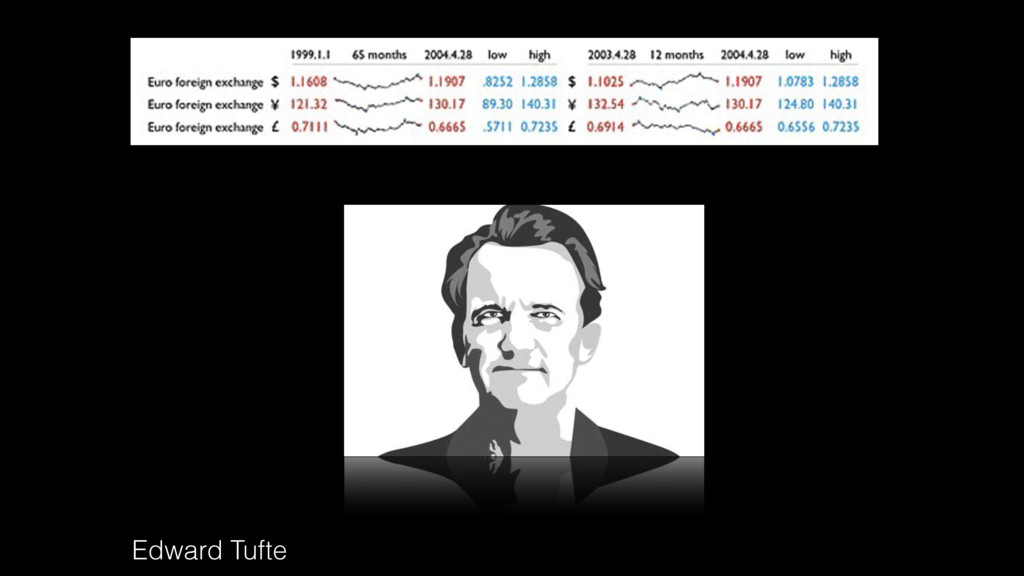
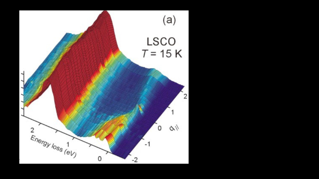
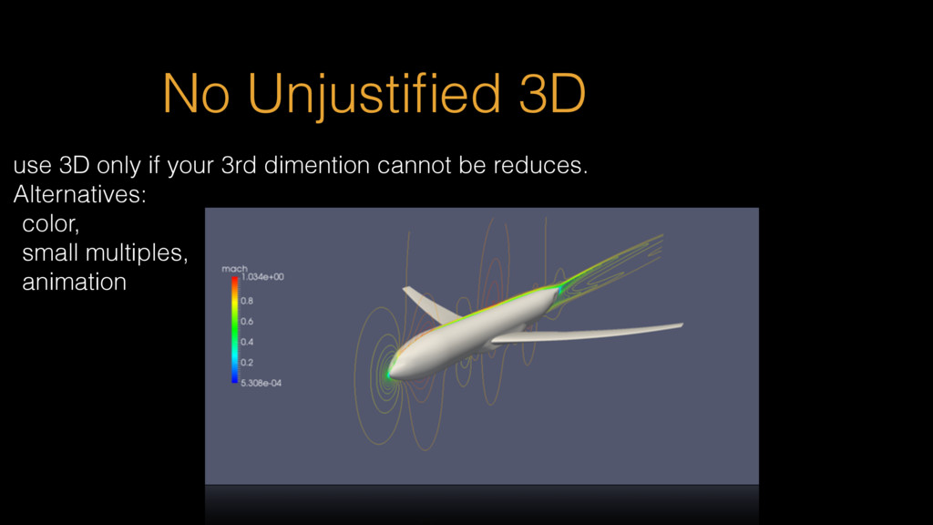
surface of the graph itself, should be directly proportional to the numerical quantities represented-effect size 2. Clear, detailed and thorough labeling should be used to defeat graphical distortion and ambiguity. Write out explanations of the data on the graph itself. Label important events in the data-data/ink 3. Show data variation, not design variation-chart junk 4. In time-series displays of money, deflated and standardized units of monetary measurement are nearly always better than nominal units. 5. The number of information carrying (variable) dimensions depicted should not exceed the number of dimensions in the data. Graphics must not quote data out of context. Tufte’s rules:
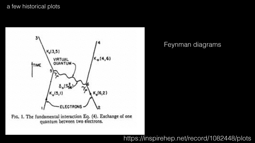
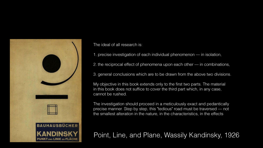
all research is: 1. precise investigation of each individual phenomenon — in isolation, 2. the reciprocal effect of phenomena upon each other — in combinations, 3. general conclusions which are to be drawn from the above two divisions. My objective in this book extends only to the first two parts. The material in this book does not suffice to cover the third part which, in any case, cannot be rushed. The investigation should proceed in a meticulously exact and pedantically precise manner. Step by step, this "tedious" road must be traversed — not the smallest alteration in the nature, in the characteristics, in the effects
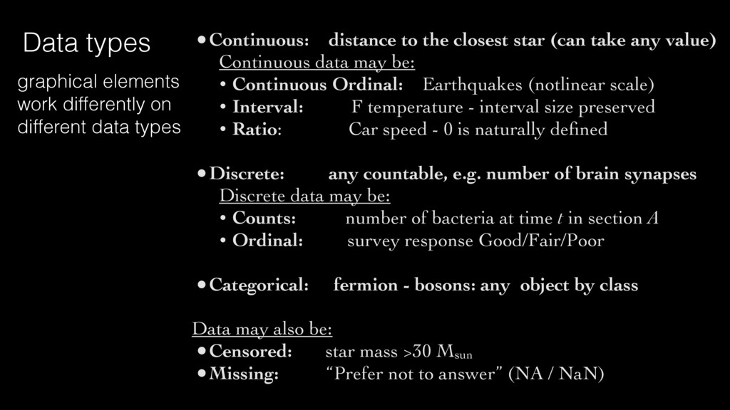
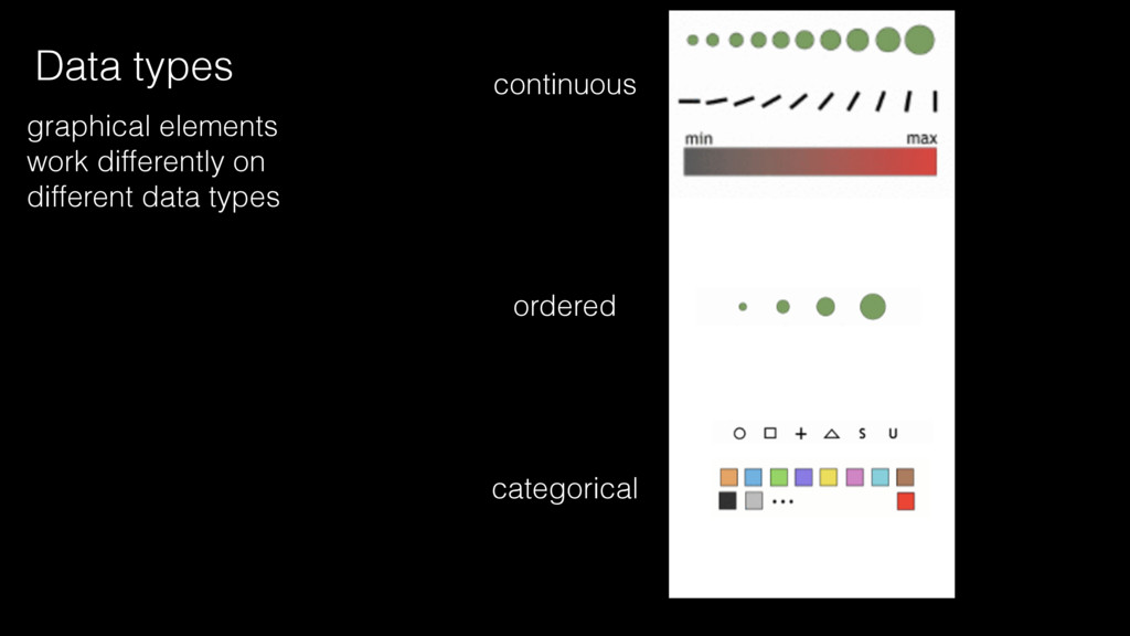
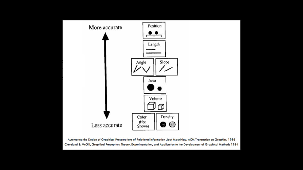
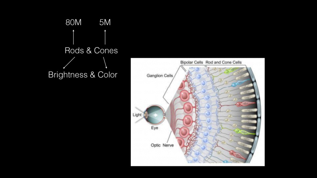
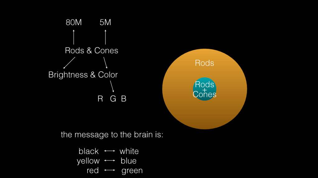
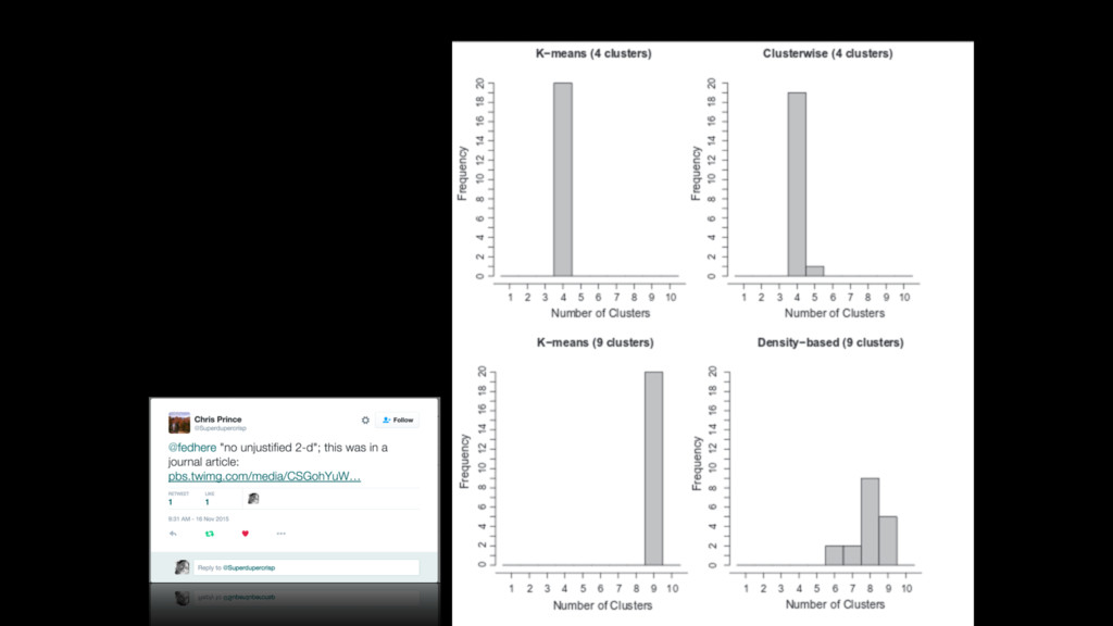
Continuous data may be: • Continuous Ordinal: Earthquakes (notlinear scale) • Interval: F temperature - interval size preserved • Ratio: Car speed - 0 is naturally defined •Discrete: any countable, e.g. number of brain synapses Discrete data may be: • Counts: number of bacteria at time t in section A • Ordinal: survey response Good/Fair/Poor •Categorical: fermion - bosons: any object by class Data may also be: •Censored: star mass >30 Msun •Missing: “Prefer not to answer” (NA / NaN) Data types graphical elements work differently on different data types
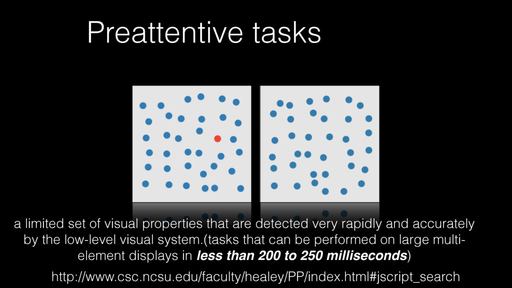
detected very rapidly and accurately by the low-level visual system.(tasks that can be performed on large multi- element displays in less than 200 to 250 milliseconds) http://www.csc.ncsu.edu/faculty/healey/PP/index.html#jscript_search
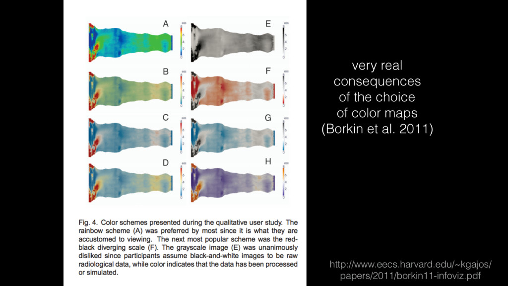
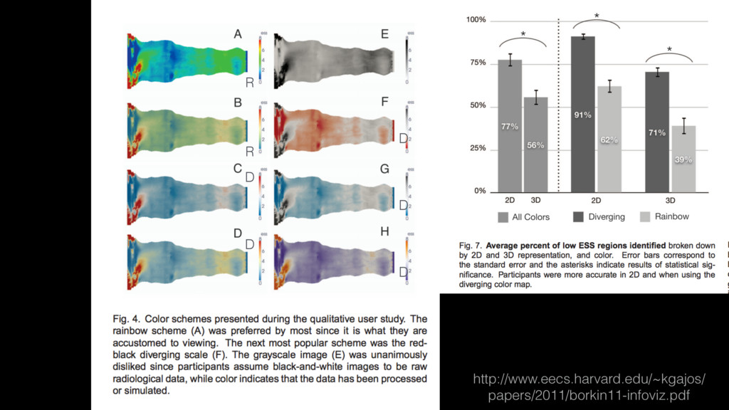
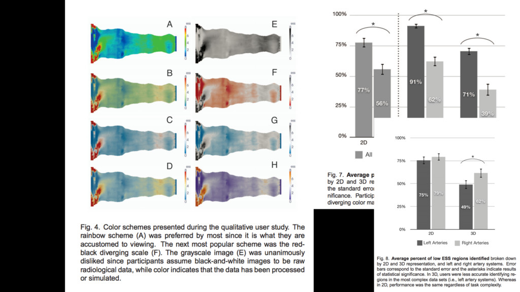
data there the center value is “special” (e.g. 0, with data ranging from positive to negative. In a diverging cm the center of the range is white or black 3) Choose a perceptually uniform color map for continuous data that does not have a focal point (a special point inside the range) 4) Choose a sequantial cm if your data range represents a progression (reflects some intentity property of the data
Bauhaus: Masters of the Persuasive Graphic http://blog.visual.ly/six-lessons-from-the-bauhaus-masters- of-the-persuasive-graphic/ 7 classical vis papers http://fellinlovewithdata.com/guides/7-classic- foundational-vis-papers Point, Line, and Plane, Wassily Kandinsky, 1926
![scientific visualizations dr. federica bianco [email protected] CUSP/CCPP @fedhere](https://files.speakerdeck.com/presentations/0da5a88036724f57a0bd0ed9849b7efc/slide_0.jpg)