including only data with X values less than the value grabbed from the user interface (expressed as input$plotrange) Model X by Y from our subset Create a scatterplot with Y as a function of X Draw a straight line based on the linear model (i.e. a “line of best fit”)
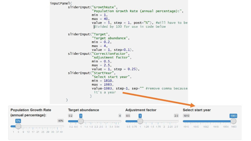
Project • Change layout, input type, and output. E.g. • Layout: Make it a flow layout, split layout, or vertical layout • Input: Instead of a slider, make it multiple choice, • Output: Advanced - Try another output style Let’s modify the above code
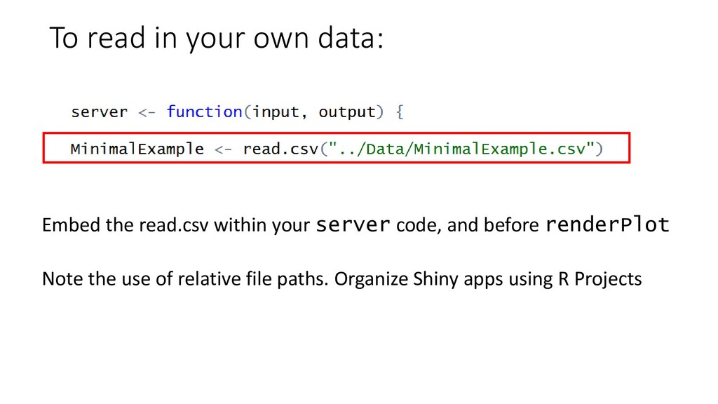
ui <- fluidPage( # Application title titlePanel("Minimal Example"), # Sidebar with a slider input for x range sidebarLayout( sidebarPanel( sliderInput("plotrange", "Maximum X value:", min = 1, max = 100, value = 50) ), # Create a plot for the XY data mainPanel( plotOutput("xyPlot") ) ) ) # Define server logic required to draw a scatterplot with a simple linear model server <- function(input, output) { library(tidyverse) MinimalExample <- read.csv("../Data/MinimalExample.csv") output$xyPlot <- renderPlot({ datasubset <- MinimalExample %>% filter(X <= input$plotrange) model <- lm(Y~X, data=datasubset) plot(Y~X, data=datasubset) abline(model) }) } # Run the application shinyApp(ui = ui, server = server) app.R ui.R server.R library(shiny) ui <- fluidPage( # Application title titlePanel("Minimal Example"), # Sidebar with a slider input for x range sidebarLayout( sidebarPanel( sliderInput("plotrange", "Maximum X value:", min = 1, max = 100, value = 50) ), # Create a plot for the XY data mainPanel( plotOutput("xyPlot") ) ) ) library(shiny) server <- function(input, output) { library(tidyverse) MinimalExample <- read.csv("../Data/MinimalExample.csv") output$xyPlot <- renderPlot({ datasubset <- MinimalExample %>% filter(X <= input$plotrange) model <- lm(Y~X, data=datasubset) plot(Y~X, data=datasubset) abline(model) }) } One-file: Two-file: Both methods are technically equivalent. Do whatever works for you
will recover in 3-5 years” “DFO is lying about how many cod there are” How can we visualize the recovery of cod, so we can have a more informed public debate about the issue?
cod, given exponential growth at a rate specified by the user: • “I think cod will recover at X% per year” show what this looks like (a curve) • Calculate how many years it will take for cod to grow beyond ‘critical’ abundance zone, given the user’s assumed growth rate • Allow the user to ‘correct’ for DFO’s “errors” – i.e. if you think there are TWICE as many fish in the sea as DFO says, let them put that into the model • Allow the user to set a custom recovery target (how many cod do we WANT there to be?) • Show this recovery in historical context (how many cod will there be vs, 100 years ago?) • Be transparent with all assumptions (i.e. extensive documentation)
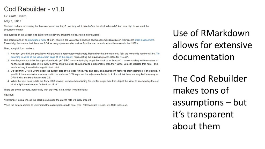
also interactive plots-literate • Any model, plot, etc. can be an interactive plot. If you are inputting data, you can get the user to input data instead – and then you have an interactive plot • This is incredibly powerful. • E.g. Cod rebuilder – don’t take MY word for it, play with the stock YOURSELF. What conditions do you have to meet to rebuild cod in 3-4 years. Do YOU think they’re realistic? Interactive plots allow for such experimentation • E.g. Stock assessment. I used an exponential growth model. There’s zero reason you couldn’t use a proper stock assessment model in this way. • Consider how your own data could be expressed as interactive plots
and cleaning data from a database • Data Policy – including data management plans • How to make figures of all kinds, ranging from the most basic to fairly complex, and making them publication- quality • How to save your data and scripts for future reference •You are now ready to do stats in R!