 SiteGround - Reliable hosting with speed, security, and support you can count on.
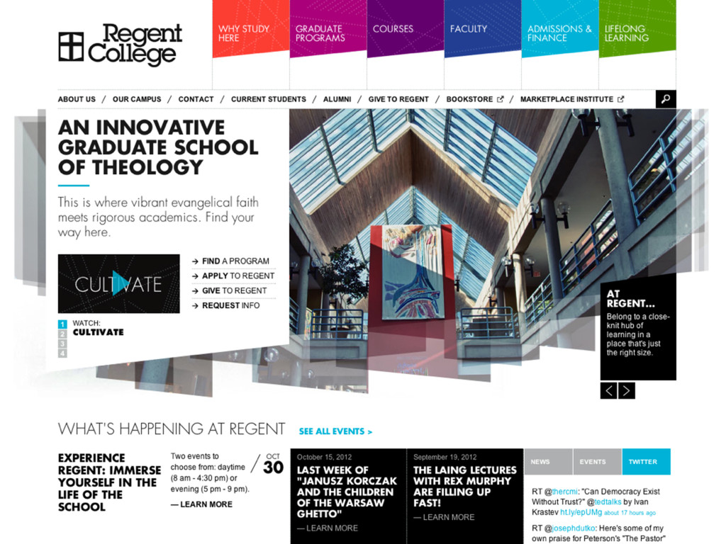
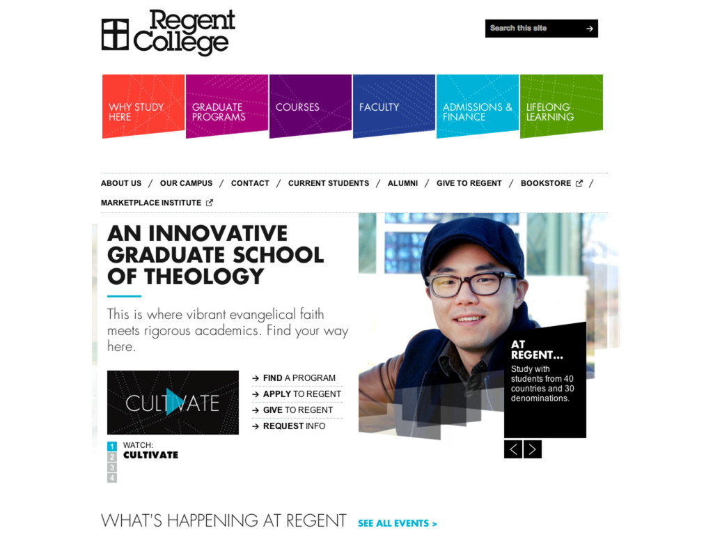
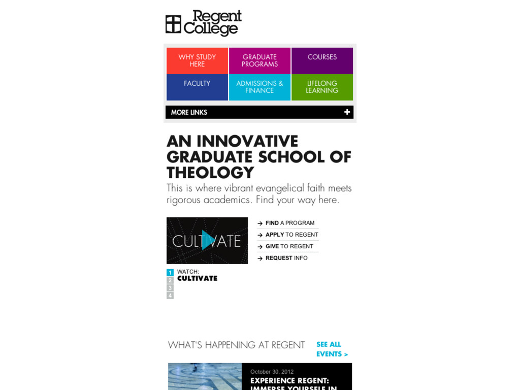
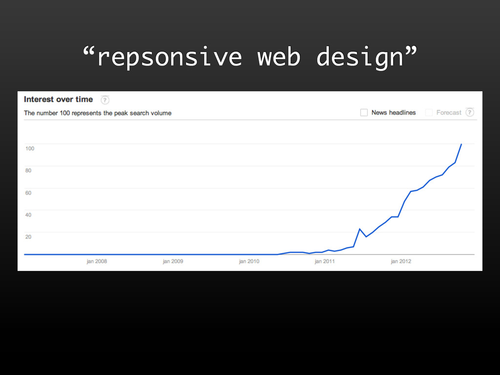
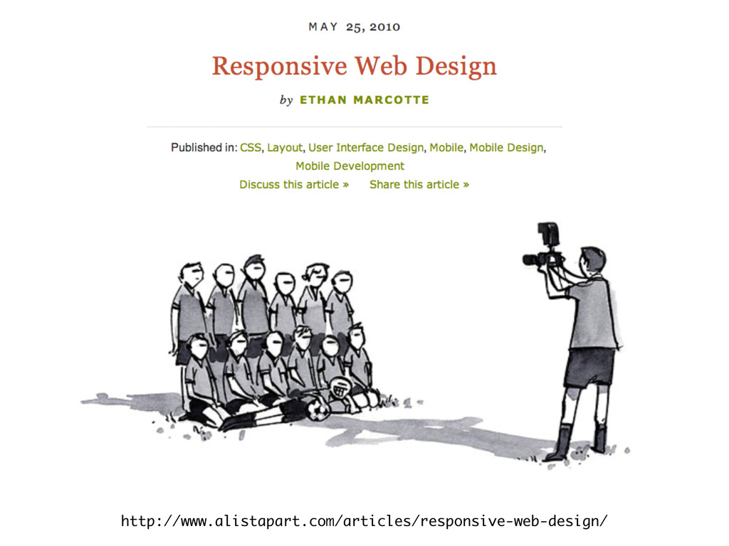
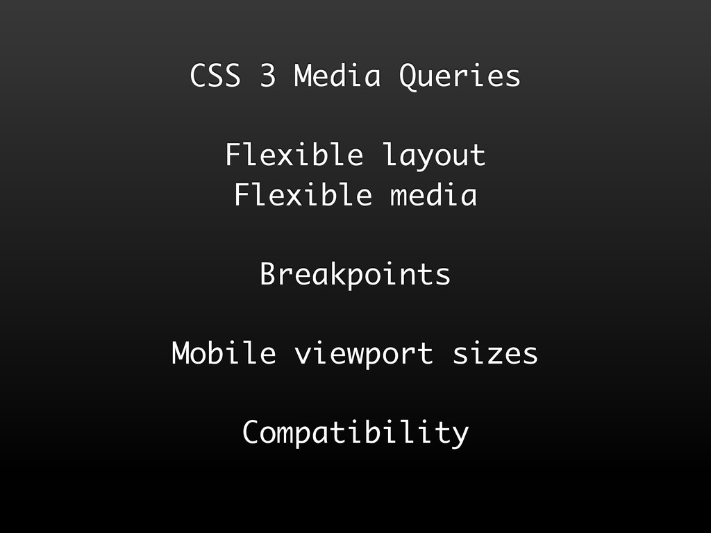
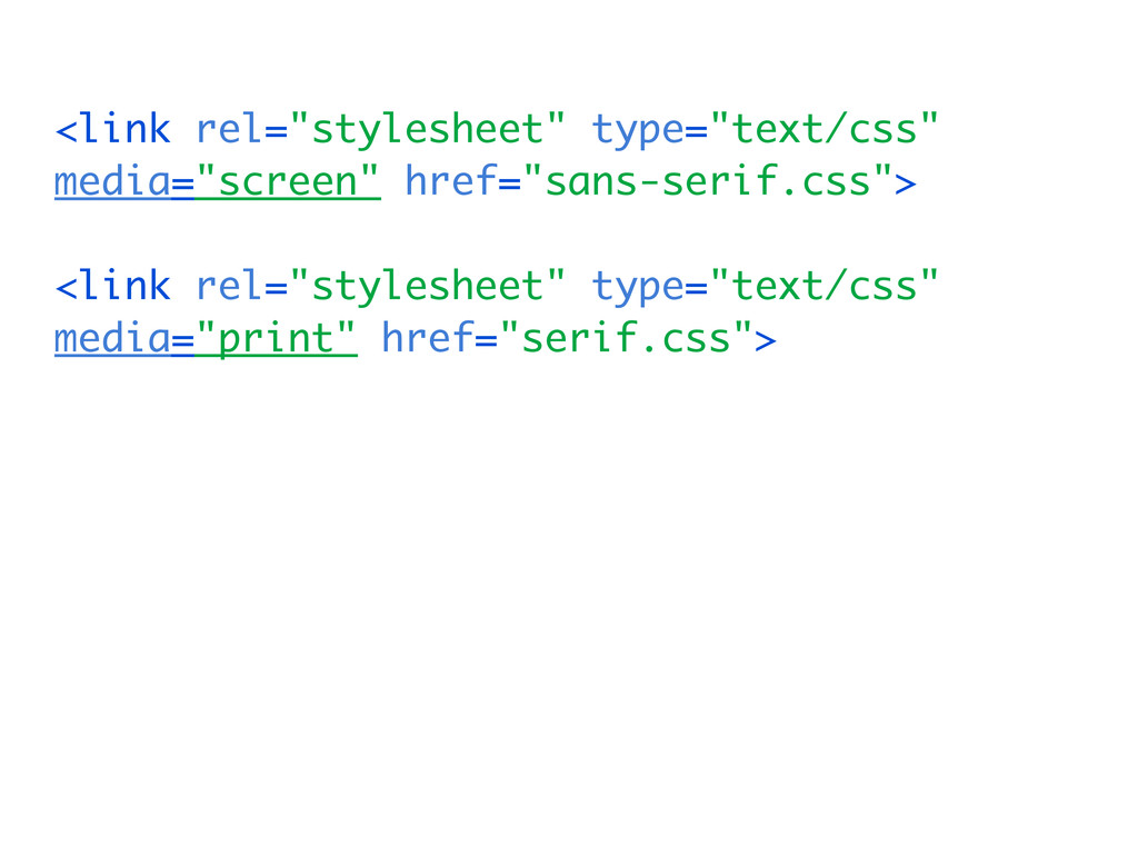
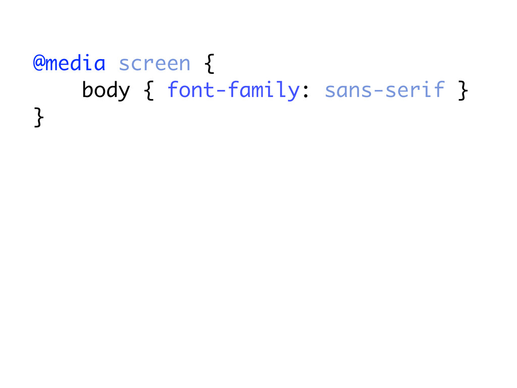
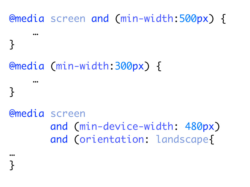
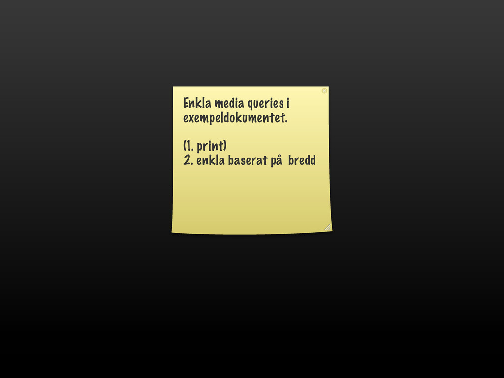
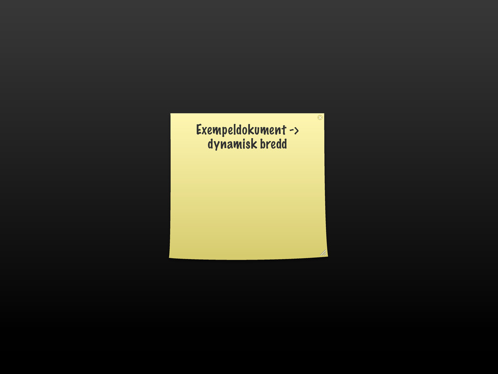
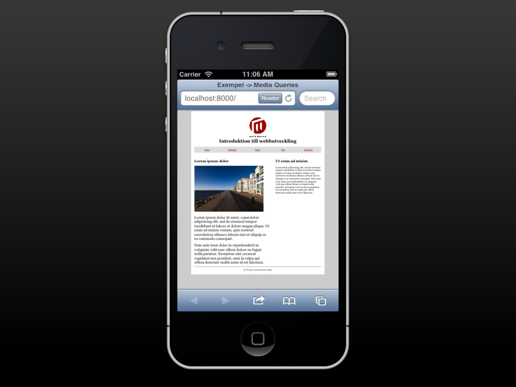
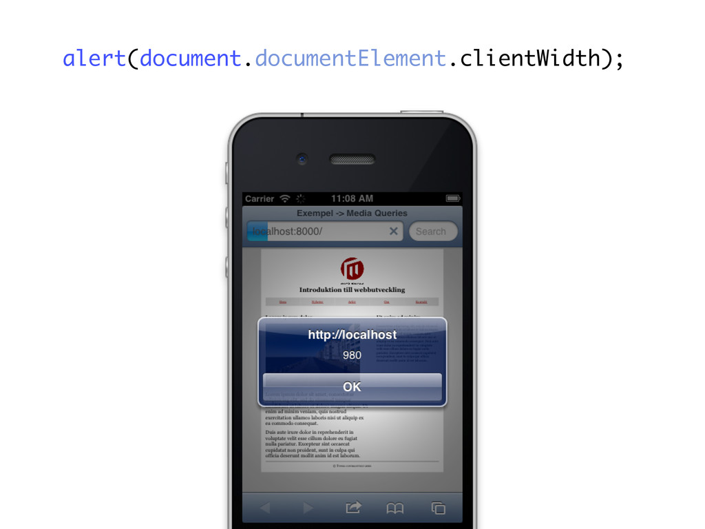
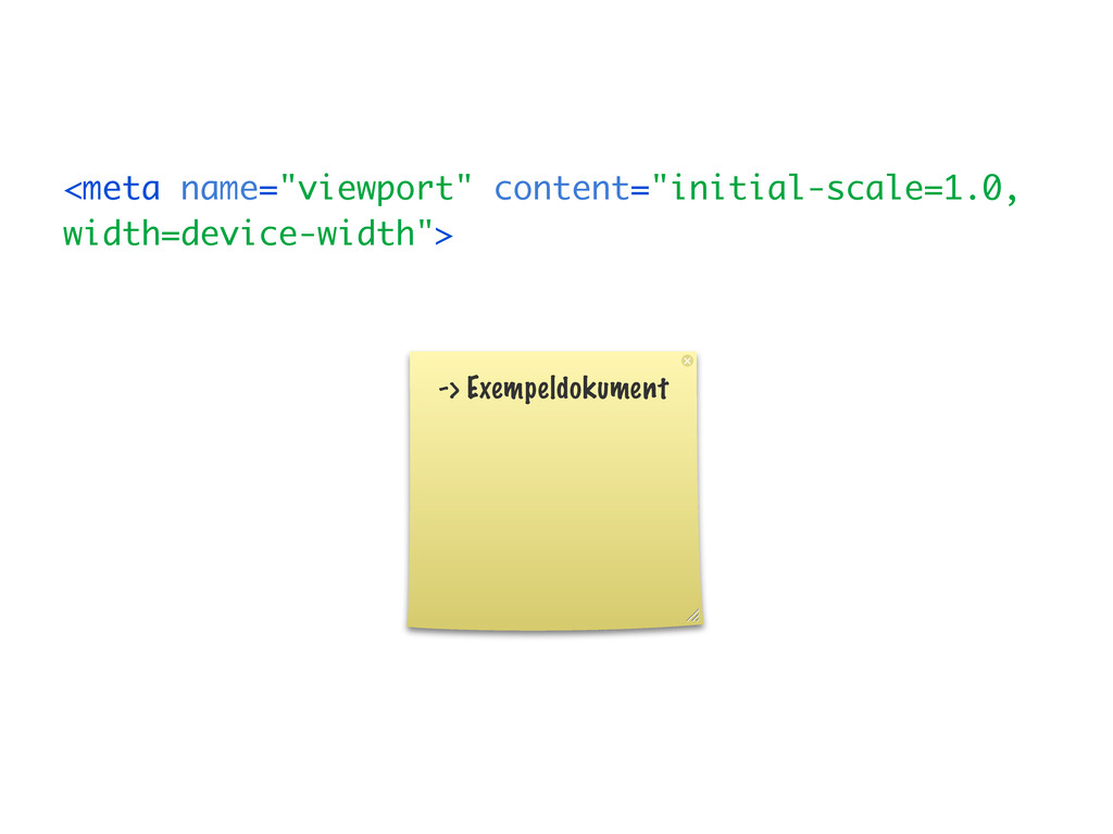
On Media Queries and Responsive Design. For the Swedish university course Introduction to Web Development: .
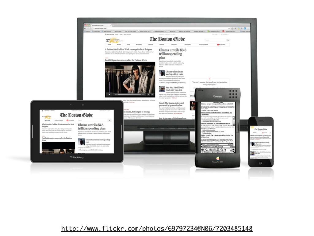
(Published under a Creative Commons BY license.)
 fohlin
 yukiogawa
 kaym
kaym
 oracle4engineer
 rryz09
 sakajunquality
 moznion
 cscengineer
 kakehashi
 hiroyaonoe
 chmikata
 smt7174
 bto
bto
 mkilby
 jnunemaker
 stuffmc
 ipullrank
 aleyda
 brettharned
 soudai
 addyosmani
 sabderemane
 tmiket
 gurzu
gurzu
 codingconduct