Upgrade to Pro — share decks privately, control downloads, hide ads and more …

To inform or confuse with tables and figures: the EJCTS experience

Graeme Hickey
October 08, 2017

To inform or confuse with tables and figures: the EJCTS experience

Presented at the 31st EACTS Annual Meeting | Vienna 7-11 October 2017

Graeme Hickey

October 08, 2017
Tweet

More Decks by Graeme Hickey

Other Decks in Research

Transcript

  1. To inform or confuse with tables and
    figures: the EJCTS experience
    Graeme L. Hickey
    University of Liverpool
    Inform
    Confuse
    @graemeleehickey
    www.glhickey.com

    View Slide

  2. Conflicts of interest
    • None
    • Assistant Editor (Statistical Consultant) for EJCTS and ICVTS

    View Slide

  3. Summarizing data
    • Very small number of statistics – report in-line
    • E.g. “The in-hospital mortality was 10% (n = 20)”
    • Many unrelated statistics (e.g. different patient characteristics) or
    displaying fine-level detail – report in tabular format
    • Many related statistics (e.g. biomarker values over time) or data to
    complex for modelling – report in graphical format

    View Slide

  4. Figures as the natural presentation tool
    Flowcharts Forest plots
    Source: Benchimol et al. PLoS Med 2015; 12(10): e1001885. Source: http://uk.cochrane.org/news/how-read-forest-plot

    View Slide

  5. Tables as the natural presentation tool
    Source: Hickey GL et 
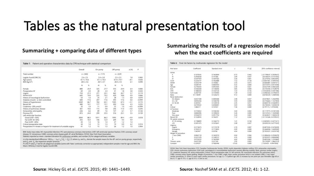
al. EJCTS. 2015; 49: 1441–1449. Source: Nashef SAM et al. EJCTS. 2012; 41: 1-12.
    Summarizing + comparing data of different types
    Summarizing the results of a regression model
    when the exact coefficients are required

    View Slide

  6. Figures or tables
    Δ (%): before
    PS matching
    Δ (%): after
    PS matching
    Age (years) 42.1 -11.0
    Men -4.3 -3.2
    White 30.0 -0.2
    Hypertension 0.0 2.3
    Diabetes mellitus -10.0 5.7
    Dyslipidemia 1.7 0.0
    + extra columns
    + figure
    Source: Bangalore et al. Circulation. 2010; 122: 1091-1100
    ?
    But avoid repetition/duplication

    View Slide

  7. Don’t trust summary statistics alone
    Source: Matejka & Fitzmaurice (2017) https://www.autodeskresearch.com/publications/samestats
    http://dx.doi.org/10.1145/3025453.3025912

    View Slide

  8. Show all the data
    We will ask authors, where possible, 
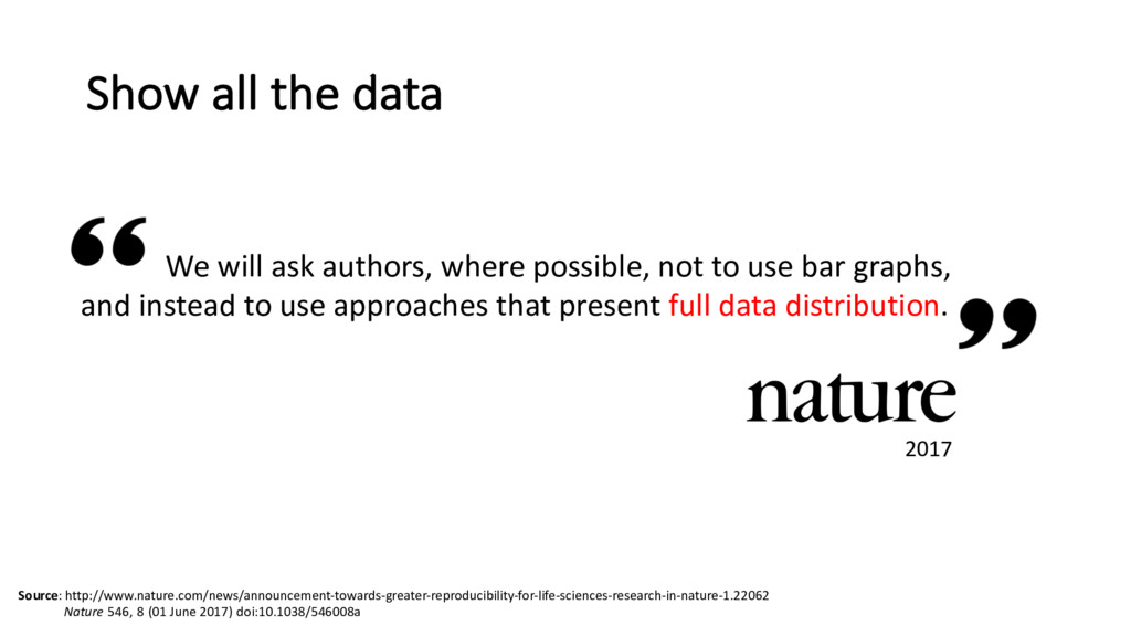
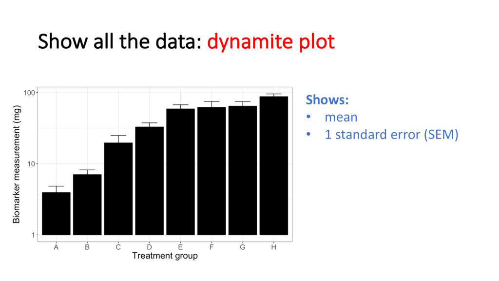
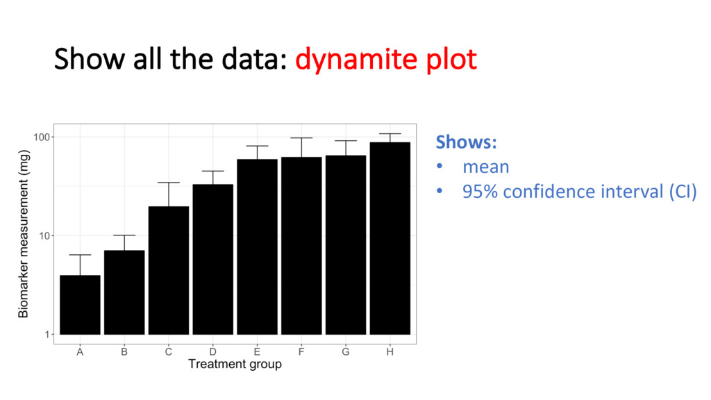
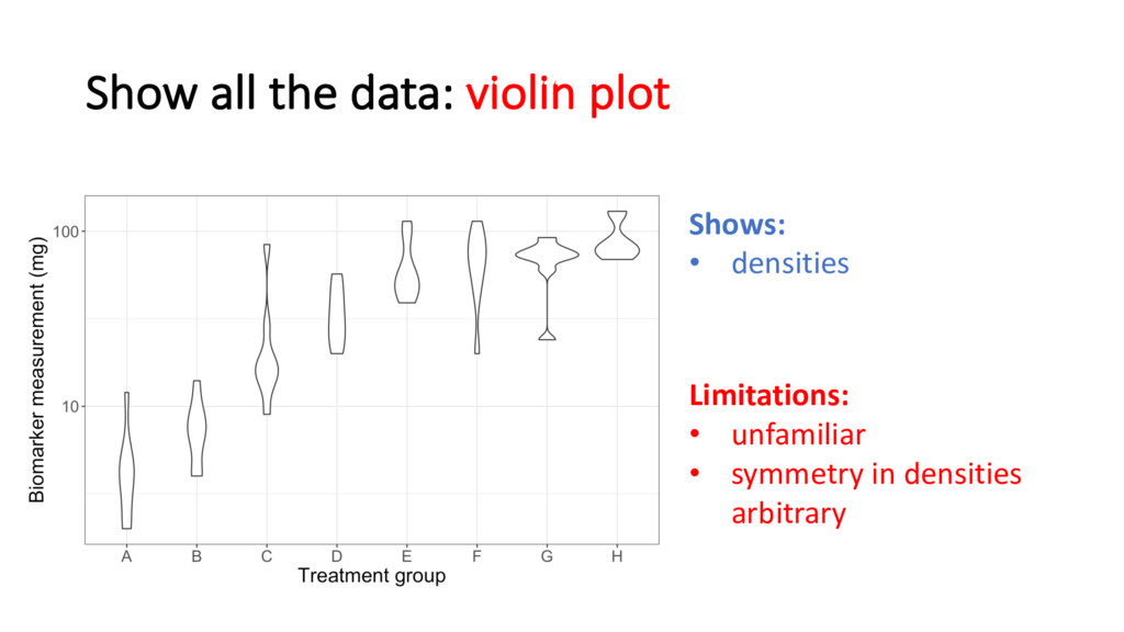
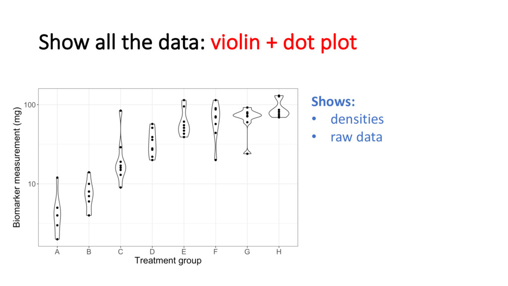
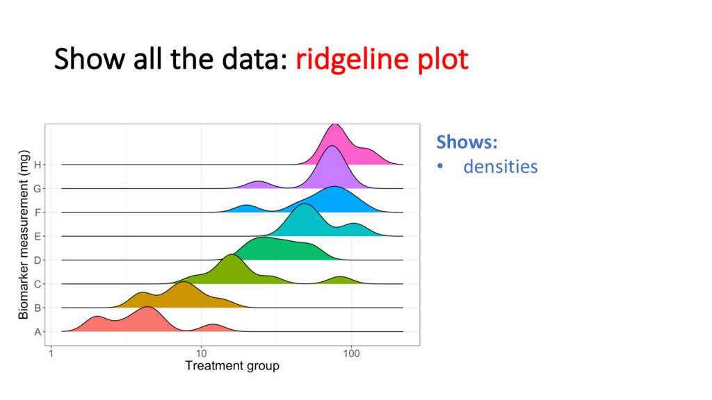
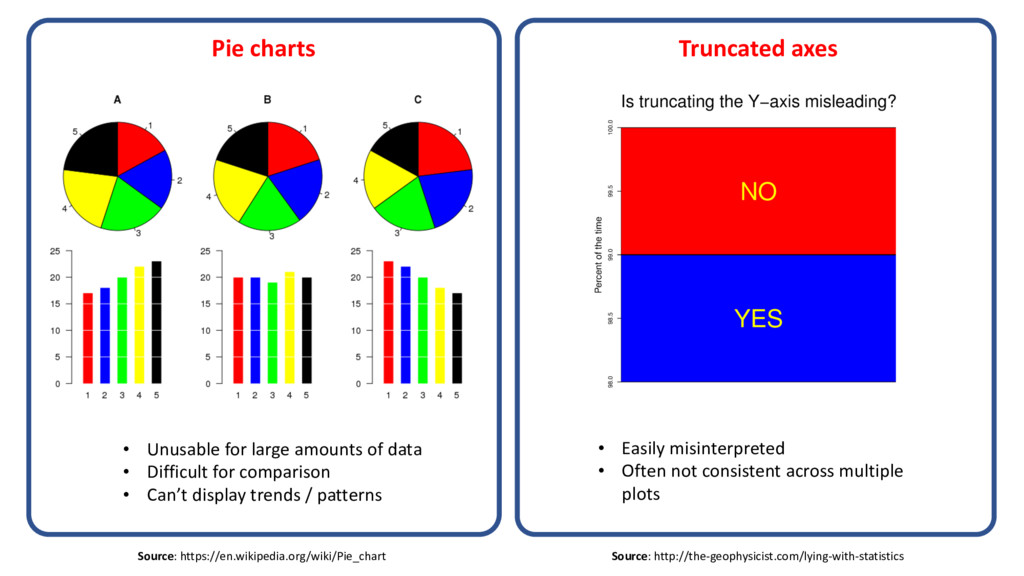
not to use bar graphs,
    and instead to use approaches that present full data distribution.
    Source: http://www.nature.com/news/announcement-towards-greater-reproducibility-for-life-sciences-research-in-nature-1.22062
    Nature 546, 8 (01 June 2017) doi:10.1038/546008a
    2017

    View Slide

  9. Show all the data: dynamite plot
    Shows:
    • mean
    • 1 standard deviation (SD)
    Hides:
    • the data
    • asymmetry
    • multi-modality
    • lower error bar

    View Slide

  10. Show all the data: dynamite plot
    Shows:
    • mean
    • 1 standard error (SEM)

    View Slide

  11. Show all the data: dynamite plot
    Shows:
    • mean
    • 95% confidence interval (CI)

    View Slide

  12. Show all the data: error bar plot
    Shows:
    • mean
    • 95% confidence interval (CI)
    A little better, but still shares
    a lot of limitations

    View Slide

  13. Show all the data: box and whisker plot
    Shows:
    • median
    • lower & upper quartiles
    • outliers
    • lowest/highest values
    within 1.5 IQR
    Up until now, my preferred
    choice of plot

    View Slide

  14. Show all the data: dot plot
    Shows:
    • raw data only
    Doesn’t show:
    • summary statistics

    View Slide

  15. Show all the data: violin plot
    Shows:
    • densities
    Limitations:
    • unfamiliar
    • symmetry in densities
    arbitrary

    View Slide

  16. Show all the data: violin + dot plot
    Shows:
    • densities
    • raw data

    View Slide

  17. Show all the data: ridgeline plot
    Shows:
    • densities

    View Slide

  18. The anatomy of a (non-)informative figure
    0 200 400 600 800 1000
    0.0 0.2 0.4 0.6 0.8 1.0 1.2
    d
    P0.0
    0.2
    0.4
    0.6
    0.8
    1.0
    0 6 12 18 24 30
    Time from diagnosis (months)
    Survival probability
    Male
    Female
    138 86 35 17 7 2
    90 70 30 15 6 1
    No. at risk
    +
    +
    +
    +
    +
    +
    +
    ++
    +
    +
    +
    +
    +
    ++
    + + +
    +
    +
    +
    +
    +
    ++
    +
    +
    +
    +
    +
    +
    +
    ++
    +
    +
    ++
    +
    ++
    +
    +
    +
    +
    +
    +
    ++
    +
    + +
    +
    + +
    Log−rank test P = 0.001
    supporting
    data
    supporting
    data
    undefined
    statistics
    inappropriate axes ranges
    unlabeled
    axes
    font size
    too small
    unclear
    axes label
    inappropriate
    axes breaks
    easily
    distinguishable lines
    legend
    grid marks

    View Slide

  19. Tables that confuse
    A (N=56) B (N=56)
    Age (years) 64.5 
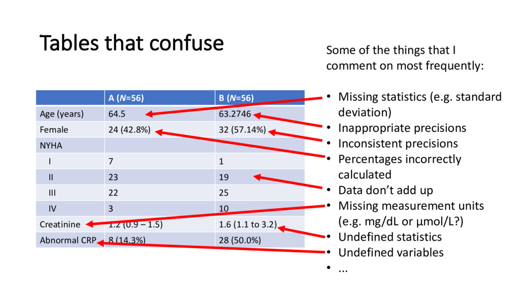
63.2746
    Female 24 (42.8%) 32 (57.14%)
    NYHA
    I 7 1
    II 23 19
    III 22 25
    IV 3 10
    Creatinine 1.2 (0.9 – 1.5) 1.6 (1.1 to 3.2)
    Abnormal CRP 8 (14.3%) 28 (50.0%)
    Some of the things that I
    comment on most frequently:
    • Missing statistics (e.g. standard
    deviation)
    • Inappropriate precisions
    • Inconsistent precisions
    • Percentages incorrectly
    calculated
    • Data don’t add up
    • Missing measurement units
    (e.g. mg/dL or μmol/L?)
    • Undefined statistics
    • Undefined variables
    • ...

    View Slide

  20. Things to
    (probably) avoid
    Use figures to inform, not confuse

    View Slide

  21. 3D charts Superfluous plots
    • 3rd dimension adds no information
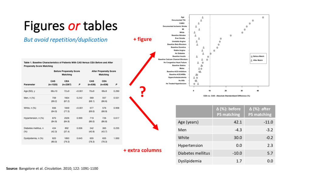
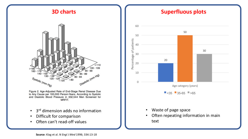
    • Difficult for comparison
    • Often can’t read-off values
    • Waste of page space
    • Often repeating information in main
    text
    Source: Klag et al. N Engl J Med 1996; 334:13-18
    20
    50
    30
    0
    10
    20
    30
    40
    50
    60
    Age category (years)
    Percentage of patients
    <35 35-65 >65

    View Slide

  22. • Unusable for large amounts of data
    • Difficult for comparison
    • Can’t display trends / patterns
    • Easily misinterpreted
    • Often not consistent across multiple
    plots
    Source: https://en.wikipedia.org/wiki/Pie_chart Source: http://the-geophysicist.com/lying-with-statistics
    Pie charts Truncated axes

    View Slide

  23. • Confusing and distracting
    • Often poorly labelled
    • Graphs presented often provide no
    extra information beyond the AUROC
    Source: Keating et al. The Annals of Thoracic Surgery. 2011; 92: 1893-6 Source: Nashef SAM et al. Eur J Cardio-Thoracic Surg. 1999;16: 9–13.
    Dual y-axis graphs ROC plots

    View Slide

  24. Where to get EJCTS/ICVTS specific advice
    EJCTS & ICVTS Statistical 
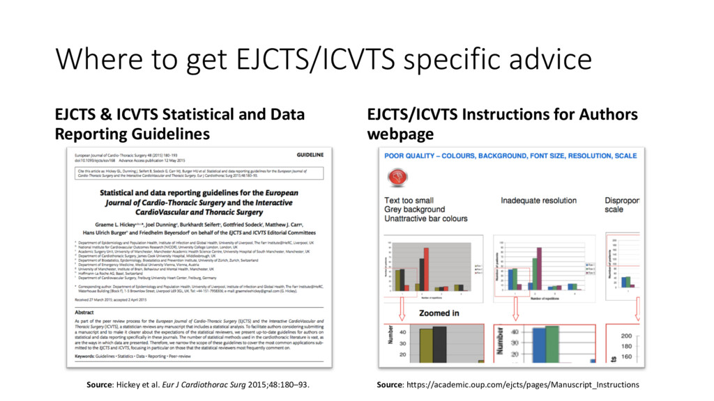
and Data
    Reporting Guidelines
    EJCTS/ICVTS Instructions for Authors
    webpage
    Source: https://academic.oup.com/ejcts/pages/Manuscript_Instructions
    Source: Hickey et al. Eur J Cardiothorac Surg 2015;48:180–93.

    View Slide

  25. Conclusions
    • Tables and figures should (ideally) be:
    • Used only if required
    • Self-contained (i.e. can be read standalone)
    • Easy to interpret
    • Clearly labelled (legends, column titles, etc.)
    • Neatly presented (high quality figures, legible font sizes, etc.)
    • Figure + Table legends are effective constructs for conveying extra
    information that facilitates interpretation
    • I always look at the figures and tables first when reviewing a paper
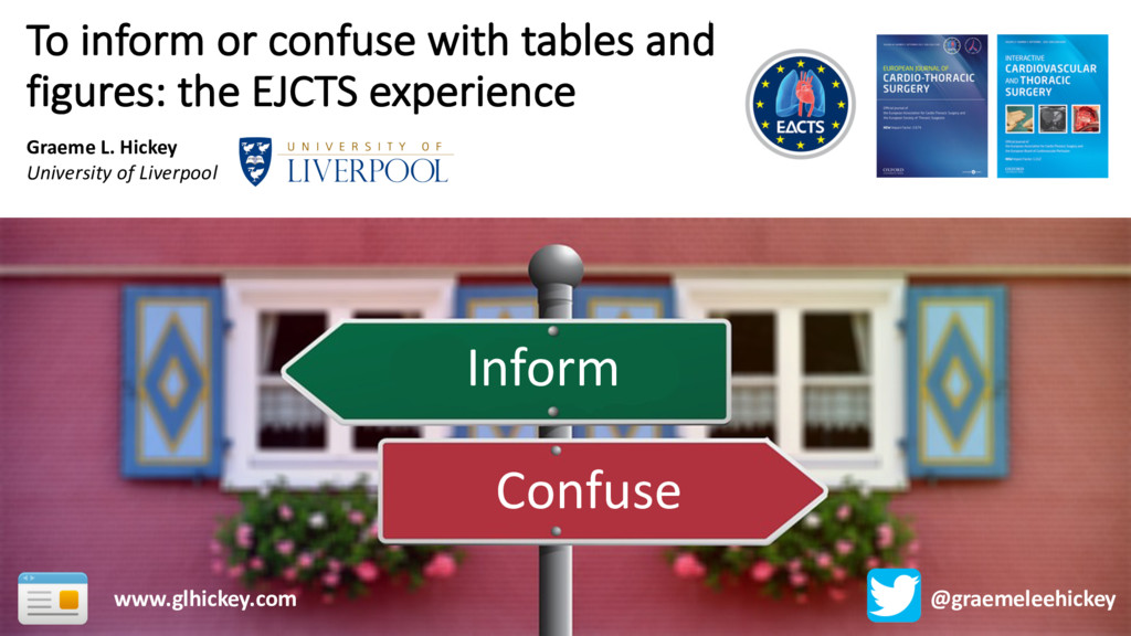
    View Slide

  26. Thank you for listening…
    any questions?
    Slides available (shortly) from: www.glhickey.com

    View Slide