$30 off During Our Annual Pro Sale. View Details »

Modeling Social Data, Lecture 4: Data visualization

Jake Hofman
February 15, 2019

Modeling Social Data, Lecture 4: Data visualization

Jake Hofman

February 15, 2019
Tweet

More Decks by Jake Hofman

Other Decks in Education

Transcript

  1. Data visualization
    APAM E4990
    Modeling Social Data
    Jake Hofman
    Columbia University
    February 15, 2019
    Jake Hofman (Columbia University) Data visualization February 15, 2019 1 / 21

    View Slide

  2. Why visualize?
    1. To explore and understand data
    2. To communicate with your readers
    Jake Hofman (Columbia University) Data visualization February 15, 2019 2 / 21

    View Slide

  3. Anscombe’s quartet (1973)1
    What’s the difference between these four data sets?
    1https://www.jstor.org/stable/2682899
    Jake Hofman (Columbia University) Data visualization February 15, 2019 3 / 21

    View Slide

  4. Anscombe’s quartet
    What’s the difference between these four data sets?
    Jake Hofman (Columbia University) Data visualization February 15, 2019 4 / 21

    View Slide

  5. Anscombe’s quartet2
    What’s the difference between these four data sets?
    2http://vissoc.co/lookatdata.html
    Jake Hofman (Columbia University) Data visualization February 15, 2019 5 / 21

    View Slide

  6. So. Many. Options.3
    3https://serialmentor.com/dataviz/directory-of-visualizations.html
    Jake Hofman (Columbia University) Data visualization February 15, 2019 6 / 21

    View Slide

  7. Even. More. Options.
    Jake Hofman (Columbia University) Data visualization February 15, 2019 7 / 21

    View Slide

  8. Good plots (a la Mackinlay 1986)
    Good plots should express the facts effectively as possible
    • “Tell the truth and nothing but the truth”
    • Use encodings that people can easily decode
    • Make a clear and concise point
    • Have a one sentence take-away
    Jake Hofman (Columbia University) Data visualization February 15, 2019 8 / 21

    View Slide

  9. Good plots (a la Mackinlay 1986)
    Automating the Design of 
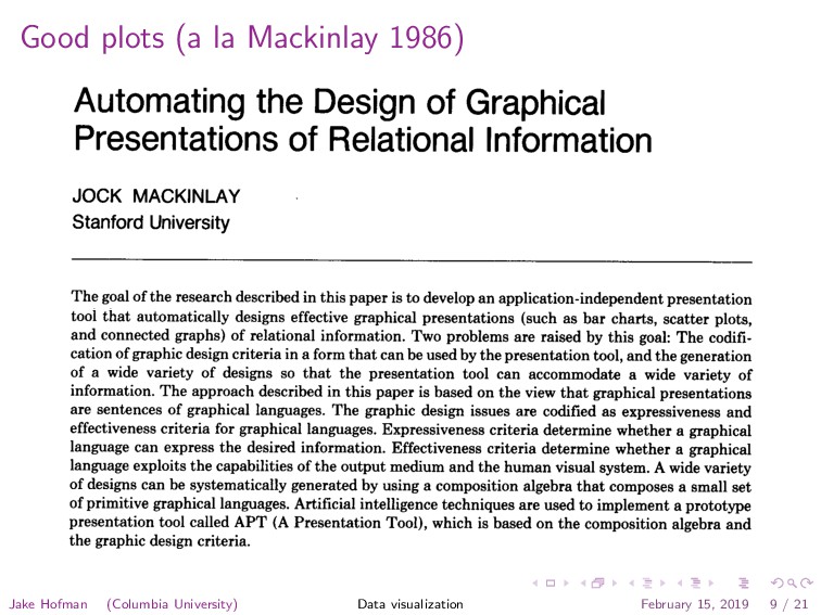
Graphical
    Presentations of Relational Information
    JOCK MACKINLAY
    Stanford University
    The goal of the research described in this paper is to develop an application-independent presentation
    tool that automatically designs effective graphical presentations (such as bar charts, scatter plots,
    and connected graphs) of relational information. Two problems are raised by this goal: The codifi-
    cation of graphic design criteria in a form that can be used by the presentation tool, and the generation
    of a wide variety of designs so that the presentation tool can accommodate a wide variety of
    information. The approach described in this paper is based on the view that graphical presentations
    are sentences of graphical languages. The graphic design issues are codified as expressiveness and
    effectiveness criteria for graphical languages. Expressiveness criteria determine whether a graphical
    language can express the desired information. Effectiveness criteria determine whether a graphical
    language exploits the capabilities of the output medium and the human visual system. A wide variety
    of designs can be systematically generated by using a composition algebra that composes a small set
    of primitive graphical languages. Artificial intelligence techniques are used to implement a prototype
    presentation tool called APT (A Presentation Tool), which is based on the composition algebra and
    the graphic design criteria.
    Categories and Subject Descriptors: D.2.2 [Software Engineering]: Tools and Techniques-user
    interfaces; H.1.2 [Models and Principles]: User/Machine Systems--human information processing;
    H.3.4 [Information Storage and Retrieval]: Systems and Software; 1.2.1 [Artificial Intelli-
    Jake Hofman (Columbia University) Data visualization February 15, 2019 9 / 21

    View Slide

  10. Some visualizations are better4 than others
    Automating the Design of 
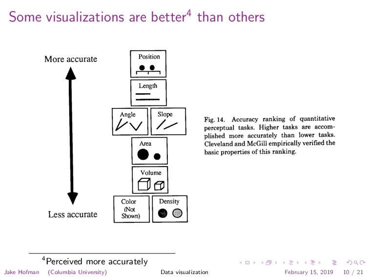
Graphical Presentations l
    125
    More accurate
    Less accurate
    I I
    Position
    IMll
    1 I
    Length
    F-l
    Iha I
    I0.I
    I I
    Volume
    rl l¶kJ
    Color
    cl
    mot
    Shown)
    Fig. 14. Accuracy ranking of quantitative
    perceptual tasks. Higher tasks are accom-
    plished more accurately than lower tasks.
    Cleveland and McGill empirically verified the
    basic properties of this ranking.
    Quantitative Ordinal Nominal
    Position Position Position
    Color Hue
    4Perceived more accurately
    Jake Hofman (Columbia University) Data visualization February 15, 2019 10 / 21

    View Slide

  11. Clevland & McGill 1984
    What percent is the smaller region 
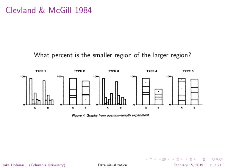
of the larger region?
    534 Journal of the American Statistical Association, September 1984
    TYPE 1 TYPE 2 TYPE 3 TYPE 4 TYPE 5
    100o 10oo 100- 10oo 100-
    IhLL O_ 0A A *
    A B A B A B A B A B
    Figure 4. Graphs from position-length experiment.
    tracted by perceiving position along a scale, in this case
    the horizontal axis. The y values can be perceived in a
    similar manner.
    The real power of a Cartesian graph, however, does
    not derive only from one's ability to perceive the x and
    y values separately but, rather, from one's ability to un-
    derstand the relationship of x and y. For example, in Fig-
    ure 7 we see that the relationship is nonlinear and see the
    nature of that nonlinearity. The elementary task that en-
    The eye-brain system is capable of extracting such a
    slope by perceiving the direction of the line segment join-
    ing (xi, yi) and (xj, yj). We conjecture that the perception
    of these slopes allows the eye-brain system to imagine
    a smooth curve through the points, which is then used to
    judge the pattern. For example, in Figure 7 one can per-
    ceive that the slopes for pairs of points on the left side
    of the plot are greater than those on the right side of the
    plot, which is what enables one to judge that the rela-
    Jake Hofman (Columbia University) Data visualization February 15, 2019 11 / 21

    View Slide

  12. Clevland & McGill 1984 / Heer & Bostock 2010
    0 40 50 60 70 80 90
    ue Proportional Difference (%)
    ans of log absolute errors against
    or each proportional judgment type;
    curves computed with lowess.
    ition-angle experiment to those for the
    ment. By designing judgment types 6
    same format as the others, the results
    Cleveland & McGill's Results
    1.0 1.5 2.0 2.5 3.0 3.5
    T1
    T2
    T3
    T4
    T5
    Log Error
    Crowdsourced Results
    1.0 1.5 2.0 2.5 3.0 3.5
    T1
    T2
    T3
    T4
    T5
    T6
    T7
    T8
    T9
    Log Error
    Figure 4: Proportional judgment results (Exp. 1A & B).
    Top: Cleveland & McGill’s [7] lab study. Bottom: MTurk
    studies. Error bars indicate 95% confidence intervals.
    Jake Hofman (Columbia University) Data visualization February 15, 2019 12 / 21

    View Slide

  13. Diffrent strokes for different data types
    • Quantitative: numerical values 
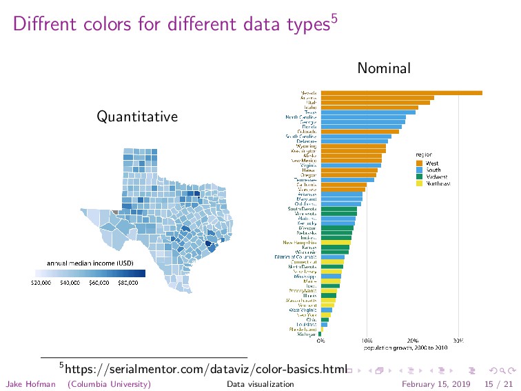
in a range (e.g., height)
    • Ordinal: categories with natural ordering (e.g., day of week)
    • Nominal: categories with no natural ordering (e.g., gender)
    Jake Hofman (Columbia University) Data visualization February 15, 2019 13 / 21

    View Slide

  14. Diffrent strokes for different data types
    Less accurate
    rl l¶kJ
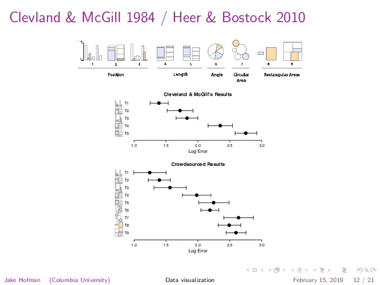
    Color
    cl
    mot
    Shown)
    Quantitative Ordinal Nominal
    Position Position
    Color Saturation
    Position
    Color Hue
    Texture
    Connection
    Containment
    Density
    Color Saturation
    Color Saturation Shape
    Length
    Angle
    Slope
    Area
    Volume
    Fig. 15. Ranking of perceptual tasks. The tasks shown in the gray boxes are not relevant to these
    types of data.
    An example analysis for area perception is shown in Figure 16. The top line
    shows that a series of decreasing areas can be used to encode a tenfold quantitative
    range. Of course, in a real diagram such as Figure 13, the areas would be laid out
    Jake Hofman (Columbia University) Data visualization February 15, 2019 14 / 21

    View Slide

  15. Diffrent colors for different data types5
    Quantitative
    Nominal
    5https://serialmentor.com/dataviz/color-basics.html
    Jake Hofman (Columbia University) Data visualization February 15, 2019 15 / 21

    View Slide

  16. A grammar of graphics
    A language to describe the components of a graphic
    Jake Hofman (Columbia University) Data visualization February 15, 2019 16 / 21

    View Slide

  17. Grammar of graphics a la ggplot26
    6http://r4ds.had.co.nz
    Jake Hofman (Columbia University) Data visualization February 15, 2019 17 / 21

    View Slide

  18. Grammar of graphics a la ggplot2 7
    1 Get your 
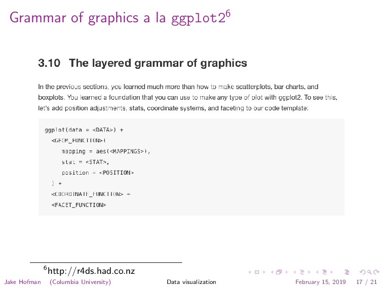
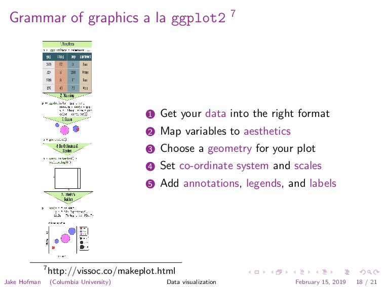
data into the right format
    2 Map variables to aesthetics
    3 Choose a geometry for your plot
    4 Set co-ordinate system and scales
    5 Add annotations, legends, and labels
    7http://vissoc.co/makeplot.html
    Jake Hofman (Columbia University) Data visualization February 15, 2019 18 / 21

    View Slide

  19. Grammar of graphics a la ggplot2
    q
    q
    q
    q
    q
    q
    q
    q
    q
    q
    q
    q
    q
    q
    q
    q
    q
    q
    q
    q
    q
    q
    q
    q
    q q
    q
    q
    q
    q
    q
    q
    q
    q
    q
    q
    q
    q
    q
    q
    q
    q
    q
    q
    q
    q
    q
    q
    q
    q
    q
    q
    q
    q
    q
    q
    q
    q
    qq
    q
    q
    q
    q
    q
    q
    q
    q
    q
    q
    q
    q
    q
    q
    q
    q
    q
    q
    q
    q
    q
    q
    q
    q
    q
    q
    q
    q
    q
    q
    q
    q
    q
    q
    q
    q
    q
    q
    q
    q
    q
    q
    q
    q
    q
    q
    q
    q
    q
    q
    q
    q
    q
    q
    q
    q
    q
    q
    q
    q
    q
    q
    q
    q
    q
    q
    q
    q
    q
    q
    q
    q
    q
    q q
    q
    q
    q
    q
    q
    q
    q
    q
    q
    q
    q
    q
    q
    q
    q
    q
    q
    q
    q
    q
    q
    q
    q
    q
    q
    q
    q
    q
    q
    q
    q
    q q
    q
    q
    q
    q
    q
    q
    q
    q
    q
    q
    q
    q
    q
    q
    q
    q
    q
    q
    q
    q
    q
    q
    q
    q
    q
    q
    q
    q
    q
    q
    q
    q
    q
    q
    q
    q
    q
    q
    q
    q
    q
    q
    q
    q
    q
    q
    q
    q
    q
    q
    q
    q
    q
    q
    q
    q
    q
    q
    q
    q
    q
    q q
    q
    q
    q
    q
    q
    q
    q
    q
    q
    q
    q
    q
    q
    q
    q
    q
    q
    q
    q
    q
    q
    q
    q
    q
    q
    q
    q
    q
    q
    q
    q
    q
    q
    q q
    q
    q
    q
    q
    q
    q
    q q
    q
    q
    q
    q
    q
    q
    q
    q
    q
    q
    q
    q
    q
    q
    q
    q
    q
    q
    q
    q
    q
    q
    q
    q
    q
    q
    q
    q
    q
    q
    q
    q
    q
    q
    q q
    q
    q
    q
    q
    q
    q
    q
    q
    q
    q
    q
    q
    q
    q
    q
    q
    q
    q
    q
    q
    q
    q
    q
    q
    q
    q
    q
    q
    q
    q
    q
    q
    q q q
    q
    q
    q
    q
    q
    q
    q
    q
    q
    q
    q
    q
    q
    q
    q
    q
    q
    q
    q
    q
    q
    q
    q
    q
    q
    q
    q
    q
    q
    q
    q
    q
    q
    q
    q
    q
    q
    q
    q
    q
    q
    q
    q
    q
    q
    q
    q
    q
    q
    q
    q
    q
    q
    q
    q
    q
    q
    q
    q
    q
    q
    q q
    q
    q
    q
    q
    q
    q
    q
    q
    q
    q q
    q
    q
    q q
    q
    q
    q
    1957 1977 1997
    1e+03 1e+04 1e+05 1e+03 1e+04 1e+05 1e+03 1e+04 1e+05
    30
    40
    50
    60
    70
    80
    GDP per capita
    Life expectancy
    pop
    q
    q
    q
    q
    300,000,000
    600,000,000
    900,000,000
    1,200,000,000
    continent
    q
    q
    q
    q
    q
    Africa
    Americas
    Asia
    Europe
    Oceania
    Health and wealth of countries over time
    ggplot(data = gapminder,
    aes(x = gdpPercap, y = lifeExp,
    size = pop, color = continent)) +
    geom_point() + scale_x_log10() +
    scale_size_area(label = comma) +
    labs(x = ’GDP per capita’, y = ’Life expectancy’,
    title = ’Health and wealth of countries over time’)
    facet_wrap(~ year)
    Jake Hofman (Columbia University) Data visualization February 15, 2019 19 / 21

    View Slide

  20. Benefits
    • Lowers the barrier to asking questions of your 
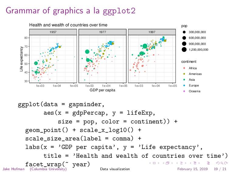
data
    • Lets you explore more, and faster
    • Easily produces publication-ready plots
    • Large and active user base for support
    Jake Hofman (Columbia University) Data visualization February 15, 2019 20 / 21

    View Slide

  21. Acknowledgements
    Slides are generously adapted from C
    ¸a˘
    gatay Demiralp, whose slides
    are generously adapted from Jeff Heer’s Data Visualization course
    Jake Hofman (Columbia University) Data visualization February 15, 2019 21 / 21

    View Slide