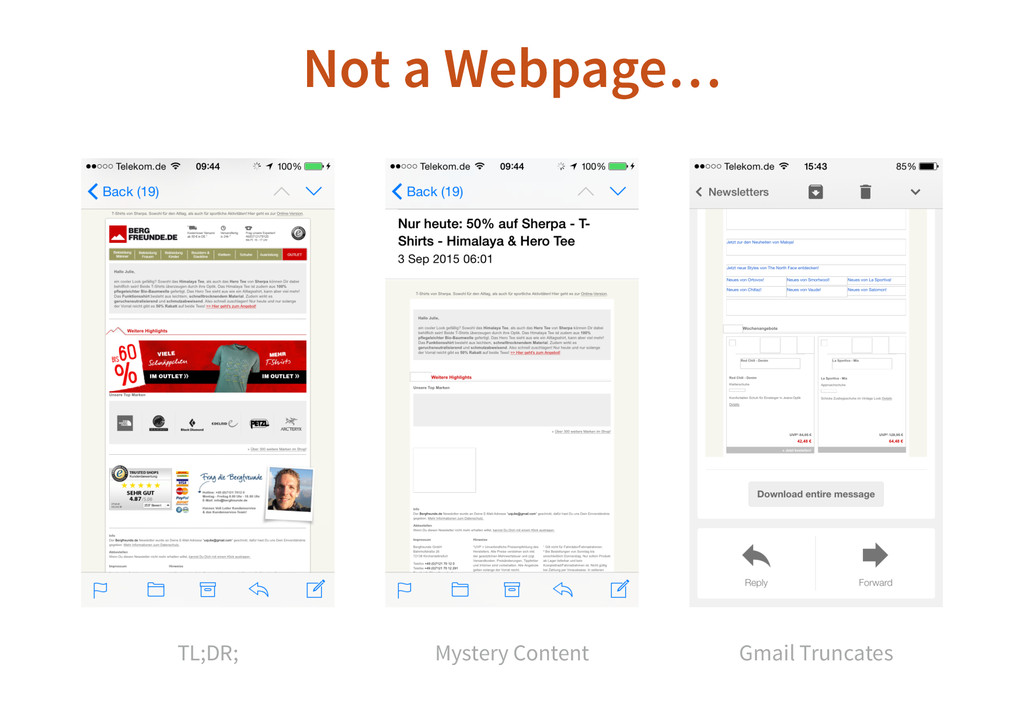
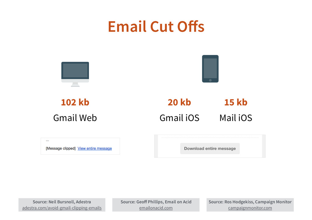
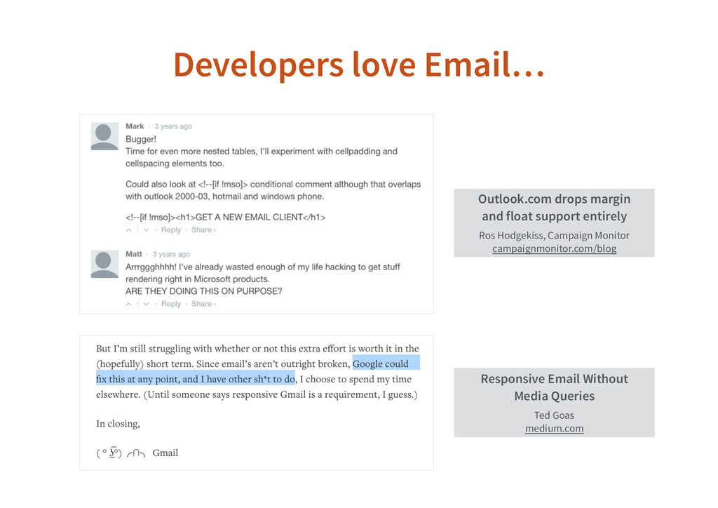
E-Mail persists after many decades and will continue to survive Chat, Skype, etc. - just as roaches have survived the atomic bomb. Despite being a pest, E-Mail is also an effective marketing channel and the most personal communication you have with your users and customers.
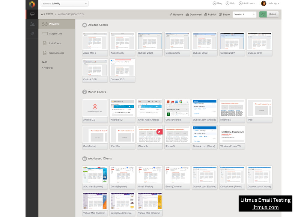
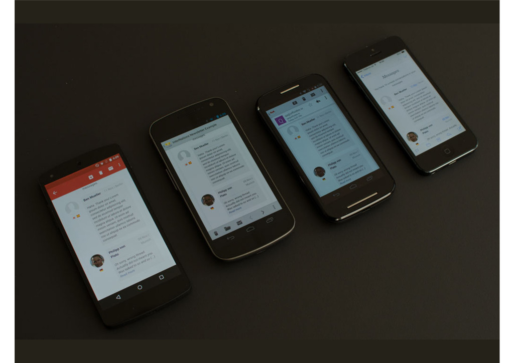
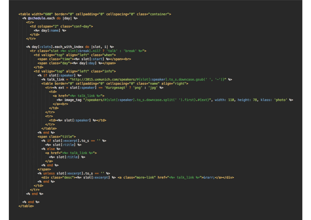
You've survived Gmail's spam filter. Now let's make sure you also survive mobile devices with responsive E-Mail HTML. It's not as difficult as you think. Let's examine how developers have solved common problems with tried and true techniques for designing and developing bulletproof E-Mails.
 jng
jng
 makicamel
 yaotti
 kishida
 kajitack
 har1101
 vinceamstoutz
 suikabar
 ioki
ioki
 syumai
 philipschwarz
 mototakatsu
 ochtum
 aemeredith
 kimpetersen
 mza
mza
 reverentgeek
 eileencodes
 madoxten
 gurzu
gurzu
 aleyda
 keavy
keavy
 soysaucechin
 bkeepers
 destraynor
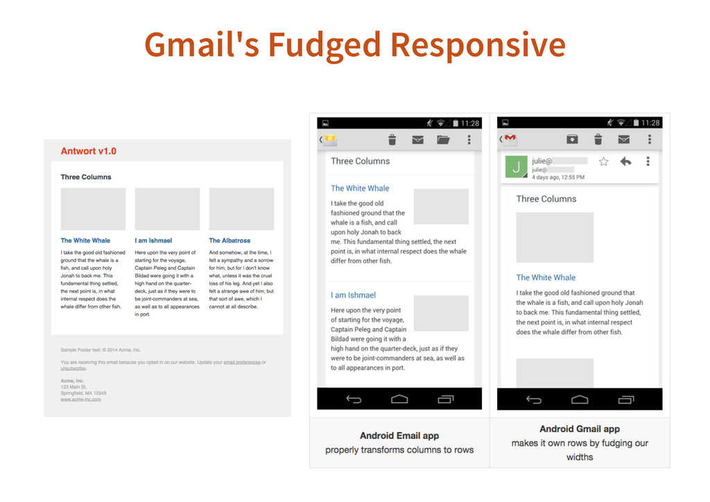
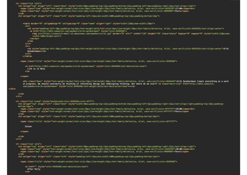
![Antwort Responsive Layouts V1 <!--[if mso]> <table border="0" cellpadding="0" cellspacing="0"](https://files.speakerdeck.com/presentations/46a2b03da76d4d96bbd4c5284696b840/slide_27.jpg)