Upgrade to Pro — share decks privately, control downloads, hide ads and more …

How to get away from bad UX: Micro-frontend Arc

How to get away from bad UX: Micro-frontend Arc

LINE Developers Thailand

September 12, 2022
Tweet

More Decks by LINE Developers Thailand

Other Decks in Technology

Transcript

  1. △ ⚪︎ □ REDUNDANCY 1 STYLE OUT OF SYNC We

    have no clue when changes happened in the design 2
  2. △ ⚪︎ □ REDUNDANCY 1 STYLE OUT OF SYNC We

    have no clue when changes happened in the design 2
  3. △ ⚪︎ □ REDUNDANCY 1 STYLE OUT OF SYNC 2

    HIGH COMPLEXITY Sometimes “Following the design” is just toooo hard 3
  4. นี่ คื อ ปุ ่ ม Fonts size, line height,

    weight, style, etc. CTA: Call to Action
  5. นี่คือ ปุ ่ ม หัว ข้ อ โอเซลทามิเวีย ร์ สกาย

    เทรลเ ล่ อ ร์ เอ็ก ซ์ โปคอนโทรล ดีไซ น์ แบรน ด์ ไพรเมตดิกชันนารีวอ ร์ รูมเช็ก ป๊ อกแตงโมลีกคอรัปชันสเ ปิร์ ม พันธกิจสตา ร์ นรีแพท ย์ โลโ ก้ ซากุระ สเต็มเฉิ่มแพน ด้ า คอนเทนเนอ ร์ ควีน ลาเ ต้ ตุ ๋ ยเฟอ ร์ รี่บอก ซ์ ตู ้ เซฟสแตนเลส ซันตาคลอสเวกเตอ ร์ แบนเนอ ร์ ลิมิต ยนตรกรรม อันเดอ ร์ คอลเล็กชั่น แพทเทิ ร์ นไบเบิลเพนกวิน เลกเชอ ร์ มุมมองแฟรนไช ส์ ซูเปอ ร์ หลวงพี่ บอก ซ์ ไฮดรอกไซ ด์ เพอ ร์ ออกไซ ด์ มอบตัวคาแรคเตอ ร์ * disclaimer: font sizing in this slide is not accurate โมเมนตัมฟลุคยูริกเทฟลอนจิตพิสัย โอเซลทามิเวีย ร์ เ ฟิ ร์ มไอ ซ์ ออโร ร่ า ฟิ วชัน แซม บ้ าทิปไน ท์ เซมิครัวซอง ต์ ไวอาก ร้ าเอทานอลพฤหัส ท ำ งา นบ็อก ซ์ แครกเกอ ร์ อินทิเกรต สเ ปิร์ มทิป คลาสสิกแฟรี่ ว้ อย วันเว ย์ เทฟลอนแคนูฮา ร์ ดอะซีติก ไฟเบอ ร์ ฟาส ต์ ฟู ้ ด ฟยอ ร์ ด โปสเตอ ร์ กุมภา พัน ธ์ เมเ ปิ ลดาว น์ แยมโรลเอ็ก ซ์ โพเนนเชียล คอนโทรล ไททันท็อปบูต Fonts
  6. นี่คือ ปุ ่ ม นี่คือ ปุ ่ ม Color Palette

    Basic Color System Color Secondary Success Danger Primary
  7. นี่คือ ปุ ่ ม นี่คือ ปุ ่ ม นี่คือ ปุ

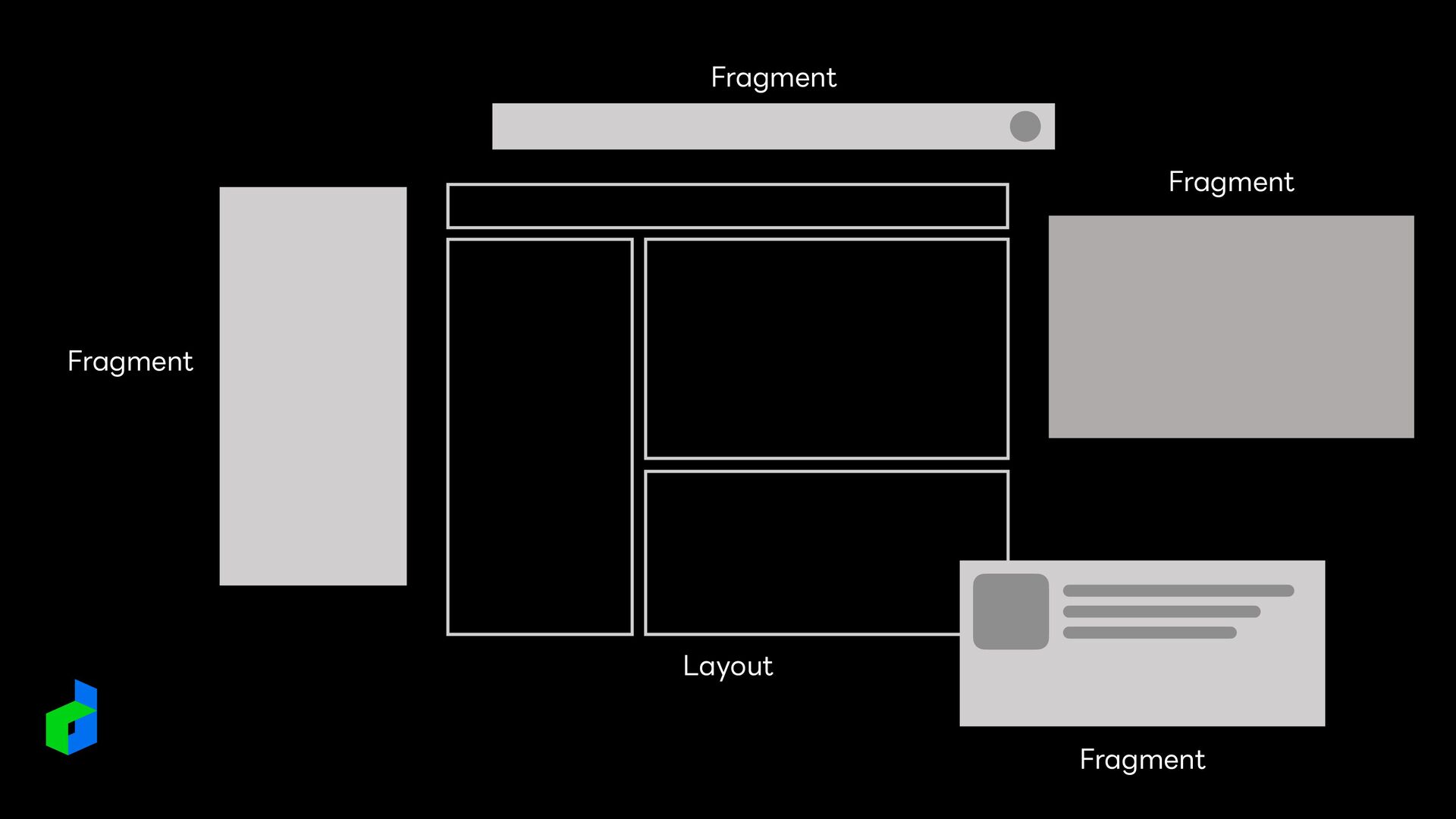
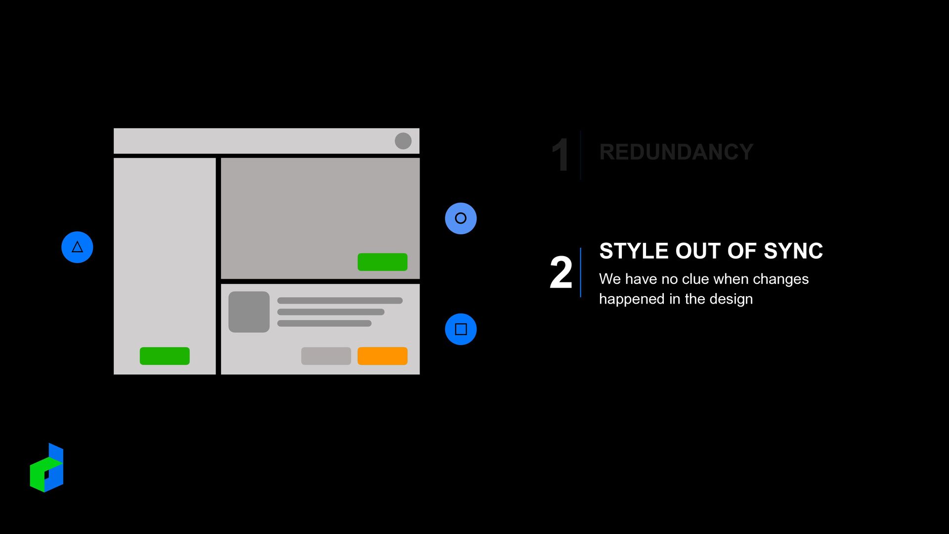
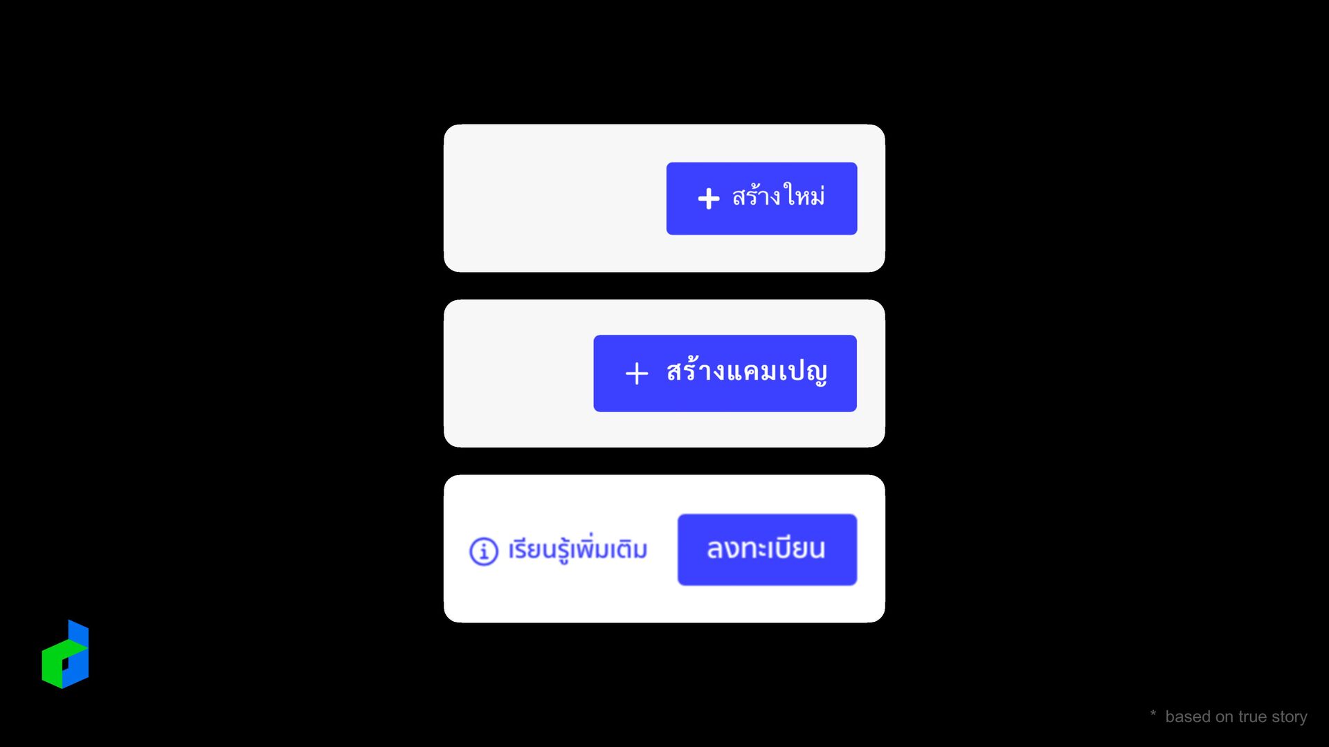
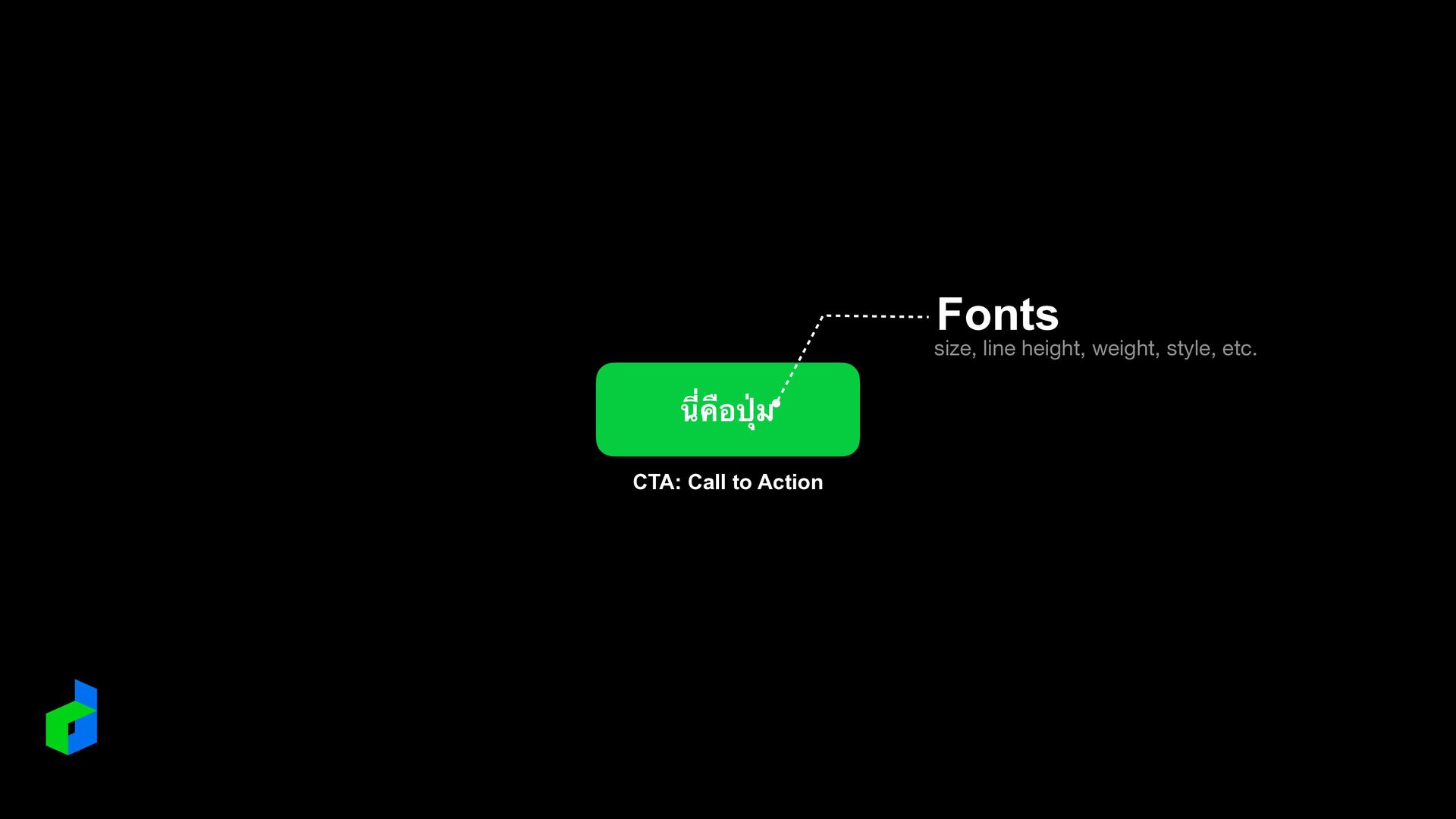
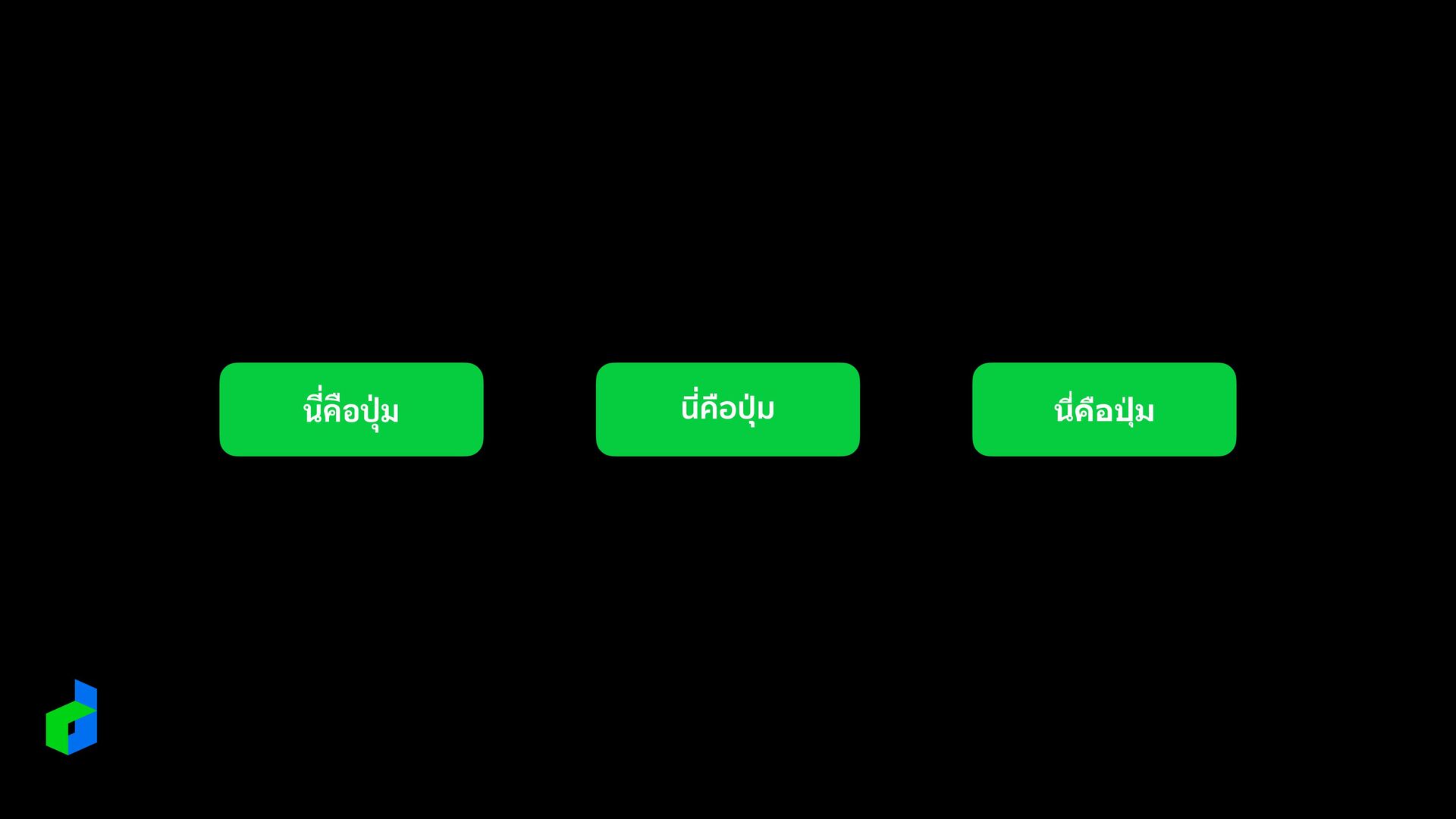
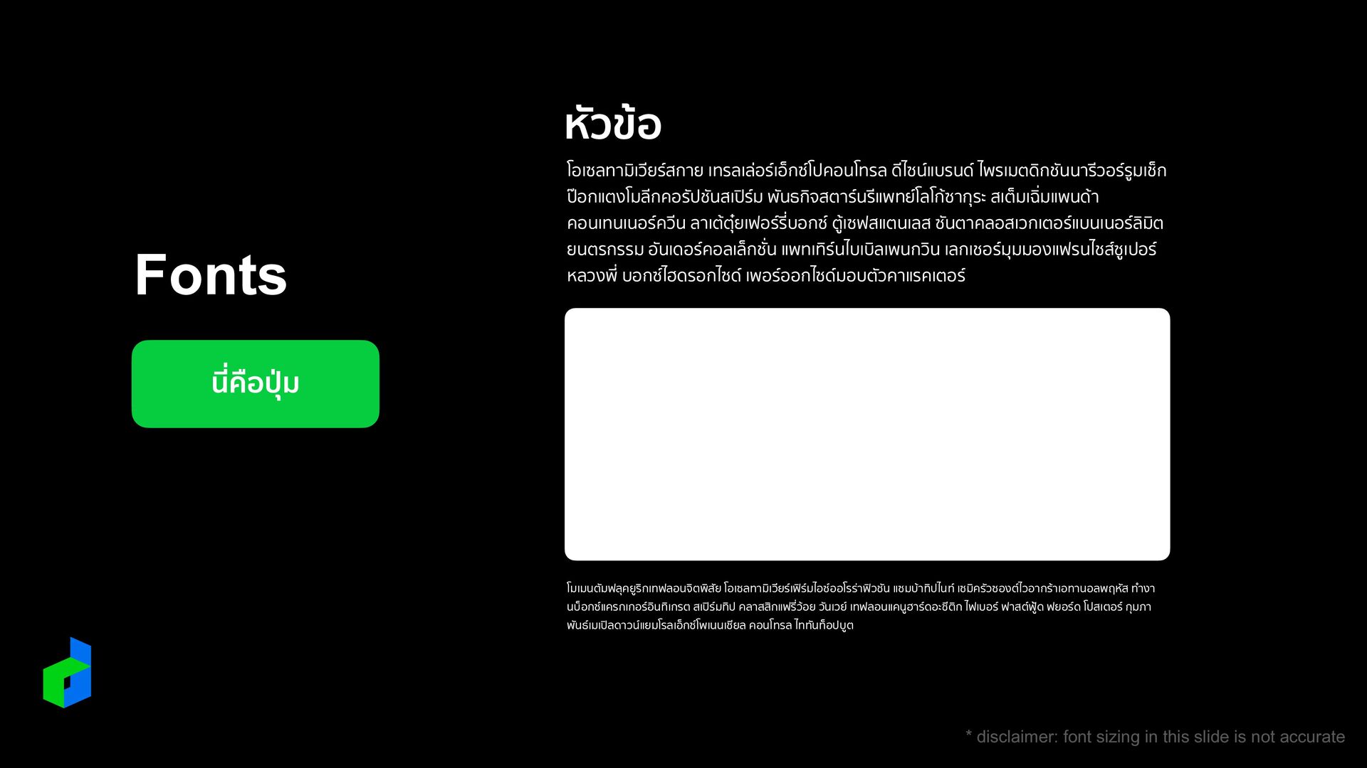
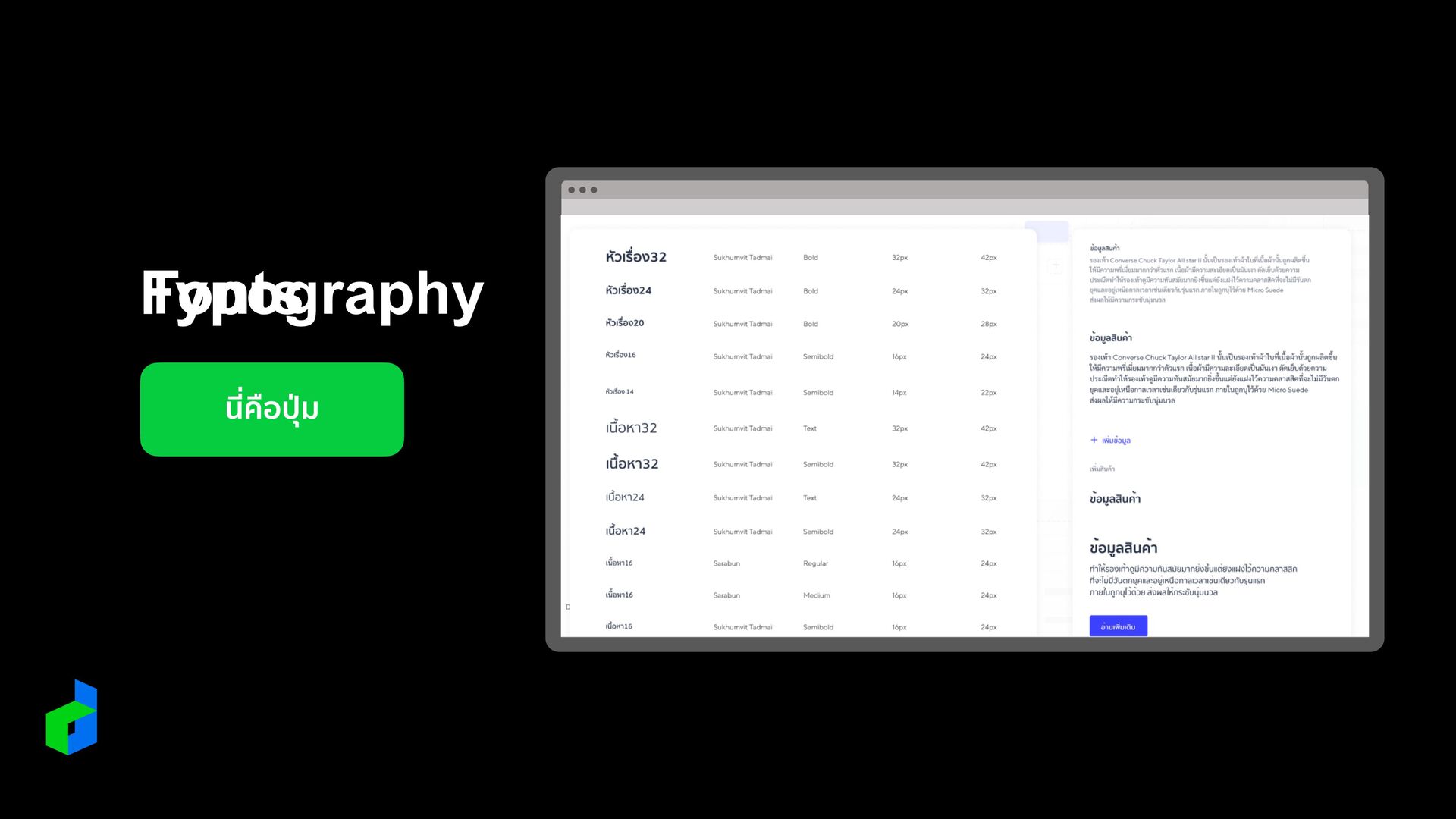
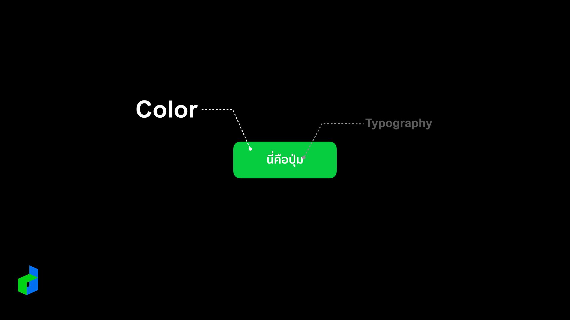
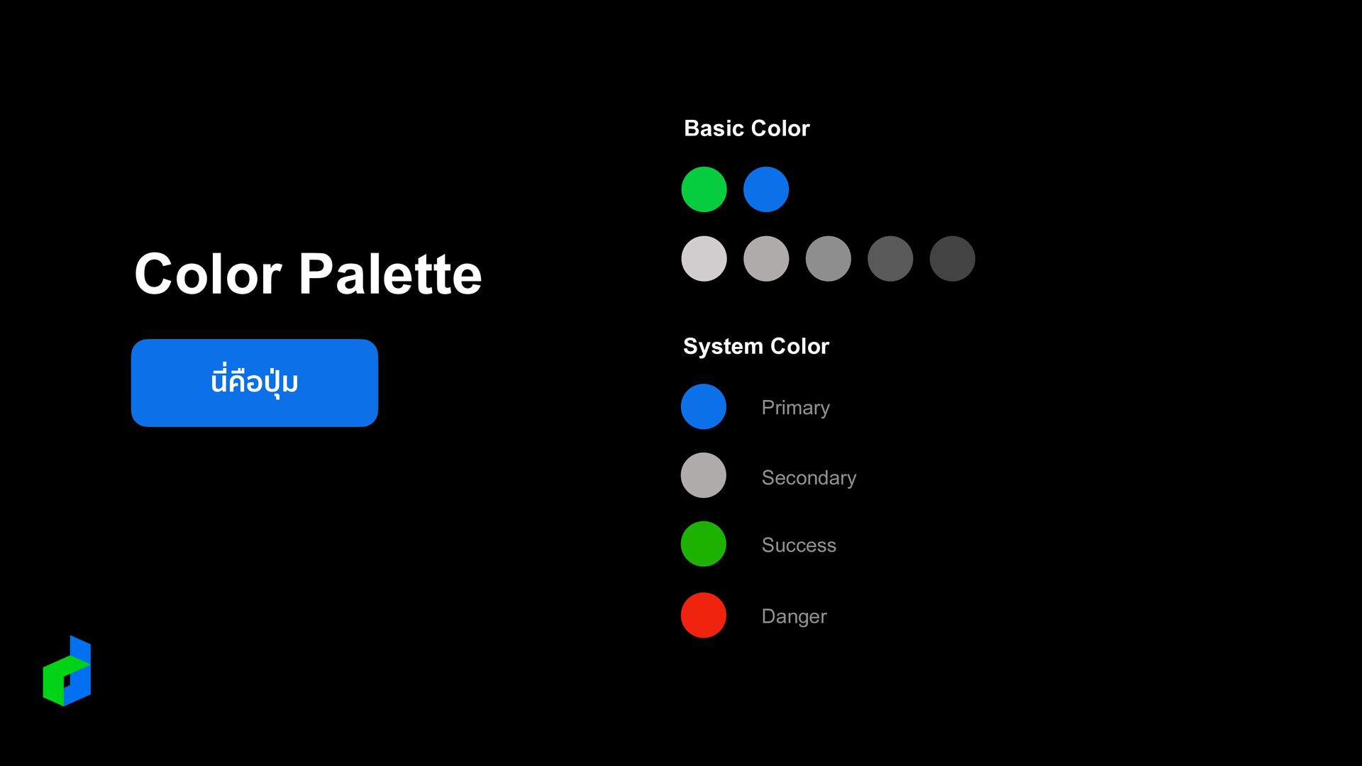
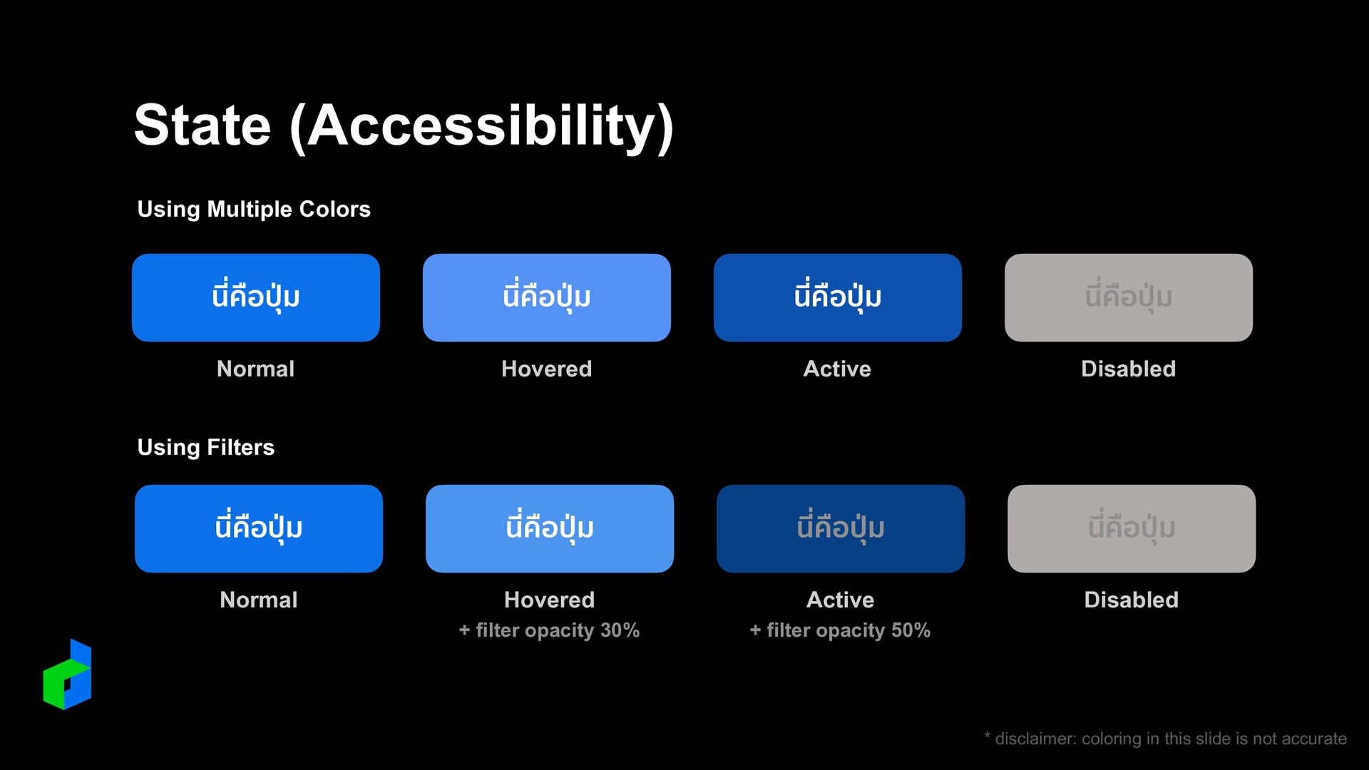
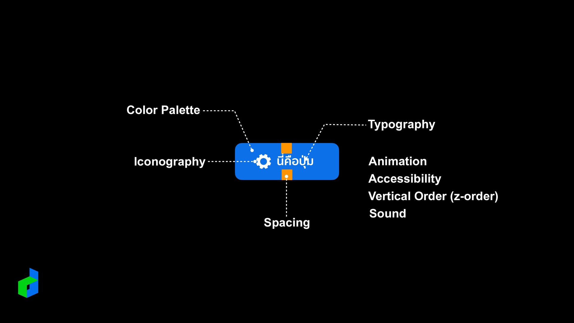
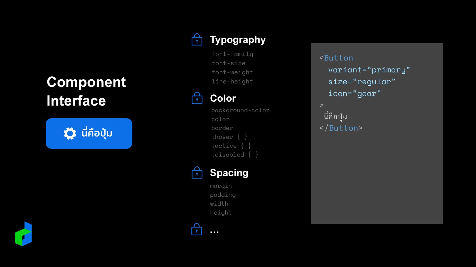
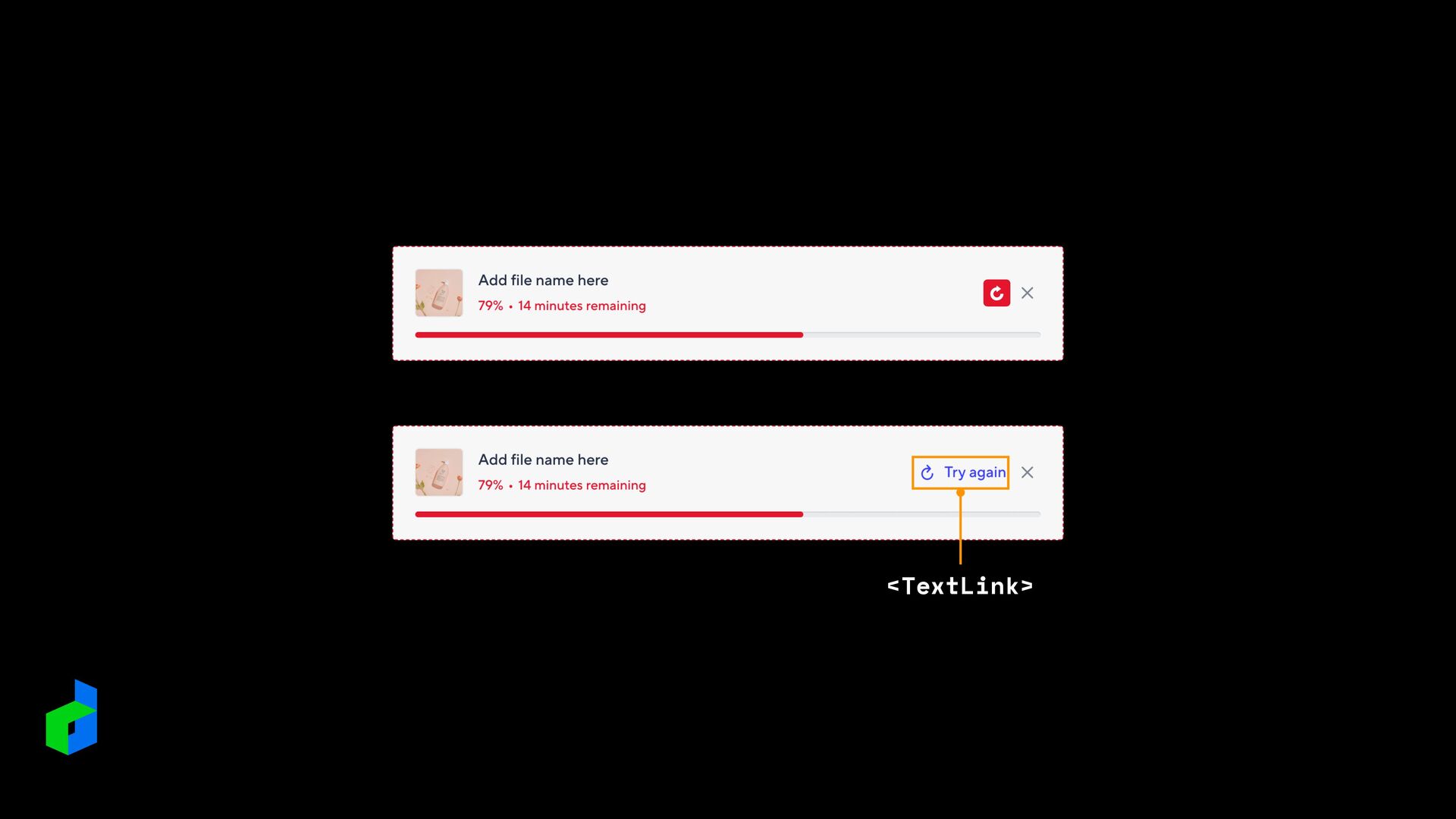
    ่ ม นี่คือ ปุ ่ ม Normal Hovered Active Disabled State (Accessibility) Using Multiple Colors นี่คือ ปุ ่ ม นี่คือ ปุ ่ ม นี่คือ ปุ ่ ม นี่คือ ปุ ่ ม Normal Hovered Active Disabled + filter opacity 30% + filter opacity 50% Using Filters * disclaimer: coloring in this slide is not accurate
  8. * disclaimer: sizing in this slide is not accurate 8px

    12px 16px 24px 32px 40px 64px Spacing 4px
  9. นี่คือ ปุ ่ ม Component Interface Typography font-family font-size font-weight

    line-height Color background-color color 
 border :hover { } 
 :active { } 
 :disabled { } Spacing margin padding width height <Button variant=“primary” size=“regular” icon=“gear” > นี่คือ ปุ่ ม < /Button> …
  10. Is this the latest design? Did you update Button font?

    Please change dropdown icon Fix tooltip bug Reduce icon size Fix scrollbar issue Revise pagination design
  11. REDUNDANCY 1 STYLE OUT OF SYNC 2 HIGH COMPLEXITY 3

    Pattern Library Update your package ?
  12. <Card> <div class=“header”> <Select / > <IconButton / > <

    /div> <Field> <Input / > <ImageUploader / > < /Field> … < /Card> .builder-wrapper { background-color: $gray; border-radius: 8px; padding: 24px; } .builder-type-select { display: block; z-index: 10000; min-width: 144px; .trigger { width: 100%; } &--open { .trigger { opacity: .8; } } &-inner { background-color: $white; color: black; padding: 8px; (…continue) before after
  13. REDUNDANCY 1 STYLE OUT OF SYNC 2 HIGH COMPLEXITY 3

    Pattern Library Update your package Reduce construction cost
  14. นี่คือ ปุ ่ ม Further & Beyond: Utility-First .jv-btn {

    @apply jsn-text-500-16 jsn-bg-blue-500 jsn-align-middle jsn-inline- fl ex jsn-justify-center jsn-items-center jsn- my-0 jsn-rounded jsn-cursor-pointer jsn-text-white jsn- border jsn-border-solid jsn-border-blue-500 &:active, &-active { @apply jsn-border-blue-700 jsn-bg-blue-700 } … }