Upgrade to Pro — share decks privately, control downloads, hide ads and more …

What's special about Spatial?

What's special about Spatial?

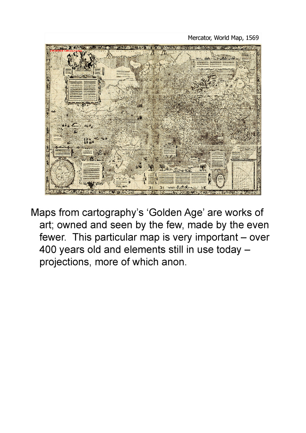
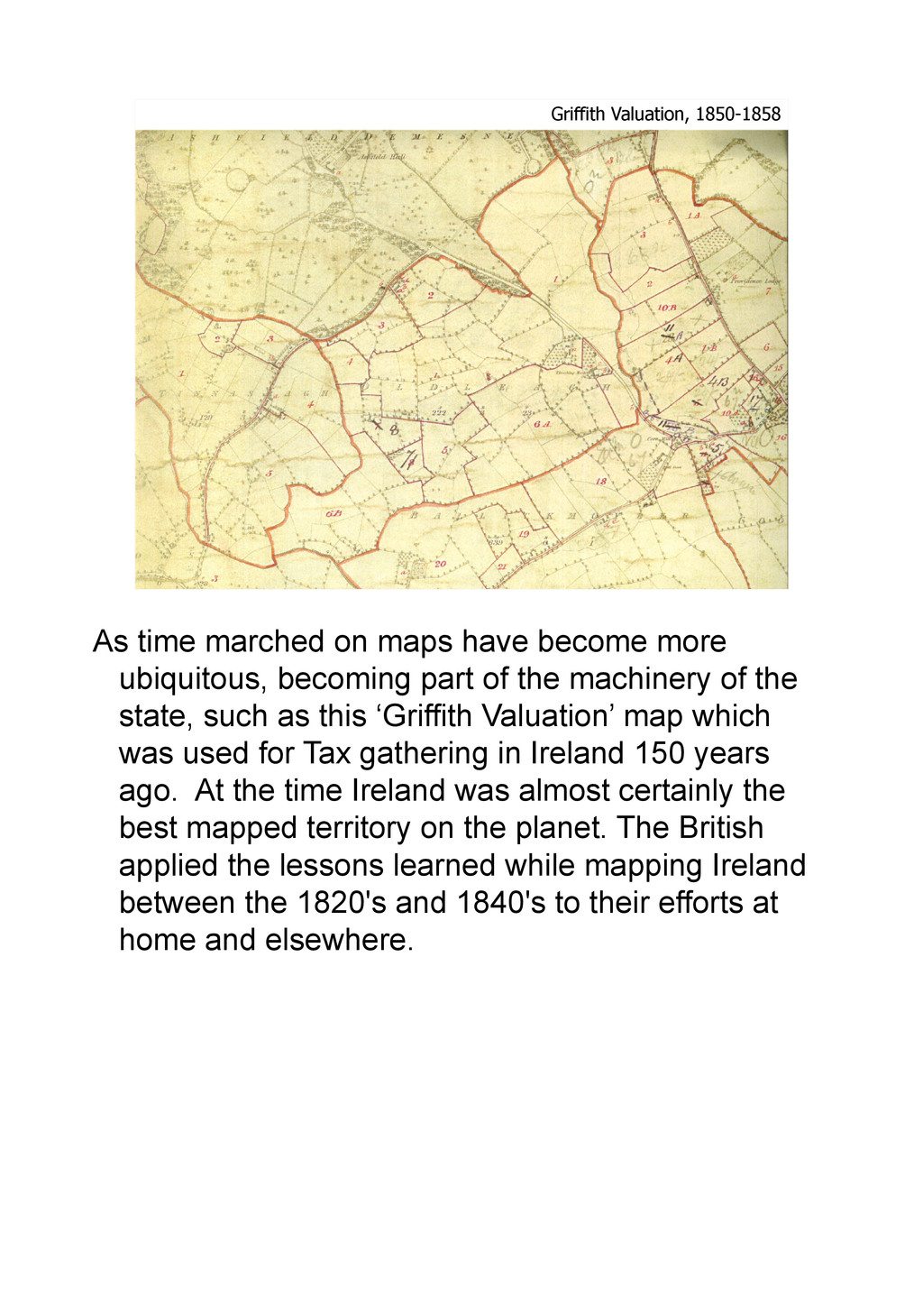
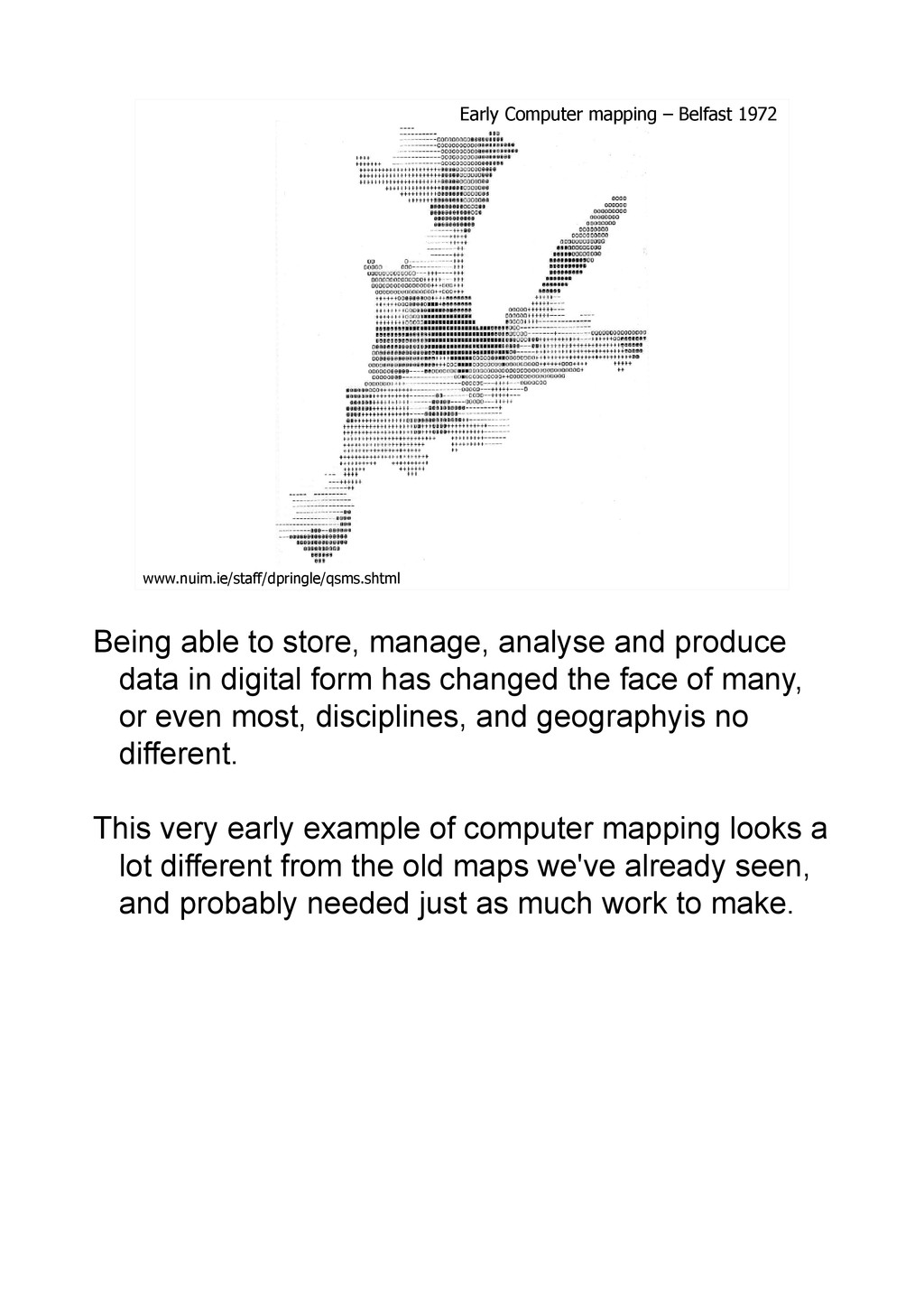
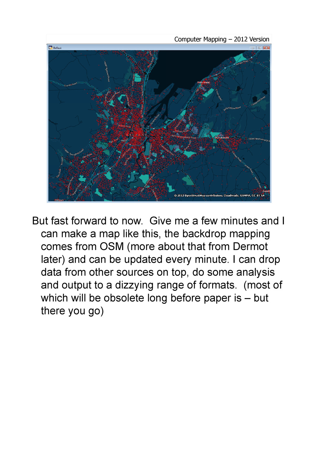
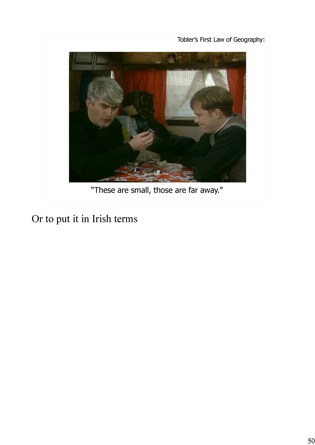
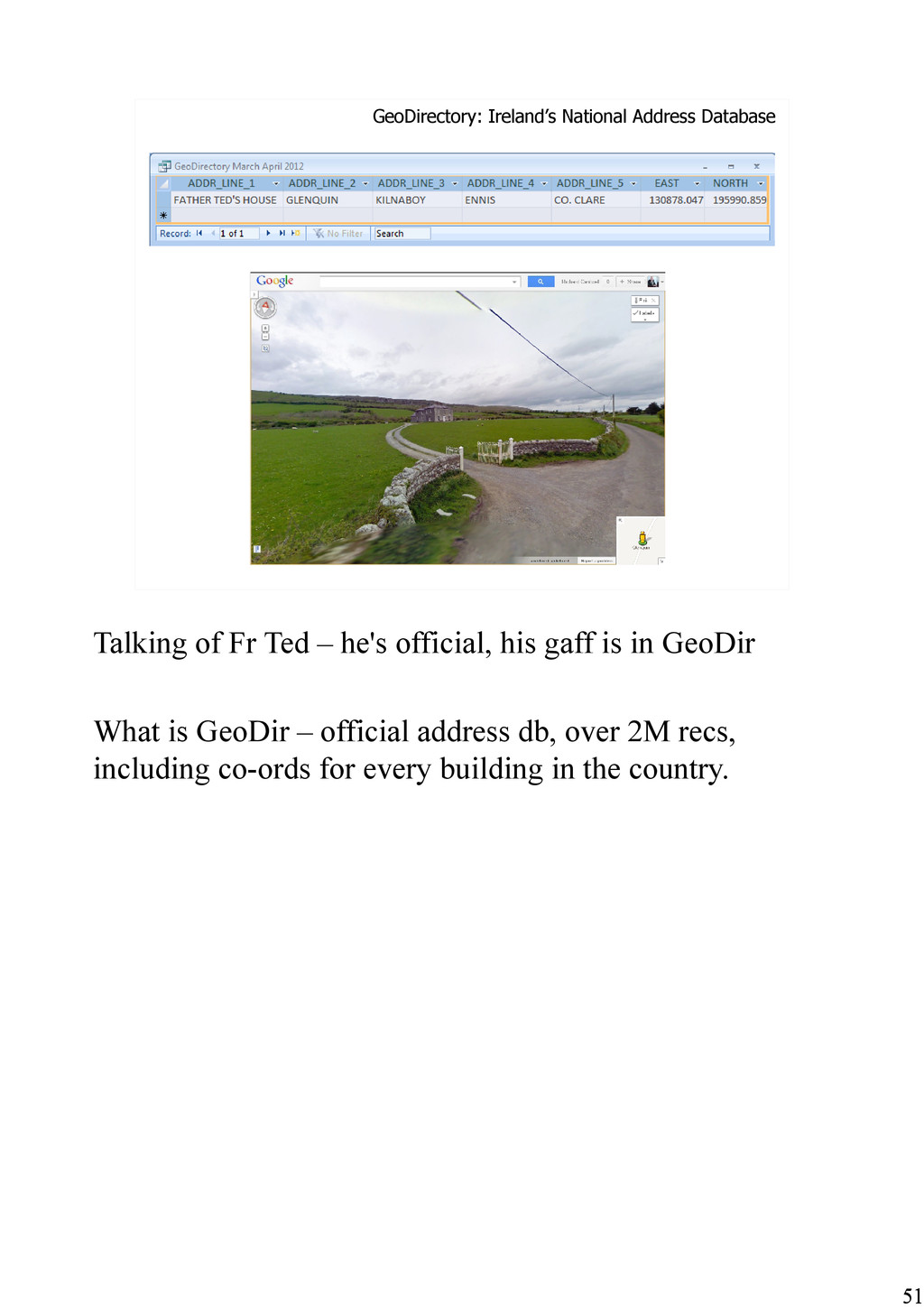
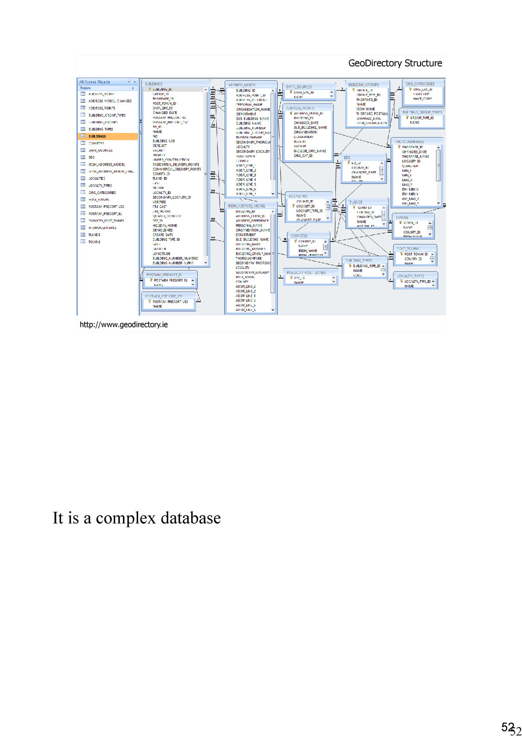
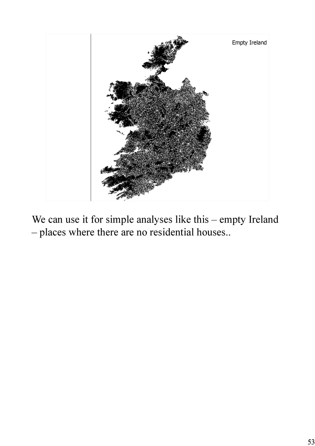
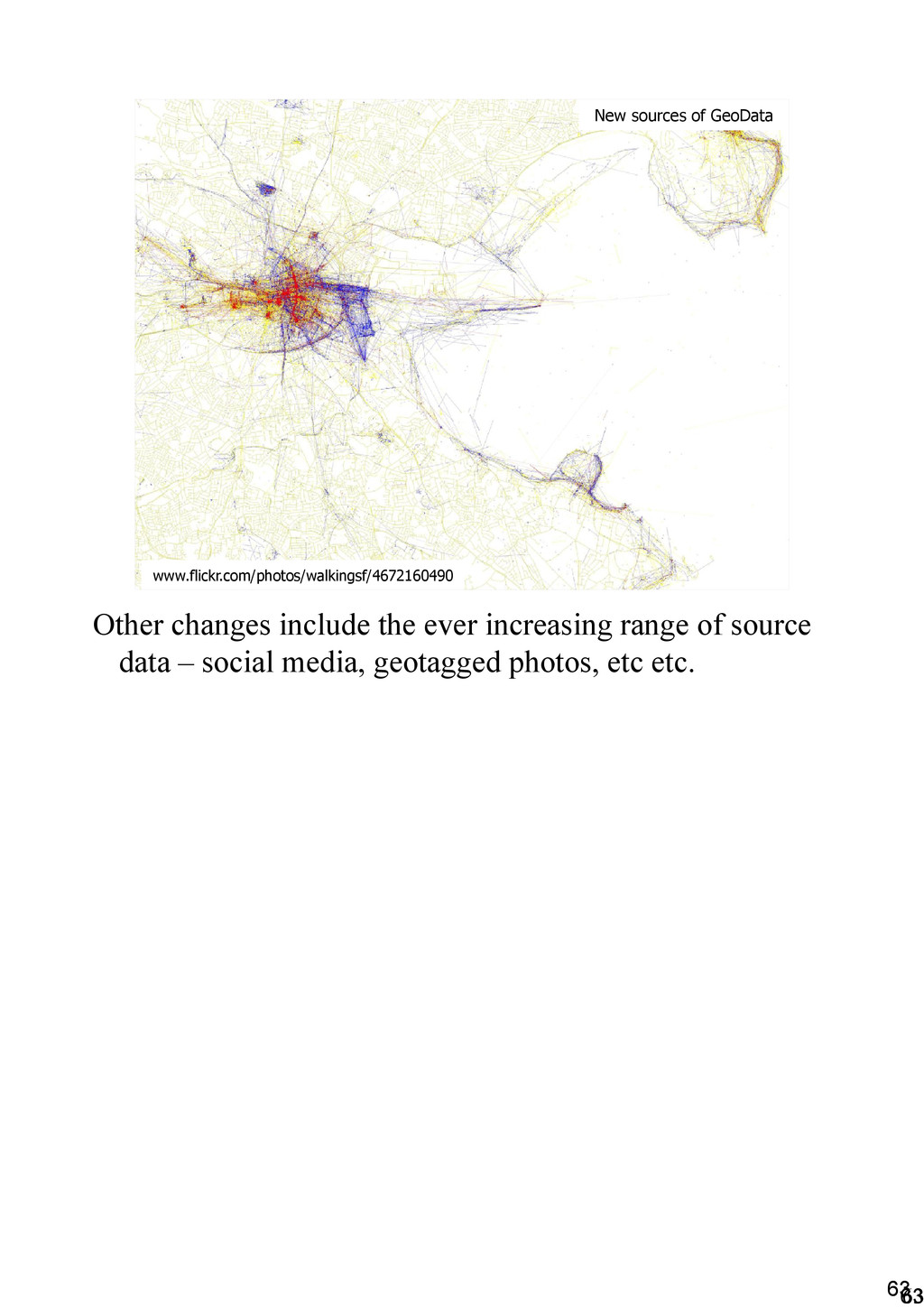
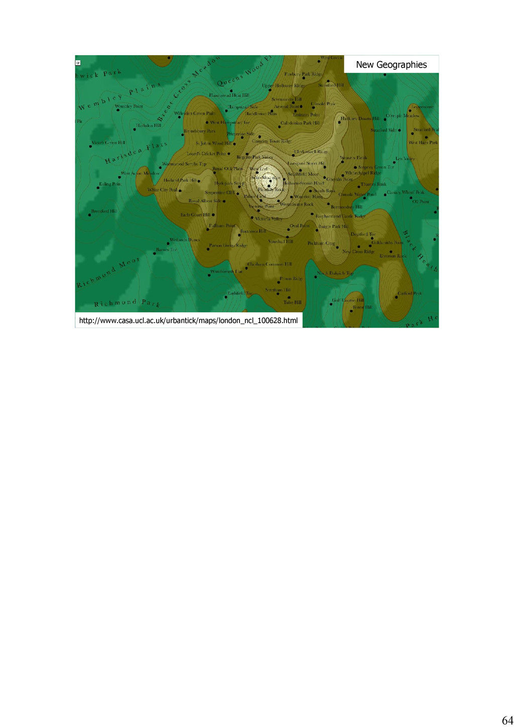
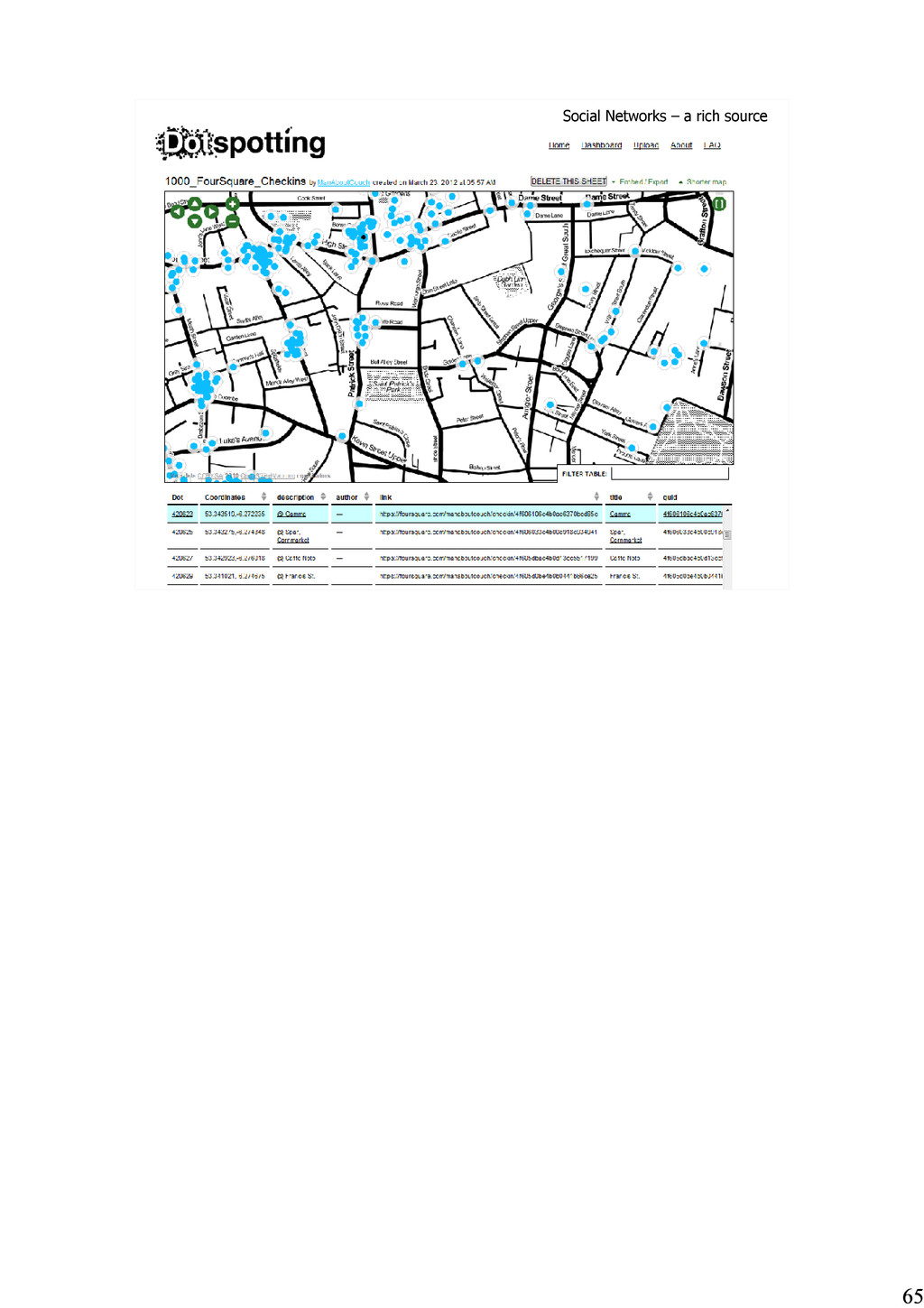
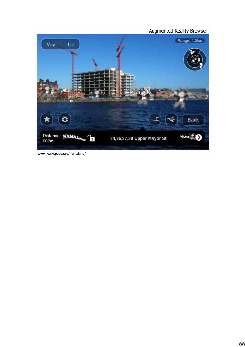
From #3DCamp12 - Location is ubiquitous.. Maps are everywhere.. Data is multiplying.. The course of the last 5 years has seen monumental change is the gathering and dissemination of Geographical Information. What is it that makes this data special? What unique challenges and opportunities exist when working with ‘GeoData’, and what is the future of this rapidly evolving sector?

Richard Cantwell

May 27, 2012
Tweet

More Decks by Richard Cantwell

Other Decks in Technology

Transcript

  1. Richard Cantwell GAMMA [email protected] www.gamma.ie Twitter: @GeoGraphicIE - Geo Related

    @ManAboutCouch - Personal What’s Special about Spatial? Hello. My name is Richard and I make maps. I work for GAMMA, one of Ireland’s leading GIS, and Location Intelligence companies. If you don’t know what those terms mean, don’t worry, I’ll explain them over the next half hour or so. What I do is help clients understand the market they’re operating in, and to do this I draw on a wide range of data from all sorts of places, from central and local govt, semi-states, the private sector, crowd sourced and of course client provided data. But the data I work with is special – it’s 'spatial' or 'geographical', that is it is information that can be located in space. I can combine data from all of these sources because they all have a locational element, meaning I can put them on a map. Once I have the data in my mapping system (or GIS) I can combine them and perform all sorts of operations on them to gain insight. In this presentation I’m going to talk about what it is that makes spatial special, what are the unique challenges and opportunities of working with this data.
  2. Mercator, World Map, 1569 Maps from cartography’s ‘Golden Age’ are

    works of art; owned and seen by the few, made by the even fewer. This particular map is very important – over 400 years old and elements still in use today – projections, more of which anon.
  3. Griffith Valuation, 1850-1858 As time marched on maps have become

    more ubiquitous, becoming part of the machinery of the state, such as this ‘Griffith Valuation’ map which was used for Tax gathering in Ireland 150 years ago. At the time Ireland was almost certainly the best mapped territory on the planet. The British applied the lessons learned while mapping Ireland between the 1820's and 1840's to their efforts at home and elsewhere.
  4. www.nuim.ie/staff/dpringle/qsms.shtml Early Computer mapping – Belfast 1972 Being able to

    store, manage, analyse and produce data in digital form has changed the face of many, or even most, disciplines, and geographyis no different. This very early example of computer mapping looks a lot different from the old maps we've already seen, and probably needed just as much work to make.
  5. Computer Mapping – 2012 Version But fast forward to now.

    Give me a few minutes and I can make a map like this, the backdrop mapping comes from OSM (more about that from Dermot later) and can be updated every minute. I can drop data from other sources on top, do some analysis and output to a dizzying range of formats. (most of which will be obsolete long before paper is – but there you go)
  6. County Population 2011 Dublin 1273069 Antrim 616384 Cork 519032 Down

    489588 Galway 250653 Derry 211669 Kildare 210312 Limerick 191809 Meath 184135 Donegal 161137 Tipperary 158754 Tyrone 158460 Kerry 145502 Wexford 145320 Wicklow 136640 Mayo 130638 Armagh 126803 Louth 122897 Clare 117196 Waterford 113795 Kilkenny 95419 Westmeath 86164 Laois 80559 Offaly 76687 Cavan 73183 Sligo 65393 Roscommon 64065 Monaghan 60483 Fermanagh 57527 Carlow 54612 Longford 39000 Leitrim 31796 But why map things at alll? Here’s a table – some patterns can be discerned, but what about distribution – the ‘Where’ question. To answer those I need to map this data..
  7. Voila! I can join that table of information to a

    spatial dataset of county boundaries which I have to hand with a couple of clicks. A couple more clicks and I've colour coded the data.
  8. Lets look a little deeper at this - maybe raw

    population isn’t the full story – some counties, like Cork, are very big but have a large population, while Dublin is small, but has a huge population. Mapping the density might be a better option. To do this I need to take the area of the county into account – GIS systems can do this at the push of a button – even if the original table doesn’t contain the area of the county – the software can figure out the size. Another couple of clicks and my map has changed.
  9. 10 10 Maybe we’re getting ahead of ourselves a bit.

    So we know one reason why we map things – easy visualisation, but that’s far from all there is to it. The 'where' question is asked all of the time, whether it's 'routing' or more complicated questions – and we've been asking complicated questions for a long time.
  10. 11 11 John Snow's 'Cholera Map' from 1854 www.TheGhostMap.com Now,

    this is probably the most overused example in any presentation about 'Geo' or 'Spatial' the famous John Snow map from 1854. It illustrates the power of combining different datasets into the one map. In this case it's water pumps and deaths from cholera.
  11. 12 12 Henry Drury Harness:1837 Flow Map and Population Density

    Map indiemaps.com/blog/2009/11/the-first-thematic-maps To make up for that overused example, two earlier and underused examples – the first flow map and one of the first ‘statistical maps’ both produced by the same man – Henry Drury Harness in a report for the Irish Railway Commissioners in 1837. The quality of the available images isn't great, but here we can see examples of maps being used to convey more than just things that exist on the ground. Whether it's 'how many trains per hour are needed on this corridor' or 'where are large concentrations of people' we've moved beyond the simple recording of location and onto a more abstract representation.
  12. 13 13 In the modern era we’re well used to

    being able to get our hands on statistical data and map it – here I'm drawing from CSO data, and I can combine this with customer locations or any other dataset and hopefully gain some insight into what's happening.
  13. 14 14 Layering Data to gain insights. The key thing

    is overlaying different data – mash-ups if you like – and there is a huge range of questions you can answer with this approach.
  14. 15 15 What’s Special about Spatial? www.blanz.net/geo13.html But at the

    core of this is the data – what is spatial data? Firstly in this day and age it's digital – or if not then it's data that has somehow been digitised, whether by scanning paper maps or tracing over them with specialised hardware.
  15. 16 16 Spatial data – data that is 'located in

    space' A definition – some kind of referencing system – lat long, ING, X, Y etc. Etc. If you can locate your data in space, it is spatial.
  16. 17 17 Represent the curved earth on a flat screen

    or paper: Projections The earth isn’t flat, our screens are though, most of the data we work with is too – so far, 3d is very cool but isn’t required for much of the analysis we do. Indeed you could consider the 'attribute' data to be the 3rd dimension. Height, or 'z' is just another attribute. (yes, I'm oversimplifying)
  17. 18 18 Projections http://xkcd.com/977 Lots of different projections – Web

    Mercator commonly used on the web. Irish Grid also
  18. 20 20 Vector Data: Point But what does the data

    look like? Two main forms: Vector and raster. Vector data stores individual features as objects, while raster can be likened to a photo – an area is covered in a regualr grid, with each cell (or pixel) having a value. Lets look at Vector data first – here's the simplest type – point data. Just an X and Y coordinate, and maybe some attributes – town names in this case. If I had more attributes, population say, I could change the size of the points to reflect the pops of the towns.
  19. 21 21 Vector Data: Line Line data – a series

    of connected points. Stored as a single object, again with attribute data – road classification in this case.
  20. 22 22 Vector Data: Region Finally, region or area data,

    a series of connected lines enclosing an area, also stored as a single object. Modern software can shift data from type to type as required.
  21. 23 23 Raster data. Raster data – height – NASA,

    Usually seen with a weather forcaster in front of it – in the public domain, so freely downloadable and reusable. Aerial photos – usually from satellites. Can be v expensive for recent & cloud free scenes, but Gmaps, Bing etc pay to use and make available under licence.
  22. 24 24 Tile Data: .../{z}/{x}/{y}.png mike.teczno.com Tile data – a

    special case. Gaining a lot of attention due to it's use by Gmaps, OSM, Bing etc. Typically vector and raster data is assembled by these orgs and rendered, either on the fly or in advance.
  23. 25 25 Tile Data Pyramid tile.openstreetmap.org/0/0/0.png tile.openstreetmap.org/10/494/331.png tile.openstreetmap.org/18/126521/84975.png Lot's and

    lots of tiles – some pre render – gmaps, other's render on demand – osm. OSM's tilestore – 1.2TB of .png files for the whole planet, the top 16 zoom levels add up to about 200GB of that, and the bottom 3 add the other 1TB.
  24. maps.stamen.com/watercolor Some amazing things being done with tiles – this

    is actually a tileset, from a San Fran company called Stamen who do lots of cool things with OSM data.
  25. izeize.com/openmaps Or even see them on my phone. This particular

    tileset is a bit of a victim of it's own popularity, quite a lot of compute power (Amazon EC2 I understand) required to generate, done pretty much on the fly, so if you visit when the internet is awake some tiles might not render
  26. www.mapbox.com/tilemill Bake your own You can make your own tiles

    too. Server based GIS software has this capability, but there is a new breed of desktop apps like TileMill which is built from Open Source SW which can do this too.
  27. 30 30 30 30 GeoCoded Address data www.autoaddress.ie There is

    also address data. We've already heard about postcodes today, but it is now possible to convert Irish addresses to points on a map, and this is crucial to unlocking the 'locational' element of most organisations data holdings – anywhere in the org that uses address data: CRM, asset registers and so on.
  28. 31 31 31 31 GeoCoded Address data www.autoaddress.ie This is

    what it might look like – you start off with addresses and end up with points on a map ready for analysis. More about this in a few minutes.
  29. 32 32 Unintentional errors Intentional errors Projection issues Data Classification

    Scale Generalisation Interpretation Modifiable Areal Unit Problem (MAUP) We've looked at the nature of spatial data, and seen some of the things you can do with it, but spatial data has it's own set of unique challenges. For some reason about 90% of the examples in this classic book are from the planning trade, draw from that what you will.
  30. 33 33 An Unintentional Error Here's an example of an

    unintentional error – google's map of Letterkenny from a couple of years ago. They took about 6 months to fix this. That's what the HSE have been spending all that money on – buying Letterkenny. Donegal people must get very sick
  31. 34 34 Common data creation errors Overshoot Undershoot Pseudonode Dangling

    Node Missing Label Point Missing Node Polygon Label Point If you're creating vector data from scratch then there are a range of errors that can creep in. The Letterkenny example was probably an undershoot – leading to a region that wasn't properly closed – but as you can see there are plenty of other types of error. Modern GIS software has tools built in for detecting and fixing these, of course, and most casual users just work with available data rather than making their own.
  32. 35 35 The Map. The reality. An Intentional Error Don't

    copy things unless you have a license. Big case against the AA by OSGB about 10 yrs ago – precision of co-ordinates in the data – the same to 10 decimal places – or the atoms were in the same place.
  33. 36 36 Projection issues: Offset Imagery Sometimes things get projected

    incorrectly, or imagery rectification goes awry. In this case, from OSM, the streets are very accurate – multiple verified GPS readings, but the backdrop imagery is offset – due to a production error. This is common enough with global datasources like this. On the other hand OSi ortho data is super accurate – an example of you get what you pay for perhaps.
  34. 37 37 Classifying Data: here be dragons.. colorbrewer2.org Can open,

    worms everywhere. Classifying data is a bog standard function. May have a continuous variable, but showing each one in it's own colour isn't practical – human eye has difficulty with more than 7 or 8 classes. But this isn't without issues...
  35. 38 38 Consider this map. I've classified the areas according

    to the proportion of vacant houses in last years census. I chose to split the data into 5 classes and pretty much let my GIS software come up with the ranges. You can see there is quite a lot of variation. Also note that I have included the number of areas in each class – just for illustration purposes.
  36. 39 39 Same data, different classification, very different message –

    this map seems to be saying – ok, there is a vacant housing problem in some areas, typically where there are a lot of holiday homes, but mostly we're ok.
  37. 40 40 Again, same data, very different message – this

    map is saying we're all fecked, time to emigrate if you don't live near a big city.
  38. 41 41 Why are these bastards lying to me So,

    when you see a map with classified data, think – what is this map trying to tell me, why were those classes picked?
  39. 42 42 Scale Issues Spatial data is typically captured at

    a certain scale, and modern software makes it very easy to use data captured at one scale at another scale, which can cause a lot of problems. These two maps were generated at the different scales, but are being shown at the same. If I want to find my way around NewcastleWest, the one on the left is useless. On the other hand if I'm doing some sort of national level project the one on the right is far too detailed to be practical / legible. If I wanted to capture roads, say, it would take forever.
  40. 43 43 Generalisation / Selection Similarly, we often work with

    very large datasets – like this roads dataset from NavTeq. If I'm working at this scale do I really need every boreen in the country – does it add to my model?
  41. 44 Continuous Variance: Surface Often we work with data that

    continuously varies – like soil types for example. The tendancy is to draw lines between different types, but the reality on the ground is that there are no hard lines – one soil type gradually merges into the next.
  42. 45 Racial origin in a US City www.flickr.com/photos/walkingsf/4982034696/ We don't

    see hard boundaries like this very often, especially when dealing with humans.
  43. 46 Even in regimented areas like this (in Mexico city

    – this is actually a photo, I thought it was a render) there is continuous variance .
  44. 47 47 The Modifiable Areal Unit Problem Which brings us

    to MAUP – different results depending on how you slice and dice your data
  45. 48 48 48 48 48 Blanchardstown – Blakestown: Pop 32,305

    (2006) Moving from 3,400 DEDs to approx 19,000 SAs – much more detailed and granular data analysis possible.
  46. 49 49 Tobler’s First Law of Geography: "Everything is related

    to everything else, but near things are more related than distant things." Concludes section on errors / issues. Most important thing about geography: 1st law, and models, data, processes all need to take this into account.
  47. 50 50 Tobler’s First Law of Geography: “These are small,

    those are far away." Or to put it in Irish terms
  48. 51 51 GeoDirectory: Ireland’s National Address Database Talking of Fr

    Ted – he's official, his gaff is in GeoDir What is GeoDir – official address db, over 2M recs, including co-ords for every building in the country.
  49. 53 53 Empty Ireland We can use it for simple

    analyses like this – empty Ireland – places where there are no residential houses..
  50. The upshot is that we can use this to geocode

    address data, as we saw earlier, and do things like drivetime analysis
  51. Vs creativecommons.org Very interesting battle going on between traditional copyright

    controlled data sources and a new breed of openly licensed data, Dermot is going to talk about this in more detail shortly.
  52. O p e n S t r e e t

    M a p Here's OSM – richly detailed
  53. Map contains data Copyright NavTeq Map contains data Copyright NavTeq

    Comparable to commercial data in many areas, and catching up quickly.
  54. 63 63 63 63 New sources of GeoData www.flickr.com/photos/walkingsf/4672160490 Other

    changes include the ever increasing range of source data – social media, geotagged photos, etc etc.
  55. 70 Pre rendered tiles – Range of data sources AJAX

    (Asynchronous JavaScript and XML) Open API's - Mashups Rapid development – releases every 7-10 days Google Earth Google Maps - Key Innovations http://berglondon.com/projects/hat/