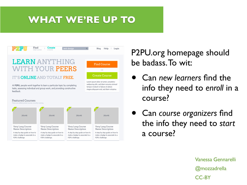
wit: • Can new learners find the info they need to enroll in a course? • Can course organizers find the info they need to start a course? Vanessa Gennarelli @mozzadrella CC-BY
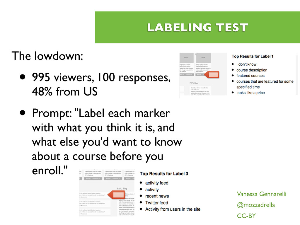
from US • Prompt: "Label each marker with what you think it is, and what else you'd want to know about a course before you enroll." Vanessa Gennarelli @mozzadrella CC-BY
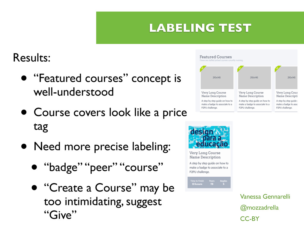
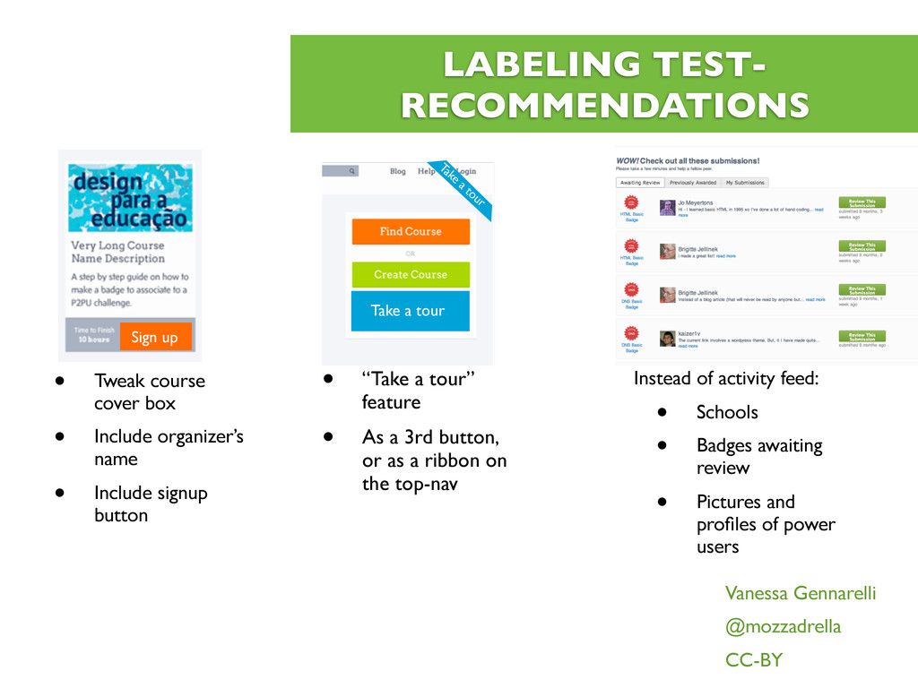
Course covers look like a price tag • Need more precise labeling: • “badge” “peer” “course” • “Create a Course” may be too intimidating, suggest “Give” Vanessa Gennarelli @mozzadrella CC-BY
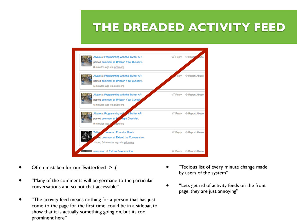
:( • “Many of the comments will be germane to the particular conversations and so not that accessible” • “The activity feed means nothing for a person that has just come to the page for the first time. could be in a sidebar, to show that it is actually something going on, but its too prominent here” • “Tedious list of every minute change made by users of the system” • “Lets get rid of activity feeds on the front page, they are just annoying”
course cover box • Include organizer’s name • Include signup button • “Take a tour” feature • As a 3rd button, or as a ribbon on the top-nav Instead of activity feed: • Schools • Badges awaiting review • Pictures and profiles of power users Vanessa Gennarelli @mozzadrella CC-BY Take a tour
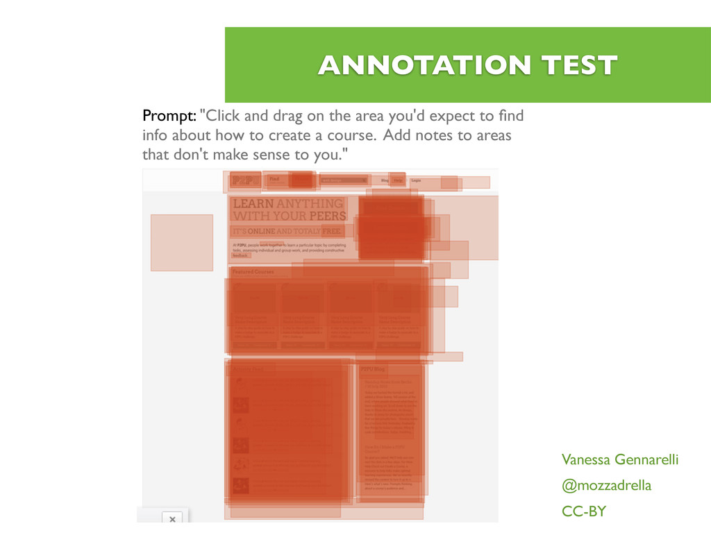
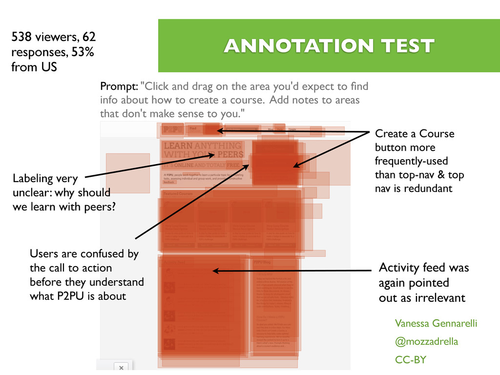
more frequently-used than top-nav & top nav is redundant Activity feed was again pointed out as irrelevant 538 viewers, 62 responses, 53% from US Prompt: "Click and drag on the area you'd expect to find info about how to create a course. Add notes to areas that don't make sense to you." Labeling very unclear: why should we learn with peers? Users are confused by the call to action before they understand what P2PU is about
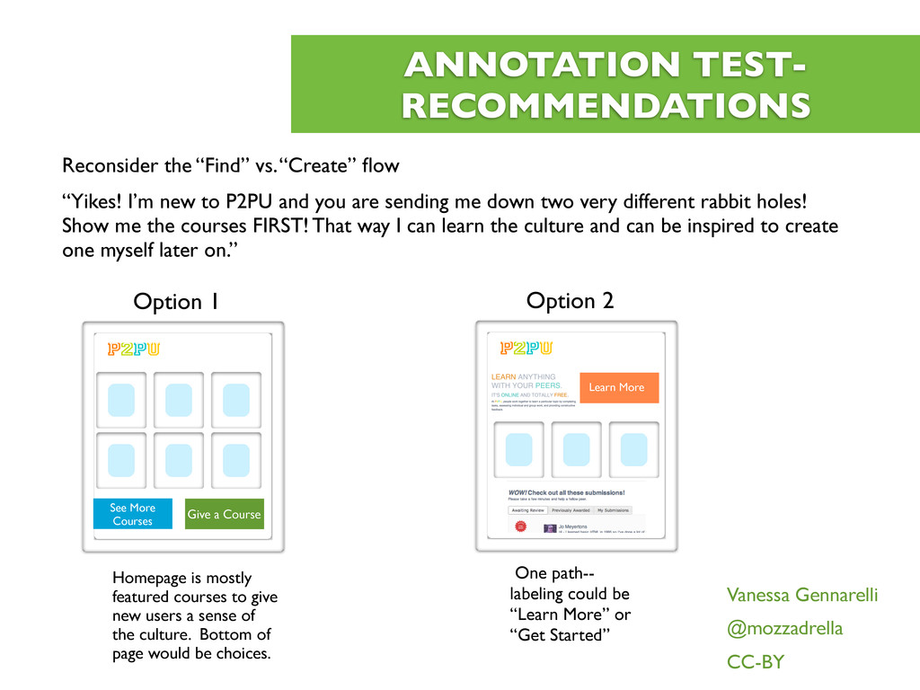
I’m new to P2PU and you are sending me down two very different rabbit holes! Show me the courses FIRST! That way I can learn the culture and can be inspired to create one myself later on.” Vanessa Gennarelli @mozzadrella CC-BY See More Courses Give a Course Homepage is mostly featured courses to give new users a sense of the culture. Bottom of page would be choices. Option 1 Learn More One path-- labeling could be “Learn More” or “Get Started” Option 2
• Double-barreled prompts--VMG *knows* better • Solution: run several tests with one question or prompt • Each successive test gets fewer results, so perhaps stagger them Vanessa Gennarelli @mozzadrella CC-BY