Upgrade to Pro
— share decks privately, control downloads, hide ads and more …
Speaker Deck
Features
Speaker Deck
PRO
Sign in
Sign up for free
Search
Search
20 Unrequested Map Tips
Search
Nathaniel V. KELSO
October 08, 2014
Design
340
0
Share
Embed
Copy iframe code
Copy JS code
Copy link
Start on current slide
20 Unrequested Map Tips
John Nelson | IDV Solutions
uxblog.idvsolutions.com
@JohnNelsonIDV
[email protected]
Nathaniel V. KELSO
October 08, 2014
More Decks by Nathaniel V. KELSO
See All by Nathaniel V. KELSO
Back to the Desktop
nvkelso
2
640
Who's On First Overview
nvkelso
1
250
Who's on First: Administrative Boundaries & Localities
nvkelso
1
230
Who ARE the People in your Neighborhood? Developing Mapzen’s Neighborhood Database
nvkelso
2
380
Introducing Web Mapping to Writing Studies and Journalism Classes at the University of Minnesota Duluth
nvkelso
0
150
A Jobs Panel: How to Hire or Be Hired
nvkelso
0
310
Big History, Little History: Cartography in the Twentieth Century
nvkelso
0
190
Displaying Change Data on a US Topo Map
nvkelso
0
130
UAEU Employees' Social Impact Assessment in Urban Development in Al Ain City
nvkelso
0
240
Other Decks in Design
See All in Design
CULTURE DECK/Frontend Engineer
mhand01
0
1.4k
「ツール」から「パートナー」へ。AI伴走時代のUXデザインとは?~操作を減らし、成果を最大にするための設計~
ncdc
1
680
保育現場にAIを 〜人と技術に橋を架けるデザインで考えてきたこと〜 uiuxcamp2026-hoiku-ai-design
hiro93n
1
310
「バイブコーディングって何?」から始まった、 AIとの一年間と、その先のこと
seto
0
620
20260309_3月ICTデザイン勉強会_地域創生2.0
a2k
0
140
Saving_the_King_-_Storyboard.pdf
terencebasart
0
110
再設計される業務 - AIにより再設計される "デザインワークフロー" / AI Ops Lab #2 Redesigned orkflows
kgsi
0
740
Of Ordination and Rebellion exploration sketches
rezaline
0
160
【優秀賞+特別賞】くまモン食いしん坊弁当「くまモンの魔法の柑橘弁当」最終審査資料
shoko_seven11
0
210
AIスライドデザインを生成する仕組みを社内共有する
kenichiota0711
7
5.7k
デザイナーが主導権を握る、AI協業の本音と実践
satosio
7
3.3k
デザイナーとエンジニアで 同じ山に登ろう
moco1013
0
270
Featured
See All Featured
Fireside Chat
paigeccino
42
4k
Chrome DevTools: State of the Union 2024 - Debugging React & Beyond
addyosmani
10
1.2k
DevOps and Value Stream Thinking: Enabling flow, efficiency and business value
helenjbeal
1
250
The SEO identity crisis: Don't let AI make you average
varn
0
510
Bridging the Design Gap: How Collaborative Modelling removes blockers to flow between stakeholders and teams @FastFlow conf
baasie
0
600
How STYLIGHT went responsive
nonsquared
100
6.2k
Distributed Sagas: A Protocol for Coordinating Microservices
caitiem20
333
23k
Six Lessons from altMBA
skipperchong
29
4.3k
Abbi's Birthday
coloredviolet
3
8.3k
Imperfection Machines: The Place of Print at Facebook
scottboms
270
14k
Kristin Tynski - Automating Marketing Tasks With AI
techseoconnect
PRO
0
280
Un-Boring Meetings
codingconduct
0
330
Transcript
John Nelson | IDV Solutions uxblog.idvsolutions.com @JohnNelsonIDV
[email protected]
Unrequested Map
Tips 2 0
None
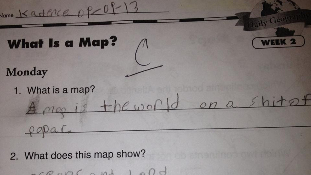
Makers need to make. Give them the chance or they'll
move on. Close Encounters of the Third Kind, Columbia Pictures. 1
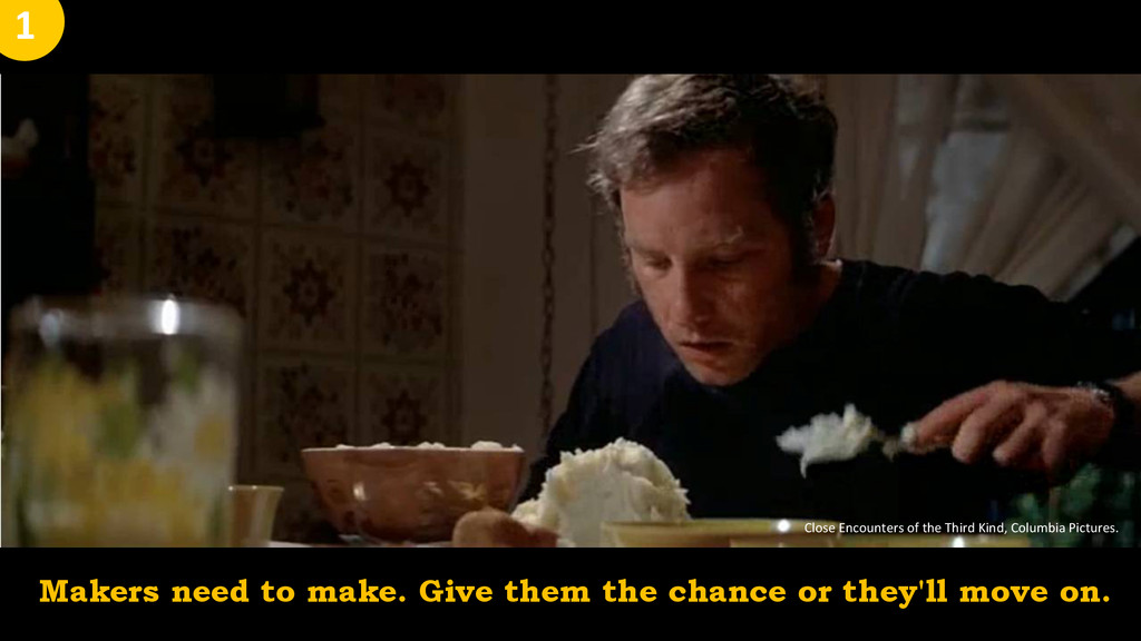
Stay away from the defaults! 2
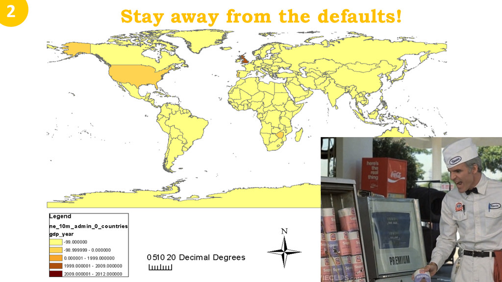
Show that same mapped data in companion charts. More visual
dimensions for discovery. 3
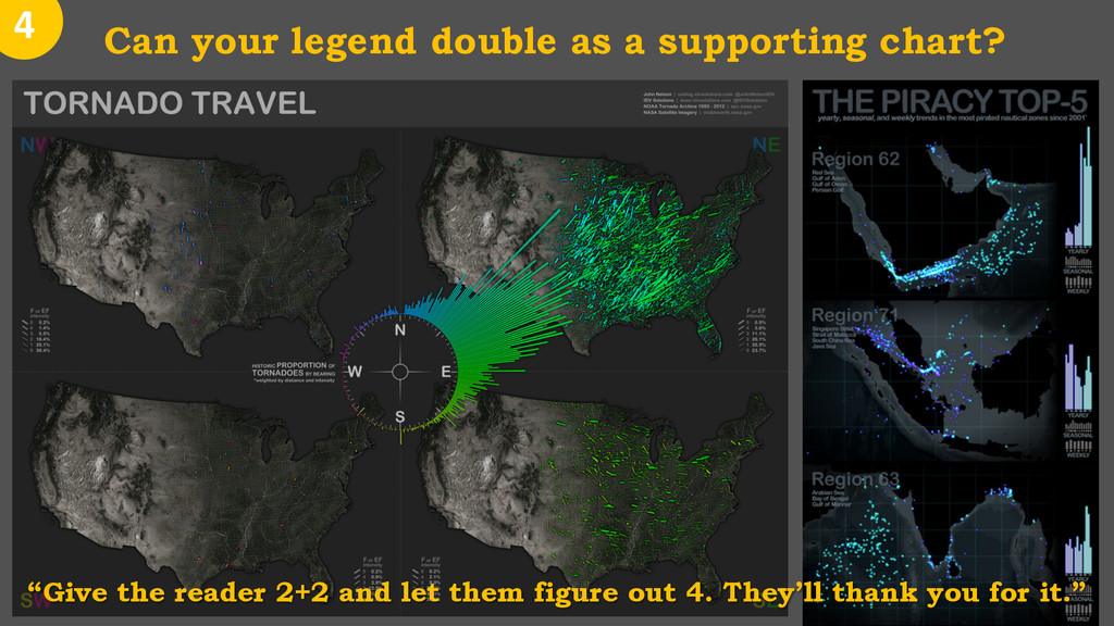
Can your legend double as a supporting chart? 4
“Give the reader 2+2 and let them figure out 4. They’ll thank you for it.”
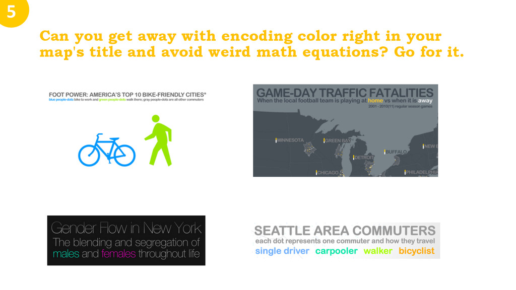
Can you get away with encoding color right in your
map's title and avoid weird math equations? Go for it. 5
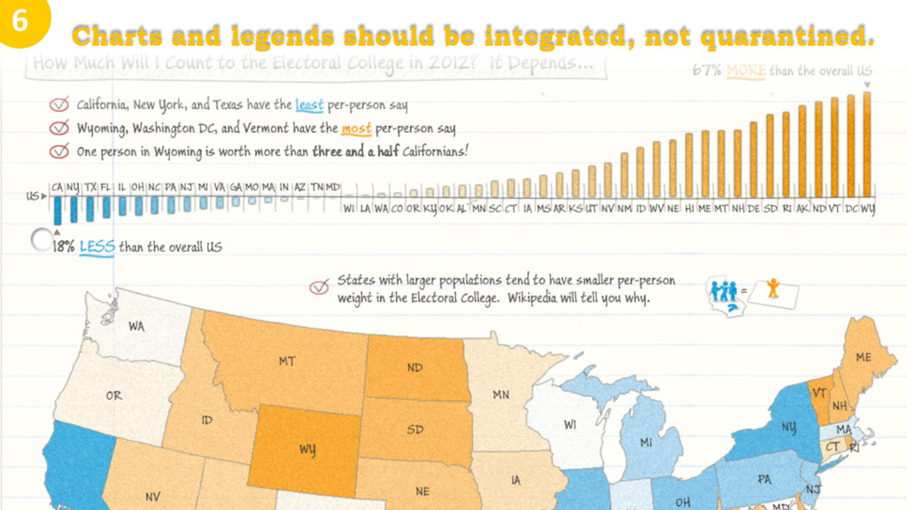
Charts and legends should be integrated, not quarantined. 6
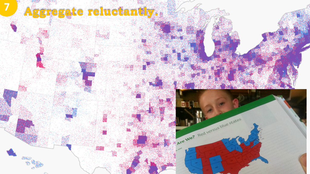
Aggregate reluctantly. 7
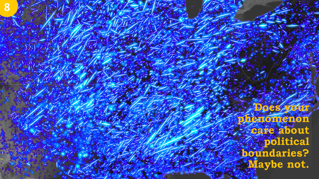
Does your phenomenon care about political boundaries? Maybe not. 8
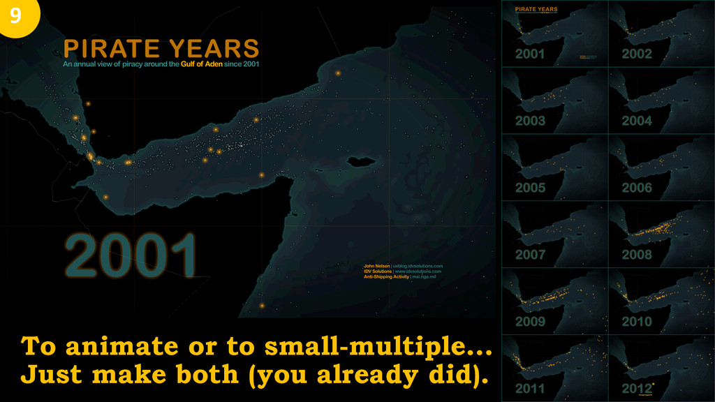
9 To animate or to small-multiple… Just make both
(you already did).
Thinking choropleth for count data? Maybe try dot density. It
self-normalizes for area, is emotionally resonant, and looks cool. • It self-normalizes for area, • is emotionally resonant, • and catches the eye. 10
10
• Brandon Martin-Anderson • Andy Woodruff • Bill Rankin •
Kirk Goldsberry 10
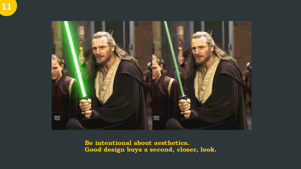
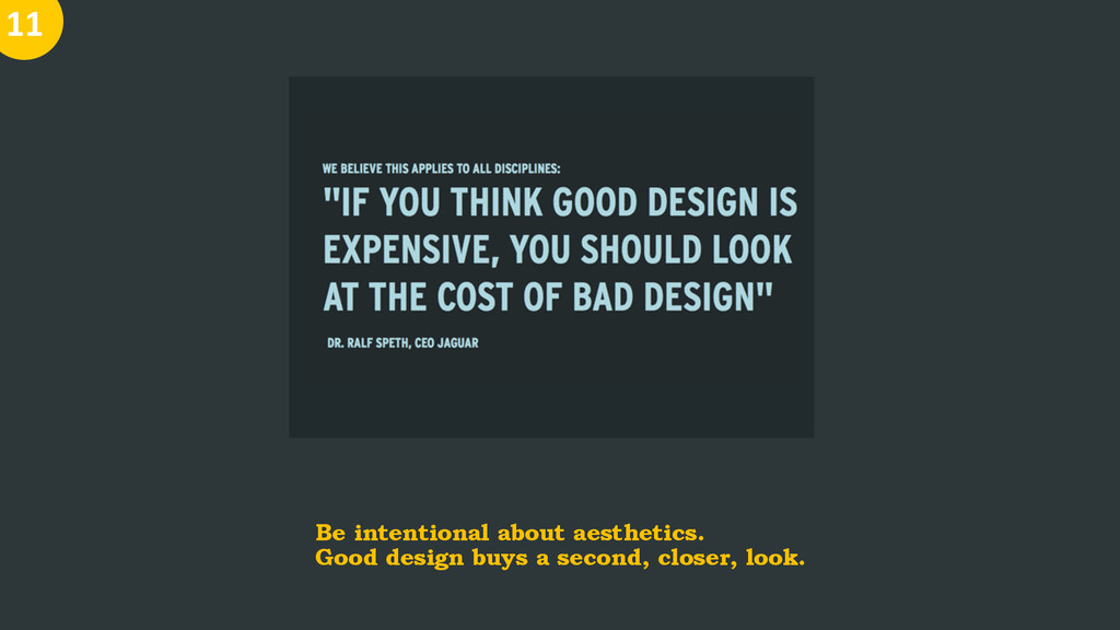
Be intentional about aesthetics. Good design buys a second, closer,
look. 11
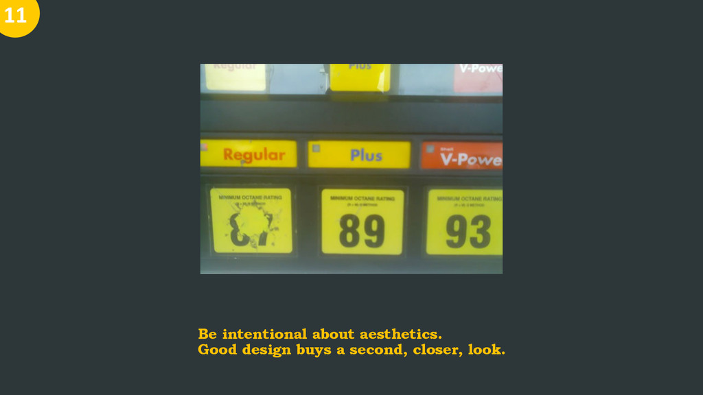
Be intentional about aesthetics. Good design buys a second, closer,
look. 11
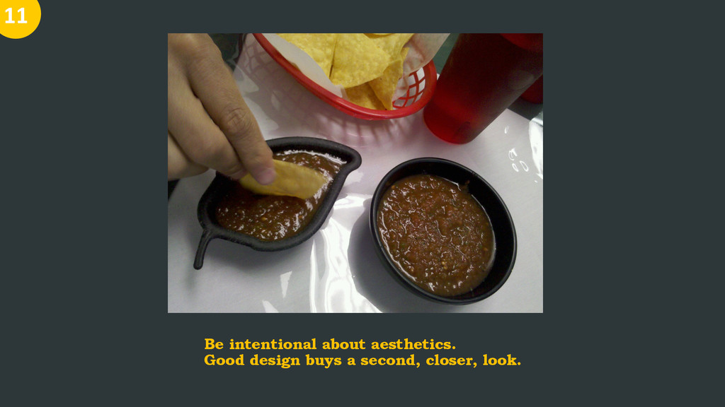
Be intentional about aesthetics. Good design buys a second, closer,
look. 11
Be intentional about aesthetics. Good design buys a second, closer,
look. 11
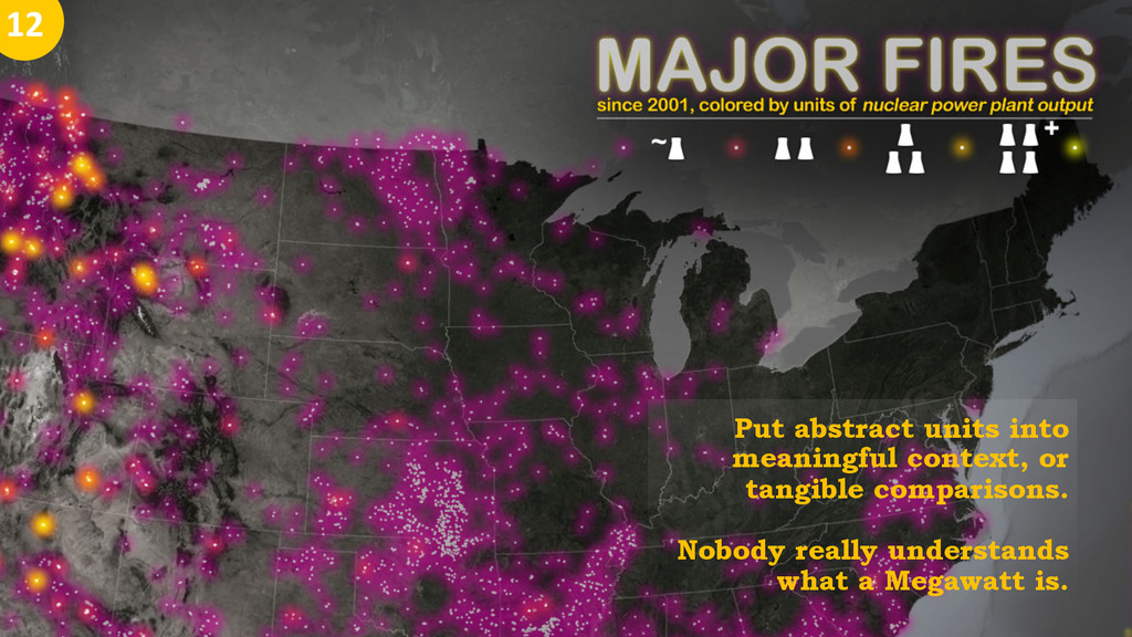
Put abstract units into meaningful context, or tangible comparisons. Nobody
really understands what a Megawatt is. 12
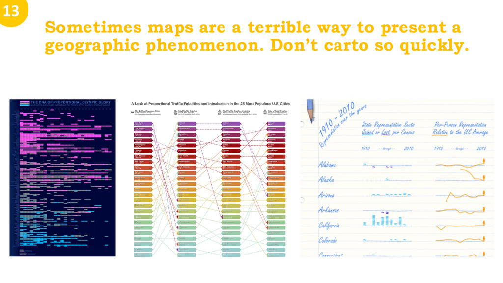
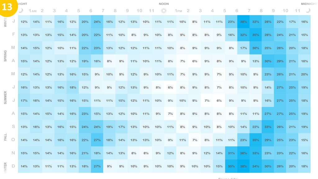
Sometimes maps are a terrible way to present a geographic
phenomenon. Don’t carto so quickly. 13
13
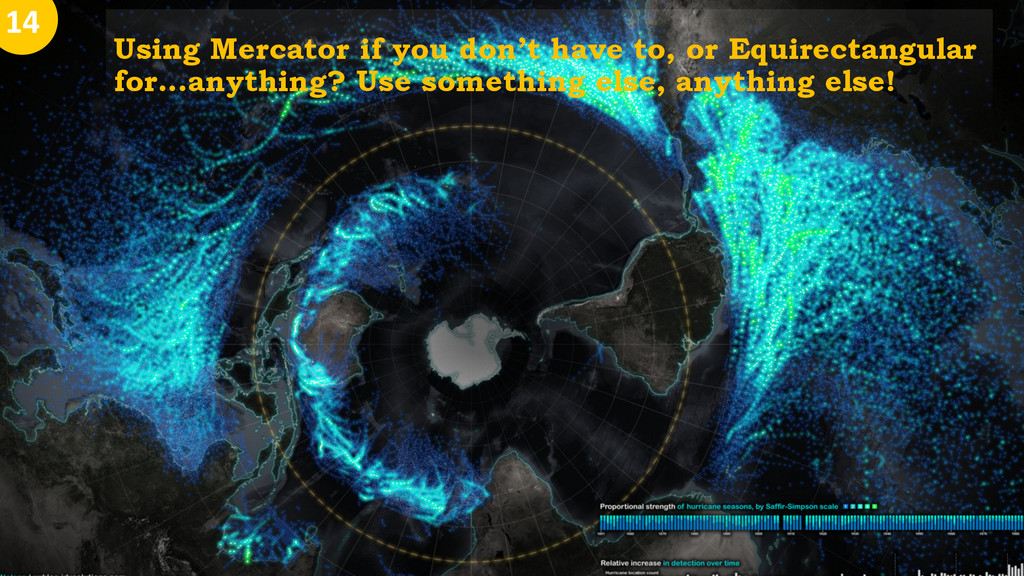
Using Mercator if you don’t have to, or Equirectangular for...anything?
Use something else, anything else! 14
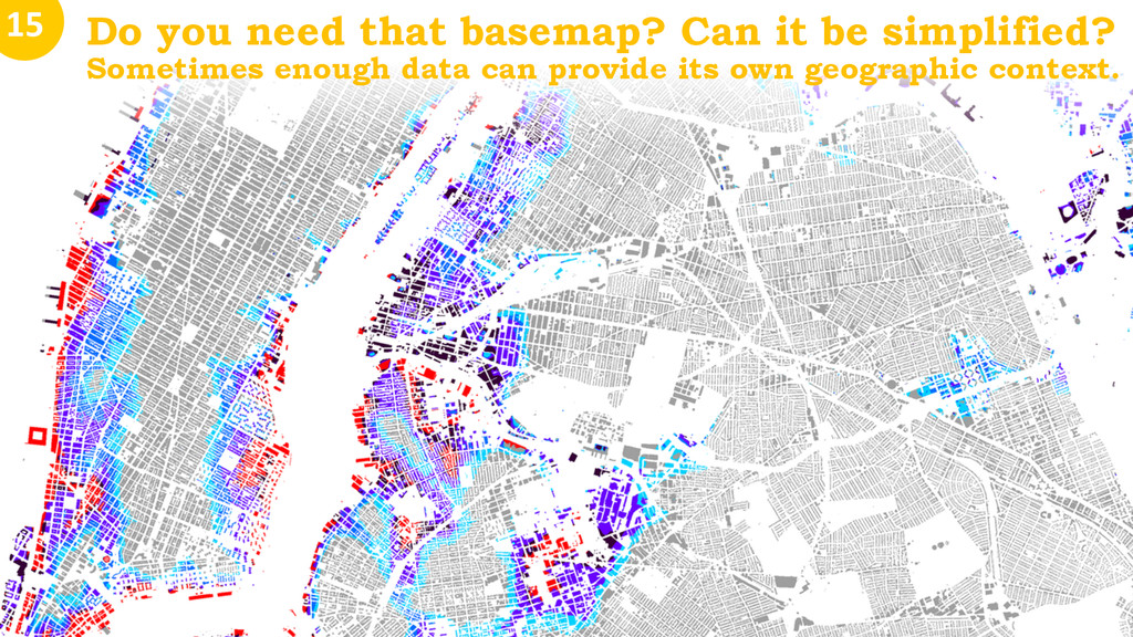
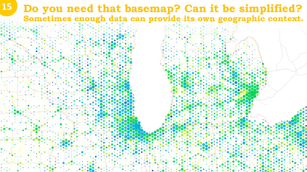
Do you need that basemap? Can it be simplified? Sometimes
enough data can provide its own geographic context. 15
15 Do you need that basemap? Can it be
simplified? Sometimes enough data can provide its own geographic context.
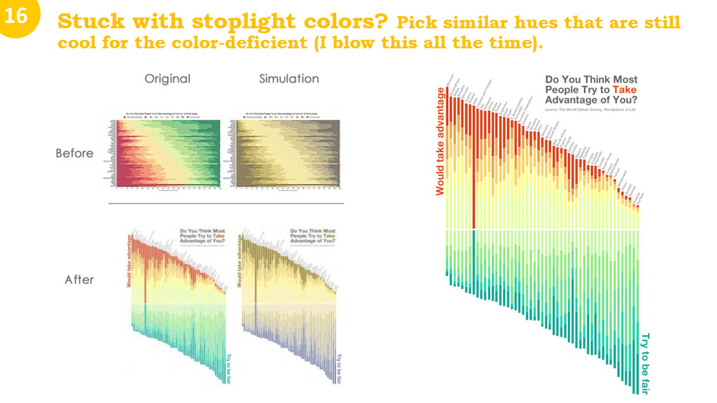
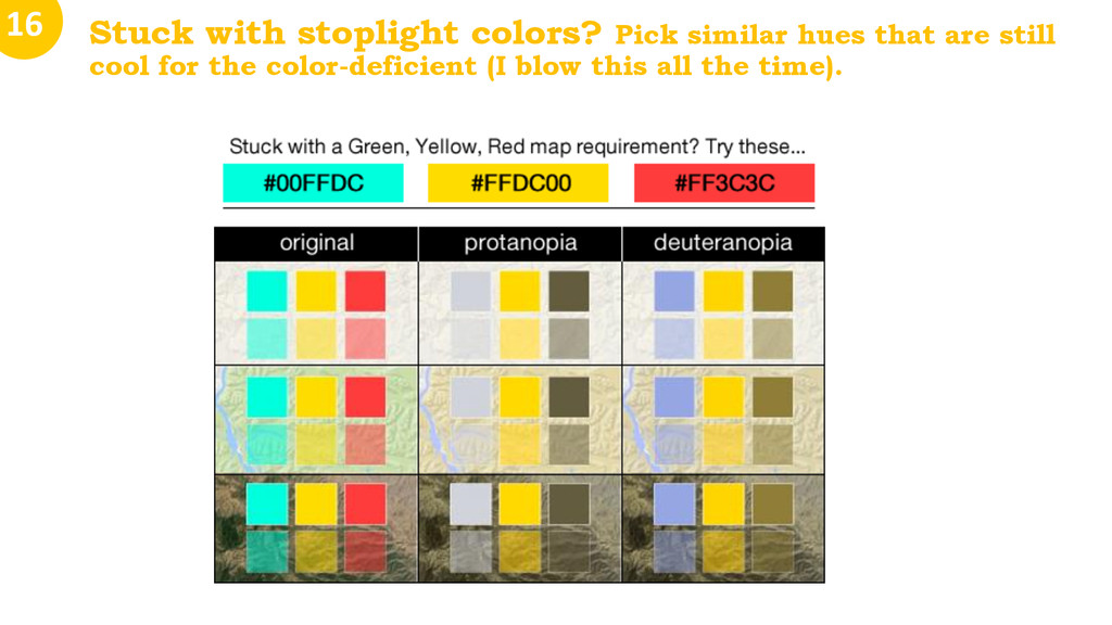
Stuck with stoplight colors? Pick similar hues that are still
cool for the color-deficient (I blow this all the time). 16
16 Stuck with stoplight colors? Pick similar hues that
are still cool for the color-deficient (I blow this all the time).
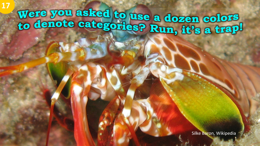
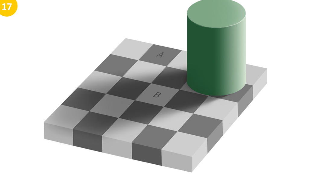
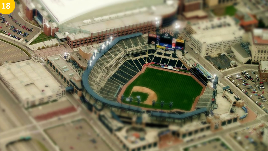
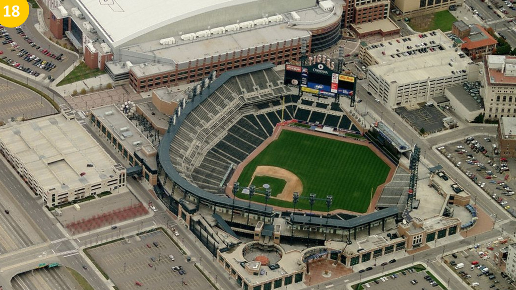
Silke Baron, Wikipedia 17
17
17
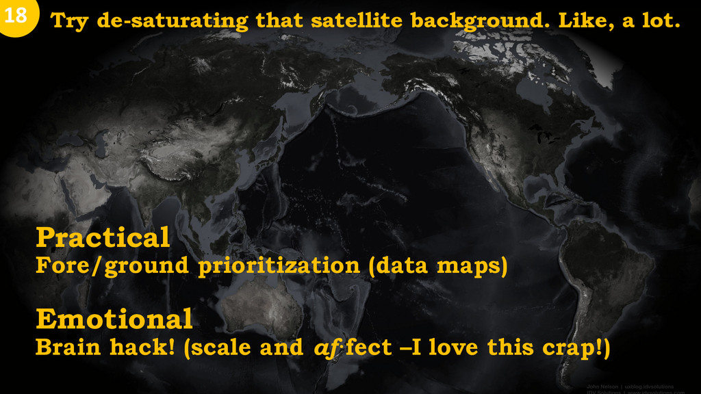
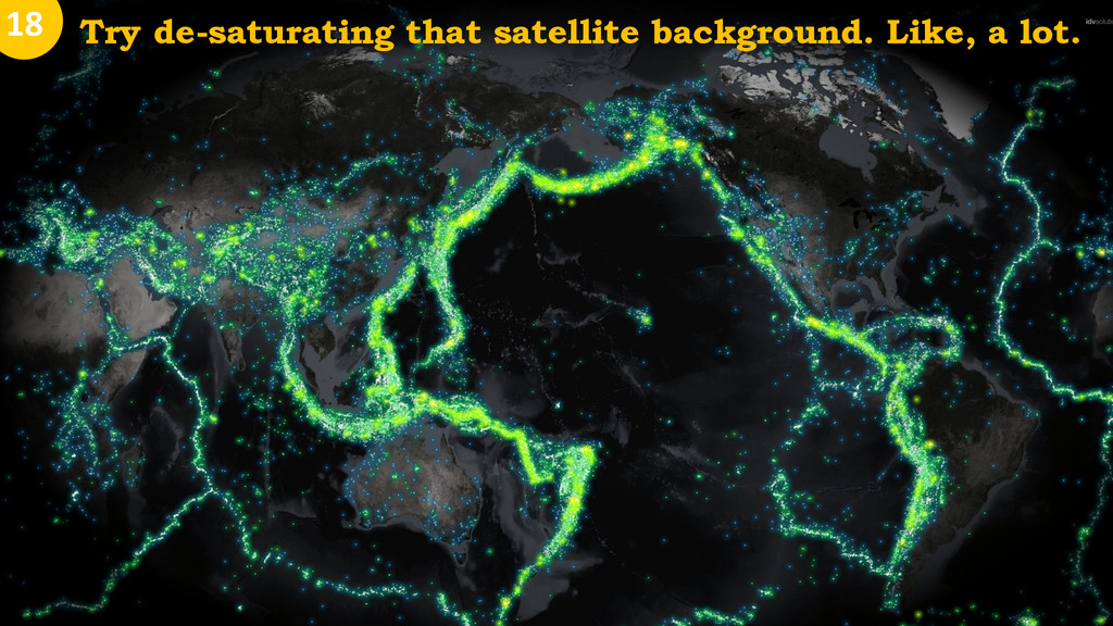
Practical Fore/ground prioritization (data maps) Emotional Brain hack! (scale and
af·fect –I love this crap!) Try de-saturating that satellite background. Like, a lot. 18
Try de-saturating that satellite background. Like, a lot. Try de-saturating
that satellite background. Like, a lot. 18
Try de-saturating that satellite background. Like, a lot. 18
18
18
18
Did you make it? Put your name on it! Were
you influenced by others? Hat tips all around! 19
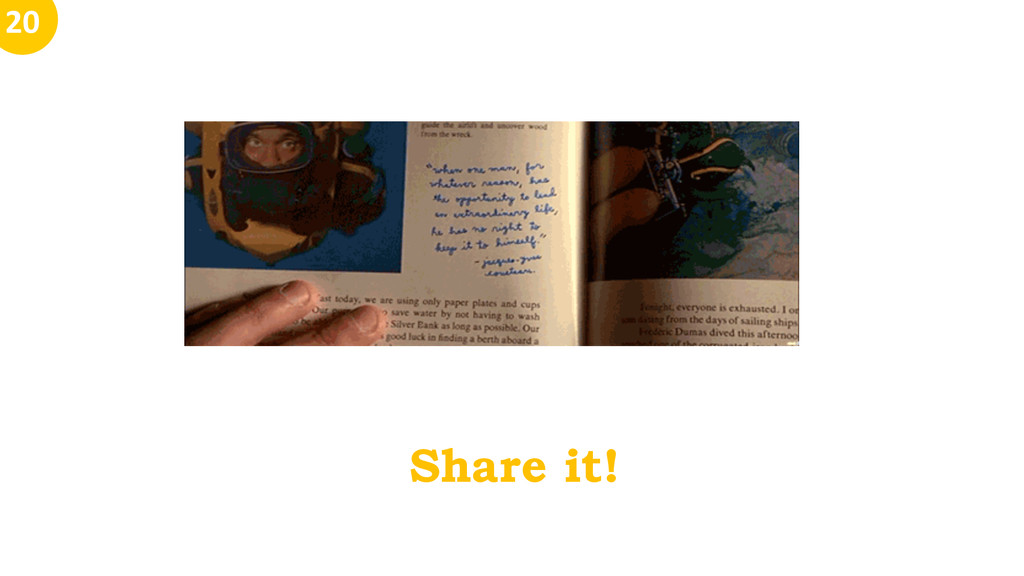
Share it! 20
John Nelson | IDV Solutions uxblog.idvsolutions.com @JohnNelsonIDV
[email protected]
Beam these
20 tips to your phone. Thanks!
![John Nelson | IDV Solutions uxblog.idvsolutions.com @JohnNelsonIDV [email protected] Unrequested Map](https://files.speakerdeck.com/presentations/29904bf032dd0132e4756e95328a2485/slide_0.jpg)
![John Nelson | IDV Solutions uxblog.idvsolutions.com @JohnNelsonIDV [email protected] Beam these](https://files.speakerdeck.com/presentations/29904bf032dd0132e4756e95328a2485/slide_37.jpg)