As a rule of thumb, Tamilians try to safe guard the script from influences. The state has also rejected the use of Hindi, with Aringar Anna stating that they did not need two languages to communicate - Ie., Hindi to talk to rest of India and English to talk to the rest of the world, and India can talk to TN in English. This stemmed from a need preserve their identity. It also came out during the wiki leaks that Karunanidhi, the chief minister in 1990 had requested US support for the formation for a separate 'Greater Tamil state', and has openly supported the LTTE.
Language is a main component of cultural identity, and scripts are the visual representation of language. And this philosophy visibly manifests itself for the language – Tamil. It is the first language to be given the status of 'classical' by the Government of India in 2004.
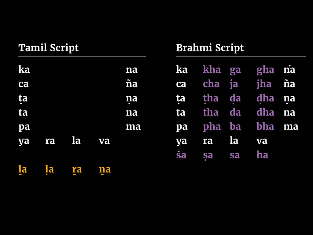
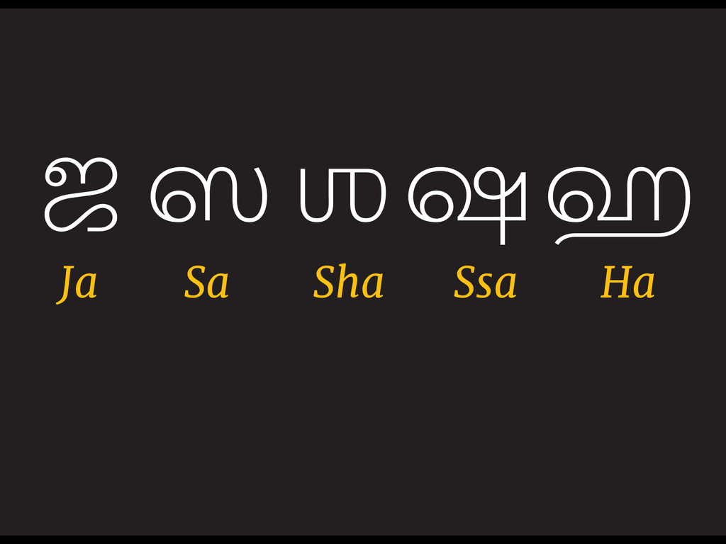
This is visible from the choice of character set - Tamil has only the first and the fifth letters of the varga, along with some other variations such as letters that are not available in the Brāhmī script, the lack of consonant clusters, unlike the consistency that is maintained by other Indic scripts. In Shen-Tamil or higher dialect, the Grantha characters are not recognised. This also becomes a caste based divide, with Brahmanic communities speaking and writing the language differently and the native who are consider themselves pure, condemning it. In pure Tamil, there are 12 vowels and 18 consonants, while an additional 5 are borrowed from the Tamil Grantha script, which is hardly ever acknowledged, and the character Ka is used in place of any of these.
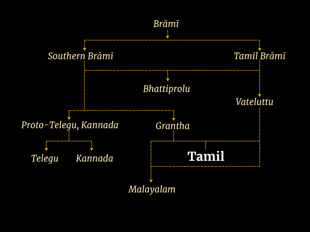
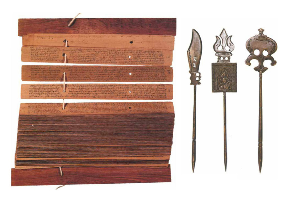
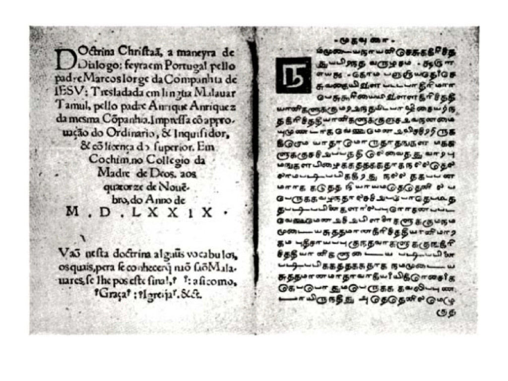
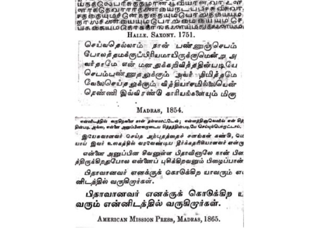
The Tamil script is a descendent of the Brahmi script. Manuscripts from south India, have their texts written on the leaves through incision with an iron stylus. After inscribing, the leaves were usually, although not invariably smeared with ink and cleaned with sand, leaving the ink in the incised letters, which otherwise would have been almost invisible. The writing materials and technique that the Tamil script was influenced by, resulted in a mono-linear tradition. The earliest Tamil printing was the Tamul Catechism of 1577, of which no known copy survives. The earliest example of surviving printed Tamil type is also the earliest example of printing in India, printed at Quilon in the Malabar coast in 1578 called Doctrina Christiam en Lingua Malauar Tamul. The script here is reproduced in its mono-linear tradition.
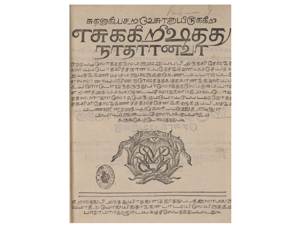
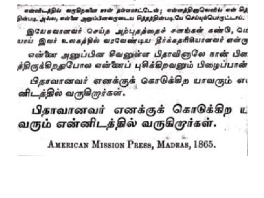
Strange modulation is visible in the headline type of Ziegenbalg's translation of the new testament in 1714. Under the supervision of the north American PR Hunt of the American Mission Press, during the latter part of the 19th century types were cut based on the calligraphy of that period, which is supposed to have been a significant improvement from the earlier models. The use of slanted type in reading texts, and modulation were the two most notable features that were introduced then.
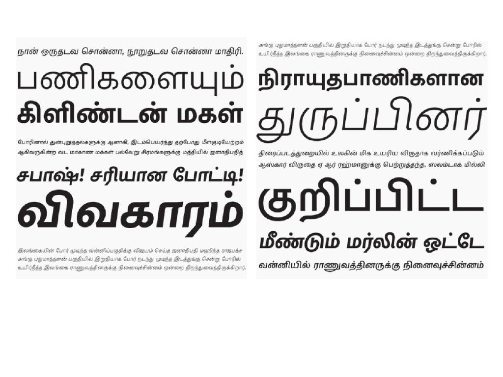
Contemporary Text Type
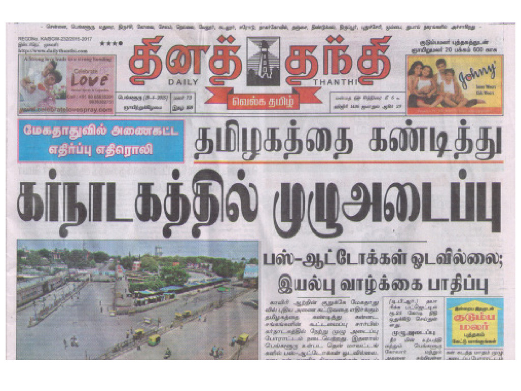
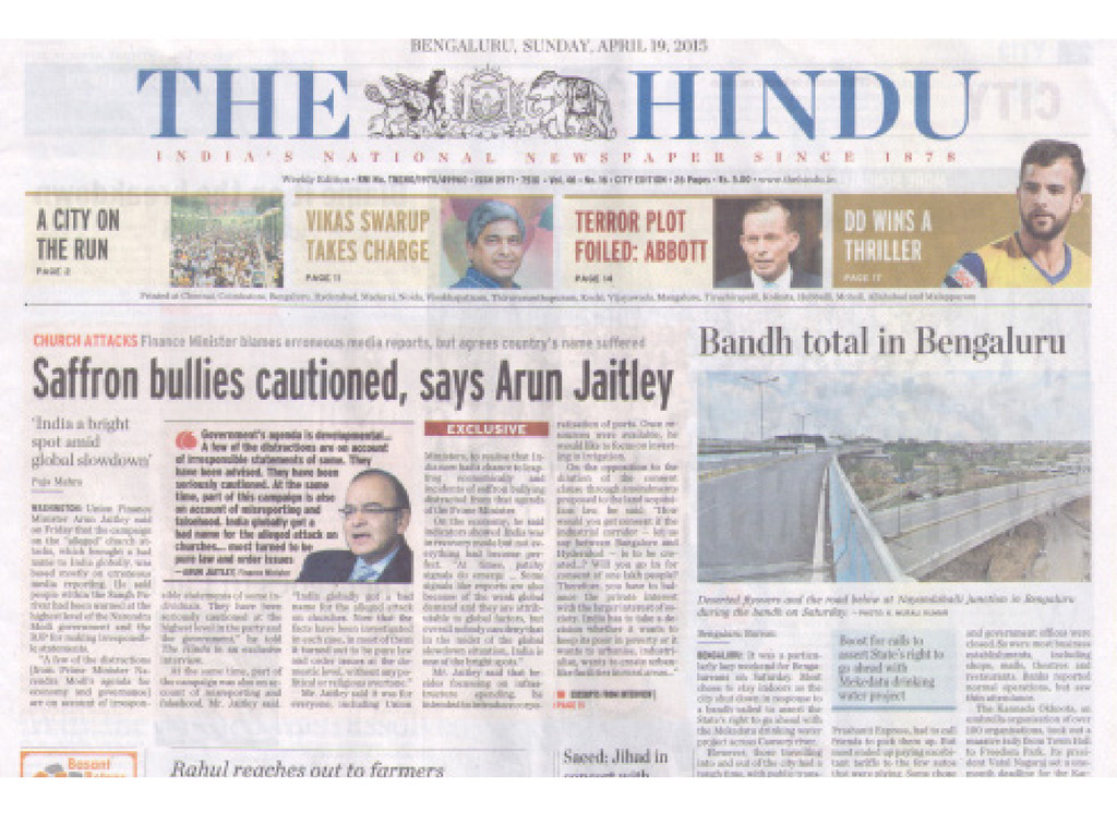
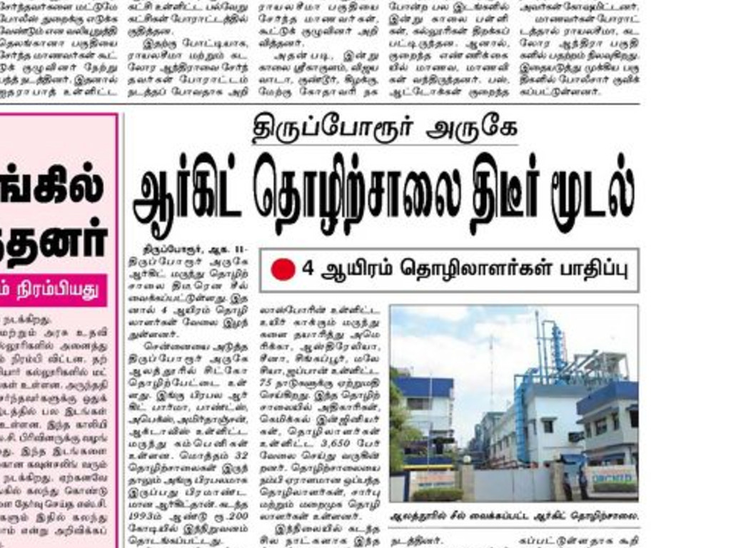
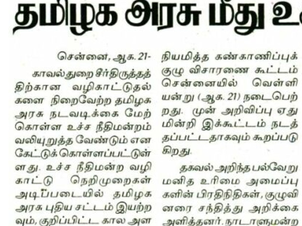
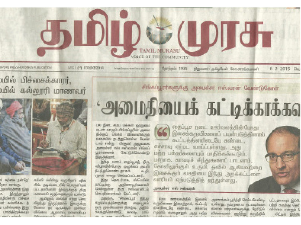
India has a growing Newspaper market. Comparison of the typographic quality between Dina Thanthi, a Tamil newspaper, ranked 10 in circulation and The Hindu, a English paper ranked 13, clearly shows the lack of aesthetic quality in Tamil typography. There are two issues - lack of hierarchy in text settings that is primarily because of the efficiency of type-design – ie., lack of large families for differentiation and the second being poor type-setting environments, like the not using word hyphenation that causes rivers and narrow column widths that are not calculated based on the script and so on. It is pertinent that Tamil type-design and typography is able to maintain a similar aesthetic quality without compromising on its own uniqueness.
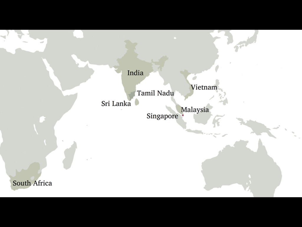
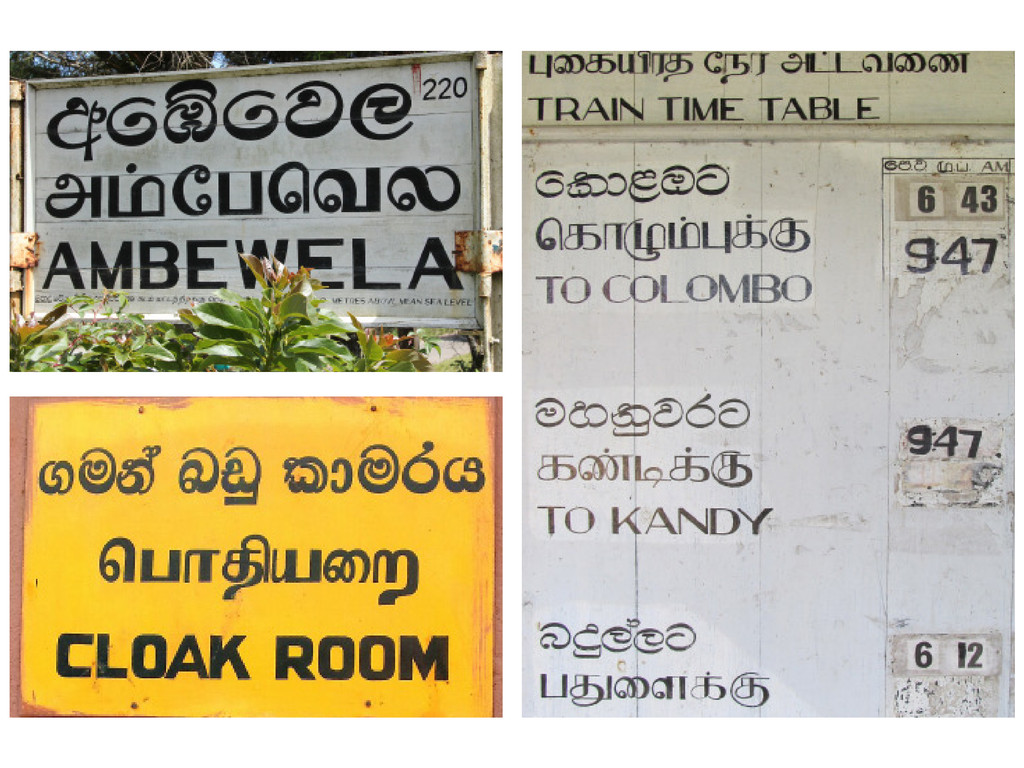
Another notable point is the use of slanted type. While the preference for upright type is visibly employed by those of the Tamil Diaspora, living in Malaysia and Singapore, though the circulation numbers are low. Sri Lankan Tamils., not being too far away from Tamil Nadu seem to be reading publications from India and watching Kollywood movies, but signage's employ upright type. This trend also seems to be catching up in Tamil Nadu, with publications such using upright type for supplements along with some forms of complementary typography for the mains.
Design considerations
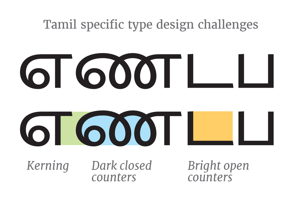
At a design level, having circular forms, with open angular forms is sharp contrast in letter forms, and needs careful thought while designing, and extensive kerning to make Tamil type look aesthetic.
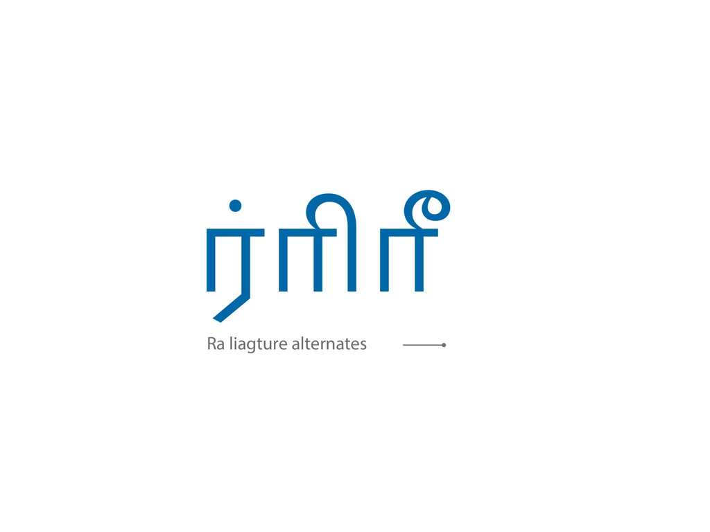
There are two variants for Ra when ligatures with Virama, I and Ii Matra. One with the tail, and the other without. The option used in newspaper is based on the editor preferences and can be used interchangeably.
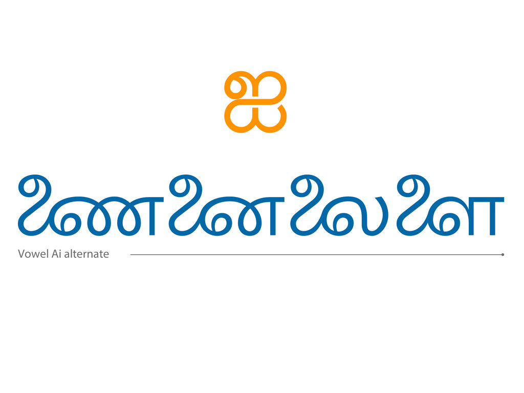
The stylistics variant for Ai matra is used only in typography and not while hand writing the script. However readers identify the character without affecting legibility.
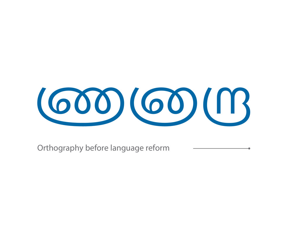
The NnAa, NnnAa and RrAa variants belong to old Tamil orthography which was reformed in the 1970s to enable Tamil to transfer to early type setting technology that had character set limitations. These characters are recognised only by certain expert readers.
The stylistic variants of I and Ii matra for Ka, Ta and Ca characters are stylistic and do not affect readability.
Wishlist
With the establishment of the Internet alliance, there is a keen interest in the vernacular typography of the sub-continent, with an intention to empower and educate. Libre fonts are vital for scripts like Tamil. The flexibility of designers setting their own brief gives room for experiments that will contribute to shaping the typographic standards for the future.
1. Off course more quality free fonts
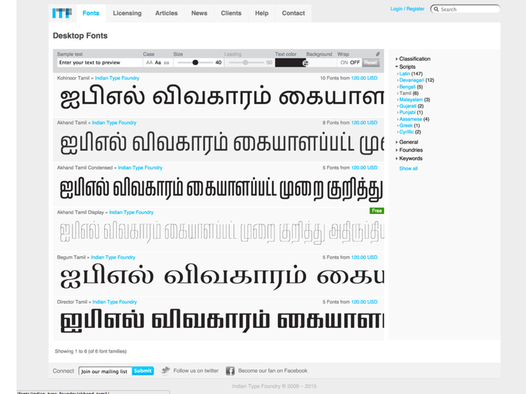
At the moment there is Lohit Tamil, Karla, Noto Tamil and Droid Tamil available at early access. To serve more than just language support, and to be able to express using type, with equivalents for Comic Sans to Minion Pro.
2. Type families that allow differentiation.
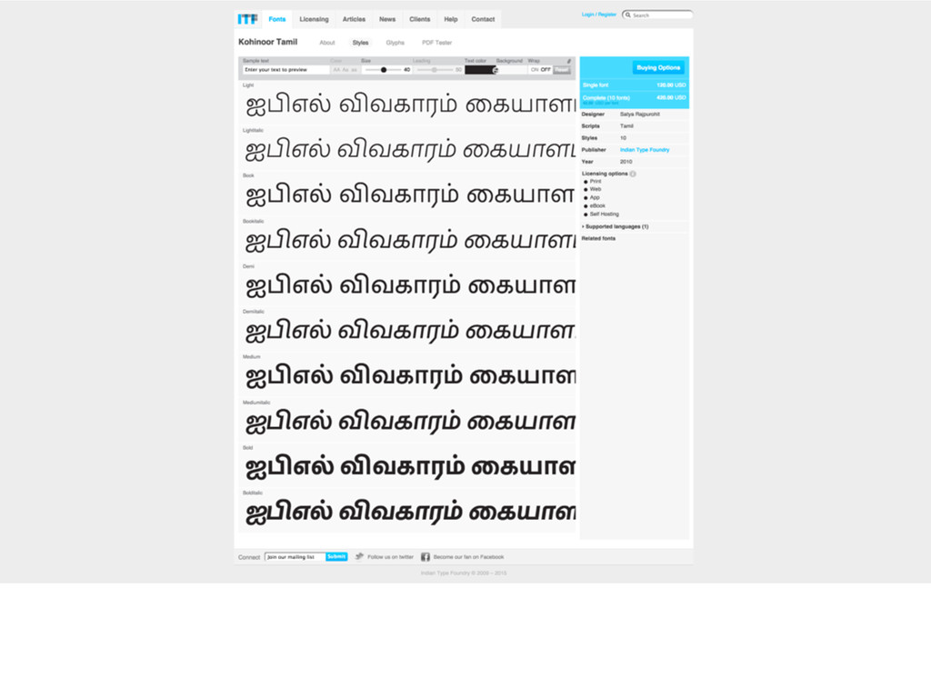
Unlike other Indic scripts, since Tamil has models for both Italic and Upright styles. Super families such as Kohinoor Tamil has five weights in two styles. It will be interesting to see modulated to mono-linear super families ranging from thin to heavy weights.
3. Experiments on letter forms that can eventually contribute to typographic richness.
Lettering experiments are found in movie poster and hand painted type. Some of these verify that design boundaries can be pushed to extents that is not reflected in Tamil type-design. They can serve as models for display type design to be inspired from.
4. The eclectic future: Super families that allow translation of content without compromising the typographic quality between languages, ie., Sufficient differentiation as found in the Latin in script.
Since models for Small Caps and such levels of typographic differentiation do not exists, experiments on what could work in these areas - Ie., Being able to transfer documents in English to Tamil without the loss of typographic quality will be a ground breaking situation that Libre fonts can facilitate.
Since Libre fonts serve as platform for empowerment for cultural identities, they carry this responsibility of shaping the demands that can be placed on vernacular typography, making this an interesting period for Tamil typography and type-design. I do hope the next decade will meet this demand.