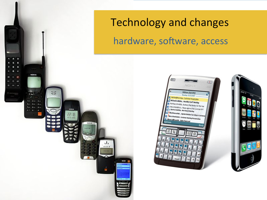
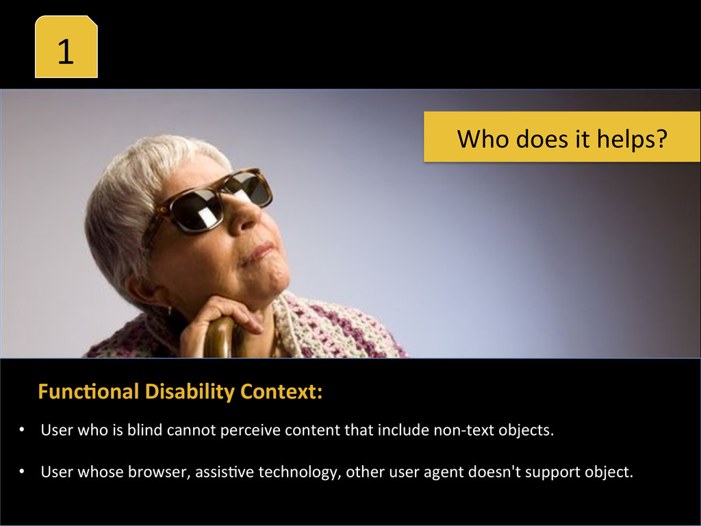
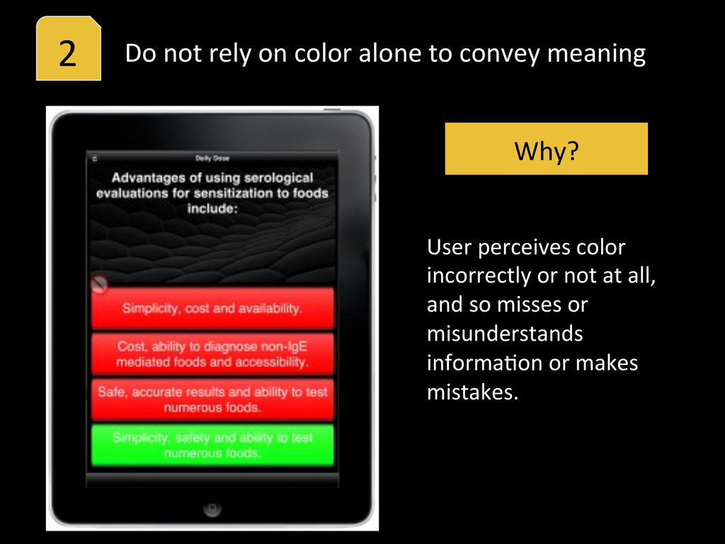
your applicaHon -‐ (images, sound, video) 1 Why? User cannot perceive important informaHon or loses informaHon due to lack of alternaHve/descripHve text.
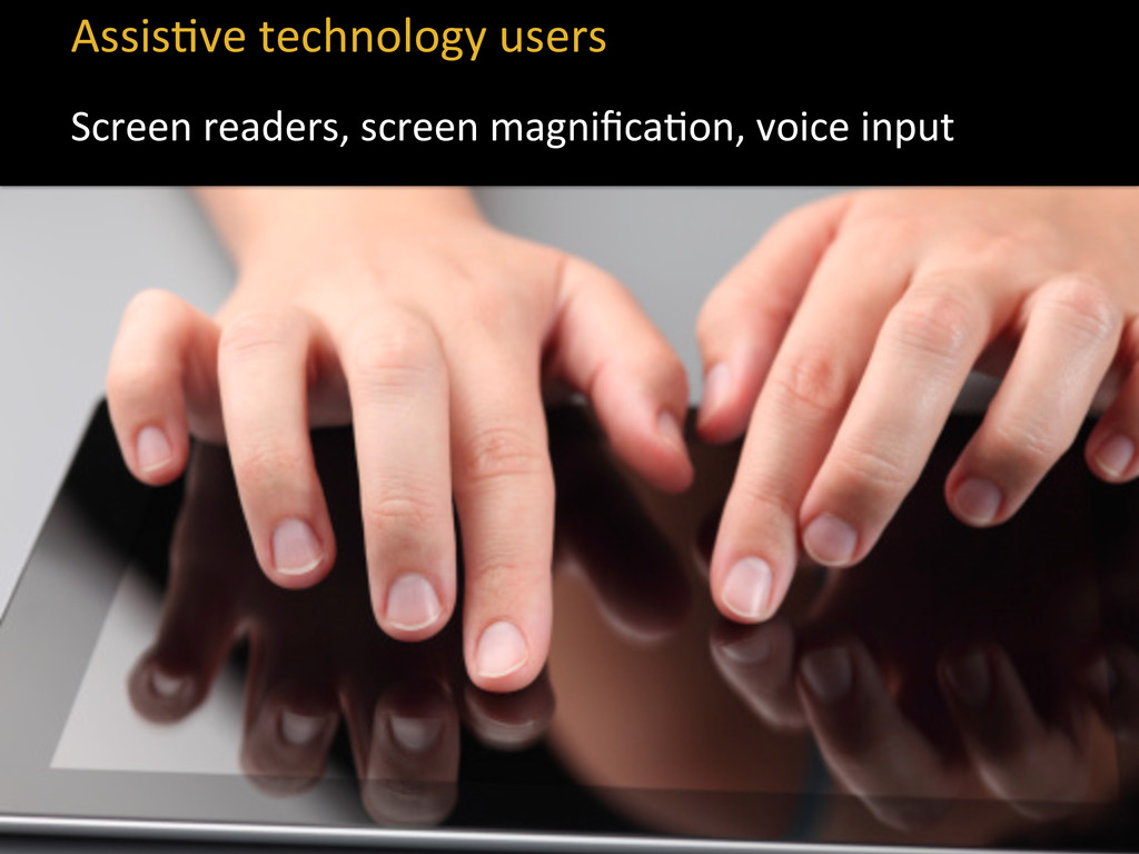
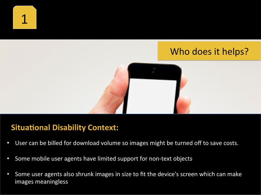
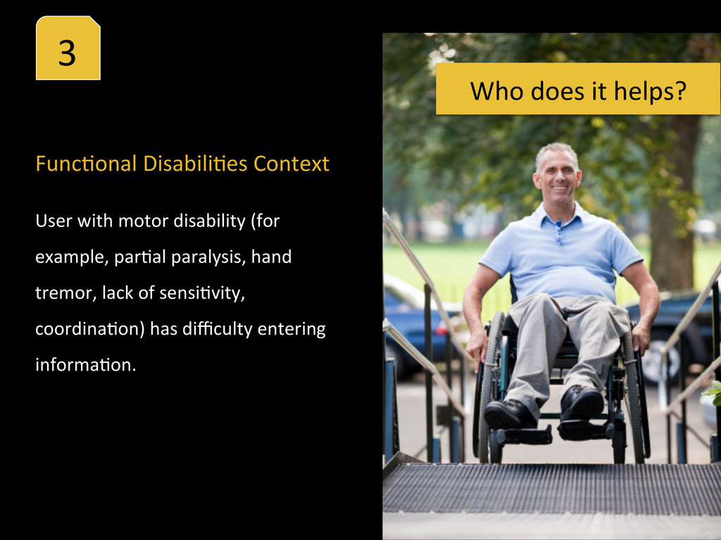
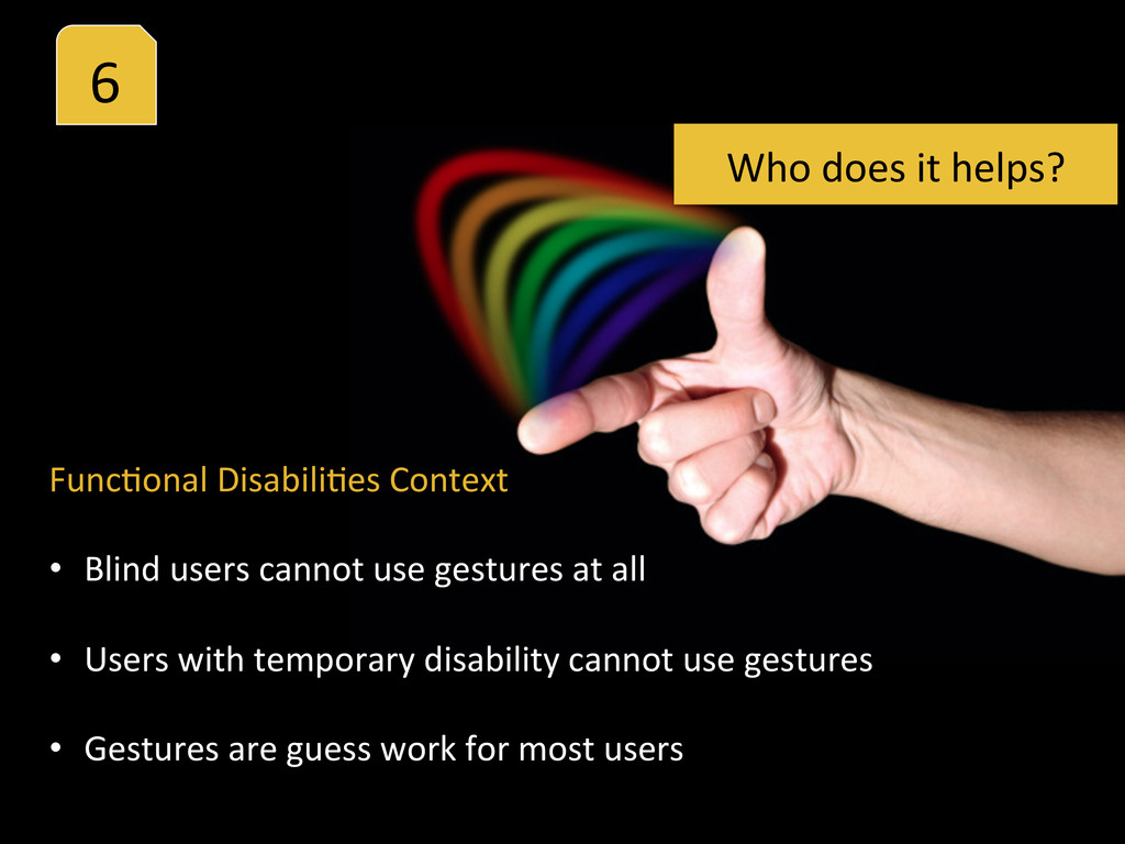
that include non-‐text objects. • User whose browser, assisHve technology, other user agent doesn't support object. Func%onal Disability Context: Who does it helps?
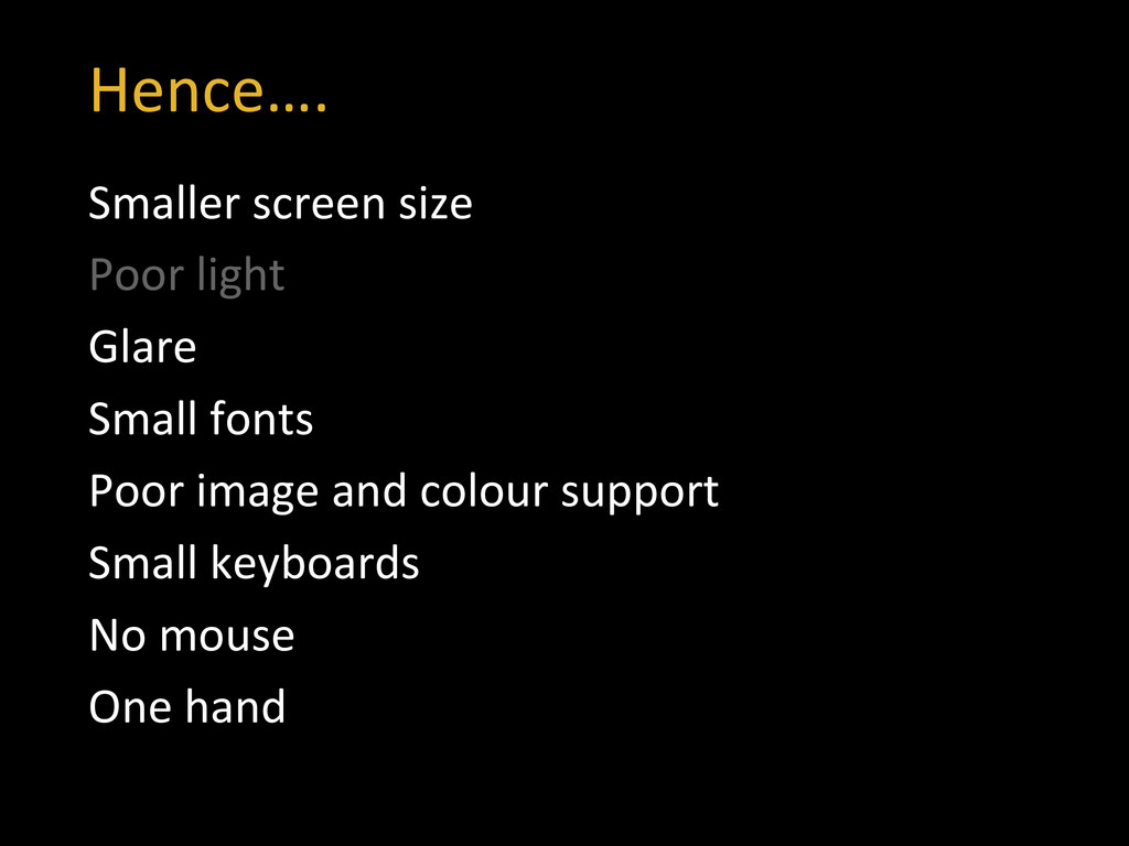
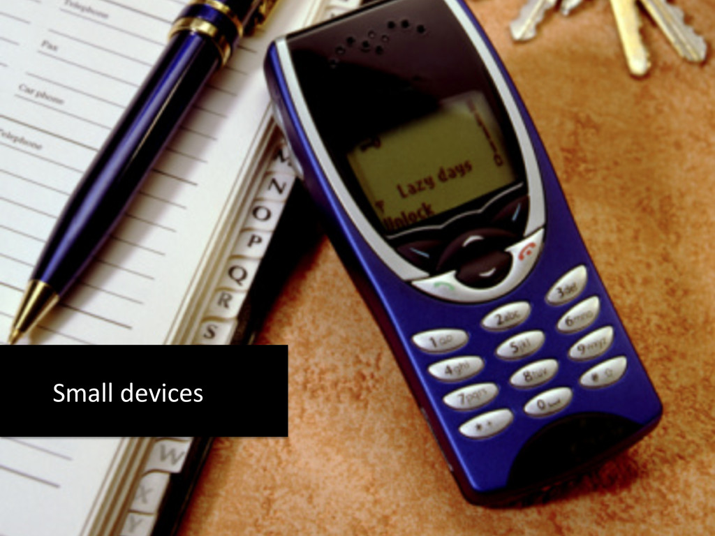
be billed for download volume so images might be turned off to save costs. • Some mobile user agents have limited support for non-‐text objects • Some user agents also shrunk images in size to fit the device's screen which can make images meaningless Who does it helps?
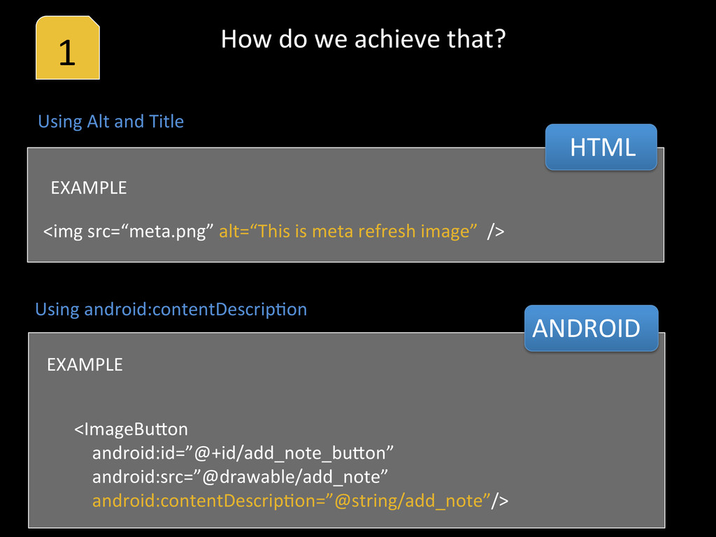
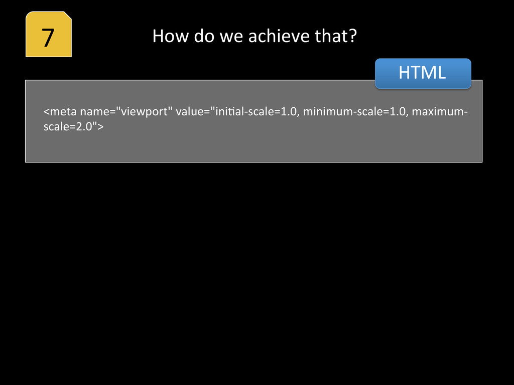
src=“meta.png” alt=“This is meta refresh image” /> EXAMPLE <ImageBuoon android:id=”@+id/add_note_buoon” android:src=”@drawable/add_note” android:contentDescripHon=”@string/add_note”/> EXAMPLE Using android:contentDescripHon ANDROID How do we achieve that?
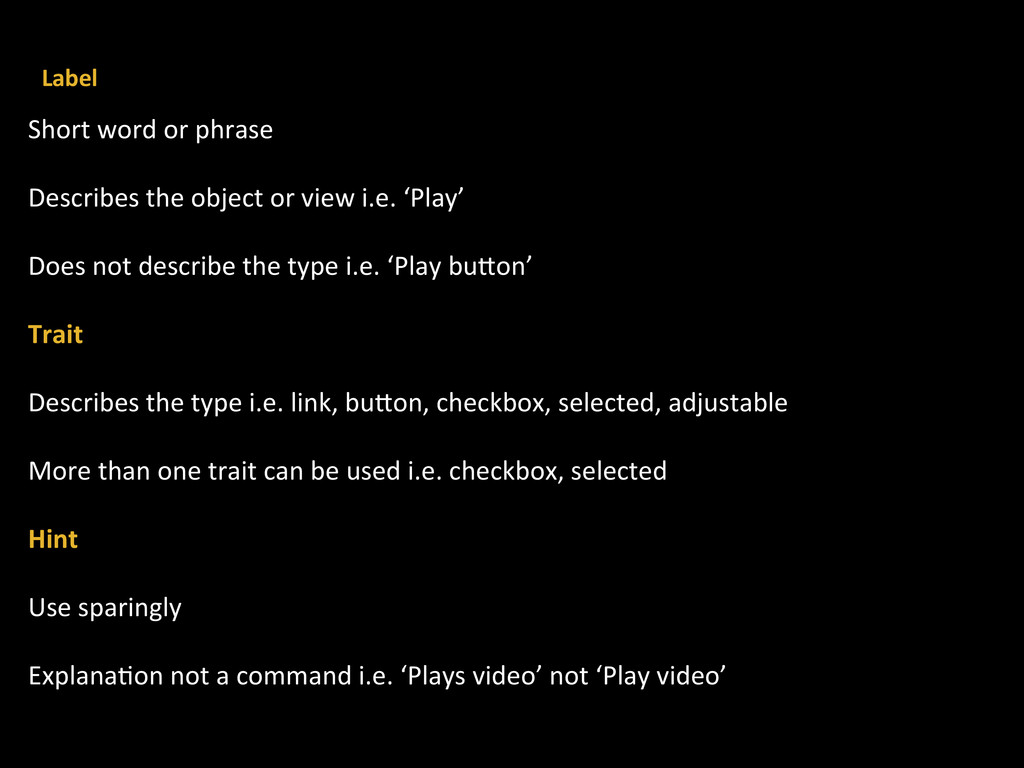
object or view i.e. ‘Play’ Does not describe the type i.e. ‘Play buoon’ Trait Describes the type i.e. link, buoon, checkbox, selected, adjustable More than one trait can be used i.e. checkbox, selected Hint Use sparingly ExplanaHon not a command i.e. ‘Plays video’ not ‘Play video’ Label
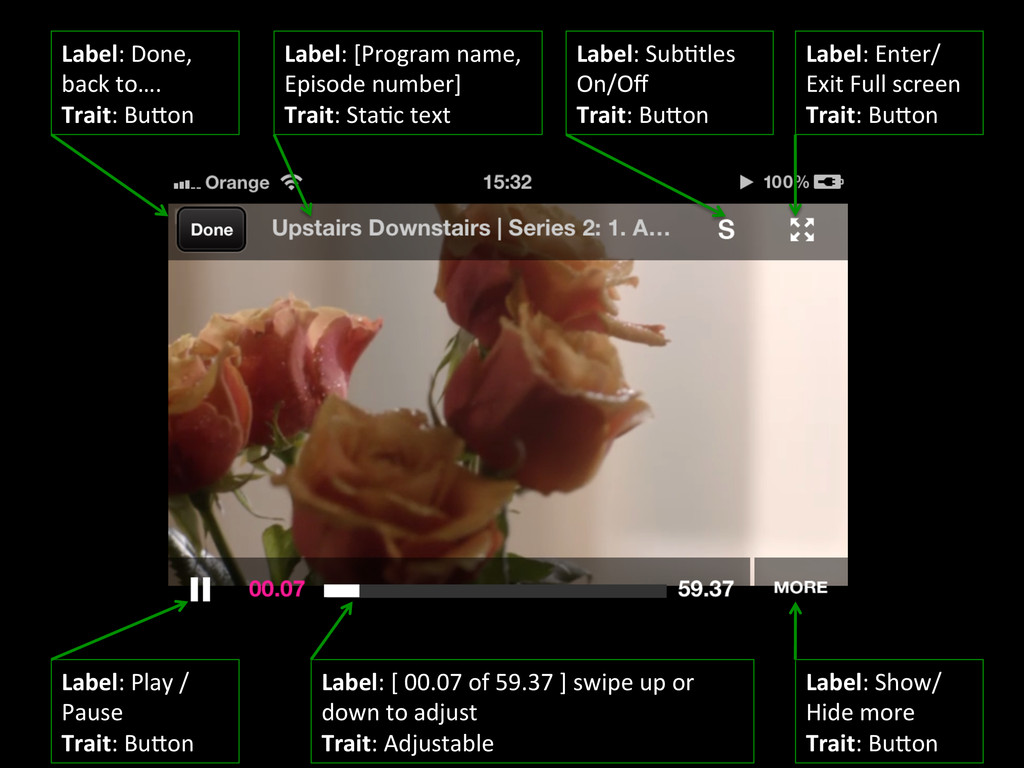
[Program name, Episode number] Trait: StaHc text Label: SubHtles On/Off Trait: Buoon Label: Enter/ Exit Full screen Trait: Buoon Label: Play / Pause Trait: Buoon Label: [ 00.07 of 59.37 ] swipe up or down to adjust Trait: Adjustable Label: Show/ Hide more Trait: Buoon
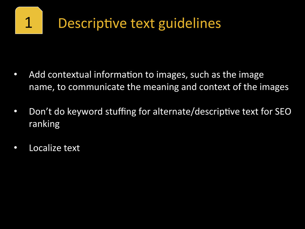
contextual informaHon to images, such as the image name, to communicate the meaning and context of the images • Don’t do keyword stuffing for alternate/descripHve text for SEO ranking • Localize text
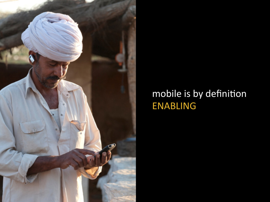
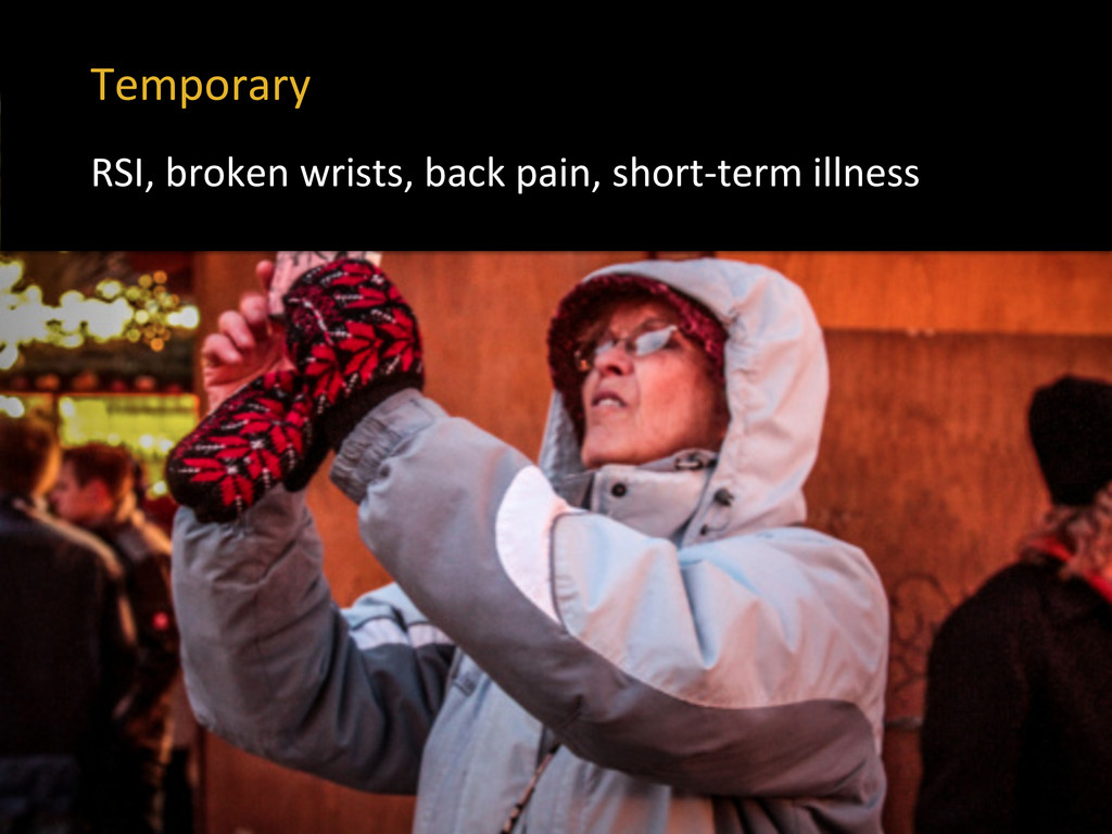
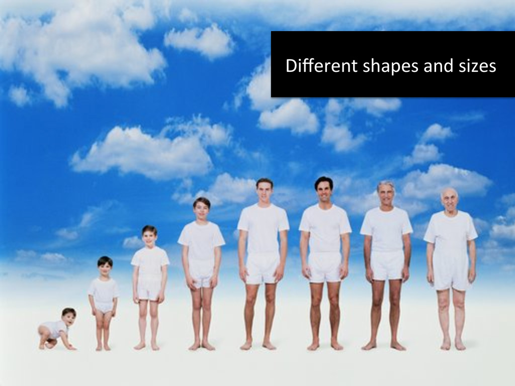
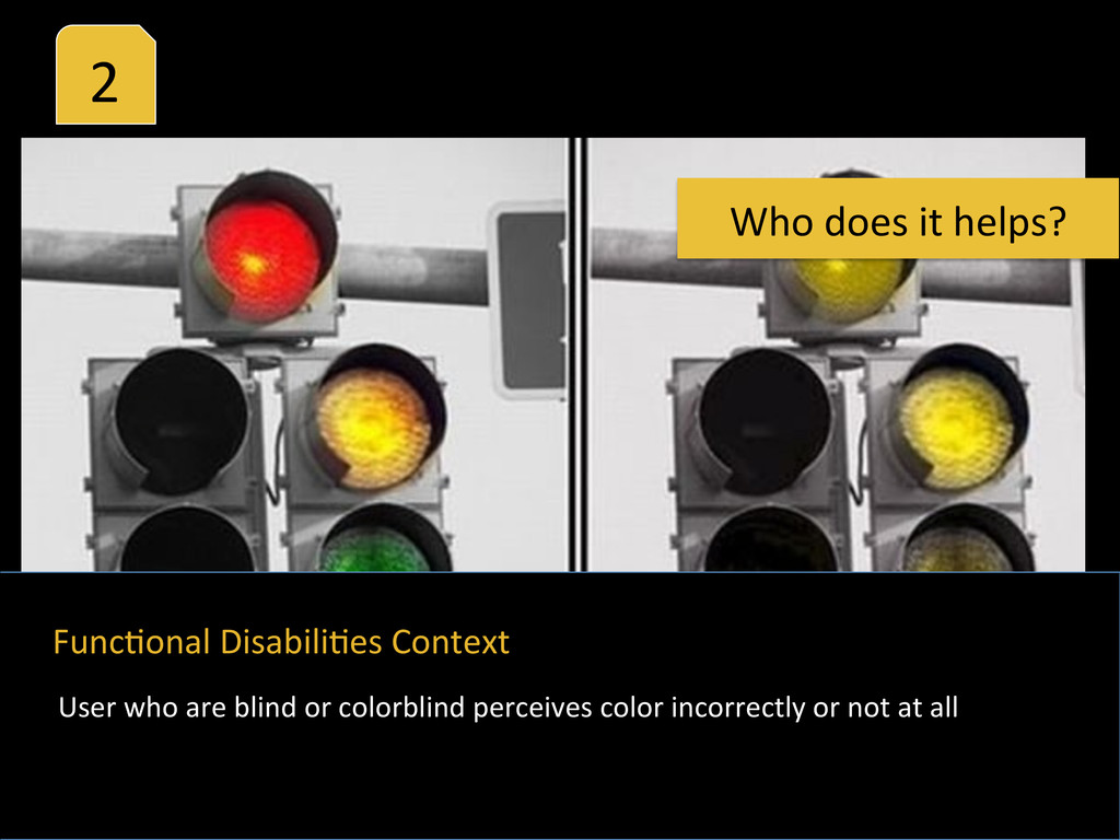
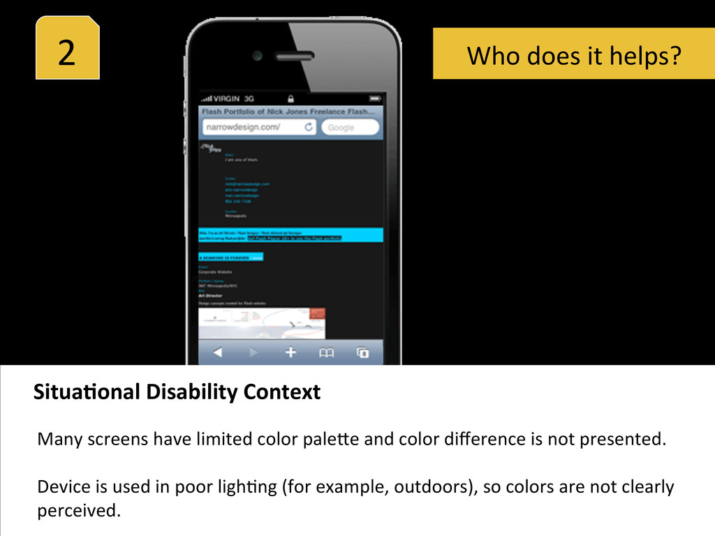
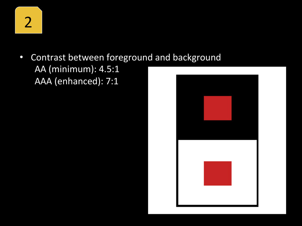
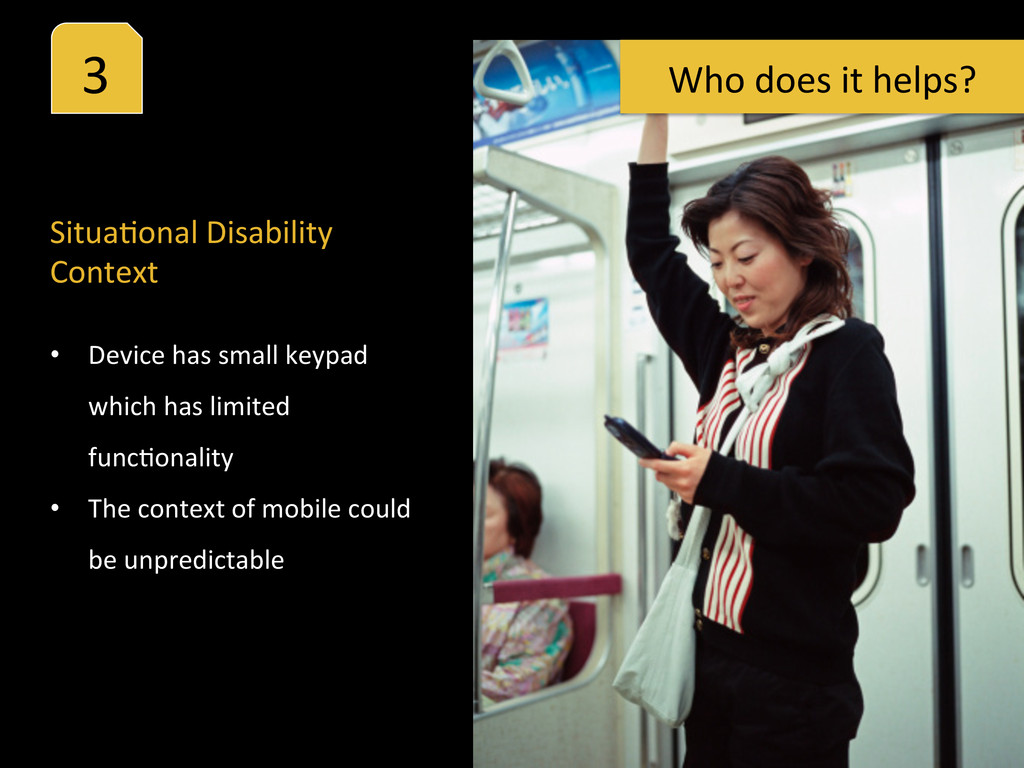
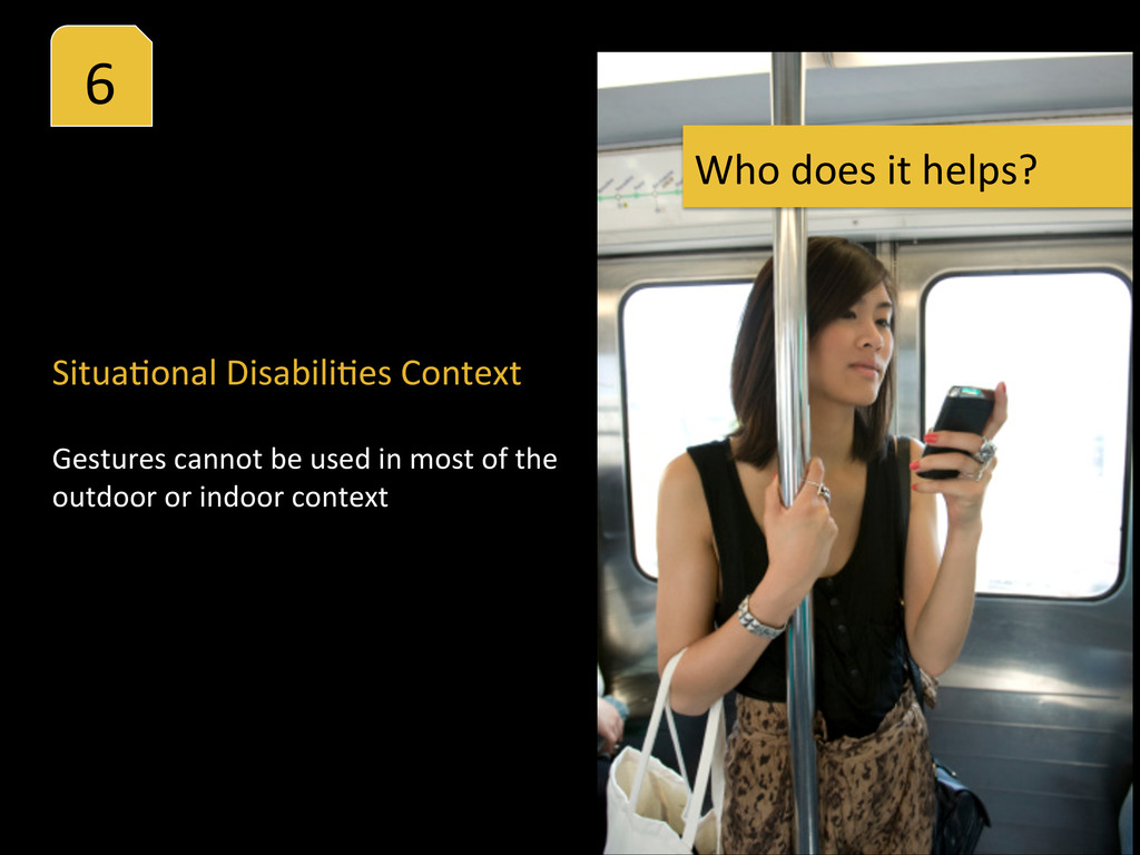
difference is not presented. Device is used in poor lighHng (for example, outdoors), so colors are not clearly perceived. Situa%onal Disability Context Who does it helps?
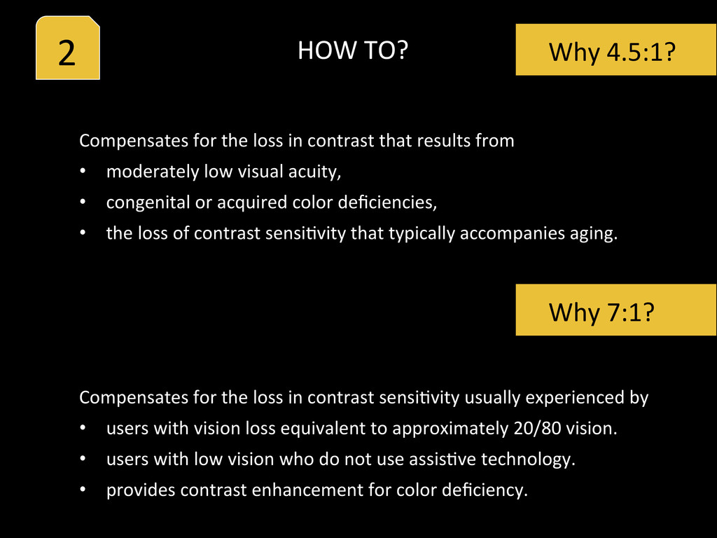
from • moderately low visual acuity, • congenital or acquired color deficiencies, • the loss of contrast sensiHvity that typically accompanies aging. Why 4.5:1? Why 7:1? Compensates for the loss in contrast sensiHvity usually experienced by • users with vision loss equivalent to approximately 20/80 vision. • users with low vision who do not use assisHve technology. • provides contrast enhancement for color deficiency. HOW TO?
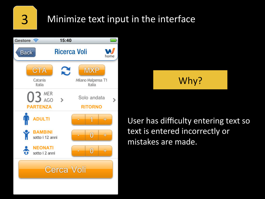
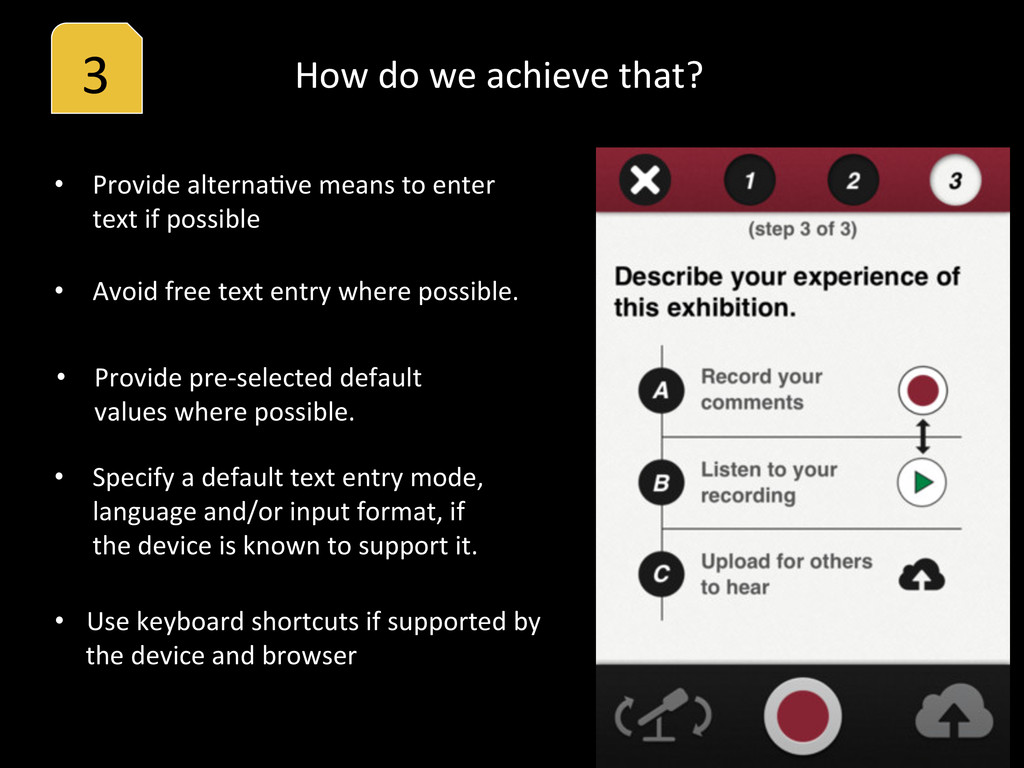
• Provide pre-‐selected default values where possible. • Specify a default text entry mode, language and/or input format, if the device is known to support it. • Provide alternaHve means to enter text if possible • Use keyboard shortcuts if supported by the device and browser How do we achieve that?
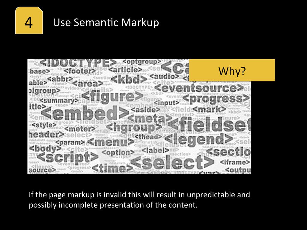
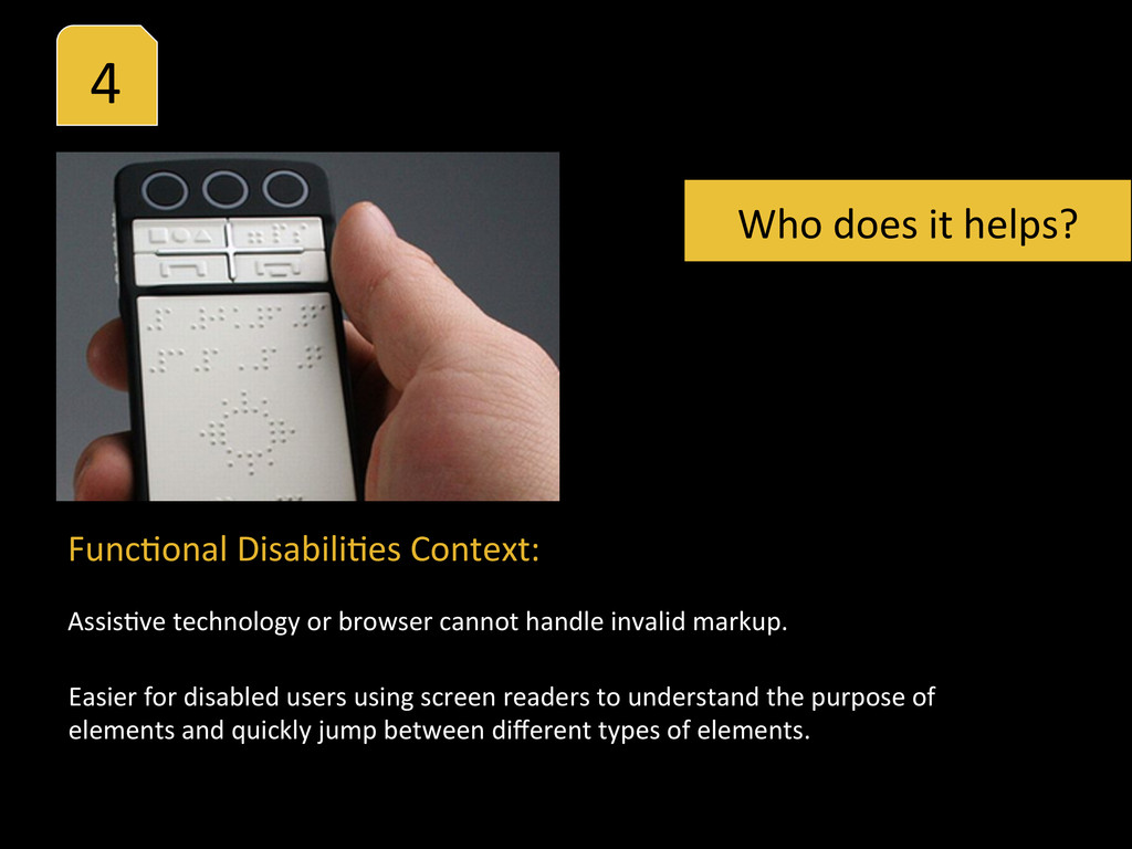
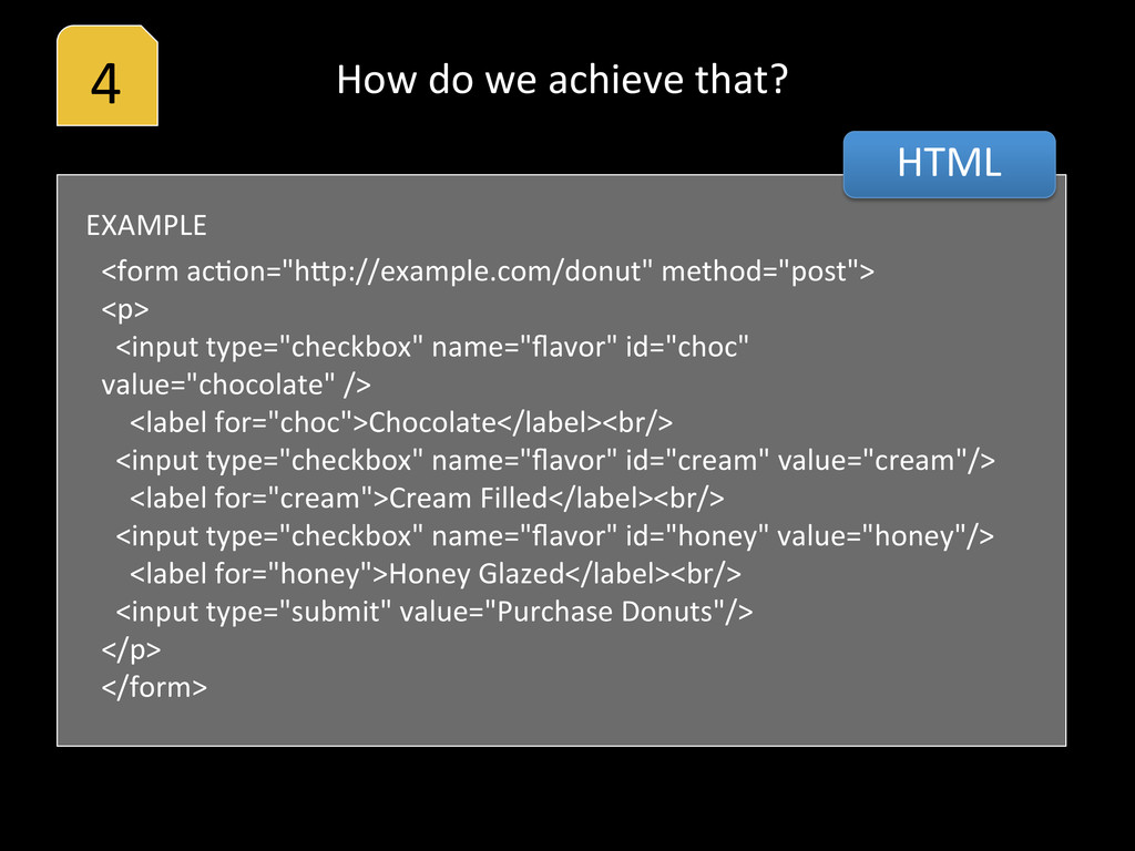
or browser cannot handle invalid markup. Easier for disabled users using screen readers to understand the purpose of elements and quickly jump between different types of elements. Who does it helps?
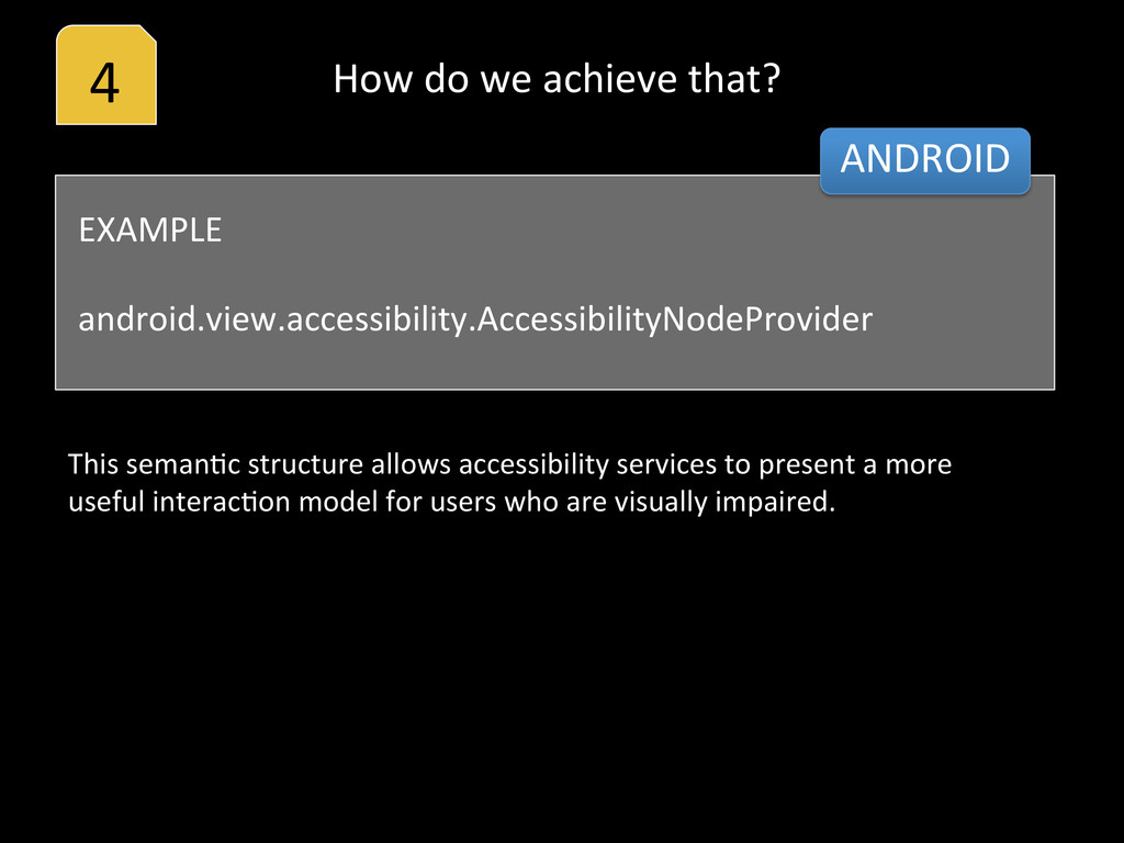
This semanHc structure allows accessibility services to present a more useful interacHon model for users who are visually impaired. How do we achieve that?
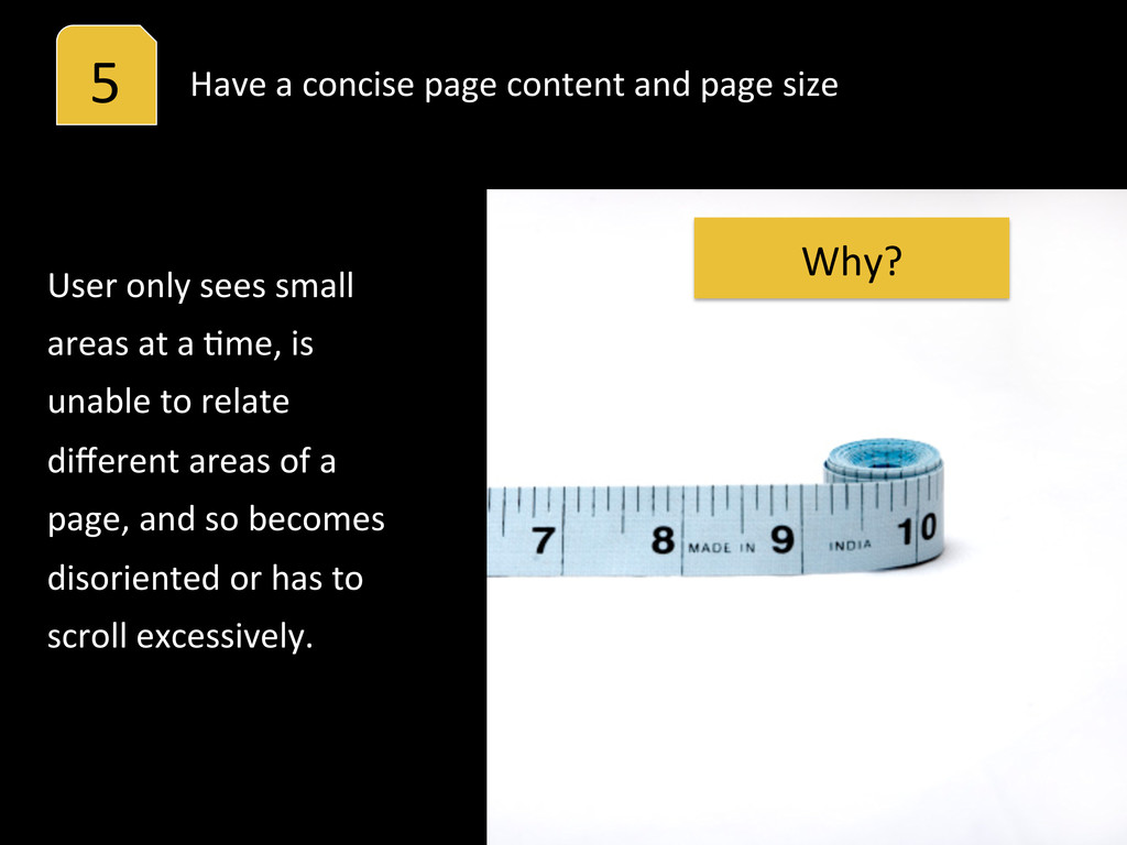
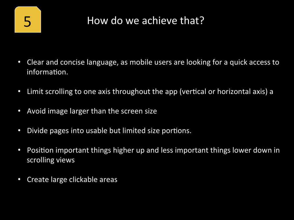
and concise language, as mobile users are looking for a quick access to informaHon. • Limit scrolling to one axis throughout the app (verHcal or horizontal axis) a • Avoid image larger than the screen size • Divide pages into usable but limited size porHons. • PosiHon important things higher up and less important things lower down in scrolling views • Create large clickable areas
(WCAG) Mobile Web Best PracHces (MWBP) RelaHonship between WCAG and MWBP Widget Accessibility Guidelines Widget Usability Best PracHces Mobile Website Guidelines (University of AusHn)
for Accessibility Android Accessibility Blackberry Best PracHce Designing Accessible ApplicaHons iOS: Accessibility Programming Guide Nokia/Symbian: User Experience checklist for Touch and Keypad (PDFs)