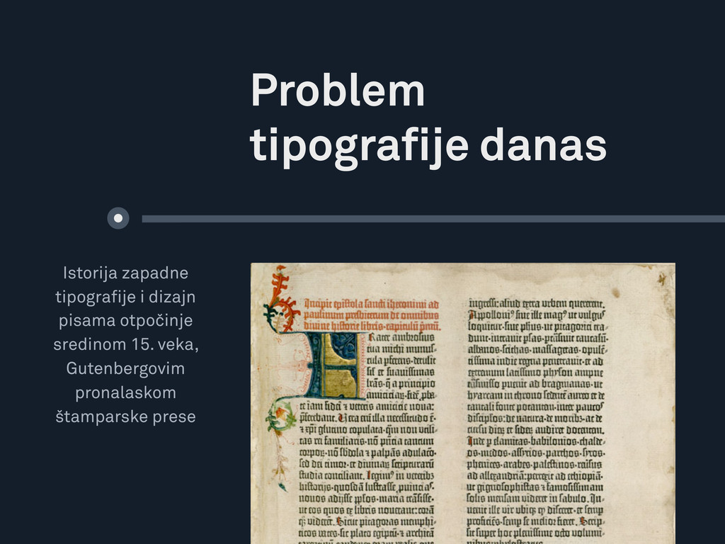
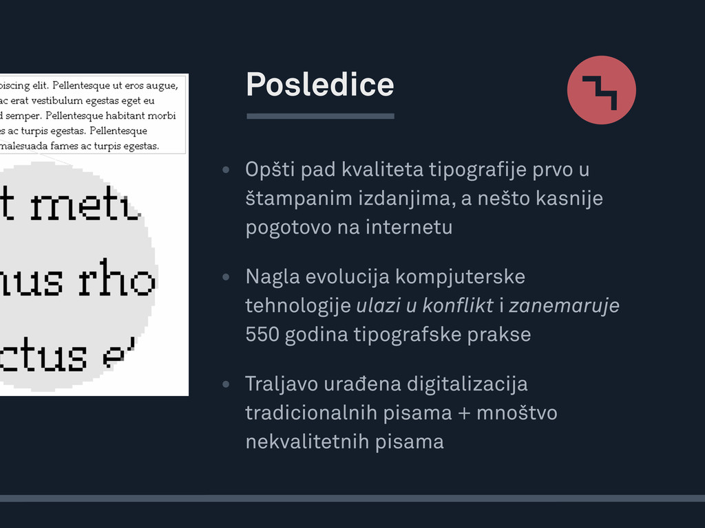
nešto kasnije pogotovo na internetu • Nagla evolucija kompjuterske tehnologije ulazi u konflikt i zanemaruje 550 godina tipografske prakse • Traljavo urađena digitalizacija tradicionalnih pisama + mnoštvo nekvalitetnih pisama Posledice
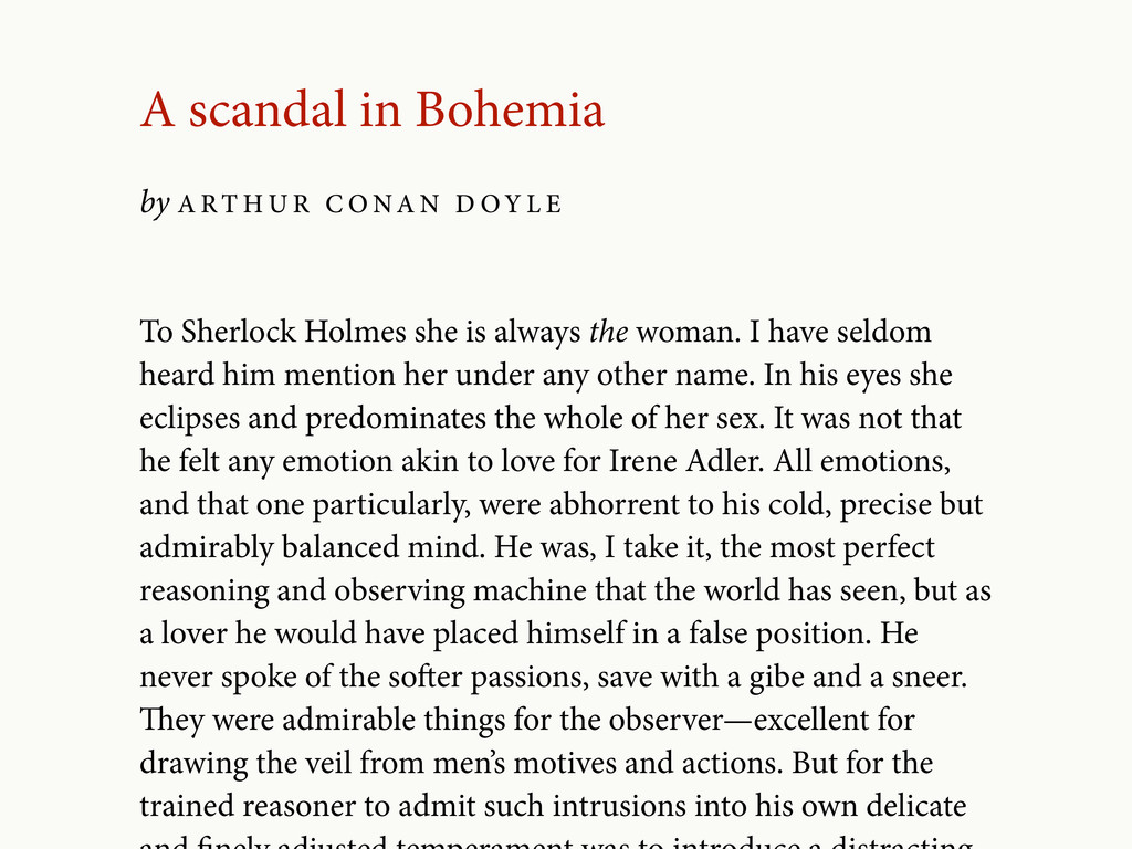
seldom heard him mention her under any other name. In his eyes she eclipses and predominates the whole of her sex. It was not that he felt any emotion akin to love for Irene Adler. All emotions, and that one particularly, were abhorrent to his cold, precise but admirably balanced mind. He was, I take it, the most perfect reasoning and observing machine that the world has seen, but as a lover he would have placed himself in a false position. He never spoke of the soer passions, save with a gibe and a sneer. ey were admirable things for the observer—excellent for drawing the veil from men’s motives and actions. But for the trained reasoner to admit such intrusions into his own delicate A scandal in Bohemia by A R T H U R C O NA N D O Y L E
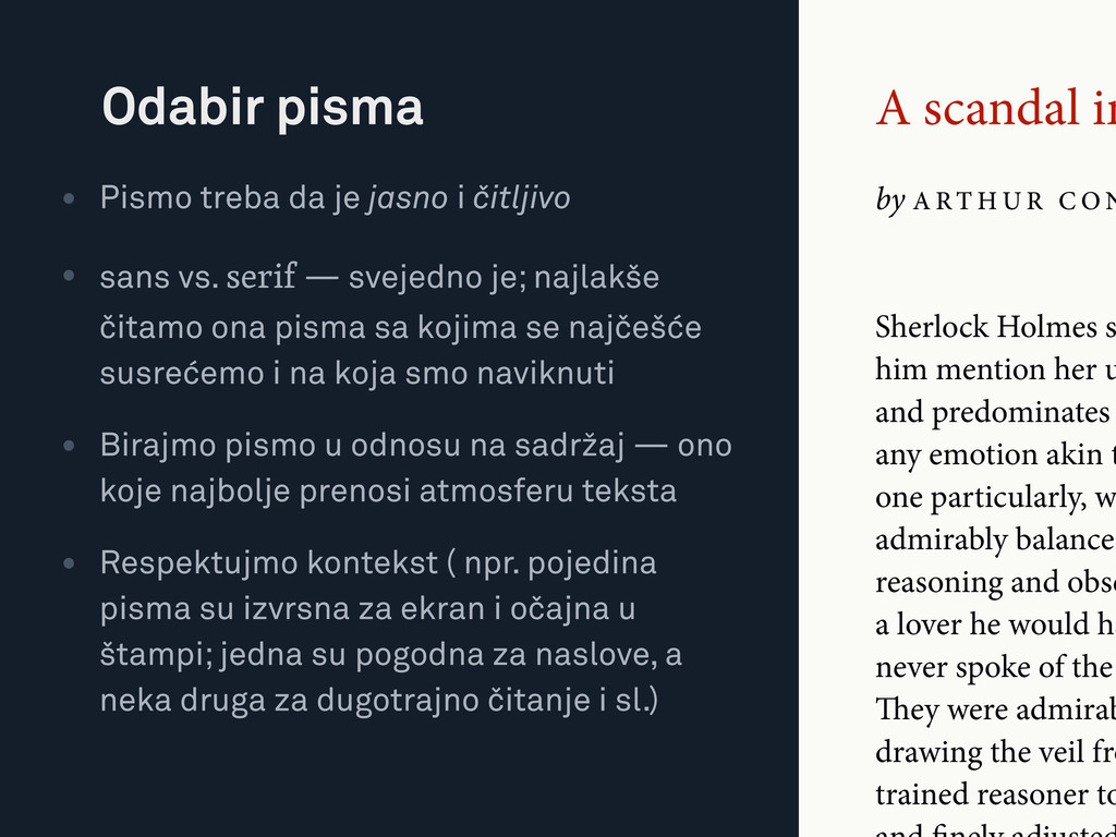
C O N Sherlock Holmes s him mention her u and predominates any emotion akin t one particularly, w admirably balanced reasoning and obse a lover he would ha never spoke of the ey were admirab drawing the veil fro trained reasoner to • Pismo treba da je jasno i čitljivo • sans vs. serif — svejedno je; najlakše čitamo ona pisma sa kojima se najčešće susrećemo i na koja smo naviknuti • Birajmo pismo u odnosu na sadržaj — ono koje najbolje prenosi atmosferu teksta • Respektujmo kontekst ( npr. pojedina pisma su izvrsna za ekran i očajna u štampi; jedna su pogodna za naslove, a neka druga za dugotrajno čitanje i sl.) Odabir pisma
C O N • Upotrebljavajmo samo kvalitetne fontove; temeljno upoznajmo određena pisma i njihove dobre verzije, ograničimo kolekciju sa kojom raspolažemo i proširujmo je sa najvećim oprezom … Sherlock Holmes s him mention her u and predominates any emotion akin t one particularly, w admirably balanced reasoning and obse a lover he would ha never spoke of the ey were admirab drawing the veil fro trained reasoner to
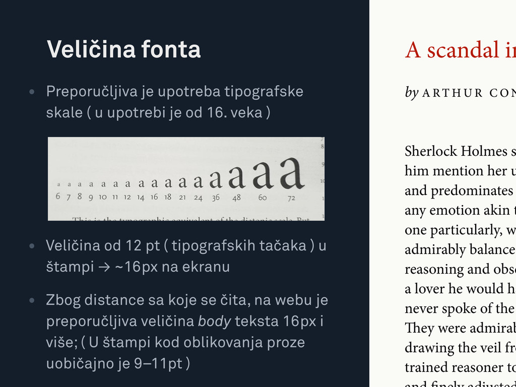
C O N Sherlock Holmes s him mention her u and predominates any emotion akin t one particularly, w admirably balanced reasoning and obse a lover he would ha never spoke of the ey were admirab drawing the veil fro trained reasoner to • Preporučljiva je upotreba tipografske skale ( u upotrebi je od 16. veka ) • Veličina od 12 pt ( tipografskih tačaka ) u štampi → ~16px na ekranu • Zbog distance sa koje se čita, na webu je preporučljiva veličina body teksta 16px i više; ( U štampi kod oblikovanja proze uobičajno je 9–11pt ) Veličina fonta
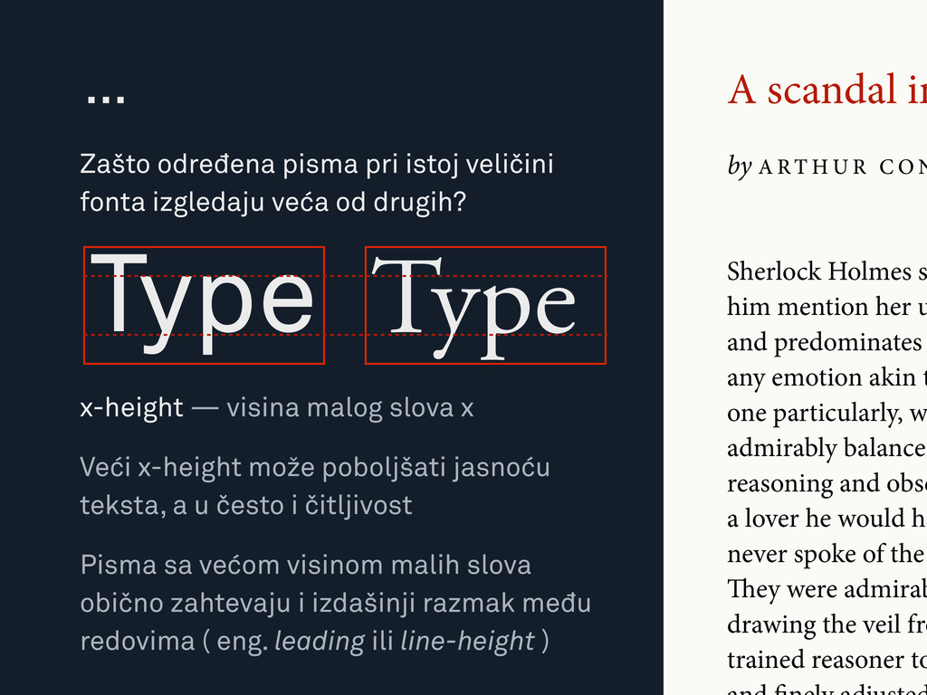
C O N Sherlock Holmes s him mention her u and predominates any emotion akin t one particularly, w admirably balanced reasoning and obse a lover he would ha never spoke of the ey were admirab drawing the veil fro trained reasoner to Zašto određena pisma pri istoj veličini fonta izgledaju veća od drugih? … Type Type x-height — visina malog slova x Veći x-height može poboljšati jasnoću teksta, a u često i čitljivost Pisma sa većom visinom malih slova obično zahtevaju i izdašinji razmak među redovima ( eng. leading ili line-height )
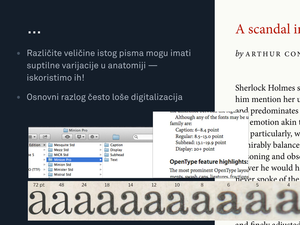
C O N Sherlock Holmes s him mention her u and predominates any emotion akin t one particularly, w admirably balanced reasoning and obse a lover he would ha never spoke of the ey were admirab drawing the veil fro trained reasoner to • Različite veličine istog pisma mogu imati suptilne varijacije u anatomiji — iskoristimo ih! • Osnovni razlog često loše digitalizacija …
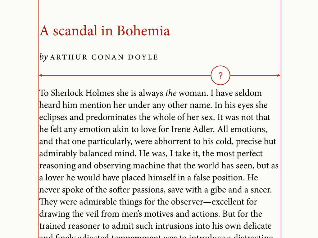
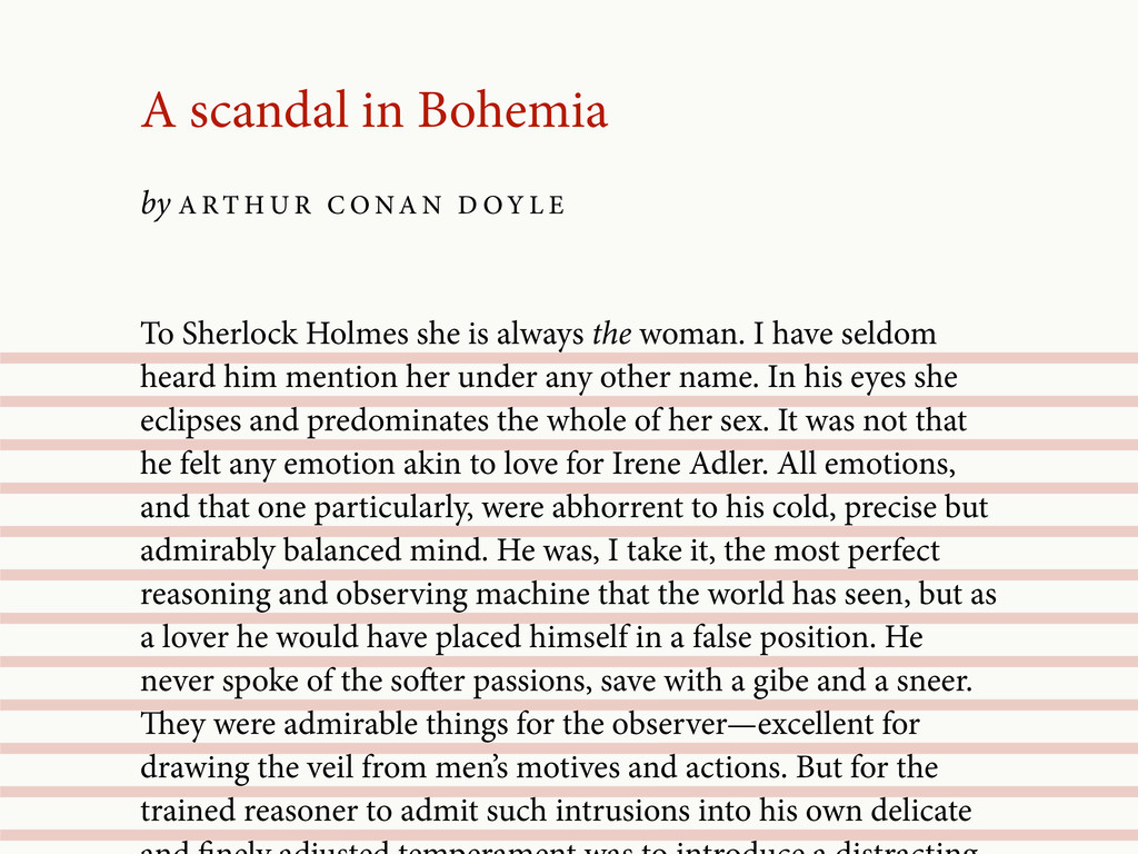
R C O NA N D O Y L E To Sherlock Holmes she is always the woman. I have seldom heard him mention her under any other name. In his eyes she eclipses and predominates the whole of her sex. It was not that he felt any emotion akin to love for Irene Adler. All emotions, and that one particularly, were abhorrent to his cold, precise but admirably balanced mind. He was, I take it, the most perfect reasoning and observing machine that the world has seen, but as a lover he would have placed himself in a false position. He never spoke of the soer passions, save with a gibe and a sneer. ey were admirable things for the observer—excellent for drawing the veil from men’s motives and actions. But for the trained reasoner to admit such intrusions into his own delicate ?
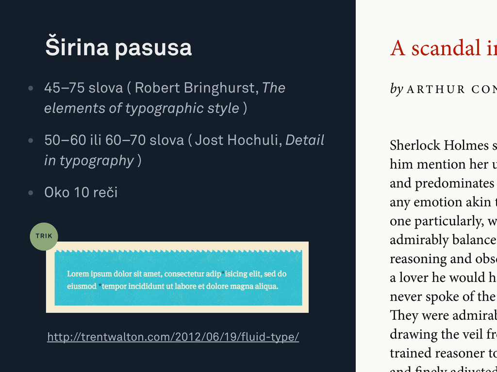
C O N • 45–75 slova ( Robert Bringhurst, The elements of typographic style ) • 50–60 ili 60–70 slova ( Jost Hochuli, Detail in typography ) • Oko 10 reči Širina pasusa Sherlock Holmes s him mention her u and predominates any emotion akin t one particularly, w admirably balanced reasoning and obse a lover he would ha never spoke of the ey were admirab drawing the veil fro trained reasoner to http://trentwalton.com/2012/06/19/fluid-type/ TRIK
R C O NA N D O Y L E To Sherlock Holmes she is always the woman. I have seldom heard him mention her under any other name. In his eyes she eclipses and predominates the whole of her sex. It was not that he felt any emotion akin to love for Irene Adler. All emotions, and that one particularly, were abhorrent to his cold, precise but admirably balanced mind. He was, I take it, the most perfect reasoning and observing machine that the world has seen, but as a lover he would have placed himself in a false position. He never spoke of the soer passions, save with a gibe and a sneer. ey were admirable things for the observer—excellent for drawing the veil from men’s motives and actions. But for the trained reasoner to admit such intrusions into his own delicate
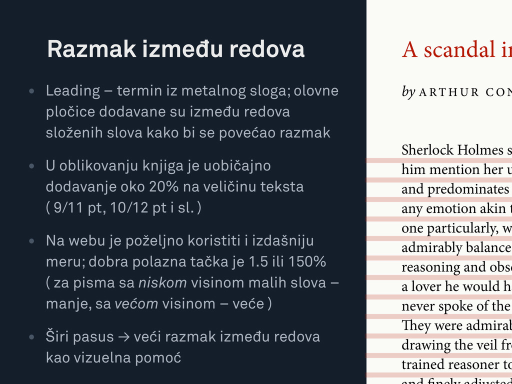
C O N • Leading – termin iz metalnog sloga; olovne pločice dodavane su između redova složenih slova kako bi se povećao razmak • U oblikovanju knjiga je uobičajno dodavanje oko 20% na veličinu teksta ( 9/11 pt, 10/12 pt i sl. ) • Na webu je poželjno koristiti i izdašniju meru; dobra polazna tačka je 1.5 ili 150% ( za pisma sa niskom visinom malih slova – manje, sa većom visinom – veće ) • Širi pasus → veći razmak između redova kao vizuelna pomoć Razmak između redova Sherlock Holmes s him mention her u and predominates any emotion akin t one particularly, w admirably balanced reasoning and obse a lover he would ha never spoke of the ey were admirab drawing the veil fro trained reasoner to
R C O NA N D O Y L E To Sherlock Holmes she is always the woman. I have seldom heard him mention her under any other name. In his eyes she eclipses and predominates the whole of her sex. It was not that he felt any emotion akin to love for Irene Adler. All emotions, and that one particularly, were abhorrent to his cold, precise but admirably balanced mind. He was, I take it, the most perfect reasoning and observing machine that the world has seen, but as a lover he would have placed himself in a false position. He never spoke of the soer passions, save with a gibe and a sneer. ey were admirable things for the observer—excellent for drawing the veil from men’s motives and actions. But for the trained reasoner to admit such intrusions into his own delicate
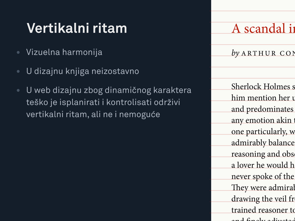
C O N • Vizuelna harmonija • U dizajnu knjiga neizostavno • U web dizajnu zbog dinamičnog karaktera teško je isplanirati i kontrolisati održivi vertikalni ritam, ali ne i nemoguće Vertikalni ritam Sherlock Holmes s him mention her u and predominates any emotion akin t one particularly, w admirably balanced reasoning and obse a lover he would ha never spoke of the ey were admirab drawing the veil fro trained reasoner to
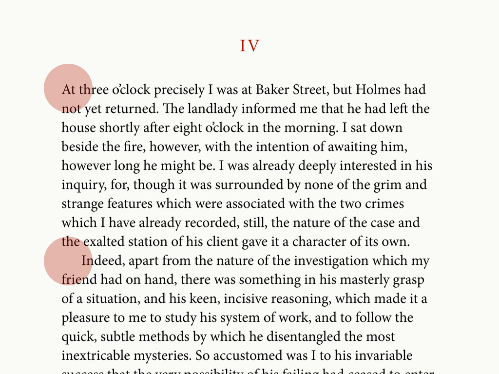
but Holmes had not yet returned. e landlady informed me that he had le the house shortly aer eight o’clock in the morning. I sat down beside the re, however, with the intention of awaiting him, however long he might be. I was already deeply interested in his inquiry, for, though it was surrounded by none of the grim and strange features which were associated with the two crimes which I have already recorded, still, the nature of the case and the exalted station of his client gave it a character of its own. Indeed, apart from the nature of the investigation which my friend had on hand, there was something in his masterly grasp of a situation, and his keen, incisive reasoning, which made it a pleasure to me to study his system of work, and to follow the quick, subtle methods by which he disentangled the most inextricable mysteries. So accustomed was I to his invariable
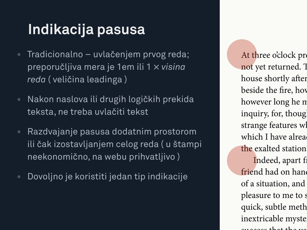
ili 1 × visina reda ( veličina leadinga ) • Nakon naslova ili drugih logičkih prekida teksta, ne treba uvlačiti tekst • Razdvajanje pasusa dodatnim prostorom ili čak izostavljanjem celog reda ( u štampi neekonomično, na webu prihvatljivo ) • Dovoljno je koristiti jedan tip indikacije Indikacija pasusa At three o’clock pre not yet returned. house shortly aer beside the re, how however long he m inquiry, for, though strange features wh which I have alread the exalted station Indeed, apart fr friend had on hand of a situation, and pleasure to me to s quick, subtle meth inextricable myster
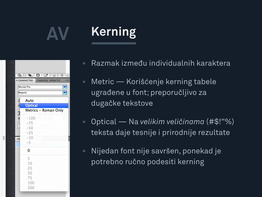
tabele ugrađene u font; preporučljivo za dugačke tekstove • Optical — Na velikim veličinama (#$!”%) teksta daje tesnije i prirodnije rezultate • Nijedan font nije savršen, ponekad je potrebno ručno podesiti kerning Kerning AV
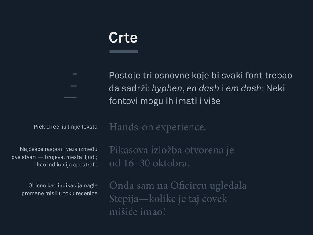
hyphen, en dash i em dash; Neki fontovi mogu ih imati i više Crte Hands-on experience. - – — Pikasova izložba otvorena je od 16–30 oktobra. Onda sam na O circu ugledala Stepija—kolike je taj čovek mišiće imao! Prekid reči ili linije teksta Najčešće raspon i veza između dve stvari — brojeva, mesta, ljudi; i kao indikacija apostrofe Obično kao indikacija nagle promene misli u toku rečenice