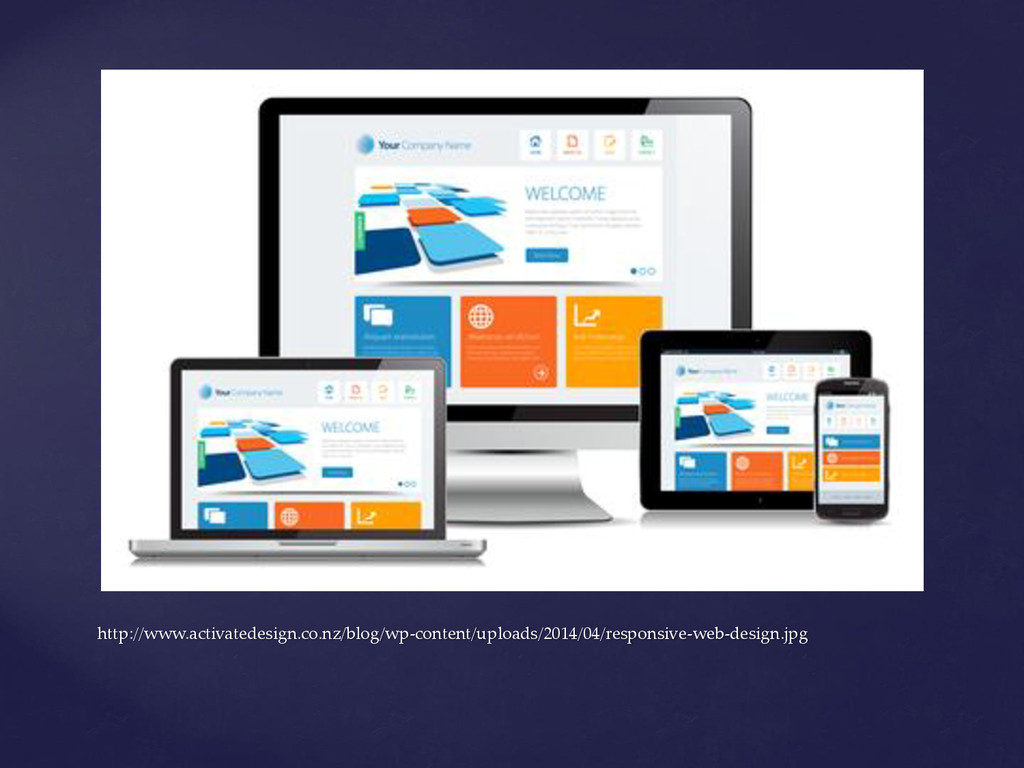
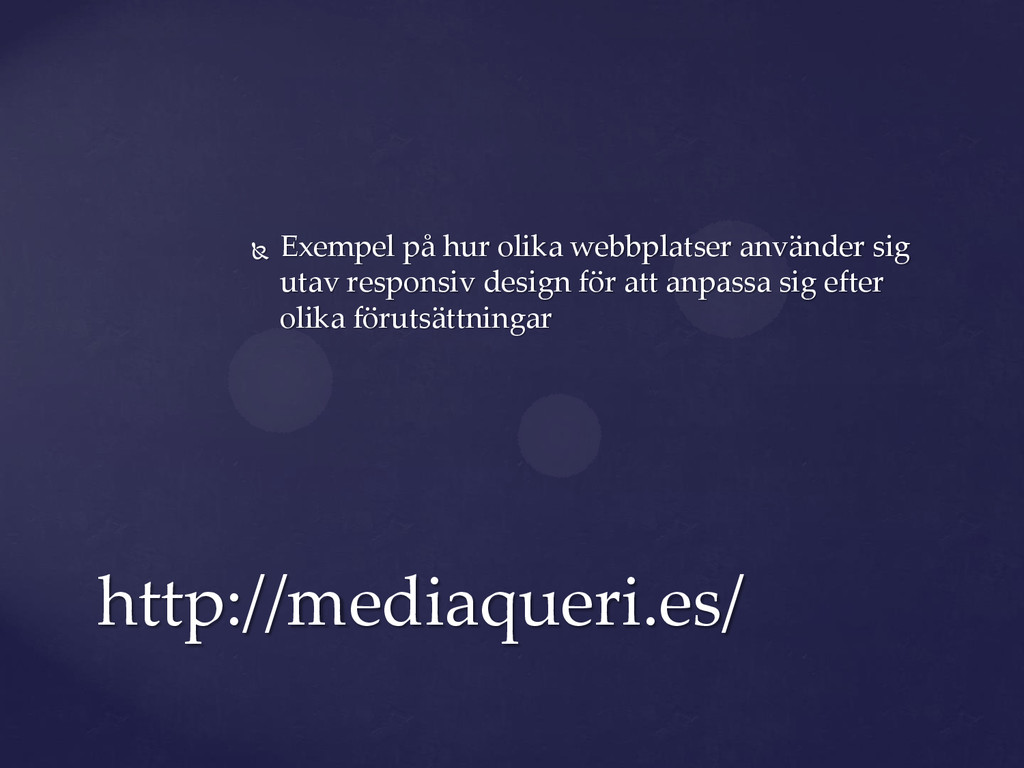
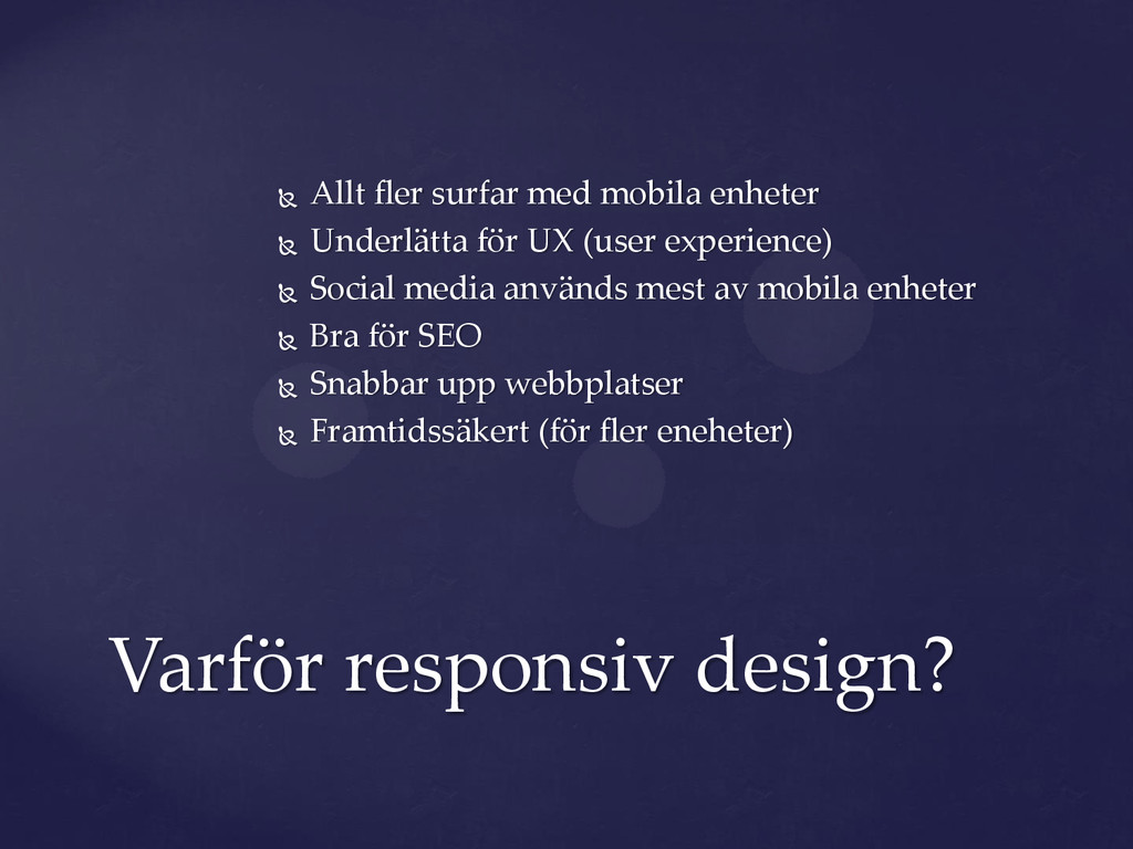
UX (user experience) Social media används mest av mobila enheter Bra för SEO Snabbar upp webbplatser Framtidssäkert (för fler eneheter) Varför responsiv design?
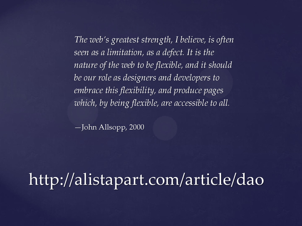
a limitation, as a defect. It is the nature of the web to be flexible, and it should be our role as designers and developers to embrace this flexibility, and produce pages which, by being flexible, are accessible to all. —John Allsopp, 2000 http://alistapart.com/article/dao
 tibbelit
 territorium
 signer
 sciencetokyo
 matsu0228
 mickey_kubo
 akiraasano
 sapi_kawahara
.png) codeforeveryone
codeforeveryone
 hidetoshikawaguchi
 yasslab
 sergeychernyshev
 kimpetersen
 mclloyd
 aleyda
 62gerente
 watany
 mfonobong
 eileencodes
 schlessera
 techseoconnect
 tmiket
 axbom
axbom