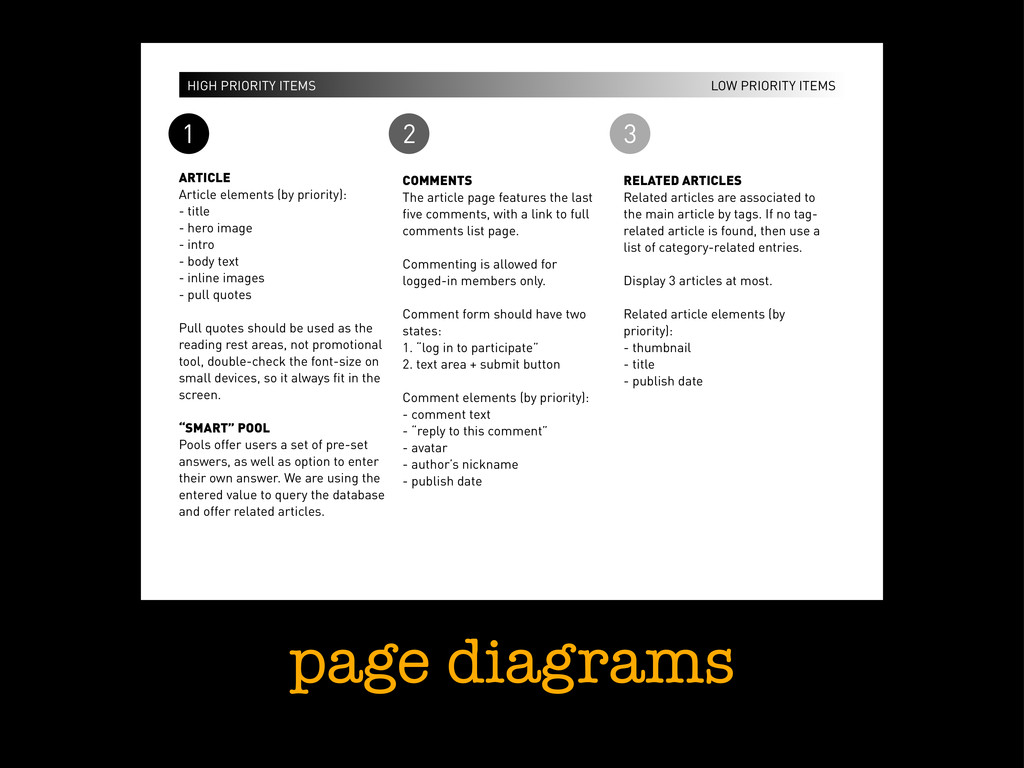
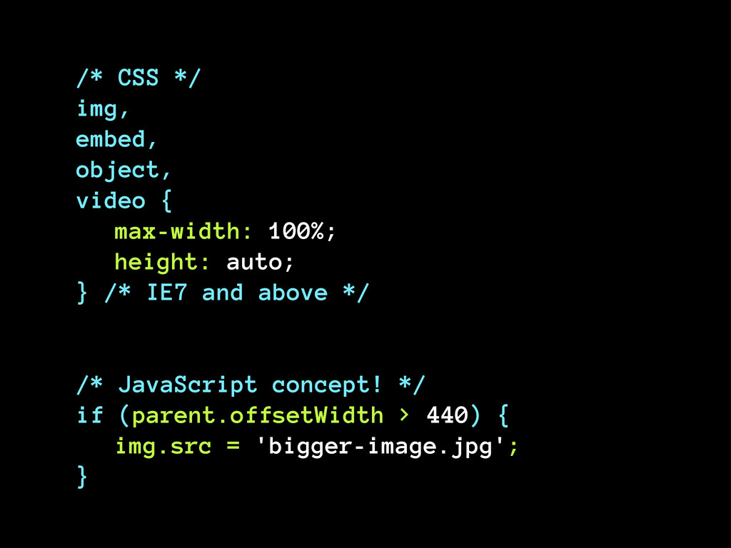
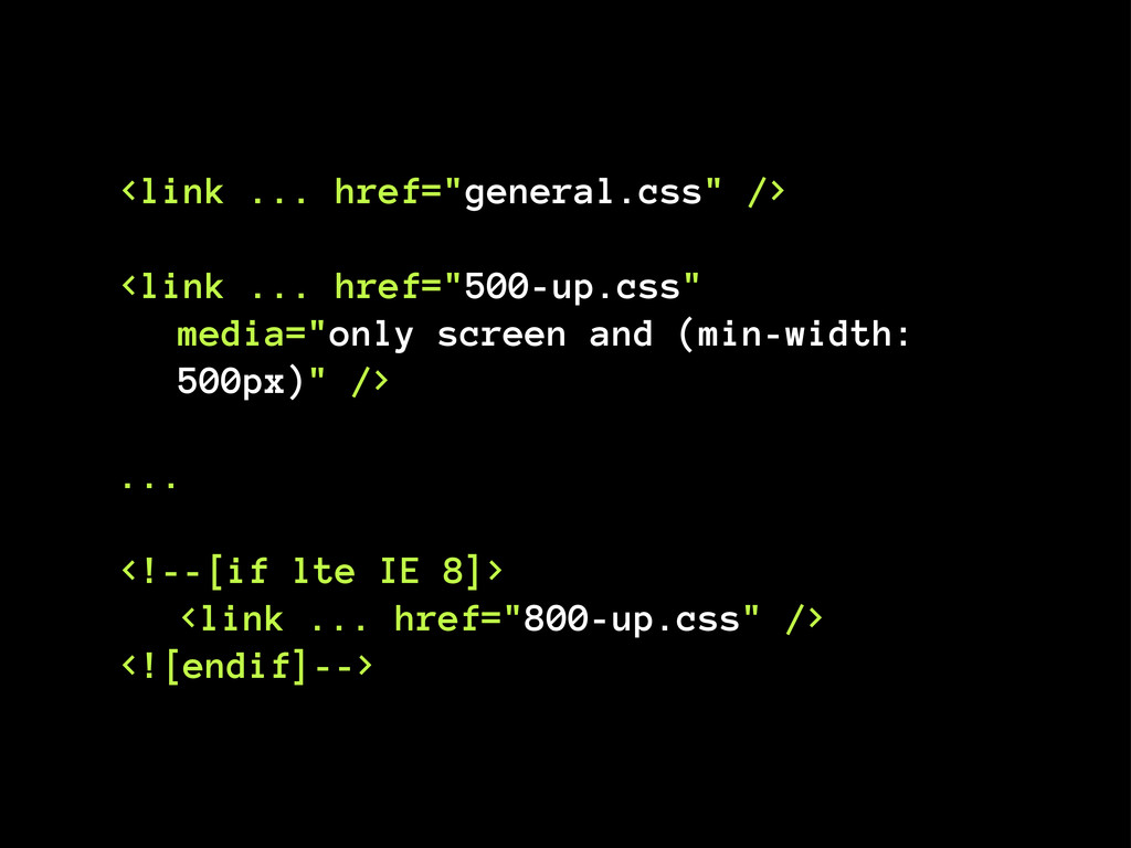
3 ARTICLE Article elements (by priority): - title - hero image - intro - body text - inline images - pull quotes Pull quotes should be used as the reading rest areas, not promotional tool, double-check the font-size on small devices, so it always fit in the screen. “SMART” POOL Pools offer users a set of pre-set answers, as well as option to enter their own answer. We are using the entered value to query the database and offer related articles. COMMENTS The article page features the last five comments, with a link to full comments list page. Commenting is allowed for logged-in members only. Comment form should have two states: 1. “log in to participate” 2. text area + submit button Comment elements (by priority): - comment text - “reply to this comment” - avatar - author’s nickname - publish date RELATED ARTICLES Related articles are associated to the main article by tags. If no tag- related article is found, then use a list of category-related entries. Display 3 articles at most. Related article elements (by priority): - thumbnail - title - publish date
 maratz
 ranyfardiany
 lynteo
 yamasaku
 centou
 hicard
 videlvequio
 yuri_ohashi
 moco1013
 sony
sony
 usagimaru
 calpin
.jpg) rwang05
rwang05
 bryan
bryan
 soudai
 wjessup
 tomoyanonymous
 tessaabrams
 shpigford
 rkendrick25
 trallard
 tammyeverts
 akosma
 aleyda
.png) helenjbeal
helenjbeal