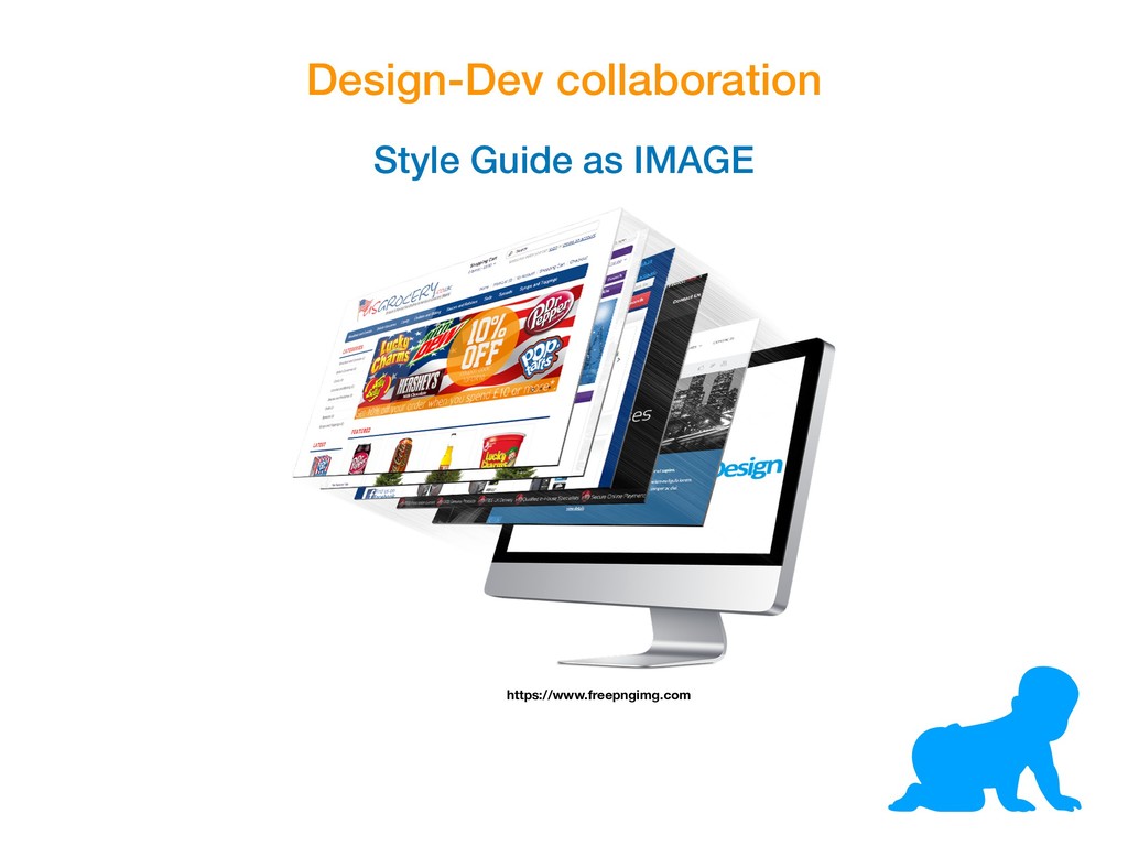
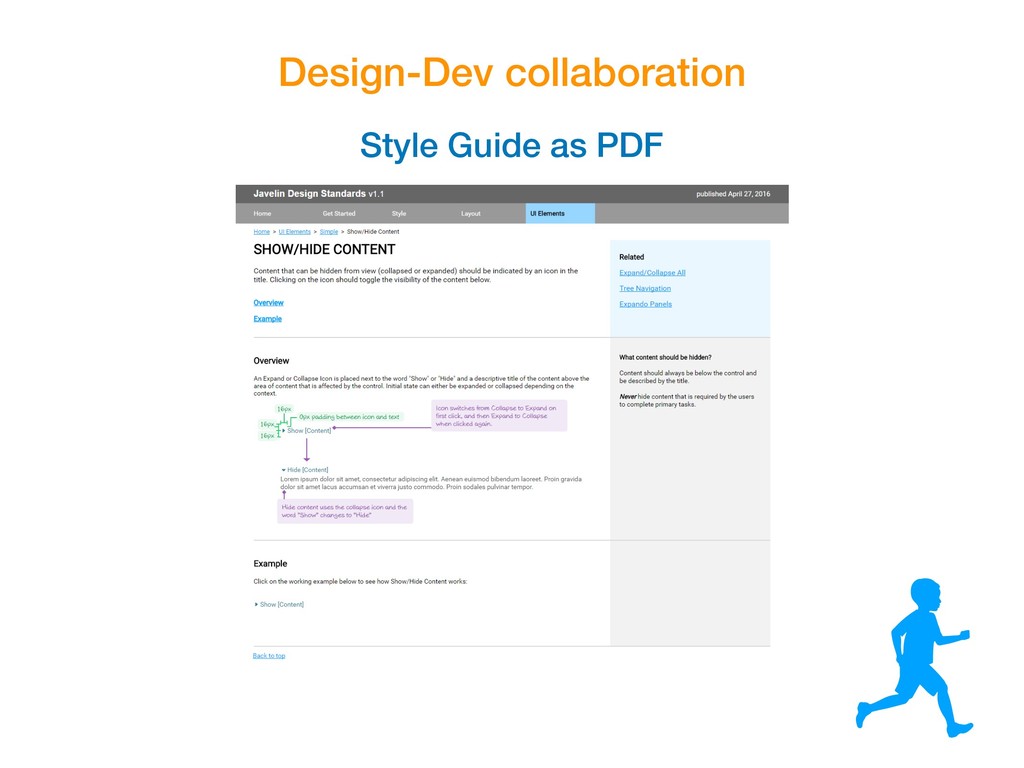
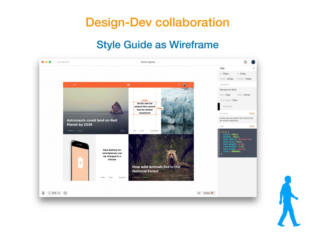
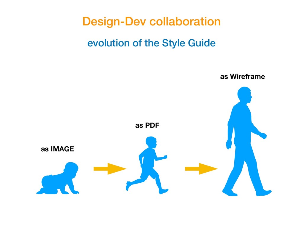
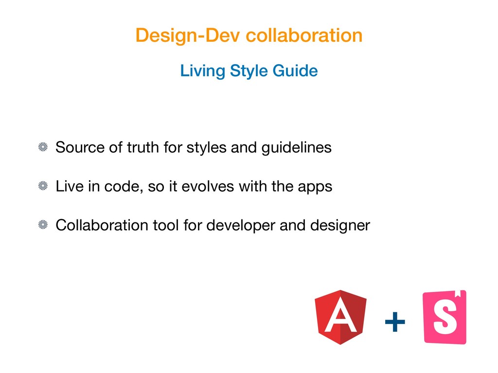
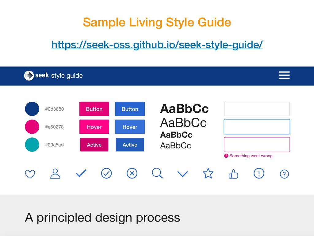
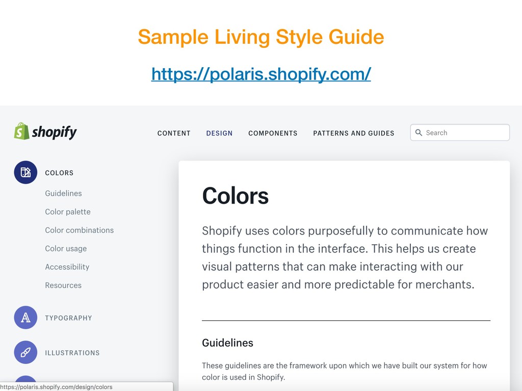
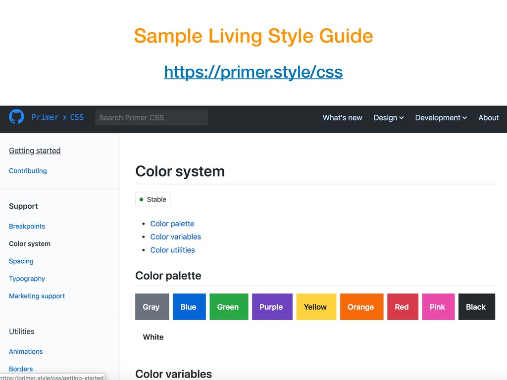
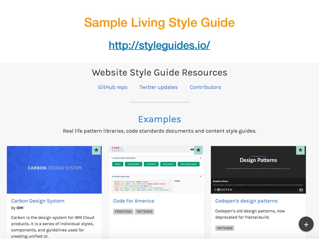
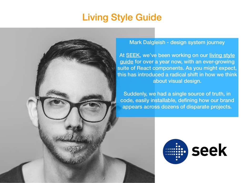
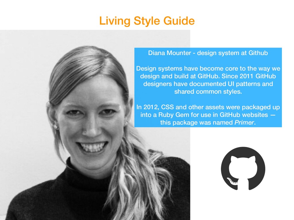
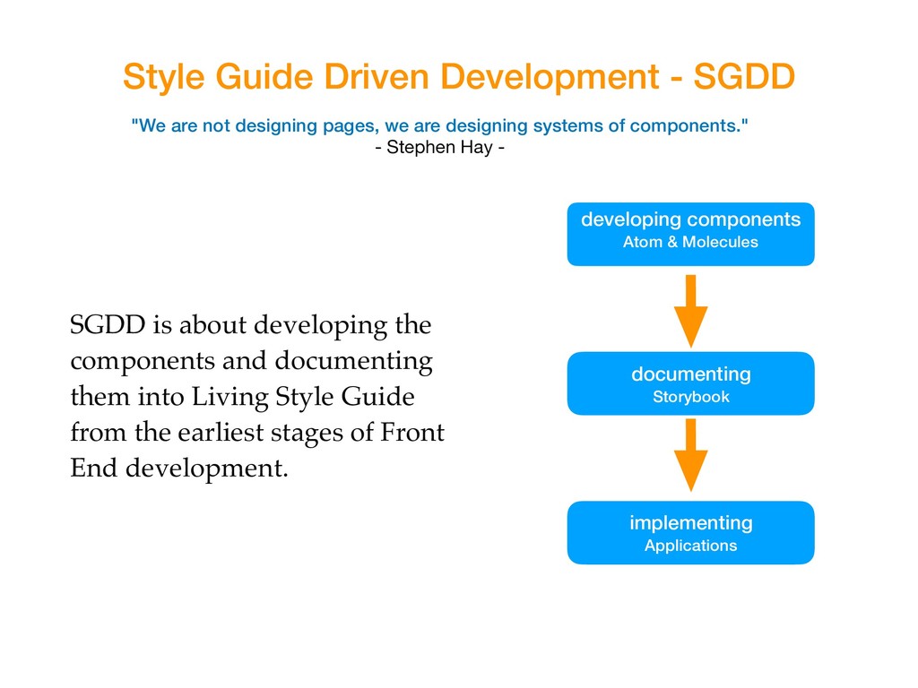
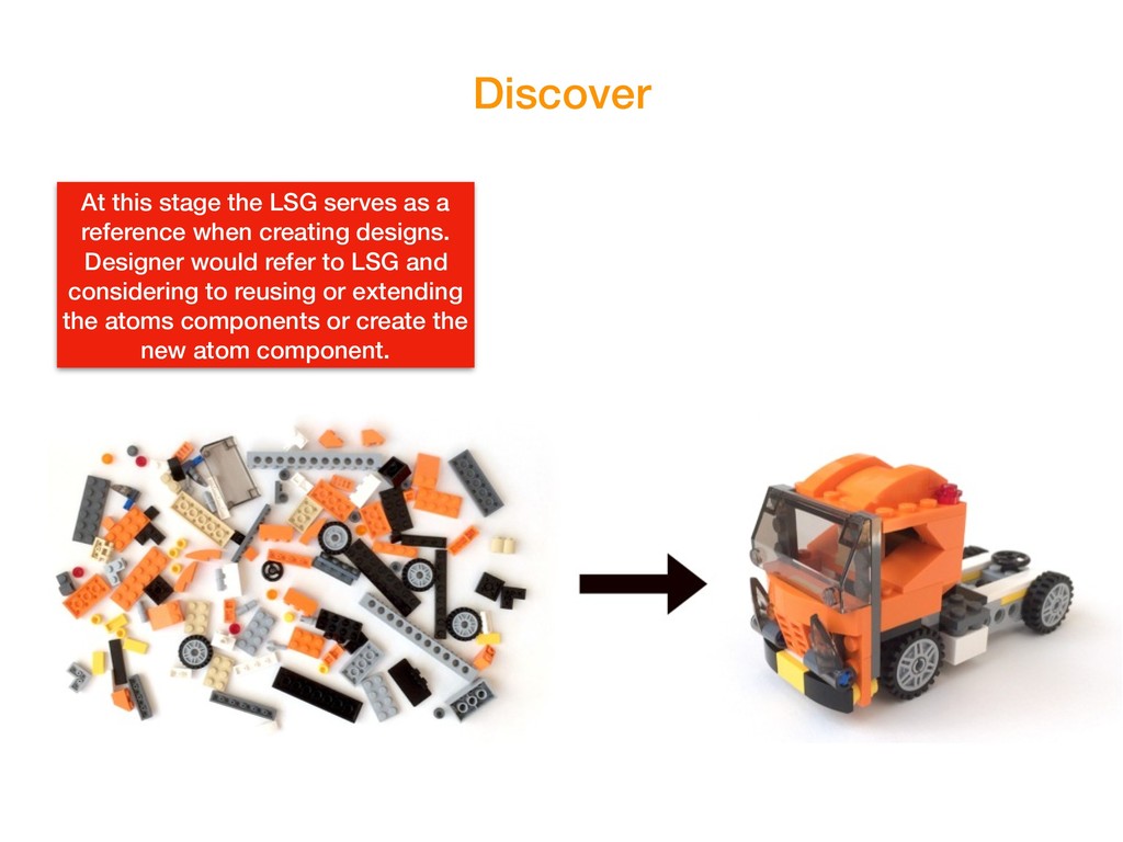
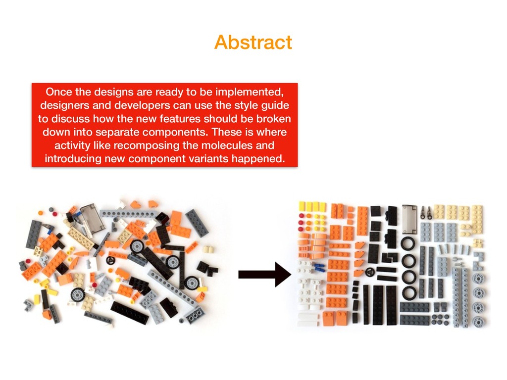
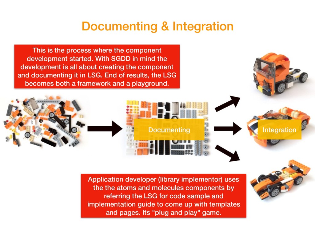
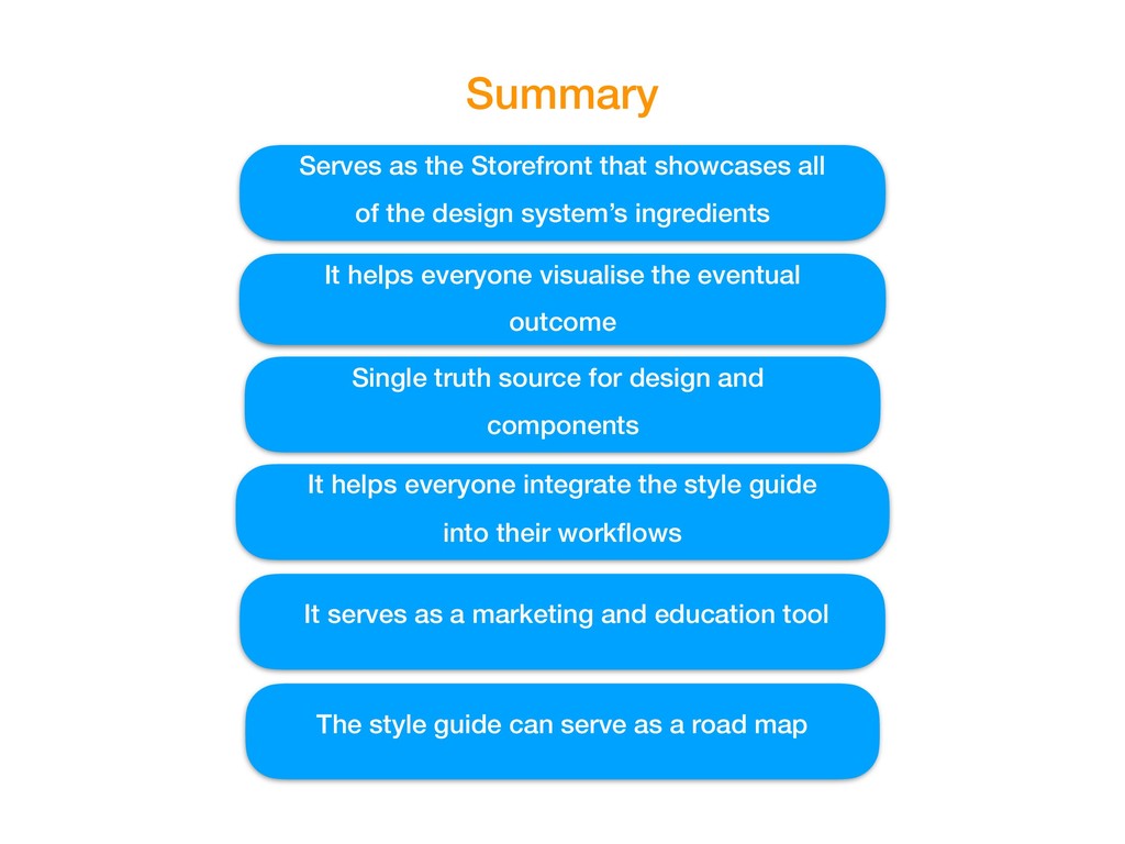
Style guide driven development starts from developing Living Style Guide from the earliest stages of development. The living style guide is a prototype that shows how user interface (UI) components will appear throughout the website or web application
KL JS meetup
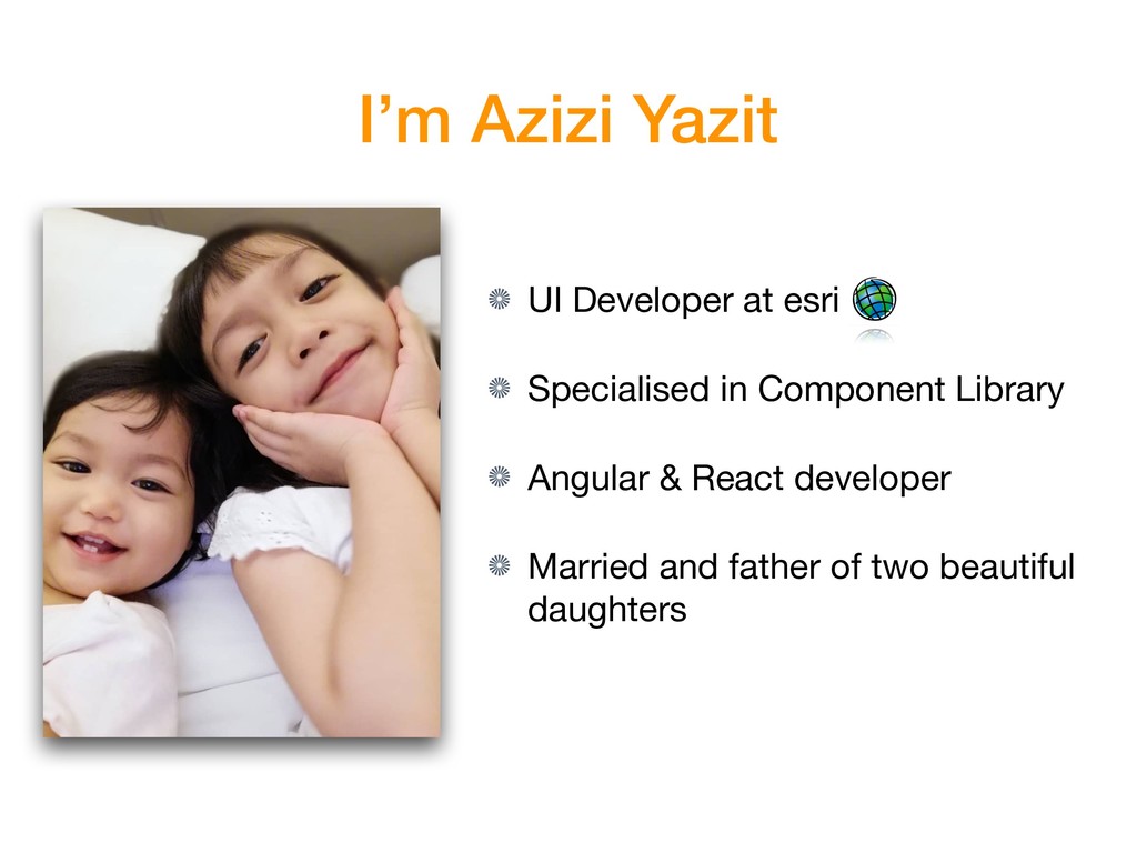
 aziziyazit
 signer
 cbtlibrary
 yatabe
 datarian
 akasan
 hidetoshikawaguchi
 robintux
 akiraasano
 jacobtomlinson
 holman
 tmiket
 jcasabona
 csswizardry
 irinanazarova
 honzajavorek
 garrettdimon
 marketingsoph
 chriscoyier
 orderedlist
 sabderemane